As someone who obsesses over designing spaces for connection—killer media rooms, game rooms that actually get used, party-ready living areas—you might think my job stops at the living room door. Not a chance.
I’ve learned that a truly great social space accounts for the entire guest experience. And let’s be honest, the bathroom is the unsung hero of any get-together. It’s a quiet moment away from the crowd, a private beat in the rhythm of the party. Its design speaks volumes about a host’s attention to detail. That’s why I see bathrooms as the perfect playground for design experiments, especially for a style as bold and honest as industrial.
Industrial design is all about embracing the unfinished, celebrating raw materials, and finding the beauty in function. Forget boring beige. If you want to give your bathroom a shot of urban edge, tile is where you start.
1. The Raw Concrete Look (Without the Hassle)
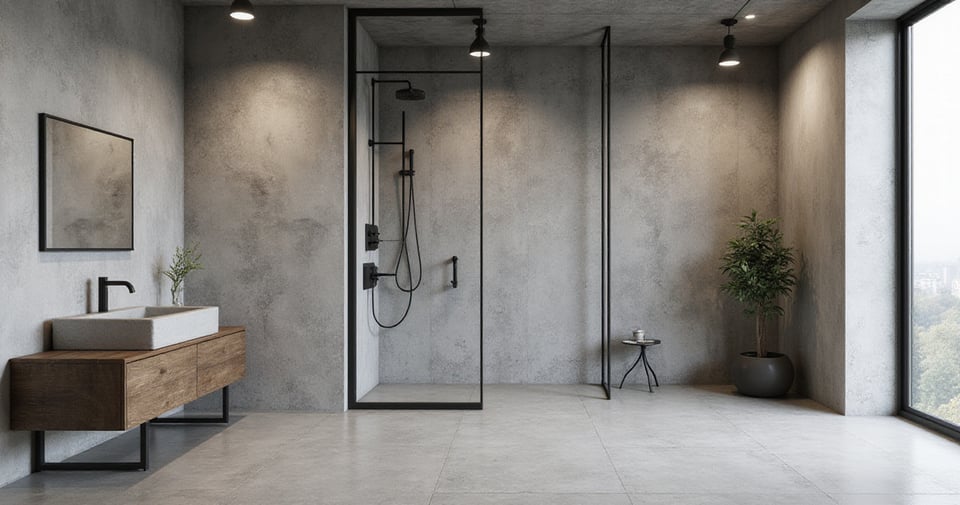
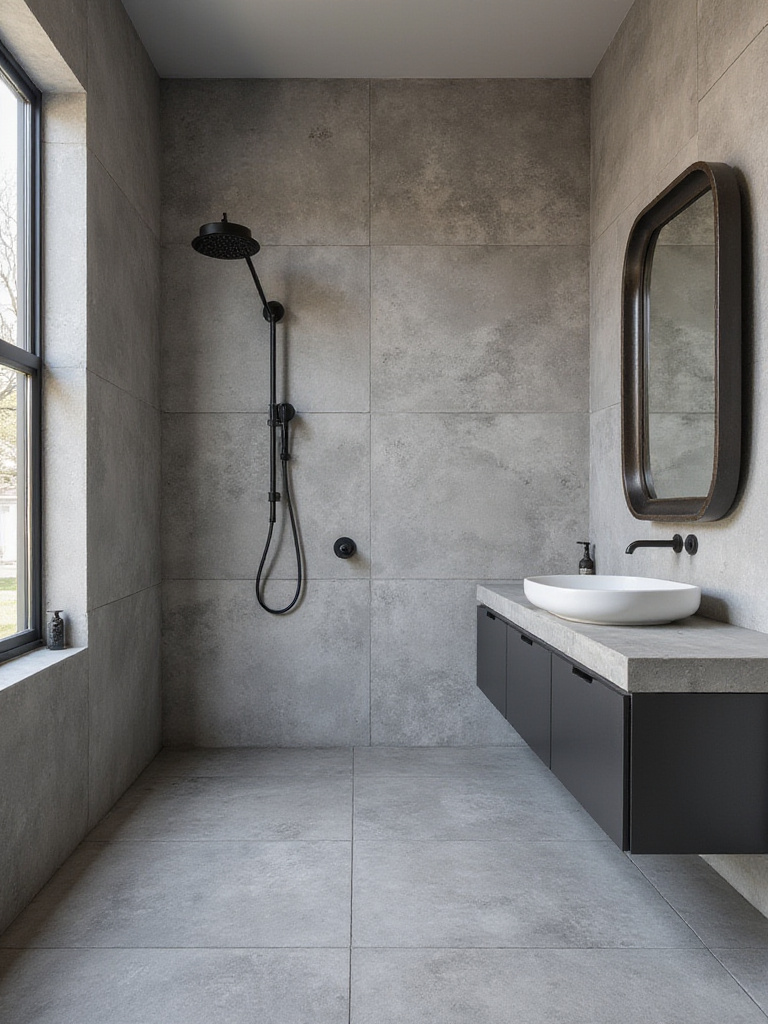
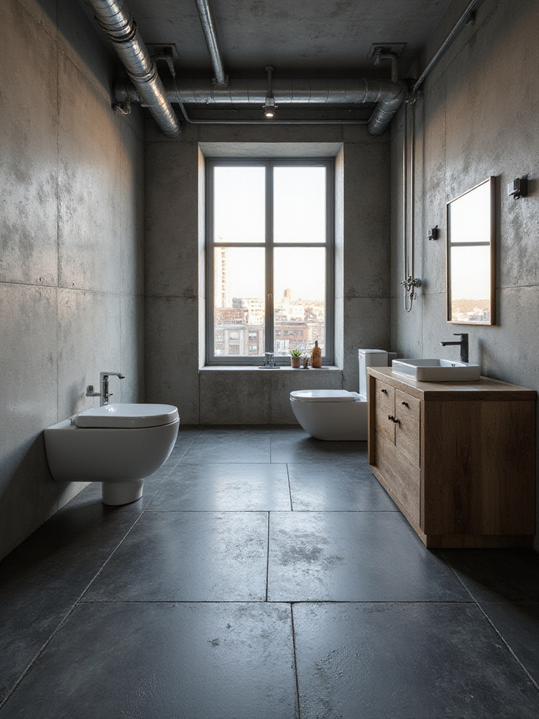
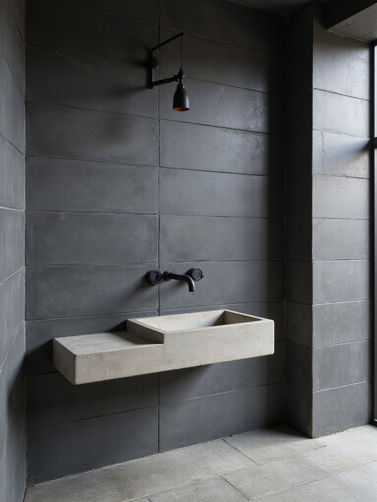
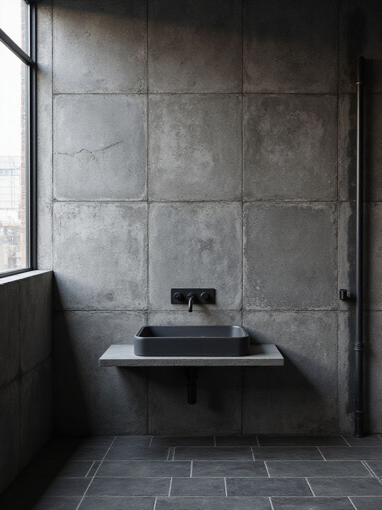
Let’s start with the absolute foundation of industrial style: concrete. But I’m not talking about pouring actual concrete, which can be a porous, high-maintenance nightmare in a wet room. No, we’re talking about the magic of modern porcelain that delivers that raw, brutalist gallery vibe with none of the headaches. The best versions have incredible detail—faint trowel marks, tiny air pockets—so every tile is slightly different.
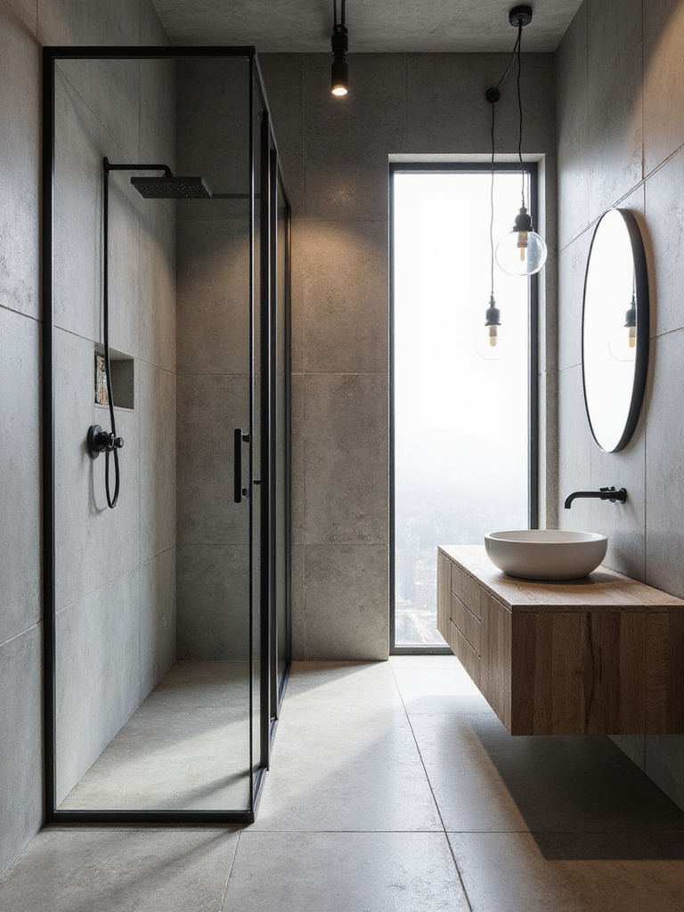
I’ve noticed what separates a good installation from a great one is variation. When the patterns are too repetitive, it just screams “fake.” High-quality porcelain mimics the randomness of a real concrete pour. Use it floor-to-ceiling for a dramatic, bunker-chic statement, or just on the floor to ground the space. It’s the perfect neutral, rugged backdrop for everything else you want to do.
But if a full concrete look feels a bit too cold, there’s another way to go dark that feels incredibly sophisticated and, frankly, is a lot easier to live with.
2. Matte Black Subway Tiles & Dark Grout
There’s something about a wall of matte black subway tiles that just feels cool. It’s moody, it’s intense, and it has this light-absorbing quality that makes a room feel instantly intimate. It’s a look I come back to again and again for clients who want drama. The key is the matte finish. Glossy black shows every single fingerprint and water spot. Matte? It just drinks it all in.
Here’s the real insider tip, though: pair it with dark grey or black grout. I know, a lot of people are afraid of dark grout, but it’s a total game-changer for maintenance. White grout in a shower is basically a full-time job to keep clean. Dark grout hides everything and makes the graphic shape of the tiles pop. Try it on a single feature wall behind the vanity for maximum impact without turning your bathroom into a cave.
While this look is all about those sharp, dark lines, you can get a similar monolithic feel with less busyness by supersizing your tiles.
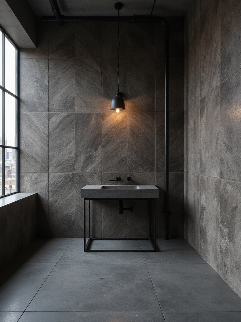
3. Big, Bold Grey Stone Effect Tiles
What really gets me about large format tiles is how they change your sense of scale. Using massive grey stone-effect tiles minimizes the grout lines, creating an almost seamless surface. Your brain stops reading it as “a tiled wall” and starts seeing it as “a slab of stone.” It feels less constructed and more excavated. It’s a powerful trick.
These tiles are perfect for making a small bathroom feel bigger and a big bathroom feel absolutely epic. I recently used 48-inch square tiles in a main-floor powder room, and the client said it felt like a little modern art museum. You get all the subtle veining and texture of real stone without the fear of staining or the wild price tag. It’s all about that massive, uninterrupted visual.
But what if you want to go in the other direction—not fewer lines, but more? And with a more interesting shape?
4. Hexagon Tiles in Charcoal or Anthracite
Hexagons are where geometry gets interesting. The six-sided honeycomb pattern feels more organic than a simple square grid, but it’s still clean and structured. Laying a floor with charcoal or anthracite hex tiles grounds a room with a texture that’s both predictable and fascinating to look at.
What’s cool is how the intersecting lines play with light. They create a subtle pattern that’s way more dynamic than a standard grid, which works wonders in tight spaces where you need some visual interest without adding clutter. Honestly, it’s one of my favorite ways to tile a bathroom floor. It feels both classic and totally modern at the same time.
And they’re practical, too. Those deep, moody tones are fantastic at hiding the dust bunny or stray hair that’s inevitable in a bathroom. Upkeep made easy.
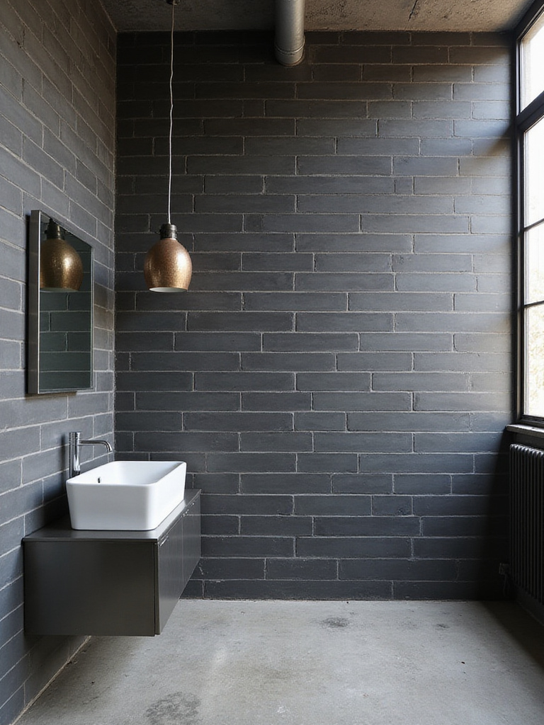
5. That Distressed Metal Vibe (in Ceramic)
Okay, this is where tile technology gets really fun. I’m obsessed with these ceramic tiles that look like weathered, aged sheets of metal—think rusted Corten steel, zinc, or tarnished iron. You get all that incredible industrial history and patina, but in a material that won’t actually rust or oxidize all over your towels when it gets steamy.
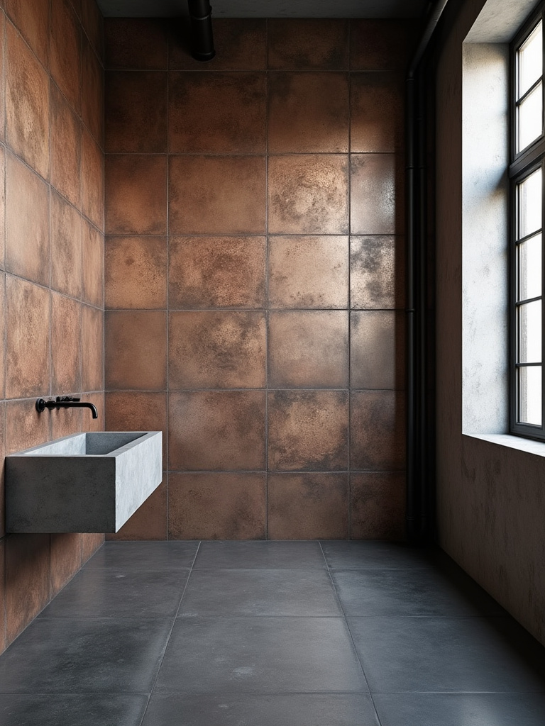
This is not an all-over look. This is your statement wall. Imagine a full shower wall of tile that looks like a sheet of weathered steel, paired with a simple concrete-look floor and matte black fixtures. It’s dramatic, it’s textural, and it tells a story. I designed a media room bar backsplash with these once, and it looked so amazing the client had me repeat it in the adjoining guest bath. It’s pure character.
This look gives you the grit of the factory. But for a warmer, more classic loft feeling, nothing beats the icon.
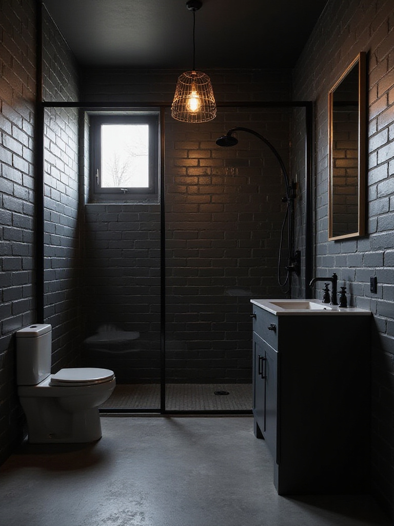
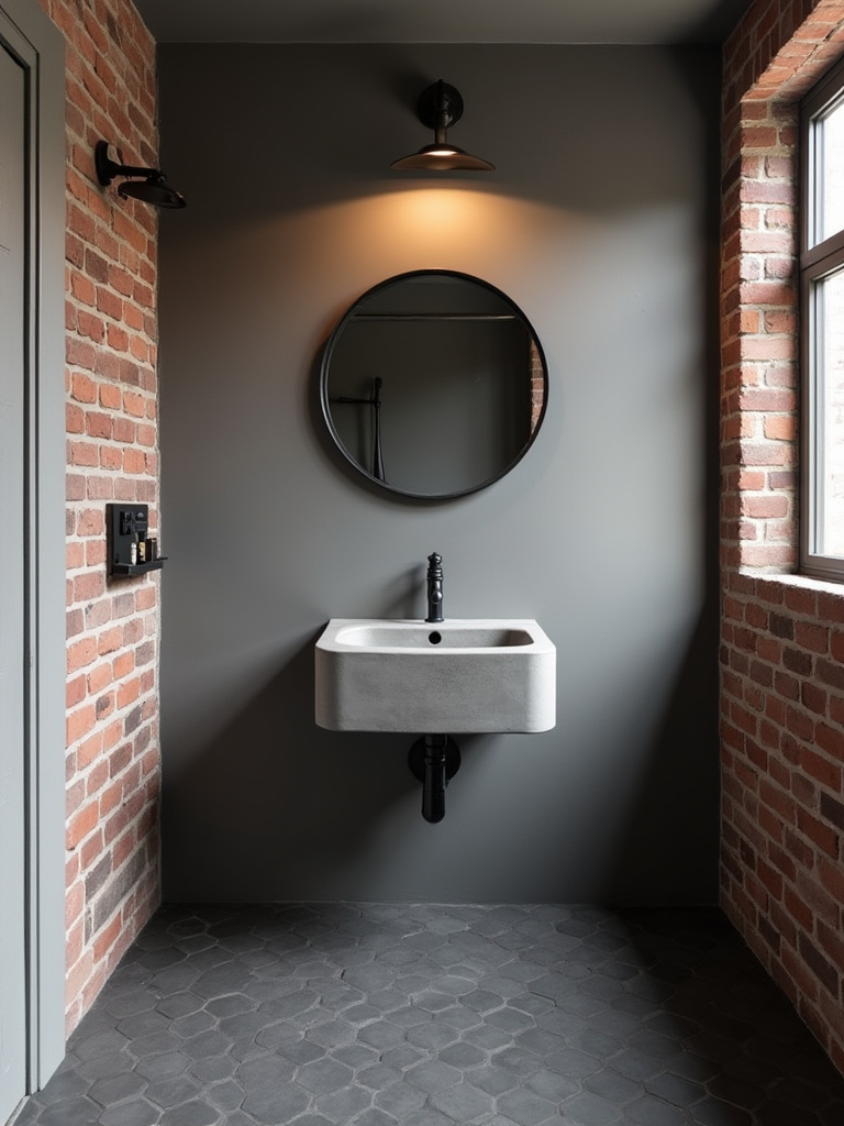
6. The Red Brick Effect
Exposed brick is the heart and soul of so many lofts and converted warehouses. A full wall of real brick in a bathroom is… a choice. And usually, a bad one, because brick is a sponge. But brick-effect porcelain or ceramic tiles? Brilliant. They give you all the warmth and texture of a SoHo loft without any of the moisture problems.
The modern versions are incredibly convincing, with slight color variations and even little nicks and “mortar” smears that make them look authentic. Pairing this with dark grout is key to selling the effect. It’s a fantastic way to introduce a warm, earthy element to counteract the cool greys and blacks that often dominate industrial design. It feels comfortable and lived-in from day one.
I love using this on a single wall to create a focal point, especially if you’ve got an awkward or long, narrow room. A brick wall at the far end can completely change the room’s proportions.
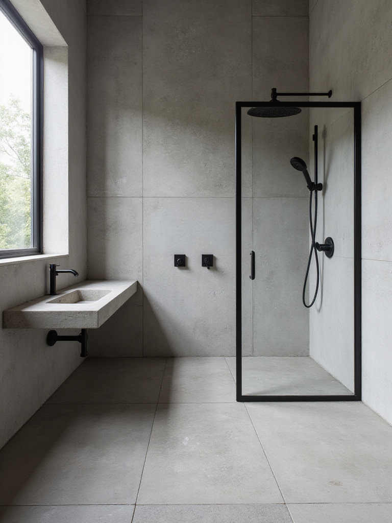
7. Dark Slate Effect Porcelain for the Floor
You need a floor that can anchor all these other cool materials. For me, that’s often a dark slate-effect porcelain. Natural slate is gorgeous but can be a bit fragile—it chips, and it needs regular sealing to avoid turning into a water-stained mess. The porcelain version gives you that same dark, layered, organic texture with none of the drama.
What’s great is that it has a slightly riven texture, which provides fantastic, much-needed slip resistance in a bathroom. It feels solid and elemental underfoot. A dark slate floor is the perfect foundation. It works with brick, it works with concrete, it works with metal… it’s the quiet, reliable workhorse of your industrial bathroom design.
Slate gives you earthy tones, but if you want to inject some unexpected color that still feels gritty and authentic, this next one is a showstopper.
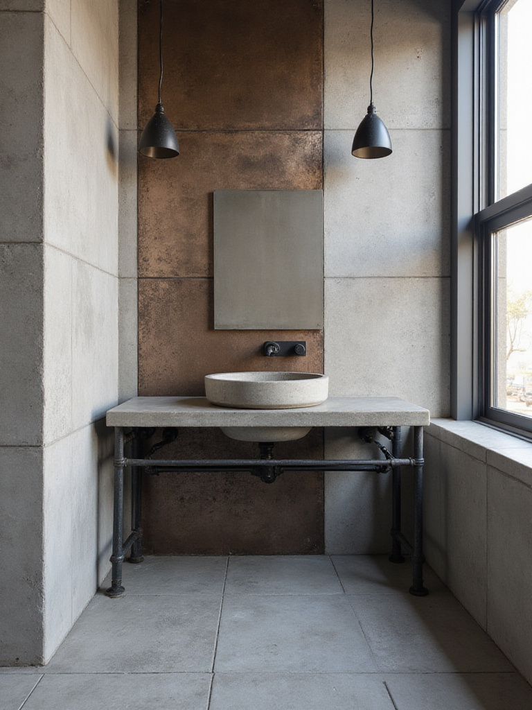
8. Oxidized Copper Accent Tiles
Think of this as the jewelry for your bathroom. Oxidized copper-look tiles, with their incredible blue-green verdigris patterns, are a splash of artistry. They mimic the natural patina that happens to copper over decades of exposure to the elements. This isn’t something you use for the whole room—it’s your secret weapon.
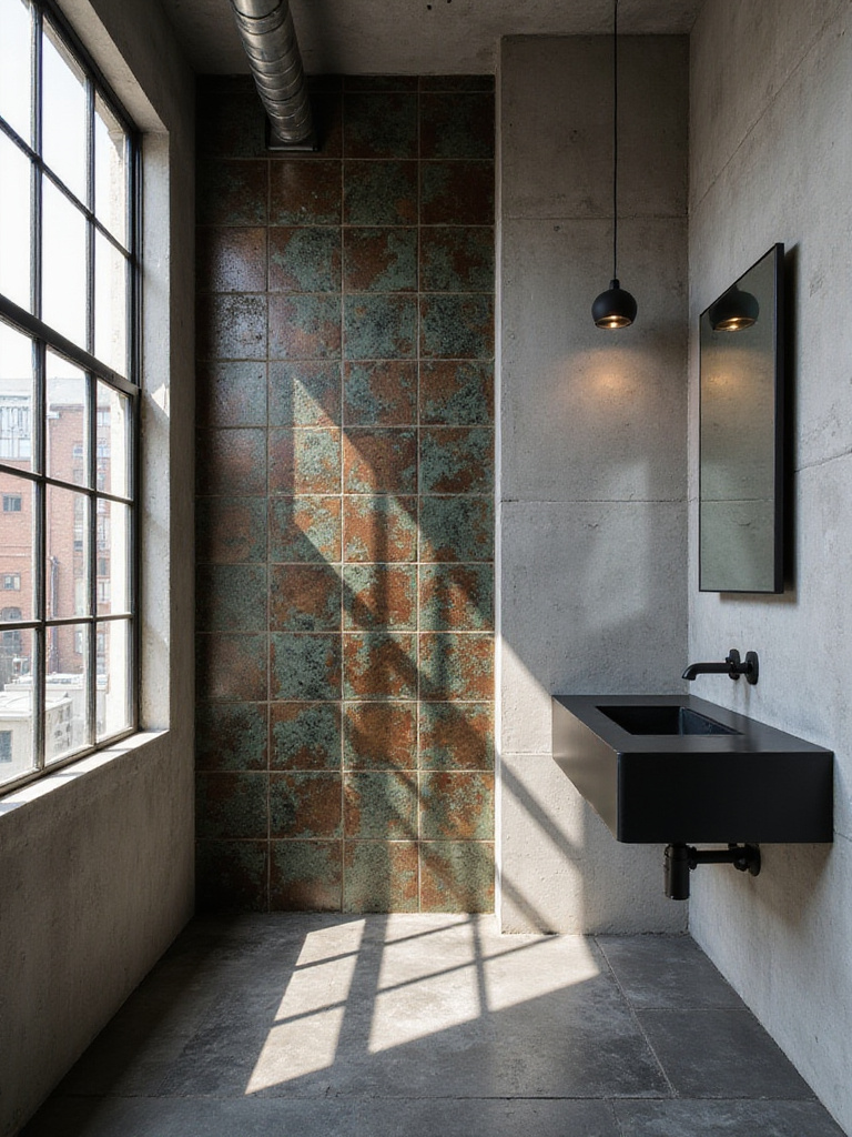
Use them to line the back of a shower niche. Create a vertical stripe of them in the shower. Use them as the backsplash behind the sink. A little goes a long way. The contrast between that brilliant, aged color and the surrounding raw materials is just fantastic. It adds a layer of richness and proves that “industrial” doesn’t have to mean a total absence of color. It’s a little bit of beautiful decay.
Speaking of classics, let’s talk about the undisputed champion of the industrial-meets-classic look.
9. White Subway Tiles with Black Grout
This look is a stone-cold classic for a reason. It’s born from the most utilitarian of spaces: the New York City subway, where it was chosen because it was bright, easy to clean, and tough as nails. Bringing that into a bathroom instantly gives it a sense of history and graphic punch.
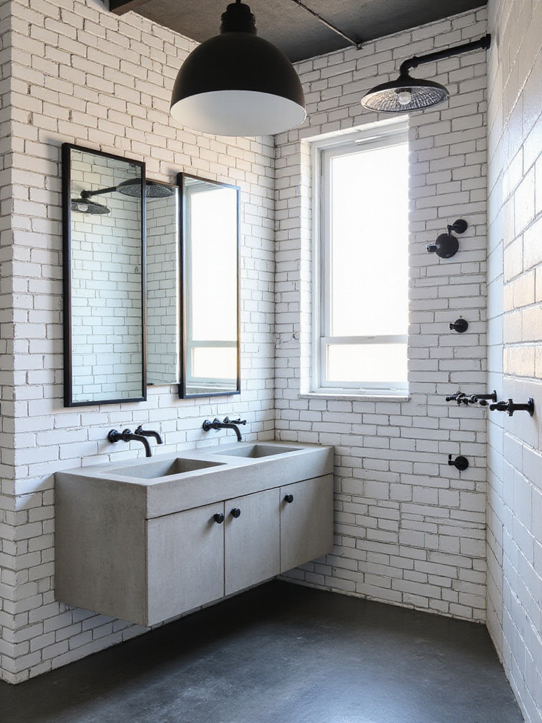
The stark contrast between the bright white tile and the bold black grout creates a visual grid that feels incredibly architectural. Here’s what’s funny—so many people are worried the black grout will feel dirty, but it’s the total opposite. It’s white grout’s dirty little secret that it’s an absolute pain to keep looking pristine. The black grout stays looking crisp forever. It’s a design choice that’s also secretly a practical one. My favorite kind.
But you don’t have to stick to classic patterns. If you want pattern with a more modern, subtle twist, you’ve got options.
10. Geometric Pattern Tiles in Muted Greys
I love the unexpected harmony of pairing a complex geometric pattern with raw, simple materials. A floor of geometric-patterned tiles in various shades of grey can transform a simple bathroom into something truly special, all while sticking to that cool, industrial color palette.
Think chevrons, cubes, or repeating abstract shapes. The pattern itself becomes the star. The trick I’ve learned is to use these intentionally. If you have a wild pattern on the floor, keep the walls simple—maybe a concrete or micro-cement effect. This creates a balance where the room feels dynamic and interesting, not just busy and chaotic. It’s about letting one surface have its moment.
Pattern isn’t just about what’s printed on the tile, though. Sometimes it’s about how you arrange a simple tile.
11. The Vertical Stack Layout
Here’s an architectural hack I use all the time. Take a basic subway tile—any color, really—and instead of laying it in the traditional running bond (brick) pattern, stack them in a perfect vertical grid. It immediately creates strong, clean lines that draw the eye upward. In a room with standard 8-foot ceilings, this simple change can make the ceiling feel a foot higher. It’s a visual trick, and it works every time.
This layout feels more modern and orderly than a brick pattern. It’s crisp, it’s architectural, and it perfectly complements the functional vibe of industrial design. For a super dramatic effect, use a dark tile with matching dark grout. You get the texture of the grid without the busyness of a contrasting grout line. Just pure, powerful verticality.
This plays with lines, but what about playing with real, physical texture?
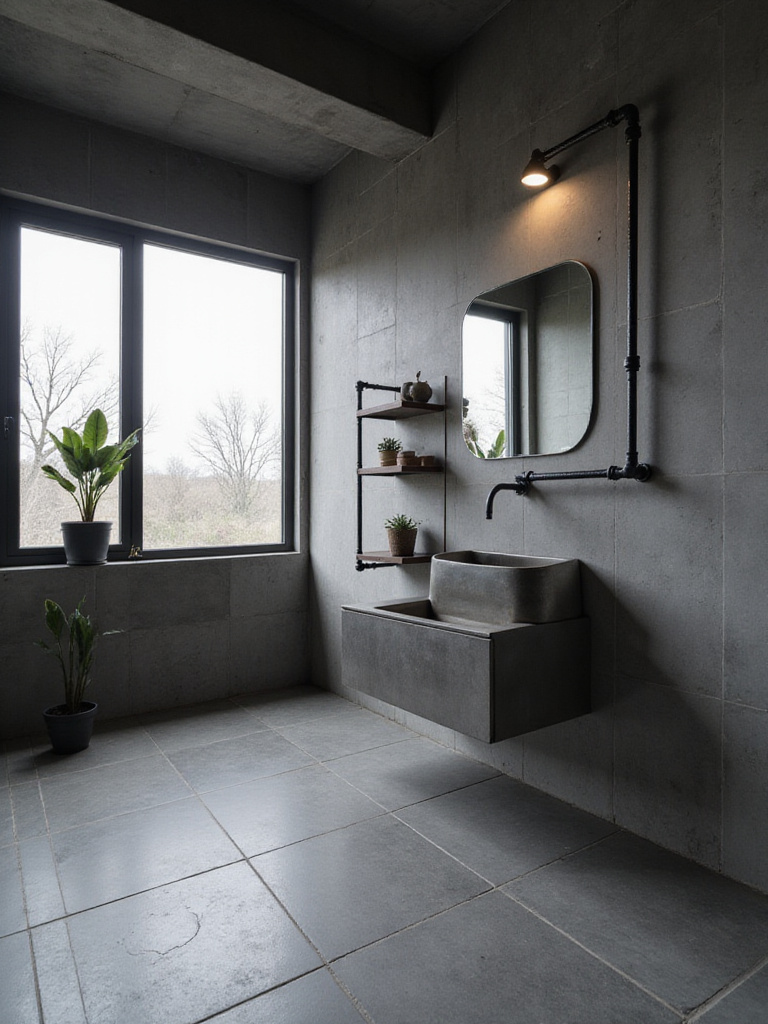
12. Textured Concrete Wall Panels (Tile Form)
At first glance, this might look like the raw concrete tile we started with. But get closer. These aren’t flat. These are three-dimensional panels that mimic the look of board-formed concrete—where you can actually see and feel the texture of the wood grain from the forms used to pour it.
This is next-level stuff. The way light hits a wall like this is incredible; it creates constantly shifting shadows and highlights throughout the day. It turns a flat wall into a dynamic surface. You get all of that amazing, rough-hewn character, but in a porcelain tile that can handle a shower. It’s the perfect blend of raw architecture and bathroom-ready performance. It feels solid, real, and has so much more depth than a simple flat tile.
Now, that’s a lot of cool, hard surfaces. But what if you want to bring in a little warmth?
13. Herringbone Pattern with Dark Wood-Look Tiles
I absolutely love the tension this creates. You have the refined, almost formal herringbone pattern—a classic of old European apartments and parquet floors—laid with tiles that look like dark, reclaimed factory timber. It’s a little bit fancy, and a little bit gritty. That combination is industrial design gold.
Modern wood-look porcelain is ridiculously good. It captures every knot, grain, and saw mark while being completely waterproof, making it perfect for a bathroom floor or even a shower wall. Arranging it in a herringbone pattern adds a sense of movement and energy to the room. When you’re using a lot of hard, cool materials like concrete and metal, a “wood” floor can keep the space from feeling too sterile.
Just a heads up: if you go with a strong pattern like herringbone on the floor, let it be the star. Keep the wall tiles simpler so they aren’t fighting for attention.
14. Checkerboard Floors in Black and Grey Matte
No, this is not your grandma’s 1950s black-and-white kitchen floor. By swapping the bright white for a smoky grey and using a matte finish, the classic checkerboard pattern becomes something else entirely. It’s more sophisticated, more muted, and a perfect fit for an industrial aesthetic.
The graphic pattern still provides that awesome rhythm and old-school vibe, but the subdued colors keep it from feeling kitschy. It provides a solid, patterned foundation that’s a fantastic counterpoint to rougher textures like brick or concrete on the walls. It’s a little bit retro, a little bit rock-and-roll.
It’s another one of those designs that proves you can be playful and still maintain a tough, industrial edge.
15. Slim Rectangular “Kit Kat” Tiles in Dark Tones
You’ve probably seen these popping up in cool coffee shops and hotels. These slim, finger-like tiles—sometimes called Kit Kat tiles—create a fluted, linear texture that’s incredibly elegant. Arranged in a tight stack, they create a surface with a beautiful rhythm and subtle shadow play. In dark tones like charcoal, forest green, or navy, they have a vibe that feels like a blend of Japanese minimalism and Brooklyn industrialism.
They have more grout lines, which sounds like a bad thing, but it’s not—it adds to the overall texture. They are perfect for a feature wall behind a freestanding tub or for wrapping an entire vanity area. They have a refined quality that can elevate the whole room, proving that “industrial” can also mean “incredibly chic.”
For a smoother, more unified concrete look, we have one more option in the concrete family.
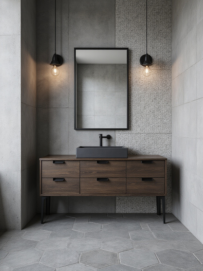
16. Concrete Microcement Effect Tiles
This is the smooth operator of the concrete world. Standard concrete-look tiles often mimic a rougher, more aggregate-filled surface. Microcement-effect tiles, on the other hand, replicate the look of hand-troweled, pigmented cement. The finish is smoother, almost velvety, with soft, subtle variations in tone.
Laying these with the thinnest possible grout lines creates a nearly seamless, monolithic look that feels incredibly modern and high-end. It’s a softer, more refined take on concrete that still has that raw, elemental character. It’s perfect for creating a serene, spa-like bathroom that still feels grounded in industrial principles.
Now, the pro move: how do you combine some of these ideas?
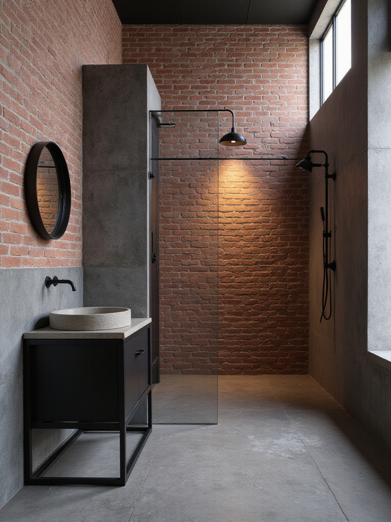
17. Mix and Match Your Textures
Think about a real factory or workshop. It’s never just one material. It’s a mix of concrete floors, brick walls, steel beams, and wooden crates. The most authentic-feeling industrial spaces embrace this. So, don’t be afraid to combine different tile effects to create a richer, more layered space.
Here’s a combo I love: a dark slate-effect floor, textured board-formed concrete-look tiles on the main shower wall, and simple white subway tiles on the other walls. Or try a red brick-effect wall with a smooth microcement-look floor. The key is to create contrast in texture while maintaining a cohesive color story (sticking to your greys, blacks, and browns). It makes the space feel like it evolved over time, not like you bought it all from page 27 of a catalog.
And for the boldest statement of all? Go all in on one.
18. Use the Same Tile on Both Walls and Floor
Want an immersive, architectural experience? Use the same tile—especially a large-format concrete or stone-look tile—on both the floor and the walls. This is the “total immersion” technique. It blurs the lines between the different planes of the room, creating an enveloping, cave-like feel that can be incredibly dramatic and calming.
This works especially well in walk-in showers or full wet rooms. By wrapping the entire space in one continuous material, you create a powerful, unified statement. This move isn’t for the faint of heart, but the payoff is huge. The best part? Against this uniform backdrop, your fixtures—a matte black faucet, a reclaimed wood vanity—become sculptural objects that really pop.
Conclusion
Ultimately, designing a bathroom isn’t that different from designing a great media room. It’s about creating a specific feeling and a seamless experience. The right tiles can do more than just cover the walls; they set a mood. They can make a space feel rugged, serene, historic, or futuristic.
Industrial design is about honesty and character. It’s about materials that are proud of what they are. So don’t be afraid to make a strong choice. After all, a bathroom might be a private space, but it’s another opportunity to share your style and make your home a place where every single detail feels like you.