You know what people always ask me? Right after we’ve spent months perfecting the workflow in their kitchen and found the perfect dining table for their family dinners, they pull me aside and whisper, “Okay, Nancy… what on earth do I do with my bedroom?” It’s like they’ve mastered the heart of their home and suddenly realize the place they’re supposed to recharge feels completely wrong. And it makes perfect sense. A kitchen is for doing, for creating, for nourishing others. But a bedroom? That’s for you. It’s your sanctuary, and getting it right feels personal and, frankly, a little paralyzing.
Everyone gets so hung up on trends they see online or that one perfect color from a magazine, but that’s just noise. The real secret to creating a bedroom that feels like a deep, restorative breath is to think about it like you’re creating a perfect meal. It’s not about one flashy ingredient; it’s about how all the elements—the mood, the light, the textures—come together in harmony. Forget the corporate-speak and the endless swatches for a minute. Let’s just talk about what actually works.
Planning Your Bedroom Paint Transformation
Before you even think about cracking open a can of paint, you have to do the prep work. In cooking, we call it mise en place—getting all your ingredients chopped and measured before you turn on the stove. It’s the non-negotiable first step that prevents chaos later. Doing this thinking upfront will save you so much time, money, and heartache.
1. Define Your Ideal Bedroom Mood: Sleep Sanctuary or Vibrant Retreat?
First things first: How do you want to feel in this room? This is the most important question, and you have to answer it before you look at a single color. Are you dreaming of a space that’s a dark, cozy cocoon where you can get the best sleep of your life? Or do you need a room that feels bright and energizing, helping you wake up and greet the day? You can’t have both. Trying to will just leave you with a space that feels muddled and doesn’t do either job well.
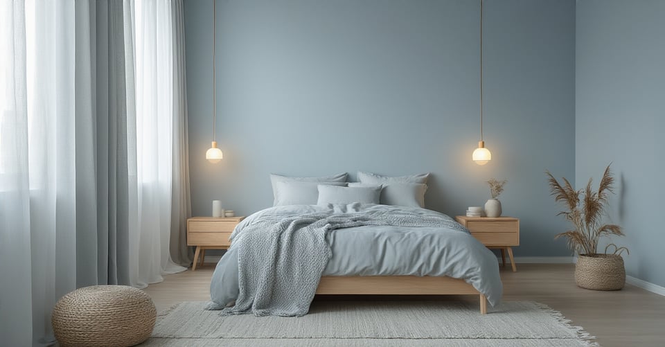
Think about it. A serene, sleep-focused sanctuary is going to lean into calming, muted colors—soft blues, gentle greens, warm grays. These colors literally help lower your heart rate. But a vibrant retreat needs colors with a bit more life to them to get your creative juices flowing, like a sunny yellow accent or a warm terracotta. I once had a client, a busy surgeon, who insisted she wanted a bright, cheerful bedroom. But after talking, we realized what she truly craved was deep, restorative rest. We painted her room a deep, moody blue-green, and she later told me it completely changed her sleep. She was getting the fuel she needed to be sharp and focused at work. That’s the power of defining the mood first.
Now that you know how you want the room to feel, let’s talk about the biggest player in the game: light.
2. Assess Natural Light: Warm or Cool Tones for Optimal Glow?
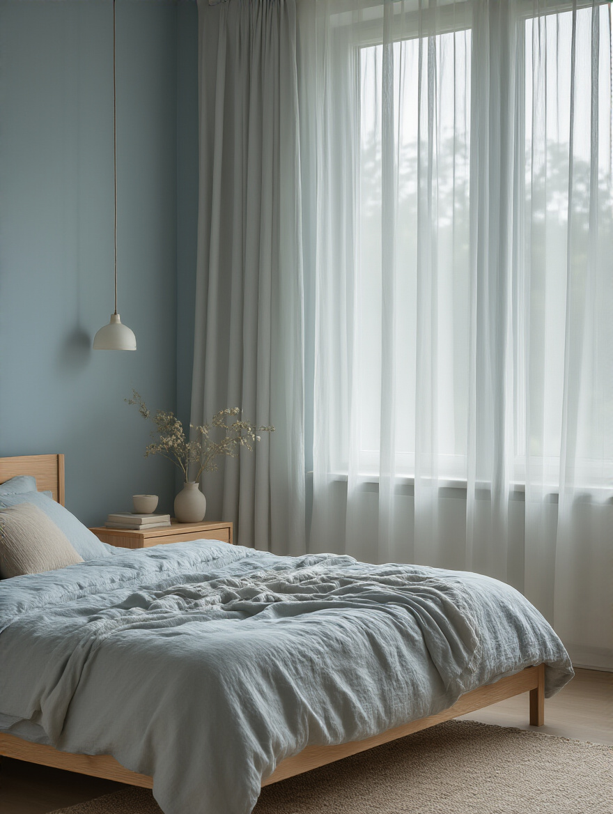
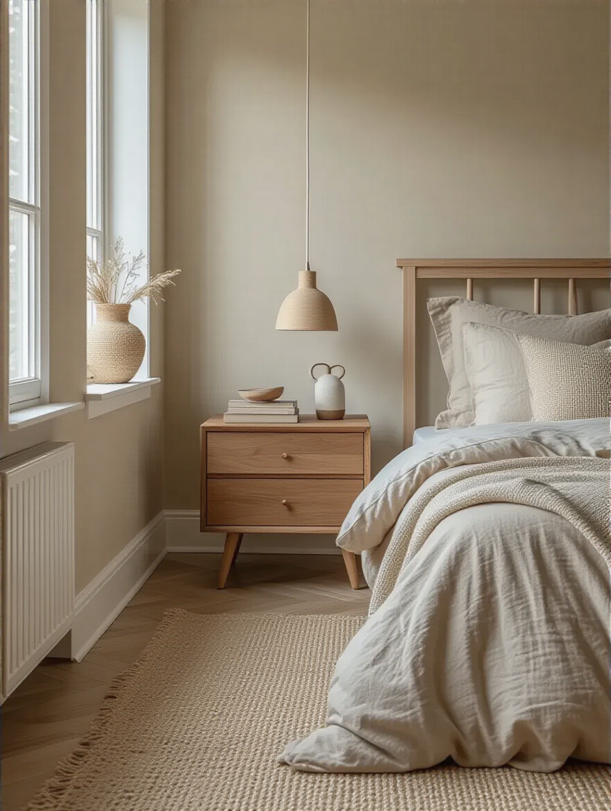
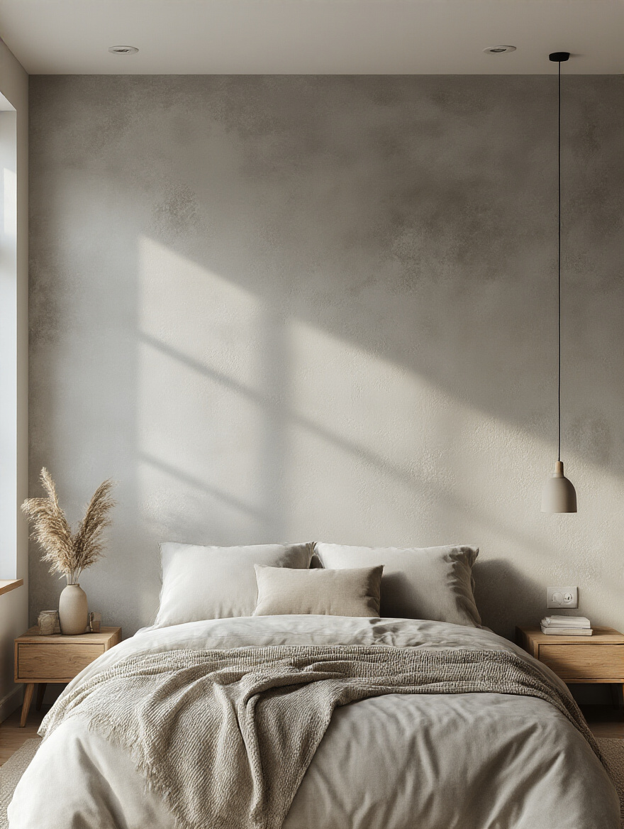
Light is an ingredient. You can’t ignore it. The exact same can of paint will look like two completely different colors in a room with warm, southern light versus one with cool, northern light. A north-facing room gets that cool, indirect light all day. If you put a cool gray in there, it can feel like a dreary, chilly cave. You need to counteract that with a color that has warm undertones—think creamy whites, warm beiges, or even a gray with a hint of yellow or red in it.
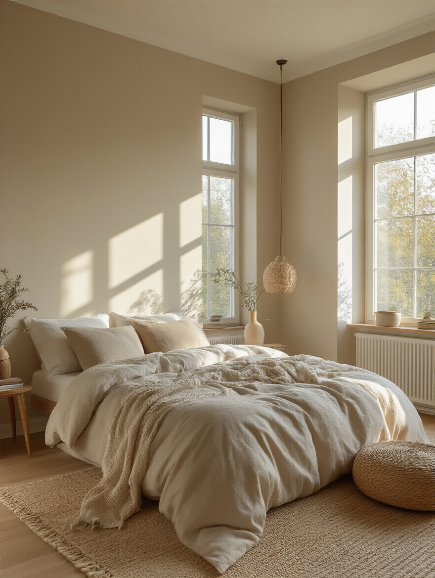
On the other hand, a south-facing room gets that bright, intense, warm light. That lovely buttery yellow you picked out can suddenly look like a screaming-bright lemon. In those rooms, you can get away with cooler colors—a crisp blue or a soft sage green—to help balance the warmth and keep the room from feeling overwhelmingly bright. So, spend a full day just watching the light in your room. See how it changes from morning to afternoon. Notice how it feels. This isn’t just some fancy designer step; it’s the key to not hating your paint color at 4 PM.
Once you understand your light, you have to look at what’s already in the room.
3. Harmonize with Existing Decor: Furniture, Art, and Flooring First.
Can we talk about one of the biggest mistakes people make? They pick a paint color in a vacuum, bring it home, and then realize it clashes horribly with their expensive cherry wood bed or their beautiful vintage rug. Please, please, please do not do this. Your paint should be the sauce that complements the main dish, not the other way around. It’s a thousand times easier and cheaper to match a paint color to your duvet cover than it is to buy all new bedding because the paint is wrong.
Take stock of the big, expensive things you’re not changing: your flooring, your headboard, your main furniture, a large piece of art. What are their undertones? That beautiful oak floor probably has warm yellow or orange undertones. Your gray sofa might have cool blue or even subtle purple undertones. I had a client who painted her bedroom a trendy “greige” without considering her furniture. It had a sneaky green undertone that made her warm cherry bed look sickly and dull. We had to repaint. The second time, we chose a greige with a warm, reddish undertone, and suddenly, the whole room snapped into focus. The bed looked rich and gorgeous, just as it should.
Knowing your room’s dimensions will also help you choose colors that make the space feel its best.
4. Understand Room Size Impact: Expand Small Spaces with Smart Hues.
This is one of the oldest tricks in the book because it works. Color can completely fool the eye and change your perception of a room’s size. If you have a small bedroom that you want to feel more open and airy, you need to stick with lighter, cooler colors. Think soft whites, pale blues, light grays. These colors naturally recede, meaning they trick your brain into thinking the walls are farther away than they actually are. It’s an instant expansion.
But what if you want a cozy, enveloping space? Or what if your bedroom is huge and feels a bit cold and impersonal? That’s when you can bring in darker, warmer colors. A deep charcoal, a rich navy, or a warm terracotta can make the walls feel like they’re giving you a hug. Don’t be afraid of dark colors in a small room, either, especially if you’re going for that cozy, den-like vibe. Painting a small room—even the ceiling—a dark color can blur all the corners and create a dramatic, infinite-feeling jewel box. It’s about deciding what you want the space to feel like, not just how big it looks.
Unlocking Harmonious Color Choices
Okay, now that you’ve done your prep work, we can get to the fun part: picking the actual colors. Think of these as classic recipes—proven combinations that create a beautiful, cohesive dish every time. You don’t have to reinvent the wheel to create something that feels special and professionally designed.
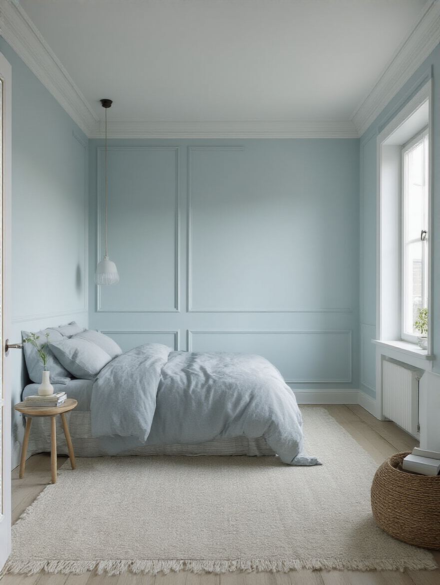
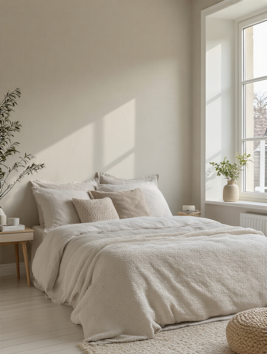
5. Embrace Monochromatic Schemes for Serene Elegance.
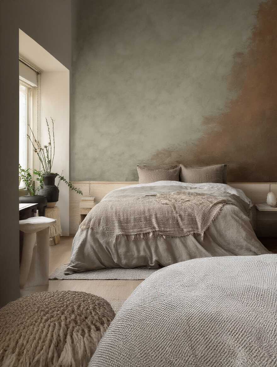
When you really want to create a calm, hotel-like escape, a monochromatic scheme is your best friend. This doesn’t mean painting everything the exact same boring color. It means choosing one base color—let’s say, a soft sage green—and then using different tints (lighter versions), tones (more muted versions), and shades (darker versions) of that same green throughout the room. The walls might be your mid-tone sage, the trim a slightly lighter tint, and the bedding a deep, shadowy shade of that green.
The key to keeping it from feeling flat is texture. A million times, texture! You’d have a matte finish on the walls, maybe a velvet pillow, a chunky knit throw, and linen curtains. The single color allows the different textures to be the star of the show. It’s incredibly sophisticated and soothing because your eye isn’t jumping all over the place. The whole room just feels seamless and calm, which is exactly what you want when your head hits the pillow.
If using one color feels a bit too limiting, you can expand your palette just a little.
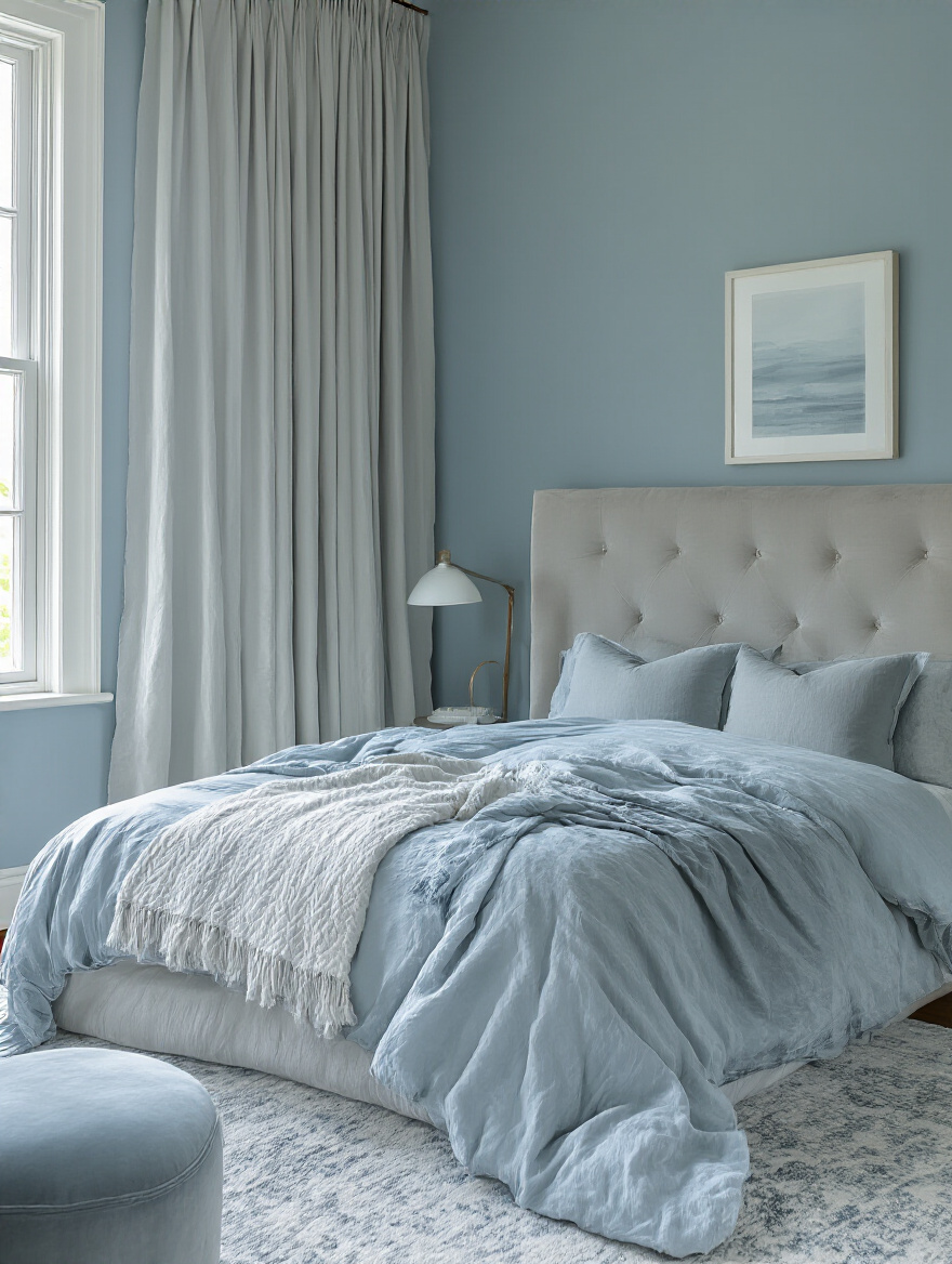
6. Leverage Analogous Colors for Gentle, Cohesive Palettes.
Analogous colors are simply colors that sit next to each other on the color wheel, like blue, blue-green, and green. Think of a sunset or the shades of a forest. They naturally go together because they share a common color, so the result is harmonious and easy on the eyes. There’s no harsh contrast or visual tension, which makes this kind of palette perfect for a relaxing bedroom.
To make it work, you use the 60-30-10 rule, a classic designer trick. You’ll choose one dominant color for about 60% of the room (usually your walls). Then, a secondary color for about 30% (your bedding, curtains, or an accent chair). Finally, a third color for about 10% (throw pillows, art, and accessories). So you could have soft blue walls, deeper seafoam green bedding, and a few little teal accents. It’s more visually interesting than a monochromatic scheme but still feels incredibly cohesive and peaceful.
Of course, sometimes you need a little jolt of energy.
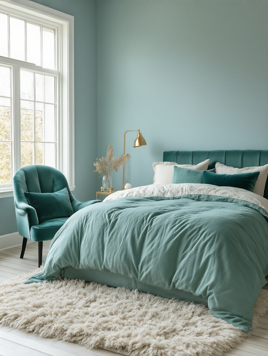
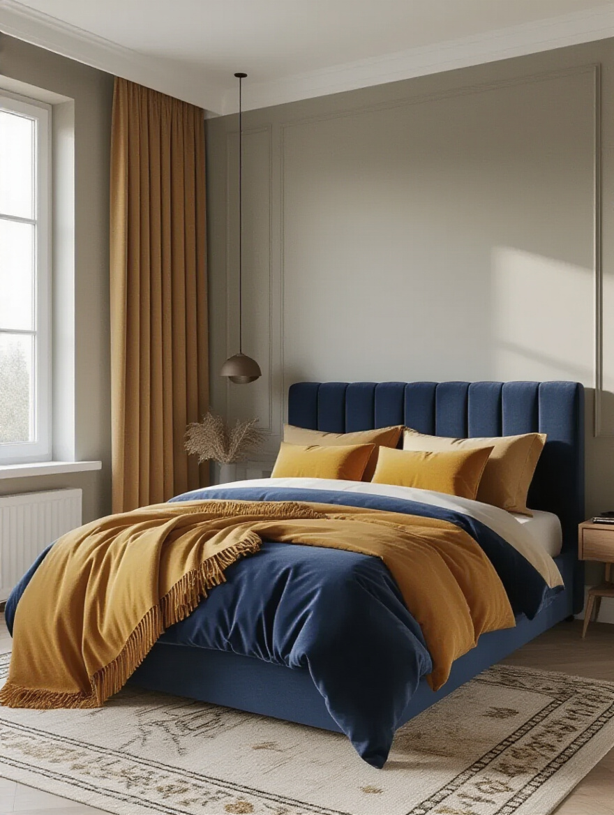
7. Boldly Introduce Contrasting Colors: Strategic Pop or Feature Wall.
Think of a contrasting color like a squeeze of lemon or a pinch of chili flakes in a dish. It’s that little pop of something unexpected that wakes everything up and keeps it from being boring. You don’t need a lot of it. A single feature wall behind your bed or a few bold pillows can be enough to add personality and a focal point to the room. This is your chance to use that bold, trendy color you love without having to commit to painting the whole room.
The trick is to be strategic. The accent wall should almost always be the one behind your bed’s headboard because it anchors the room and makes the bed the star. And if you introduce a bold color, like a vibrant coral or a deep emerald green, repeat that color in tiny doses elsewhere in the room—in a piece of art, a pattern on a pillow, or a vase on the nightstand. This makes the choice feel intentional and woven into the fabric of the room, rather than just a random, jarring statement.
Now, let’s talk about the sneakiest part of picking paint, the one that trips everyone up.
8. Decipher Paint Undertones: Avoid Clashes with Warm or Cool Basics.
I’m going to confess something. Early in my career, I specified a beautiful “greige” for a client’s living room. In the can, it looked like the perfect warm, neutral gray. But on their walls, in their light, it went lavender. A soft, but distinctly purple, lavender. It was a disaster, and it was because I had failed to properly account for the paint’s cool undertones clashing with the warm light in their home. Undertones are the subtle, background colors hiding within a main color, and they are the number one reason people say their paint “just looks wrong.”
The BS everyone believes is that a paint chip from the store is what the color will look like. It’s a lie. Here’s the shortcut you need: get your top two or three paint chips and hold them up against a piece of pure white printer paper. Suddenly, the undertones will jump out at you. You’ll clearly see the green in that gray, or the pink in that beige. Do the same thing against your flooring and furniture. Do the undertones play nicely together? A cool, blue-based gray will look terrible next to a warm, yellow-based beige carpet. This single step will save you from making a very expensive mistake.
You should also look beyond your four walls for inspiration.
9. Consider Your Climate and View: Bring Outdoors In Effectively.
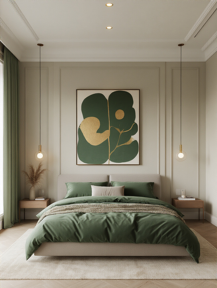
Your bedroom doesn’t exist in a bubble. It has windows, and what’s outside those windows can be a powerful source of inspiration. Connecting your indoor space to the natural world outside is a core principle of good design because it just makes us feel better. It’s like pairing local wine with local food—it just feels right because it belongs. If your window looks out onto a beautiful green forest, why not bring those calming greens and earthy browns inside?
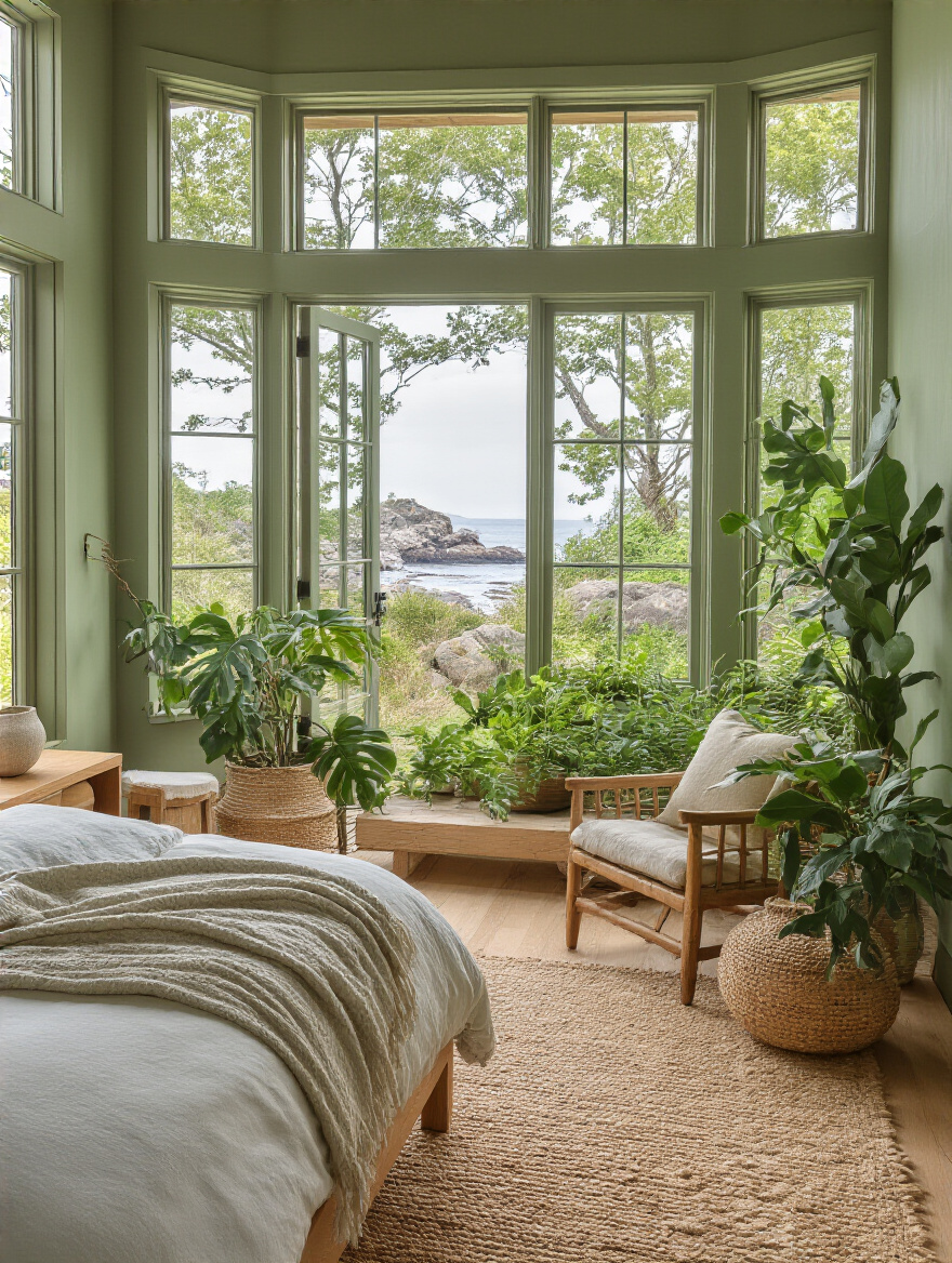
This also applies to your climate. If you live in a hot, sunny place like Arizona, using cool, light-reflecting colors like pale blues and soft whites can actually make the room feel cooler and more refreshing. But if you’re in a place that’s gray and chilly for much of the year, like Seattle, bringing in richer, warmer colors like a cozy terracotta or a deep, mossy green can make your bedroom feel like a warm, welcoming haven from the weather. Let the outside guide your choices for the inside, and your room will feel grounded and deeply connected to its surroundings.
Elevating Your Space with Creative Paint Techniques
Alright, you have a solid plan and a color palette. Now we get to have some real fun. These techniques are like the finishing touches in cooking—the beautiful plating that takes a simple dish and makes it feel special. These are the details that will make your bedroom look truly designed.
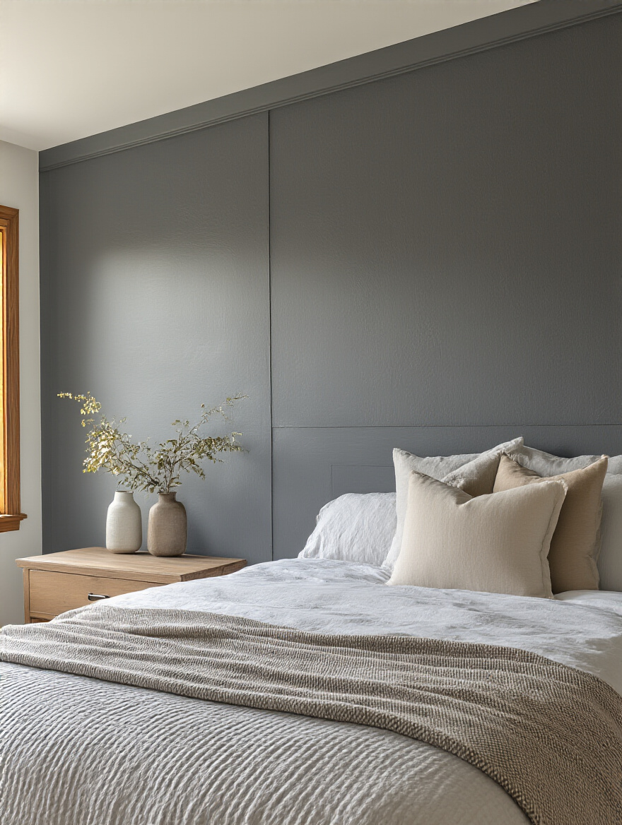
10. Design an Impactful Accent Wall: Focus and Define Your Room.
We’ve already touched on this, but an accent wall is more than just a different color. You can use materials to create one, too. Think beyond just paint! A wall of beautiful, textured wallpaper, warm wood shiplap, or even upholstered panels behind the bed can add a layer of depth and luxury that paint alone can’t achieve. It’s your chance to create a powerful focal point that grounds the room and gives it a ton of personality.
The key is to make it feel intentional. Your accent wall should highlight the room’s best feature, which is usually the bed. It draws your eye and immediately tells you what the room is for: rest. Don’t just pick a random wall. And don’t feel like you have to go crazy with a bold color. A wall painted a darker shade of your main wall color, or a wall with a subtle texture, can be just as impactful while maintaining a serene feeling.
You can also use multiple colors on a single wall for a custom look.
11. Explore Two-Tone Walls for Architectural Interest and Depth.
This is such a stylish and clever trick, especially for a room that doesn’t have a lot of architectural character. Painting the bottom third or half of a wall a different color from the top immediately creates the illusion of a chair rail or wainscoting. It adds instant sophistication and depth to a flat, boring wall. You can go for a bold contrast—like a dark charcoal on the bottom and a crisp white on top—or a subtle, tonal shift for a softer look.
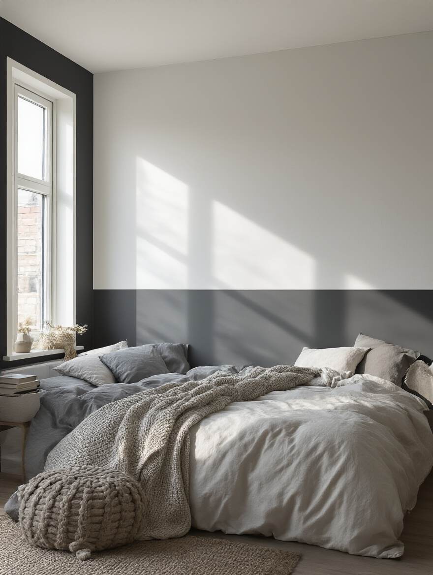
This technique is also fantastic for manipulating the feel of a room’s height. If you want your ceilings to feel taller, place the dividing line a little higher than the halfway point. Your eye is drawn upward, creating an illusion of height. If you have ceilings that are too tall and you want the room to feel cozier, do the opposite. A darker color on the bottom half of the wall will ground the space and make it feel more intimate and human-scaled.
Texture can be just as powerful as color in adding that extra layer of interest.
12. Incorporate Textured Paint Finishes: Subtle Sophistication or Bold Statement.
Paint isn’t just about color; it’s also about touch. Textured finishes like limewash, Roman clay, or suede paint can add an incredible layer of organic, tactile depth to your walls. A limewash finish, for example, creates a soft, chalky, cloud-like effect that moves with the light throughout the day. It’s subtle, but it gives a room a sense of history and soul that a flat paint never could. It feels rustic and modern at the same time.
These finishes are perfect for an accent wall. They catch the light in beautiful ways and add a warmth and character that’s hard to beat. They can also be very forgiving, helping to hide minor imperfections in an old wall. It’s a step beyond simple paint and a commitment to creating a space that engages more than just one of your senses. When you can see and feel the texture, the room comes alive.
And while you’re looking at your walls, don’t forget to look up.
13. Paint the Ceiling to Raise or Lower Visual Perceptions.
The ceiling is the “fifth wall” of your room, and most people completely ignore it, just painting it builder-white out of habit. This is a huge missed opportunity! Painting the ceiling can be one of the most transformative things you do in a bedroom. If you want the room to feel bigger and the ceilings higher, paint it a color that’s a shade or two lighter than the walls, or even the same light color as the walls. It blurs the lines and makes the space feel more expansive.
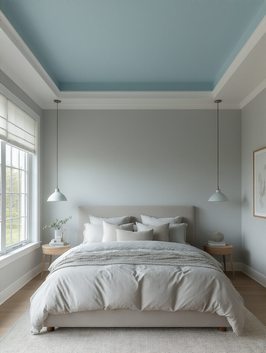
Conversely, if you have a big bedroom with soaring ceilings that you want to feel more cozy and intimate, paint the ceiling a darker color. A deep charcoal, a dark navy, or even a rich brown on the ceiling can bring it down visually, creating a snug, tent-like feeling that’s perfect for sleeping. This is a bold move, but the payoff is a room that feels incredibly intimate, dramatic, and custom-designed.
You can also use paint to create features that aren’t even there.
14. Use Paint for Faux Headboards or Zoned Areas for Style.
This is my favorite trick for anyone on a budget or living in a rental. You don’t need to buy a big, expensive headboard to anchor your bed. You can paint one! A simple painted rectangle, arch, or even a full circle on the wall behind your bed creates an instant focal point and the illusion of a custom headboard for the cost of a sample pot of paint. It’s high-impact, low-cost design at its best.
This “zoning” technique also works wonderfully in multi-purpose rooms. If you have a desk in your bedroom, you can paint a block of color on the wall behind it to visually separate the “work zone” from the “rest zone.” This simple visual cue can actually help your brain switch gears, signaling that one area is for focus and the other is for relaxation. It’s a powerful way to add function and style without adding a single piece of furniture.
Refining Your Paint Scheme for Lasting Impact
You’ve planned, you’ve chosen your colors, you’ve even considered some creative techniques. Now it’s time for the final steps that will ensure your beautiful vision becomes a reality you love for years to come. This is the quality control phase that separates the amateur projects from the professional ones.
15. Test Large Samples: See How Light Transforms Paint Shades.
If you only listen to one piece of advice I give you, let it be this: NEVER, EVER pick a paint color from a tiny paper chip. I cannot say this enough. It is the single biggest cause of “paint regret.” You MUST buy a sample pot of your top contenders and paint a large swatch—at least two feet by two feet—on your wall. Or, even better, paint it on a piece of white poster board that you can move around the room.
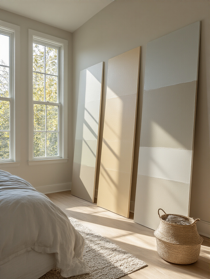
Live with those samples for a few days. See how they look in the bright morning light, in the afternoon sun, and at night with your lamps on. A color can look perfect at 10 AM and completely wrong at 8 PM. I had a client who was sure she wanted a specific beige, but when we tested a large sample, we saw that at night under her warm lamps, it turned a sickly yellow. Seeing it big, in her own space, saved her from a huge and costly mistake. This is the most important step. Don’t skip it.
Once you’ve settled on the perfect color, it’s time to enhance it.
16. Integrate Smart Lighting: Enhance Your Chosen Paint Scheme After Dark.
Your paint color doesn’t have to be static. With today’s smart lighting, you can essentially “repaint” your room with the touch of a button. A single neutral gray on the walls can feel cool and crisp during the day with bright, white light, and then transform into a warm, cozy, and inviting space at night with a soft, amber glow. Smart bulbs that allow you to change the temperature and color of your light are a game-changer for bedroom ambiance.
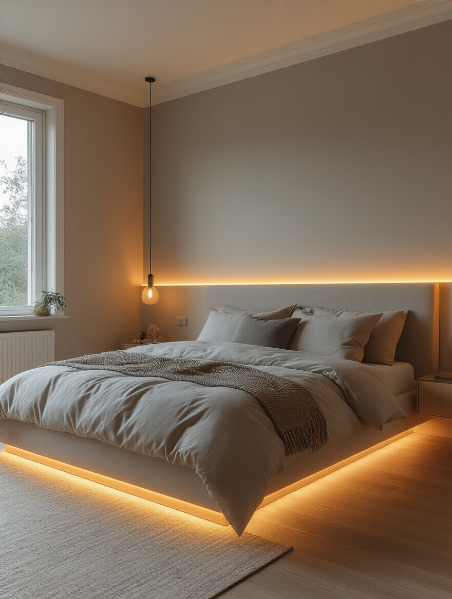
This is your secret weapon for making your paint scheme work harder for you. You can program a “wake-up” scene with bright, cool light to help you feel energized in the morning, and a “wind-down” scene with warm, dim light to signal to your body that it’s time to rest. It allows you to fine-tune the mood of your room on demand, making your chosen wall color incredibly versatile and responsive to your needs.
Now, let’s bring in the soft stuff.
17. Avoid Common Mismatches: Coordinate Paint with Bedding & Textiles.
Just as you need to consider your hard furniture, you absolutely must coordinate with your soft furnishings—especially your bedding, which is often the largest block of color and pattern in the room besides the walls. It’s far, far easier to find a paint color that works with your favorite duvet cover than it is to find a new duvet cover that works with a paint color you’ve already put on the walls. Let your textiles lead the way.
If you have a patterned rug or bedding, pull a color directly from that pattern for your walls. It could be the main color, or for a more subtle look, it could be one of the quieter, secondary colors in the pattern. This instantly creates a cohesive, “pulled-together” look that feels intentional and harmonious. If your bedding is a solid color, you can either choose a wall color in the same family for a monochromatic look or a complementary color for a bit more contrast. But always, test them together.
Finally, let’s talk about the paint itself.
18. Budget Smartly: High-Quality Paint Invests in Longevity.
I know it’s tempting to grab the cheapest gallon of paint to save a few bucks. Please don’t. Think of it this way: when you’re cooking, do you use the cheap, watery olive oil, or the good stuff that actually tastes like something? High-quality paint is the good olive oil. It has more pigments and binders, which means it covers better in fewer coats, saving you time and effort. More importantly, it creates a more durable, scrubbable finish that will look great for years.
The biggest cost in any painting project isn’t the paint—it’s the labor, even if it’s your own time. A cheap paint job might look okay for a year or two, but it will scuff easily and fade, and you’ll find yourself having to do the whole project over again much sooner. A high-quality paint might cost $20-$30 more per gallon, but if it lasts twice as long, you’ve actually saved money. Invest in the good stuff. Your future self will thank you.
Conclusion
See? It’s not so scary. Transforming your bedroom is about being thoughtful and intentional. It’s about creating a space that truly supports you. Just like a well-designed kitchen makes cooking a joy, a well-designed bedroom makes resting a restorative act. It’s the foundation for the rest of your life. When you get a good night’s sleep in a room that feels like a sanctuary, you’re a better parent, a better partner, a more patient cook, and a happier person.
So forget the trends and the pressure to get it “perfect” on the first try. Take these ideas, trust your instincts, and do the prep work. Start by defining how you want to feel, test your colors in your own light, and choose quality that will last. You have all the tools you need to create a bedroom that isn’t just beautiful, but is a deeply personal retreat that nurtures you day after day. You absolutely deserve that.