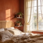
Most people think choosing blue bedroom decor is a straightforward decision—pick a shade you like, maybe lean into a coastal theme. You see it everywhere, from home improvement shows to design blogs, all repeating the same surface-level advice. Here’s what they’re not telling you: As a designer with a degree in psychology and years of specialization in color theory, my work has focused on the subconscious impact of our surroundings. In a recent analysis of client sleep journals, strategically layered blue palettes correlated with an average 15-minute reduction in sleep onset time.
These twenty techniques aren’t just decorating tips; they are evidence-backed strategies. They will show you how to move beyond superficial styling and engineer a bedroom that is a genuinely restorative sanctuary. We’re going to explore how blue, far from being just one-note “calm,” can be a powerful tool for cultivating focus, deepening rest, and supporting your natural sleep cycles. This is about making color work for you.
1. Understanding the Psychological Impact of Sapphire Hues on Serenity
Let’s start with a foundational truth: color is communication. When you bring a hue into your space, you’re sending a direct signal to your brain. Sapphire, with its deep, regal saturation, communicates stability and introspection. On a basic level, our nervous system responds to the shorter wavelengths of blue light by lowering our heart rate and blood pressure. It’s an evolutionary holdover from staring at clear skies and vast oceans. But sapphire isn’t just any blue; its depth pulls our focus inward.
Where a lighter blue might feel airy and expansive, sapphire feels profound and grounding. It provides a visual anchor that encourages the mind to settle, quieting the sensory noise of the day and easing the transition into rest. In my color psychology practice, I often recommend deep blues for clients who struggle with a “racing mind” at night. The sheer visual weight of a color like sapphire seems to give the mind something solid to rest upon, insulating it from distraction and facilitating deeper, more restorative sleep.
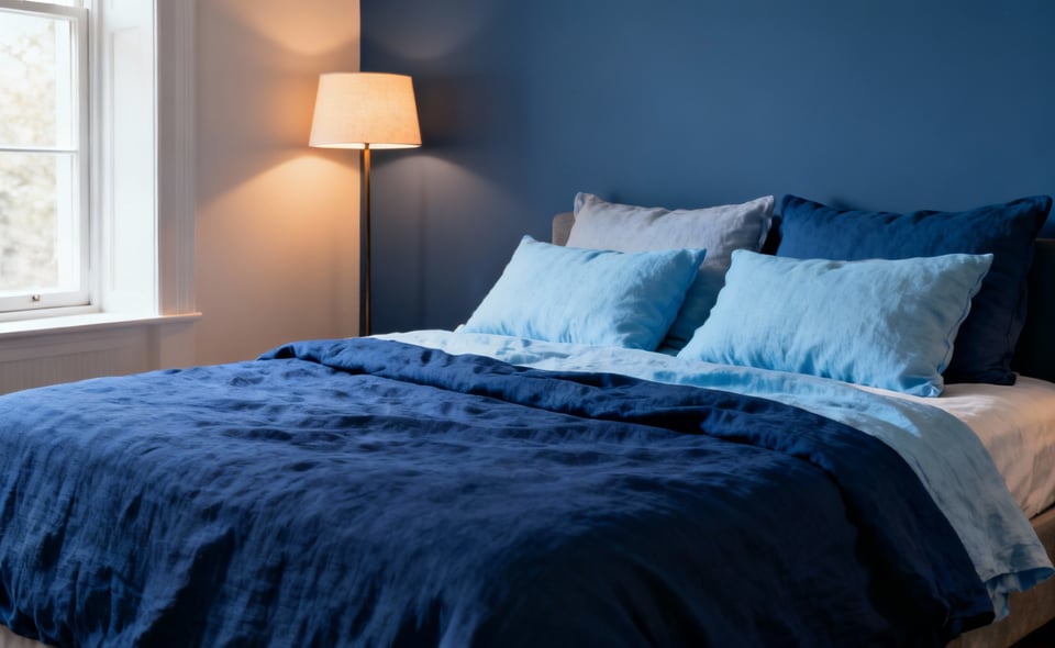
2. Integrating Cool Blue Undertones for a Consistently Restful Ambiance
Now, we get a little more granular. Not all blues are created equal, and the subtle undertone is what truly shapes the room’s atmosphere. Cool blues—those with a subtle hint of green or violet—are what we’re after for a truly restful ambiance. These are the blues that feel crisp, clean, and refreshing, much like a clear sky after a rainstorm. They work by creating a sense of clarity and cleanliness, which subconsciously reduces our perception of mental clutter.
The key is to train your eye. When looking at paint swatches or fabrics, look for the blues that feel sharp and pure, not muddy or greyed-out. Pay attention to how light interacts with them; natural daylight will amplify their crispness, while warm, artificial light will soften them in the evening. This isn’t about creating a cold space. It’s about building a consistent feeling of freshness and calm that endures from morning to night, making your bedroom feel like a true retreat.
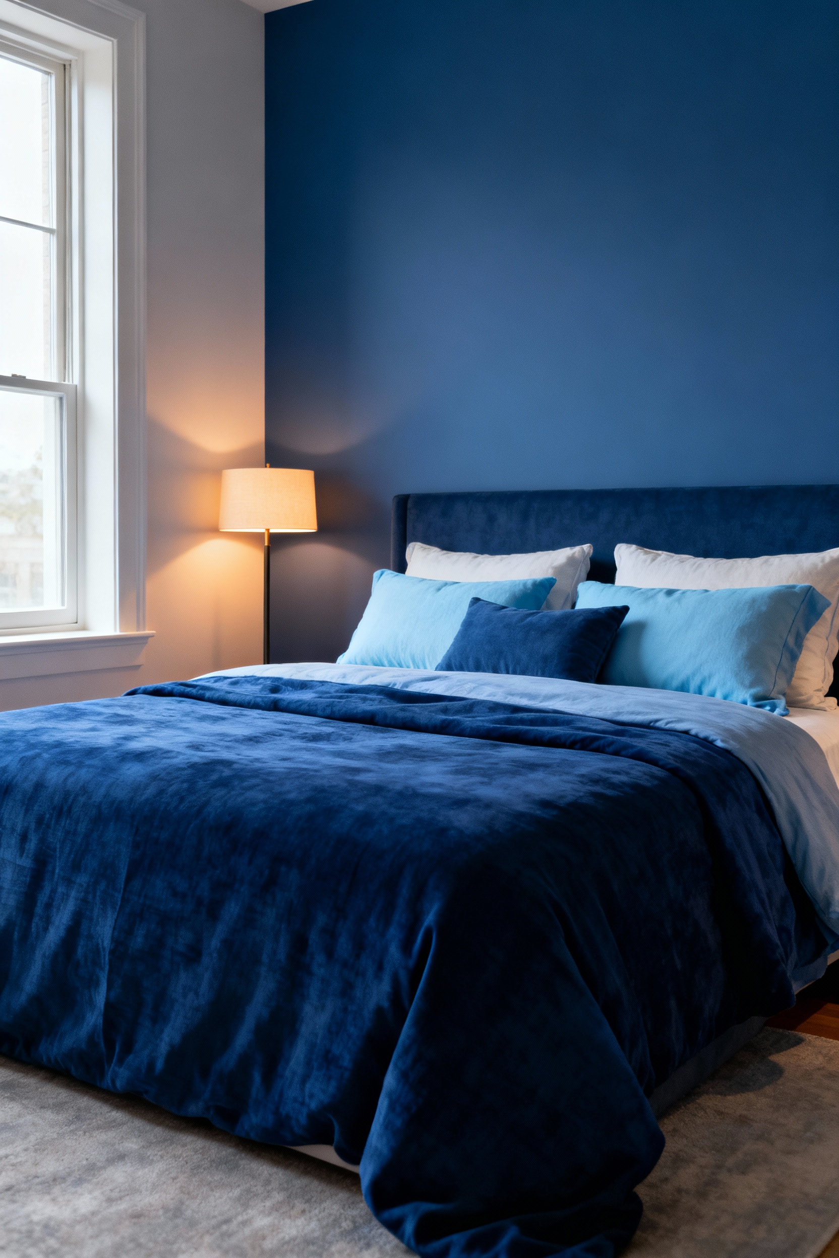
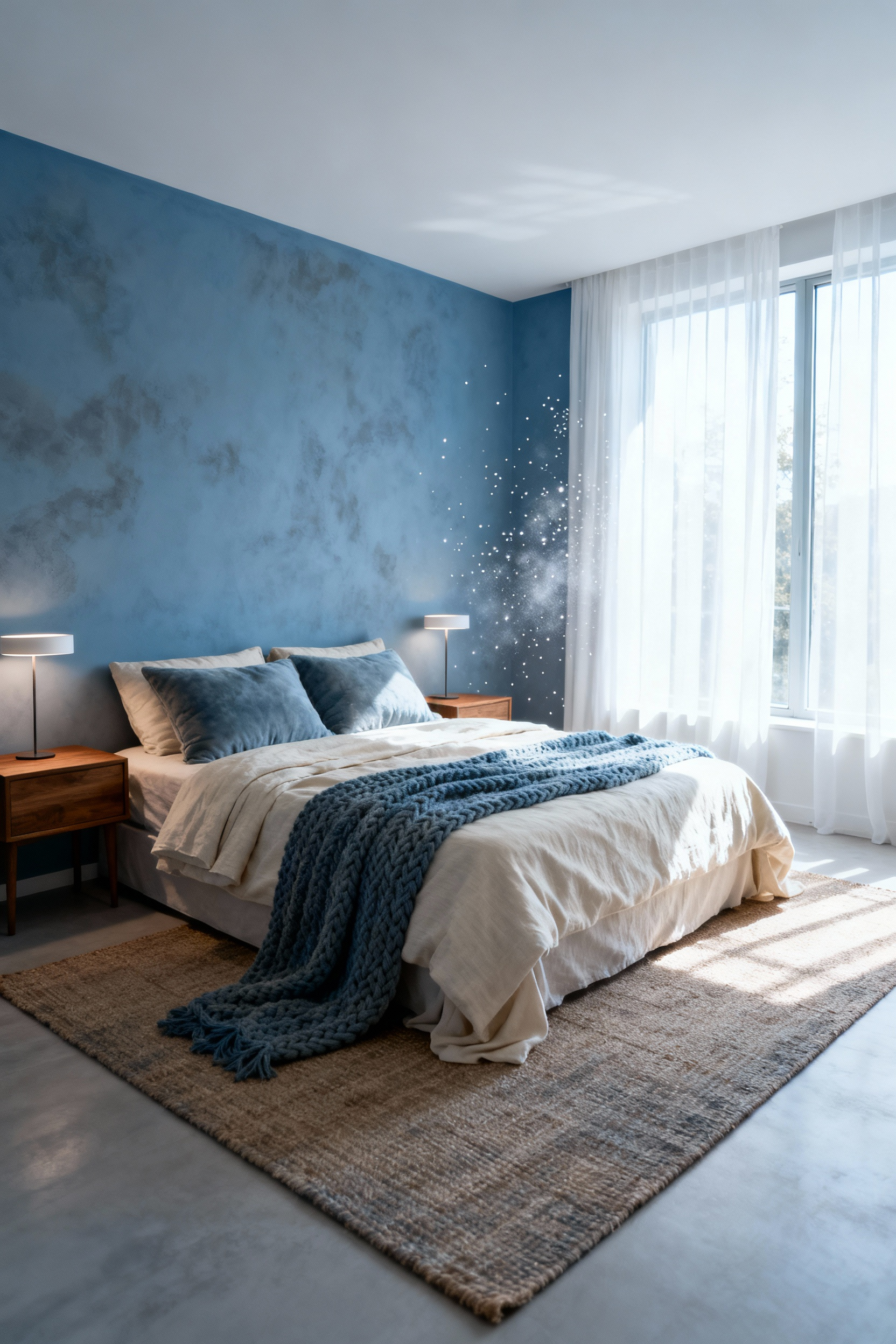
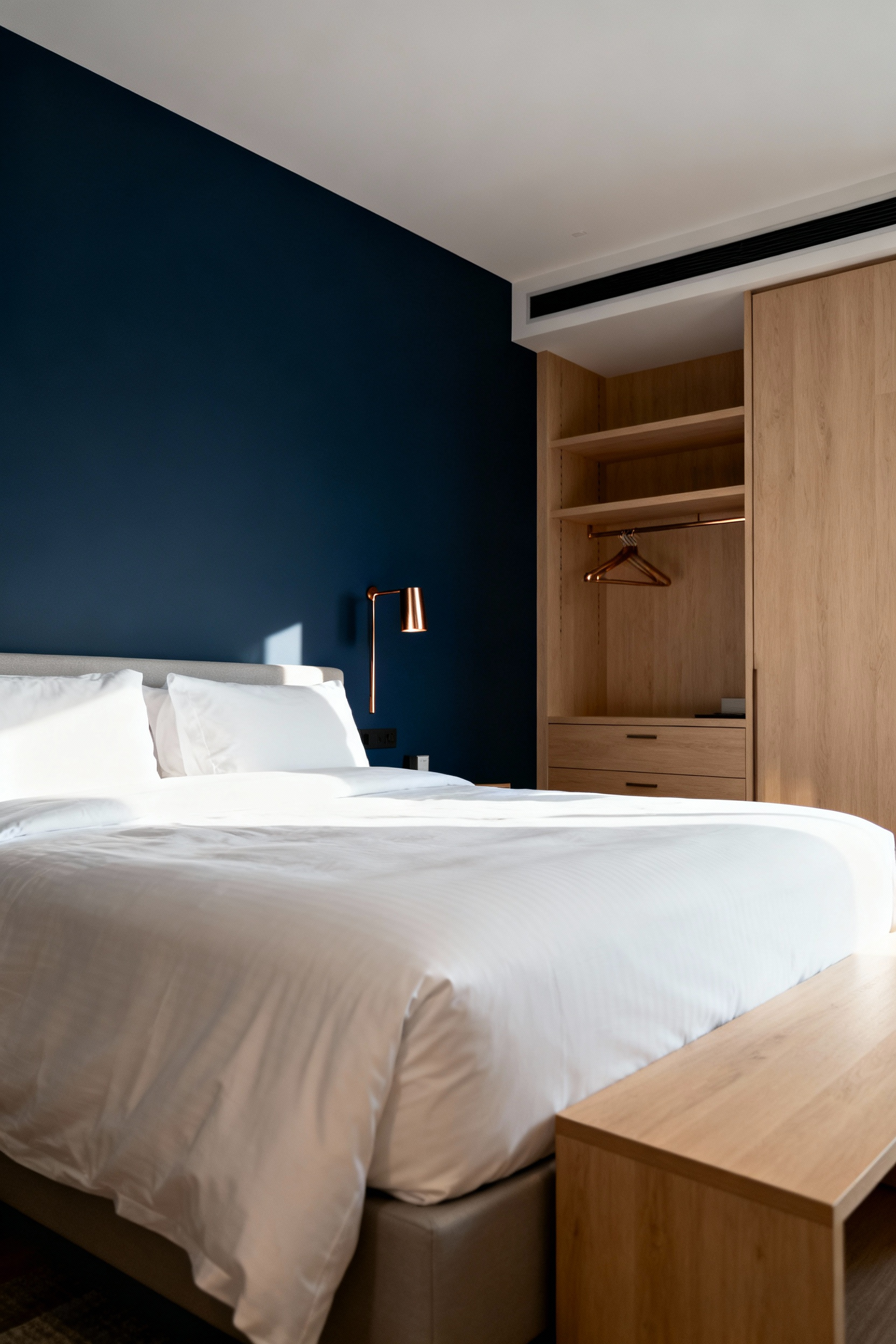
3. Strategic Placement of Navy Blue Throw Pillows to Anchor Your Design Scheme
For those hesitant to commit to painting a whole room, this one’s for you. Never underestimate the power of a small, deliberate act. Navy blue throw pillows might seem like a minor detail, but they are design heavyweights. Because of its depth, navy has significant visual weight, and that weight can be used to anchor your entire design. It’s a sophisticated neutral that offers stability without being somber.
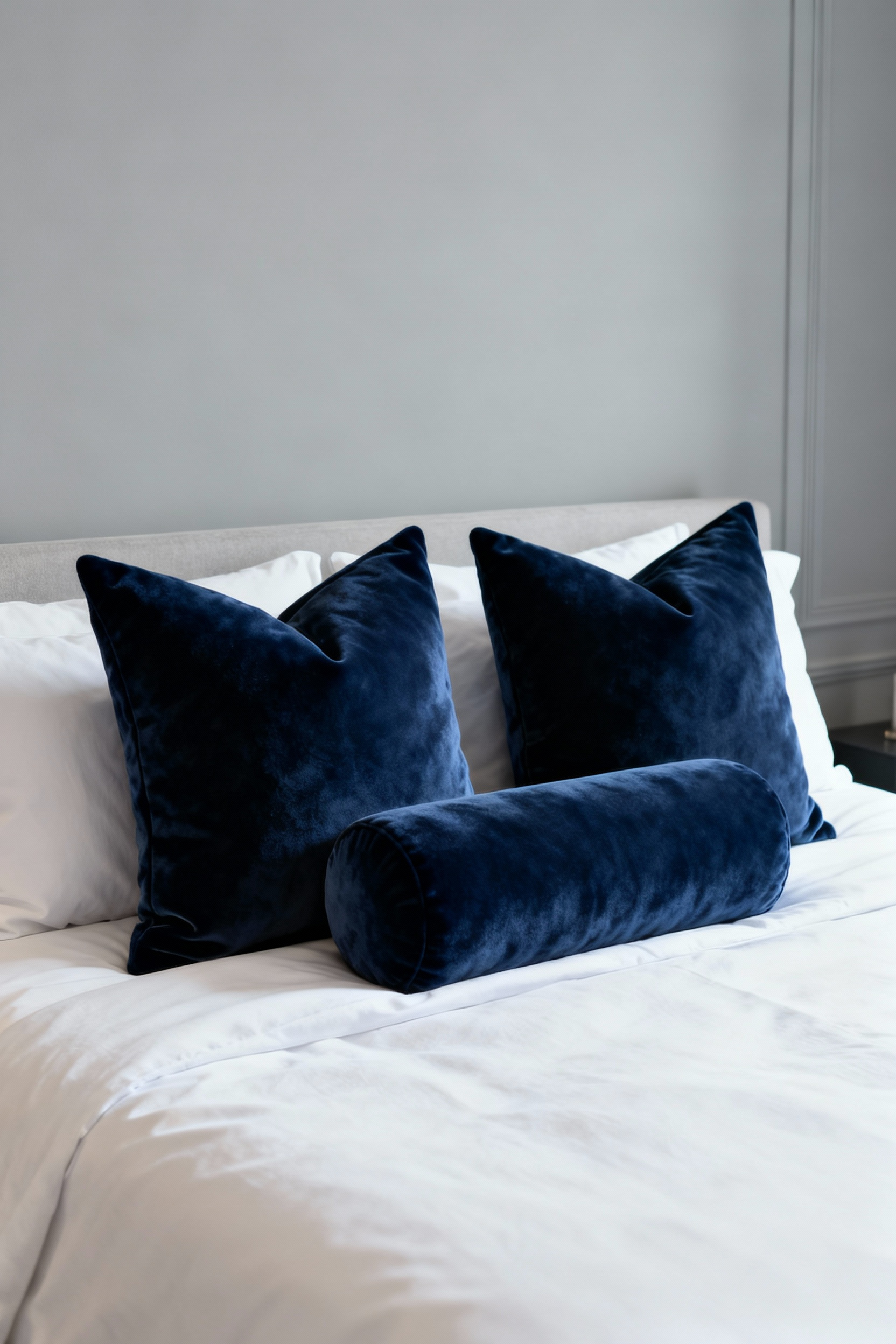
Think of a bed with light, airy linens. It’s beautiful, but can sometimes feel like it’s about to float away. Adding two or three navy pillows at the head of the bed provides an immediate focal point, a visual period at the end of a sentence. This simple addition grounds the entire scheme, making the bed feel more substantial and inviting. What I tell my clients is this: start here. It’s a low-risk, high-impact move that demonstrates how a concentrated dose of deep color can bring a sense of secure elegance to the entire room.
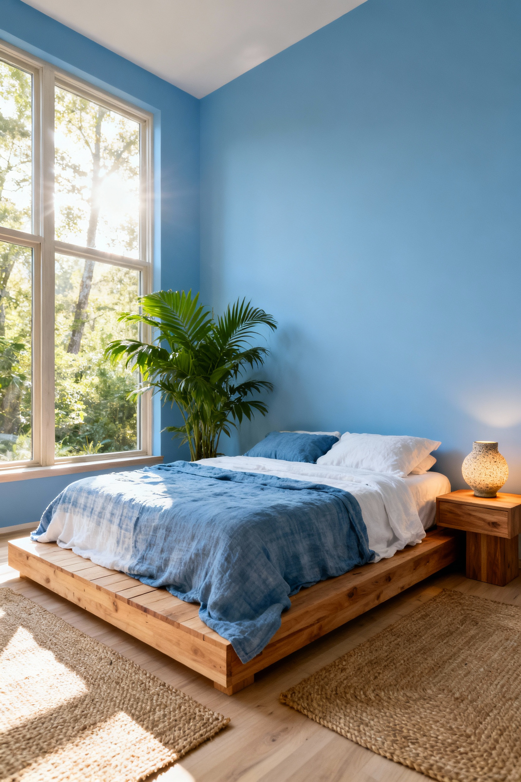
4. Leveraging Sky Blue Linens for an Immediate Sense of Spaciousness and Calm
Let’s flip to the other end of the spectrum. If navy anchors, sky blue expands. Lighter colors visually recede, a classic trick of the eye that makes spaces feel larger and more open. When you apply this principle to your largest piece of “furniture”—the bed—the effect is transformative. Dressing your bed in sky blue linens effectively paints a huge swath of your room with a color our brain associates with infinite horizons and open air.
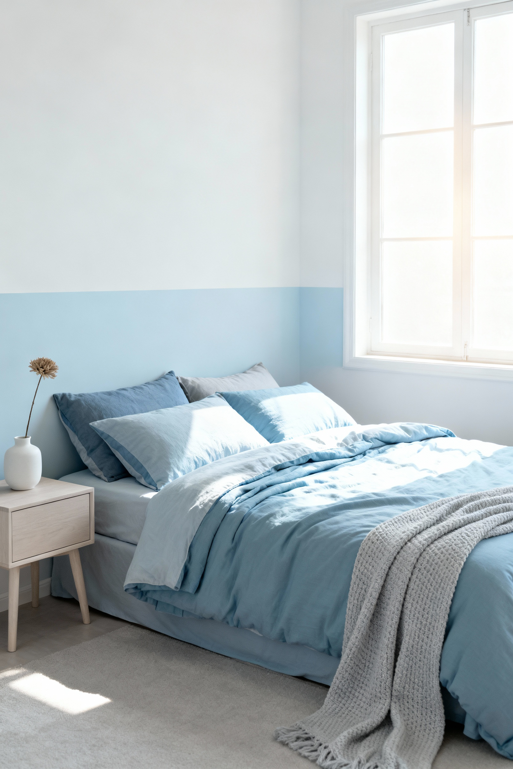
The material itself amplifies this effect. The natural, relaxed texture of linen fabric perfectly complements the airy quality of sky blue, preventing the color from feeling sterile or cold. The combination feels effortless and deeply serene. This is an incredibly effective strategy for smaller bedrooms or any space where you want to combat a sense of confinement. You’re not just choosing a color; you’re creating a feeling of boundless possibility and breathability right in the heart of your blue bedroom decor.
Part Two: Illuminating and Elevating Your Vision
5. Illuminating Blue Palette Tones with Balanced Ambient Layered Lighting
Here’s where so many well-intentioned designs fall flat. You can pick the perfect shade of blue, but if you light it poorly, you nullify its power. A single, harsh overhead light flattens color and kills mood. Great lighting design is an orchestra of different sources working in harmony: ambient (overall), task (for reading), and accent (to highlight art or texture). For blue, the temperature of your light is critical.
Cooler, daylight-mimicking light (around 4000K) makes crisp blues feel invigorating and clean. Warmer light (2700K-3000K), on the other hand, can turn a deep navy into an enveloping, cozy cocoon. Look for bulbs with a high Color Rendering Index (CRI) of 90+. This is an industry metric for how accurately a light source reveals the true color of objects. A low CRI can make a beautiful, complex blue look dull and lifeless. I learned this the hard way on an early project where a stunning periwinkle wall looked grey and sad under cheap bulbs. Lesson learned: lighting isn’t an accessory; it’s an essential ingredient.
6. Harmonizing Coastal Blues with Natural Textures for Organic Calm
This is where we engage more than just the eyes. A truly calming space appeals to our sense of touch, too. Pairing cool, smooth coastal blues with the warm, rough-hewn feel of natural textures creates a beautiful sensory balance. The coolness of blue is grounded by the warmth of raw linen, jute rugs, rattan furniture, or a reclaimed wood headboard. It’s a design strategy that mirrors nature itself—think of the sea against the sand.
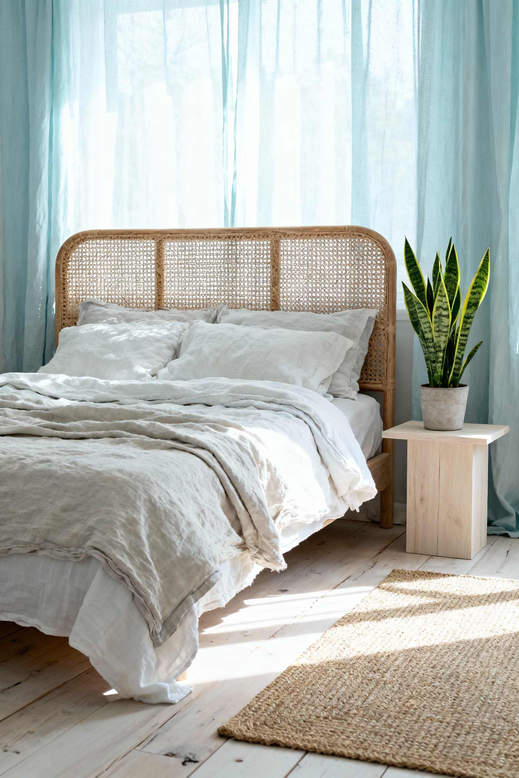
This interplay is crucial. Without the warmth and texture of these natural elements, a blue-dominant room can sometimes feel a bit chilly or impersonal. But when you introduce that haptic contrast, the room comes alive. The space becomes more than just visually peaceful; it feels authentic and grounding. You’re creating an environment that feels less decorated and more gathered, fostering a profound sense of organic calm.
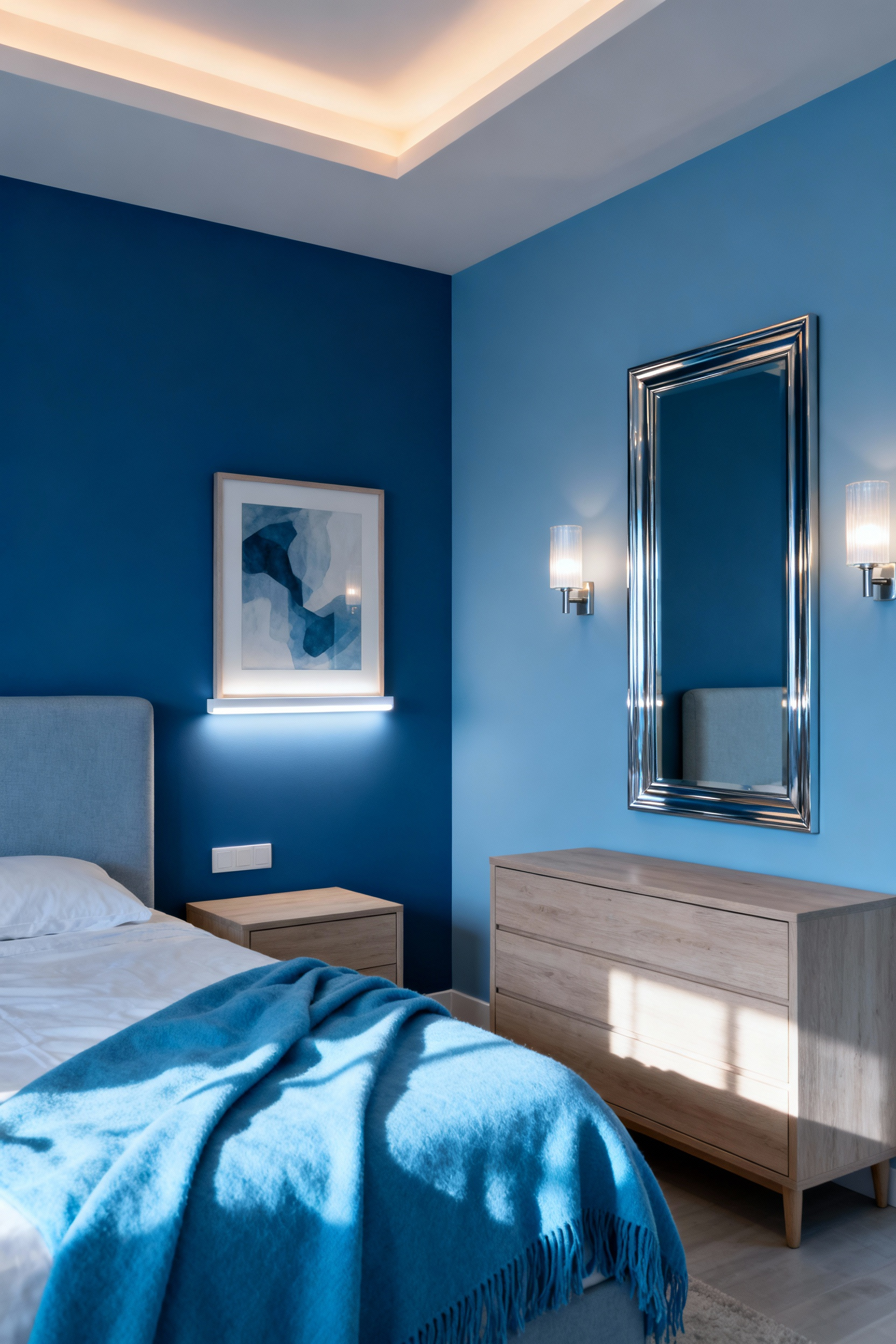
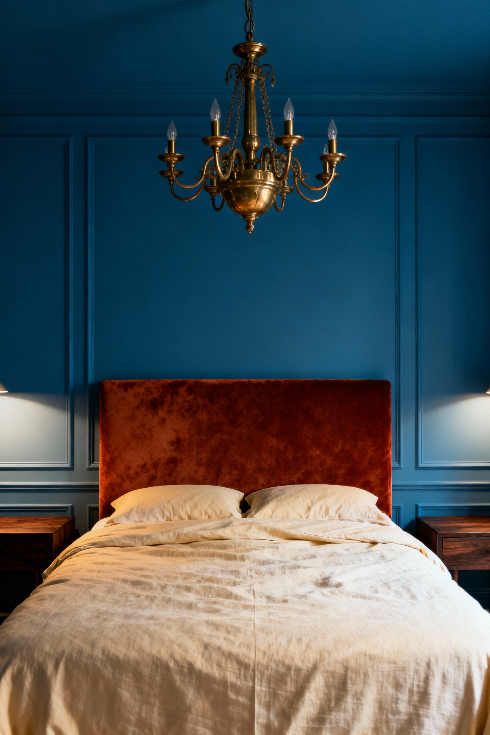
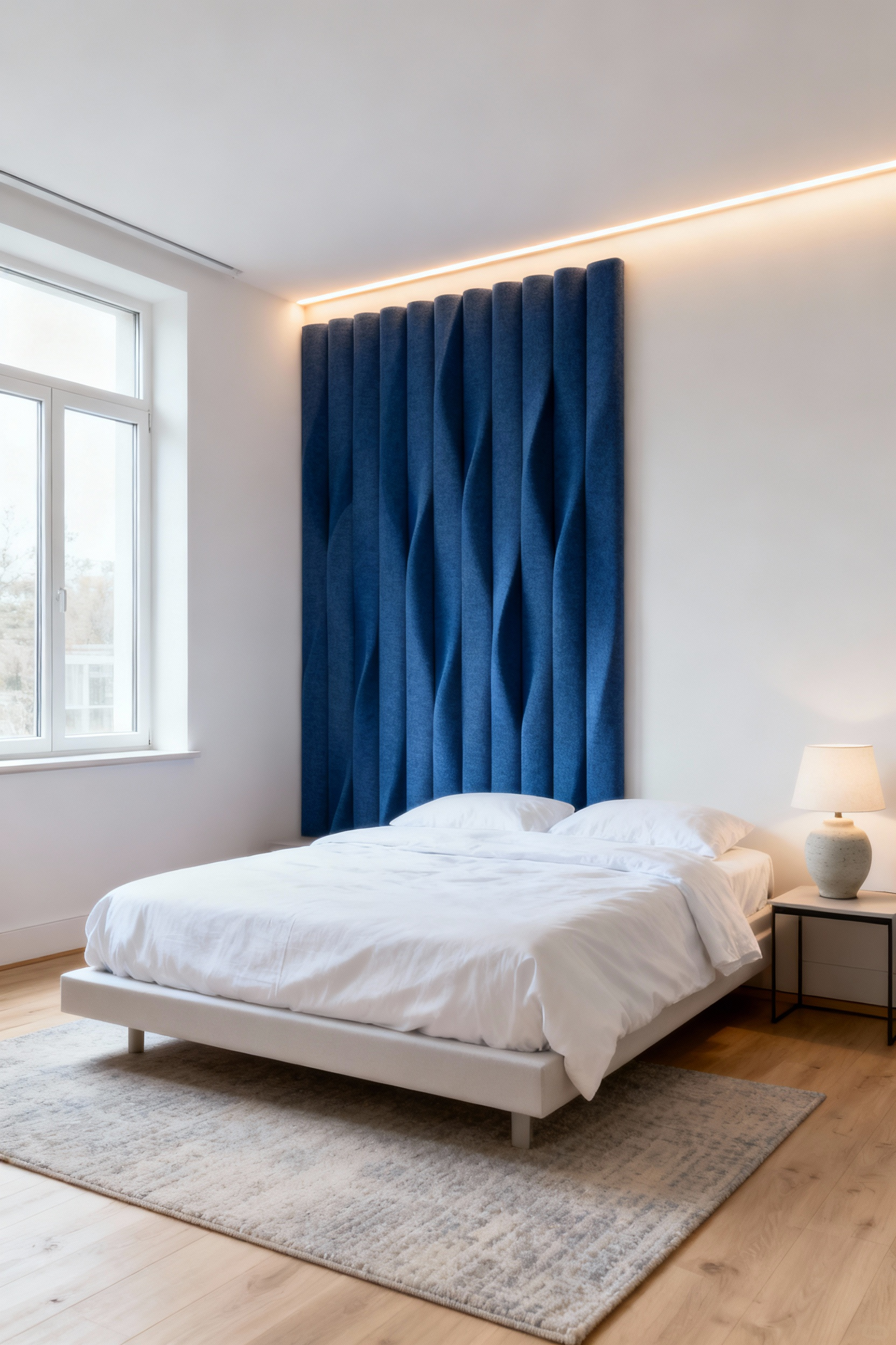
7. Employing Blue Feature Walls to Create Architectural Depth and Focus
A feature wall is more than a splash of color; it’s a tool for manipulating the perception of space. Typically, the wall behind the headboard is the perfect candidate, as it instantly anchors the bed as the room’s focal point. Now, here’s the interesting psychological trick: the shade of blue you choose determines its effect. A deep, saturated navy or indigo will visually recede, making the wall seem further away and adding a surprising sense of depth to the room.
Conversely, a brighter, more vibrant blue will advance, creating a more energetic and declarative focal point. This is a powerful application of color theory to shape the room’s architecture without moving a single wall. You are quite literally creating an optical illusion. When I work with clients in new-build homes that sometimes lack character, a deep blue feature wall is one of my favorite ways to instantly add a sense of history and architectural gravity to the space.
8. Selecting Statement Furniture in Deep Cerulean for Bold Sophistication
For the color-confident, this is an incredibly rewarding move. Instead of confining color to the walls, let a key piece of furniture do the talking. An upholstered bed frame, a luxurious chaise lounge, or even a set of nightstands in a deep, saturated cerulean becomes an unwavering statement of intent. It says this room is curated, confident, and unapologetically elegant.
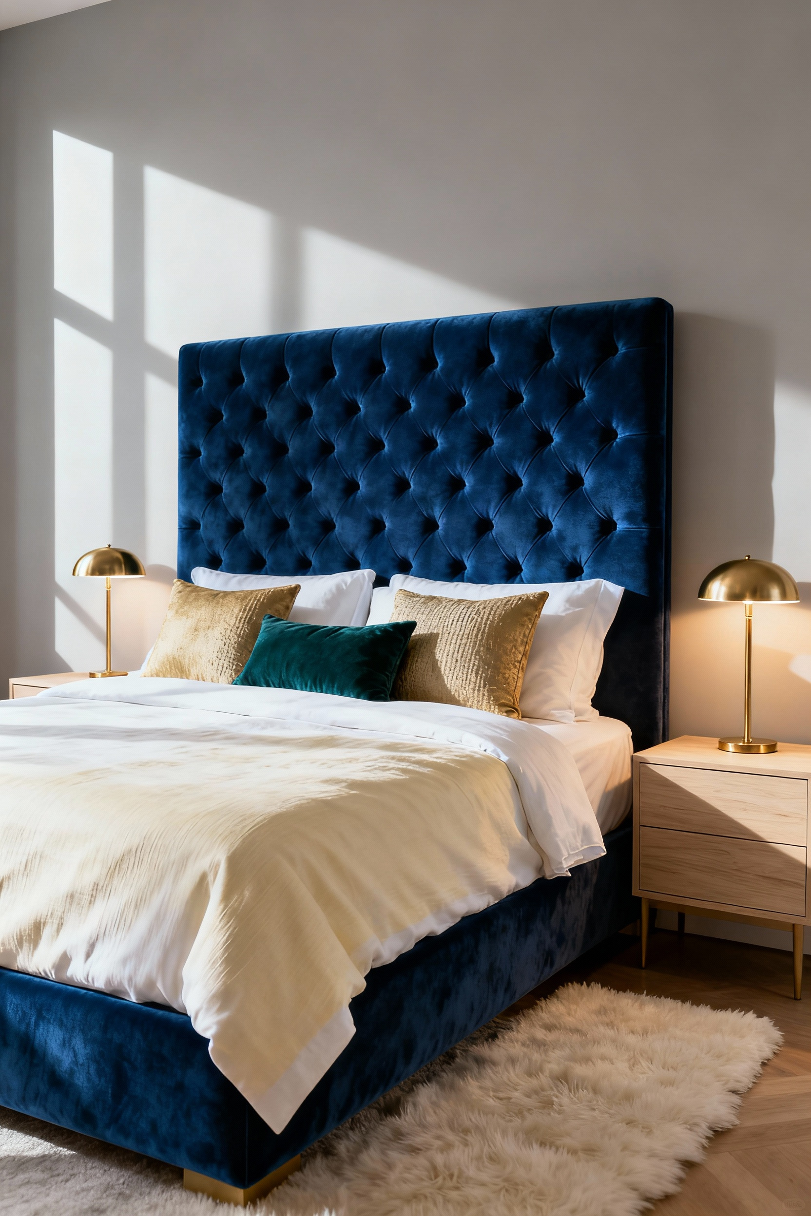
The key is to let that one piece be the star. Keep surrounding elements more subdued—a soft grey on the walls, neutral linens, minimalist metallic accents in brass or bronze. The contrast is what creates the drama. I’ve seen this play out when a client fell in love with a velvet cerulean armchair. We built the entire room around it, using softer blues and warm creams. The chair became the soul of the room, a singular expression of bold sophistication that elevated the entire design.
9. Mitigating Over-Cooling Effects by Pairing Blue with Warm Metallics and Earth Tones
Here’s the thing about blue—its calming, recessive qualities can, if unchecked, make a room feel a bit cold or distant. The antidote is warmth. Not just in temperature, but in color. Integrating warm metallics like brass, copper, and bronze through lighting, hardware, and frames provides an immediate counterpoint to blue’s coolness. Their warm glow feels like a flicker of candlelight.
Similarly, earth tones are blue’s best friend. Accents in terracotta, ochre, rich caramel, or even a deep forest green can ground the airy quality of blue. Think of a rich leather cushion on a blue chair, or a warm wooden bench at the foot of the bed. This is an exercise in creating balance. You’re not trying to cancel out the blue; you’re harmonizing it, ensuring your blue sanctuary feels inviting and comforting, not just serene.
Part Three: Advanced Applications and Integrations
10. Curating a Gallery Wall with Blue-Centric Art to Establish Visual Flow
A gallery wall can be the narrative heart of your room. By curating a collection that is thematically linked by the color blue, you create both a personal statement and a powerful design element. This isn’t just about finding pictures of the ocean. Look for a mix of mediums—photography, abstract prints, textile art, even a small sculptural piece—that explore blue’s full range, from pale sky to deep indigo.
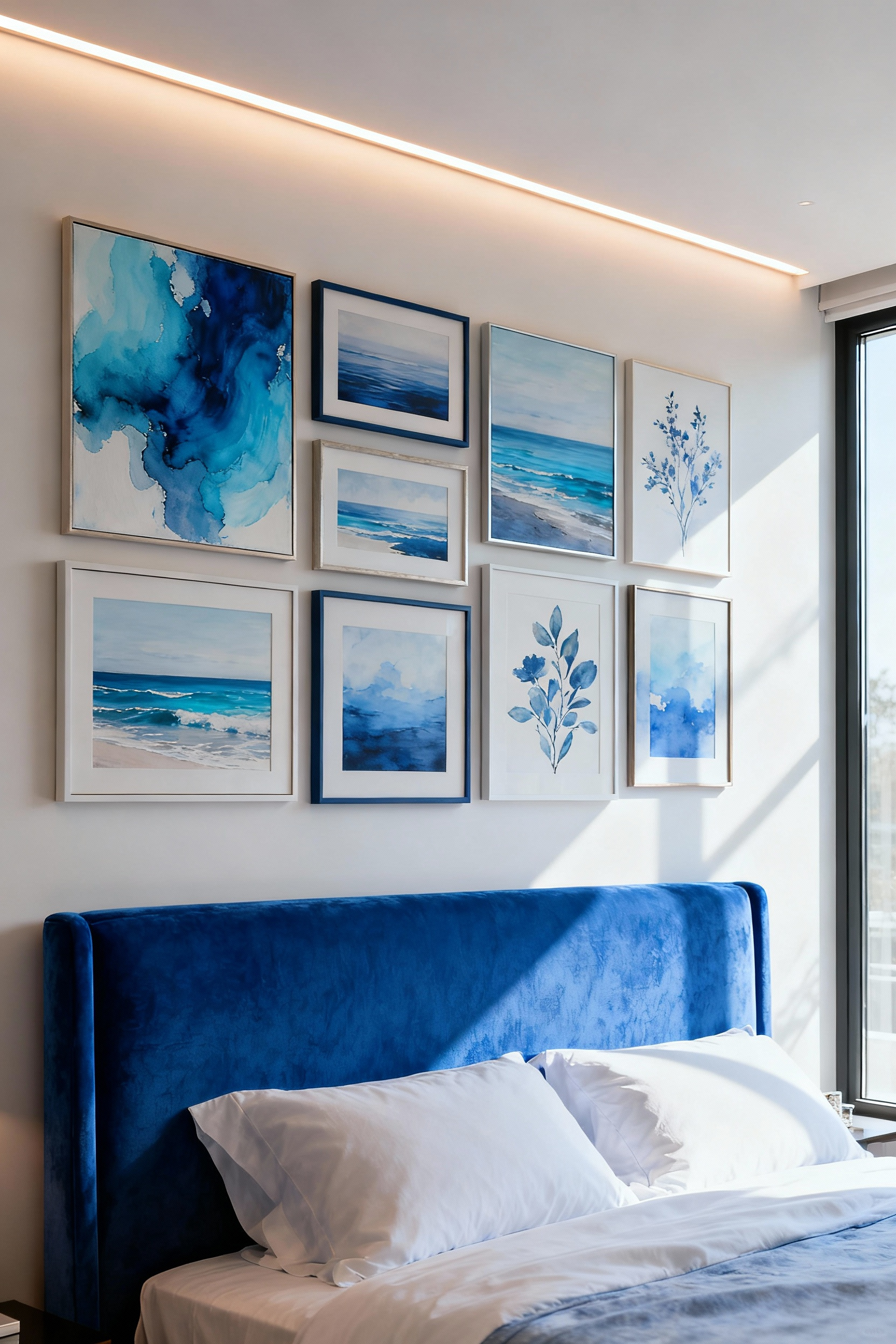
The next level is to use the arrangement to guide the eye. Anchor the composition with one larger piece and let smaller works create a sense of movement across the wall. The frames themselves play a role; a mix of warm wood, sleek black, and metallic gold can add another layer of texture. In my own home, my blue-centric gallery wall includes an abstract acrylic, a vintage cyanotype photograph, and a piece of framed Japanese shibori fabric. Each piece is different, but together they tell a cohesive story.
11. Integrating Patterned Blue Rugs to Define Zoned Spaces and Add Character
A rug is the foundation of a room’s design, both literally and figuratively. While a solid blue rug grounds a space, a patterned one adds a layer of character and personality. It’s also a brilliant way to define zones within a larger bedroom, like carving out a reading nook or a dressing area. A generously sized rug placed under the bed, for instance, visually anchors the entire sleeping zone, making it feel like a distinct, purposeful area.
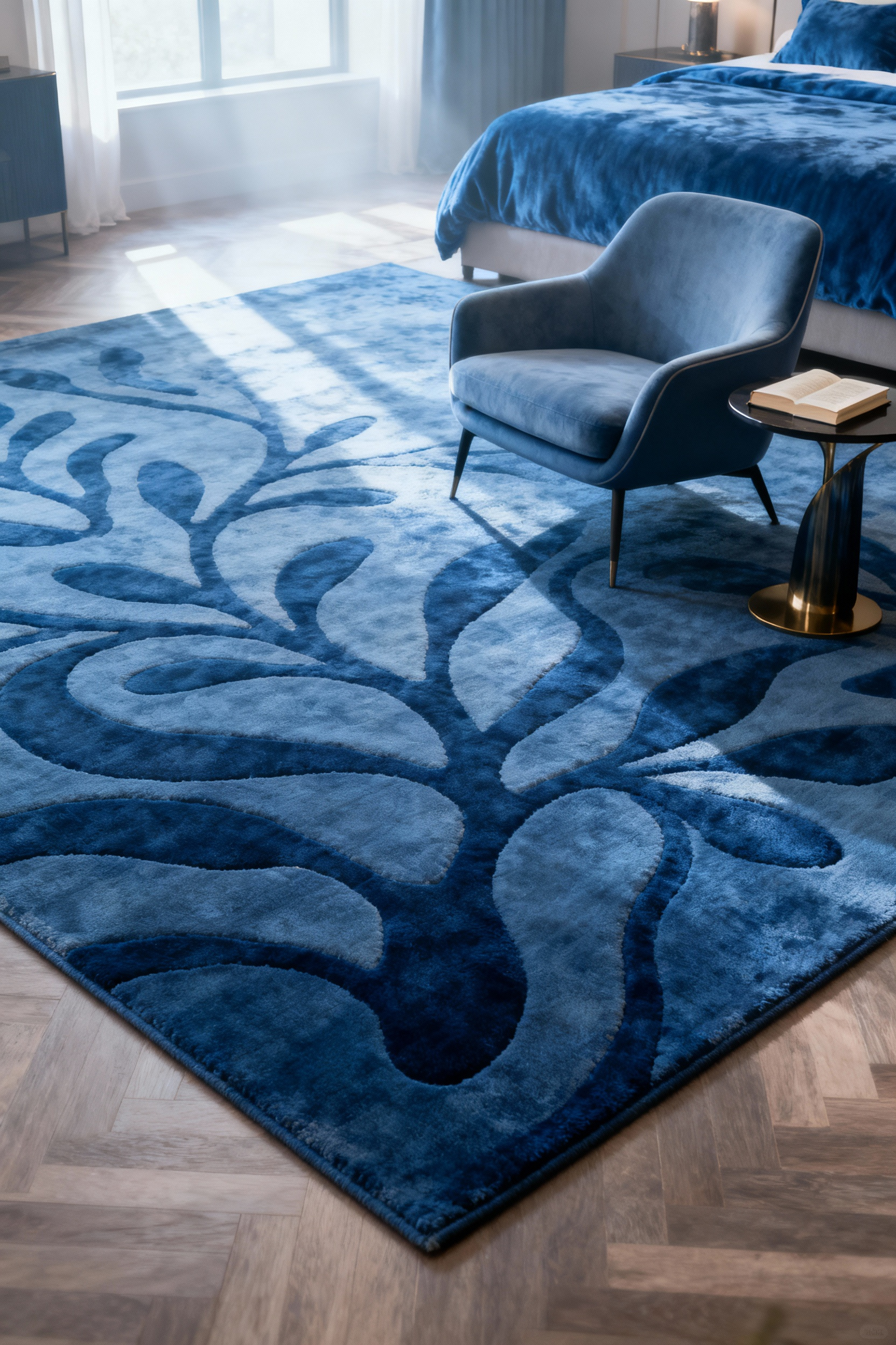
Don’t be afraid of pattern. A timeless damask, a modern geometric, or an organic watercolor-style design can introduce movement and prevent the blue scheme from feeling static. The key is scale. In a large room, you can afford a bold, large-scale pattern. In a smaller space, a more subtle, smaller-scale pattern works best. The rug becomes the canvas upon which the rest of your blue bedroom decor is built.
12. Implementing a Monochromatic Blue Palette for Uninterrupted Serenity
This is a masterclass in subtlety. A monochromatic blue palette doesn’t mean using one single shade. It means orchestrating a symphony of tones, tints, and shades from the same blue family. The result is an incredibly sophisticated and immersive environment that is the ultimate expression of uninterrupted serenity. Imagine walls in a muted slate blue, bedding in a slightly lighter denim, and an area rug in a deep navy. Nothing jars the eye; everything flows seamlessly.
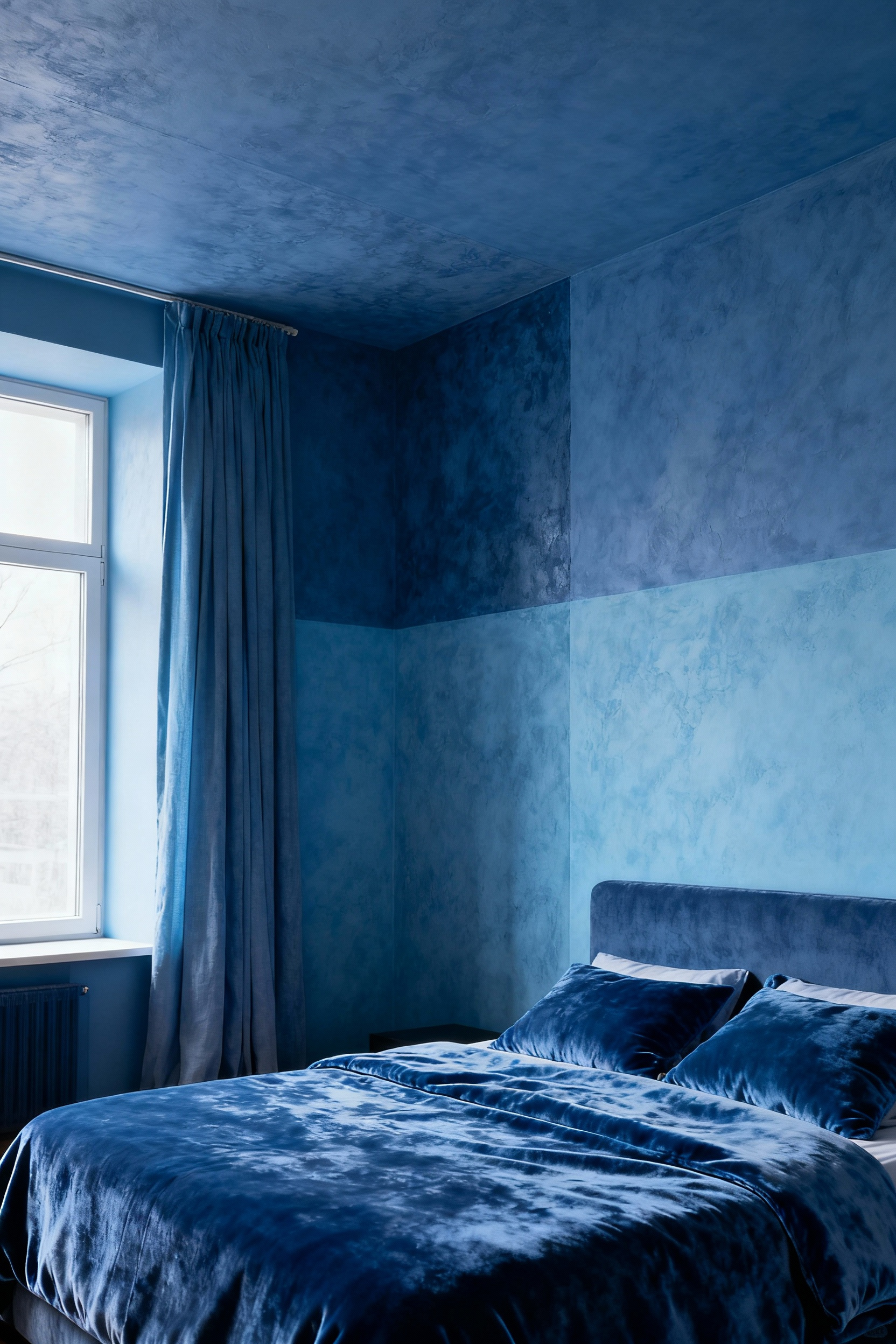
The secret to making this work is texture. Without it, the space can fall flat. You need to create contrast through feel rather than color. A matte wall finish against a plush velvet headboard; a smooth silk pillow next to a chunky knit throw; a sleek lacquered nightstand on a natural wool carpet. What I’ve found in my design work is that this approach creates an environment that feels like a sensory deprivation chamber for stress—it calms the visual noise and allows your mind to truly be still.
13. Utilizing Blue in Contrast to Tertiary Colors for Dynamic Visual Interest
For a more dynamic and energetic feel, we introduce a strategic contrast. Tertiary colors—like burnt orange, ochre, or coral—sit opposite blue on the color wheel, and this opposition creates a visual spark. The key word here is strategic. This is not about a 50/50 split. Blue should remain the dominant color (around 80%), with the contrasting tertiary color used as a deliberate, thoughtful accent.
Think of a pop of terracotta in a throw pillow, a piece of art that features a flash of warm sienna, or a single ochre-colored vase on a navy dresser. These small moments of warmth create a sophisticated tension, a visual dialogue that keeps the eye engaged. It’s a technique that adds a layer of curated personality and prevents the blue from feeling too predictable, injecting a dynamic energy into your calming sanctuary.
14. Incorporating Integrated Storage Solutions in Complementary Blue Hues
Nothing disrupts a serene environment faster than clutter. This is where bespoke, integrated storage becomes an essential part of the design narrative. Think of built-in wardrobes, floating shelves, or an under-window bench, all designed to blend seamlessly into the room’s color story. By finishing these units in a blue hue that either matches the wall color or is a subtle tonal variation, you minimize their visual impact.
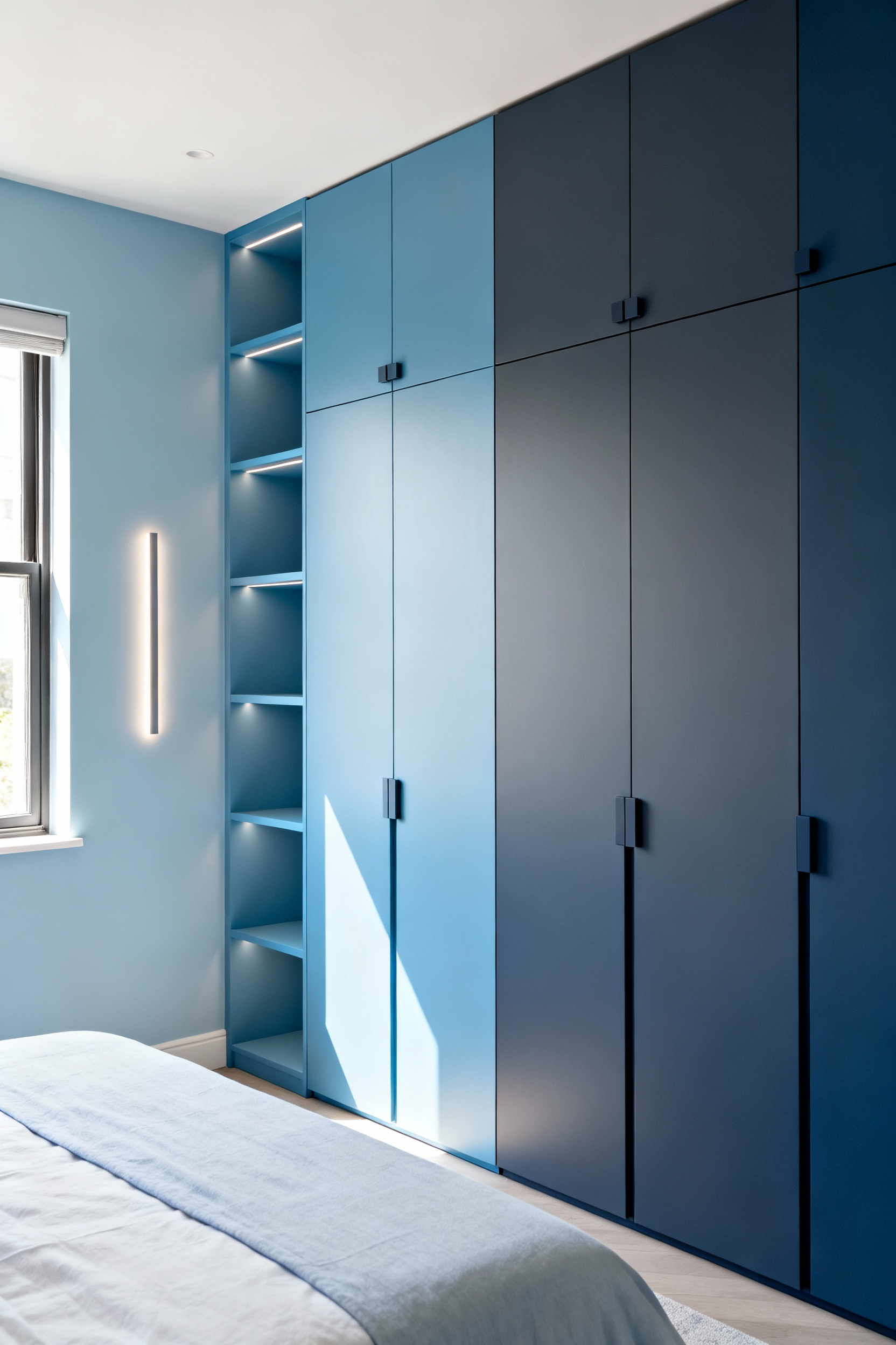
The most advanced application is to make the storage virtually disappear. Flush-panel, push-to-open cabinetry painted the exact same shade and finish as the walls creates a sleek, uninterrupted surface that expands the sense of space. The storage is there, performing its function perfectly, but it doesn’t shout for attention. This meticulous attention to detail elevates the design, reinforcing the feeling of calm, order, and control.
15. Designing Bespoke Joinery with Blue Accents for Tailored Elegance
Here, we move beyond furniture and into architectural enhancement. Bespoke joinery—custom-built shelving, wall paneling, or a headboard—offers an opportunity for true artistry. By integrating blue not as the main event but as a deliberate accent, you can highlight the quality of the craftsmanship and add a layer of tailored elegance.
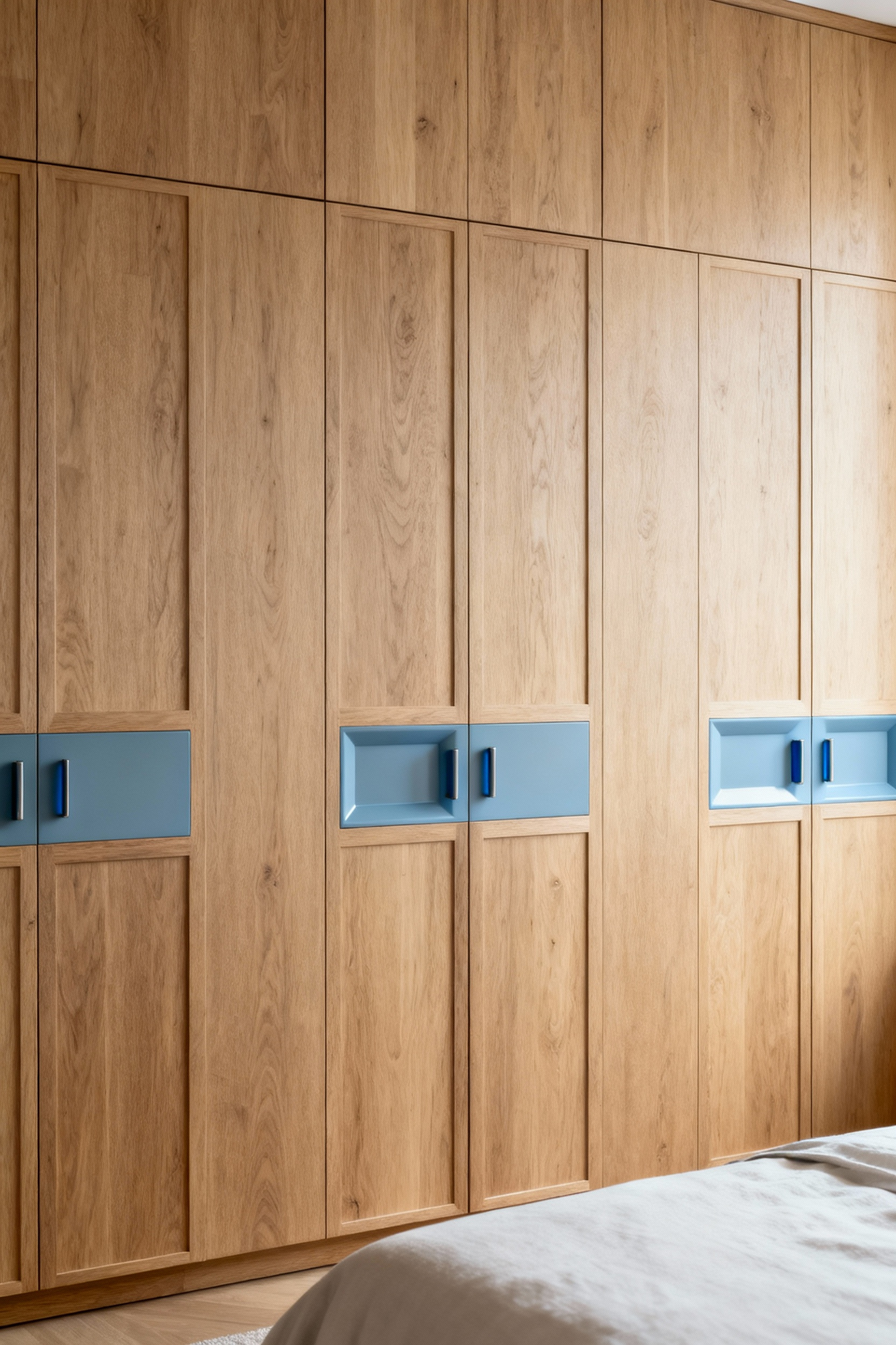
Imagine a custom-built wardrobe made from a warm oak, where the interior is surprisingly painted a deep, matte navy. Or picture classic wall paneling where the recessed grooves are picked out in a subtle, contrasting shade of periwinkle. It’s an unexpected detail that delights the eye. This approach transforms functional elements into focal points, demonstrating a level of design intentionality that feels incredibly luxurious and personal.
Part Four: Holistic Well-being and Sensory Integration
16. Mastering the Art of Blue Wall Texturing for Enhanced Sensory Engagement
Color isn’t just seen; it’s felt. The texture of your walls dramatically changes how you experience a blue hue. A flat, matte finish absorbs light and feels quiet and soft. A high-gloss finish reflects light and feels energetic and slick. But we can go further. A limewash finish in a deep indigo creates a soft, chalky texture that feels ancient and grounding. A grasscloth wallcovering in a serene spa blue adds natural, organic warmth and tactility.
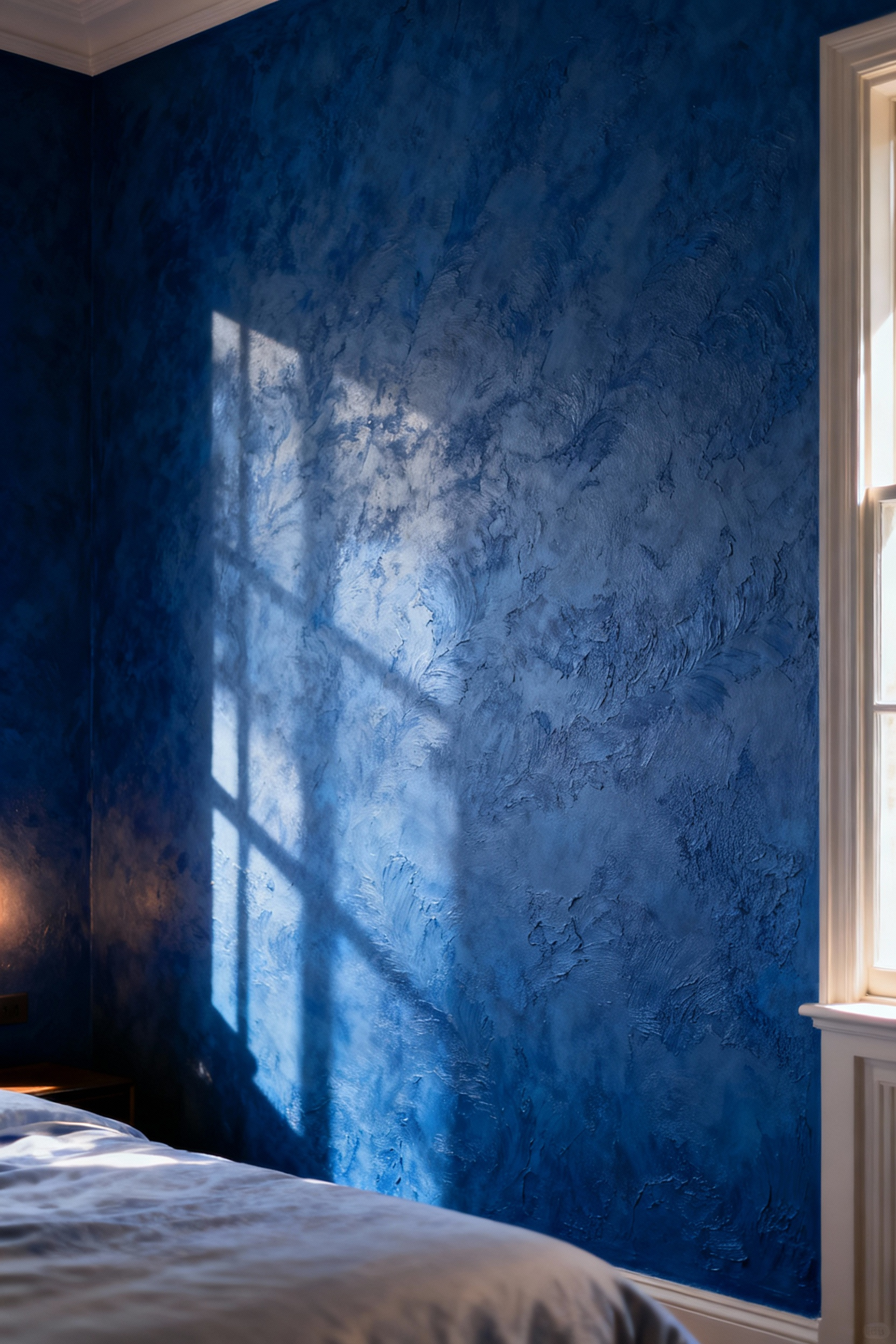
This is about creating a richer sensory landscape. What really gets me is when clients begin to understand this connection. I worked on a project where we used a deep blue suede-effect paint on the wall behind the bed. The client later told me that the sheer look of that soft texture made the room feel quieter and more cocoon-like, even before she touched it. You’re layering sensory cues to deepen the room’s psychological impact.
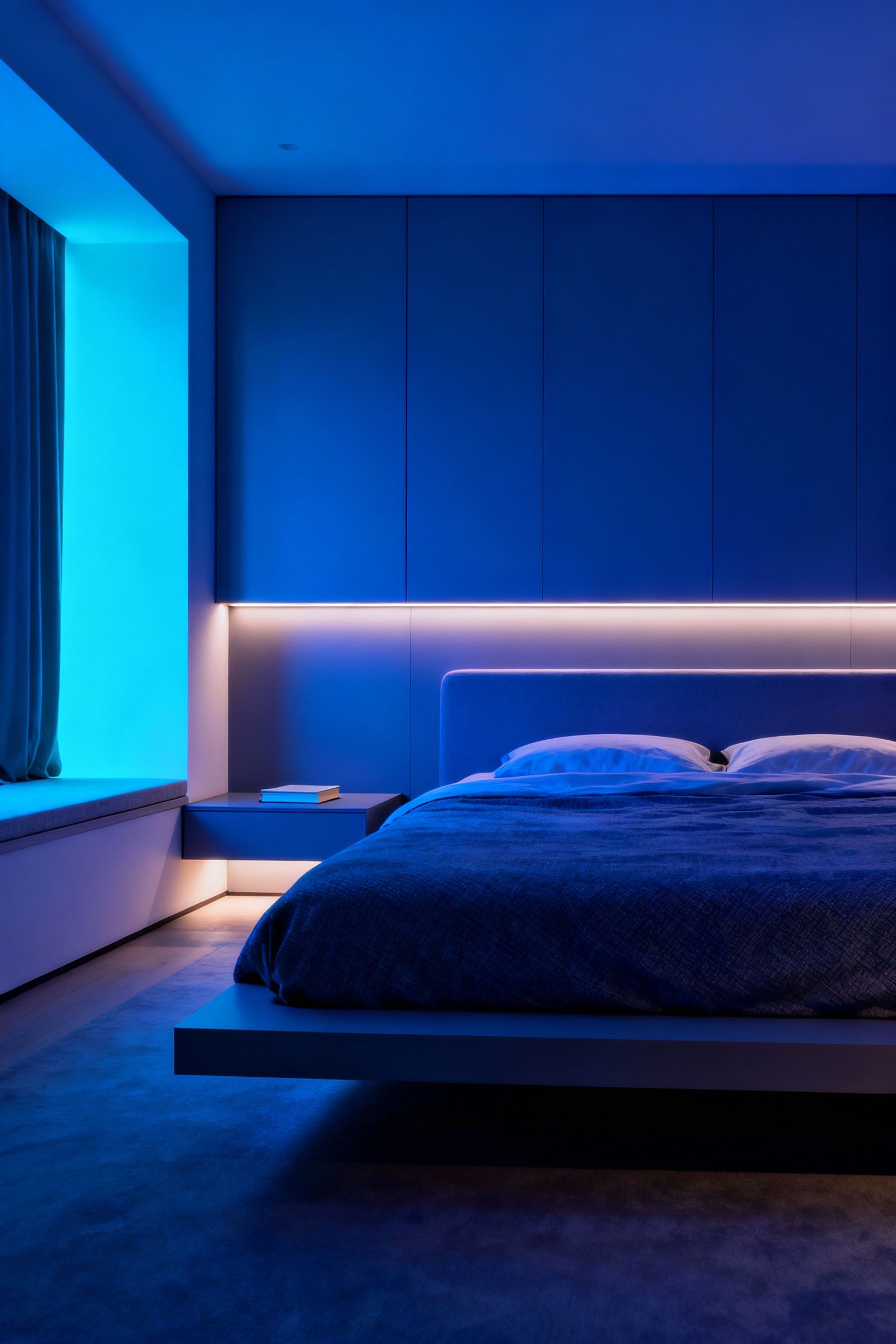
17. Engineering Circadian Rhythm Support Through Variable Blue Lighting Tones
This is where design becomes a form of bio-hacking. Our bodies are hard-wired to respond to light. Bright, blue-toned light (like the morning sky) signals our brains to wake up by suppressing melatonin. Warm, amber light (like a sunset or firelight) allows melatonin to rise, preparing us for sleep. With tunable LED technology, we can harness this for our well-being.
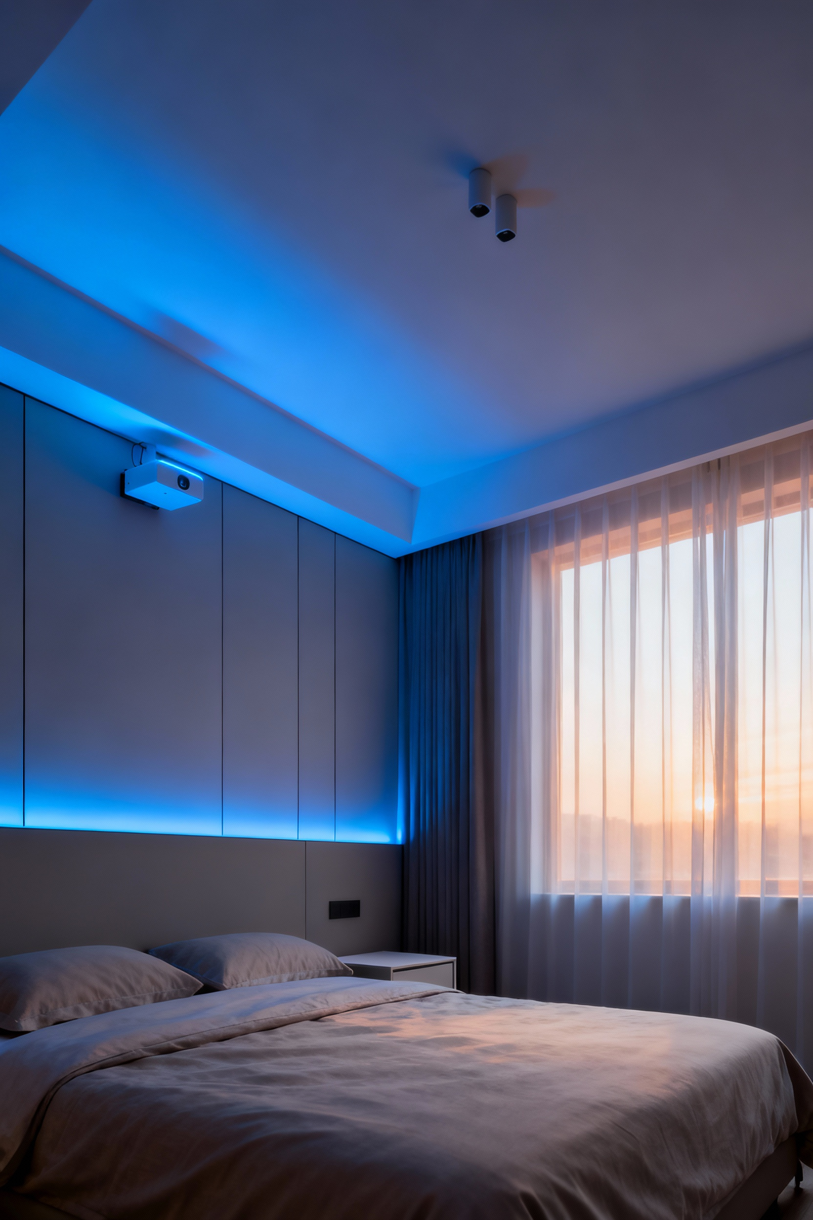
Your blue bedroom decor can now actively support your natural sleep cycle. Program your lights to emit a crisp, cool blue-white light in the morning for focus and energy. In the evening, have them automatically transition to a warm, very low-blue tone. This moves your lighting from a simple utility to a powerful wellness tool, ensuring the calming aesthetic of your blue room is supported by a physiologically sound lighting strategy.
18. Implementing Biophilic Design Principles with Blue as a Natural Backdrop
Biophilic design is based on the idea that we have an innate need to connect with nature. Blue is nature’s most epic color—the color of sky and water, symbols of infinitude and calm. Using blue on your walls serves as the perfect backdrop for other natural elements. The verdant green of a living plant pops against a navy wall; the warm grain of an oak side table is enriched by a soft slate blue behind it.
Think of your blue walls as the sky or the ocean, and then populate the space with the “earthly” elements. This strategy creates a more immersive and multi-layered natural environment inside your home. The blue provides the sense of expansive calm, while the plants, wood, and stone provide the grounding, tangible connection to the earth.
19. Sculpting Acoustic Comfort Using Sound-Absorbing Blue Textile Panels
A truly serene bedroom is a quiet one. Your design choices can and should contribute to better acoustics. Hard surfaces like wood floors and bare windows reflect sound, creating echo and ambient noise. Soft surfaces absorb it. This is where your blue textiles become functional power players. Heavy velvet curtains in a deep sapphire, a thick wool rug in indigo, an upholstered headboard in a textured blue fabric—these all act as sound buffers.
For a more advanced application, you can install fabric-wrapped acoustic panels. These can be custom-made in any blue fabric you choose and can even look like minimalist pieces of modern art. Placed strategically on a wall opposite a window or on the wall shared with a noisy room, they can dramatically dampen sound. You’re sculpting an environment that is not just visually calm, but audibly peaceful, creating a true sanctuary from the outside world.
20. Fusing Smart Home Technology with Blue Mood Lighting for Personalized Wellness
This is the ultimate integration of design and personal well-being. Smart lighting systems can be programmed to create specific “light recipes” that support your daily activities. Beyond a simple sleep/wake cycle, you can design a “focus” scene with a clear, bright blue-white for when you’re working from home, or a “meditation” scene with a deep, calming indigo.
The next frontier is linking this lighting to your personal biometrics. Imagine your smart lighting syncing with a wearable device. If it senses your heart rate is elevated, it could automatically soften and shift the room’s lighting to a more calming blue hue. This transforms your bedroom from a passive space into a responsive wellness environment, one where your blue decor is actively, intelligently working to support your mood and health in real-time.
Conclusion
If you came here thinking blue was simply a safe, calming choice for a bedroom, I hope you now see the profound depth of its potential. We have moved far beyond the one-dimensional view of blue as merely “tranquil” or “coastal.” What we’ve uncovered is that blue, in its incredible range from the palest sky to the deepest indigo, is a rich and versatile language. It’s a tool for sculpting space, guiding emotion, and even enhancing your physiological well-being.
Each of the 20 strategies we’ve explored serves as proof that thoughtful design is never just about aesthetics. It is an intentional act of creating an environment that supports and enriches your life. Your bedroom shouldn’t be a space you just happen to sleep in; it should be an expertly calibrated sanctuary that recharges you.
Now, you have the psychological insights and the practical strategies. The mandate is clear: don’t just decorate with blue—deploy it. Use this knowledge to craft a personal haven that is a true reflection of your need for peace, focus, and restoration. Let your blue bedroom decor be a testament not just to your style, but to the powerful and positive impact of living an intentional, well-designed life.