There is a common belief that the success of a dinner party hinges entirely on the menu—that if the culinary execution is flawless and the wine list is impeccable, the evening is guaranteed to be a triumph. Experience proves otherwise. Even the most exquisite meal loses its luster if the dining room lights are sterile, harsh, or poorly defined.
The “Dinner Party Test” acts as the ultimate litmus test for a home’s design. It measures not just the aesthetics of a space, but its ability to foster genuine human connection and facilitate a seamless flow from the first cocktail to the final course.
Lighting serves as the invisible conductor of this experience, transitioning a room from a functional workspace to a setting ripe for memory-making. Passing this test requires more than a single overhead fixture; it demands a psychological understanding of how we interact with our environment. When we utilize warm lighting—specifically in the 2700K to 3000K range—we mimic the natural comfort of a sunset. This creates a “flattering glow” that scientifically lowers stress and encourages intimacy.
This approach ensures that guests feel like the stars of the show rather than subjects under a harsh spotlight, allowing the conversation to deepen as the evening progresses.
This guide explores the essential balance between technical precision and atmospheric style required to curate these moments. For more foundational advice, read our comprehensive guide to dining room lighting. We will define how to select fixtures with a high Color Rendering Index (CRI) to ensure your food looks as vibrant and appetizing as it tastes, while layering ambient and functional light sources to support the multi-act event of entertaining. By mastering these elements, you transform your dining room into a functional, beautiful stage where the atmosphere is as memorable as the meal itself.
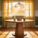
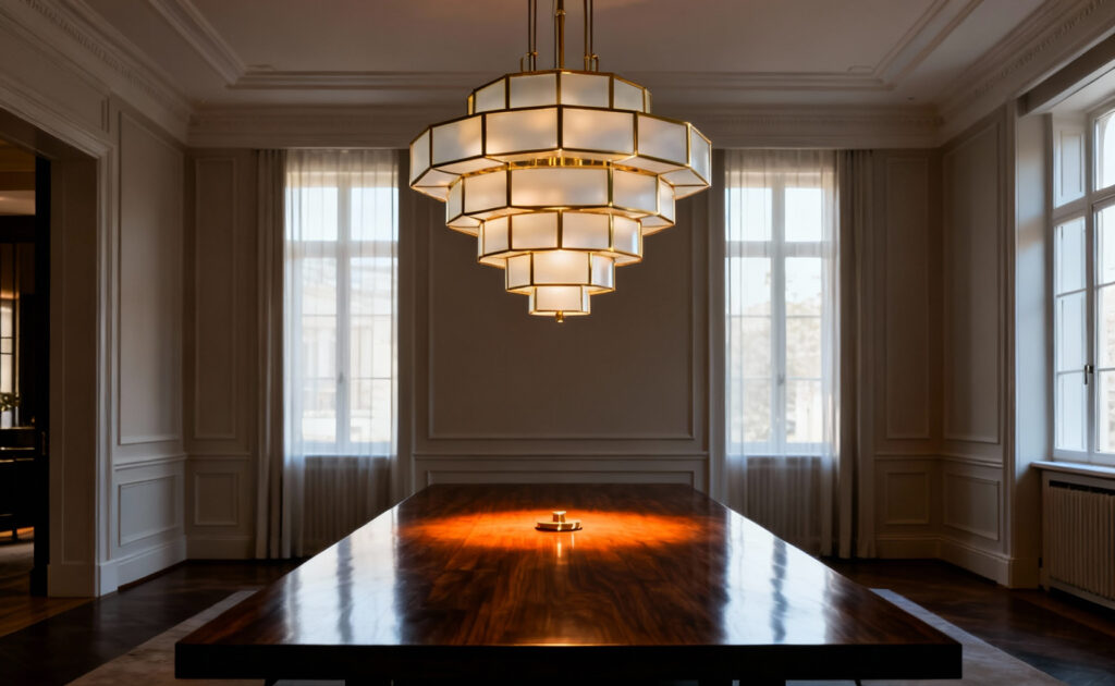
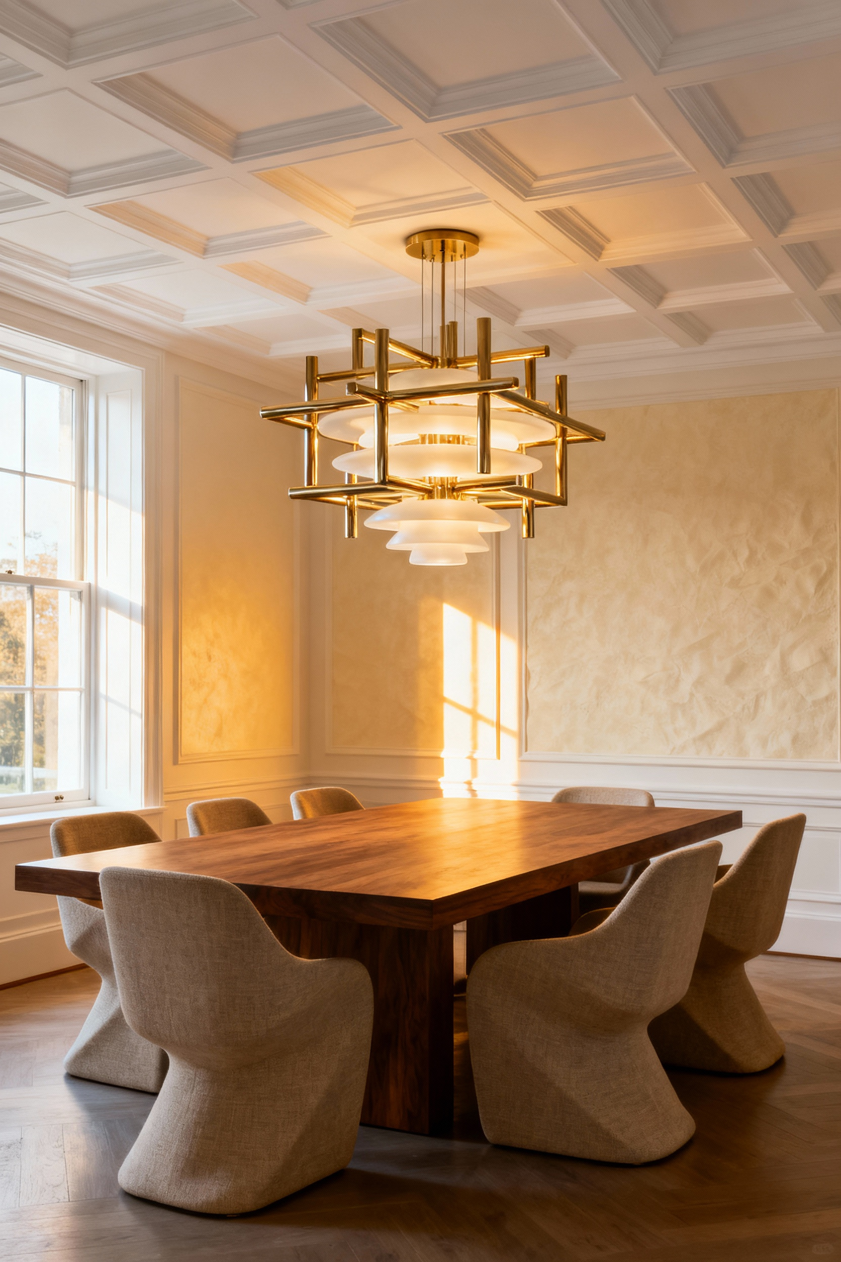
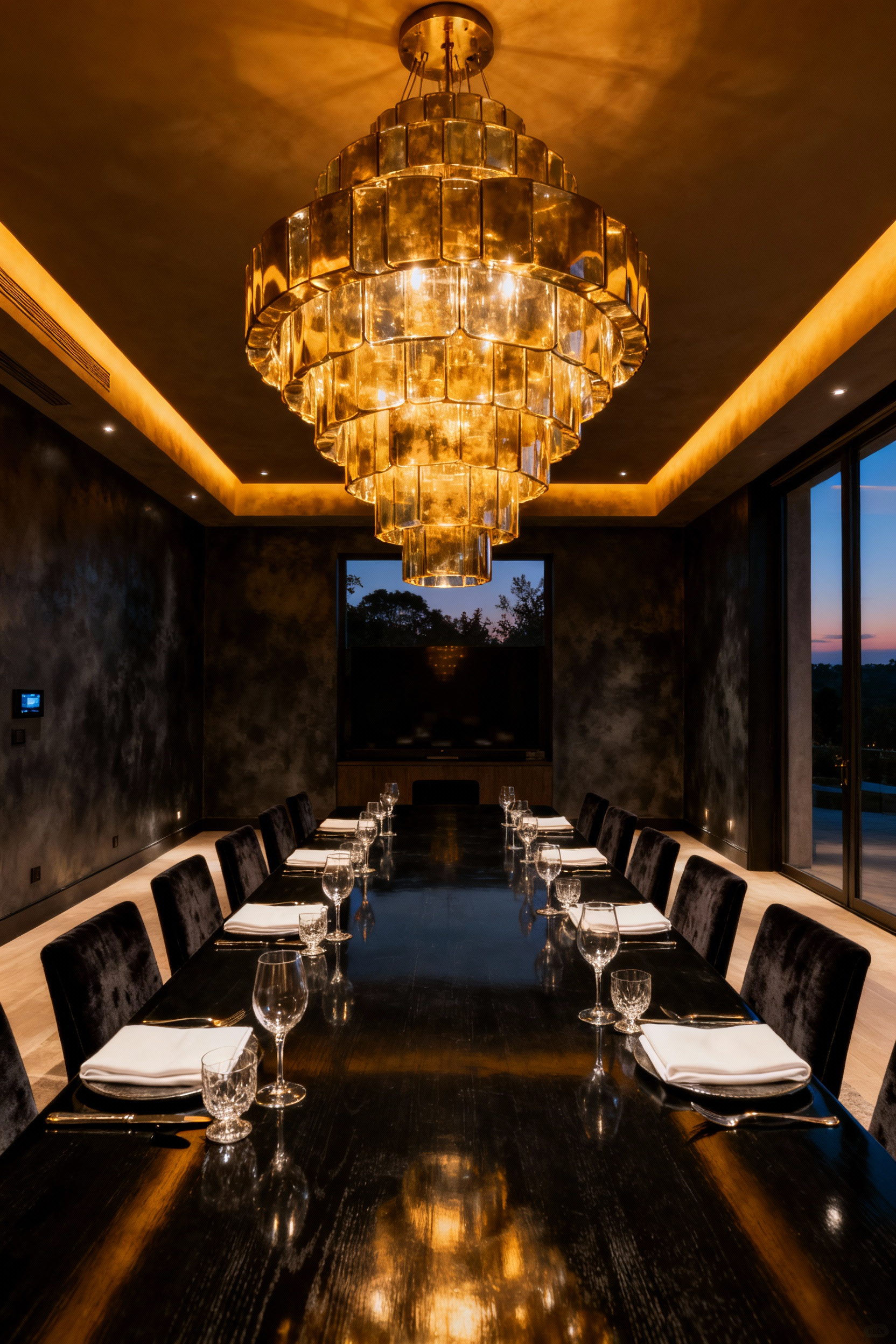
Understanding the Focal Point: Why the Chandelier is Your Table’s Anchor
Think of the chandelier not merely as a light source, but as the gravitational center of your dining experience. In design terms, we view this fixture as the definitive “anchor.” It provides a sense of hierarchy and intention, creating a vertical boundary that transforms an open area into a dedicated gathering space. Without it, a table is just floating furniture; with it, the area proclaims, “This is where we gather.”
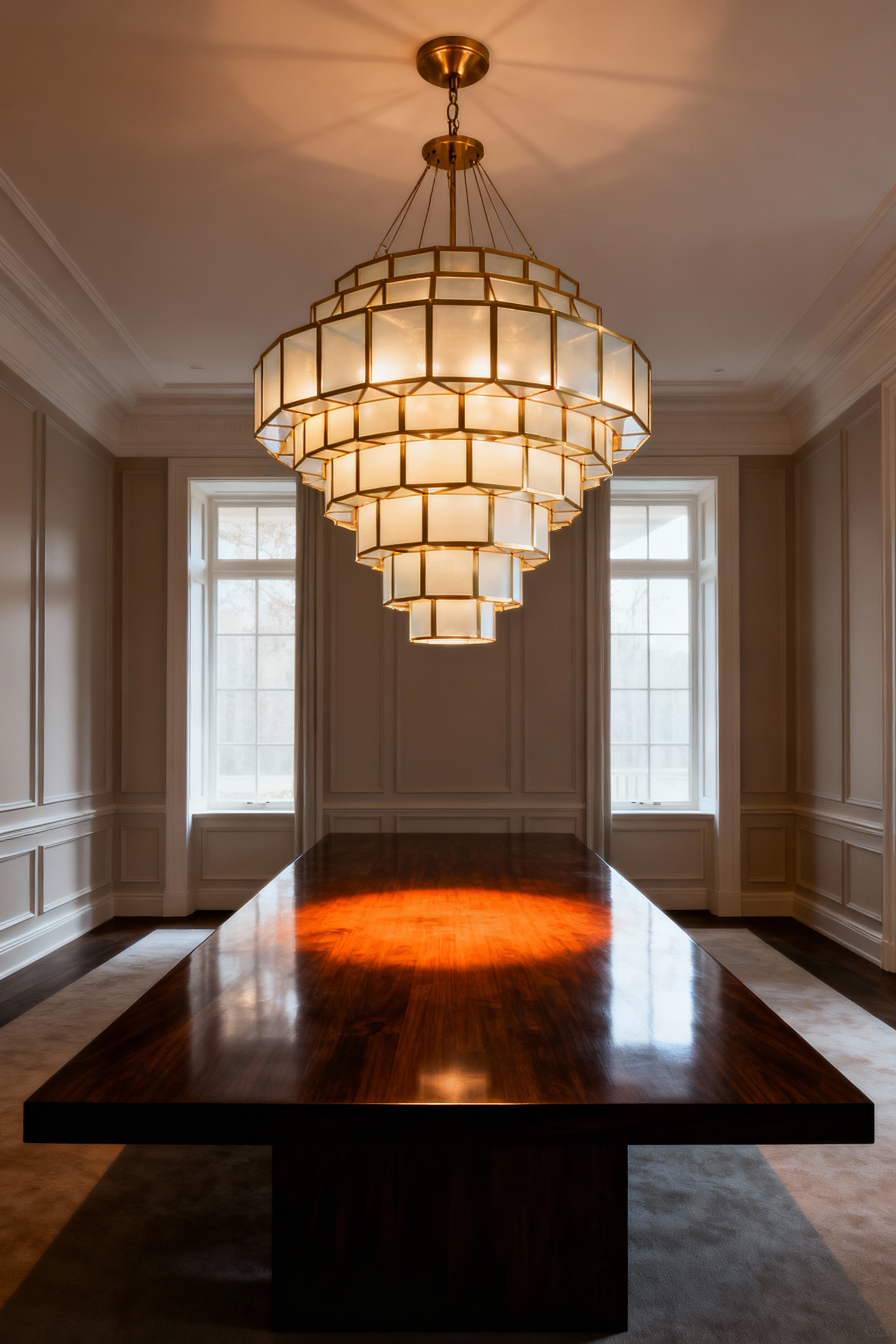
To successfully ground the room, the math needs to align with the aesthetics. If you want to master dining room chandeliers like a designer, avoid the timid look of a fixture that is too small. Conversely, one that is too large makes the space feel top-heavy and precarious.
The sweet spot for visual stability generally lies in selecting a fixture width that is one-half to two-thirds the width of your table. This proportion fuses the two elements into a singular compositional unit.
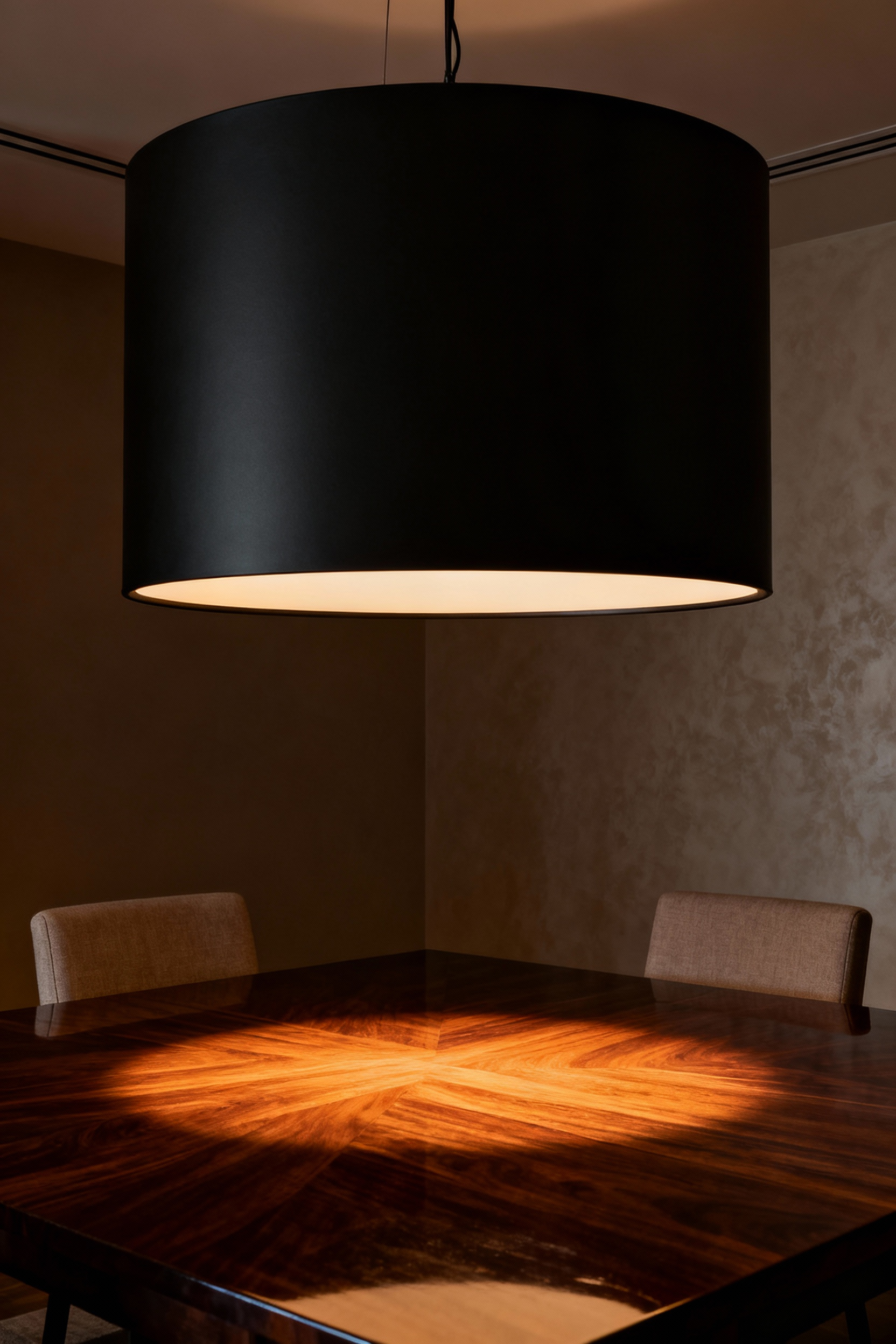
Equally important is the vertical relationship, which directly impacts the flow of conversation. We hang fixtures 30 to 36 inches above the tabletop not just for illumination, but to protect critical sightlines. This clearance ensures the light creates an intimate canopy without obstructing your view of the guest sitting opposite you.
Beyond these physical dimensions, the chandelier acts as an emotional anchor. By utilizing dimmers to shift from the bright, alert lumens of a family brunch to the warmer, softer glow of a dinner party, the fixture controls the room’s psychology. It allows you to dictate the mood, bridging the gap between functional architecture and the human experience of dining.
Scale and Proportion: The ‘Rule of Thirds’ for Table-to-Fixture Sizing
In kitchen and dining design, visual comfort is just as crucial as physical comfort. While designers often colloquially refer to the “Rule of Thirds,” the most effective strategy for sizing a chandelier or pendant is actually the One-Half to Two-Thirds guideline. To achieve a look that feels anchored rather than overwhelming, your fixture’s diameter or width should span between 50 and 67 percent of the table sitting beneath it.
This specific range isn’t arbitrary. It brackets the Golden Ratio, creating a natural hierarchy where the light acts as a bold focal point without dominating the conversation. A fixture sitting at that two-thirds mark feels effortless and organic, whereas anything larger risks making the room feel top-heavy and visually unstable.
Beyond aesthetics, we have to consider the mechanics of a dinner party. Regardless of the math, you must preserve at least six inches of clearance on all sides of the fixture relative to the table edges. This crucial buffer ensures your guests can stand up or gesture without collision and keeps sightlines open across the table, facilitating better flow and conversation.
Proportion applies to the vertical space as well. Hanging the fixture 30 to 36 inches above the tabletop creates a distinct “intimate volume,” or design bubble. This pulls the light source down to layer the illumination, concentrating the glow on the meal and faces while letting the rest of the room drift into softer shadow. If you are working with vaulted ceilings, ensure the fixture’s body height occupies roughly one-third of the total room height so the piece doesn’t look lost in the architectural volume.
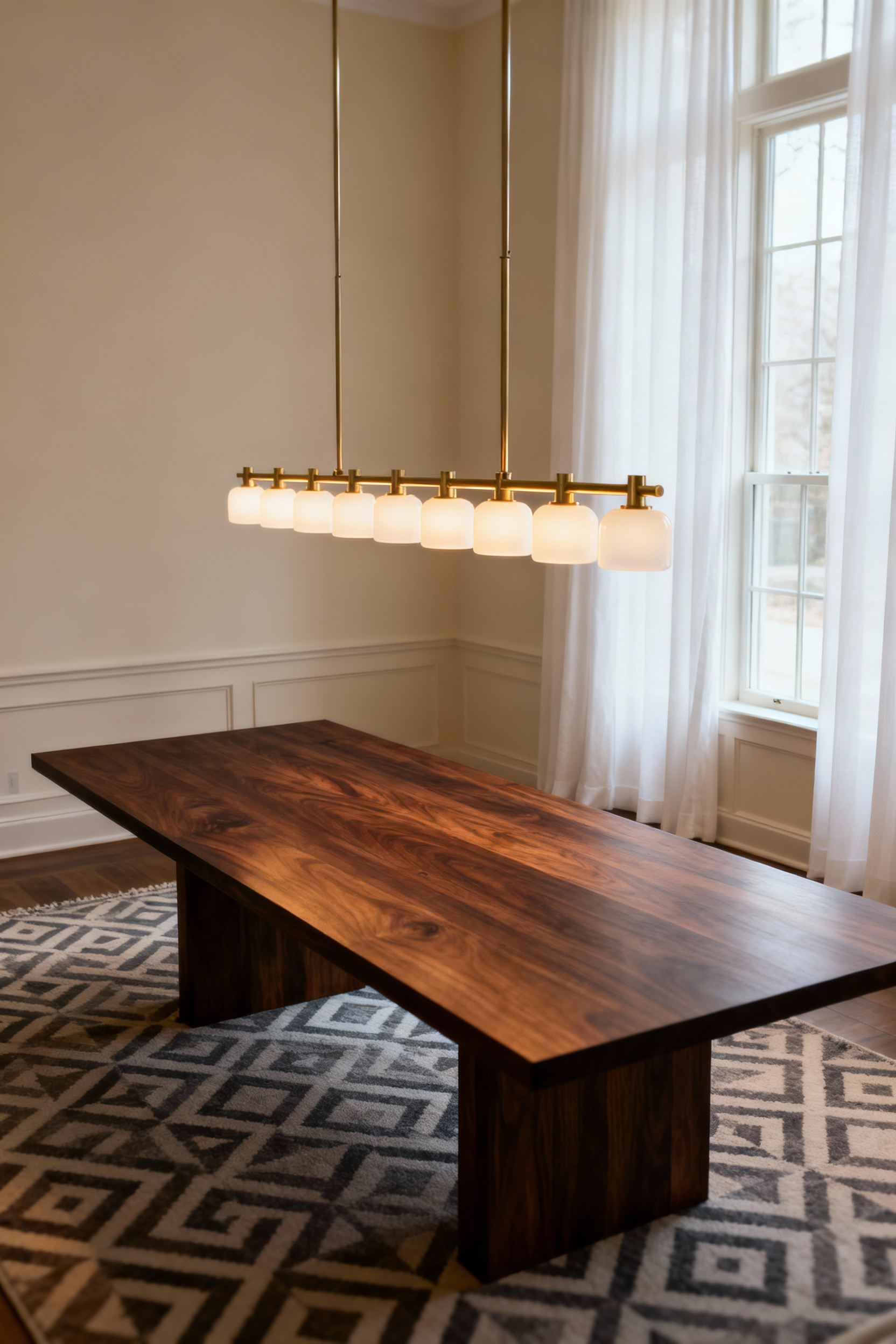
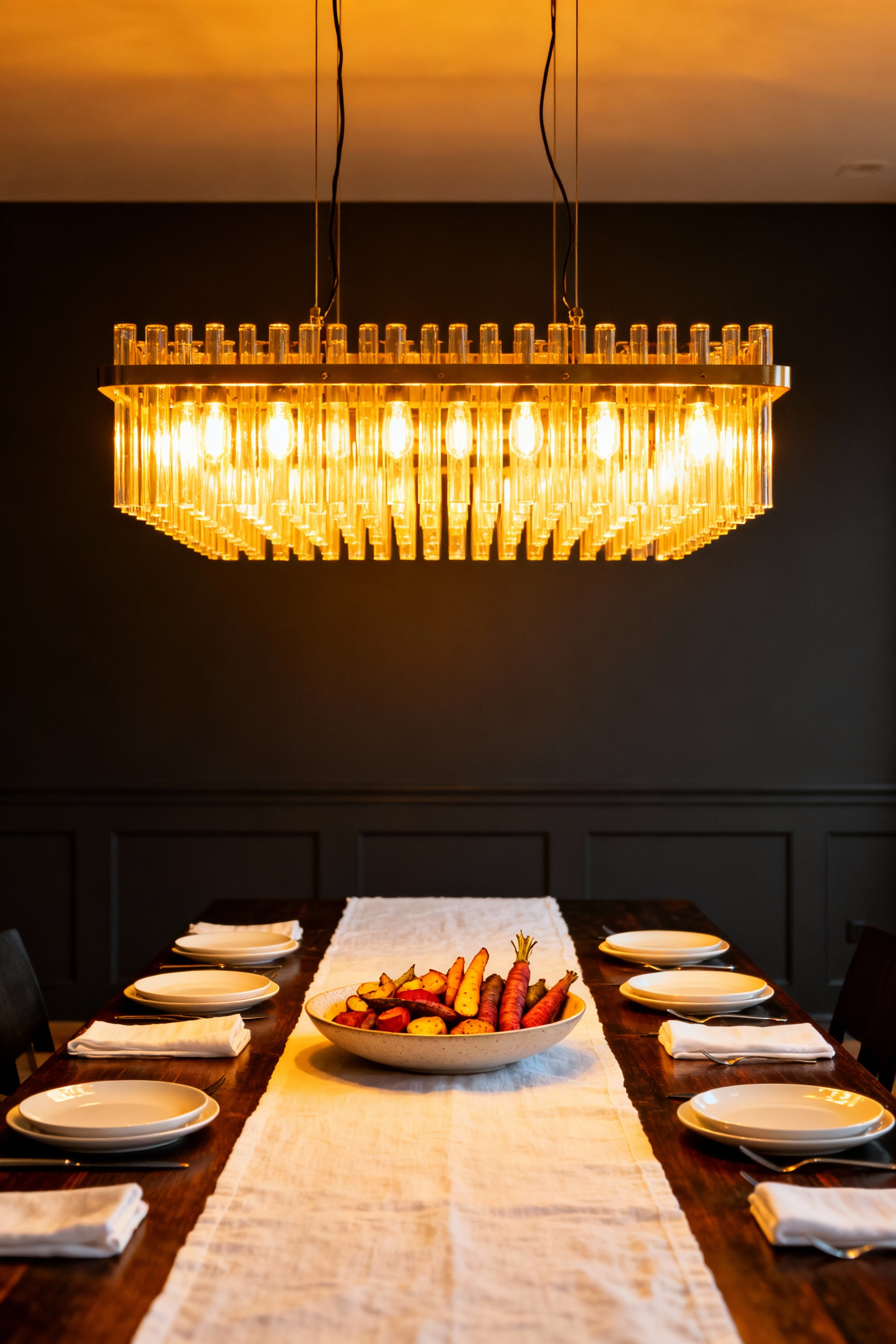
Linear Suspension: Structuring Light for Rectangular Banquet Tables
There is a distinct architectural logic to pairing a linear suspension fixture with a rectangular banquet table. While a traditional round chandelier can create a central “hot spot” that leaves the ends of the table in shadow, the linear form respects the table’s footprint. It creates a uniform wash of illumination ensuring every guest, regardless of where they are seated, experiences the same quality of light.
This works to anchor the room visually; in open-concept spaces, that distinct horizontal line formally defines the dining zone without the need for walls.
Achieving this balance requires strict attention to proportion. Ideally, the fixture should hover 30 to 36 inches above the surface—low enough to create an intimate “light ceiling” that draws people in, yet high enough to maintain clear sightlines for conversation across the table.
Length matters just as much to the overall composition. Aim for a profile that stops 10 to 12 inches short of the table’s edges on either side. This buffer prevents the risk of head bumps and keeps the aesthetic grounded rather than top-heavy.
From a culinary perspective, this structure is unbeatable. By distributing multiple light sources across a horizontal bar, you minimize the harsh shadows that can often distort the appearance of a beautifully plated meal or cast dark hollows on a guest’s face. When paired with high-quality dimming capabilities, you gain total control over the atmosphere, shifting effortlessly from a bright, functional workspace for setting the table to a warm, candle-like glow that highlights the wine and décor during the meal.
The Pendant Cluster: Creating Intimate Conversation Zones in Round Spaces
Round tables inherently encourage communal dining by removing the hierarchy of a “head” seat, but without the right overhead anchor, the energy can dissipate into the room’s upper volume. A pendant cluster acts as a psychological canopy, effectively solving this spatial challenge. By hanging multiple fixtures at intentionally staggered heights, you visually lower the ceiling over the dining area.
This creates a “light tent” effect that compresses the space, drawing focus exclusively down to the table surface and the faces around it.
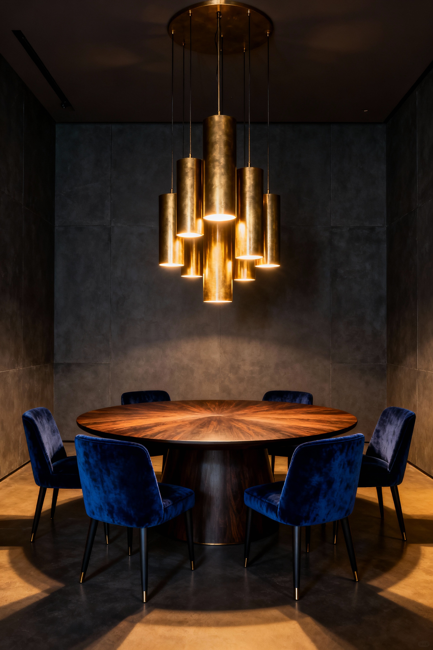
To maintain this intimacy without sacrificing functionality, suspension height is critical. The bottom edges of the lowest pendants should hover between 30 to 36 inches above the tabletop. This sweet spot provides focused task lighting for the cuisine while keeping sight lines clear, ensuring your lighting installation doesn’t become an obstacle to eye contact.
For the most dynamic visual hierarchy, I recommend using an odd number of smaller pendants—typically three or five—arranged with varied drop lengths. This adds depth and sculptural interest, turning the fixture into an art piece that offers even illumination across the circular surface without the heaviness of a single chandelier.
The true success of this conversation zone lies in the quality of the light itself. A single bright source can cast harsh shadows, but a cluster disperses light in a way that flatters skin tones, mimicking the complexity of candlelight. To achieve this, utilize low-wattage bulbs in the 2700K to 3000K range and consider a dimmer non-negotiable. Being able to transition from a brighter setting for service to a low-lumen, warm glow is what creates that sophisticated, “subdued” ambiance that encourages guests to linger long after dessert.
Flush Mount Solutions: Elevating Style in Low-Ceiling Dining Areas
Dealing with limited overhead clearance no longer means settling for the utilitarian dome lights of the post-Victorian era. The flush mount has undergone a massive stylistic redemption, evolving from a standardized necessity into a sculptural centerpiece. Contemporary designs now favor clean lines and premium materials—think textured linen, polished brass, or opal glass. This allows the fixture to serve as a deliberate focal point that aligns with modern architectural trends rather than an afterthought.
From a culinary and entertaining perspective, lighting is the garnish of the room. Relying on a single ceiling source often creates a “flat” effect that does no favors for your dinner guests or the plating. To counter this, treat the flush mount as a statement anchor within a layered scheme. Pairing it with dimmable wall sconces adds necessary depth, while ensuring the bulbs burn at a warm 2700K to 3000K minimizes harsh shadows and maintains a cozy, appetizing atmosphere.
Beyond aesthetics, these low-profile fixtures are spatial problem solvers. By hugging the ceiling plane, they reduce visual clutter, effectively tricking the eye into perceiving more verticality. Opting for a wider diameter with a translucent shade helps diffuse light broadly across the ceiling, softening the architectural edges and making a compact dining area feel significantly airier and more conducive to open movement.
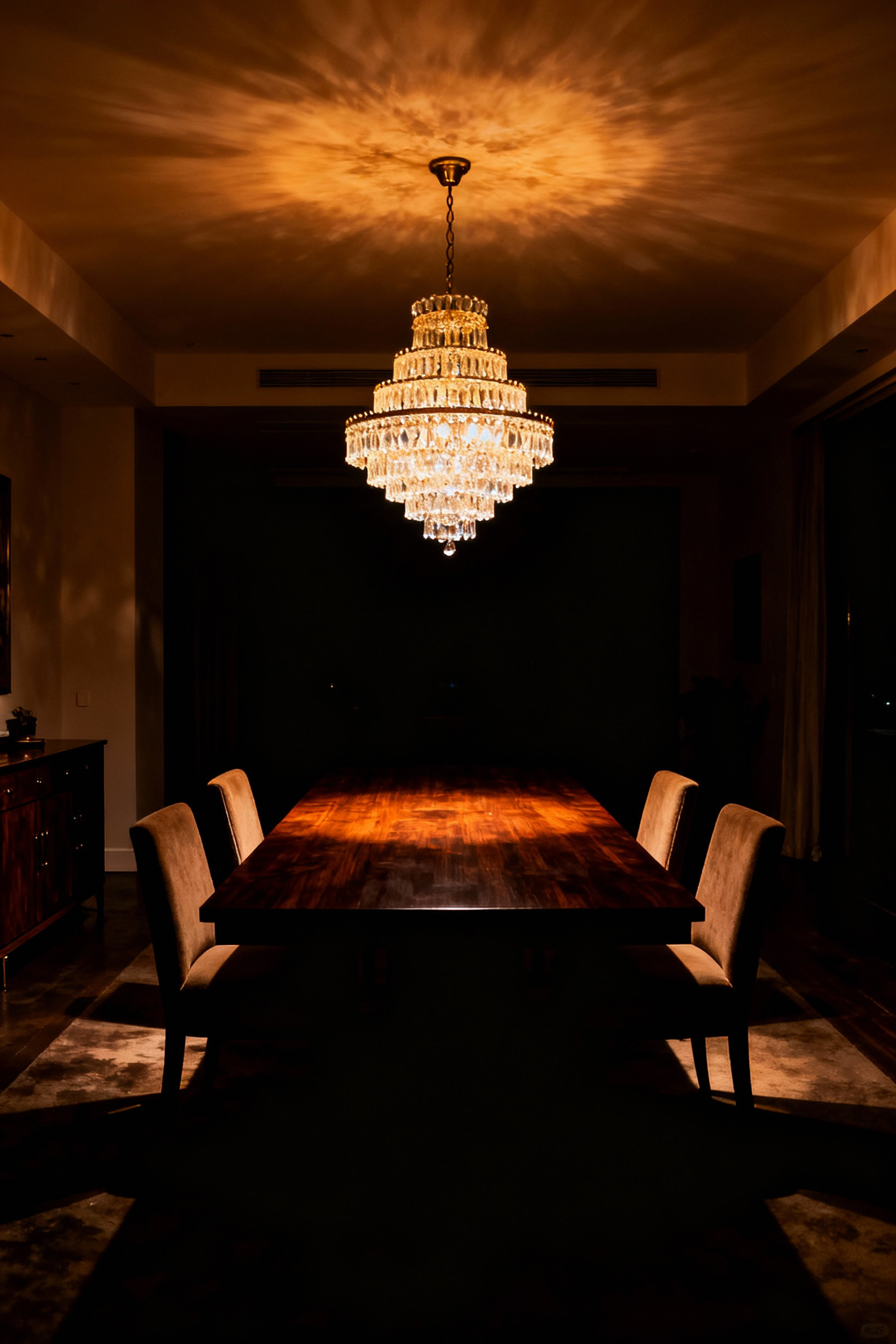
The 30-Inch Standard: Mastering Suspension Height for Unobstructed Sightlines
In the world of dining design, few measurements are as critical—or as frequently botched—as suspension height. The industry standard dictates that the bottom of your chandelier or pendant should float between 30 and 36 inches above the tabletop. This crucial measurement is key to optimizing your lighting over the table.
This isn’t an arbitrary aesthetic choice. It is an ergonomic necessity derived from the table itself, which typically stands 30 inches from the floor. By hovering the fixture in that specific window, the lowest point sits roughly 60 inches from the ground—just above seated eye level. This clearance preserves the most vital element of a dinner party: the ability to see your guests across the table without ducking around a low-hanging shade.
Beyond simple sightlines, this height acts as an atmospheric anchor. Hanging the light closer to the 30-inch mark creates an intimate, focused pool of illumination that highlights the cuisine—making your plating look vibrant rather than washed out—while visually defining the dining zone within an open plan.
Crucially, staying within this range prevents the dreaded “interrogation effect.” If a fixture hangs too low, exposed bulbs can glare directly into a diner’s eyes; too high, and the light feels distant and disconnected, leaving the table feeling cold and utilitarian.
That said, treat this rule as a baseline for standard eight-foot ceilings, not an immutable law. If you are working with extra vertical space, the fixture needs to rise to maintain visual proportion. A reliable formula is to raise the suspension by approximately three inches for every additional foot of ceiling height. This adjustment prevents the light from looking like a disconnected UFO floating in the void, ensuring the fixture remains visually linked to the table while respecting the scale of the room.
Kelvin Count Matters: Why 2700K is the ‘Appetizing Sweet Spot’ for Food Presentation
Think of lighting as the final seasoning on a dish; it has the power to either enhance the flavor profile or leave the experience feeling flat. When we specify a 2700K bulb, often labeled “Extra Warm White,” we aren’t just making an aesthetic choice; we are engineering a psychological response.
This specific color temperature mimics the spectral qualities of traditional firelight and candlelight, tapping into a deep-seated instinct that associates this amber glow with safety and intimacy. Unlike the alerting effects of cooler daylight bulbs, 2700K encourages guests to relax into a “savor-state,” naturally slowing the pace of the meal to promote conversation and lingering.
Beyond mood, this lighting temperature acts as a natural filter for the food itself. Culinary presentation relies heavily on the warm spectrum—the deep red of a medium-rare steak, the golden-brown crust of fresh bread, or the vibrant sear on grilled vegetables. Warm light amplifies these appetizing hues while suppressing sterile blue tones that can make food appear muted or unappealing. Research supports this, showing that diners exhibit higher “willingness to eat” scores and more positive facial expressions under this specific warm glow compared to cooler alternatives.
Achieving the perfect ambiance requires a distinction between warmth and darkness. The goal is to hit the “pleasure combination”: pairing that soft 2700K color with sufficient brightness, or lux. A dining space should never be so dim that the visual texture of the meal is lost. By using a high-lumen fixture on a dimmer, you maintain that inviting, appetizing warmth while ensuring the culinary details on the plate are fully illuminated and appreciated.
The Dimmer Switch: Transitioning from Homework Station to Evening Ambiance
The dining table often leads a double life. By afternoon, it serves as a high-traffic homework station requiring the visual clarity of high-CRI lighting. We rely on those bright, blue-rich wavelengths—typically around 4000K—to stimulate alertness and maintain the focus necessary for algebra or spelling words. However, that same intensity feels antiseptic once the textbooks are cleared away.
This is why I consider the dimmer switch the most critical tool in a versatile dining space; it allows us to execute a deliberate psychological shift from duty to relaxation.
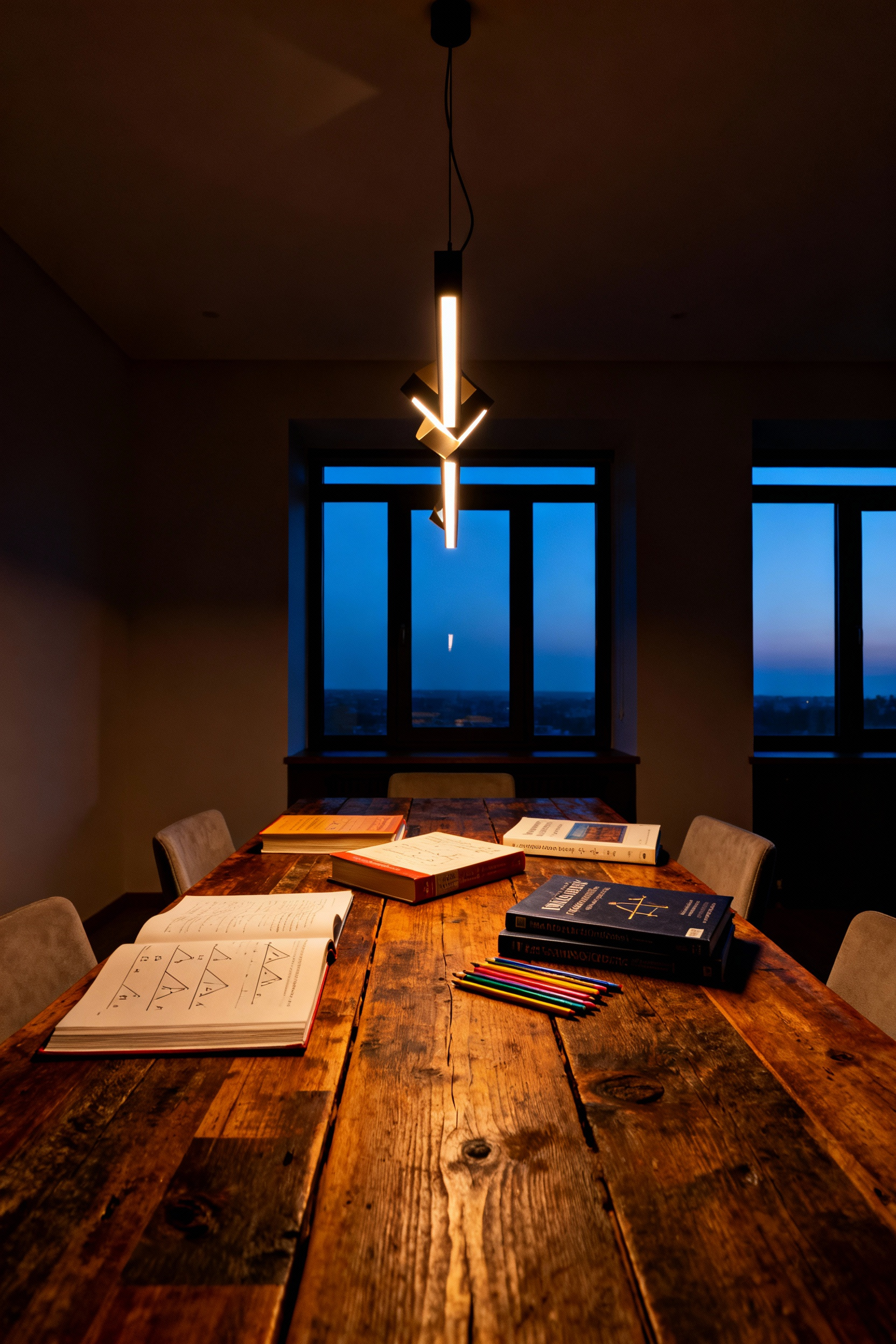
Joel Spira, the pioneer of the modern residential dimmer, originally marketed the device as a tool for “domestic theater,” and that sentiment remains the design gold standard. Lowering the light level effectively pulls the curtain on the day’s stress. As the intensity drops, the room transitions into a warmer spectrum—ideally hitting that 2700K sweet spot—which mimics the biological comfort of candlelight.
From a culinary standpoint, this shift is non-negotiable. Soft, warm light enhances the natural reds and browns in cooked proteins and sauces, making the meal visually appetizing, whereas cool, high-output light can render food unappealingly gray.
Beyond aesthetics, a dimmer environment encourages a slower eating pace, turning a quick bite into a restorative experience. To achieve this seamlessly, ensure your fixtures utilize dimmable LEDs paired with a compatible switch. An incompatible pairing often results in flickering or sudden “clipping” of light, a technical friction that instantly breaks the magic. The goal is a smooth glide into the evening, creating a sanctuary where the only task left is to enjoy the meal.
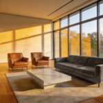
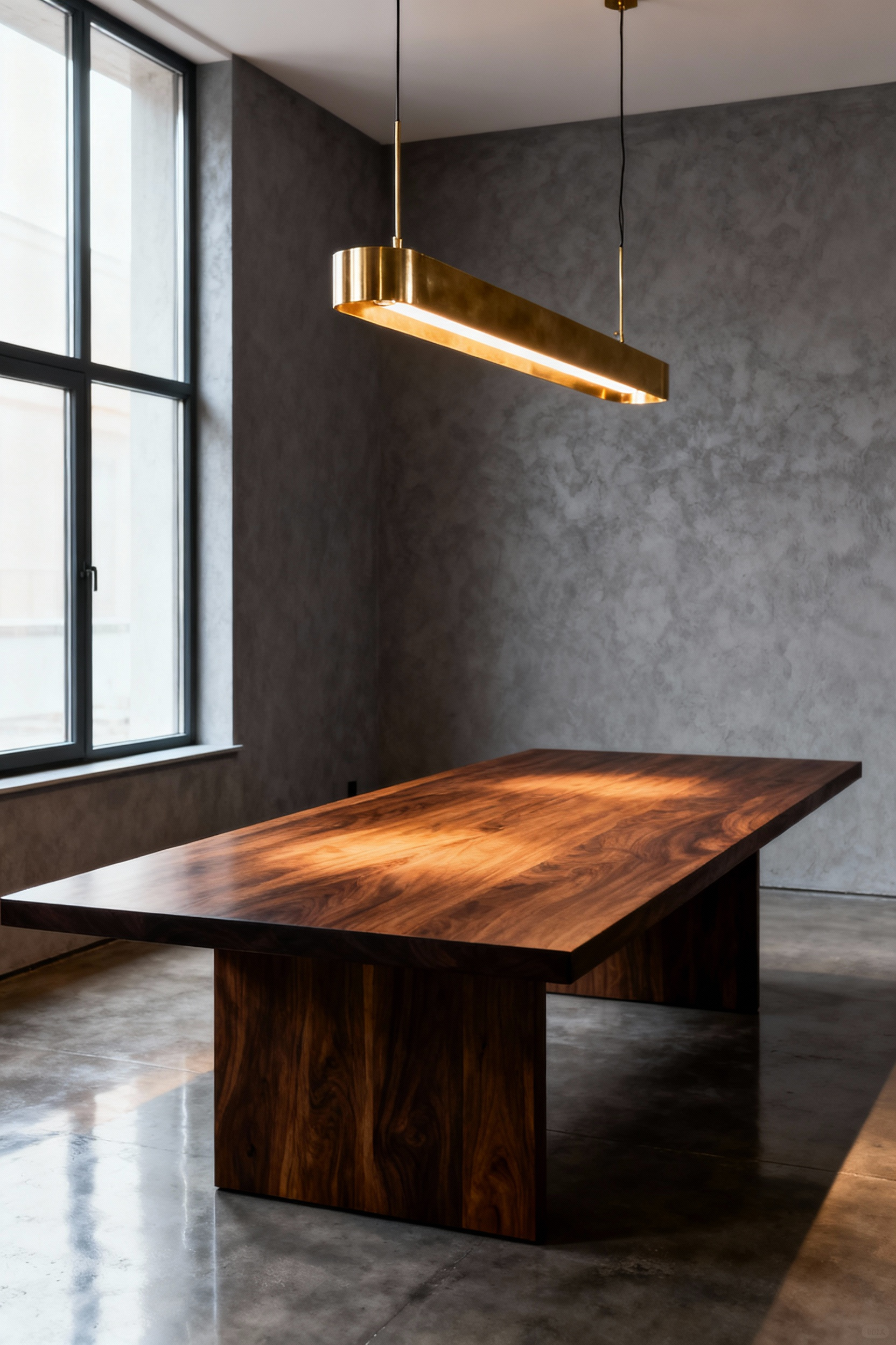
Layering Light: Moving Beyond the Centerpiece for Dimensionality
The era of the solitary, oversized chandelier acting as a room’s sole illuminator is fading, and for good reason. Relying on a single overhead source creates a “monologue” of light that often flattens the room’s architecture and casts harsh, unflattering shadows. A truly functional dining space requires a conversation between light sources, creating a dynamic interplay of brightness and shadow that adds depth and professionally zones the area, particularly in open-concept homes.
To achieve this, we must expand our approach to address the specific sensory needs of dining. We begin with “light for doing”—ensuring the food looks vibrant and true on the plate. This is best achieved through pendants or flanking recessed downlights that direct illumination downward, eliminating shadows over the meal.
This must be balanced with “light for knowing” and “feeling.” By incorporating wall sconces or buffet lamps at eye level, we introduce a soft, ambient glow that mimics the comfort of candlelight. This creates a friendly environment where guests can clearly read facial expressions without the glare of a high-wattage bulb overhead.
The secret to making these layers work in harmony is cohesion and control. It is critical that all bulbs share a warm color temperature, ideally around 2,700 Kelvin, to avoid a disjointed or clinical effect. Furthermore, installing independent dimmers for every layer is non-negotiable. This “light for changing” allows the room to pivot instantly from a bright, functional workspace for homework to a moody, sophisticated atmosphere for an intimate dinner party. By sculpting the room with light at varying heights, you pull the visual focus in, making the space feel curated rather than just lit.
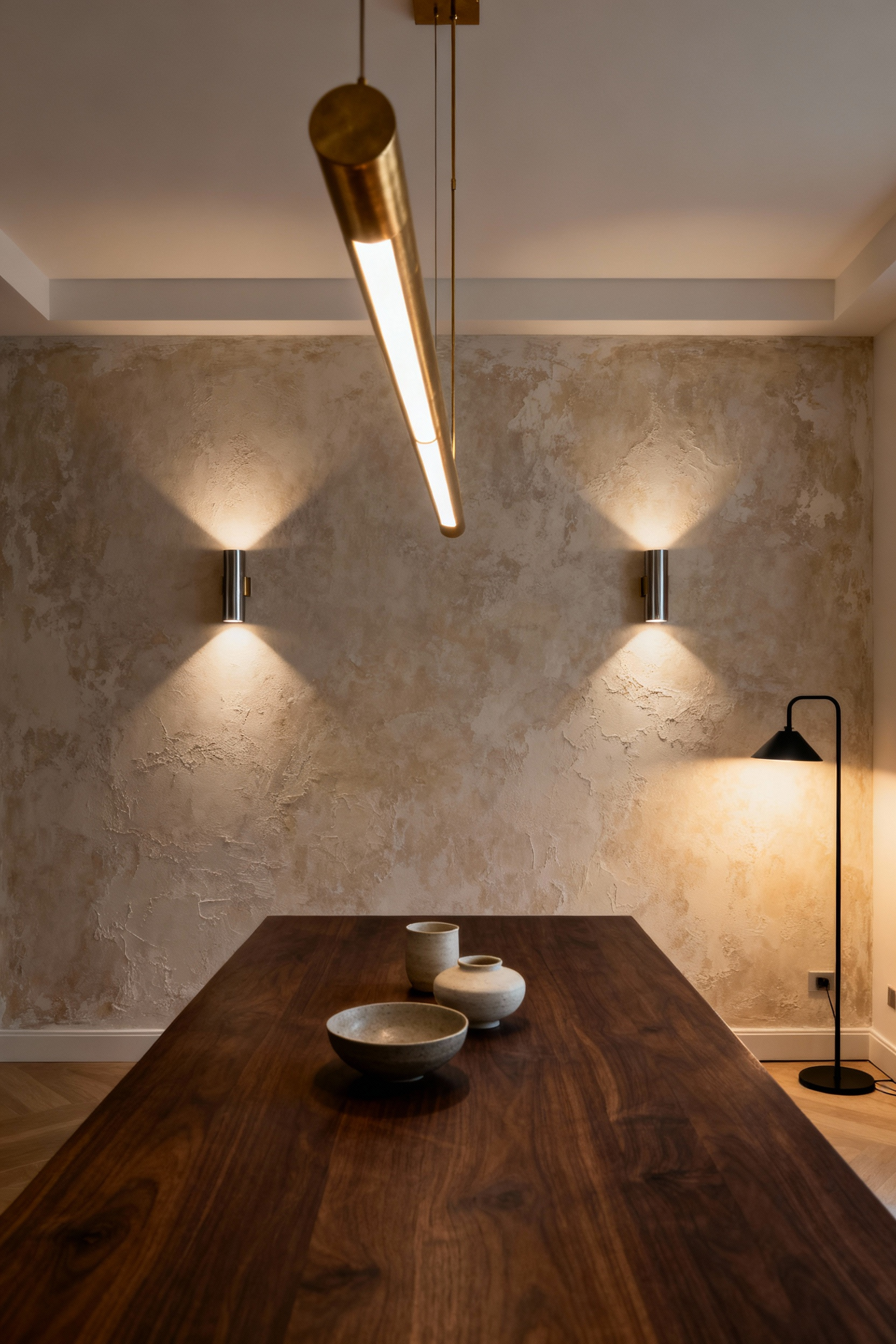
Perimeter Glow: Using Wall Sconces to visually Widen the Room
While a statement chandelier often claims the spotlight, relying solely on overhead fixtures can unintentionally shrink your dining space. Centralized light tends to cast deep, defined shadows into the corners, creating hard visual boundaries that cause the walls to feel as though they are pressing inward.
The remedy lies in establishing a “perimeter glow” using wall sconces. By washing the room’s edges with light—particularly with fixtures that diffuse illumination horizontally or bidirectionally—you dissolve those dark anchor points. This tricks the eye into perceiving a softer, more ambiguous boundary, effectively pushing the walls back and widening the visual field.
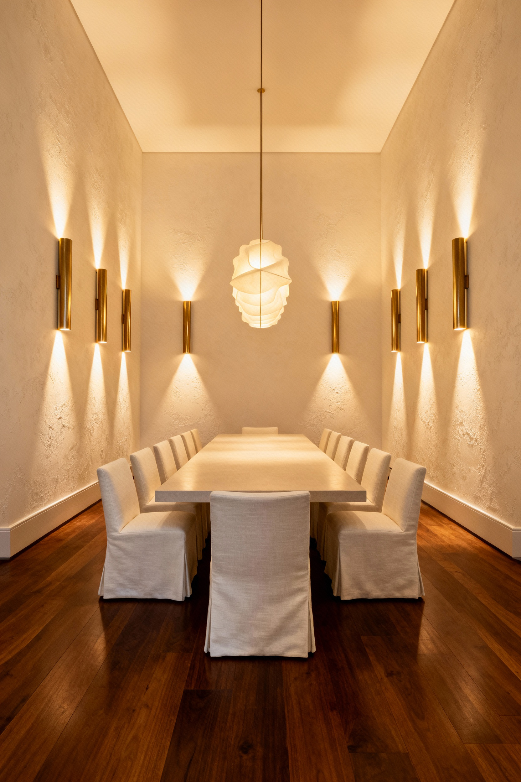
Beyond the spatial illusion, this layered approach shifts the atmosphere from clinical to convivial. Overhead lighting is excellent for highlighting the cuisine, but a soft side-wash from sconces is far more flattering for your guests. It mimics the historic, intimate feel of candlelight, smoothing out features and encouraging relaxation.
From a design perspective, symmetry is your best tool here. Flanking a sideboard or a large mirror with sconces forces the eye to travel the full width of the wall rather than focusing solely on the center table. If you are dealing with lower ceilings, uplighting sconces can also draw the gaze upward, adding verticality to the width. To ensure this glow remains comfortable rather than blinding, install fixtures roughly 60 to 66 inches from the floor—high enough to wash the wall, but safely out of the direct line of sight for seated diners.
Service Station Illumination: Task Lighting for Buffets and Sideboards
In a well-designed dining room, the sideboard or buffet functions as the unsung hero of workflow, transforming from a static display piece into a bustling service station the moment guests arrive. Historically, specifically during the Regency era, this area was illuminated to catch the glint of family silver and signal status. Today, the design intent remains similar but focuses more on hospitality than hierarchy. We need to create a dedicated “stage” for the meal, ensuring that the transition from plating to serving feels seamless and intentional.
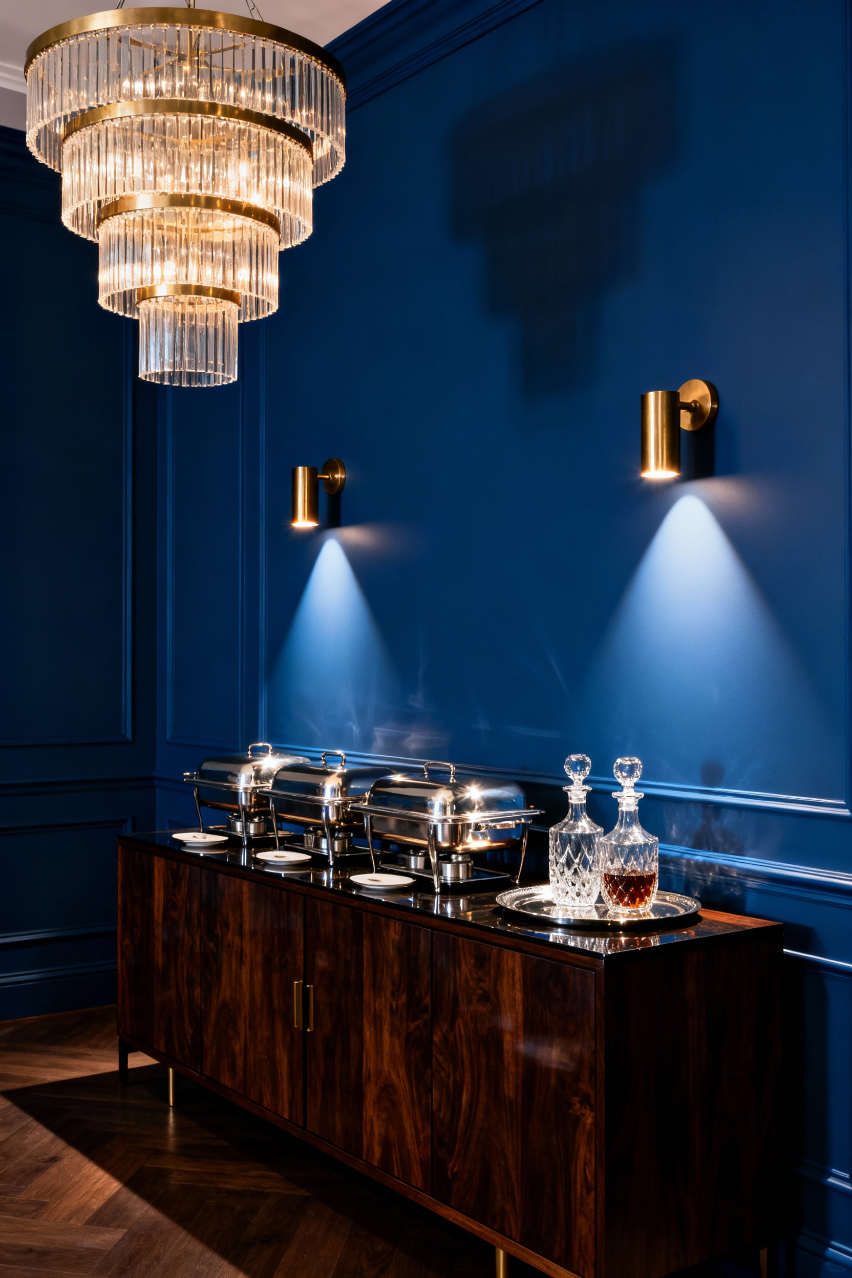
Lighting quality here is arguably more critical than quantity because it directly influences how appetizing the cuisine appears. When you spend hours roasting a bird or preparing a complex sauce, you don’t want the visual appeal washed out by low-fidelity bulbs. I always insist on a Color Rendering Index (CRI) of 90 or higher for these stations. This ensures food looks vibrant and true to life.
While a warm spectrum between 2700K and 3000K keeps the atmosphere inviting, a slightly warmer, rosy hue—around 2250K—is a designer’s secret weapon for carving stations, as it naturally intensifies the succulent appearance of red meats.
To make this practical, the sideboard requires a higher brightness level than the dining table itself—typically 400 to 500 lux—so guests can serve themselves without squinting in the shadows. Precision is key to achieving this without ruining the room’s mood. Adjustable gimbal fixtures with a narrow 25°–35° beam spread work beautifully to cast tight pools of light strictly on the food, avoiding spillover onto the floor. Alternatively, tall buffet lamps or swing-arm sconces provide that necessary task layer while keeping the light source near eye level, perfectly blending technical utility with elegant form.
The Invisible Layer: Integrating Recessed Cans for Cleaning vs. Dining
Think of your dining room as having a dual personality: it is a stage for intimate gatherings, but it is also a workspace that requires maintenance. Relying solely on a decorative chandelier often fails both sides of this equation. A central fixture rarely casts enough light to spot crumbs in the corners or streaks on the table, yet cranking it up to maximum brightness usually results in harsh shadows rather than clarity.
This is where the “invisible layer” of recessed cans becomes essential. These fixtures provide the high-foot-candle output necessary for deep cleaning and setup without competing with your design aesthetic. The key lies in utilizing “tunable white” LED technology. For prep work and cleaning, you can adjust the Correlated Color Temperature (CCT) to a cooler, neutral white range of 3500K to 4100K. This clarity helps you spot dust and ensure the room is pristine before guests arrive.
Once the work is done, the lighting must shift gears to support the dining experience. By tuning the CCT down to a warm 2700K, you immediately flatter skin tones and enhance the rich colors of the food. Placement and hardware selection remain critical, though. To avoid the “cafeteria effect” or unconscious glare that creates visual fatigue, I specify fixtures with regressed trim, where the bulb sits deep within the housing.
Control is the final piece of the puzzle. The recessed layer must be on a separate dimmer from the chandelier. During the meal, these perimeter lights should be dimmed to a mere 10 to 20 percent. This allows the decorative fixture to serve as the focal point while the recessed cans provide a soft, ambient lift that eliminates gloom without drawing attention to themselves. This transition—from high-utility brightness to a supportive glow—allows you to physically turn down the noise of the day and set the scene for connection.
Material Coordination: How to Mix Metals Between Kitchen and Dining Areas
Gone are the days when every fixture in your home needed to match perfectly. In fact, a strict monochromatic metal palette often results in a flat, visual monotony that can make a space feel dated. The secret to a curated, high-end aesthetic lies in the strategic tension between warm and cool tones.
Warm metals, such as brass or oil-rubbed bronze, bring an inviting glow essential for a convivial dining atmosphere, while cool tones like stainless steel and polished nickel reflect the clean, functional nature of a working kitchen.
To master this mix without it looking accidental, treat your dining room lights as the visual anchor. A large-scale brass chandelier can serve as the dominant finish, effectively bridging the gap to a kitchen filled with stainless appliances. A reliable method for maintaining cohesion is separating metals by plane: reserve one finish for vertical elements, like lighting fixtures, and a contrasting metal for horizontal touchpoints, such as faucets and drawer pulls.
Don’t underestimate the power of sheen and neutrals, either. Mixing the mirror-like quality of polished chrome with the soft texture of brushed brass adds necessary depth and prevents the room from feeling one-dimensional. If you struggle to balance the two, matte black or wrought iron fixtures act as sophisticated neutrals. They ground the design, allowing your mixed metals to read as an intentional collection rather than a mismatched error.
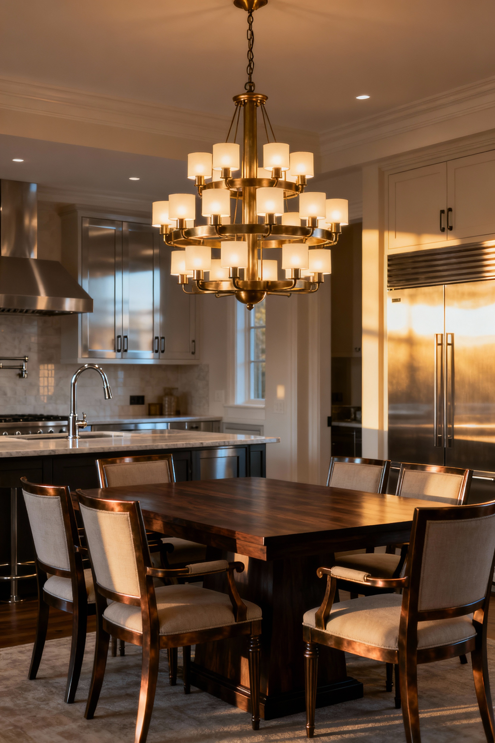
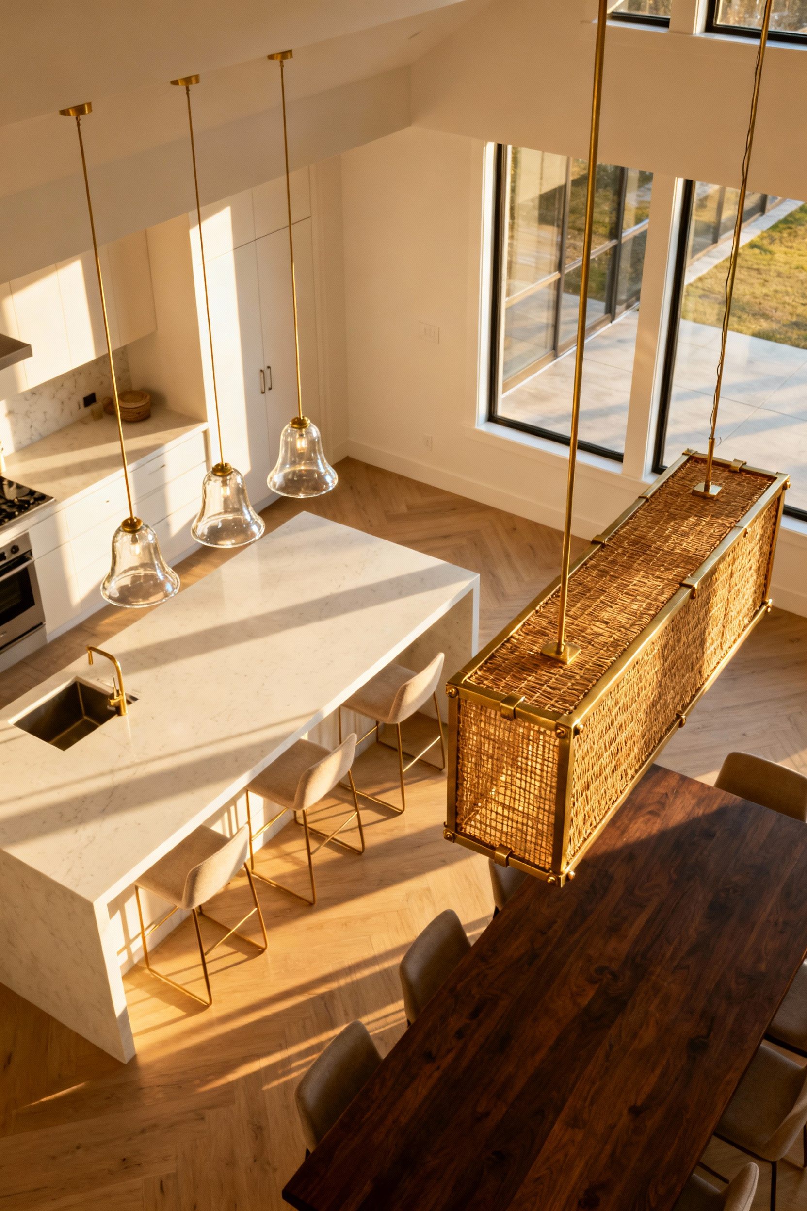
Open Concept Flow: Harmonizing Island Pendants with Dining Fixtures
In an open-concept home, where physical walls have been removed, your lighting fixtures inherit the responsibility of defining space. A common misstep is purchasing identical suites for both the island and the dining table, but this “matchy-matchy” approach tends to flatten the room visually.
Instead, embrace the paradox of cohesion by maintaining a single unifying anchor—such as a specific brass finish or woven texture—while varying the form. If your island pendants are airy, glass structures that allow the eye to travel through to the living area, ground the dining space with a solid, opaque fixture or a multi-arm chandelier. This contrast creates necessary visual texture and distinct zones without breaking the stylistic thread.
Beyond looks, you have to solve for function. Your kitchen island is a high-performance task zone requiring clarity for safe food preparation, typically demanding neutral-cool light. Conversely, the dining area relies on warm, soft light to stimulate conversation and relaxation.
To prevent a jarring transition between these two atmospheres, standardize your ambient recessed lighting to a “warm-neutral” 3000K throughout the great room. For the decorative fixtures themselves, leverage tunable LED technology. This allows your island pendants to shift from crisp task lighting during afternoon prep to a warm, candle-like glow when guests arrive, effectively syncing the atmosphere across the floor plan.
Finally, consider the vertical rhythm of the space. By maintaining a consistent hanging height for the base of both fixture sets, you create an unconscious visual ribbon that ties the room together. Let the dining fixture serve as the heavy focal anchor that establishes the ceiling plane, while visually lighter island pendants act as the invisible barrier separating the culinary workflow from the social arena.
Glare Management: Selecting Diffusers and Shades for Guest Comfort
True hospitality extends beyond the menu; it implies ensuring your guests aren’t squinting through the main course. The primary enemy of a relaxed dining atmosphere is “discomfort glare,” visual fatigue caused by a direct line of sight to a harsh bulb.
Controlling this starts with geometry. To create an effective cutoff angle, I recommend suspending the bottom rim of your pendant between 27.5 and 35.5 inches above the tabletop. This positioning ensures the shade itself acts as a mechanical shield, blocking the light source from the eyes of a seated adult.
The architecture of the fixture plays a massive role in this shielding. Deep drum shades are excellent for dining because their straight, vertical walls offer a strict cutoff that contains light effectively. In contrast, shallow, tapered styles—like Coolie or Empire shades—often possess a wider aperture that fails to hide the bulb unless hung awkwardly low.
Ideally, this physical shielding is paired with a high-quality diffuser material. We want to avoid high-contrast luminance ratios where the bulb is significantly brighter than the table surface. Instead, look for opal or milky white glass that transforms the intense LED hotspot into a soft, uniform haze.
This diffusion does more than save eyes; it flatters them. Soft, scattered light provides necessary vertical illuminance, making guests’ faces look welcoming rather than shadowed. However, the material must be chosen carefully to preserve the Color Rendering Index (CRI). A quality diffuser softens the glow without muddying the light spectrum, ensuring that the rich reds of a roast or the vibrancy of fresh greens remain appetizing (Ra > 90). By combining a warm 2700K temperature with physical glare control, you shift the room from a utilitarian feeding space to an intimate sanctuary.
Smart Home Integration: Creating ‘Scene Presets’ for Hosting
True high-end hosting relies on creating an immersive atmosphere, and smart home “Scene Presets” allow you to orchestrate this environment with a single command. Rather than manually adjusting individual dimmer switches, a pre-programmed macro instantly synchronizes lighting, audio, and climate to align with the psychology of the meal.
The most critical element of this synchronization is the quality of light. To encourage guests to relax and linger, the preset should drop the color temperature to a warm 2700K to 3000K range. However, warmth must not sacrifice clarity; a Color Rendering Index (CRI) of 90 or higher is essential for the dining table. Without this high fidelity, the visual appeal of your culinary efforts diminishes—a beautifully seared steak or a vibrant glass of red wine can appear muddy and unappetizing under poor color rendering.
Beyond the technical specifications, the scene manages architectural layering to direct the eye. A sophisticated “Dinner” preset establishes a hierarchy of light, perhaps dimming the ambient chandelier to 40-60 percent for intimacy while keeping pendant lights focused on the table to showcase the food.
Simultaneously, this same command should trigger your multi-room audio to a conversation-friendly volume and lower the thermostat to preemptively account for the rising room temperature caused by body heat. This integration allows for seamless transitions throughout the evening. You can effortlessly shift from a bright, high-energy “Welcome” scene to a moody, intimate “Lounge” setting for dessert without ever breaking your stride or the conversation.
Conclusion: Lighting as the Key Ingredient for the Perfect Gathering
Lighting is far more than a practical utility; it is the silent orchestrator of your dinner party’s rhythm and the final seasoning on the plate. Just as a chef balances flavors, a host must balance warmth and intensity to elevate the dining room aesthetic from a simple feed into a true sensory experience.
By prioritizing high CRI fixtures that render your culinary creations in their most appetizing hues and employing dimmers to shift the room’s energy, you are not merely illuminating a space—you are curating connection. This layered approach merges the historical tradition of the flattering, intimate glow with the modern functionality required to keep guests relaxed and lingering long past dessert.
Ultimately, your dining space serves as a stage for memory-making, where illumination guides the emotional arc of the night. Even the most efficiently designed kitchen is wasted if the resulting dining atmosphere feels sterile or jarring.
Begin by auditing your current chandelier or pendant: swap out any cold, low-quality bulbs for warm, high-CRI alternatives and ensure every dining circuit is controlled by a dimmer. With these subtle but powerful adjustments, you gain the flexibility to choreograph the perfect evening, ensuring your dining room lights deliver on their promise, and both your food and your friends are always seen in their best light.
Frequently Asked Questions
What is the ideal hanging height for dining room lights?
The industry standard height for hanging a chandelier or pendant above a dining table is 30 to 36 inches. This clearance ensures the fixture acts as an intimate anchor for the table while preventing the light source from obstructing the sightlines between seated guests. For ceilings taller than eight feet, add approximately three inches of height per additional foot of ceiling clearance to maintain visual proportion.
What is the best color temperature (Kelvin) for dining room lighting?
The best color temperature is 2700K (“Extra Warm White”). This warm, amber light mimics candlelight and firelight, which scientifically encourages relaxation and intimacy. Furthermore, 2700K enhances the warm spectrum in food (reds, golds, and browns), making meals look richer and more appetizing, which is crucial for culinary presentation.
How do I size a chandelier for my dining table?
To ensure the light fixture anchors the space without overwhelming it, its width or diameter should be between one-half (50%) and two-thirds (67%) the width of the dining table beneath it. This proportion provides visual balance and prevents guests from hitting their heads or obstructing sightlines.