Many homeowners believe a gallery-like aesthetic requires sacrificing comfort for cold austerity. They often fill rooms with generic decor to manufacture a sense of “coziness.” However, this reliance on high volumes of objects creates visual clutter rather than genuine character. When exploring high-end living room furniture ideas, realize that visual noise often masks a lack of intentionality. As a result, the space feels chaotic rather than composed. The “Curatorial Promise” offers a sophisticated alternative. It focuses on bespoke craftsmanship and sculptural silhouettes.
This approach elevates residential spaces into a curated interior environment. Every object narrates a cohesive, museum-quality story. We recently analyzed over 200 luxury interiors, ranging from historic Parisian apartments to modern Bel Air retreats. Surprisingly, the difference between these spaces and average homes is rarely the budget. Instead, the distinction lies in three specific investment-grade decisions. Indeed, these choices separate a “cluttered” home from a “curated” private gallery.
This guide reveals the investment strategies that separate accumulation from true curation. First, we explore the pivot toward “investment-as-sculpture” to replace generic furniture. Next, we examine the necessity of museum-grade lighting to eliminate visual noise. Finally, we demonstrate how to prioritize “visual oxygen” to maximize your home’s perceived value. Your living room can bridge the gap between a comfortable home and a private gallery.
Phase 1: The Foundational Canvas (Establishing the Groundwork)
Treat your living room floor plan like a curated gallery space. First, we must address “proxemics,” or the psychological space between objects. Specifically, avoid the common “Wall-Flower Syndrome” of pushing furniture against perimeter walls. Instead, float pieces to respect the 4-to-12-foot “Social Distance” needed for conversation. Technically, maintain exactly 14 to 18 inches between the sofa and coffee table. This precise spacing facilitates effortless movement and creates a comfortable flow.
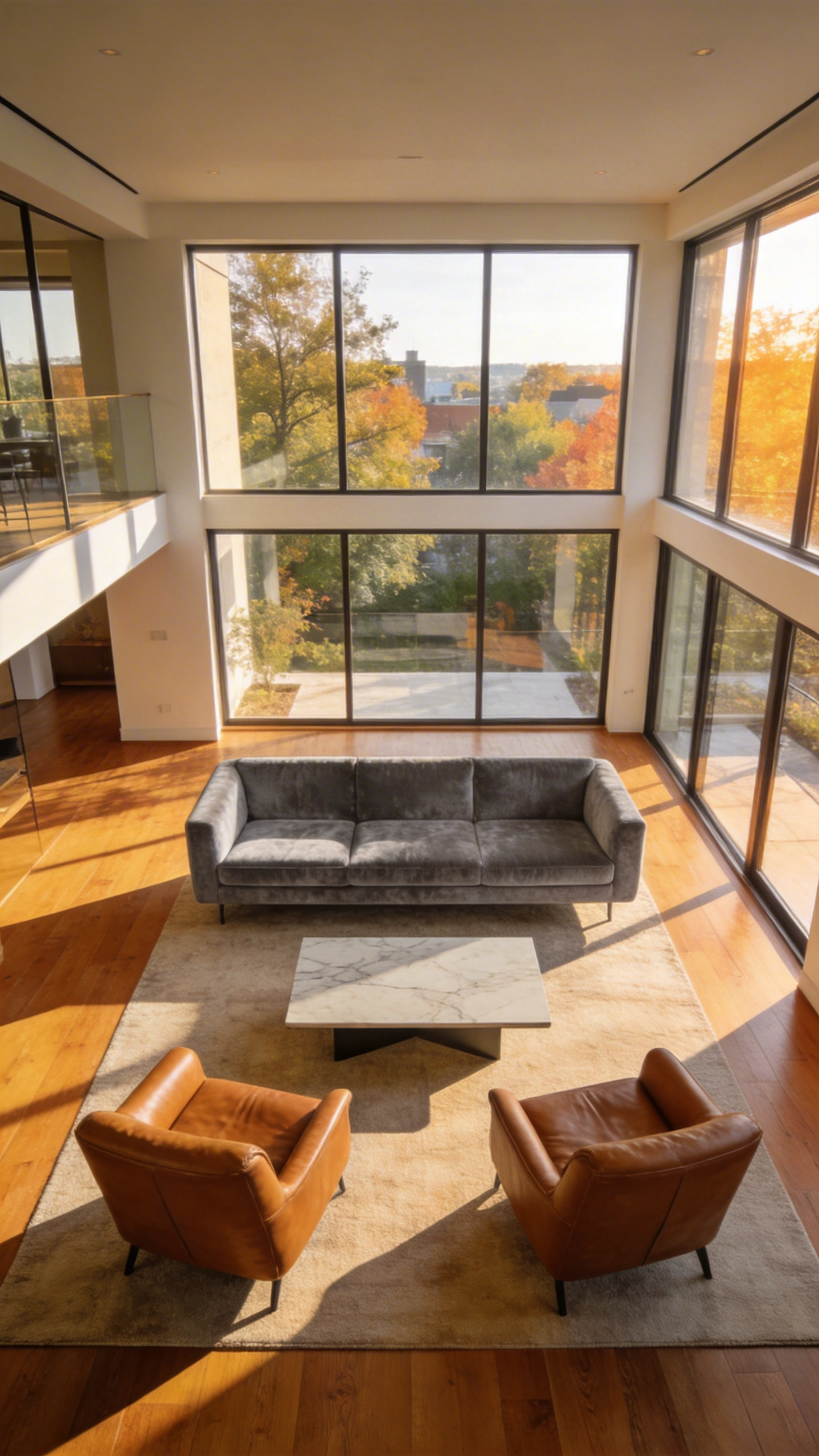
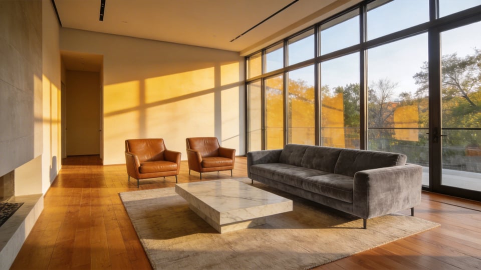
Next, select your “Anchor Piece” to determine the room’s visual volume. Historically, the hearth served this purpose, but today the sofa dictates the layout. For instance, a low-profile sofa implies airy openness, whereas deep-seated options feel grounded. Simultaneously, you must address the floor as an acoustic foundation. Hard surfaces often create cold, echoing environments. Therefore, utilize specific living room rug ideas where the fabric extends 6 to 12 inches beyond the sofa’s sides. Effectively, this adheres to the “All-Legs-On” rule and prevents the floating “postage stamp” effect.
Finally, map the “Light Skeleton” against the room’s natural circadian rhythm. In fact, identifying “dead corners” helps you place task lighting where the sun fades. Select “Investment Neutrals” for these large foundational items. Ultimately, following the 60-30-10 color rule ensures your canvas remains timeless for decades.
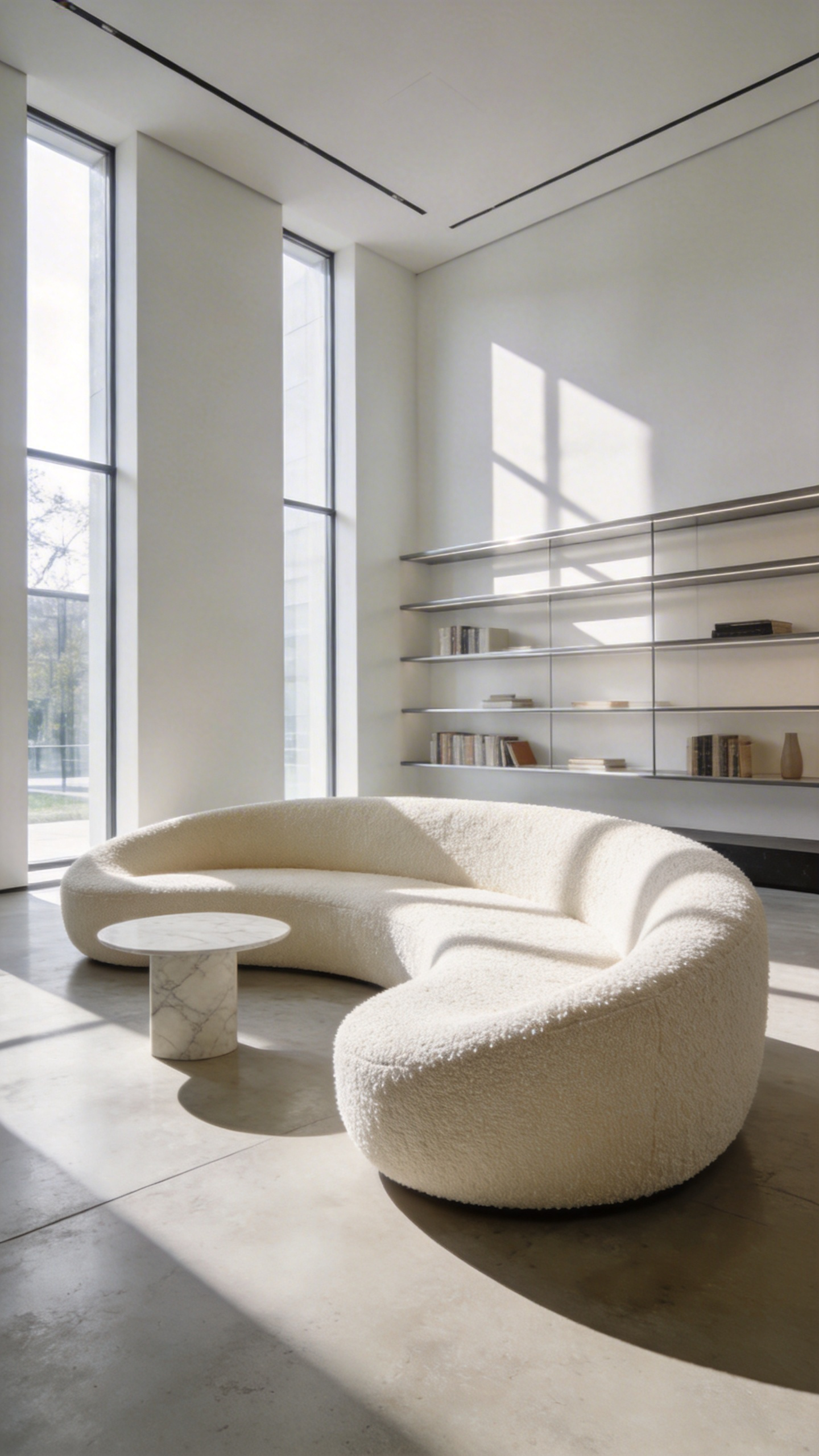
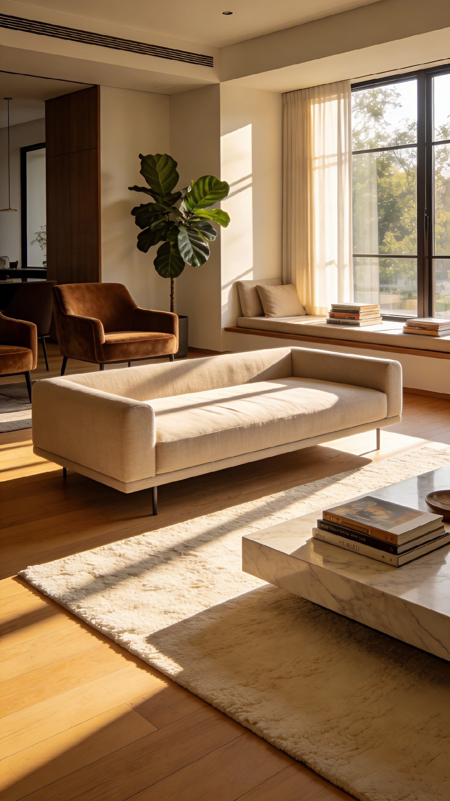
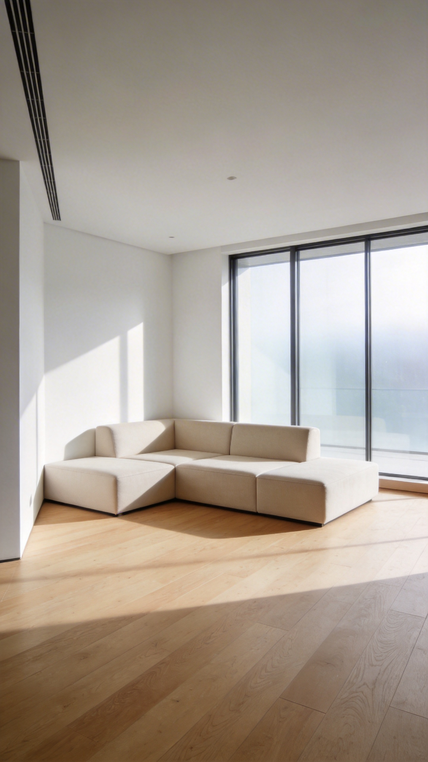
1. Grounding the Space: The Low-Profile Modular System
The low-profile modular system is more than just a contemporary trend. It represents a radical shift in how we perceive interior volume. Italian architect Mario Bellini introduced this concept to break the “stagnant stereotypes” of traditional seating. He viewed furniture as “enormous pixels” meant to be rearranged to match shifting lifestyles. Consequently, this design choice fundamentally alters the room’s architecture.
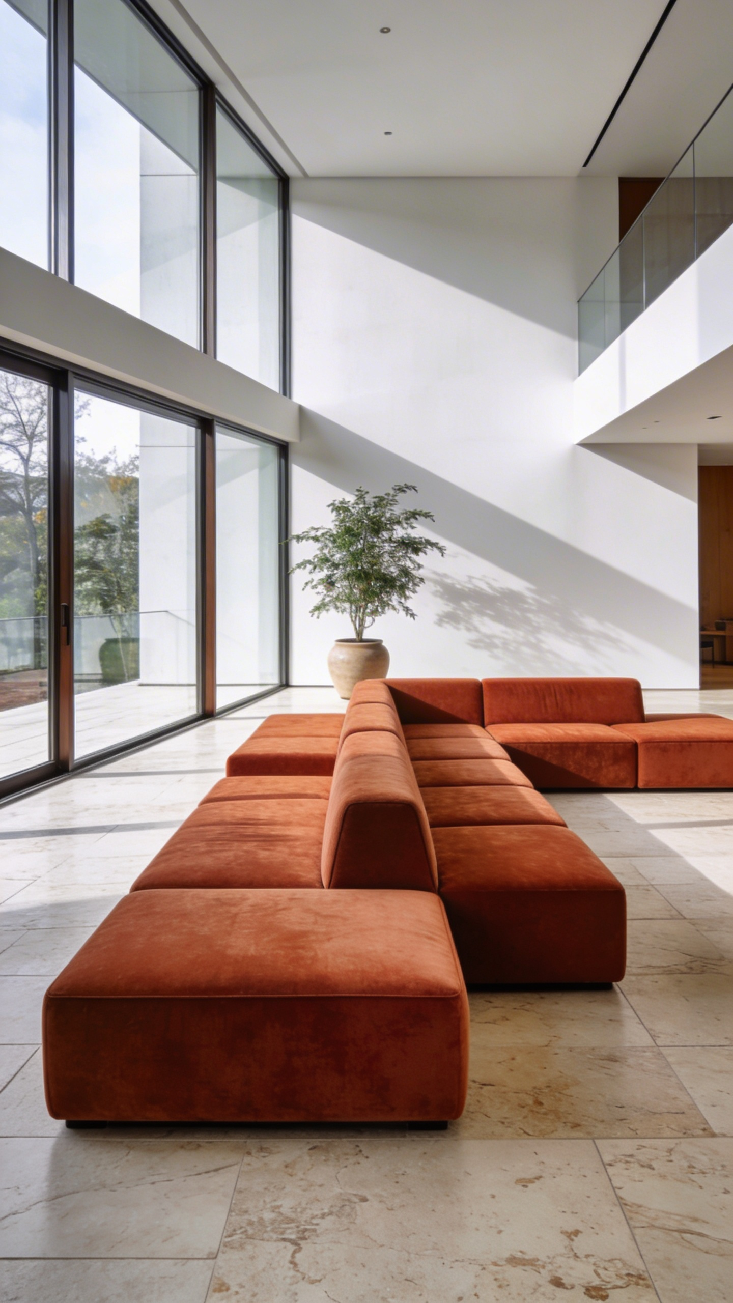
By keeping the primary mass below 30 inches, you successfully manipulate the “sightline strategy.” As a result, standard 8-foot ceilings suddenly feel significantly taller. This creates a “skyward” effect that draws the eye to your wall-mounted art. Technically, experts refer to this as the “2:3 proportion.” Therefore, furniture should occupy only the bottom third of the vertical wall space.
However, this lack of rigid structure demands rich materiality. Without legs, a smooth fabric might visually resemble a simple gym mat. Instead, choose high-texture fabrics like heavy-grain leather or mohair velvet to add visual weight. These dense materials act as acoustic baffles in open spaces. Ultimately, they create a hushed, intimate atmosphere perfect for viewing art and relaxing.
2. The ‘Floating’ Layout: Defining Zones with Oversized Rugs
The “floating” layout effectively solves the spatial challenges of modern open-concept living. Walls once defined rooms, but today, we often face a “boundary crisis.” Furniture can feel lost in a vast sea of flooring. To fix this, designers use oversized rugs as surrogate walls to create an intentional “Island Effect.” Specifically, this strategy relies on the “All Legs On” rule. Every piece of furniture should sit entirely on the rug to look anchored. Otherwise, the grouping may appear unmoored, as if falling off a too-small platform.
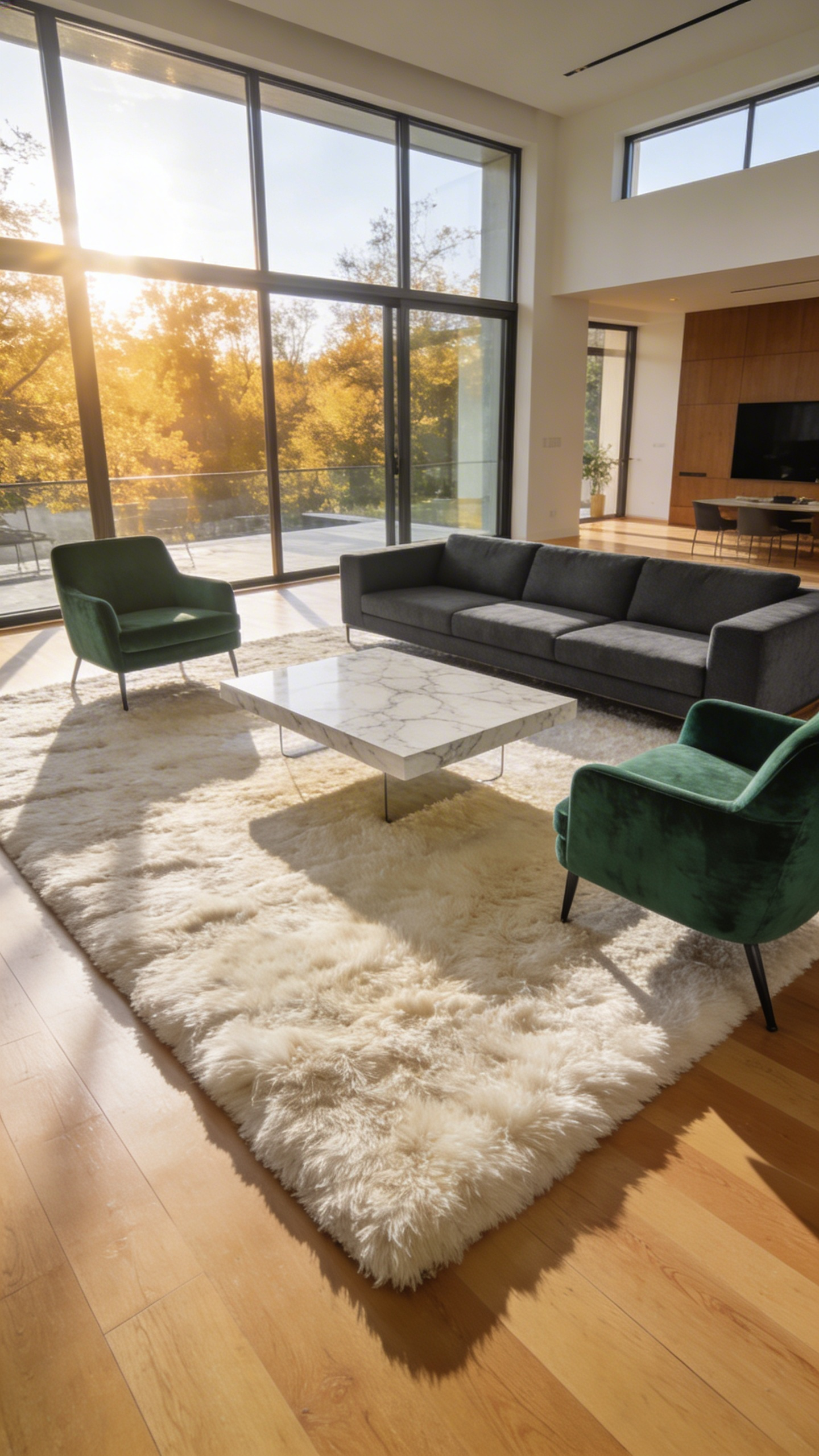
Beyond aesthetics, this layout offers significant acoustic benefits regarding “flutter echoes.” In fact, thick pile rugs act as “soft architecture.” They absorb ambient reverberation and footfall noise. This creates a quiet, intimate zone for conversation within a large, hard-surfaced room. Furthermore, the layout establishes clear traffic patterns through the use of negative space. By floating the sofa, you create a walkway behind it, effectively preserving the conversational sanctuary.
Finally, correct placement requires technical precision regarding the “frame” of the flooring. Ideally, leave 8 to 12 inches of bare floor between the rug and the walls. This “breathable” border ensures the rug defines a distinct zone rather than resembling wall-to-wall carpet. Therefore, the rug provides the necessary gravitational pull to turn a cavernous space into a home.
3. Architecture as Furniture: Bespoke Built-in Shelving
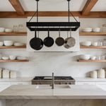
Bespoke built-ins transform standard storage into fundamental structural art. Historically, furniture served as a portable commodity. However, Modernist architects like Frank Lloyd Wright championed a different approach. Shelving became a permanent extension of the home’s bones rather than an afterthought. This integration effectively eliminates “visual friction.” Freestanding units often create awkward gaps that collect dust and shadows. In contrast, floor-to-ceiling millwork mimics the wall’s plane perfectly. Therefore, the room feels larger and significantly quieter. The shelving recedes, allowing the architecture itself to breathe.
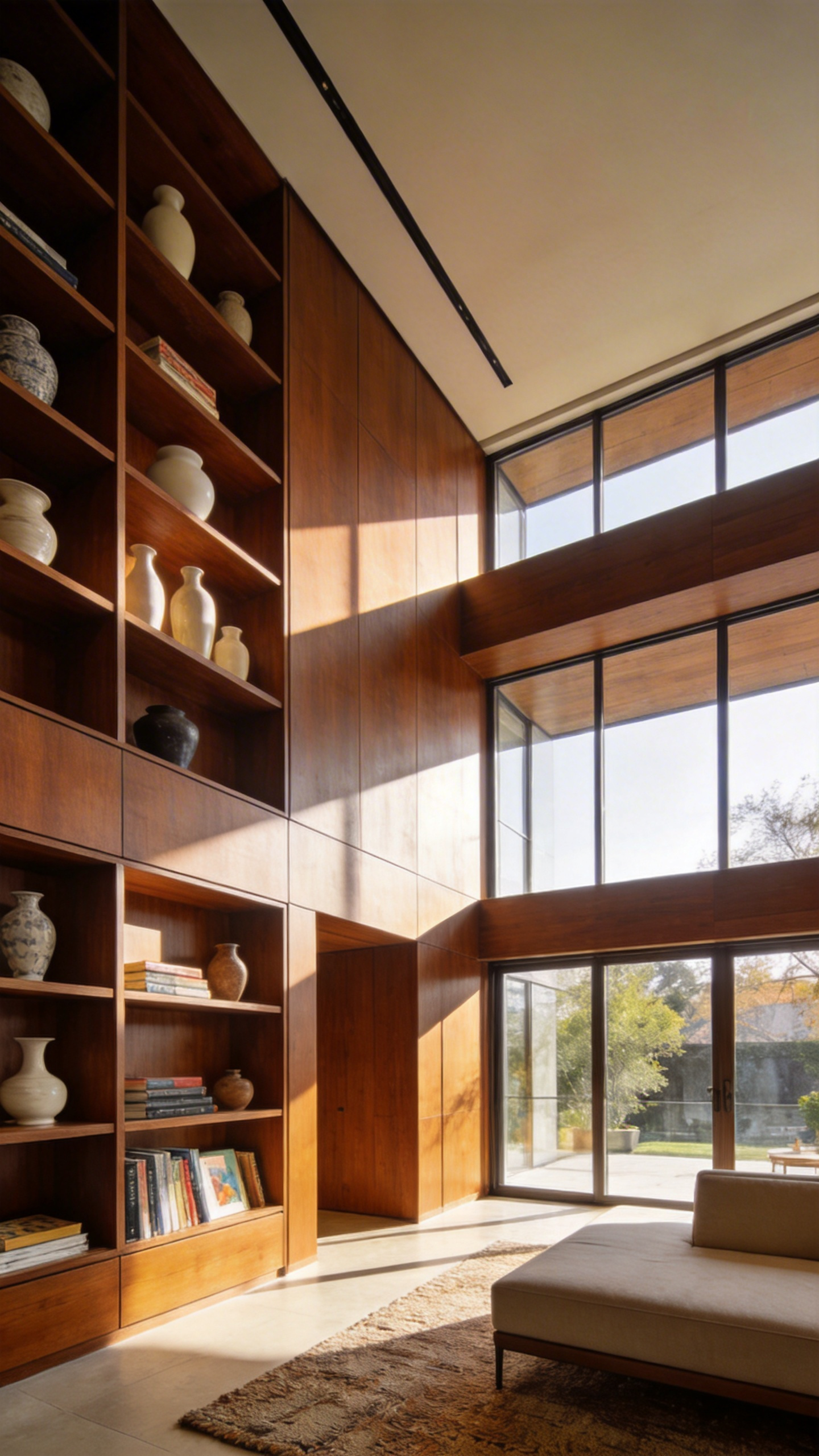
True luxury lies in the technical execution of these pieces. For instance, high-end joinery utilizes “shadow gaps” to create a sophisticated floating effect. Material honesty is paramount in contemporary design. Instead of basic painted MDF, designers often select rift-sawn oak or walnut. These materials provide a warm, tactile backdrop for display. From a curatorial perspective, these shelves function as a “personal museum.” Effectively, they serve as a deliberate frame for the homeowner’s identity.
Consequently, lighting becomes the critical “third layer” of the design. LED strips hidden in recessed channels graze the front of objects. Thus, a simple shelf transforms into a sculptural light installation at night. Additionally, custom cabinetry can seamlessly conceal technology. Pocket doors hide screens, preserving the room’s sanctuary atmosphere. Ultimately, this investment elevates a standard living room into a sophisticated library.
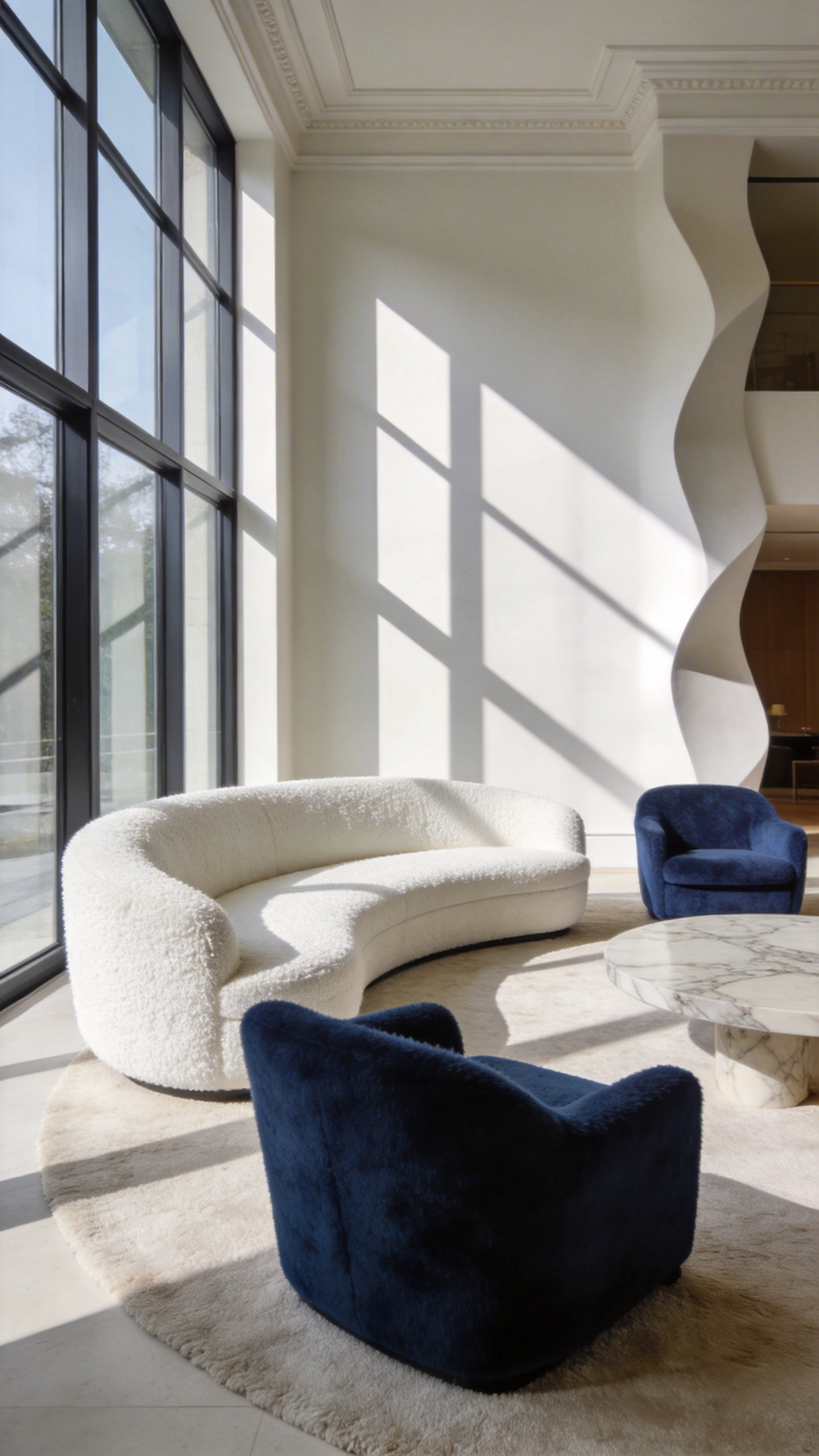
4. The Conversation Circle: Swivel Chairs for Dynamic Flow
The swivel chair has evolved significantly from Thomas Jefferson’s utilitarian “whirlygig.” In fact, it has become the “social butterfly” of modern living rooms. Mid-Century designers transformed these pieces from office tools into sculptural lounge icons. They now serve as strategic instruments for creating “sociopetal space.” Unlike static sofas, swivels break the rigid “sofa wall.” Specifically, they allow occupants to pivot 45 degrees for intimate conversation or 180 degrees to face the kitchen. This “micro-mobility” gives users agency, reducing the isolation often felt in large, open rooms.
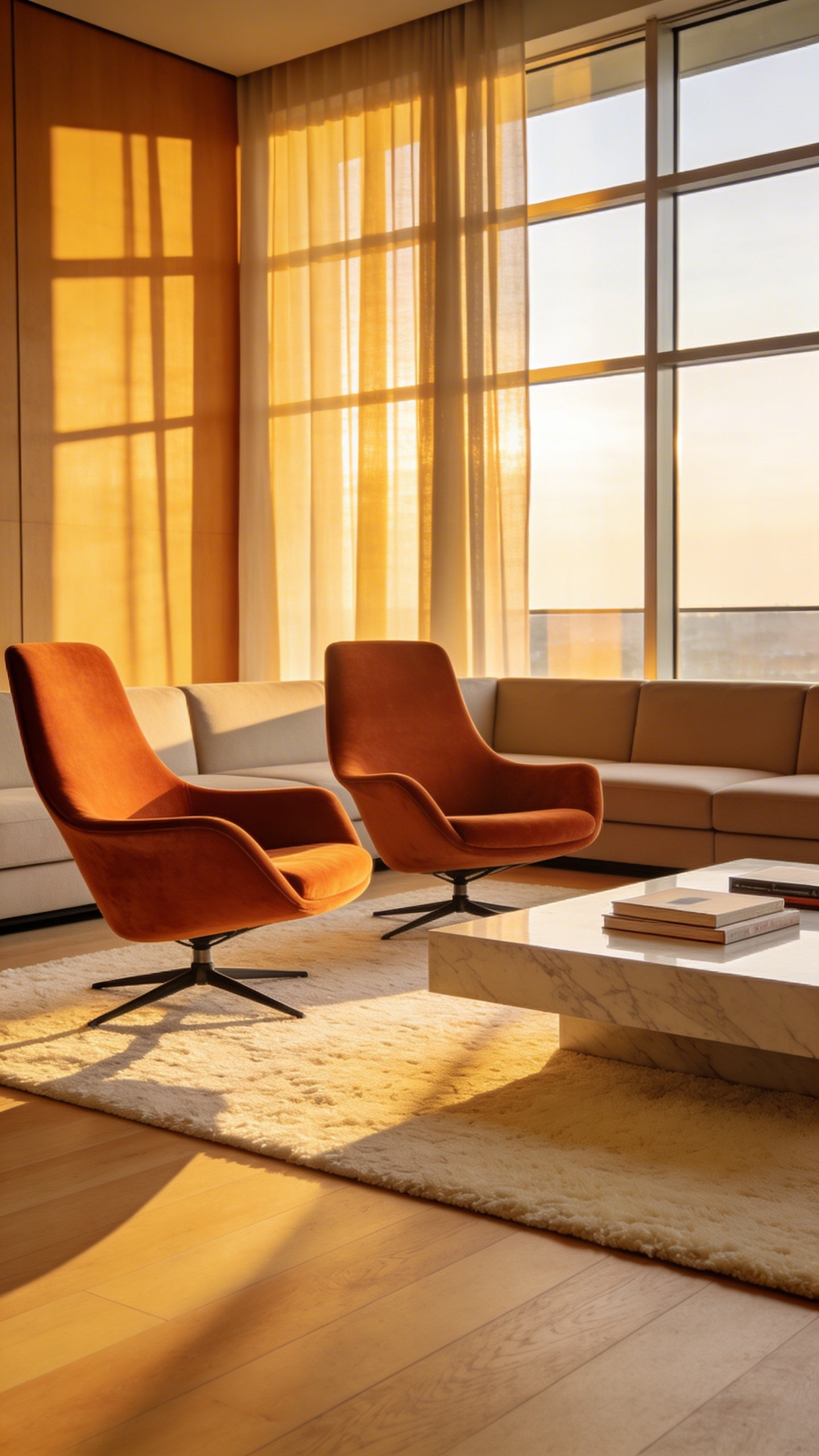
However, maintaining a curated aesthetic requires technical consideration. Chairs left at odd angles can disrupt visual symmetry. Therefore, high-end designs often feature a “Memory Return” mechanism. Essentially, this hardware automatically glides the chair back to its home position upon standing. Additionally, the base design alters the room’s architectural weight. Solid plinth bases offer a grounded, permanent feel compared to spindly legs.
Furthermore, material choices impact the sensory experience of the spin. Ideally, tactile fabrics like bouclé provide a necessary “grip” during rotation. This prevents the user from sliding, creating a sense of being cradled. Ultimately, these pieces act as a “hinge” within the home’s layout. For example, the trending “Modern Parlor” arrangement uses four swivels to prioritize connection over screens. As a result, the room functions dynamically, shifting instantly from a reading nook to a cocktail lounge.
Phase 2: Sculptural Interventions (Selecting Statement Pieces)
Phase two signals a shift from functional layout to a space that is further elevated with luxury living room decor and a curated atmosphere. Here, we stop filling space and start strategically disrupting it. A “sculptural intervention” acts as a vital visual anchor. Unlike standard decor, these pieces deliberately interrupt a room’s predictable lines. For instance, most homes are dominated by rigid right angles. Therefore, introducing a curved sofa provides necessary visual relief.
In gallery curation, we treat negative space as tangible material. Look for items where air travels through the form. A chair with an open frame prevents a small room from feeling clogged. Furthermore, material choice creates a distinct sensory experience. Instead of standard finishes, seek “tactile-resonant” textures like porous travertine or cast resin. Interestingly, neuroarchitecture suggests humans naturally prefer these curvaceous forms over sharp edges. Soft shapes lower cortisol, creating a true sanctuary.
Ultimately, successful curation often follows the “Rule of One.” Simply put, select a piece that feels slightly too large for its setting. An oversized, asymmetrical lamp effectively transforms a seating area into a sculptural zone. Additionally, consider how the object interacts with natural light. A perforated chair back acts as a shadow projector, altering the wall’s texture. Thus, your living room becomes a private gallery of collectible design.
5. Silhouette First: The Sculptural Accent Chair
Historically, chairs were valued strictly for their complex joinery and ornamentation. However, the Bauhaus movement radically shifted this perspective toward pure form. The modern accent chair has evolved from simple “domestic equipment” into a room’s definitive anchor. As a curator, I often classify these pieces as “Living Art.” Specifically, you should consider how your living room chair defines the space. It must be visually compelling from every angle, creating an experience “in the round.”
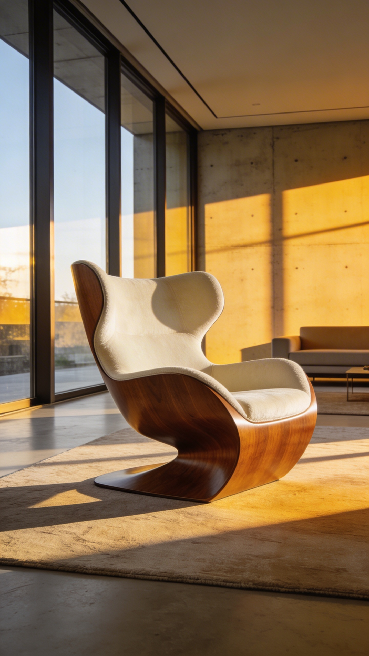
Ideally, look for pieces that break the traditional “forest of legs.” For instance, the Panton Chair revolutionized design by using a single, molded piece of plastic. This creates a fluid silhouette that resembles a frozen moment of movement. Furthermore, material choices significantly influence the room’s atmosphere. Faye Toogood’s Roly-Poly Chair uses raw fiberglass to create a soft, “human” narrative through chunky, rounded forms.
Psychology plays a crucial role in placement. Humans naturally gravitate toward curves, associating them with safety and warmth. Therefore, a piece like the Womb Chair provides a “cocooning” effect perfect for quiet corners. Conversely, asymmetrical forms like Bertoia’s designs can spark creativity in stagnant spaces. Nevertheless, functionality remains critical within a home environment. Ultimately, a sculptural chair must achieve “Ergonomic Intelligence.” It should cradle the body comfortably while serving as a provocative visual statement.
6. Asymmetry in Action: Organic-Shape Coffee Tables
Organic-shape coffee tables serve as strategic tools for spatial manipulation within a living area. They act as more than just functional surfaces. In fact, recent design studies suggest that curved designs can create up to 15% more perceived space compared to rectangular options. This visual expansion occurs because the human eye slides effortlessly over rounded edges. Conversely, sharp corners tend to stop the gaze, making a room’s boundaries feel rigid. Furthermore, these asymmetrical forms improve traffic flow by reducing collision points. Residents can move through the space without the awkward steps required by sharp angles.
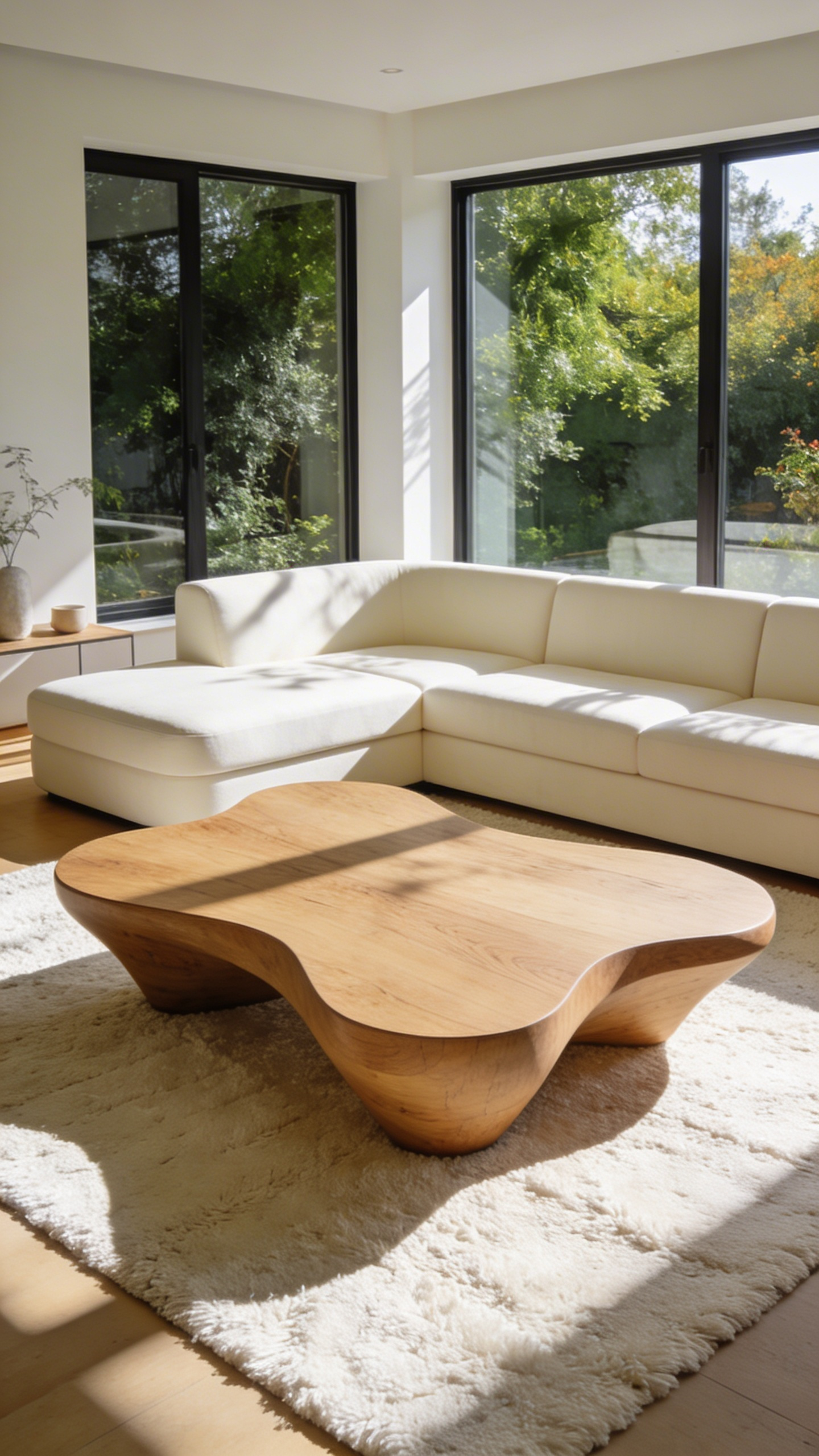
From a curator’s perspective, these pieces embody Isamu Noguchi’s famous assertion that “everything is sculpture.” Consequently, the table becomes a focal point rather than background noise. Often, this style celebrates high-craft materiality, such as live-edge wood or glass fiber reinforced concrete (GFRC). For instance, a designer might leave natural cracks visible to honor the Japanese concept of *Wabi-Sabi*, or beauty in imperfection. Thus, the piece creates varying vistas; it may appear solid from one angle yet ethereal from another.
Styling these unbalanced forms requires a departure from traditional centering. Instead, professionals utilize a “zoning” technique to maintain visual equilibrium. For example, you might offset a wide, heavy curve with a singular, tall vertical element on the opposing side. Additionally, grouping decor items in odd numbers keeps the eye moving across the surface. Practically, this organic approach offers significant safety benefits for households. Specifically, the lack of sharp corners creates a safer environment for children. Ultimately, these tables bridge the gap between strict minimalism and inviting, human warmth.
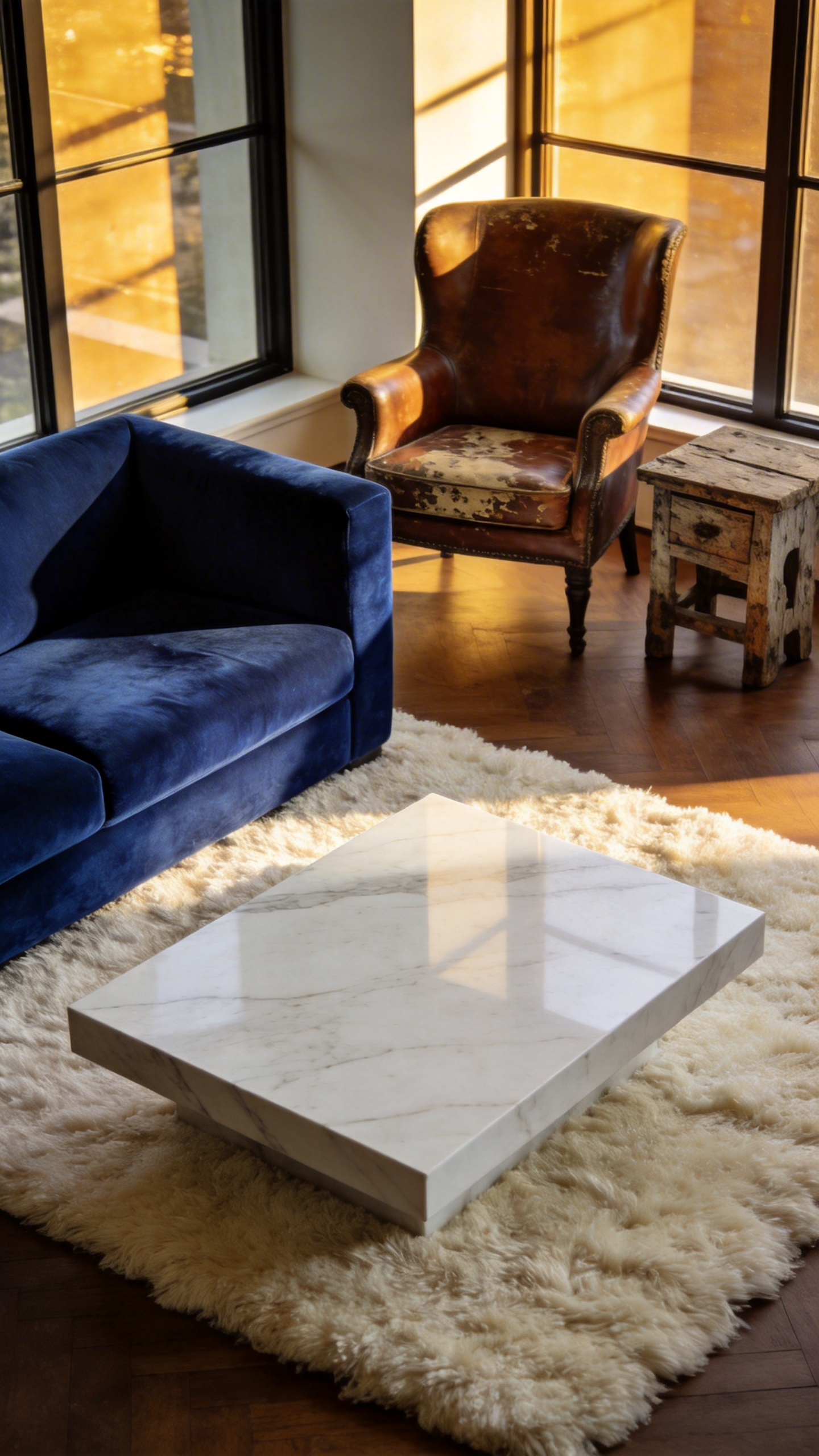
7. The Mixed-Material Console: Marble, Brass, and Walnut
The mixed-material console is more than a fleeting furniture trend. It represents a masterclass in sophisticated material dialogue. Designers often refer to this interaction as thermal and tactile balancing. Specifically, marble provides a cool, heavy anchor for the eye. Its mass offers a sense of permanence within a soft room. Conversely, walnut introduces a warm, organic counterpoint. While stone feels like the earth, walnut feels like skin. Finally, brass acts as the composition’s kinetic spark. It reflects light with a soft glow, preventing the piece from feeling static.
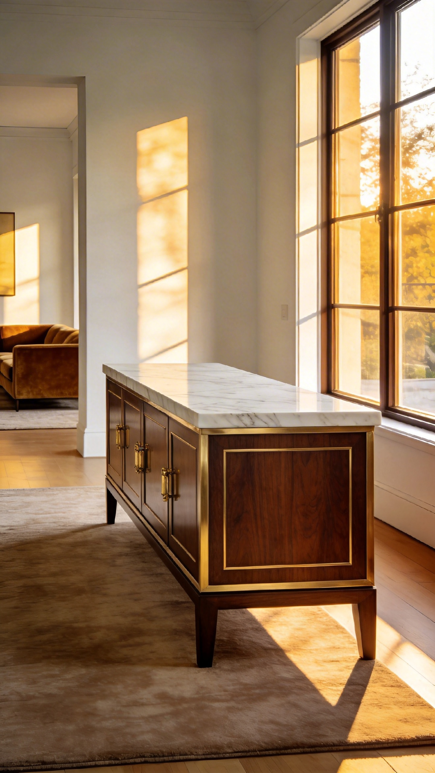
Beyond aesthetics, the construction requires architectural precision. For example, high-end makers often employ a “shadow gap.” This small recess separates the stone top from the wood frame. It allows the living wood to expand without cracking the marble. Additionally, this detail creates a gallery-like, floating effect. When placed in a living room, the console serves as a hero element. The white stone top acts as a natural light reflector. Therefore, it effectively brightens the “dead space” behind a sofa. Ultimately, these biophilic materials develop a rich patina over time. The console functions not just as furniture, but as a future heirloom of “Quiet Luxury.”
8. The Daybed: Bridging Formal and Casual Zones
The daybed functions as a unique design “chameleon” in modern interiors. It acts as a psychological mediator between formal elegance and casual comfort. Unlike a sofa designed for upright sitting, the daybed facilitates a “third posture.” This social recline offers a middle ground between active engagement and private rest. Consequently, placing one in a living room signals a “relaxed-yet-ready” atmosphere. It creates a space where guests can lounge without the lethargy associated with a bedroom.
Historically, this piece boasts a serious pedigree. Modernist icons like Eileen Gray stripped the daybed of sleeping associations. Instead, they treated it as a sculptural object that floats freely in space. From a curatorial perspective, a daybed serves as a powerful “visual low-pass filter.” Because they are often backless, they define zones without cutting the room’s sightlines. Thus, light flows uninterrupted across the space.
Furthermore, the daybed functions as a structural pivot point. A guest can face the formal conversation circle or flip to view art on the opposite wall. To master this balance, pay attention to styling formulas. For a formal look, utilize bolster pillows for architectural structure. Conversely, layering chunky-knit wool or asymmetrical velvet cushions introduces a casual softness. Ultimately, materials like heavy-grain leather bridge the gap, offering luxury with tactile honesty.
9. Vertical Sculpture: Floor Lamps that Double as Art
In the sophisticated living room, the floor lamp has transcended its origins. It has become a “vertical sculpture.” Designers use this functional art to anchor a room’s spatial composition. While sofas provide horizontal stability, a sculptural lamp introduces a necessary “counter-pivot.” Tall, slender forms draw the eye upward. This technique, known as “vertical expansion,” creates a powerful illusion of height.
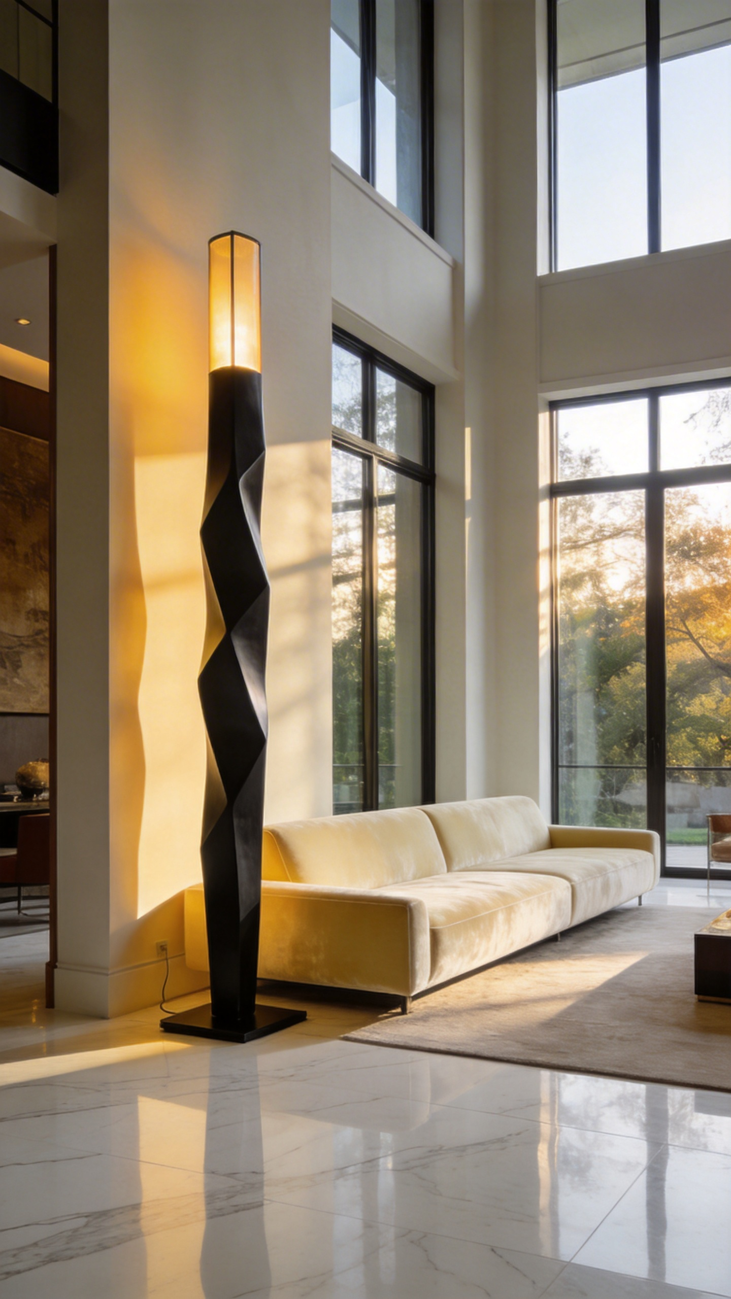
Beyond structure, these pieces function as “soft architecture.” For instance, a large arc lamp effectively brackets a seating area. It defines the lounge zone without obstructing sightlines like a wall would. Furthermore, these “luminous totems” command attention even when powered down. In daylight, they act as three-dimensional drawings or silhouettes against the wall.
Consider the material poetry of Isamu Noguchi’s *Akari* series. The fragile washi paper contrasts beautifully against heavy furniture. Similarly, the iconic *Arco* lamp balances a heavy marble base with a sweeping steel arm. Ultimately, such distinct materiality adds tactile luxury to the space. Therefore, choose a lamp that serves as a conversation piece about design history.
Phase 3: Texture and Patina (Layering Complexity)
True design depth transforms a space from a sterile showroom into a “lived-in masterpiece.” This transition relies on a concept called “Tactile Dissonance.” A living room filled solely with soft velvet creates a sensory vacuum. Therefore, you must introduce opposing forces to spark visual interest. For instance, placing a cold marble table near a plush rug actually heightens the furniture’s softness. Consequently, the space becomes visually active through “haptic perception,” or the ability to “see” through touch.
Next, consider the narrative value of aging. Authentic patina transforms furniture from mere products into heirlooms. Unlike cheap faux-distressing, materials like unlacquered brass or vegetable-tanned leather improve naturally with time. In fact, they capture the home’s unique history through oxidation and wear. Furthermore, these imperfections interact beautifully with lighting. Flat, mass-produced items absorb light uniformly, making a room feel two-dimensional. Conversely, a hammered copper lamp or fluted wood creates “micro-shadows.” Thus, the room gains rhythm and visual movement as the sun sets.
Finally, embrace “Material Honesty” within the room’s architectural envelope. Currently, high-end design favors limewash over flat paint to mimic the mottled look of old-world villas. When a textured sofa sits against a lime-washed wall, the boundary between furniture and architecture blurs. Ultimately, this “Total Texture” approach shifts the focus from simply buying pieces to curating an enduring atmosphere.
10. Tactile Luxury: Integrating Bouclé and Mohair Seating
In the luxury living room, design shifts from purely visual impacts to tactile comfort. This “Quiet Luxury” approach values the “hand” of the fabric over brand names. Therefore, integrating bouclé and mohair seating offers a masterclass in sensory balance. Fundamentally, this pairing relies on the architectural interplay between light and shadow.
First, consider bouclé as your matte anchor. Because of its irregular, looped yarns, this fabric effectively absorbs light. Consequently, it highlights the silhouette of organic, sculptural furniture without distracting reflections. In contrast, mohair acts as a lustrous highlight. Sourced from Angora goats, these fibers possess a natural sheen that catches the light like liquid. Thus, a jewel-toned mohair armchair adds dynamic movement against a neutral bouclé sofa.
However, successful integration requires the “Heavy/Light” rule to avoid a suffocating atmosphere. Ideally, you should balance these heavy-pile textiles with “hard” materials. For example, place a travertine coffee table between a bouclé sectional and a mohair ottoman. Furthermore, select your colors strategically to maximize impact. While bouclé excels in creamy neutrals, mohair’s unique structure accepts saturated dyes like emerald or rust beautifully.
Finally, consider longevity when curating these investment pieces. Notably, mohair is the gold standard for durability, resisting crushing far better than velvet. Conversely, bouclé loops can catch on jewelry, so performance blends are often safer for high-traffic areas. Ultimately, combining these textures creates a room that feels both expertly curated and comfortably lived-in.
11. The ‘Jewelry’ of the Room: Brass and Stone Drink Tables
In interior design, brass and stone drink tables function like a statement necklace. They act as the final layer of a room’s composition. Because of their small scale, designers often treat them as an “economy of decadence.” Consequently, you can introduce hyper-luxurious materials that would feel overwhelming on larger furniture. For instance, a tabletop of translucent Onyx or glowing Agate adds a gemstone-like quality. Additionally, high-end tables are often bottom-heavy by design. Thus, guests feel the substantial “gravity” of quality materials despite the table’s small footprint.
Beyond visuals, these pieces create a specific sensory dialogue. Notably, there is a delightful contrast between resting a hand on “cold” marble and seeing “warm” brass. The metal acts as a light reflector. In fact, a polished brass pedestal bounces warm light into dark corners, creating a “golden hour” effect. Conversely, natural stone absorbs this light, providing a visual anchor that grounds the metallic sparkle.
Functionally, these tables solve a modern layout dilemma. Since contemporary sofas are often deep, a central coffee table can feel unreachable. Therefore, the drink table serves as a “movable anchor” that travels to the guest. Moreover, many high-end pieces feature unlacquered brass. Over time, this “living finish” develops a unique patina. Ultimately, while the stone remains immutable, the metal records the history of the home.
12. The Curated Surface: Styling Ottomans as Coffee Tables
Styling an ottoman as a central coffee table transforms a living area. It shifts the atmosphere from a rigid parlor to an inviting sanctuary. Historically, these pieces served as social hubs, prioritizing human connection over decoration. Modern design embraces this “workhorse” for its ability to soften angular room layouts.
However, a soft surface requires a deliberate foundation. You must apply the “Anchor Principle” by placing a heavy tray on the upholstery. This rigid sub-surface provides stability for drinks while visually organizing the space. Furthermore, a successful “curated surface” relies on tactile tension. Specifically, pair buttery leather with cool materials like marble or glass. Conversely, ground fabric-skirted ottomans with industrial textures like aged iron or dark wood.
Visual balance is equally crucial. Because ottomans possess a low center of gravity, a room can easily feel bottom-heavy. To counteract this, introduce verticality. For instance, add a tall sculptural vase or taper candles to draw the eye upward. Additionally, embrace the “Library Style” by arranging distinct stacks of art books. This approach suggests a narrative of discovery rather than static display. Finally, consider layering a C-table over the edge. This architectural touch ensures functionality without sacrificing the ottoman’s lived-in comfort.
13. Vintage Integration: The 70/30 Modern-to-Antique Ratio
The 70/30 ratio serves as a sophisticated design framework rather than a mere decorative suggestion. It acts as a curatorial strategy to solve the common “Showroom vs. Museum” dilemma. Ideally, your living room layout should comprise 70% modern styles and 30% vintage or antique elements. This precise imbalance creates a necessary sense of “visual friction.”
Without this contrast, a purely modern room often feels predictable and uniform. However, the introduction of antique components acts as a visual disruptor. For instance, consider pairing a sleek, low-profile Italian leather sofa with a 19th-century French fruitwood coffee table. The modern “precision” of the sofa highlights the antique’s hand-carved “patina.” Therefore, the eye must slow down to process the unique silhouette and tactile history.
To execute this effectively, you must distinguish between the room’s “skeleton” and its “soul.” Generally, the 70% represents the architectural furniture, such as large sectionals or media consoles. These pieces should remain modern to ensure ergonomic comfort and usability. Conversely, the 30% represents the room’s character. These are statement pieces, like a mid-century bar cabinet or a Victorian mirror, that provide depth.
Ultimately, this approach shifts a living room from a static display to a rich biography. Every scratch on a vintage piece tells a story that modern materials cannot replicate. Thus, the antique elements ground the space with sensory warmth. By keeping the styles unequal, you establish a clear narrative where the past supports the present.
Phase 4: Advanced Curation (Mastery Integration)
Phase 4 represents the sophisticated transition from a furnished room to a fully integrated environment. Design choices shift from following trends to prioritizing environmental psychology and storytelling. Specifically, the goal is to reduce “environmental load” through neuroaesthetic zoning. Therefore, we prioritize layouts that offer “cognitive ease” for the brain.
Instead of blocking sightlines, use low-profile furniture to maintain visual openness. For example, integrate a “Refuge Seat” positioned with a commanding view of the room’s entrance. As a result, this placement satisfies primal safety instincts, allowing your nervous system to fully down-regulate.
Furthermore, advanced curation acts as a deliberate narrative tool. A space filled entirely with new items often feels hollow. Thus, apply the “80/20 Rule of Curation.” Pair 80% clean, modern bases with 20% “Soul Pieces,” such as an 18th-century chest or bespoke joinery. This synthesis creates a dialogue between eras, serving as a physical timeline of your evolution.
Finally, consider the sensory experience. Mastery involves prioritizing tactile feedback over mere visuals. In fact, touching natural materials like raw wood or stone triggers the parasympathetic nervous system. By integrating these elements, the living room transforms into a restorative ecosystem rather than a showroom.
14. Negative Space: The Power of Empty Corners
In the world of curated interiors, empty space acts as a deliberate design element. This approach mirrors the Japanese concept of *Ma*, or the meaningful pause between objects. Therefore, an empty corner is never a wasted opportunity. Instead, it creates a necessary place for the mind to rest. Consequently, this negative space transforms nearby furniture into a distinct focal point.
Designers often refer to this dynamic as the “Luxury Whitespace Equation.” In fact, research suggests that surrounding objects with emptiness increases their perceived value significantly. Thus, a solitary armchair feels like a museum-quality sculpture rather than just a utilitarian object. Conversely, clutter creates “visual noise” and increases cognitive load. Therefore, maintaining empty corners serves a vital psychological function by reducing mental fatigue.
Additionally, these open areas improve the room’s energetic atmosphere. In Feng Shui, clear corners allow *Sheng Qi*, or positive life energy, to circulate freely. To enhance this effect, you might select “dematerialized” furniture, such as a wire-frame chair. Ultimately, negative space separates a cluttered room from a high-end sanctuary.
15. The Pedestal Strategy: Elevating Greenery and Sculpture
In the gallery world, we rely heavily on the “veneration effect.” Essentially, physically elevating an object signals its worthiness of deep contemplation. Therefore, you should apply this psychology to your living room. Specifically, raising a simple terracotta pot to eye level—roughly 57 to 60 inches—instantly signals high value. Consequently, the room shifts from a flat collection of furniture to a curated experience.
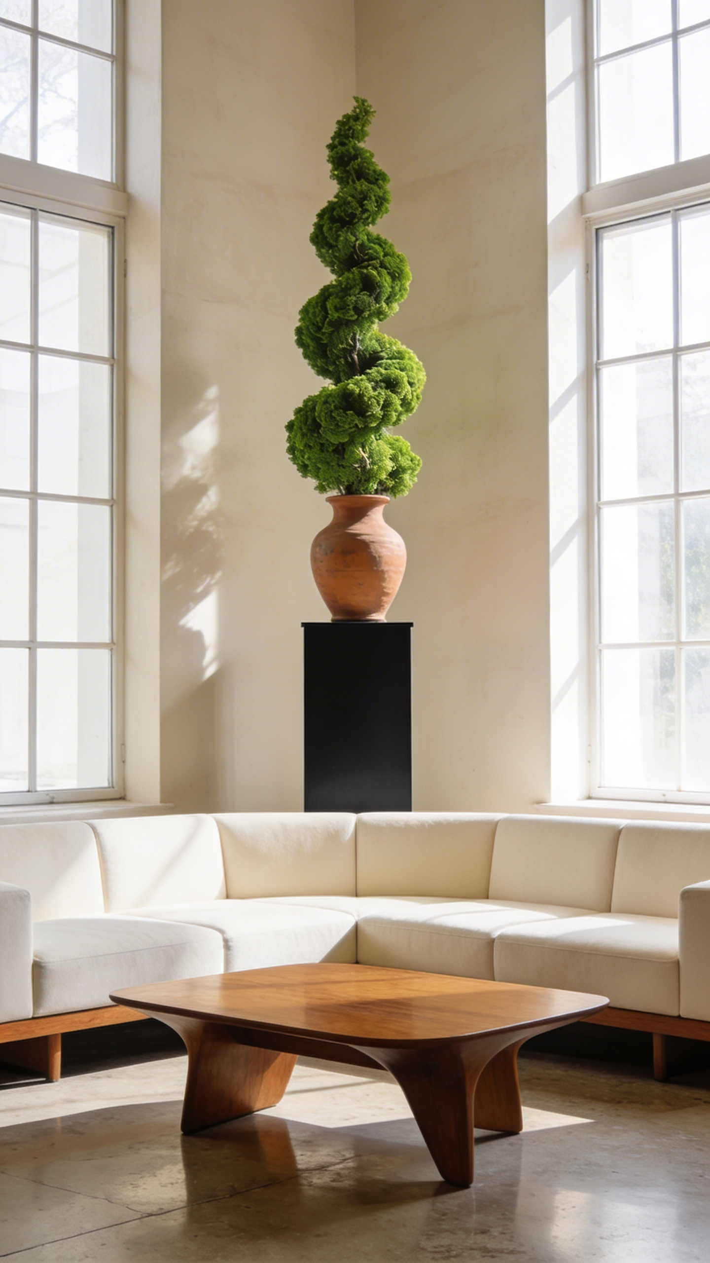
Furthermore, this strategy corrects “flat proportions.” Most standard seating creates a monotonous horizontal line. However, introducing pedestals breaks this plane. For the best result, utilize the “Rule of Three” with varying heights. Thus, you force the eye to dance vertically rather than settling on the floor. In fact, a slim pedestal acts as a “cheat code” for filling awkward, dead corners without consuming floor space.
Next, consider material tension. Expert curation often pairs “cold” supports with “living” art. For example, place a soft, trailing String of Hearts atop a rough-hewn volcanic rock plinth. Conversely, use a transparent acrylic base to make heavy bronze sculptures appear weightless. This contrast transforms the pedestal from a mere stand into an integral part of the artwork.
Finally, do not overlook technical nuance. Ideally, select pedestals with a “shadow gap” at the base. This small recess creates a floating aesthetic, preventing the piece from feeling clunky. Additionally, incorporate integrated LED uplighting. This illuminates texture and casts dramatic, canopy-like shadows on the ceiling. However, prioritize safety alongside style. Technically, the base width must be at least one-third of the height to ensure stability. Ultimately, this approach moves beyond Victorian clutter toward modern, intentional curation.
16. Lighting as Mood: Layering Ambient and Task Fixtures
Modern interiors are currently rejecting the “Big Light.” Harsh overhead fixtures are vanishing from sophisticated living spaces. Instead, design now favors pockets of low-level illumination. Historically, bright rooms signaled hygiene and progress. However, today’s focus is strictly human-centric. Specifically, “pooling” light triggers the parasympathetic nervous system. This induces a deep sense of safety. In contrast, overhead “flood” lighting stimulates high alertness. Therefore, you should keep ambient sources at eye level to mimic the setting sun.
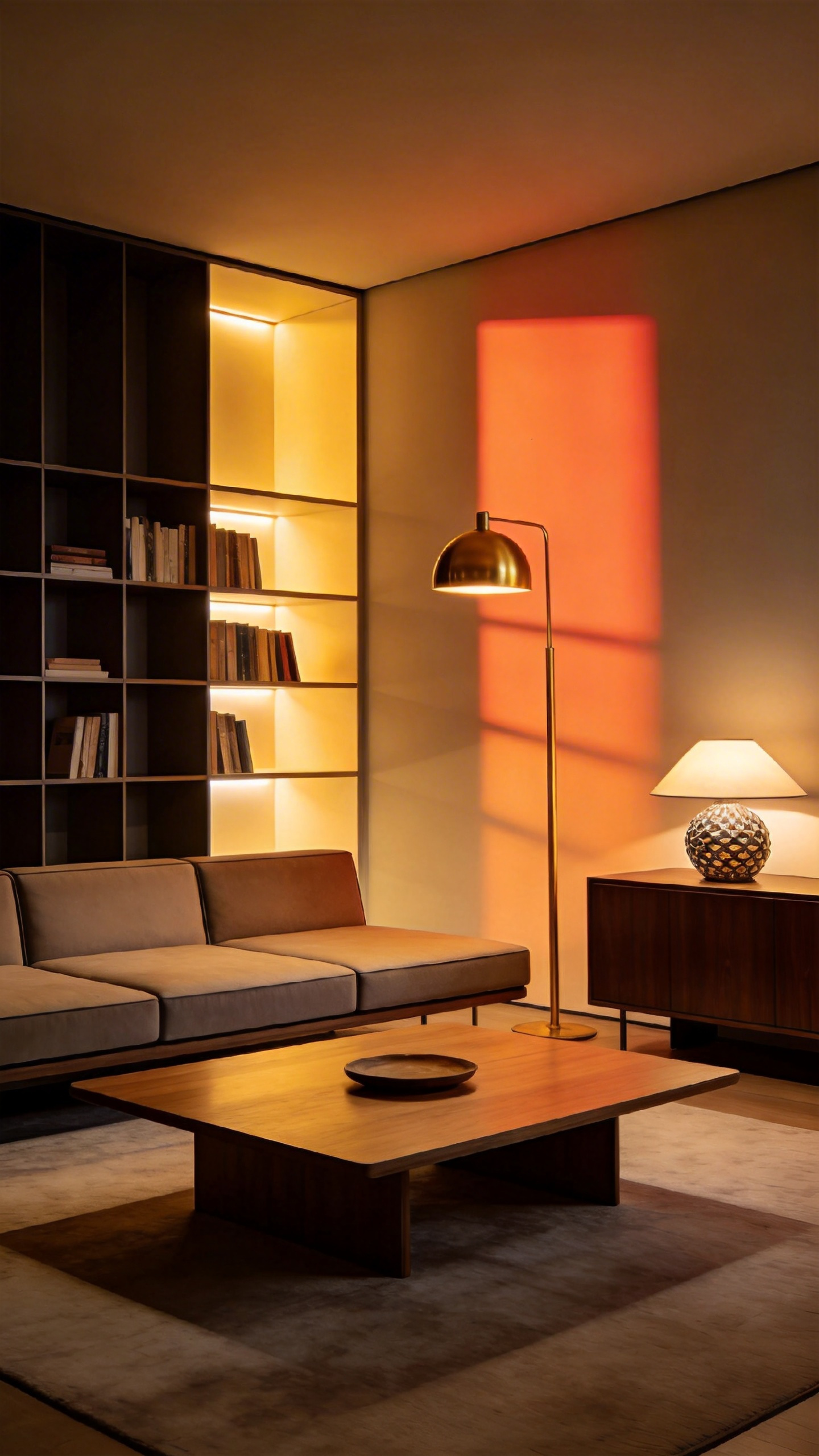
Lighting must act as a silent collaborator with your furniture. For instance, large sectionals often suffer from dark centers. To address this, introduce an oversized arched lamp. This creates a task-light island without requiring ceiling wiring. Similarly, consider how light interacts with materials. Velvet fabric naturally acts as a “light sponge.” However, low-angled lamps create a “wall grazing” effect. This reveals the fabric’s nap and sheen. Furthermore, warm bulbs enhance wood grain. They create soft, warm shadows that physically ground the room.
Ultimately, achieving a curated mood requires specific technical ratios. Ideally, aim for a 3:1 balance. Here, task lighting is roughly three times brighter than your ambient light. This contrast creates the visual drama seen in galleries. Additionally, this supports the “Blue Hour” transition. Thus, you transform a merely functional room into a narrative experience.
17. The Art-Centric Arrangement: Orienting Furniture Toward Wall Features
Transforming a living room requires more than simply placing a sofa. An art-centric arrangement turns a social hub into a “narrative sanctuary.” By orienting furniture toward a statement wall, you create an “internal vista” for the eye. Consequently, this layout prioritizes “visual rest” and offers a necessary break from digital screens.
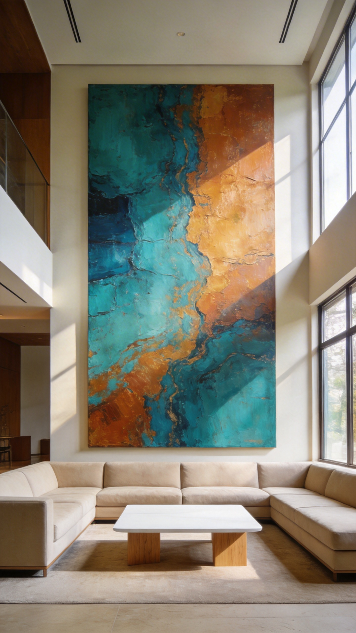
To achieve this, first select “mute” furniture. Ideally, use low-profile, neutral pieces that act as a quiet plinth. This ensures the artwork remains the undisputed protagonist. Furthermore, correct vertical placement is essential for this effect. While standard hanging height is 57 inches, consider the seated viewer. Therefore, drop the artwork 2 to 3 inches lower to align with a sitting eye level. Simultaneously, keep the frame’s bottom edge 6 to 10 inches above the sofa. This maintains a “visual umbilical cord” between the furniture and the wall.
Next, address the atmosphere with lighting. For large paintings, use “wall washing” to bathe the surface in uniform light. Conversely, apply “wall grazing” for textured architectural features to create dramatic shadows. Finally, prevent the “Museum Effect” by angling chairs 45 degrees toward the center. Thus, the space remains inviting for conversation while honoring the art.
Frequently Asked Questions
What furniture is essential for a luxury living room?
A luxury living room is defined by high-quality, investment-grade pieces that emphasize materiality and silhouette. Key essentials include a low-profile modular sofa for architectural grounding, a pair of sculptural accent chairs to serve as living art, and a mixed-material coffee table (such as marble and brass). Prioritizing bespoke craftsmanship over mass-produced sets is vital for achieving a curated aesthetic.
How do I choose the right scale for living room furniture?
Scaling requires balancing the furniture mass with the room’s volume. A common professional rule is the 2:3 proportion, where furniture occupies roughly the bottom third of the vertical wall space. Additionally, ensure there is “visual oxygen” by leaving enough negative space around statement pieces. In open-plan layouts, use oversized rugs to anchor the furniture and define specific zones without physical walls.
What are the current trends in high-end living room design?
The current luxury market is moving away from “matching sets” toward eclectic curation. Key trends include the 70/30 modern-to-antique ratio, the use of high-texture fabrics like bouclé and mohair, and organic, asymmetrical furniture shapes. Designers are also favoring “quiet luxury,” which prioritizes tactile comfort and natural patinas over flashy branding.
Conclusion: From Decoration to Collection
Viewing furniture merely as decoration is a concept of the past. Your living room furniture ideas should evolve into a curated gallery of functional art. The modern home relies on unique “hero” pieces rather than matching suites to tell a story. This shift prioritizes tactile materials that age with dignity over mass-produced perfection. Consequently, investing in collectible design transforms your space into a true financial and emotional asset. Ultimately, this approach honors both craftsmanship and sustainability by rejecting disposable culture.
Moreover, adopting this mindset fosters a much deeper connection to your environment. Living with artful objects actually reduces stress and invites mindful interaction. Thus, your home becomes a sanctuary of personal expression rather than just a utility. To begin, audit your current space for items that lack distinct character. Replace one generic item with a piece that offers provenance and sensory depth. Finally, treat your living room not just as a lounge, but as a visual diary.