You know what people always ask me about designing a home office? It’s not about the desk, not really. It’s not even about the ergonomic chair, though we get there. The question that comes up, again and again, is about the kitchen. They’ll say, “Jesse, my kitchen is right off my workspace, and it’s a disaster. It’s draining my energy before I even log on.” And they’re right to ask. In the new world of work, your kitchen isn’t just where you cook. It’s your break room, your coffee bar, your social hub, and the backdrop to your life—and your focus.
Getting the color right in your kitchen is about so much more than making it look pretty for guests. It’s a strategic investment in your daily productivity and well-being. A chaotic, poorly-lit, or visually jarring kitchen creates low-grade stress and decision fatigue that bleeds into your entire day. A well-designed one, starting with the right paint, becomes a space that recharges you. It makes your breaks more restful and your transitions back to work more seamless. Let’s cut through the noise and talk about how to get this right, so your kitchen works for you, not against you.
Planning Your Perfect Kitchen Palette
Before you even think about a color chip, you need a plan. Most people get this backward. They find a color they love in a magazine and try to force it into a space where it just won’t work. We’re not doing that. We’re going to be strategic, starting with the unchangeable facts of your room.
1. Assess Natural Light Sources for Optimal Color Choice
The biggest mistake you can make is choosing a color in a brightly lit store and expecting it to look the same in your kitchen. Your kitchen’s light is unique. A north-facing room gets cool, indirect light that can make a lovely warm gray look like sad, purple-ish cement. A south-facing room gets intense, warm light that can turn a soft cream into a blinding, sickly yellow by midday. Light isn’t just a detail; it’s half the color.
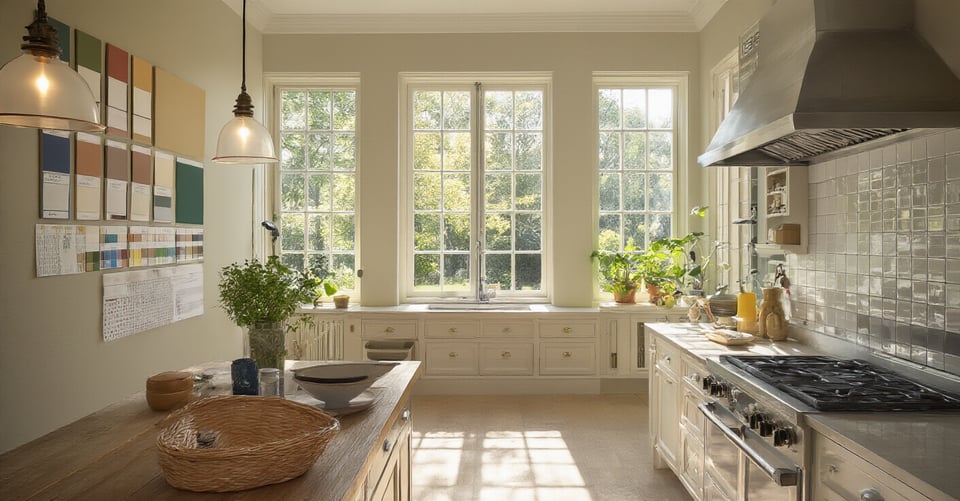
Ignoring this is how you end up with a room that feels depressing or overwhelmingly harsh, which directly saps your energy. Your goal is to choose a color that looks good when you grab your morning coffee and when you’re wrapping up work in the late afternoon. Spend a full day just observing your kitchen. Tape up some large paint samples on different walls and see how the light changes them from sunrise to sunset. This single step will save you more time, money, and sanity than any other.
With a true understanding of your light, you can now make that light work with the most expensive, unchangeable parts of your kitchen: the cabinets and floors.
2. Harmonize Paint with Existing Cabinets and Flooring Finishes
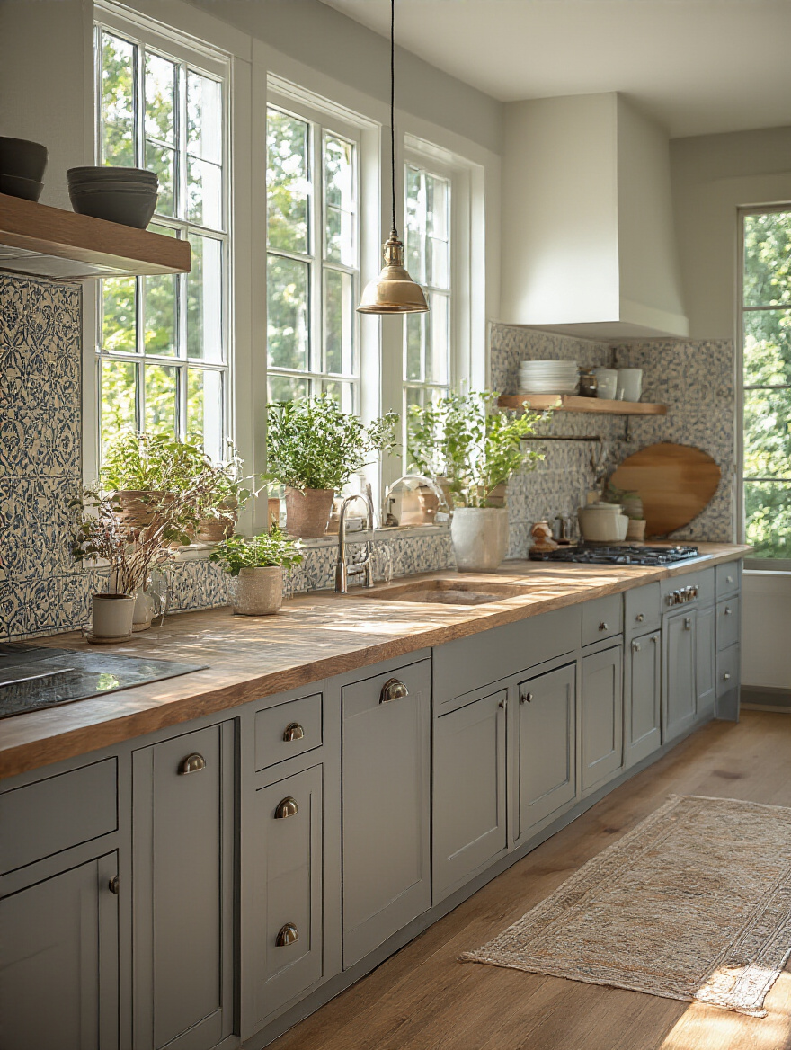
Can we talk about the biggest lie in home design? It’s that the walls are the most important color decision. They’re not. The most important colors are the ones that are hardest and most expensive to change: your cabinets, countertops, and flooring. These are your “givens.” Your wall paint is the supporting actor, not the star. Its job is to make your cabinets and floors look their absolute best.
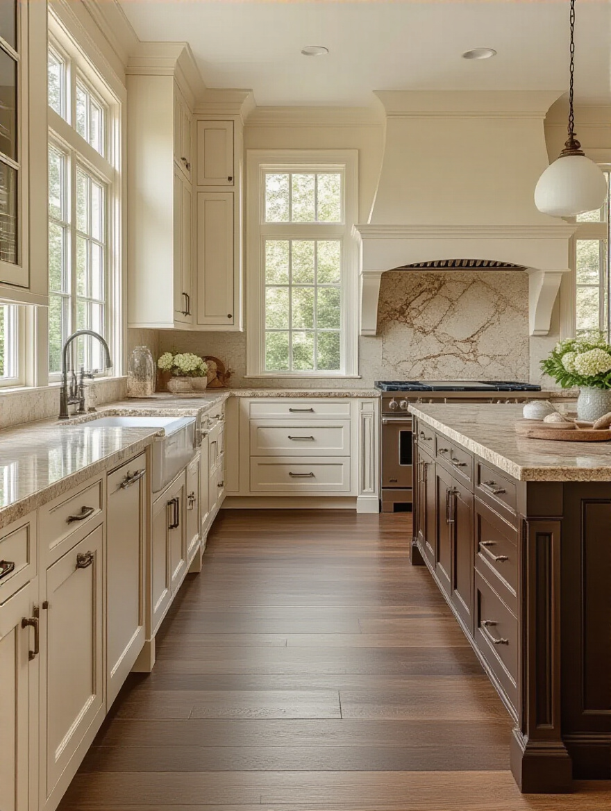
I once worked with a client who had beautiful, warm honey-oak cabinets from the 90s. He wanted a “modern” look, so he painted the walls a very popular, very cool-toned gray. The result was a disaster. The cool gray walls made his warm oak cabinets look aggressively orange and dated. The whole space felt tense and conflicted. It was a productivity killer because his eyes could never rest. We repainted with a warm, creamy off-white, and suddenly the cabinets looked rich and intentional. Don’t fight your fixed elements. Work with them.
The key to making this work is to understand the secret language that all these finishes are speaking: undertones.
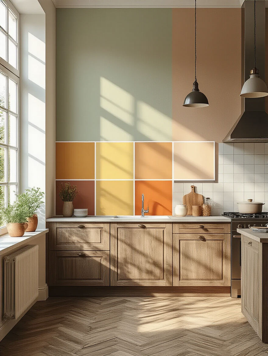
3. Identify Your Kitchen’s Undertones for Cohesive Schemes
Forget the fancy design terms for a second. “Undertone” just means the subtle color hiding underneath the main color. That “white” countertop might have a hint of blue (cool) or a hint of yellow (warm). Your “gray” floor tile might lean green or even purple. If you mismatch these undertones, your room will always feel slightly “off,” even if you can’t put your finger on why. It creates a subtle visual friction that your brain has to constantly process, draining your mental battery.
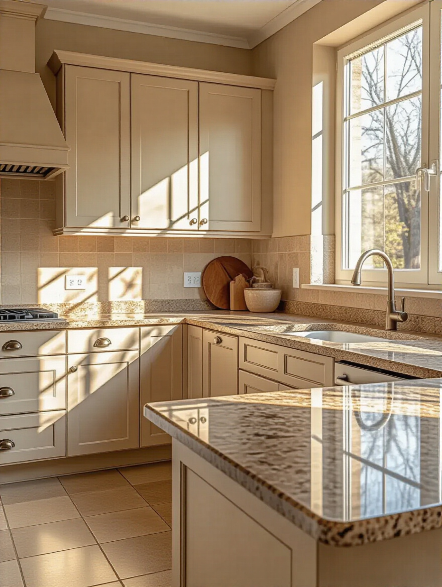
Here’s the shortcut I wish I’d known earlier: take a pure white piece of printer paper and hold it up next to your cabinet, your countertop, and your floor. The stark white of the paper will make the hidden undertones pop. You’ll instantly see if that “beige” tile has a pinkish hue or if that “white” cabinet is actually a soft, creamy yellow. Once you know your dominant undertone (warm or cool), you only look at paint colors that share it. This single trick eliminates 90% of bad color choices.
Now that you know the rules of your space, you can start thinking about how you want it to feel.
4. Define Desired Mood and Ambiance with Strategic Hues
Your kitchen is a functional space, but it’s also an emotional one. How do you need to feel when you step away from your desk for a break? Do you need a calm, serene oasis to decompress, or do you need a vibrant, energetic hub to recharge you for the next task? The colors you choose are the most powerful tool you have for setting this mood. This isn’t fluff; it’s a productivity strategy.
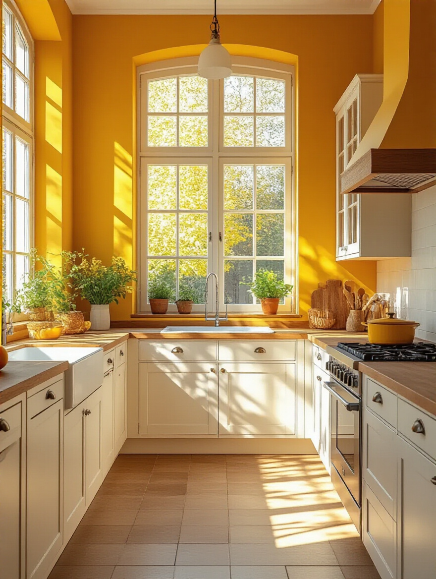
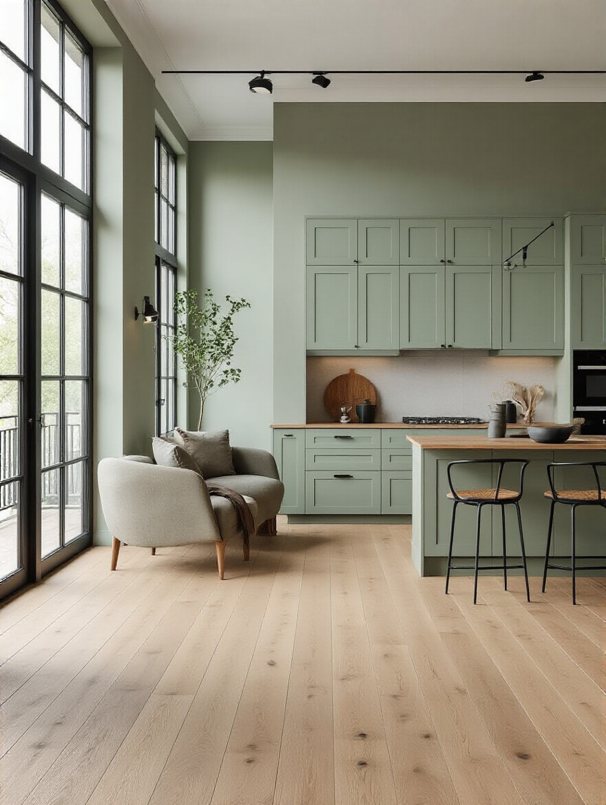
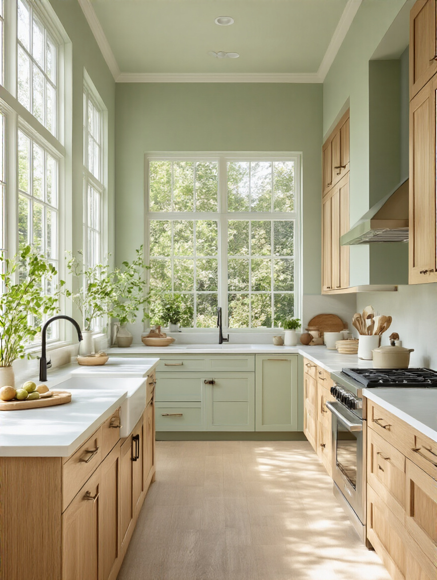
If your work is high-stress, you might want a kitchen in calming, restorative colors like soft blues, sage greens, or warm, earthy neutrals. These colors lower your heart rate and create a sense of peace. If your work requires creative energy, maybe you need pops of optimistic yellow or motivating orange. Don’t just pick a pretty color; pick a color that serves a purpose for your mental state. This transforms your kitchen from a room for chores into a tool for well-being.
This mood-setting becomes even more critical when your kitchen is part of a larger, open space.
5. Consider Open Concept Layouts for Seamless Color Flow
In an open-concept home, your kitchen is never just your kitchen. It’s visually connected to your dining area, your living room, and maybe even your direct line of sight from your desk. Treating these spaces with different, disconnected color schemes creates visual chaos. Your brain has to work harder to make sense of the choppy landscape, which translates into mental clutter and a feeling of being unsettled. This is the enemy of deep work.
The solution is to create a unified color story. Pick a primary neutral color and let it flow through the entire open area. Then, use different shades or strategic accent colors to define “zones.” Maybe the kitchen walls are a soft greige, while the wall in the living area is a slightly deeper version of the same color. Or a bold navy blue on the kitchen island gets echoed in the throw pillows on the couch. This creates a cohesive, harmonious environment that allows your eye—and your mind—to rest.
Once your planning is rock-solid, it’s time to move from theory to reality.
Mastering Kitchen Color Selection & Testing
This is where the rubber meets the road. All the planning in the world means nothing if you don’t test your choices in the real world. Skipping this phase is like buying a car without a test drive—a recipe for regret.
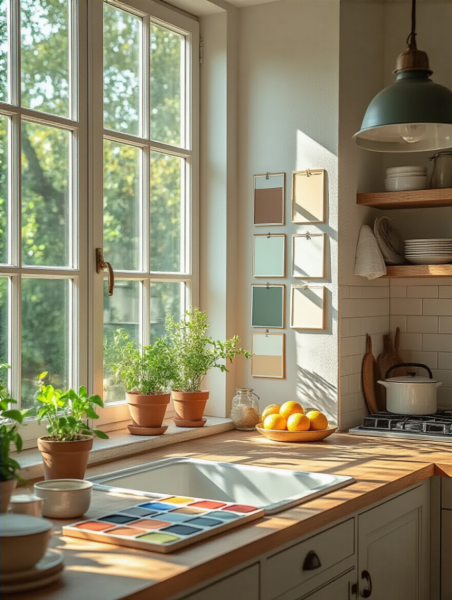
6. Test Paint Swatches on Multiple Walls and Light Conditions
Do not, under any circumstances, paint your kitchen based on a tiny 2×2 inch paper swatch. It is a lie. That little square can’t possibly tell you how a color will look covering 400 square feet, bouncing light off your specific green-undertone granite. You have to see it in action, in your space, with your light.
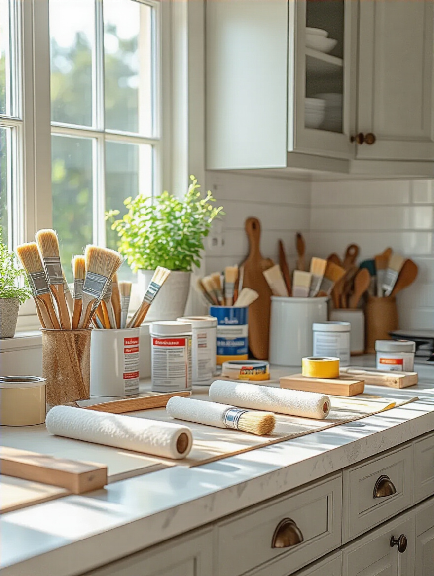
Get large, peel-and-stick samples (Samplize is a great resource) or paint a big piece of white poster board with a sample pot. Why a board? Because you can move it around. Check it on the wall next to the window in the morning. Check it on the dark interior wall in the evening under your artificial lights. Check it right up against your cabinet doors and your backsplash. A color can look perfect on one wall and terrible on another. This step feels tedious, but it is the single most effective way to prevent a thousand-dollar mistake.
Let’s start the testing process with the most versatile and functional color family out there: the neutrals.
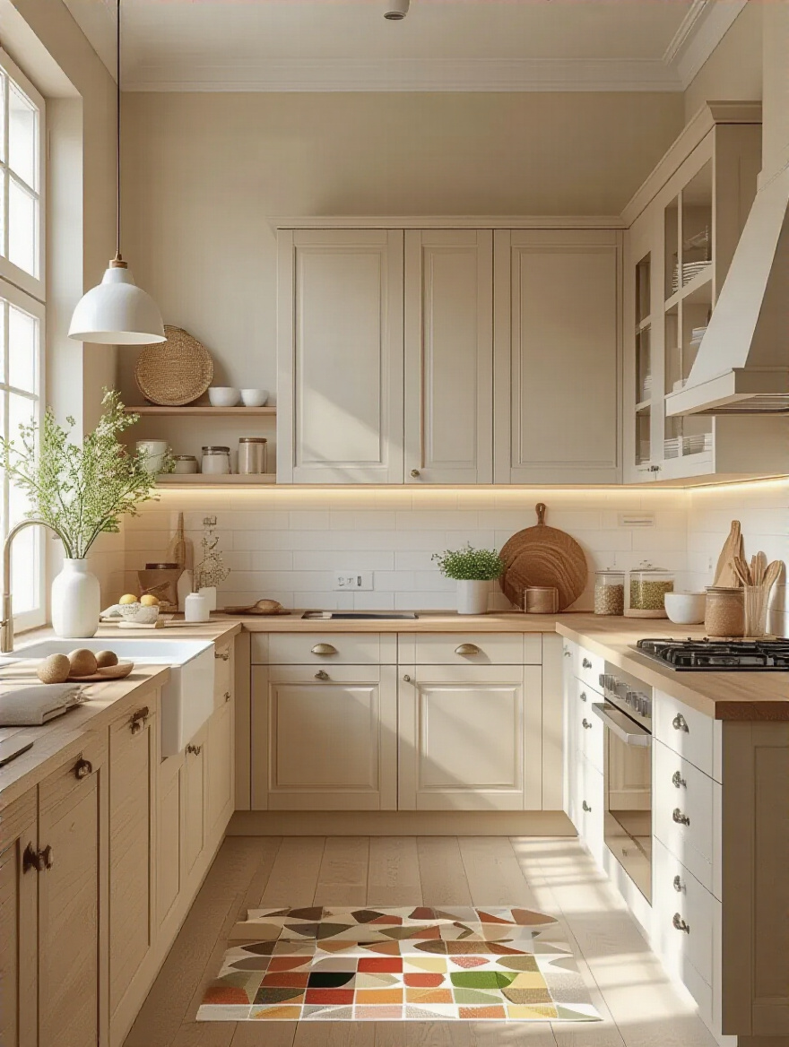
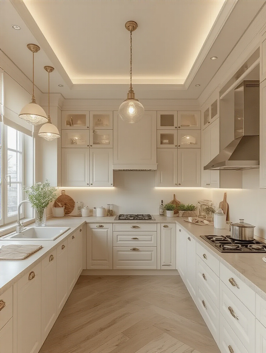
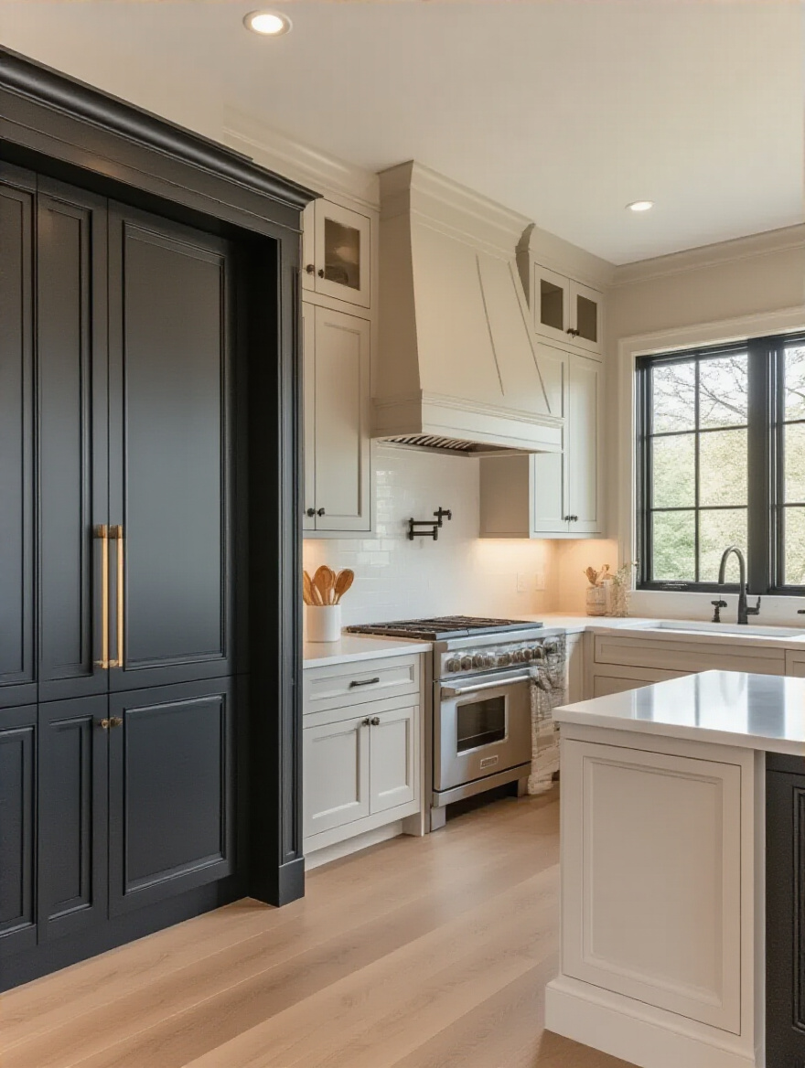
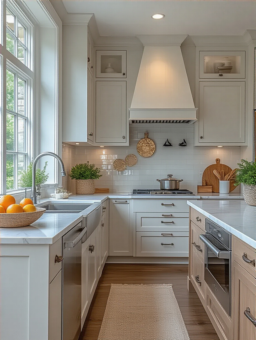
7. Explore Popular Neutral Paint Colors: Greige, White, Gray
There’s a reason professionals lean so heavily on neutrals like greige (a mix of gray and beige), complex whites, and soft grays. They are the ultimate supporting actors. They create a calm, uncluttered backdrop that reduces visual noise and allows you to think clearly. A good neutral doesn’t demand attention; it creates a serene foundation that makes everything else in the room look better.
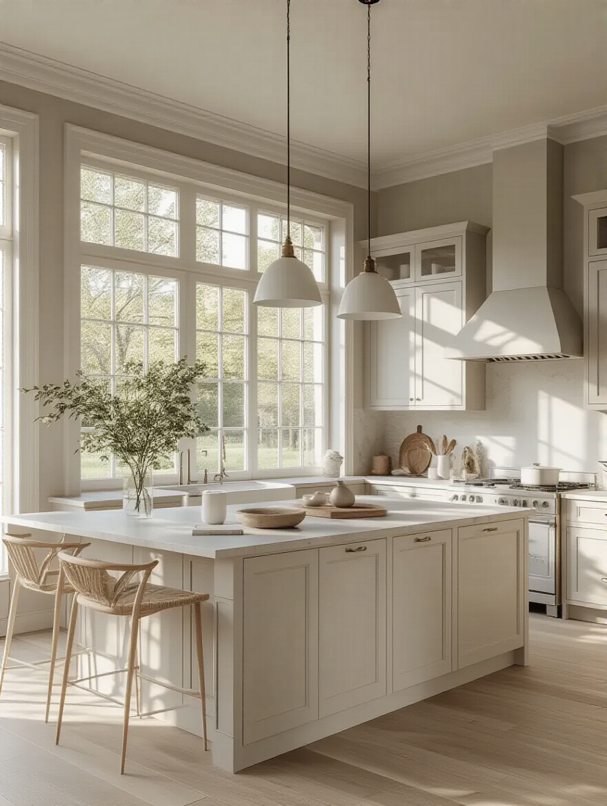
The trick is finding the right neutral. A crisp, cool “art gallery” white can feel sterile and clinical, while a creamy white like Benjamin Moore’s “White Dove” feels warm and inviting. A popular greige like Sherwin-Williams’ “Agreeable Gray” is famous for its ability to work with both warm and cool undertones, making it a fantastic, flexible choice. Your goal isn’t to find a “no color” color, but to find a neutral with the right undertone and depth to make your kitchen feel both spacious and calming.
Once you have your foundational neutral, you can inject some personality and energy with accents.
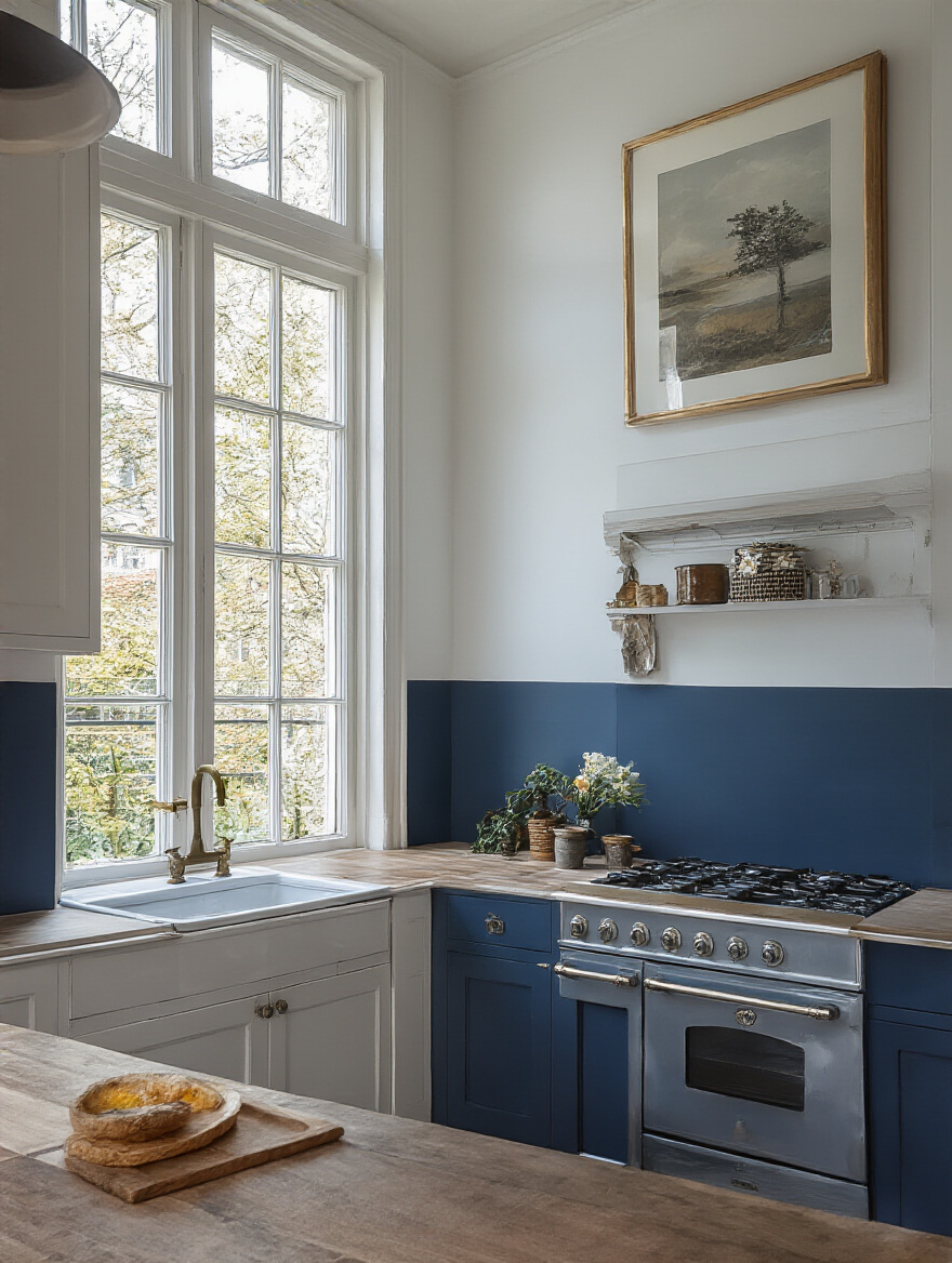
8. Incorporate Bold Accent Colors for Dynamic Visual Impact
A totally neutral space can sometimes feel a bit flat, especially if you need it to be a place that energizes you. This is where accent colors come in. But we’re not just throwing a random color on a wall. A strategic accent color can serve a real purpose. It can define a zone, create a focal point that anchors the room, or provide a much-needed jolt of creative energy.
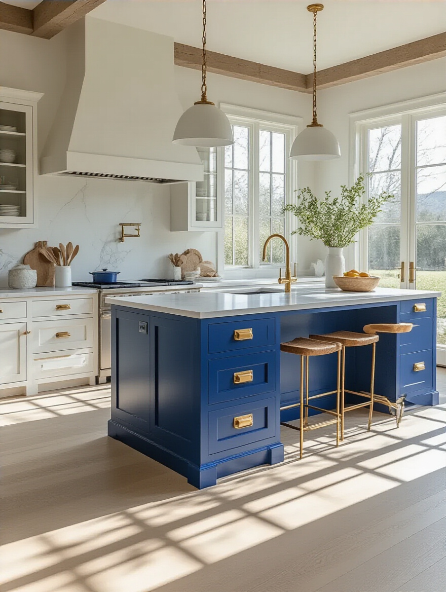
Instead of a whole room, think about using a bold, deep blue on just the kitchen island to ground the space. Or paint the inside of your glass-front cabinets a vibrant green for a surprising pop of color that makes you smile. You could even paint your pantry door a cheerful yellow. This gives you all the psychological benefits of a bold color without the overwhelming commitment. It’s a low-risk, high-reward strategy for adding personality and function.
All of this—neutrals, accents, undertones—is made easier by understanding a few simple rules of the road.
9. Leverage Color Theory for Harmonious and Engaging Palettes
You don’t need a degree in art to understand the basics of color theory. All you need is one simple shortcut: the 60-30-10 rule. This is a designer’s secret weapon for creating a balanced, professional-looking space that feels effortlessly right.
Here’s how it works:
- 60% is your dominant color. This is typically your neutral wall color. It’s the main backdrop for the whole room.
- 30% is your secondary color. This is usually for your cabinets, an accent wall, or major furniture. It’s there to add interest and contrast.
- 10% is your accent color. These are the pops of color in your accessories, your light fixtures, or a painted pantry door. It’s the jewelry.
Sticking to this ratio prevents your space from feeling chaotic or one-dimensional. It’s a simple, foolproof framework for building a color palette that has depth, personality, and balance—all critical for a space that supports your focus.
It’s smart to have timeless rules like this in your back pocket, especially when you’re looking at what’s popular right now.
10. Research Current Kitchen Paint Trends for Modern Appeal
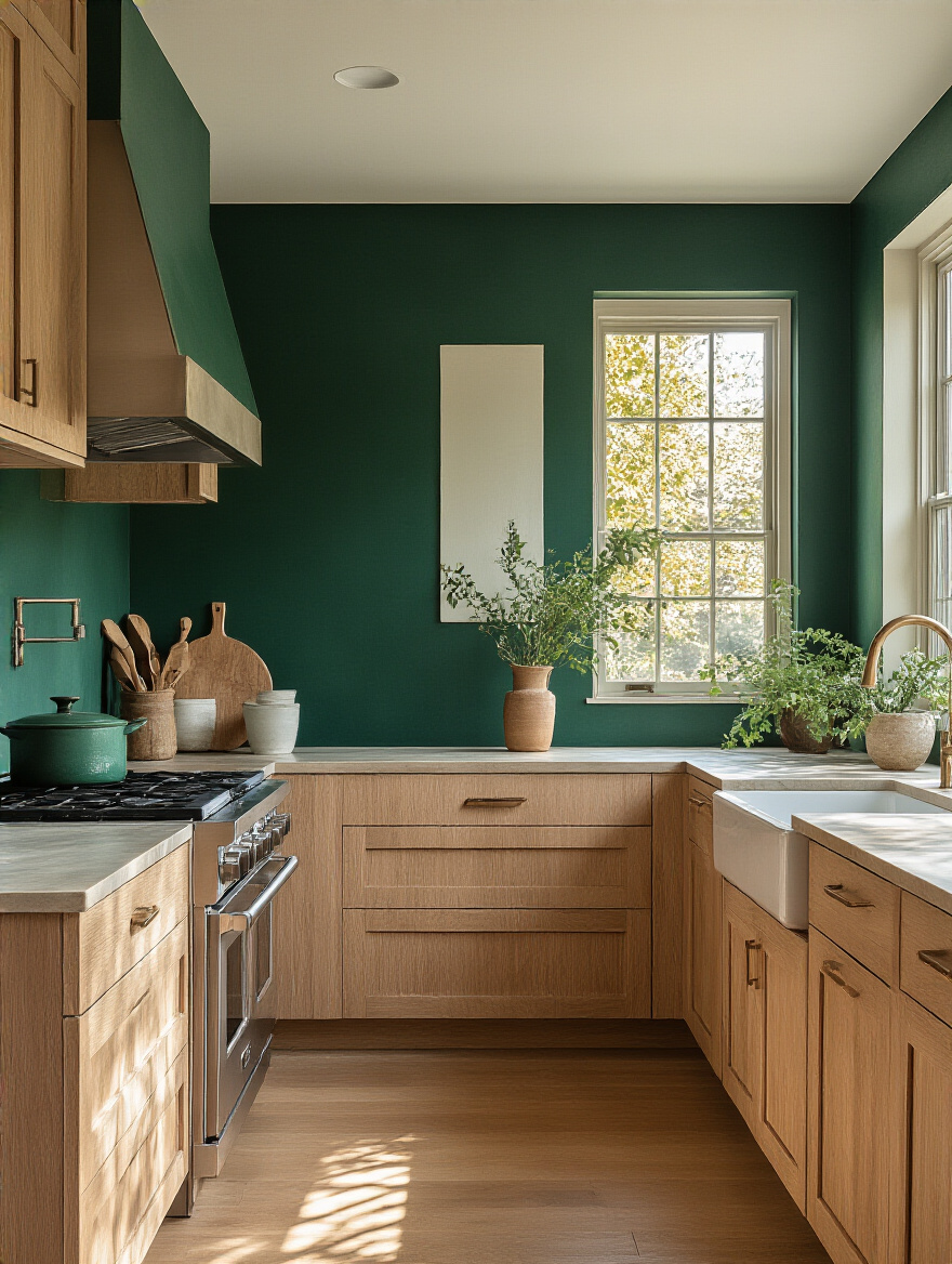
Looking at trends is useful, but with a major caveat. The worst thing you can do is blindly follow a trend that doesn’t fit your space or your needs. Remember the Tuscan kitchen trend of the early 2000s with all the dark gold and brown? It feels incredibly dated now. Your goal is to look at trends for inspiration, not for rules.
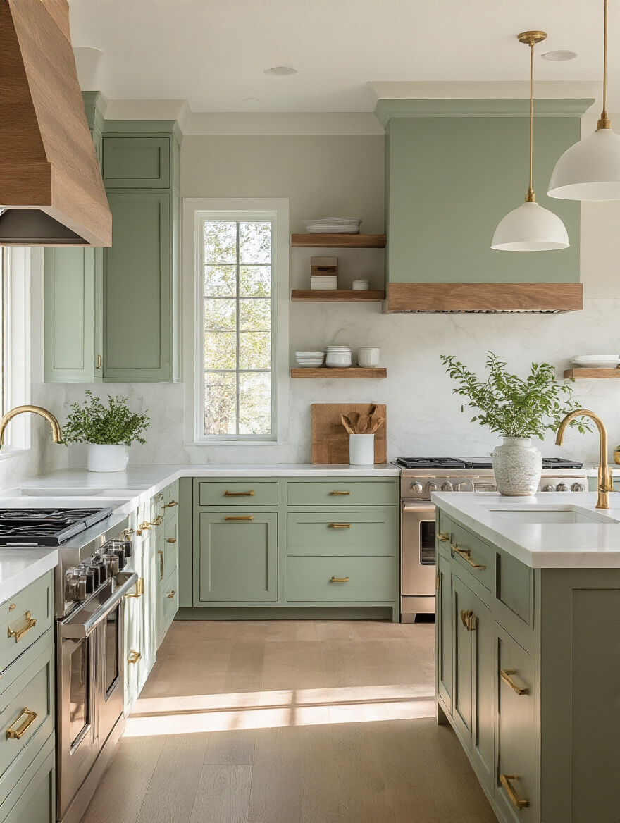
Right now, the big trends are moving away from cool, sterile grays and toward warmer neutrals, earthy greens, and deep, moody blues. These are fantastic because they connect us to nature and create a sense of grounding calm—perfect for a WFH environment. Use a trend as a starting point. If you love the dark green trend, don’t paint your whole kitchen with it. Use it on your lower cabinets or an island to feel current without creating a space you’ll hate in three years.
Understanding trends is about what’s popular; understanding psychology is about what’s effective.
11. Understand Color Psychology to Influence Kitchen Feel
We touched on this when we talked about mood, but it’s worth its own point. Every color sends a signal to your brain. Blue is known to promote focus and calm. Green is restful and balancing. Yellow is optimistic and energetic. Red can stimulate appetite and conversation. These aren’t just abstract ideas; they have a measurable physical and psychological effect.
Think about how you use your kitchen throughout your workday. Is it the place you go when you’re stuck on a problem and need to think? A calming blue or green might be perfect. Is it where you grab a quick snack for an energy boost? Maybe a few yellow or orange accents are what you need. By consciously choosing colors based on the psychological effect you want, you are actively designing a space that supports your daily professional and personal needs.
A huge part of that psychological effect is the perception of space itself.
12. Select Cooler Tones to Visually Expand Small Spaces
If your kitchen is small or cramped, it can feel constricting and stressful—the last thing you need during a busy workday. The right paint color is the cheapest and fastest way to create an illusion of space. Light, cool colors (think soft blues, light greens, and grays with a blue or green undertone) are “receding” colors. They trick your eye into thinking the walls are further away than they actually are.
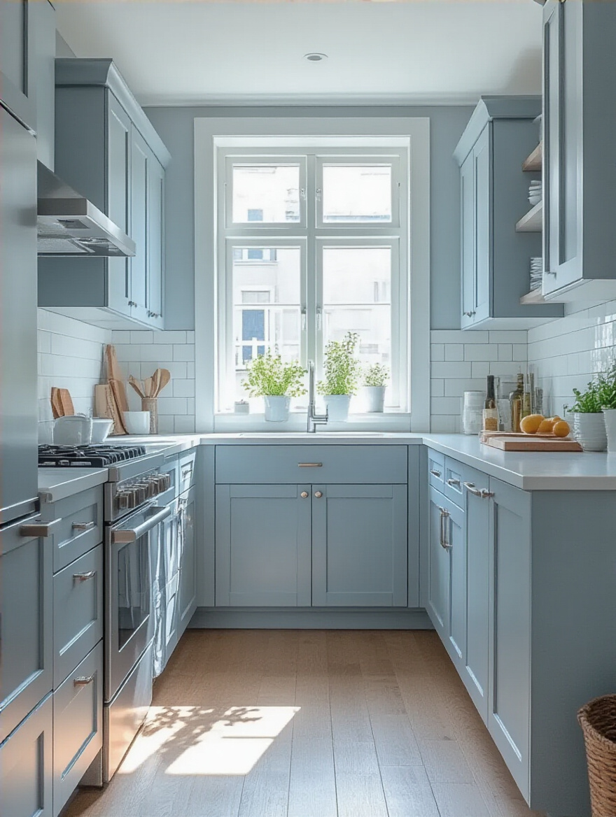
Painting a small, dark kitchen a light, airy blue can make it feel instantly larger and brighter. It boosts the effectiveness of whatever natural light you have and creates a sense of openness. This isn’t just an aesthetic trick; it’s a mental health one. Having a bit more “breathing room,” even if it’s just a visual illusion, can make your entire home environment feel less claustrophobic and more conducive to well-being.
You’ve done the mental work. Now, it’s time to get practical and make sure your brilliant plan is executed flawlessly.
Practical Application, Finishes & Prep
A brilliant color choice can be completely ruined by poor application. This is the part where diligence pays off. Getting these details right ensures your paint job not only looks professional but also stands up to the reality of a busy kitchen.
13. Choose the Ideal Paint Finish: Eggshell, Satin, or Semi-Gloss
Paint finish isn’t just about how shiny the wall is; it’s a functional choice that determines how durable and easy-to-clean your walls will be. In a kitchen, with its splatters, grease, and moisture, this is non-negotiable. Using a flat or matte paint in a kitchen is a rookie mistake. It’s like a sponge for stains and impossible to scrub without ruining the finish.
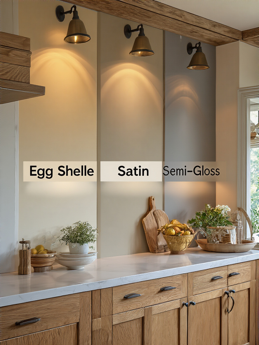
For kitchen walls, your best bets are satin or semi-gloss.
- Satin has a subtle glow and is very durable and easy to wipe down. It’s the go-to for most designers.
- Semi-gloss has more shine and is even tougher, making it perfect for trim, doors, and cabinets—areas that take a real beating.
Think of the finish as an investment in your future time. Choosing a scrubbable finish means you’ll spend less time and energy on maintenance, freeing you up for more important things.
That same scrubbability needs to look good next to your other hardworking surfaces.
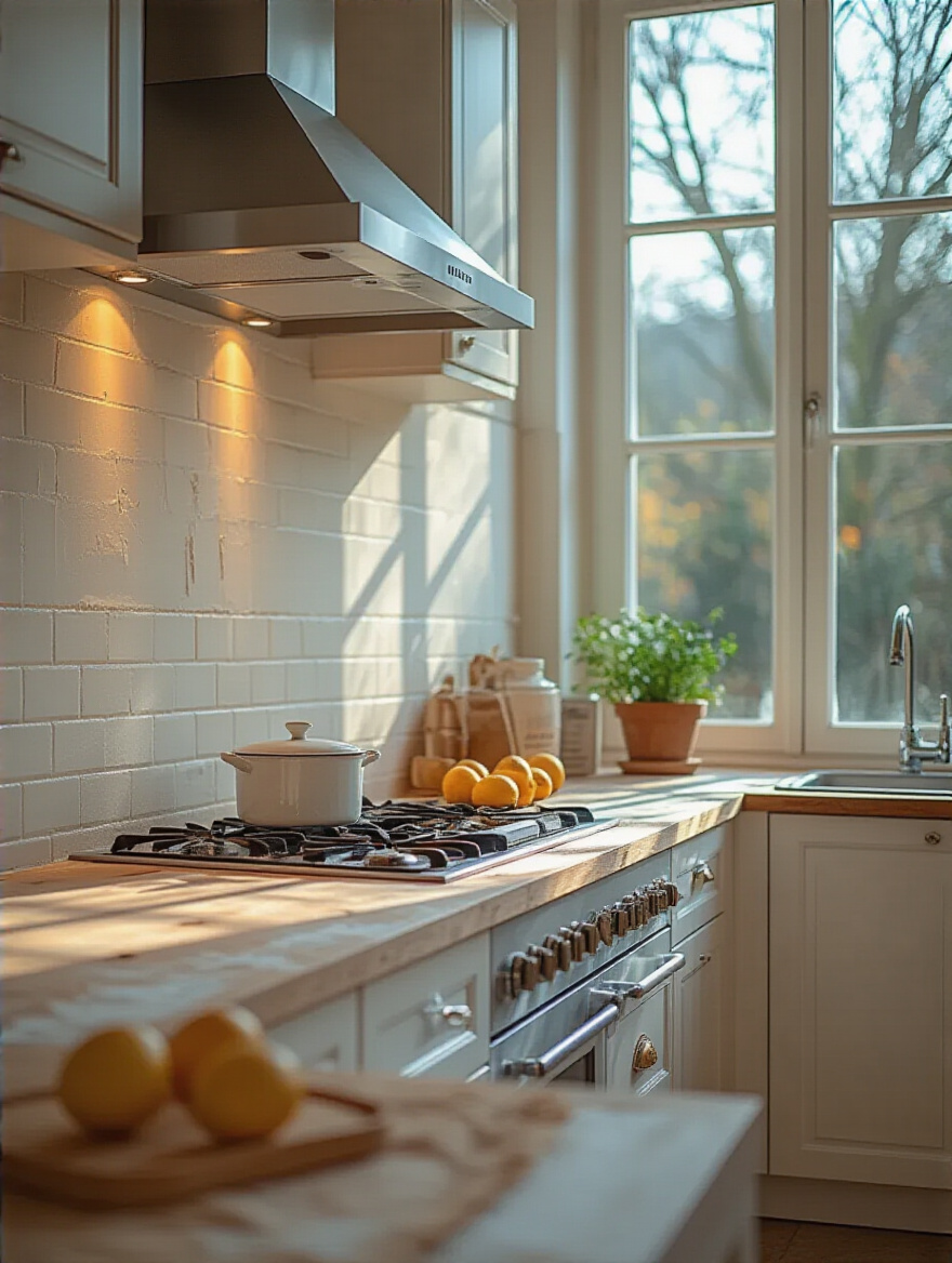
14. Coordinate Wall Colors with Backsplash and Countertop Patterns
If you have a “busy” countertop or a patterned backsplash, your wall color needs to be the quiet friend in the conversation. Trying to pair a bold wall color with a dramatic, multi-colored granite countertop will result in a visual screaming match. The room will feel cluttered, chaotic, and loud—the opposite of a productive environment.
The pro move is to pull the quietest, most neutral color from your countertop or backsplash pattern and use that for your wall color. If your granite has veins of gray, flecks of cream, and swirls of brown, pick the softest cream or the most subtle gray for the walls. This guarantees harmony. It lets your expensive finishes be the star of the show and creates a cohesive, calming backdrop that ties everything together.
This beautiful, cohesive vision can only become a reality with one crucial, often-skipped step.
15. Prepare Walls Thoroughly for a Durable, Flawless Finish
Here’s the unfiltered truth: the success of your paint job is 80% preparation. You can buy the most expensive paint in the world, but if you put it on a dirty, greasy, or unprepared wall, it will fail. It will peel, bubble, or chip, and you will have wasted your time and money. This is especially true in a kitchen.
Before you even think about opening a can of paint, you must clean your walls with a degreasing cleaner (like TSP substitute) to remove any invisible film of cooking oil. Then, fill any holes, sand them smooth, and wipe everything down. Finally, use a high-quality primer. A primer does two things: it ensures your final color is true and vibrant, and it gives the paint a perfect surface to stick to for a long-lasting, durable finish. Don’t skip this. Seriously.
Part of that prep is making sure you have everything you need before you start.
16. Accurately Calculate Paint Quantity to Prevent Shortages
There are few things more frustrating than running out of paint halfway through the second coat on a Saturday night. It kills your project’s momentum and can even compromise the final look, as different batches of the same paint color can have slight variations. A mid-project run to the store is a recipe for delay and potential color mismatch.
Use an online paint calculator (every major brand has one) and be honest about your space. Measure the walls, subtract for large windows and doors, and then—this is the important part—add 10-15% extra. This buffer covers you for a second coat, any unexpected absorption by the walls, and leaves you with a little extra for future touch-ups. Having it all on hand from the same batch ensures perfect color consistency.
Now look up—what are we doing with that big empty space above your head?
17. Decide on Ceiling Color: Matching, Contrasting, or White
The ceiling is the “fifth wall,” and ignoring it is a missed opportunity. What you do up there has a huge impact on how the room feels. You have three main options, each with a different strategic purpose.
- Classic White: This is the safest and most common choice for a reason. A crisp white ceiling makes a room feel taller and brighter by reflecting the maximum amount of light. If your kitchen is small or dark, this is almost always the right answer.
- Matching the Walls: Painting the ceiling the same color as the walls (in a flat finish) can make a room feel larger and more cohesive by blurring the lines where the walls end and the ceiling begins. It creates an enveloping, sophisticated “color-drenched” look.
- Contrasting Color: Painting the ceiling a dark or bold color is a dramatic statement. It can make a room with very high ceilings feel cozier and more intimate, or it can just add a huge dose of personality. This is an advanced move, but it can be spectacular.
Don’t forget the other architectural details that frame your beautiful new wall color.
18. Paint Trim and Doors to Elevate Overall kitchen design
Think of the trim, baseboards, and doors in your kitchen as the picture frame for your walls. Freshly painted walls next to scuffed, yellowing trim looks unfinished and cheapens the entire effect. A fresh coat of paint on these elements is what makes the whole project look crisp, intentional, and professional.
Typically, trim is painted in a durable semi-gloss white for a classic, clean contrast that makes your wall color pop. But you can also get creative. Painting the trim the same color as the walls can create a modern, seamless look that makes the space feel larger. Or, for a bold, designer touch, you could paint the trim a contrasting dark color, like black or charcoal, to really define the room’s architecture. Whatever you choose, don’t neglect it.
Now that we’ve nailed the fundamentals, let’s look at a few ways to take your kitchen to the next level.
Advanced Styling & Long-Term Maintenance
You have your color, you’ve mastered the prep, and you’ve covered the details. Now we can add a layer of custom style that makes the space uniquely yours and ensure it stays looking great for years to come.
19. Implement Two-Tone Walls for Added Depth and Sophistication
If you want a custom, high-design look without a high price tag, a two-tone wall is a fantastic technique. This involves painting the bottom third or half of the wall a different color from the top. It’s a classic look that feels both timeless and completely modern.
A common strategy is to use a darker, more durable color on the bottom portion. This grounds the room and is incredibly practical, as the lower part of the wall is where scuffs and splashes happen. Then, use a lighter color on top to keep the space feeling open and airy. To make it look intentional, align the dividing line with an existing architectural feature, like the height of your countertop or the bottom of your cabinets. Use a laser level and good painter’s tape for a razor-sharp line.
Another way to add a major style statement is to concentrate all your color in one place.
20. Create a Stunning Accent Wall with Bold, Contrasting Shades
An accent wall is the perfect solution for someone who loves bold color but is afraid of committing to an entire room of it. It’s a low-risk, high-impact way to inject energy and personality into your kitchen. The key is to choose the right wall. It should be a natural focal point, like the wall behind your dining nook or the wall your stove is on—a solid wall without too many windows or doors to break it up.
Choose a color that contrasts with, but still complements, your other finishes. A deep, moody charcoal or a rich navy blue can make a wall recede, adding depth and sophistication. A vibrant jewel tone, like emerald or sapphire, can create a stunning, energetic backdrop. To tie it all together, repeat that bold accent color in small doses around the room—in your dish towels, a fruit bowl, or the fabric on your bar stools.
All this beautiful work deserves to last, which brings us to the final, crucial choice.
21. Use Durable, Washable Paints for Easy Kitchen Maintenance
Let’s be blunt: your kitchen is a war zone. It’s a place of high heat, high moisture, and flying food. You absolutely must use a high-quality paint that is specifically labeled as “durable” and “washable.” Investing in a premium acrylic paint formulated for kitchens and bathrooms is not an upsell; it’s a necessity.
These paints are engineered to form a hard, non-porous shell that repels stains and can be scrubbed clean without damaging the finish. This means that a spaghetti sauce splatter that would permanently stain a cheaper, matte paint can be wiped away with a damp cloth. This single choice will extend the life of your paint job by years and save you countless hours of touch-ups and frustration. It’s the ultimate “work smarter, not harder” decision.
Even with the best paint and planning, things can go wrong. Here’s how to avoid the most common pitfalls.
22. Address Common Painting Mistakes for Professional Results
Having seen countless DIY projects, I can tell you that most mistakes are completely avoidable. Getting a professional-looking result comes down to avoiding these common errors and embracing a few pro techniques.
- The Mistake: Rushing and applying one thick coat. This leads to drips, sags, and an uneven finish that takes forever to dry properly.
- The Fix: Apply two or three thin coats. It provides better coverage, a smoother finish, and superior durability. Be patient and let each coat dry completely.
- The Mistake: Using cheap brushes and rollers. They leave behind bristles, create a streaky texture, and make it impossible to get clean lines.
- The Fix: Invest in high-quality tools. A good angled brush for cutting in edges and a quality roller are worth every penny for the professional result they deliver.
- The Mistake: Pulling off the painter’s tape after the paint is fully dry. This often rips the fresh paint off with the tape, ruining your clean line.
- The Fix: Carefully remove the tape while the final coat is still slightly damp but not wet to the touch. Pull it off at a 45-degree angle for the crispest line possible.
Conclusion
Choosing a kitchen paint color isn’t a frivolous decorating task; it’s a foundational act of designing a home environment that supports your work, your health, and your happiness. By thinking strategically about light, function, and mood, you move from just picking a color to building an atmosphere. You are creating a space that can calm you down during a stressful day or energize you for a creative challenge.
You now have the tools—from the big-picture psychology to the nitty-gritty practical tips—to transform your kitchen into the supportive, functional, and beautiful space you deserve. It’s an investment of time upfront that will pay dividends in your daily life for years to come. So trust your research, test your samples, and get ready to create a kitchen that truly works.