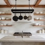
Of all the rooms in a home, the kitchen feels the most alive. It’s a studio, a laboratory, a gathering space. For years, I’ve walked through pristine galleries where art hangs in quiet contemplation, but I’ve come to believe the most important art collection you’ll ever own is the one you live with every day. And the kitchen, the true heart of the home, has been ignored for too long. We obsess over countertops and cabinets, leaving the walls as a painted afterthought.
But what if your walls could do more than just hold up the ceiling? What if they could tell a story, set a mood, or transport you to another place entirely? Forget the peeling, fussy florals from your grandmother’s era. Today’s wallpapers are tough, resilient, and stunningly artistic. It’s time we treat our kitchens with the creative respect they deserve.
Ready to see your kitchen as the gallery it was meant to be? Let’s get into it.
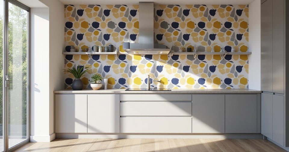
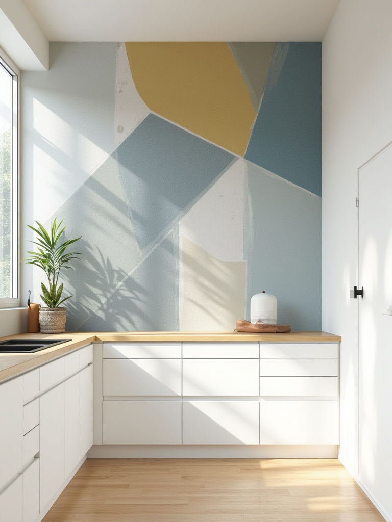
1. Go Bold with Geometric Patterns
There’s an energy to geometric patterns that’s almost architectural. It’s no surprise they were central to movements like the Bauhaus, where design was meant to be both beautiful and functional. A great geometric doesn’t just decorate a wall; it gives it a backbone, a rhythm.
What’s so brilliant about them in a kitchen is their ability to feel both retro and completely of-the-moment. I once worked on a mid-century home where we used a large-scale hexagon pattern behind a floating walnut shelf. The sharp lines of the print talked directly to the clean lines of the cabinetry, creating this incredible visual harmony. But in a more traditional kitchen, that same hexagon in a softer color could feel more like a cozy, honeycomb quilt. The secret is in the scale and contrast. Don’t be afraid to go big—a large pattern can actually make a small kitchen feel grander. Just avoid pairing a super busy geometric with an equally busy granite countertop. That’s a mistake I see a lot, and frankly, it just makes your eyes tired.
A geometric pattern introduces a sense of order and dynamism, setting a strong foundation for the rest of your kitchen’s story.
2. Get the subway tile Look (Without the Grout!)
I get it. The clean, classic grid of subway tile is endlessly appealing. It’s a design staple for a reason. But let’s be honest—the process of tiling is a commitment. The mess, the cost, the grout that never seems to stay pristine white… it’s a lot.
This is where the art of illusion comes in. High-quality subway tile wallpaper has become so convincingly realistic, you genuinely have to touch it to know. The best ones aren’t just flat photos; they have printed shadows and subtle tonal shifts that mimic the depth of real ceramic. My advice? Look for a print where the “tiles” aren’t perfectly uniform. Real handmade tiles have tiny imperfections, and a good wallpaper will replicate that, which is what sells the effect. I helped a client who was renting an apartment use a vinyl subway tile paper for a backsplash, and it completely transformed her kitchen from generic to chic in a single afternoon. No landlord complaints, no lost security deposit.
It’s the perfect solution for anyone who craves that timeless look without the long-term relationship.
3. Introduce Rustic Charm with Faux Brick or Stone
There’s an undeniable romance to an old brick wall. It brings an immediate sense of history, texture, and warmth to a room. But unless you’re lucky enough to live in a converted loft or a historic brownstone, creating that look often involves a major, dusty renovation.
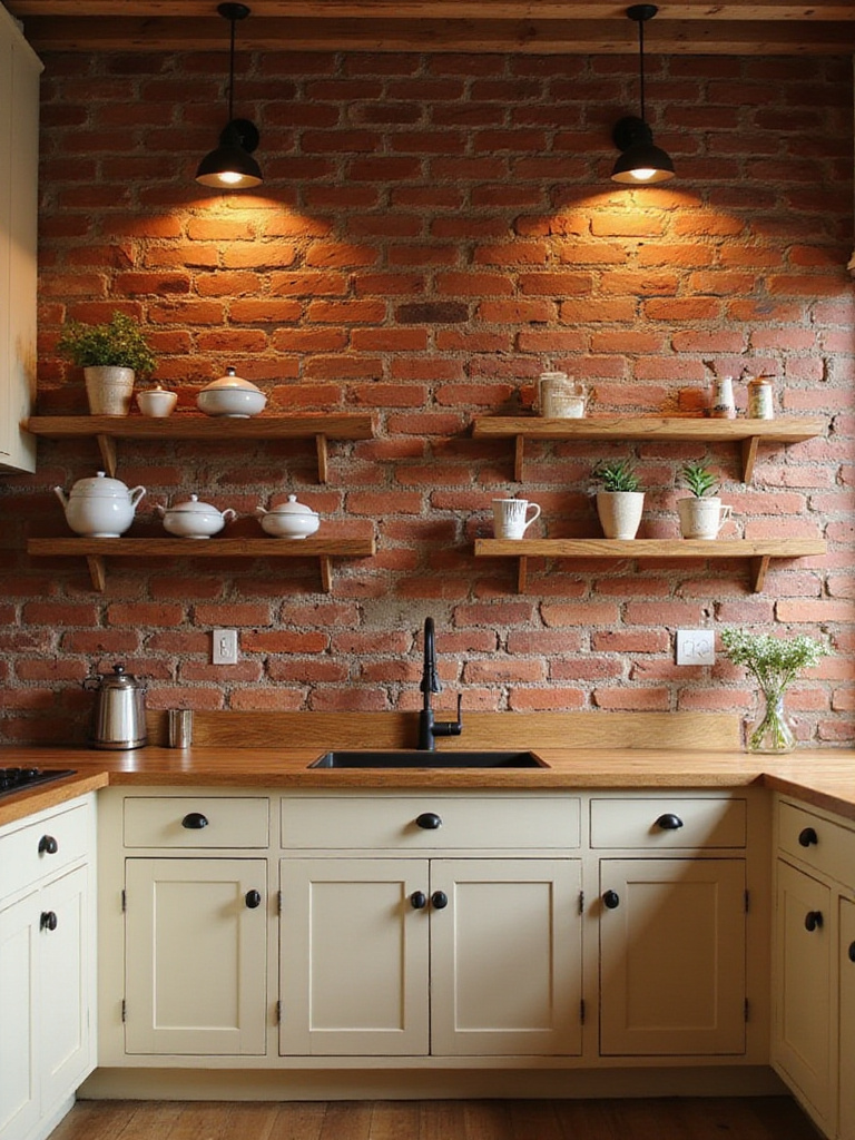
This is where wallpaper becomes not just a design choice, but a practical solution. The latest generation of faux brick and stone wallpapers has honestly blown me away. They have depth and shadow; some are even slightly embossed to give you a tactile feel. A client recently used a whitewashed brick paper in her modern farmhouse kitchen, and it created the perfect textural backdrop for her sleek, dark blue cabinets. It added all the character of a 100-year-old wall with none of the structural headaches.
It’s about capturing a feeling—that raw, authentic texture—without having to call a mason.
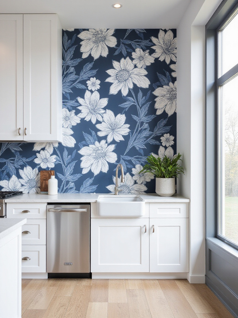
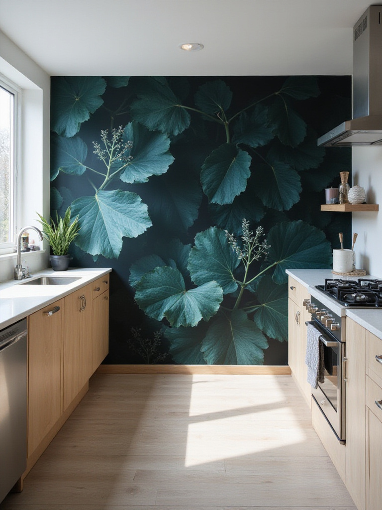
4. Bring Nature Indoors with Botanical Prints
A few years ago, I curated a show that featured an artist who worked exclusively with pressed plants from her garden. The effect was stunning—a deep, calming connection to the natural world. Botanical wallpaper does the same thing for a home. It breathes life into a space.
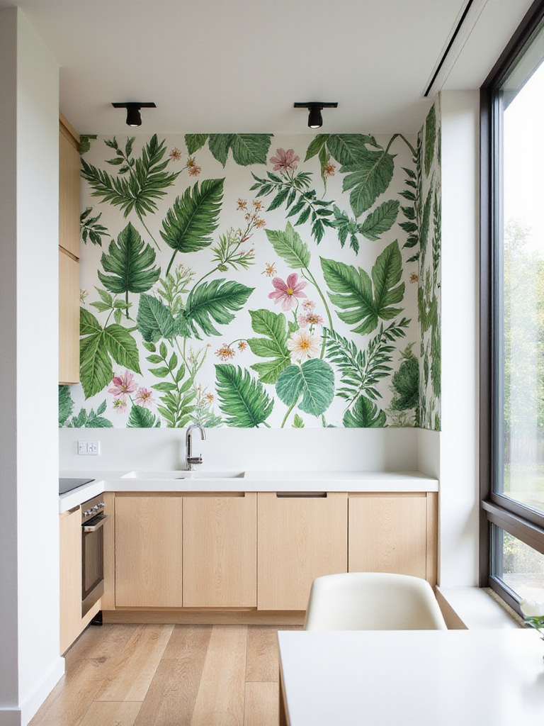
You can go in so many directions here. For a classic, almost scientific look, think of those beautiful, detailed illustrations of herbs you’d find in an old textbook. But for a more contemporary jolt of energy, oversized tropical leaves—think monstera or banana leaf—can turn a wall into a dramatic, living mural. I’ve found that botanical wallpapers do more than just look pretty; they genuinely change the feel of a room. A kitchen can feel very sterile with all its hard surfaces and appliances. Adding a splash of green, even a printed one, softens the entire space.
The pairing that always stops me in my tracks? A lush, vibrant botanical print against sharp, industrial elements like stainless steel or concrete. The tension between the organic and the manufactured is just electric.
5. Add Playful Fun with Foodie Themes
Let’s not take ourselves too seriously. The kitchen is, after all, a place of creation and enjoyment. Why not let the walls in on the fun? Food-themed wallpaper can be an absolute delight, as long as you steer clear of the cutesy, cartoonish stuff.
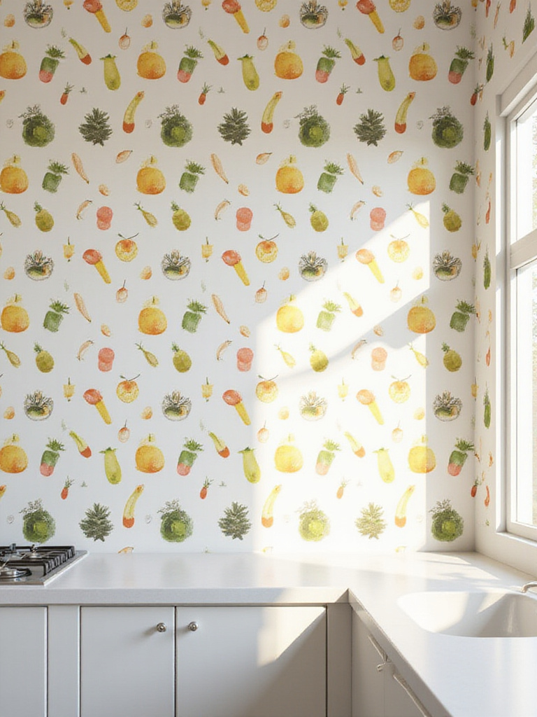
The trick is to find a pattern that reads as art first, and food second. Think of a sophisticated, almost abstract pattern of artichokes, a chic toile print with subtle culinary scenes, or a minimalist design of hand-drawn citrus fruits. It’s about a little wink and a nod to the room’s purpose. One of my favorite projects involved lining the inside of a pantry with a wallpaper covered in beautifully illustrated Italian lemons. It was this hidden burst of sunshine that made the simple act of grabbing a can of tomatoes feel a little more joyful.
Choose a design that celebrates your love for food in a way that feels stylish, not kitschy. It’s a way to show that your passion for food extends to your eye for design.
6. Use Stripes to Define Your Space
Stripes are one of the oldest tricks in the design book for a reason: they work. In art, line is used to direct the eye, and in a room, stripes do the exact same thing. They are a powerful tool for manipulating your perception of a space.
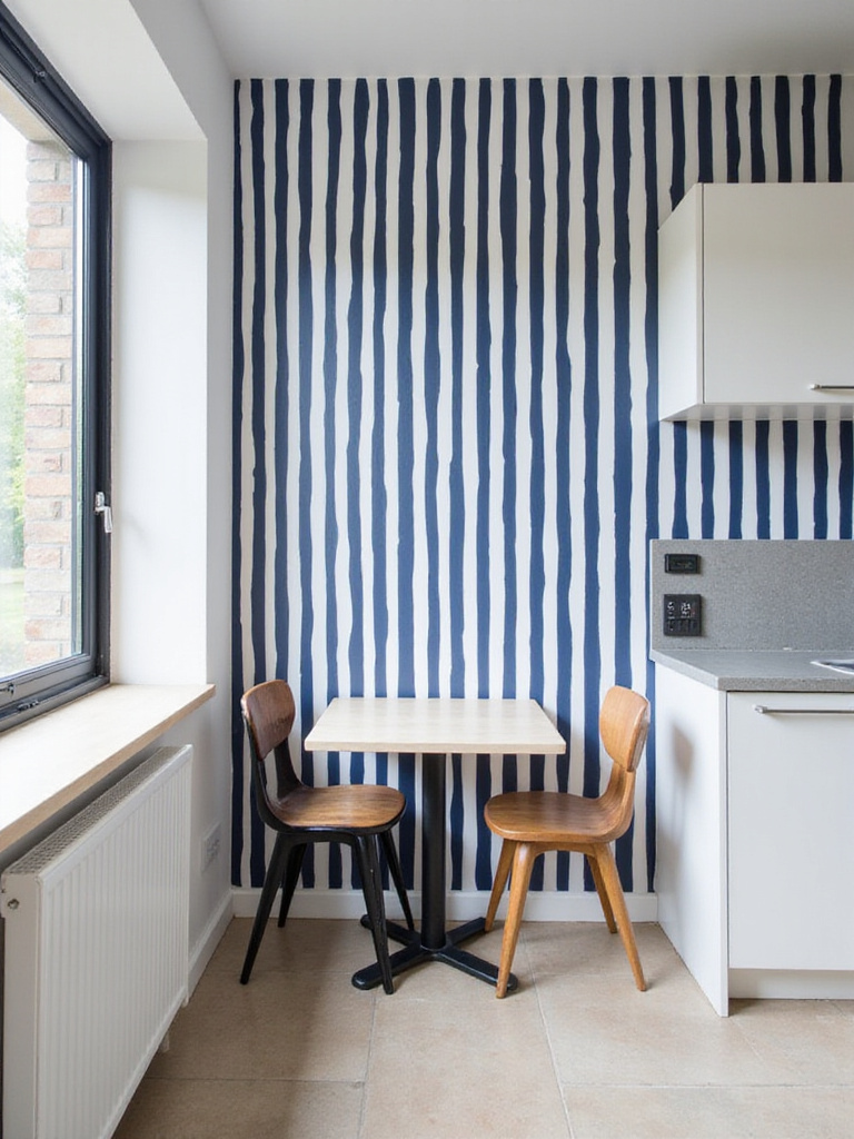
Have a kitchen with low ceilings? Vertical stripes will instantly draw the eye upward, creating a sense of height and airiness. Working with a narrow galley kitchen? Turn those stripes on their side. Horizontal lines will make the space feel wider and more expansive. But it’s not just about the direction—the width and color matter immensely. A thin, tone-on-tone pinstripe adds subtle texture, while a bold, high-contrast cabana stripe is a major statement. I often recommend using stripes on a single wall, maybe behind a breakfast nook, to visually carve out a “room within a room” in an open-concept space.
It’s less about decoration and more about architectural illusion—a simple, elegant way to redraw the lines of your kitchen.
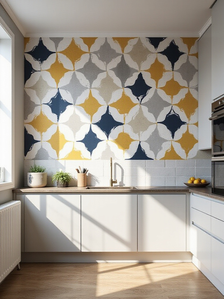
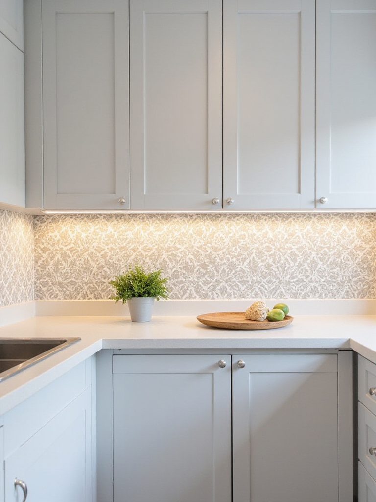
7. Embrace Elegance with Classic Damask
Damask patterns carry a certain weight and history. Originating as luxurious woven fabrics from Damascus, they have an inherent elegance. You might think of them as being too formal or traditional for a kitchen, but that’s where modern interpretation comes in.
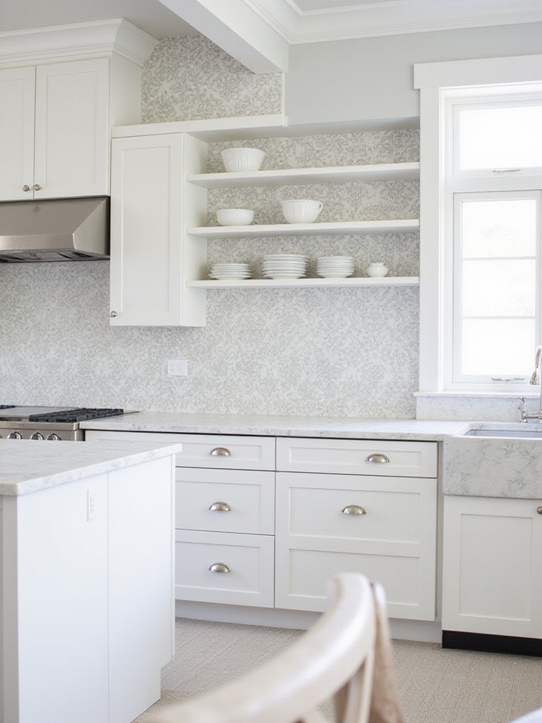
Forget the heavy red and gold velvets of a palace. Imagine that same intricate, symmetrical pattern in a surprising color combination—charcoal and white, or navy and silver. Suddenly, it feels fresh and contemporary. I’ve seen oversized damask used on a single wall in an otherwise minimalist kitchen, and the effect is breathtaking. It acts like a massive piece of abstract art, its classic bones updated for a modern eye. The subtle shimmer you often find in these patterns is also a huge bonus in a kitchen, as it catches the light beautifully throughout the day.
This isn’t about creating a period room. It’s about borrowing a bit of classical grace and giving it a modern twist.
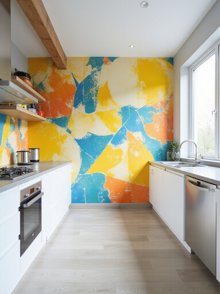
8. Choose Abstract Art for a Modern Edge
This is where my curator’s heart really sings. Using an abstract wallpaper is like commissioning a mural from a contemporary artist. It’s a pure expression of color, form, and emotion, and it can completely set the energetic tone for your kitchen.
When you’re looking at abstracts, ask yourself what feeling you want to create. Do you want the calm, flowing energy of a watercolor wash, or the vibrant, staccato rhythm of a sharp, graphic composition? Because these prints are non-representational, they invite personal interpretation. A sweeping blue and grey abstract might feel like a stormy sea to you, and a peaceful cloudscape to someone else. That’s the beauty of it. The key is to let the wallpaper be the star. Pair it with simple, clean-lined cabinets and countertops so it doesn’t have to compete for attention.
You’re essentially turning your wall into the focal point of a gallery—a piece of art that energizes your daily routines.
9. Install Functional Chalkboard Wallpaper
Function and form don’t have to be enemies. In fact, some of the best designs are born where they meet. Chalkboard wallpaper is a brilliant example of this. It’s a wall treatment that’s meant to be used, touched, and changed.
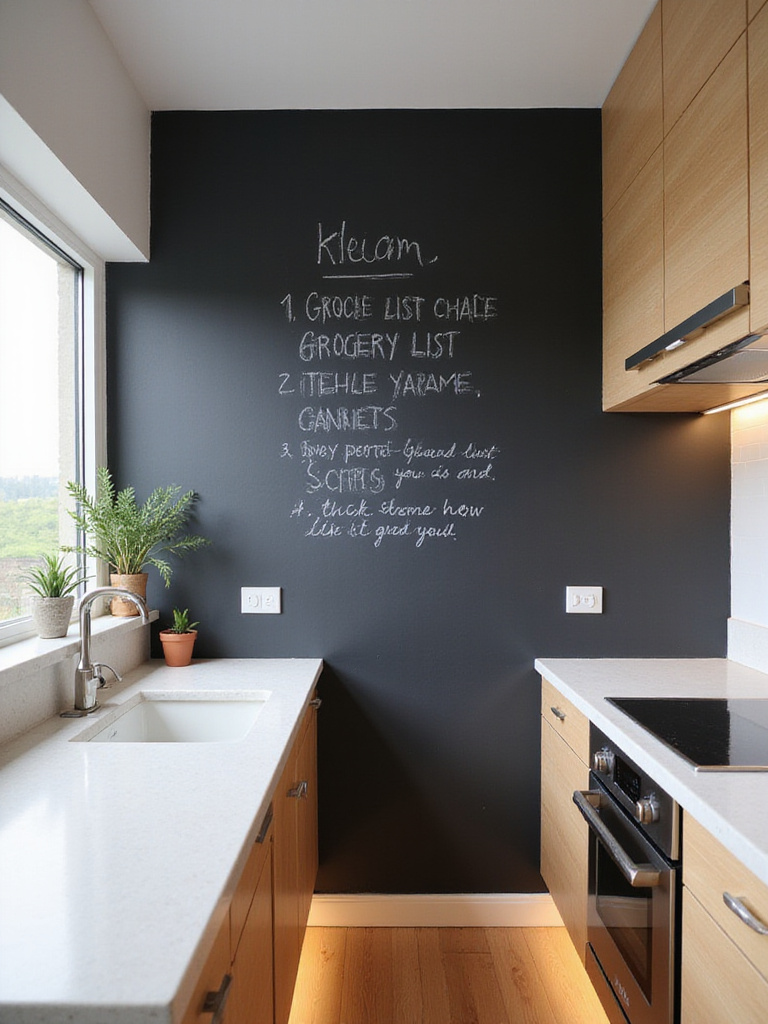
Forget the simple black square. Modern chalkboard papers come in deep greens, navys, and charcoals. I love seeing a whole wall dedicated to it, perhaps by a pantry or a small breakfast table. It becomes this living document of the family: the week’s menu, a grocery list, a child’s spontaneous drawing, a message to a loved one. It’s a dynamic surface that reflects the rhythm of your home in a way static paint never could. A tip from experience: invest in good quality chalk markers. They create sharper lines and less dust than traditional chalk.
This isn’t just a wall; it’s a communication hub and a constantly evolving piece of collaborative family art.
10. Add Sparkle with Metallic Accents
Light is everything in a space. It dictates mood, defines texture, and can make a room feel expansive or cozy. Metallic wallpaper is a fantastic tool because it actively plays with light.
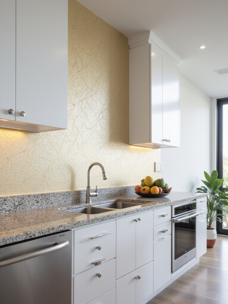
It doesn’t have to be full-on, Las Vegas glam. The most effective metallic papers often use shimmer as a subtle accent—thin gold lines running through a geometric pattern, or a soft, pearlescent sheen on a floral background. These surfaces catch the light as you move through the room, creating a gentle luminosity. They’re especially powerful in smaller or darker kitchens, as they bounce light around and create a sense of depth. Imagine the warm glow it casts in the evening under your cabinet lights.
It’s a quiet kind of magic, making your walls come alive in a way that flat paint just can’t replicate.
11. Prioritize Practicality with Washable Wallpaper
Okay, let’s get practical. The number one fear I hear about kitchen wallpaper is, “But won’t it get ruined?” It’s a valid concern. Kitchens are work zones—there’s steam, grease, and the occasional spaghetti sauce splash.
This is why you have to choose the right material. Most of the beautiful designer wallpapers you see today are available in vinyl or vinyl-coated versions. These aren’t the shiny, plastic-looking papers of the past. They have matte finishes and rich textures, but with one huge advantage: they’re cleanable. When you’re shopping, look for terms like “washable” or even better, “scrubbable.” This means they’re specifically engineered to stand up to wiping down with soap and water. You get all the aesthetic impact without the high-maintenance anxiety.
Art should enhance your life, not add stress to it. Choosing a durable, washable paper is the key to making it work in the busiest room of the house.
12. Make a Statement with an Accent Wall
Sometimes, a little bit of a bold pattern goes a long way. If the idea of wallpapering your entire kitchen feels overwhelming, an accent wall is your best friend. It’s a lower-commitment way to bring in pattern and create a powerful focal point.
So, which wall should you choose? Look for a natural focal point in your kitchen. The wall behind your range (if properly protected) is a great candidate, as is the main wall of a breakfast nook, or the wall you see first when you walk into the room. This is your chance to be daring. Pick that large-scale mural or that wild, colorful pattern you fell in love with but were too nervous to use everywhere. By containing it to one wall, you give the pattern room to breathe and make its statement without suffocating the space.
It’s like hanging one incredible, oversized painting. It commands attention and sets the tone for the entire room.
13. Surprise and Delight Inside Cabinets
Some of the most delightful art experiences are the ones you don’t expect. I love the idea of creating little “secret” moments of beauty in a home, and the inside of a cabinet is the perfect place for one.
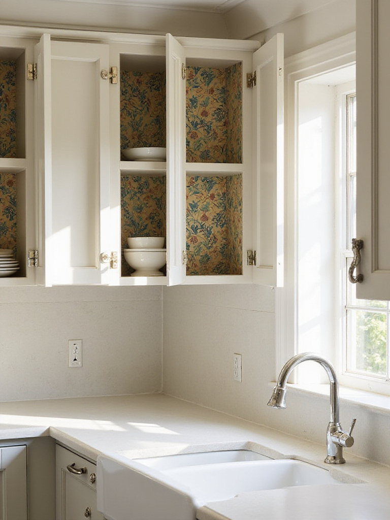
This works especially well with glass-front cabinets, as the wallpaper becomes a beautiful backdrop that makes your glassware or dishes pop. But even in solid-door cabinets, it’s a private moment of joy just for you. Every time you open the door to grab a coffee mug, you’re greeted with a splash of pattern and color. It’s an easy place to experiment, too. Peel-and-stick papers are perfect for this, since it’s a small area and the stakes are low. Think of it as lining a beautiful piece of luggage—it’s a personal touch that elevates the everyday.
It’s a testament to the idea that good design should be enjoyed even in the most private, utilitarian spaces.
14. Look Up! Wallpaper the Ceiling
We’re so conditioned to think about the four walls around us that we often forget about the massive, blank canvas right above our heads. The ceiling—what designers often call the “fifth wall”—is a goldmine of design opportunity.
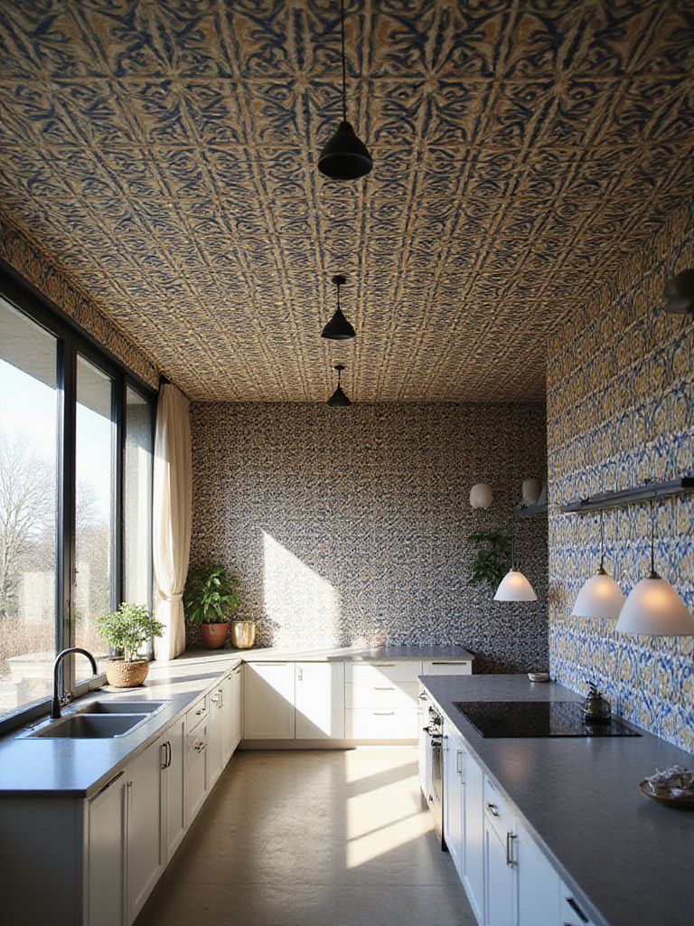
Wallpapering a ceiling can have a transformative effect. In a kitchen with tall ceilings, a dark or dramatic pattern can make the space feel cozier and more intimate. In a smaller kitchen, a light, reflective pattern can create a sense of airiness. It immediately adds a layer of architectural interest to what is usually a completely ignored surface. It’s an unexpected move that shows real design confidence. The view from below, especially from an island or a dining table, can be absolutely stunning.
It’s a bold choice, no doubt. But it’s one that takes your kitchen from a simple room to a fully considered, immersive design experience.
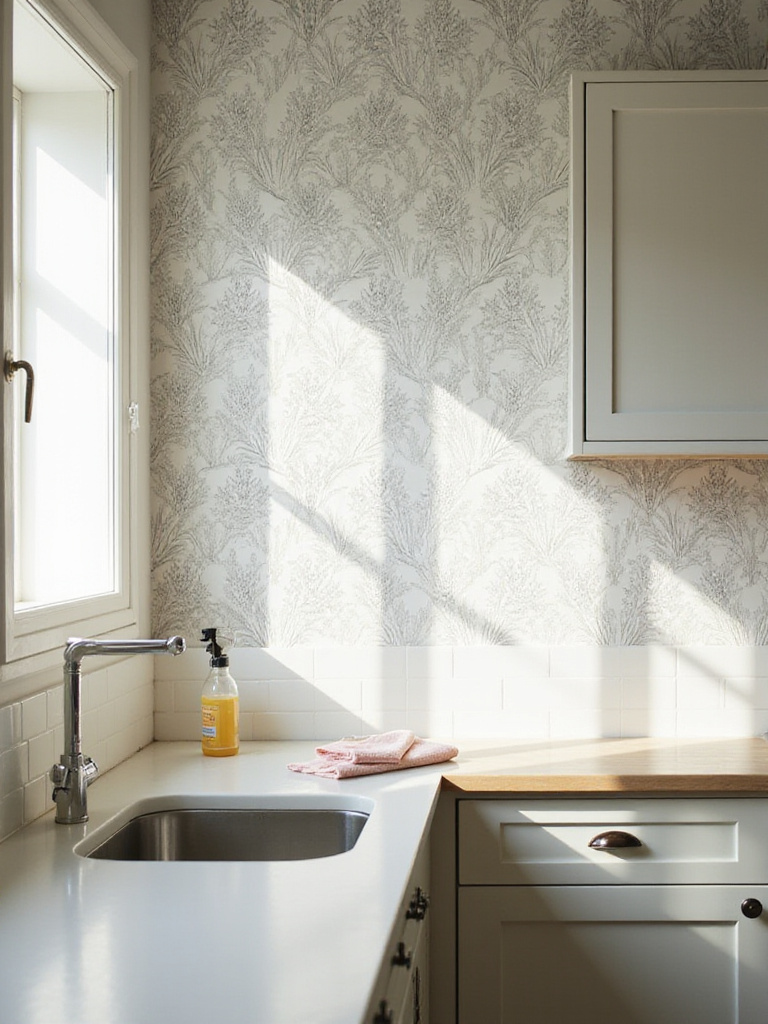
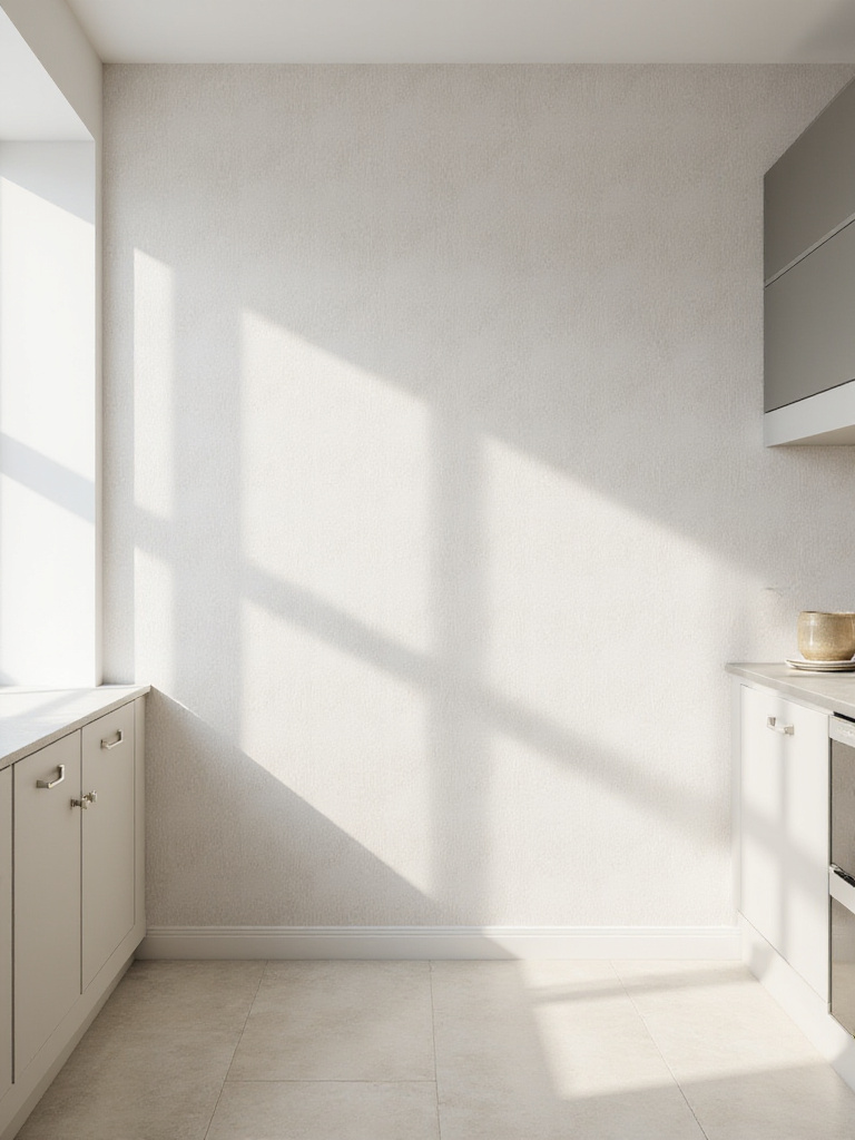
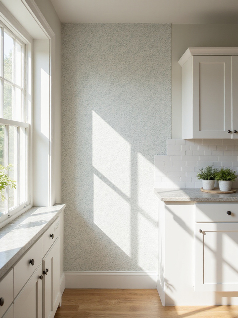
15. Opt for Subtle Charm with Delicate Prints
Not every piece of art needs to shout. Sometimes, the most sophisticated statements are made in a whisper. If you’re not one for bold geometrics or massive murals, a delicate, small-scale print can add a layer of texture and depth without overwhelming your space.
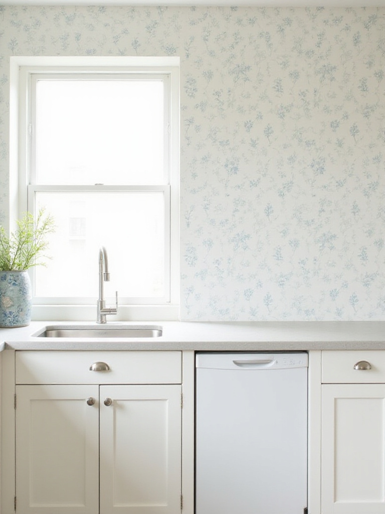
Think of tiny florals, subtle pinstripes, or a soft, tone-on-tone pattern. From a distance, the wall might look like a single, solid color. But as you get closer, it reveals its quiet complexity. This approach is perfect for kitchens that already have a lot going on—maybe you have dramatic cabinetry, a statement backsplash tile, or bold light fixtures. A subtle wallpaper acts as a beautiful, textural background that complements, rather than competes with, these other elements.
It’s the design equivalent of a beautifully tailored linen shirt—simple, timeless, and effortlessly chic.
16. Create Drama with a Large-Scale Mural
If an accent wall is like hanging a single large painting, then a wall mural is like stepping into the painting itself. Unlike a repeating pattern, a mural is a single, cohesive image that stretches across the entire wall, creating an incredible sense of drama and place.
This is your opportunity to create a window to another world. Imagine prepping vegetables while looking out over a misty, watercolor landscape of the Tuscan hills, or sitting at your breakfast bar surrounded by an oversized, abstract forest. Because murals are so immersive, they can visually expand a room, tricking the eye into seeing depth beyond the physical wall. Many companies even offer custom murals from your own high-resolution photographs, allowing you to bring a cherished travel memory right into the heart of your home.
It’s the ultimate statement, transforming a functional wall into a powerful, transportive piece of environmental art.
17. Channel Nostalgia with Vintage Patterns
There’s a comfort and character to vintage designs that’s hard to replicate. Bringing a vintage-inspired pattern into your kitchen is like adding a piece of history—it immediately gives the space a sense of soul and timelessness.
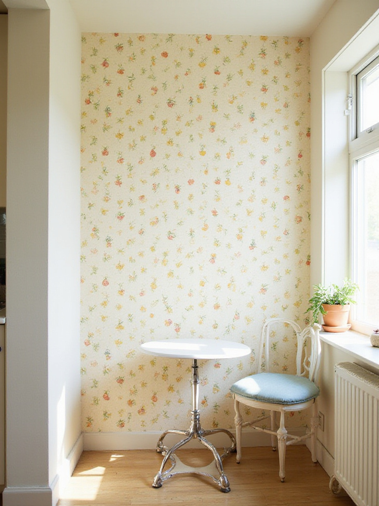
Whether you’re drawn to the cheery, illustrative fruit patterns of the 1940s, the groovy geometrics of the ‘60s, or the delicate florals of an English cottage, the key to making it feel fresh is balance. The last thing you want is for your kitchen to feel like a dated theme park. Pair a vintage-style paper with modern elements: sleek, flat-panel cabinets, contemporary lighting, or minimalist hardware. This juxtaposition is what keeps it feeling current and intentional. A classic William Morris print, for instance, looks incredible against sharp, modern appliances.
You’re not recreating the past; you’re respectfully borrowing from it to create something new and deeply personal.
18. Add Depth with textured wallpaper
In the art world, we talk a lot about texture—the way a surface feels, the way it catches the light. Textured wallpaper brings that same tactile dimension to your walls. It’s an experience that engages more than just your sense of sight.
Options range from papers that mimic natural materials like grasscloth or linen, to embossed geometric patterns that have a subtle three-dimensional quality. Running your hand over a wall with a slight texture is a completely different experience than touching a flat, painted surface. It adds a layer of organic warmth and complexity. These papers are fantastic for creating a sophisticated, layered look, especially in neutral color palettes where texture becomes the main source of visual interest.
It’s a subtle but powerful way to make your kitchen feel richer and more thoughtfully designed.
19. Energize Your Kitchen with Bright Colors
Color is pure emotion. It can make us feel energized, calm, happy, or contemplative. Using a brightly colored wallpaper is one of the quickest ways to inject a specific mood into your kitchen.
Think about the energy you want in your space. Sunny yellows and vibrant oranges are known to stimulate appetite and conversation—perfect for a breakfast nook. Cool blues and greens can bring a sense of calm and focus, which can be lovely in the main cooking area. If an entire room of bright color feels too intense, use it strategically. A jolt of a fun, colorful pattern on the back of an open shelving unit or inside a pantry can be just the dose of joy your kitchen needs.
This is your chance to stop playing it safe with neutrals and use color to make your kitchen a space that doesn’t just serve you, but actively inspires you.
20. Keep it Subtle with Neutral Patterns
Neutral does not, and should not, ever mean boring. A subtly patterned wallpaper in a palette of greys, beiges, creams, or soft earth tones can bring incredible sophistication to a kitchen.
The power of a neutral pattern lies in its versatility and longevity. A quiet herringbone, a soft, tone-on-tone damask, or a texture that mimics linen provides a beautiful, complex backdrop that won’t clash with your other design choices, now or five years from now. It adds depth and prevents the walls from feeling flat, while still allowing other elements—your art, your colorful stand mixer, a beautiful bowl of fruit—to be the star of the show.
It’s a long-term investment in a calm, cohesive, and elegant aesthetic that will stand the test of time.
21. Go Easy with Peel and Stick Wallpaper
For anyone who has “commitment issues” when it comes to design, peel-and-stick wallpaper is, frankly, a gift from the heavens. It offers all the transformative power of wallpaper without the paste, the mess, or the long-term bond.
This is the perfect entry point if you’re nervous about wallpapering. The quality has improved immensely over the years, and you can now find stunning designer patterns in this format. It’s ideal for renters who want to personalize their space without risking their security deposit. It’s also brilliant for those of us who love to change things up. You could even use it to have seasonal backsplashes if you wanted! Made a mistake during installation? Just peel it off and reposition it. Changed your mind in two years? It comes off without damaging the wall.
It completely removes the fear factor, allowing you to experiment freely and find a look you truly love.
22. Transform Your Backsplash Area
The backsplash is prime real estate for making a design statement. It’s a contained area that’s naturally a focal point. While tile is the traditional choice, wallpaper opens up a universe of pattern possibilities.
Now, this is the one spot where material choice is absolutely non-negotiable. You must use a highly durable, waterproof vinyl wallpaper. Some people even install a clear panel of acrylic or tempered glass over a more delicate paper to protect it from water and grease while keeping the pattern perfectly visible. This allows you to use virtually any design you want. I’ve seen this done with antique maps, delicate Chinoiserie prints, and bold graphics—all options that would be impossible with tile.
It turns a purely functional area into a jewel box of pattern and detail, a curated moment of art right where you need it most.
Conclusion
Ultimately, the most successful kitchen designs are the ones that feel deeply personal. Wallpaper is an incredible medium for expressing your style because it’s so immediate and transformative. Whether you opt for a bold, room-defining mural or a subtle texture that whispers its elegance, you are elevating the space from purely functional to truly expressive.
Treat your kitchen walls like the canvas they are. You’re not just cooking in there; you’re living in there. Make it a space that nourishes your spirit as much as it nourishes your body.