A bedroom should be more than just a place to sleep. It’s your private retreat, the one space in the world that is truly, entirely yours. As someone who has spent over a decade helping people create homes that work for every age and ability, I’ve seen firsthand how the color of those four walls can dramatically shift your reality. It can quiet a busy mind, ease the transition into a new day, or provide a deep, restorative sense of safety.
What really gets me is how often we treat paint as a simple decoration. It’s not. It’s a powerful tool for well-being. The right color is foundational to creating a home that supports you through every stage of life. So, whether you’re planning for aging parents, raising young kids, or simply want to create a space that feels like a deep exhale, let’s talk about color. Forget trends for a moment and think about how you want to feel.
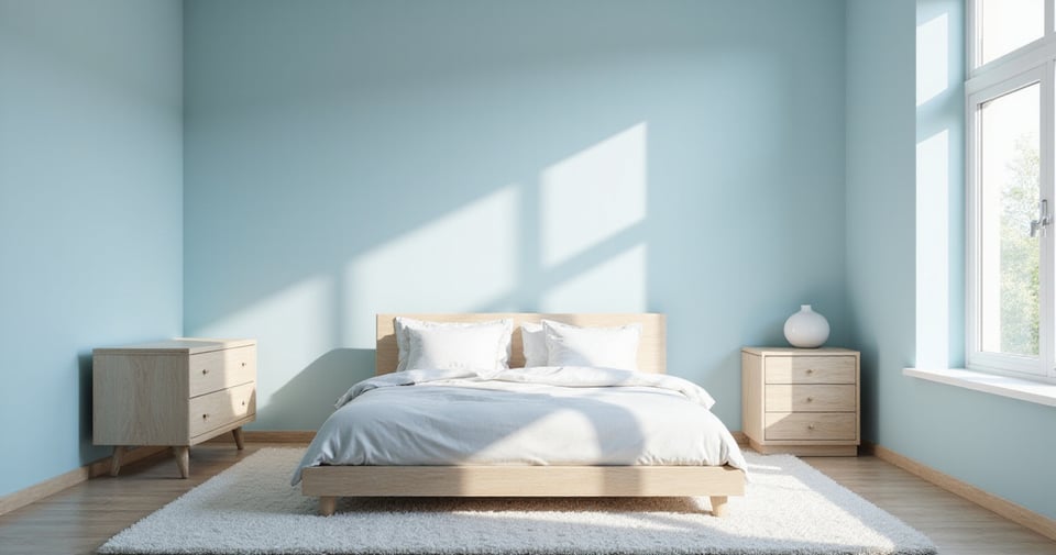
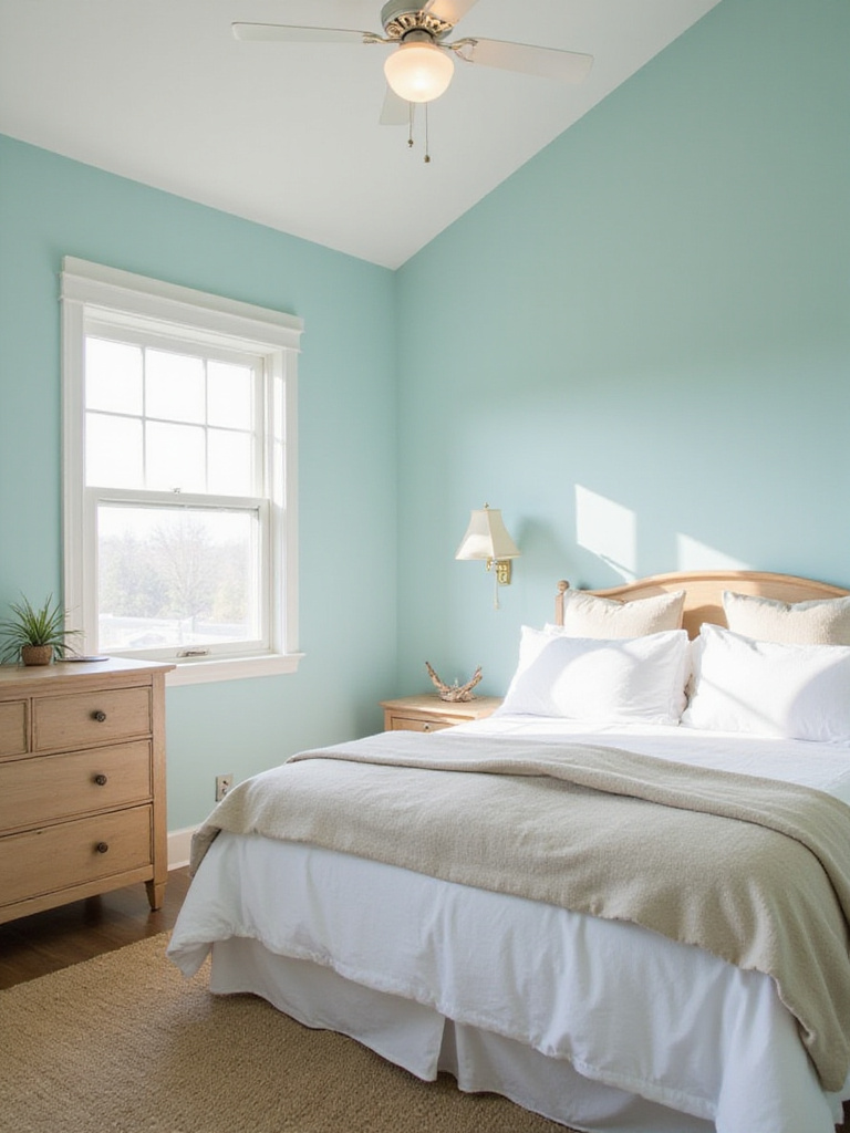
1. For a Peaceful Night’s Sleep, Try Calming Sky Blue
There’s a real, biological reason this color works. Our brains are wired to associate the soft, muted blue of the sky with calmness. It’s a signal to our nervous system that everything is okay, which can actually help lower your heart rate and blood pressure. When I’m working on a sensory-friendly design, a gentle blue is often my starting point because it’s not demanding. It just is.
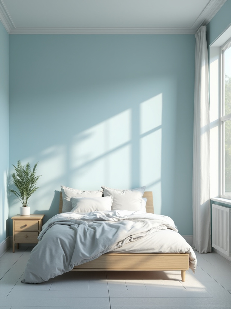
But you have to be picky. We’re not talking about a vibrant, electric blue. Think about the hazy, soft color of the sky on a perfect afternoon. Those are the shades—powder blue, pale cerulean—that work magic. I love pairing it with the warmth of a wood headboard and crisp white linens. It’s a timeless look that feels both clean and deeply comforting, and the forgiving nature of the color hides minor scuffs and dings, which is a bonus for any active household.
While blue encourages us to look up and breathe, another color brings us right back down to earth.
2. For a Natural Retreat, Use Serene Sage Green
I’ve become a huge advocate for biophilic design—the idea that we have an innate need to connect with nature. Sage green is biophilic design in a paint can. It brings the restorative, grounding feeling of the outdoors into your most personal space, creating a sense of balance that our hectic lives often lack. It’s a color that promotes rest without feeling sleepy.
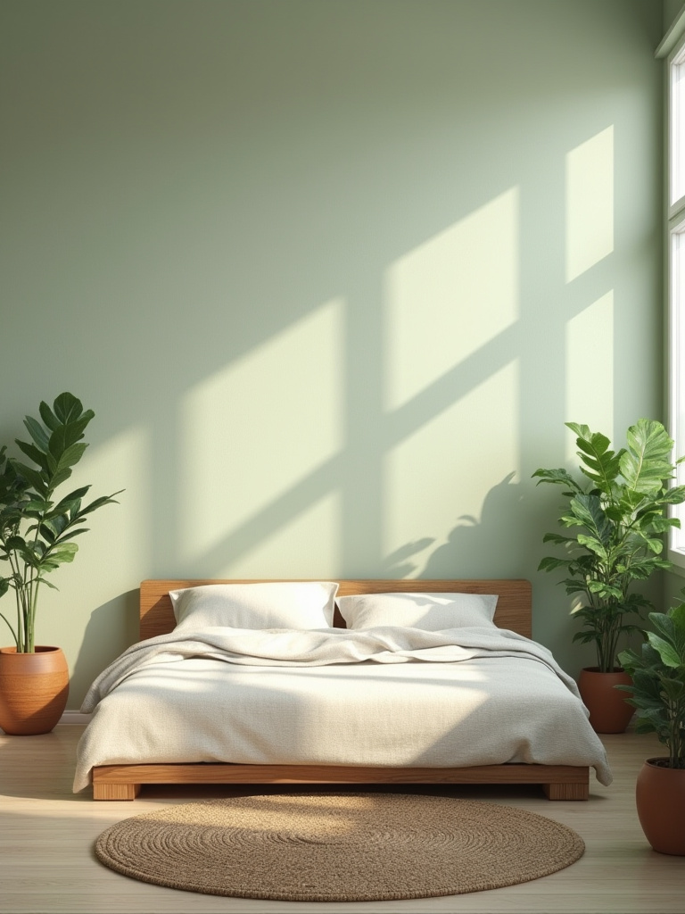
Here’s where it gets a little technical but makes all the difference: the light in your room matters. For a north-facing room that gets cooler light, I’ll choose a sage with a slightly warmer, yellower undertone to keep it from feeling dreary. In a bright, south-facing room, a cooler sage with more gray in it feels sophisticated and calm. Then, layer in textures—a rattan basket, a few live plants, a chunky wool throw. You’re not just painting a room; you’re building an ecosystem of calm.
Sage green grounds us in quiet strength, but sometimes what a room really needs is a clean slate.
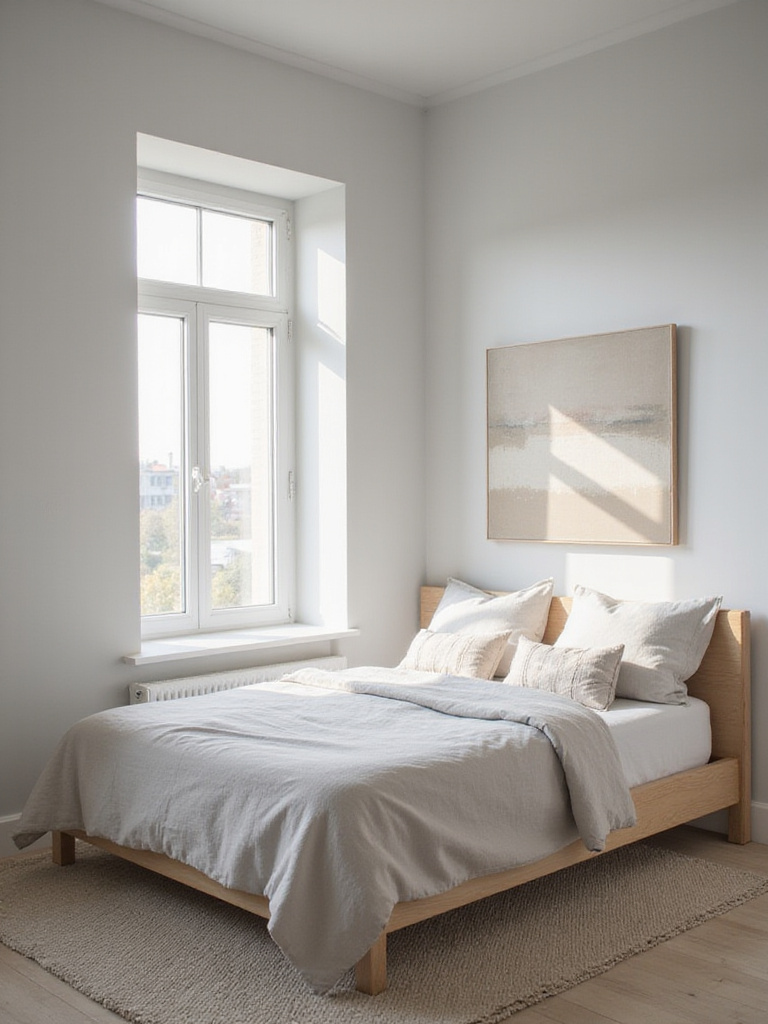
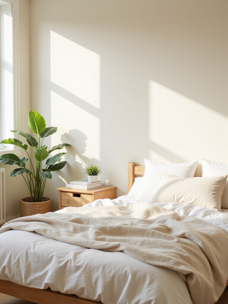
3. For a Fresh Start, Go with a Classic Crisp White
Now, I have a love-hate relationship with all-white bedrooms. Done right, they are stunning. Done wrong, they can feel cold and clinical—the last thing you want in a room meant for rest. The secret isn’t the white itself, but its undertone. What a lot of people don’t realize is that there are hundreds of whites. Cool whites with a hint of blue or gray can feel bright and modern in a room with lots of warm, southern light. But in a north-facing room? They can look sterile. That’s where warmer, creamier whites are your best friend.
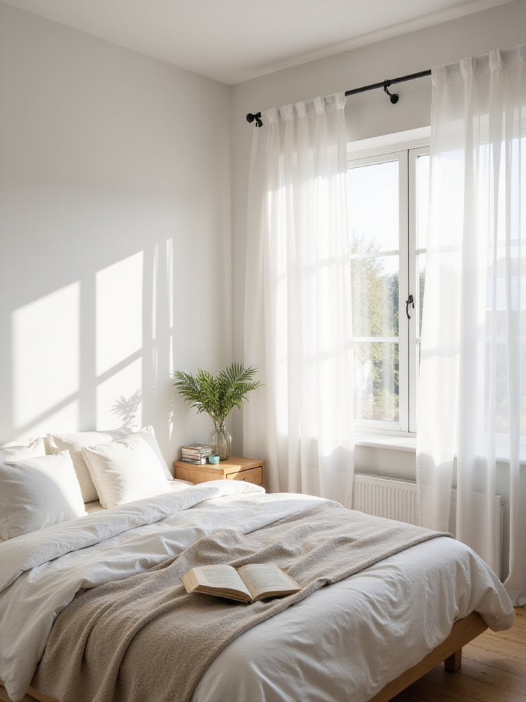
From a universal design perspective, white walls can be fantastic for creating high contrast, which is helpful for people with low vision. A dark-colored door frame against a white wall is much easier to navigate. The trick is to prevent it from feeling like a hospital. The key is texture, texture, texture. Think of a big, nubby knit blanket, a weathered wood bench, and linen curtains. Those layers add the warmth and soul that a simple coat of paint can’t provide on its own.
While white offers a blank canvas, some of us crave a room that feels more like a gentle hug.
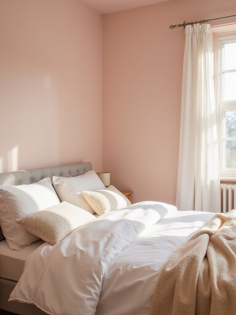
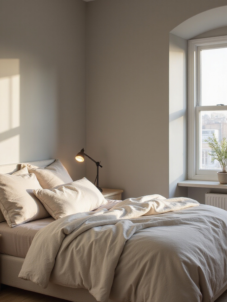
4. For That “Hug-in-a-Room” Feeling, Try Cozy Warm Beige
Let’s be honest, beige got a bad rap for a while. It was the color of boring, generic spaces. But the right warm beige is something else entirely. It’s a color that feels like sinking into a comfortable armchair at the end of a long day. I once worked with a family whose grandmother, who was living with them, felt constantly agitated in her bright, cool-toned room. We repainted it in a warm, sandy beige, and the change was immediate. The room became her haven.
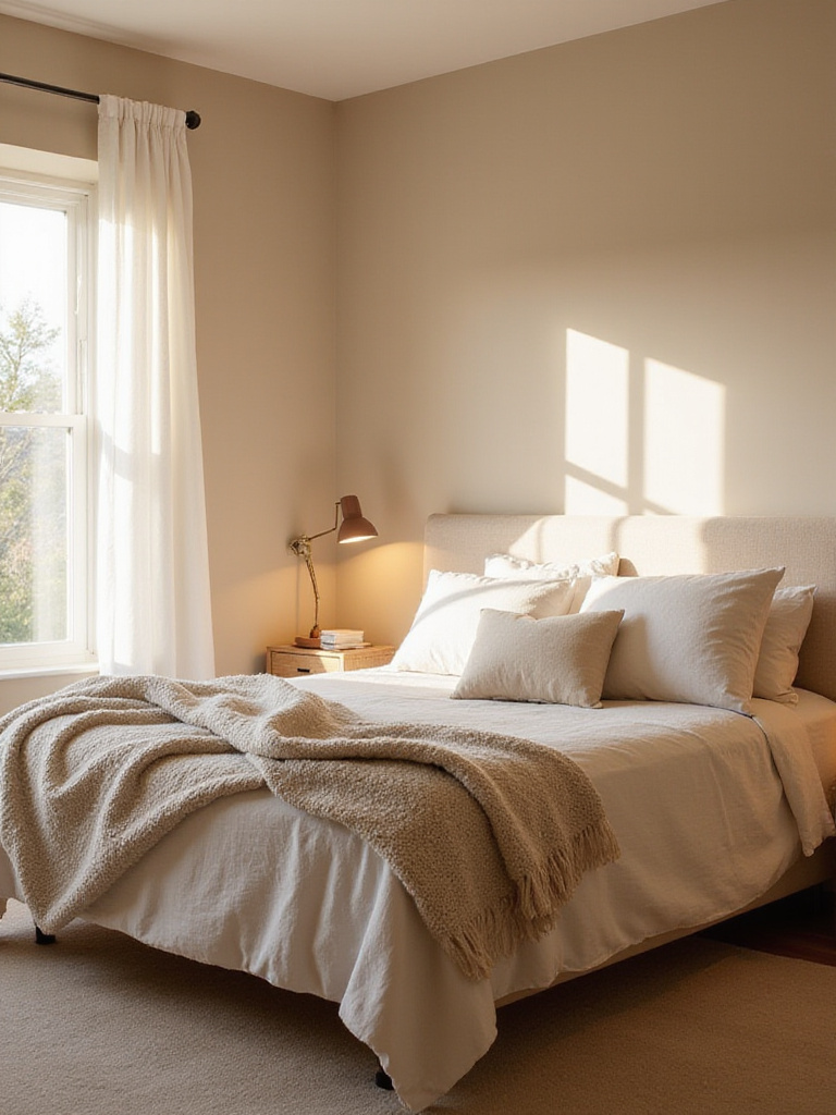
The magic is in the subtle red or pink undertones that give the color a life of its own. It shifts beautifully as the light changes throughout the day, creating soft, gentle shadows. This isn’t a flat, dead color. It’s responsive. To make it feel truly luxurious, layer in other tones from the same family—creamy bedding, a slightly darker taupe throw, and natural wood. It creates a rich, monochromatic look that is anything but boring.
Warm beige offers soft comfort, but if you’re looking for a little more drama, you might want to go to the dark side.
5. For a Touch of Modern Edge, Go for Sophisticated Charcoal Grey
The idea of painting a bedroom a dark color like charcoal can be intimidating. “Won’t it feel like a cave?” is a question I get all the time. My answer? Only if you want it to. Frankly, a dark wall can do the opposite—it can make the boundaries of the room recede, creating a sense of infinite, cozy space. It’s about crafting a cocoon, not a cave.
What’s brilliant about charcoal is how it makes everything else in the room pop. Your artwork looks more important. The white of your bedding looks crisper. The warmth of a brass lamp feels richer. It’s a sophisticated backdrop that adds instant drama and intimacy. I especially love it in bedrooms that get a ton of natural light, where it can feel grounding and balanced during the day and incredibly enveloping at night.
From the cool confidence of charcoal, let’s explore a color with a softer, almost spiritual vibe.
6. For a Dose of Tranquility, Consider Relaxing Lavender Hues
There’s a history of calm associated with lavender that goes back centuries, from aromatherapy to ancient Roman baths. Bringing that soft, muted purple onto your bedroom walls taps into that long legacy of peace. But this is another case where the specific shade is everything. We’re not talking about a sugary, bright purple from a kid’s room. Think dusty, grayed-out lavender.
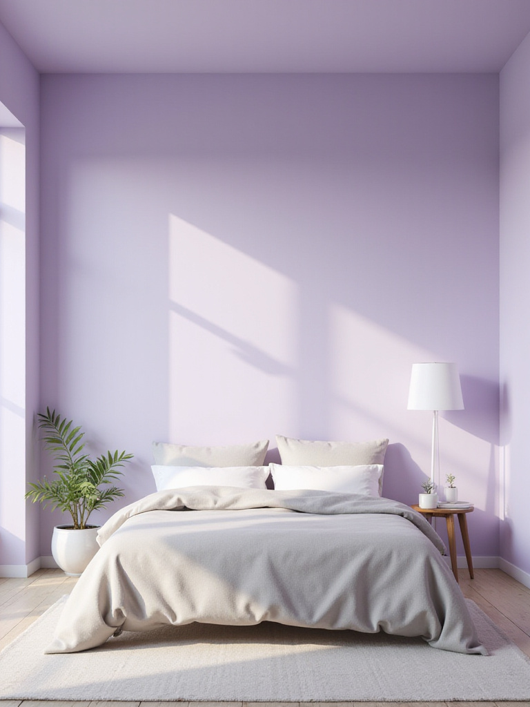
These muted shades are wonderful for creating a space that feels both creative and serene, which can be a tough balance to strike. It encourages quiet contemplation without putting you to sleep. It’s a fantastic choice for a bedroom that also doubles as a reading nook or a space for meditation. Pair it with soft grays, creamy whites, and natural wood to keep it grounded and sophisticated.
From the ethereal calm of lavender, we dive into the deep end with a truly immersive blue.
7. For a Dramatic Escape, Try Deep Midnight Blue
Painting a room midnight blue is a commitment, but the payoff is incredible. It’s like wrapping your room in the night sky. There’s something deeply protective and luxurious about it. This is a color that says, “The day is done. You are safe here.” For a client who was a veteran dealing with PTSD, we created a midnight blue room that he described as his “personal fortress.” It quieted the visual noise and helped him feel secure.
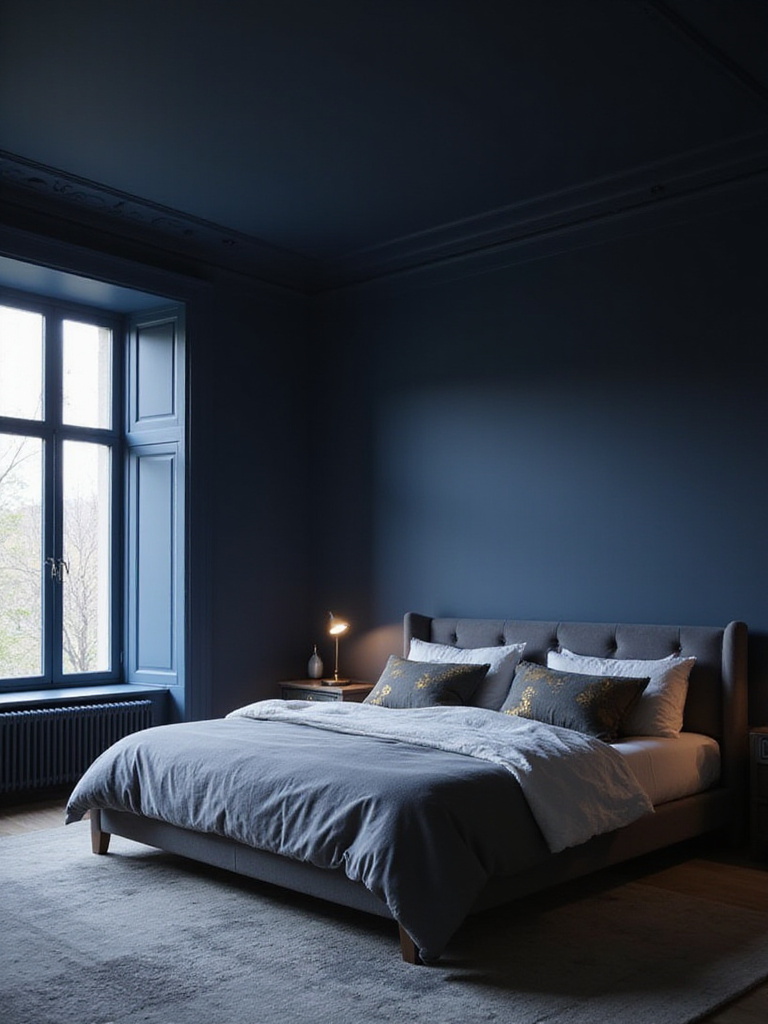
One of the surprising benefits is how practical it is. A deep, matte navy is excellent at hiding scuffs and imperfections, making it a great choice for a high-traffic home. And the way it plays with light is just stunning. Add a few metallic accents—a gold mirror, a brass reading lamp—and they will gleam like stars. It’s drama, but it’s a quiet, elegant drama.
From the drama of a night sky, we come back to the earth with a color that feels ancient and warm.
8. For Grounding Warmth, Choose Earthy Terracotta
There’s a reason we’re so drawn to earth tones. They connect us to something stable and timeless. Terracotta, with its baked-earth feel, does this better than almost any other color. It’s warm, inviting, and has a richness that feels both ancient and completely modern. It wraps a room in a grounded, comfortable energy that is perfect for winding down.
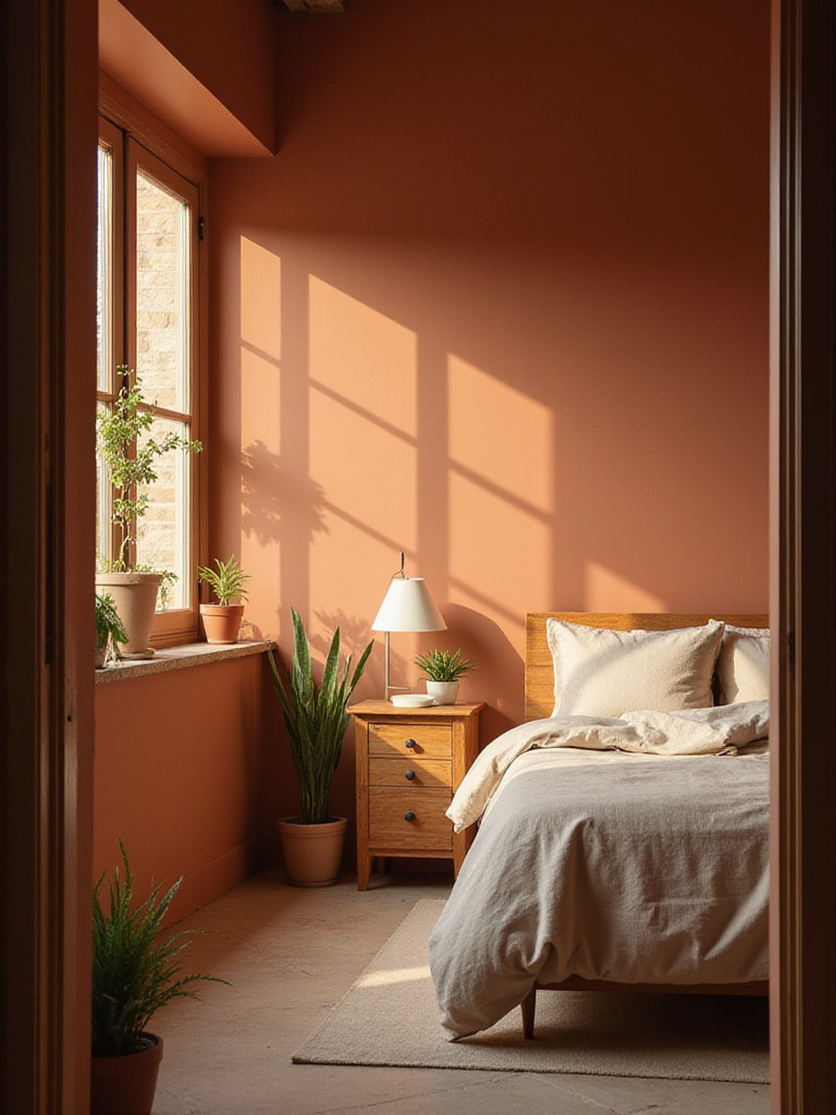
I love using terracotta on an accent wall behind the bed to create a warm, inviting focal point that isn’t overwhelming. It pairs beautifully with its natural neighbors—sage greens, creamy whites, and even deep blues. And you can lean into the organic feel by bringing in materials like unfinished wood, linen, and clay pottery. It’s a color with a story, and it makes your room feel like it has one, too.
From grounded, earthy tones, we can take a breath of fresh air with something a bit brighter.
9. For a Bright Awakening, Go with Fresh Mint Green
Just as sage green connects us to the forest floor, a soft mint green connects us to renewal and spring. It’s a color filled with gentle optimism. I find it’s a wonderful choice for people who struggle with waking up in the morning. It doesn’t jolt you awake like a harsh alarm clock; it gently nudges you into the day with a feeling of freshness and possibility.
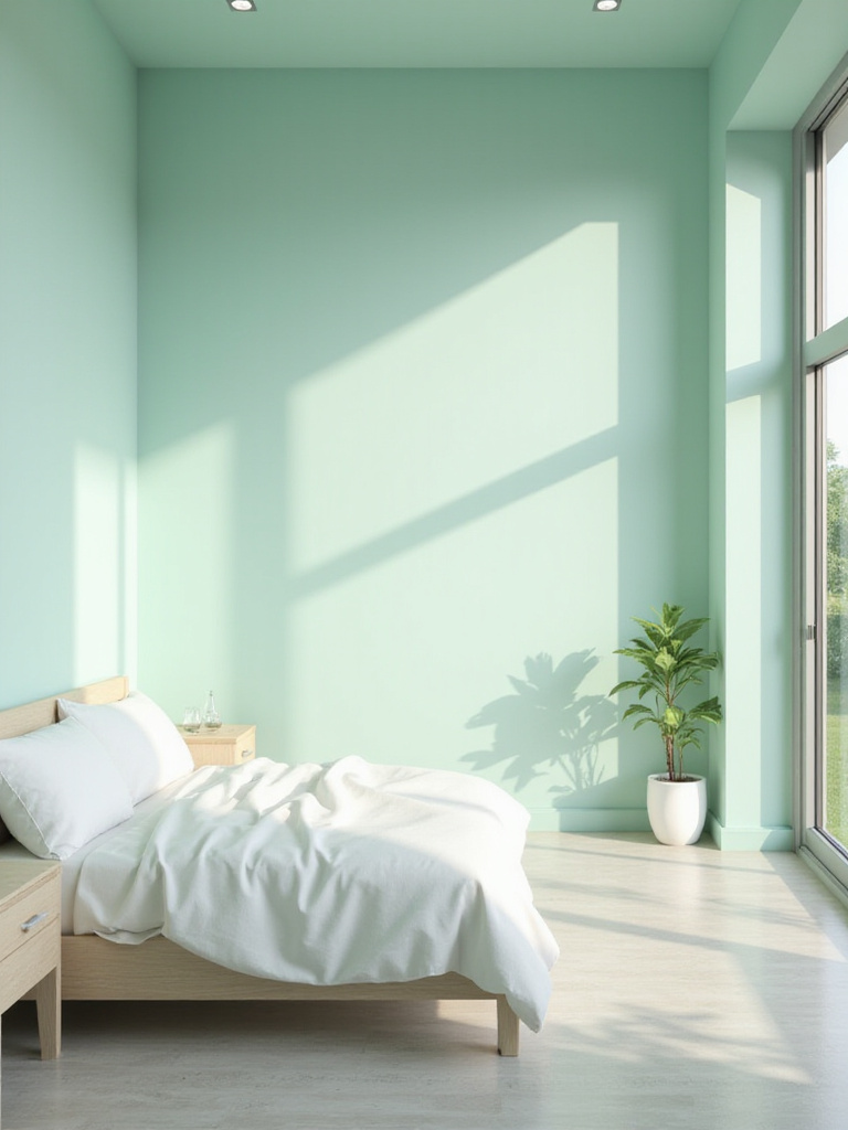
The mistake many people make is choosing a mint that is too sweet or bright, which can end up feeling more appropriate for a nursery. Look for a mint with a touch of gray to it—that’s the key to making it feel sophisticated. It has a vintage, almost nostalgic quality while still feeling incredibly fresh. Pair it with crisp whites and light woods for a clean, airy feel that’s hard to beat.
From mint’s cool energy, let’s shift to a color that offers a much warmer, more tender embrace.
10. For Romantic Comfort, Try a Soft Dusty Rose
Pink in a primary bedroom? Stay with me here. We’re not talking about bubblegum pink. Dusty rose is a whole different animal. With its beige and gray undertones, it’s a grown-up, sophisticated color that feels more like a soft glow than a loud statement. It creates a space that feels nurturing and warm, almost like being wrapped in a cashmere blanket.
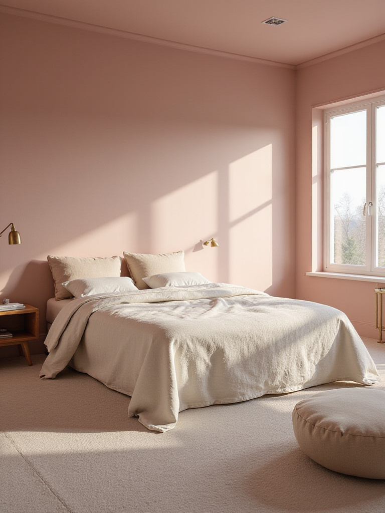
This is a great example of how color can influence our emotions. A soft, warm pink can make us feel cared for and calm. It’s romantic without being cliché. I’ve found it to be a fantastic bridge color in rooms used by couples, as it feels both soft and strong. To keep it from feeling too sweet, ground it with charcoal gray accents, warm woods, and maybe a touch of brass.
From the gentle warmth of rose, we find a perfect, quiet balance in a timeless neutral.
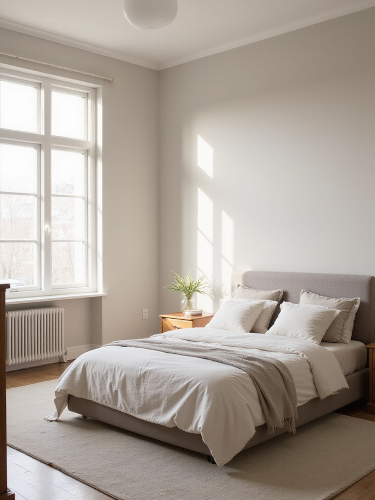
11. For Understated Calm, Choose Peaceful Pale Grey
Grey has been the king of neutrals for a long time, and for good reason. A soft, pale grey is the ultimate chameleon. It can feel modern, traditional, calming, or energetic, all depending on what you pair it with and—this is crucial—its undertone. A pale grey with blue undertones will feel crisp and cool. One with green undertones feels more natural and serene. And a pale grey with beige undertones (what we call “greige”) is the champion of warmth.
The beauty of pale grey is that it creates a quiet, restful backdrop that doesn’t demand attention. This makes it an ideal choice for anyone who is sensitive to visual clutter. It allows your furniture, artwork, and textiles to be the stars of the show. To add depth, I always recommend layering different sheens—a matte finish on the walls, a satin or semi-gloss on the trim, and lots of soft fabrics. This creates a rich, textured space that feels anything but flat.
While pale grey offers a whisper of color, sometimes a space calls for something far more saturated and deep.
12. For Depth and Luxury, Use a Rich Forest Green
There’s a design trend moving towards darker, more enveloping spaces, and I think it’s a reaction to our chaotic world. We’re craving sanctuary. A deep forest green delivers exactly that. Painting a bedroom this color feels like stepping into a dense, quiet wood. It’s grounding, protective, and incredibly luxurious.
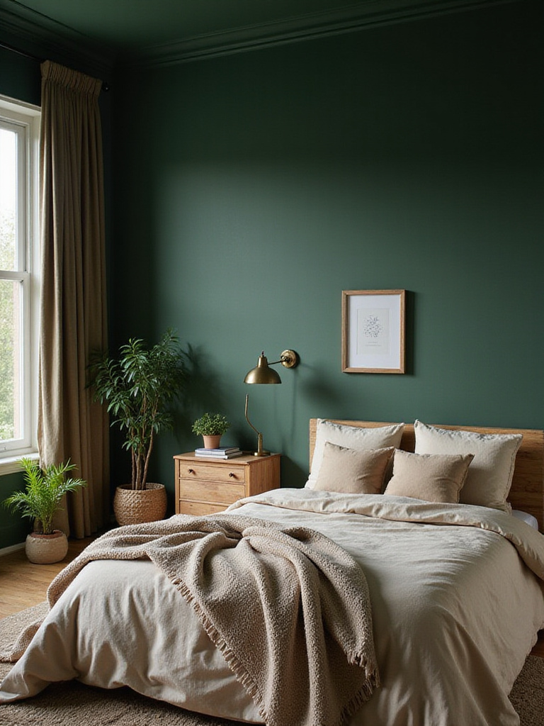
It might seem counterintuitive, but a dark color like forest green can actually make a small room feel more expansive because it blurs the corners and creates a sense of depth. It’s a bold choice, but one that pays off in atmosphere. It’s magnificent when paired with leather, dark wood, and rich metallic finishes like aged brass or copper. It creates a heritage feel that is both sophisticated and profoundly comforting.
From the depths of the forest, let’s find the perfect spot right in the middle.
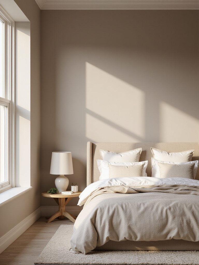
13. For the Perfect Neutral Blend, Try Gentle Greige
Ah, greige. For years, designers have sworn by it, and it’s easy to see why. It’s the Goldilocks of paint colors. It takes the best of both worlds—the sophisticated cool of grey and the welcoming warmth of beige—and blends them into one perfect, versatile neutral. It’s almost impossible to get wrong.
What I love about greige is how it adapts to its surroundings. In morning light, it can feel warmer and more like beige. In the cool light of evening, its gray undertones come forward. This adaptability makes it a fantastic foundation for any design style and an ideal choice for a room that needs to feel calming for multiple people, like in a multi-generational household. It doesn’t fight with warm woods or cool blues; it just provides a perfect, harmonious backdrop.
From that perfect balance, let’s dial up the cheerfulness for our mornings.
14. For a Cheerful Morning, Choose a Sunny Soft Yellow
A lot of people are scared of yellow, associating it with an aggressive, hard-to-live-with brightness. But a soft, buttery yellow is a completely different experience. It doesn’t shout; it glows. Painting a room in this shade is like guaranteeing yourself a little bit of sunshine, even on the cloudiest days. It’s inherently optimistic.
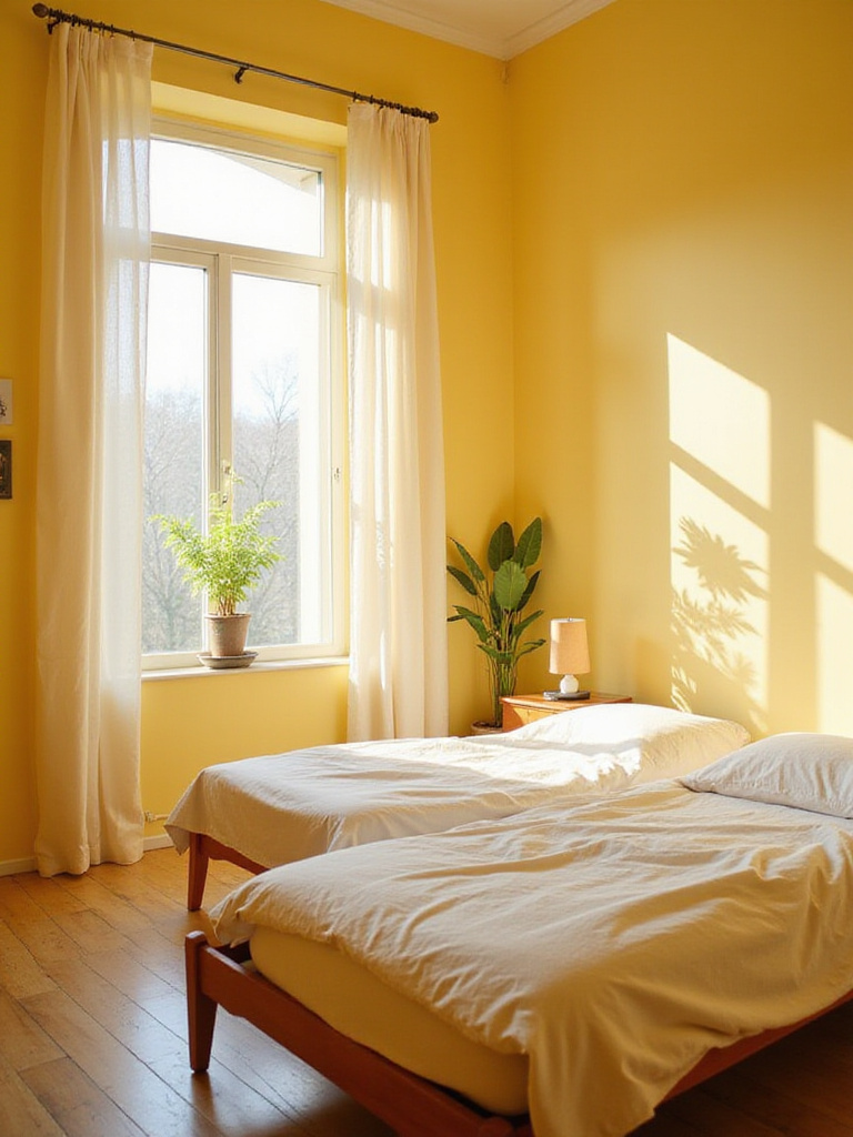
For a bedroom, the key is to avoid anything with a green undertone, which can feel harsh, and lean into yellows with a creamy, almost beige base. These colors reflect light beautifully without being glaring, making them a wonderful choice for north-facing rooms that need a little help feeling bright and airy. One of my favorite, unexpected pairings is a soft yellow with deep navy blue accents. The contrast is sophisticated and timeless.
While soft yellow brings the morning sun, navy blue offers the elegance of a clear night.
15. For a Bold, Modern Statement, Use Navy Blue
Navy blue has shaken off its old-school, nautical associations and has become a go-to for creating spaces that feel both bold and incredibly chic. It’s like a perfectly tailored suit—it looks sharp, confident, and timeless. Modern navy often has subtle green or even purple undertones, which gives it a contemporary depth that is just beautiful.
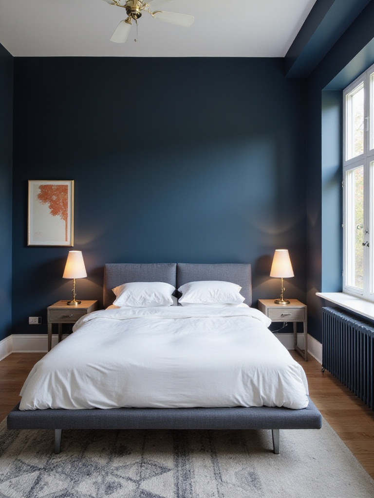
The great thing about navy is its power of contrast. It makes whites look whiter, metallics look richer, and warm woods look warmer. It’s a very stable, grounding color that can, paradoxically, feel both exciting and very calming. It’s an excellent choice for a primary bedroom where you want to create a hotel-like sense of sophisticated escape.
From the bold confidence of navy, we can soften into a shade that’s all about gentle romance.
16. For Sweet Dreams, Go with Romantic Blush Pink
Blush pink is dusty rose’s slightly brighter, sweeter cousin. And yes, you can absolutely use it in a primary bedroom without it looking like a kid’s room. The key, again, is to choose a shade that has some gray or beige mixed in to give it a muted, sophisticated quality. The effect is like being surrounded by the gentle light of dawn.
This color is pure comfort. It has a warmth that feels soothing and safe, which is why it can be so conducive to good sleep. To keep the look modern and grounded, avoid pairing it with other sweet colors. Instead, try it with olive green, charcoal gray, or natural wood tones. The contrast makes the blush feel intentional and stylish rather than overly sentimental.
From the tenderness of blush, we move to a classic that radiates quiet elegance.
17. For Timeless Style, Choose Elegant Taupe
If greige is the perfect blend of gray and beige, taupe is its slightly warmer, earthier sibling. It has more noticeable brown undertones, giving it a depth and warmth that feels incredibly sophisticated and timeless. Taupe is a “forever” color. It’s a neutral that will never go out of style and will support almost any decor you throw at it.
One of the best things about taupe is how it makes a room feel complete and cohesive. It has enough color to feel present and intentional but is neutral enough not to compete with your furniture or art. I often recommend layering different shades and textures of taupe in a room—from the paint to the bedding to the curtains—to create a rich, enveloping space that feels incredibly calming and high-end.
While taupe offers quiet sophistication, sometimes you need to make one single, powerful statement.
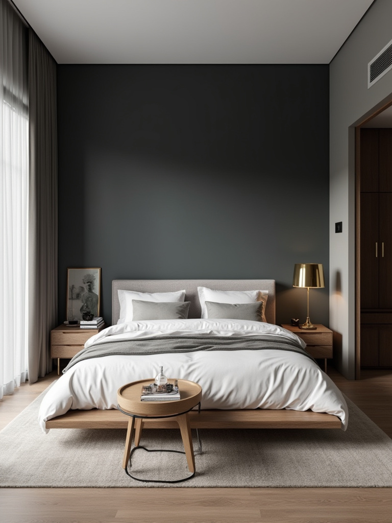
18. For Intense Focus, Create a Dramatic Black Accent Wall
I know, I know. Black? In a bedroom? It sounds like a recipe for a gloomy dungeon. But hear me out. A single, strategically placed black accent wall—usually behind the headboard—can be one of the most elegant and dramatic statements you can make. It doesn’t make the room feel small; it creates a focal point of immense depth and sophistication.
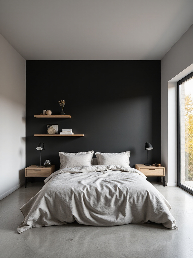
Think of it as a backdrop. A black wall makes a simple white headboard look like a piece of sculpture. It makes brass reading lights glow. It gives the room a bold, architectural feel that is undeniably luxurious. It’s a confident move, to be sure. But for a room that needs a powerful anchor, or for someone who wants to create that high-end, boutique hotel feeling at home, it’s a phenomenal choice.
From that single point of drama, let’s explore a color that’s all about creative energy.
19. For a Pop of Creative Energy, Try Vibrant Teal
Teal is such a fascinating color. It sits perfectly between the calming properties of blue and the renewing energy of green, and the result is a color that feels both vibrant and sophisticated. As a full-room color, it can be a bit much for some people in a space meant for rest. But as a pop? It’s spectacular.
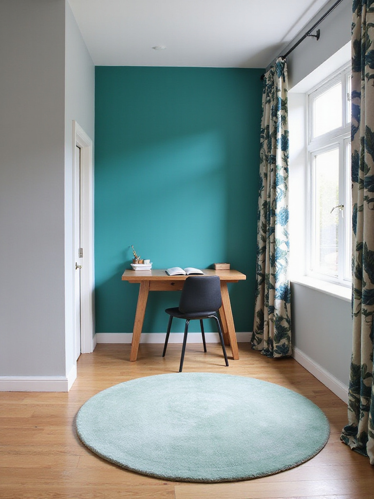
Consider a teal accent wall in a part of the bedroom you use for more than just sleeping—a reading corner, a small desk area, or even the inside of a bookshelf. It can define a zone and infuse it with a dose of creative, uplifting energy without overwhelming the entire space. It pairs wonderfully with warm neutrals like beige and taupe, and looks incredible with natural wood and leather accents.
From teal’s energetic pop, we can head to the coast for something utterly serene.
20. For Coastal Vibes, Try Soothing Aqua
There’s no color that says “vacation” quite like aqua. It’s the color of shallow tropical water and clear skies, and it instantly brings a sense of serenity and escape into a room. Even on a gray, rainy day, an aqua room can make you feel like you can hear the waves.
The key to making aqua feel restful rather than jarring is to choose a muted, slightly grayed-out version. A bright, saturated aqua can be a little too energetic for a sleep space. But a soft, washed-out aqua is pure tranquility. It’s a natural fit with weathered woods, woven jute rugs, and crisp white linens—all the elements that create that relaxed, beach house feel.
From the calm of the coast, we find a different kind of brightness in a color that feels like a soft glow.
21. For Soft Brightness, Use a Creamy Off-White
If crisp, pure white feels a little too stark for you, creamy off-white is the perfect alternative. It gives you all the brightness and light-reflecting qualities of white but with an added layer of warmth that makes a room feel instantly more welcoming and comfortable. The subtle yellow, pink, or beige undertones make all the difference.
An off-white bedroom is a beautiful canvas for collected treasures. It’s a color that doesn’t compete for attention, allowing your artwork, textiles, and cherished objects to shine. It also develops a lovely character throughout the day, warming up in the afternoon sun and feeling cozy and soft in the evening lamplight. It’s a simple, classic choice that is anything but boring.
From creamy brightness, we find that perfect midpoint of sophisticated comfort once more.
22. For Balanced Comfort, Choose a Welcoming Warm Grey
When clients tell me they want a room that feels modern but also cozy and approachable, my mind almost always goes to warm grey. It’s a true workhorse. It bridges the gap between the cool, minimalist aesthetic and a more traditional, comfortable style. Those subtle beige or brown undertones are the secret—they keep the gray from ever feeling sterile or cold.
From a future-proofing perspective, warm gray is a fantastic investment. It’s incredibly versatile and long-lasting, adapting beautifully to changing styles and accessories. This means you won’t have to repaint every few years, which is better for your wallet and the planet. It works with nearly any accent color, from bold jewel tones to soft pastels, making it one of the most flexible and forgiving colors you can choose.
And finally, for those who are ready to embrace the ultimate in luxury, there is one color that reigns supreme.
23. For a Touch of Opulence, Try Regal Deep Purple
Purple has a long and storied history of being associated with royalty and luxury, and for good reason. A deep, rich purple—think aubergine or plum—creates a jewel-box feeling in a bedroom that is unmatched. It feels intimate, dramatic, and deeply restful all at once. It combines the creative energy of purple with the grounding, protective quality of a dark color.
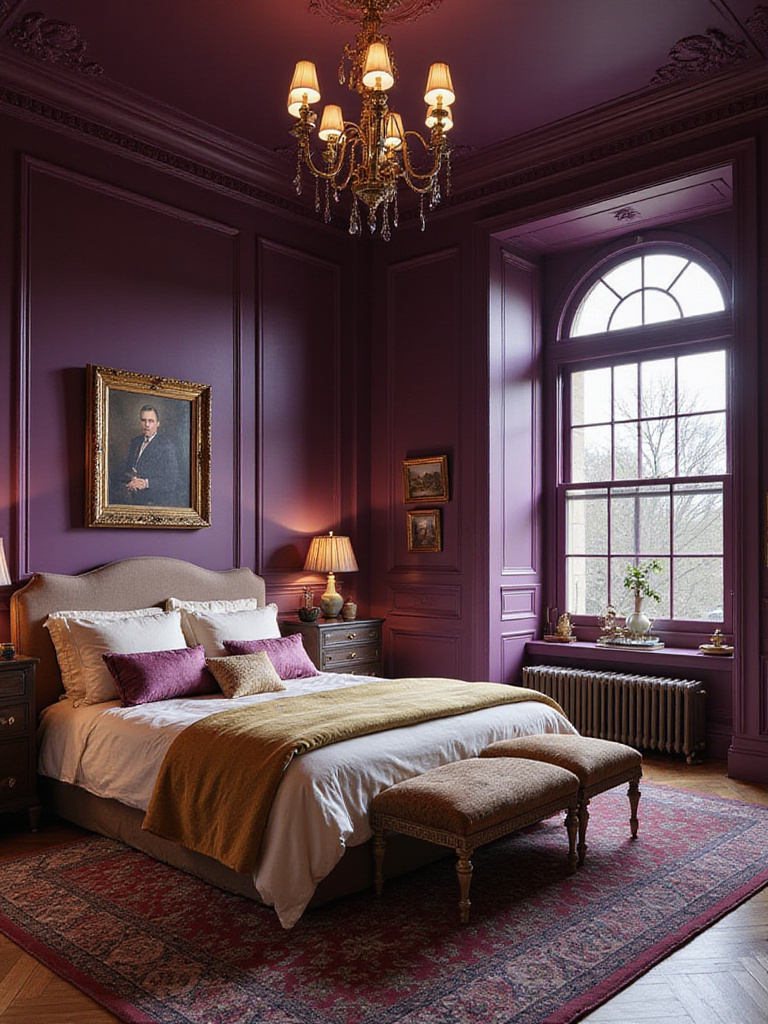
This is a color that demands balance. Because it absorbs so much light, you need to bring in reflective elements. Metallic accents like silver or gold, a large mirror, and varied textures are essential to keep it from feeling flat. Paired with cream or soft gray, the effect is breathtaking. It’s a bold move that transforms a simple bedroom into a truly opulent sanctuary.
Conclusion
Choosing a paint color for your bedroom is a deeply personal decision. It’s about more than what’s on-trend; it’s about what nurtures you. I always tell my clients to get the sample pots. Paint a big square on a couple of different walls and live with it for a few days. See how it makes you feel in the morning, in the harsh light of midday, and in the quiet of the evening.
The perfect color is the one that makes you breathe a little deeper every time you walk into the room. It’s the one that supports the life you live and the future you’re planning for. Your walls are waiting to tell your story. Trust yourself to choose the right language.