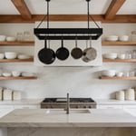
There is a running joke among kitchen designers that the kitchen is the last room people wallpaper — and the first room they wish they had. Paint is safe. But kitchen wallpaper designs can transform a purely functional space into one of the most characterful rooms in your home, and the range available today makes it possible for every style, every budget, and every kitchen size. I have redesigned hundreds of kitchens over the years, and the ones that stick in my memory are not the ones with the most expensive cabinetry — they are the ones where someone was brave enough to hang wallpaper.
This collection covers everything from vintage botanical prints to bold Art Deco metallics, from peel-and-stick options under $40 to investment papers from Cole & Son and House of Hackney. Whether you are renting and want something removable, renovating on a budget, or finally tackling that dated galley kitchen, there is a kitchen wallpaper design here that will change how you feel about walking into your kitchen every morning.
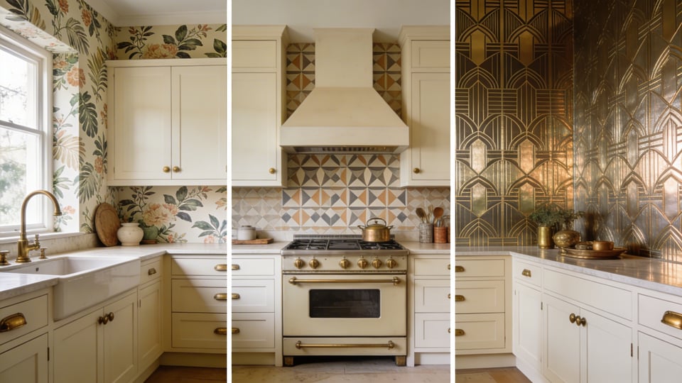
1. Vintage Botanical Prints for a Warm, Gathered Kitchen Feel
There is something about a botanical print that makes a kitchen feel as if it has been lived in for decades, even when you moved in last year. That quality — of things collected slowly, layered over time — is one the best kitchen wallpaper ideas deliver without effort and that no amount of carefully staged open shelving can quite replicate.
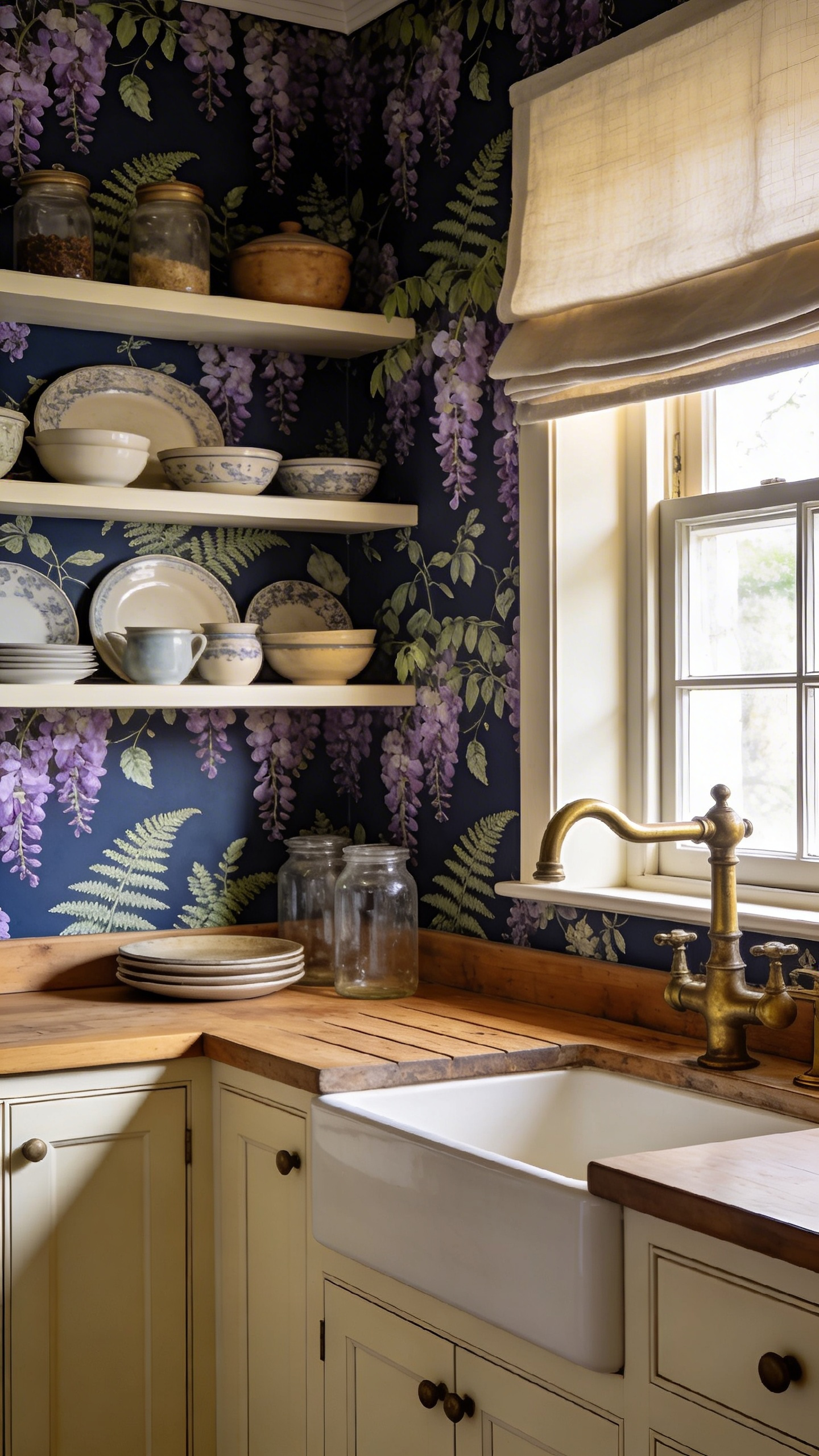
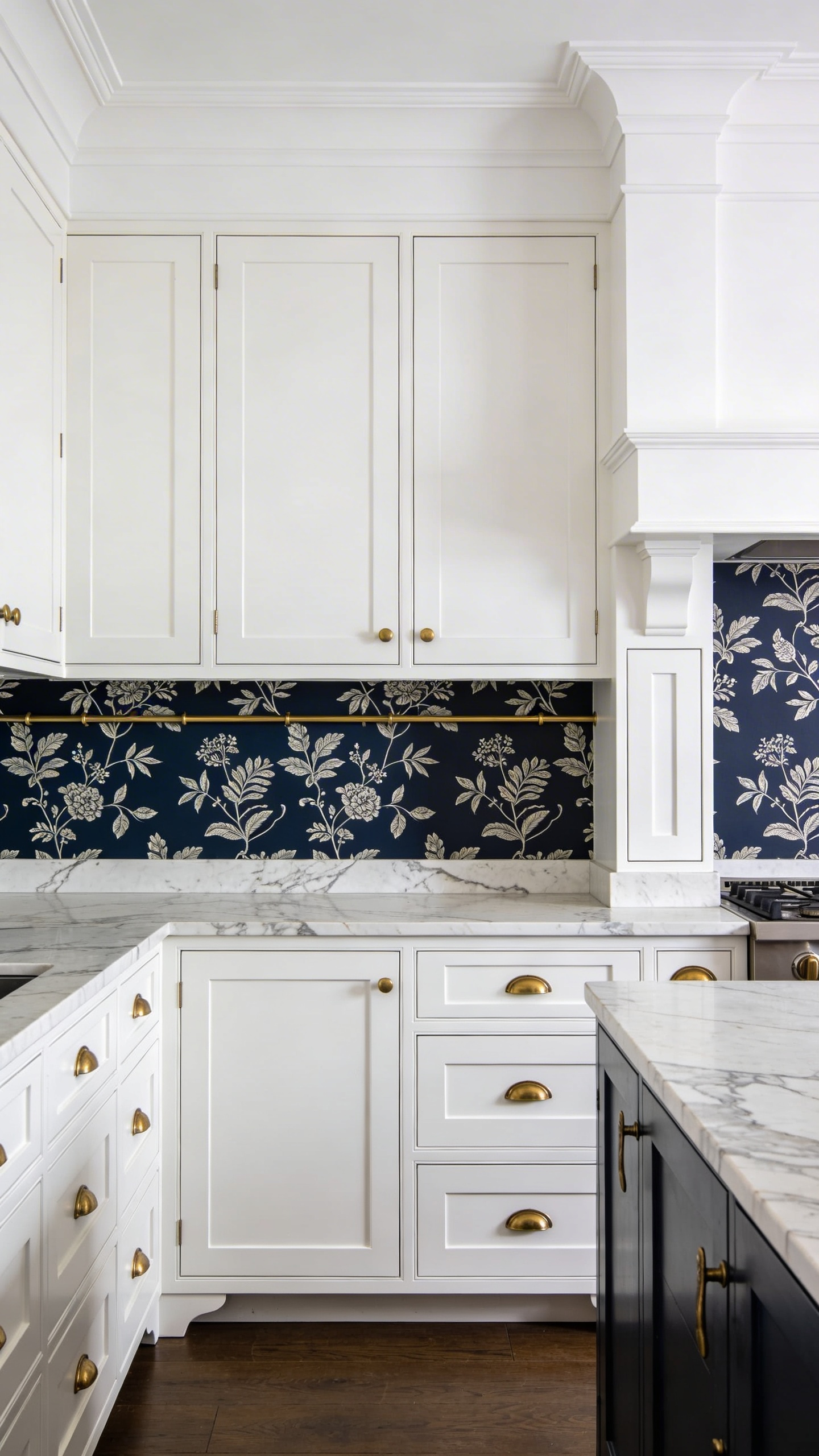
Cole & Son’s Botanica collection is the benchmark. It draws from the English landscape — wisteria, sweet pea, bluebell, maidenhair fern — and prints them at a scale and depth that rewards close looking. Sanderson has been doing this since 1860 with equal authority. Both brands offer their papers in multiple colourways, and the colourway decision matters more than the print itself.
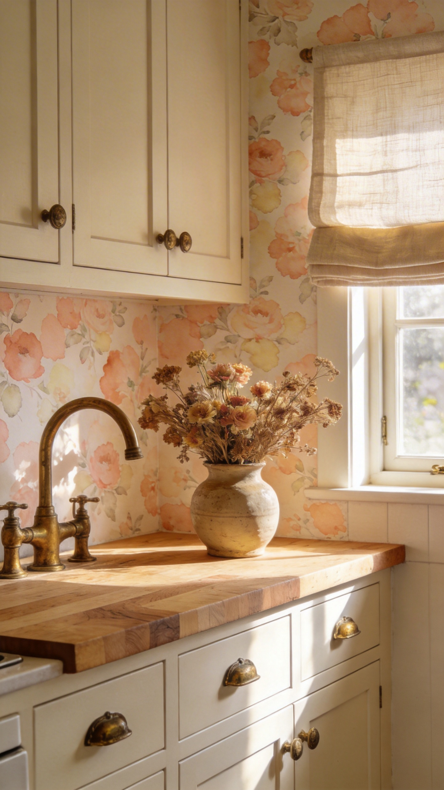
Dark-ground botanicals (navy, forest green, near-black backgrounds) turn a kitchen wall into something intimate and cocooned. They work brilliantly behind open shelving, where dishes, glassware, and a few plants sit against the print like objects in a still life. Keep dark-ground papers to a single feature wall, though — four walls of dark botanical under overhead kitchen lighting is oppressive. Cream or parchment grounds are warmer and more flexible: they work full-room and pair with warm wood cabinetry, aged brass taps, and linen blinds in a combination that is nearly impossible to get wrong.
Always specify a vinyl-coated or non-woven substrate. Paper-backed botanical wallpaper will not survive a kitchen long-term. And keep it at least 6 inches from the hob — steam is the enemy of even the most durable print. You will find plenty of inspiration for how botanical walls fit within a broader scheme in these kitchen wall decor ideas for every style.
2. Classic Black-and-White Checkerboard for High-Contrast Drama
Checkerboard has moved decisively beyond retro novelty. The Y2K revival and the ongoing love affair with Parisian bistro aesthetics have repositioned black-and-white check as a genuinely contemporary kitchen wallpaper choice — particularly when handled with restraint.
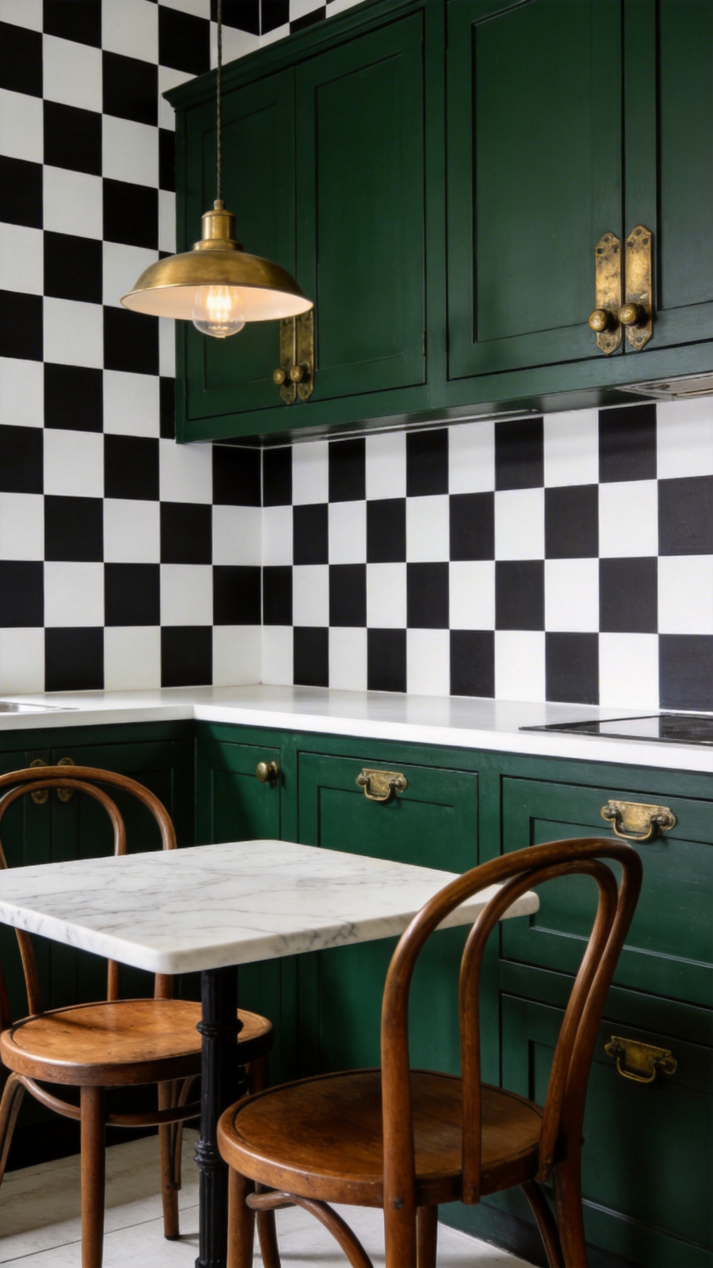
Tempaper’s Checkmate pattern is the peel-and-stick option most designers reach for. It is vinyl, moisture-resistant, and repositionable — which means you can get the hang right before committing. It also comes in taupe/white, blush/white, and grey/white versions that read as quieter and more current than classic black-and-white. For a kitchen with a lot happening already (open shelving, coloured tiles, statement island), the greige version is the smarter call.
Scale is the critical decision. Micro-gingham (under 1 inch) reads almost as texture from a few feet away — it adds depth without competing with anything else in the room. Three- to four-inch checks are the most photographed kitchen option: bold enough to register as a design decision, small enough to tile cleanly. Larger checks (6 inches and above) need a long, uninterrupted wall to look right, and most kitchens do not have one.
On cabinetry pairings: forest green with black-and-white check is a bistro classic. So is navy blue with check and brass hardware. Terracotta against check creates a Mediterranean-graphic quality that has been popular in editorial since 2023. The check is confident enough to handle strong cabinetry — it does not need to be anchored by white.
3. Modern Geometric Kitchen Wallpaper for a Bold Statement
Geometric kitchen wallpaper covers a lot of ground — hexagons, triangles, diamonds, chevrons, arcs — and each geometry produces a different atmosphere. Getting the geometry right for your kitchen matters more than getting the colour right, because the pattern’s energy is what you will live with day to day.
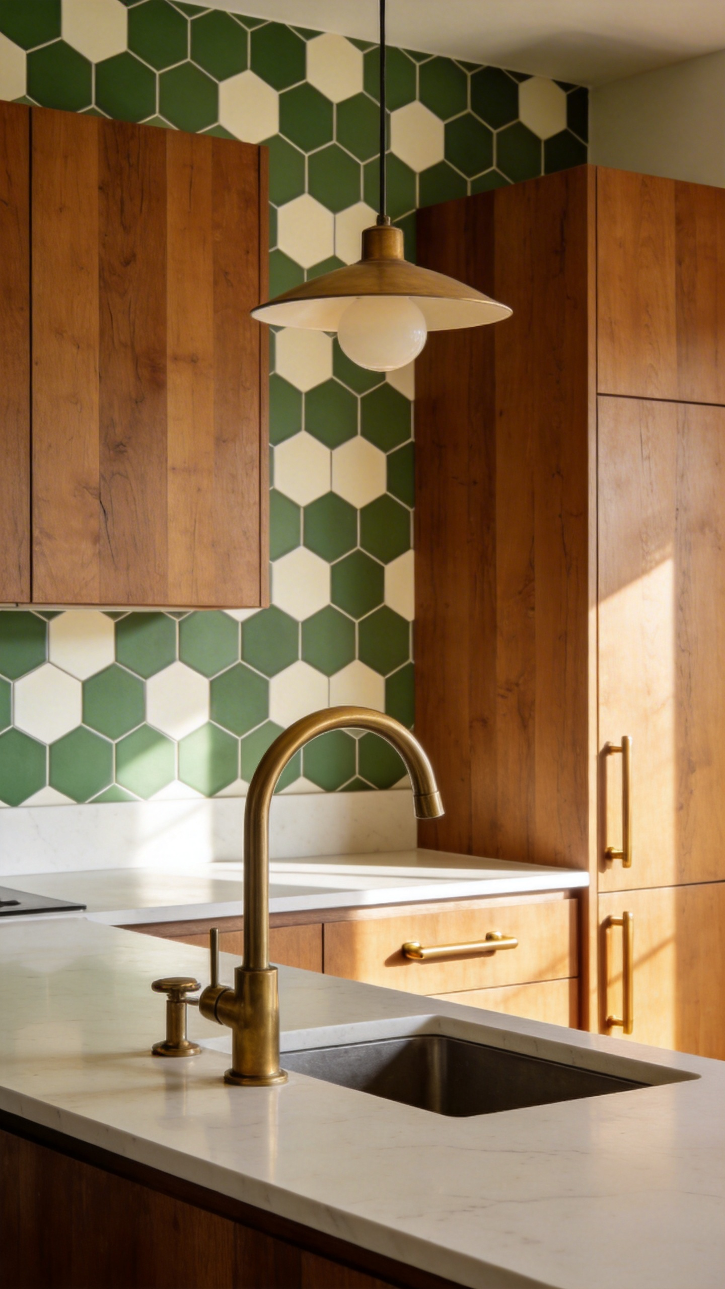
Hexagon-based geometric prints have the most warmth of the graphic patterns. The honeycomb reference is natural and organic, which prevents a geometric kitchen from feeling clinical. House of Hackney works in this territory with characteristic richness — layered colourways, hand-finished quality — though at around £128 per roll, it is an investment. For a more accessible option, Bobbi Beck’s geometric collection covers over 70 designs at a range of price points, all in kitchen-safe materials.
Triangle repeats are the most dynamic. They generate energy and movement — suited to open-plan kitchens where the wallpapered wall is visible from a living area and needs to hold its own across distance. Diamond patterns feel more formal and classical, suited to kitchens with marble countertops and traditional mouldings.
On colour: two-tone geometric (black/white, navy/cream, sage/white) is the safest starting point. Matte black hardware anchors it — the hardware echoes the darkest tone in the paper. Brushed brass pairs with geometric in warmer tones — ochre/cream, rust/white, terracotta/linen — for a more editorial feel. If you go multi-colour, a neutral countertop is essential. The eye needs somewhere to rest, and a patterned worktop next to a patterned wall creates overload even in a well-proportioned kitchen.
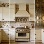
4. Faux Subway Tile Wallpaper as a Budget Backsplash Alternative
This is the kitchen wallpaper design decision that makes the most financial sense for the most people — and it is more convincing than most homeowners expect. Faux tile peel-and-stick wallpaper can replicate the visual effect of real ceramic or encaustic tile at a fraction of the installation cost, and it is completely reversible.
Tempaper leads the market here. Their Soleil tile design features black and blue starbursts with a golden centre against an off-white ground — it replicates the richness of imported encaustic tile without the £80+/sq metre installation cost. Their standard tile-inspired range handles kitchen steam and indirect moisture, which is the critical test any kitchen wall covering must pass. The full comparison against real tile work is covered in these modern kitchen backsplash ideas that actually transform the space.
Installation and Practical Notes
WallPops takes a different approach: their faux tile comes as a single continuous piece in 18-inch-wide, 9-foot-long rolls. No seam alignment is required — which is the main failure point for DIY tile wallpaper. If you have ever watched a checkerboard peel-and-stick panel drift off-register over ten feet of wall, you will appreciate this.
The honest limitations: keep faux tile wallpaper at least 6 inches from the hob. Sustained heat above 150°F softens peel-and-stick adhesive and causes the vinyl to pucker. It is not suitable directly behind a sink. Use a line of clear silicone at the bottom edge where the paper meets the countertop. And plan panel seam placement before you peel — joins at corners rather than mid-wall are invisible; mid-wall joins are not.
5. Soft Watercolour Floral Kitchen Wallpaper for a Romantic Cottage Look
Watercolour florals are not the same as botanical prints, and the distinction matters in a kitchen context. Botanical prints are precise — detailed leaf venation, scientific proportions, strong lines. Watercolour florals are gestural and loose, as if the artist sketched quickly and let the pigment bleed slightly into the ground. That softness is the quality that makes them so right for a cottage kitchen.
Colour Temperature and Coordination
The colour temperature of the ground matters enormously. Warm pink, peach, and apricot watercolour florals complement cream cabinetry and natural wood worktops — they sit in the same warm register and the room reads as a coherent whole. Cool lilac and pale blue florals are better with grey or white painted cabinetry. Mix the temperature and the kitchen will feel slightly unsettled without most people being able to say why.
Aged brass hardware is the natural partner for watercolour florals. Unlacquered brass develops a patina that deepens over time in a way that complements the hand-painted quality of the print — both feel as if time has worked on them. Layer with linen or cotton Roman blinds in a solid coordinating colour — the textile absorbs steam and provides a visual rest from the pattern.
Keeping the Look Fresh Rather Than Fussy
The wallpaper carries all the pattern load here. Matte-finish cabinet doors, a single-colour countertop, and one window with good natural light — that is the full supporting cast. High-gloss cabinet doors create a jarring contrast against a soft watercolour print, and additional patterned surfaces (tiled floor, patterned rug, decorative backsplash) tip the room from romantic into cluttered.
6. Industrial Brick-Effect Prints for an Urban Kitchen Edge
The practical case for brick-effect wallpaper over real exposed brick in a kitchen is strong. Real brick requires pointing, sealing, and regular maintenance to prevent grease absorption. Brick-effect vinyl wallpaper gives the visual warmth of raw masonry with none of those problems — it is fully washable, cleans with a damp cloth, and installs in an afternoon.
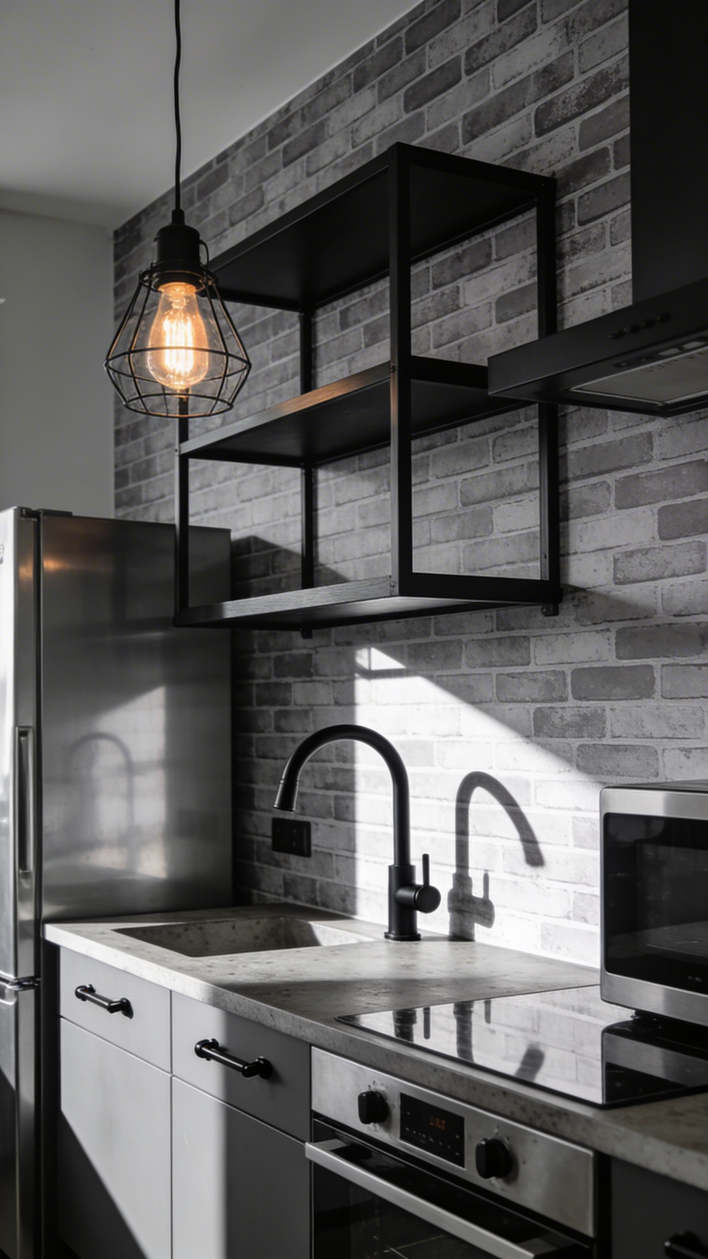
The tone decision is where this design choice lives or dies. Red London brick is the warmest and most traditional — paired with dark wood countertops and copper hardware, it creates a period-industrial look that reads as specific and confident. Whitewashed brick creates a lighter, Scandi-influenced industrial quality that works in smaller kitchens where full red brick would feel heavy. Grey or slate-toned brick is the most contemporary urban option: pair it with matte black taps, polished concrete worktops, and stainless steel appliances.
For styling, the industrial-reference elements reinforce each other deliberately: black powder-coated metal shelving brackets against brick-effect walls is the definitive look. Factory enamel pendant lights and wire-cage shades complete the picture. One hardware mistake to avoid: chrome taps against a brick-effect wall. Chrome reads as too polished against a rough-texture print — matte black or aged copper are the choices that make the illusion hold.
A note on quality: low-resolution photo-print brick wallpaper falls apart up close. In a kitchen, you are always within arm’s reach of the walls. Always order a sample and check it at normal working distance before committing to the full order.
7. Vertical Stripe Wallpaper Designs That Make Kitchens Feel Taller
The optical illusion that vertical stripes create is reliable: the eye follows the repeat upward, and the ceiling reads as higher than it is. This is as useful in kitchens as it is in fashion — and it is one of the few wallpaper for kitchen walls that solves a structural problem (low ceiling) with a purely surface treatment.
Stripe Width and the Height Illusion
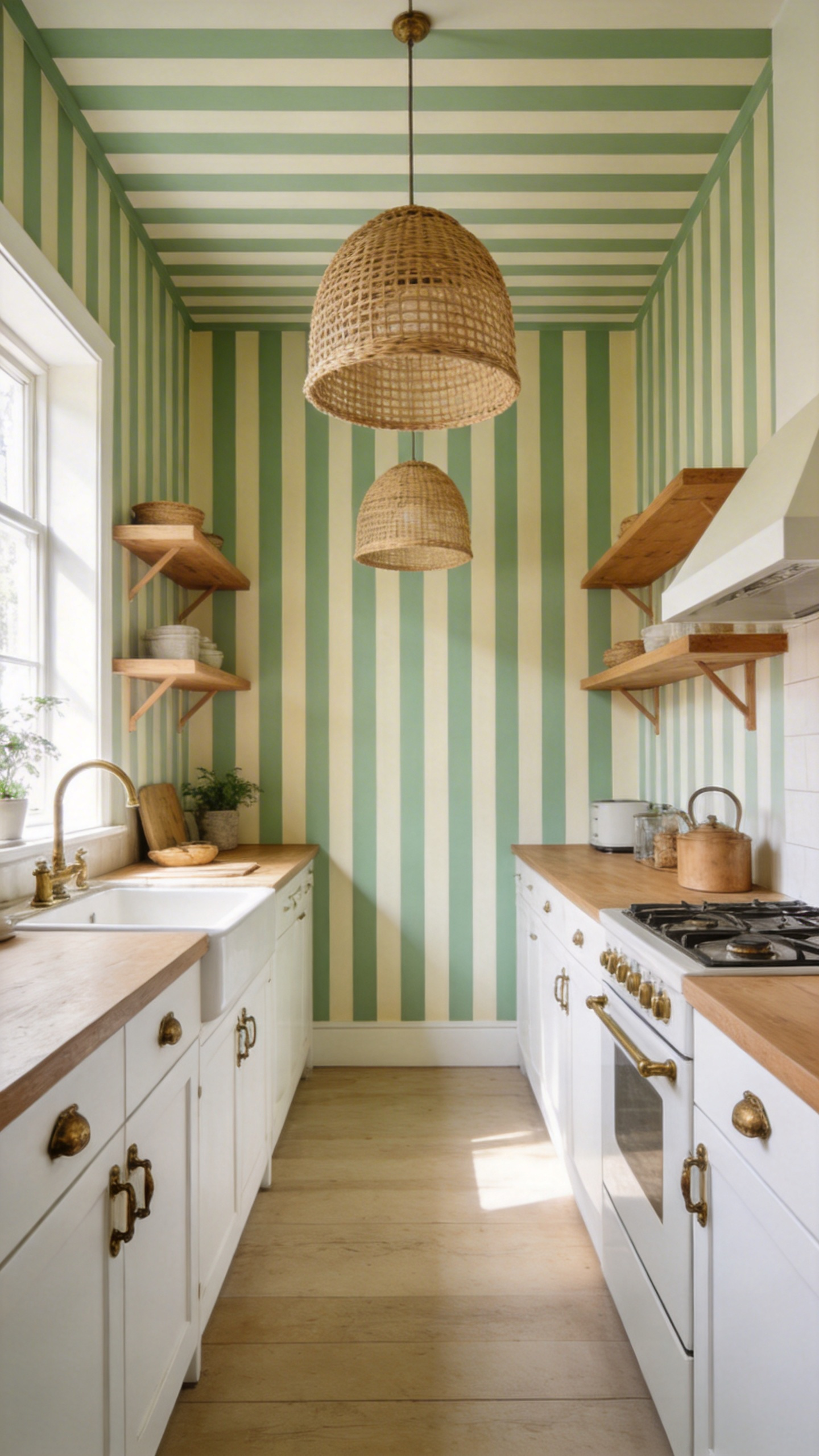
Design guides agree that narrower stripes work harder in small rooms than wide bands. For a kitchen under 100 sq ft, pinstripes (under 1 inch wide) add the height illusion without visual complexity — they read almost as texture from across the room. The small kitchen design ideas that actually work include several approaches to height and space that pair well with vertical stripe wallpaper.
Two-inch alternating stripes are the classic kitchen option: bold enough to register as a decision, precise enough to tile without the alignment errors that wider stripes are unforgiving about. Four-inch or wider bands need a wall of at least 10 feet without interruption to look right — and they must be hung with a laser level. A stripe that is even one degree off-vertical is visible within seconds and impossible to un-see once spotted.
Colour Combinations for Kitchen Stripes
On colour: navy and white is the most established kitchen stripe combination, referencing coastal and nautical design. Sage green and cream is where editorial has been living for the past two years — warm, organic, and ideal alongside rattan, linen, and aged brass. Charcoal and ivory is the urban-sophisticated version, suited to modern kitchens with dark stone countertops. For a subtle height effect rather than a bold statement, opt for closer tonal values (light grey and white rather than navy and white) — the optical effect is gentler but still present.
8. Tropical Leaf and Palm Prints for a Bold, Bistro-Inspired Space
The reference for tropical leaf wallpaper in kitchens is the great Parisian brasseries and New York bistros — where dense plant arrangements create an atmosphere of abundance and purposeful informality. It is a design association that works almost subconsciously: tropical walls say that this is a room where people eat well and linger.
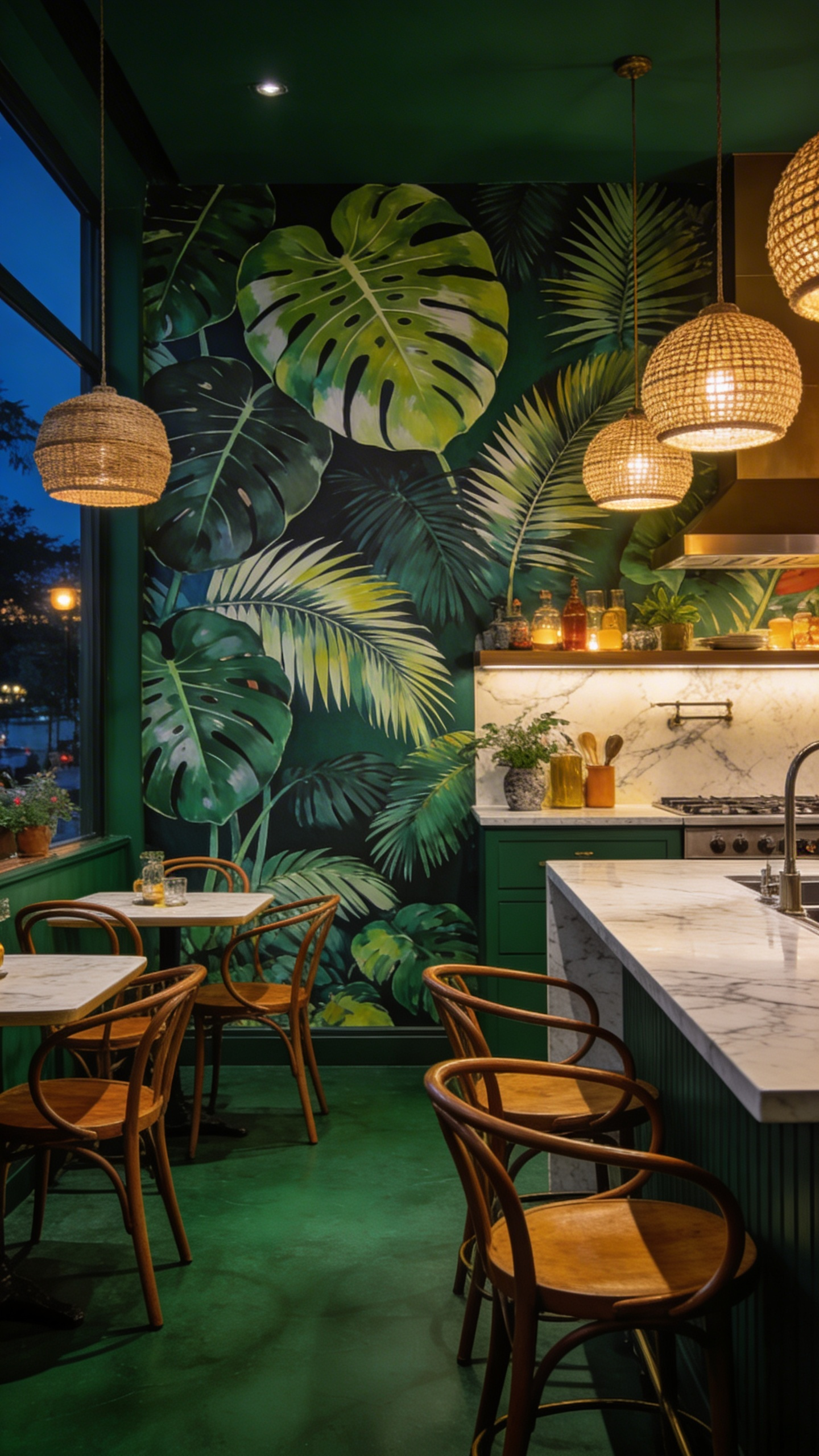
Scale and density are the decisions. Large-scale individual leaf prints — monstera, bird of paradise, fiddle-leaf fig — are dramatic and photogenic, but they need a wall of at least 8 feet high and 6 feet wide to complete the visual before a cabinet or window interrupts. Apply them to a single accent wall in kitchens under 200 sq ft; on multiple walls, they overwhelm. All-over dense banana leaf prints (the Martinique style, made famous at the Beverly Hills Hotel) work at full-room scale in large kitchen-diners with high ceilings. For most homes, Rifle Paper Co.’s lighter-density tropical designs — leaves floating on a white or cream ground — are the practical choice.
Dark-ground tropical (deep forest green, near-black background) creates a moody, intimate kitchen that is extraordinary in the evening and occasionally gloomy on a grey winter morning. If your kitchen has strong natural light, it is a magnificent choice. If it depends on overhead LED panels, a bright tropical green on white or cream will serve you better year-round — it reads as fresh and energetic under artificial light in a way dark-ground prints do not.
Rattan pendant lights, bentwood chairs, and natural-fibre placemats echo the botanical theme through material rather than pattern. That layering of references is what takes a tropical kitchen from a themed restaurant into a designed space.
9. Classic French Toile for a Cozy Countryside-Inspired Kitchen
Toile de Jouy originated in Jouy-en-Josas, France in 1760, and its distinctive narrative scenes — shepherdesses, pastoral landscapes, genre vignettes, all printed in a single ink colour on cream ground — have never really gone away. But they have rarely felt as contemporary as they do now, driven by the cottagecore movement and a broader appetite for heritage patterns with storytelling depth.
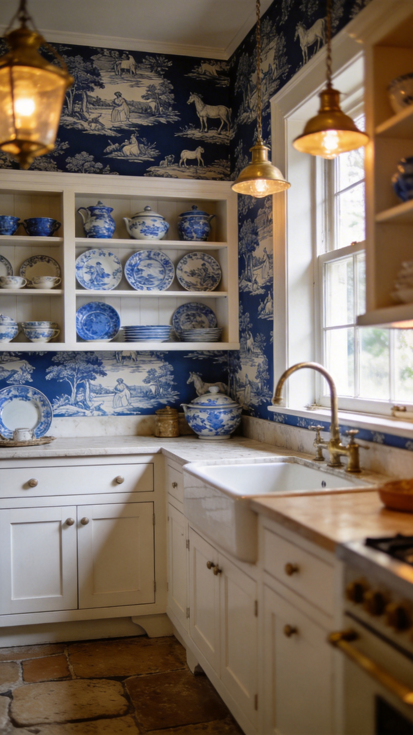
The quality that makes toile so right for kitchen-dining spaces is precisely the one that makes it unconventional: you can read it. The scenes in a toile print reward repeated viewing — guests at a kitchen table can find details they had missed before. No other wallpaper pattern achieves that. Harrison Cropper and Fabrics & Papers are specialist UK suppliers; for US buyers, Etsy has multiple independent sellers offering custom peel-and-stick toile in a range of formats.
The colourway update is where contemporary toile finds its footing. Dark khaki green on cream feels grounded and current — it works with natural wood cabinetry, terracotta floor tiles, and aged brass hardware. Navy on white is coastal-adjacent and bridges French country with Hamptons. Black toile on off-white creates an almost editorial quality — graphic enough to feel intentional in a modern kitchen while retaining every bit of historical character. The classic red-on-white is the most period-accurate but also the most defining — it will shape the kitchen’s entire aesthetic and commitment is required.
The mistake to avoid: combining toile with other traditional patterns. Gingham curtains, floral cushions, and a flowered rug with toile wallpaper becomes a display rather than a design. Let the toile do the storytelling. Everything else should be solid, simple, and in a coordinating colour.
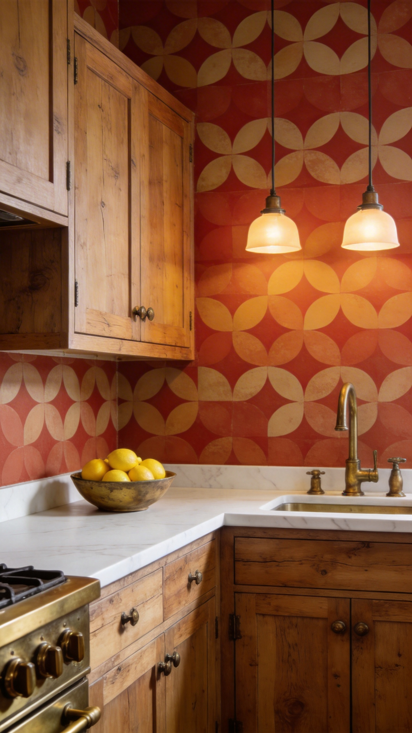
10. Mediterranean Tile Motif Kitchen Wallpaper Designs
Encaustic cement tile — the hand-poured geometric tile of Morocco, Spain, and Portugal — has been one of the most aspirational kitchen design elements for the past decade. The genuine article costs £60-120 per square metre, plus installation. Mediterranean tile-motif kitchen wallpaper designs deliver the visual vocabulary at a fraction of the cost, and the best examples are genuinely convincing.
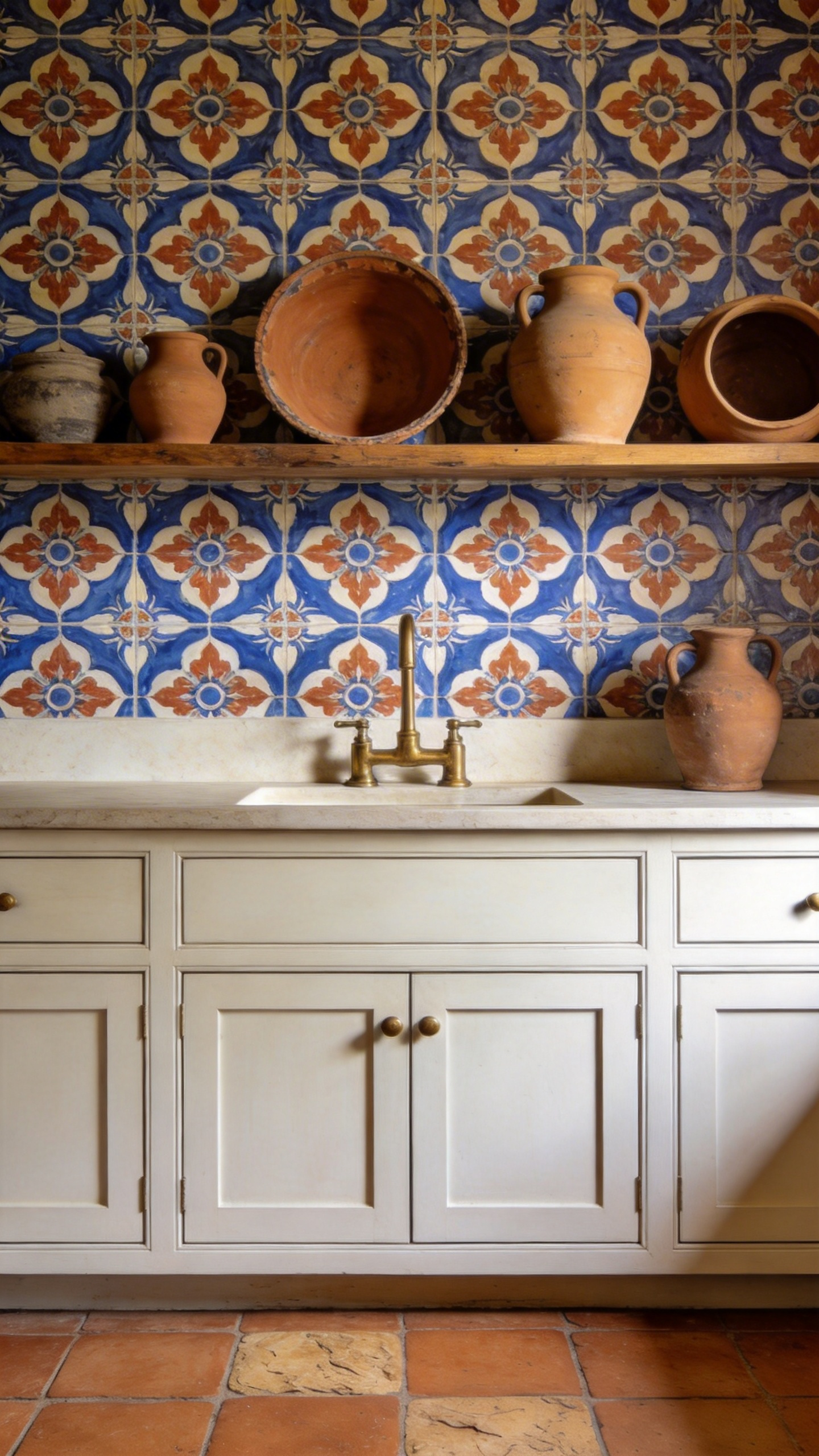
MINDTHEGAP and the Premium Option
MINDTHEGAP’s Morocco Tiles wallpaper is the benchmark. The pattern spans three coordinating rolls (each 20.5 × 118 inches) — the design spreads across the three drops, creating a large-format tile effect that a single-roll repeat cannot achieve. It is printed on a non-woven substrate with eco-friendly inks, which makes it both kitchen-appropriate and a responsible material choice. The key visual success is the matte finish — it mimics the non-reflective surface of real cement tile in a way that gloss finishes never do.
Choosing Between the Three Mediterranean Traditions
The three traditions within Mediterranean tile design pull in different directions. Moroccan patterns (zellij-influenced geometric star-and-diamond motifs) are bold, high-contrast, and work best on a single cooking alcove or chimney breast. Spanish azulejo tends toward softer, more decorative motifs — scrollwork and floral forms — suited to a wider range of kitchen styles. Portuguese azulejo is typically blue-and-white with narrative elements; it shares DNA with toile but reads as coastal and Mediterranean. ONDECOR’s Moroccan azulejo peel-and-stick in blue/red/yellow is the accessible version for renters and budget renovators.
The classic mistake is pairing Mediterranean tile wallpaper with a patterned tile floor. Two competing geometric pattern scales in the same room create visual chaos. Use plain terracotta, limestone, or concrete underfoot and save the pattern for the walls. More guidance on balancing backsplash elements is in these modern kitchen backsplash ideas for white cabinets.
11. Scandinavian Abstract Minimalism for a Clean, Airy Kitchen
Scandi kitchen wallpaper, at its best, is not a non-choice. It is a highly specific decision: to add warmth and texture to a kitchen through restraint rather than pattern, through suggestion rather than depiction. The organic abstract prints from Boråstapeter, Ferm Living, and Engblad & Co. do this with a sophistication that purely plain walls cannot achieve.
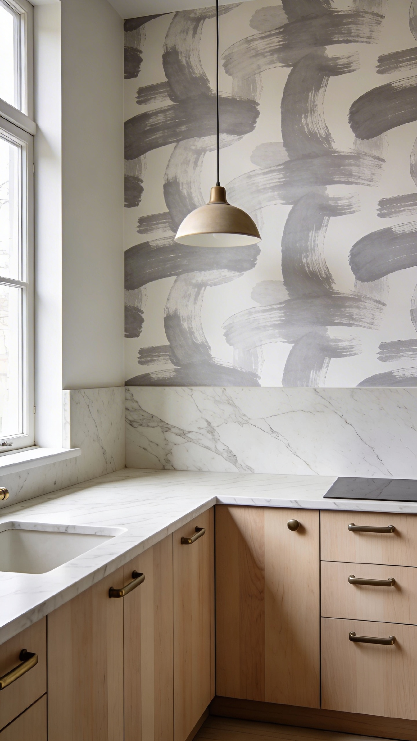
Boråstapeter is Sweden’s oldest wallpaper manufacturer. Their collections range from strict minimalist to nature-inspired, and the common quality is a controlled use of the ground colour — the background always breathes. Ferm Living (Danish) works at the design-forward end, with abstract collections that use organic shapes suggesting leaves, stones, and water movement without depicting them directly. The result reads as texture from a distance and reveals intention up close.
The Japandi crossover is the 2025-2026 development worth knowing about. Patterns that blend Japanese wabi-sabi quality (irregular brush strokes, natural dyeing variations, imperfect edges) with Scandinavian minimalism (restrained palette, white space, natural pigments) represent the most interesting corner of the abstract wallpaper market right now. They add a nature reference to a kitchen without the specificity of a leaf or flower print.
In terms of coordination: light wood cabinet doors (birch, maple, lightly oiled oak) are the natural partners. White marble countertops add a subtle pattern reference — Carrara veining complements rather than competes with abstract wallpaper. Keep hardware in brushed nickel or matte black; gold tones shift the palette toward Japandi and away from pure Scandi, which is a valid move but a different mood.
12. Vintage Map and Postcard Prints for an Eclectic Breakfast Nook
The characteristic that sets map and travel-themed wallpaper apart from every other option on this list is that people actually look at it. A botanical print is beautiful; a map print is engaging. Guests at a kitchen table can trace routes, find cities they have visited, and spot details they missed the last time. That interactive quality is uniquely well-suited to the breakfast nook — a space specifically designed for sitting and lingering.
Choosing the Right Map Reference
The tone of the map matters as much as the subject. A world map in primary-colour cartography reads as a children’s bedroom. The same world map in aged sepia tones, with calligraphy lettering and compass roses, reads as a library. Vintage atlas prints, 19th-century expedition cartography, and natural history survey illustrations all sit in the latter category. They have genuine aesthetic authority because the designs predate the idea of decoration for its own sake.
City-specific maps (London underground, Paris streets, the New York subway) are the most personal statement — they make a specific claim about the household’s story. Botanical expedition prints (specimens labelled in Latin alongside territory sketches and compass decorations) bridge the map and botanical categories — sophisticated enough for a serious kitchen and educational enough to reward a close look.
Framing the Nook With the Wallpaper
Apply map wallpaper within the nook zone only — ceiling to floor on the nook walls — and leave the main kitchen walls plain. The wallpaper defines and cocoons the eating area. Against a banquette, the seating back shields the lower section from direct contact. Choose one statement pendant over the table (wicker globe, industrial cage, mid-century mushroom shade) rather than recessed lighting — the pendant creates a visual ceiling within the nook that completes the sense of a space within a space.
13. Wainscoting-Effect Wallpaper for Structured Kitchen Elegance
Panel-effect wallpaper prints the shadow lines and recessed fields of raised timber panelling directly onto the wall surface — and from any normal viewing distance, the three-dimensional illusion holds. In a kitchen where real carpentry work is either impractical or unnecessarily expensive, this is one of the most cost-effective transformations available.
The proportion decision is the critical one. Standard dado height is 90-110cm from the floor — roughly one-third of an 8-foot wall — and this proportion is correct for most kitchen ceiling heights. Setting it too low (under 75cm) makes ceilings feel compressed. Half-height panelling (120cm) is a more contemporary approach that works well in kitchens with 9-foot or higher ceilings — it creates a substantial horizontal element without encroaching on the upper-wall zone where windows and upper cabinets sit.
The wall above the panel line should be painted before the wallpaper is hung below — this prevents paint drips on the finished paper. On colour: choose an upper-wall paint two to three tones lighter than the dominant background of the panel wallpaper, and the tonal gradient from floor to ceiling feels natural. White or off-white above a tone-on-tone panel-effect wallpaper is the most versatile combination.
For the greatest architectural effect, carry the dado line colour into the window and door architraves. This ties upper and lower zones together and makes the panelled effect look built-in rather than applied. Tone-on-tone panel-effect wallpaper — cream pattern on a slightly deeper cream or pearl ground — is the subtlest approach. It adds texture and visual interest without a colour statement, suited to open-plan kitchens where strong colour would conflict with adjacent spaces.
14. Kitchen Wallpaper in Earthy Terracotta and Natural Tones
Terracotta is the kitchen wallpaper colour story of 2025-2026, and it has earned its position honestly. Where grey dominated kitchen design from 2016 to 2020 and now reads as firmly of that era, terracotta and earthy warm tones feel current in the way that naturally occurring colours often do — they do not date because they were never trend-first.
The psychological basis is practical: warm earth tones in kitchens — clay reds, ochres, warm tans, burnt orange — are associated with warmth, appetite, and comfort. That is not interior design theory; it is why restaurants have used terracotta and warm amber for decades. In home kitchens, those same associations make the space more inviting and the time spent there more pleasurable.
Print Options Within the Earthy Palette
Within the earthy palette, the print options cover a broad range. Terracotta geometric wallpaper (abstract repeat patterns in clay tones) pairs with natural oak cabinetry for a contemporary Mediterranean look. Ochre linen-texture wallpaper — printed to simulate woven fabric — adds tactile warmth that functions almost as a neutral, elevating the room without dominating it. Burnt orange is the stronger end of the spectrum and pairs particularly well with brass or copper fixtures, which share the warm metallic tones rather than contrasting with them.
Hardware and Cabinet Pairings
On cabinet pairings: aged brass is the natural hardware partner for terracotta kitchen wallpaper — both share that warm, oxidised quality. Matte black hardware works too, providing contemporary contrast that prevents the scheme from reading as purely rustic. Natural oak or warm-toned wood cabinet doors complement without competing. The one pairing to avoid is cool-grey or charcoal cabinetry against a terracotta wall — the temperature clash sits uncomfortably. For lighting that reinforces a warm palette, farmhouse kitchen lighting ideas covers warm-toned fixture choices that work with an earthy scheme.
15. Art Deco Metallic and Jewel-Toned Patterns for Kitchen Glamour
Art Deco wallpaper in a kitchen is a commitment — a decision to treat the cooking space as a designed room with atmosphere, not just a functional zone with good appliances. Done with restraint, it is one of the most arresting kitchen wallpaper designs available. Done without restraint, it creates a space that feels like a casino at 7 in the morning.
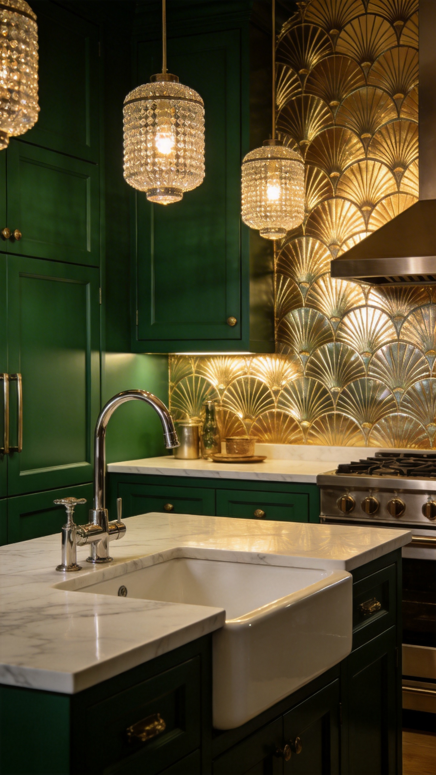
The motif vocabulary is well-established: fan and scallop repeats, sunbursts, radiating chevrons, stepped arches. Graham & Brown’s Art Deco range references authentic 1930s styles, and Milton & King offers premium options with metallic elements. The fan/scallop is the most adaptable of the Deco patterns — it tiles in a half-drop repeat that creates a seamless all-over pattern, and it scales from small kitchen features to full walls.
Metallic gold Art Deco wallpaper needs anchoring. The secret is a deep jewel-toned element — deep emerald green cabinetry, sapphire blue island, or a rich burgundy banquette — that gives the metallic shimmer a visual partner of equivalent weight. Without that anchor, metallic wallpaper looks expensive and uncertain at the same time. Matte-finish metallic wallpapers (which use mica or foil particles within a non-reflective coating) are significantly easier to live with in a kitchen than full-gloss metallic — they read as warm and textured rather than reflective and demanding.
Restrict metallic Deco wallpaper to a single feature wall: the wall behind the hob, the chimney breast, or the end wall of a galley. Four walls of Art Deco metallic in a working kitchen is overwhelming regardless of how well-designed the rest of the room is. That restraint is what makes the commitment feel deliberate.
16. Playful Food and Herb Motifs for a Personality-Rich Kitchen
There is a narrow but genuinely worthwhile space between culinary-themed kitchen wallpaper that reads as charming and the version that reads as a novelty item in a gift shop. The dividing line is almost always execution: illustrated food motifs (hand-drawn in watercolour or ink, with the same visual language as botanical prints) are interior-appropriate; photographic food prints (close-up strawberries, stacked macarons, pizza slices) are not.
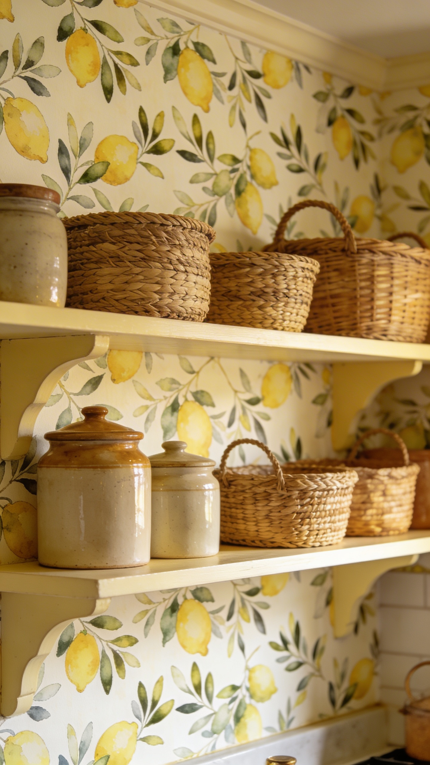
Rifle Paper Co. applies its distinctive hand-drawn illustration style to food and botanical subjects with equal authority. Lemon and olive branch motifs are the most persistently popular kitchen wallpaper subjects — their Mediterranean reference works in cottage, contemporary, and farmhouse kitchens without commitment to a single aesthetic. Herb specimen prints (rosemary, thyme, sage, and bay labelled in botanical-illustration style) have an educational quality that feels at home in a serious cooking kitchen. James River Studios offers a strong fruit and herb print collection at accessible prices.
The placement discipline is the key creative decision here. Apply culinary-themed kitchen wallpaper in a contained zone — a larder or pantry alcove, the interior of a kitchen dresser, a breakfast nook, the back of a recess behind open shelving — and leave the main kitchen walls plain. At single-accent-wall scale, it is charming; at full-room scale, it becomes a theme rather than a design.
The mistake to avoid is cumulative culinary theming: food-print wallpaper combined with a cookbook-display shelf, windowsill herb pots, a fruit bowl centrepiece, and vegetable-themed tea towels is a lot. The wallpaper makes the culinary reference definitively. Everything else can just be functional.
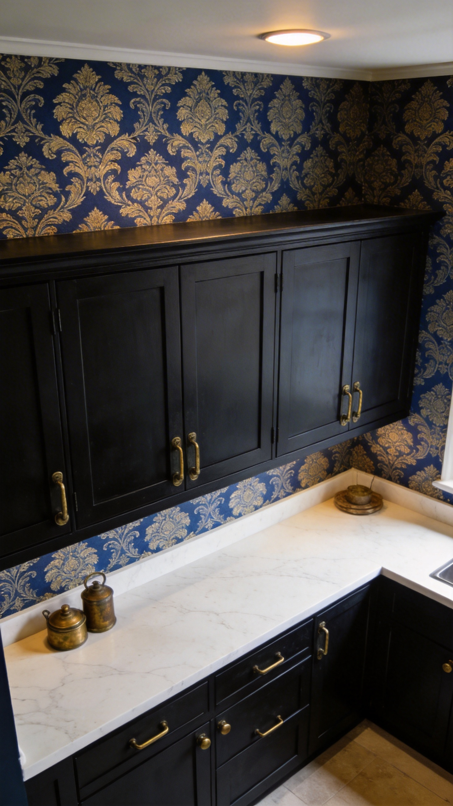
17. Damask and Heritage Prints for a Formal, Elevated Aesthetic
Damask in a kitchen is a confidence move. It says, with complete architectural conviction, that this is a room designed to be enjoyed, not just used. The pattern has Baroque origins and a history in formal drawing rooms and dining rooms — bringing it into the kitchen is an unexpected decision that becomes a design statement the moment it is executed well.
Contemporary damask collections have found a way to update the format without stripping its character. Tone-on-tone damask — cream pattern on a slightly deeper cream or pearl ground — is the subtlest approach. It adds surface interest and depth without a colour statement, which makes it right for open-plan kitchens where the wallpapered wall is visible from adjacent living spaces and strong colour would create conflict. Walls Republic’s 2025 modern damask range has several tone-on-tone options with simplified Baroque motifs that read as contemporary.
High-contrast damask (black on white, deep blue on pale grey, gold on navy) is the kitchen statement version — restricted to a single feature wall (chimney breast, cooking alcove, end wall), paired with matte black cabinetry and aged brass hardware. For the dinner-party kitchen, where the space’s atmosphere matters as much as its function, this combination delivers.
A clean slab-fronted cabinet door (no mouldings, no raised panels) provides the right contrast against an ornate heritage wallpaper — the high-low tension between the two is intentional and it works. The modern heritage update to damask simplifies the classical Baroque motif: fewer leaves, cleaner lines, more white space, updated palette. Slate blue and white or pale sage and cream feel current while retaining every structural element of the original.
18. Half-Wall Kitchen Wallpaper Designs With Contrasting Paint Above
The split-wall technique — wallpaper below the dado rail, coordinating paint above — is one of the most practical kitchen wallpaper decisions available because it places pattern and texture precisely where the room needs it most. The lower third of kitchen walls takes constant abuse: chair backs, countertop splashes, hand contact at working height. A wipeable, durable patterned surface there and a simple, easily repainted solid colour above — that is sound design logic as well as good aesthetics.
Setting the Dado Height
The dado height is the proportion that determines everything. Standard dado rail sits at 90-110cm from the floor — roughly one-third of an 8-foot wall — and this proportion is correct for most kitchen ceiling heights. Setting it lower than 75cm makes the ceiling feel compressed; at half height (120cm) in a kitchen with 9-foot ceilings, it creates a more graphic, deliberate division. A narrow galley benefits from the horizontal line at dado height — it visually widens the space in the same way that horizontal stripes widen a figure.
The Colour Relationship Between Wallpaper and Paint
The colour relationship between wallpaper and upper-wall paint is the creative decision. The fail-safe approach: choose a paint two to three shades lighter than the dominant background colour of the wallpaper — it maintains cohesion without requiring an exact match. Deliberate contrast (dark botanical wallpaper below, white paint above) creates a sharp horizontal statement. Carrying the dado rail colour into the window and door architraves ties upper and lower zones together as a complete architectural scheme. For the specific paint decisions on the upper half, these kitchen paint colour tips cover everything from undertones to finish selections.
One technical note that genuinely matters: the horizontal cut line must be set with a laser level, not by eye. A dado line that is even 2-3mm off-horizontal is visible across a kitchen in seconds and is not fixable without re-hanging.
Choosing Your Kitchen Wallpaper Design: Where to Start
The question I hear most often is not “which pattern” — it is “where do I start?” The answer depends on three practical factors that narrow the field considerably before you open a sample book.
Match the Paper to Your Kitchen’s Conditions
First: kitchen size and natural light. Small kitchens (under 100 sq ft) need light-ground wallpapers — cream, white, and pale grey backgrounds — and repeats under 12 inches that can complete before a cabinet or window interrupts. A bold botanical at a 24-inch repeat looks extraordinary in a large kitchen and chopped-up in a small one. North-facing or low-light kitchens should use warm-toned wallpaper to compensate: terracotta, botanical on cream, soft ochre. Cool greys and blues intensify in cool light and will make a low-light kitchen feel colder than it already is.
Second: cabinetry colour. White and cream cabinets offer almost unlimited freedom — white is the universal background colour that supports every pattern family in this list. Dark or coloured cabinetry constrains the choice: a strong blue island needs a quieter wall (Scandi abstract, tone-on-tone wainscoting, linen texture) unless you are deliberately pursuing high-contrast impact. Bold cabinetry with bold wallpaper is a valid design choice — but it needs to be made consciously, not arrived at by accident.
Durability First, Pattern Second
Third — and this is the specification decision that every kitchen wallpaper design comes down to, regardless of how beautiful the pattern: always use vinyl-coated or non-woven substrate. Look for ‘scrubbable’ or ‘highly scrubbable’ on the product specification — ‘washable’ is not the same standard. Non-woven is the most kitchen-appropriate substrate: it is steam- and air-permeable, so moisture does not build up behind the paper, and it removes dry when redecoration time comes. Keep wallpaper of any kind at least 6 inches from direct heat sources.
Start with a physical sample. Order two or three candidates and tape them to your kitchen wall for a week. See them in morning light, in task lighting, in the evening. The right kitchen wallpaper designs are the ones that look better with every passing day — not just in the first week, but in the third year.