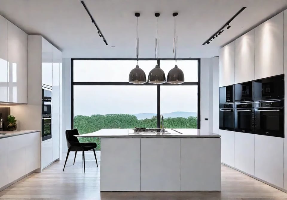
Ah, the small kitchen conundrum! It’s like trying to fit an elephant into a Mini Cooper, right? Well, fear not, my fellow space-challenged friends! I’m Jesse Wilson, and I’m here to tell you a little secret: your walls are the untapped superheroes of your culinary kingdom.
Picture this: you walk into your kitchen, and instead of feeling boxed in, you’re greeted by a space that feels as expansive as your culinary dreams. Sounds too good to be true? Trust me, with a few clever tricks and a dash of creativity, we can turn your cozy corner into a masterpiece that would make even Martha Stewart double-take. So, grab your favorite mug of coffee (or wine, I won’t judge), and let’s embark on a journey to maximize your space and unleash your inner kitchen decorator!
The Power of Light and Reflection
Alright, my fellow small-space dwellers, let’s shed some light on the situation—literally! If you’ve ever felt like your kitchen walls are closing in on you, it’s time to harness the magic of light and reflection. Trust me, with a few clever tricks, we can turn your cozy culinary corner into a bright and airy oasis.
Embrace Light Colors
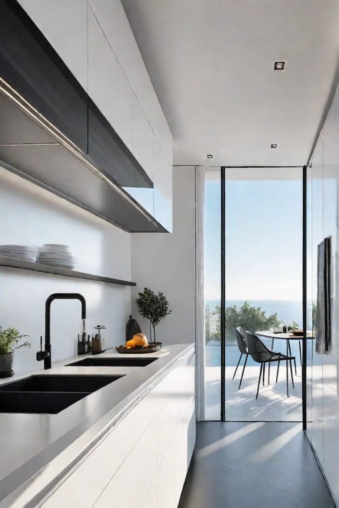
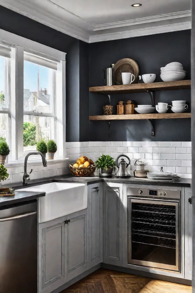
First things first, we need to give those walls a makeover. Picture this: you walk into your kitchen, and instead of feeling boxed in, you’re greeted by a sea of soft, light hues that make you want to twirl around (careful with that spatula, though!). Light colors are like the fairy godmother of small spaces—they reflect light and instantly make a room feel more spacious.
Here’s your game plan:
- Go for cool tones like white, cream, or pale blue
- Try high-gloss paint for a subtle reflective effect (bonus: it’s easier to wipe off those inevitable spaghetti sauce splatters)
- Look for paint brands that specialize in light-reflecting qualities (I’ve had great luck with Benjamin Moore’s “Aura” line and Sherwin-Williams’ “Duration Home”)
Pro tip: Don’t forget about the ceiling! A fresh coat of white paint up there can work wonders in bouncing light around the room.
Reflect on This
Now, let’s talk mirrors. I know what you’re thinking—“Jesse, my kitchen isn’t a disco ball!” But hear me out. Strategically placed mirrors can double the perceived size of your space and create some seriously cool visual effects.
Try these mirror-magic tricks:
- Hang a large mirror above a key piece, like your dining table or peninsula
- Place a mirror near a window to reflect natural light deeper into the room (it’s like having two windows for the price of one!)
- Get creative with mirrored backsplashes or cabinet inserts for a subtle reflective touch
Speaking of creativity, let’s think outside the box (or should I say, outside the frame?). Who says mirrors have to be boring rectangles? I once found an old window frame at a flea market, replaced the glass with mirrors, and voilà—instant character and light-bouncing goodness!
Now, for the burning question: what are the best light-reflecting paint finishes for kitchens? While high gloss reigns supreme in the reflection department, it can show every imperfection. For a happy medium, I’m a big fan of satin or semi-gloss finishes. They still bounce light around like champs but are more forgiving on those not-so-perfect walls.
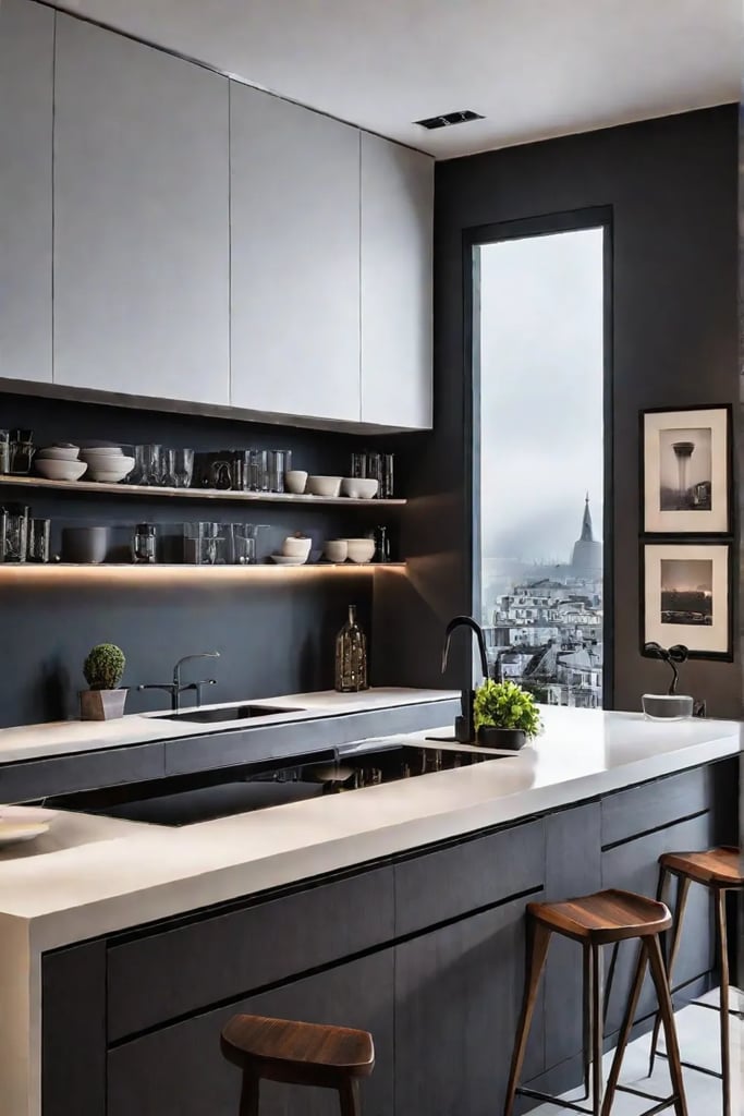
Remember, folks, in small kitchens, light and reflective elements are your secret weapons. They’re like the dynamic duo of space-expanding superpowers. So go forth, grab that paintbrush, hunt for that perfect mirror, and watch your kitchen transform from cramped to capacious!
As we wrap up our light-filled journey, let’s set our sights upward. In the next section, we’re going to explore how “Verticality: Your New Best Friend” can take your small kitchen to new heights—literally! Get ready to reach for the stars (or at least the ceiling) as we discover the power of going vertical in your space.
Verticality: Your New Best Friend
Today, we’re going to talk about your new BFF in the world of kitchen design: verticality. Trust me, once you embrace the power of going up, you’ll never look at your pint-sized culinary space the same way again.
Upward and Onward
Let’s face it, when you’re working with a kitchen that’s more “cozy” than “spacious,” every inch counts. That’s where vertical lines come in to save the day. Did you know that our eyes naturally perceive vertical spaces as larger than horizontal ones? It’s like a magic trick for your kitchen!
Here are some quick and easy ways to create that illusion of height:
- Hang a series of vertically oriented framed prints. Think tall and narrow, like vintage botanical illustrations or abstract line art.
- Install striped wallpaper with vertical lines. It’s like putting your walls in pinstripes – an instant height boost!
- Use tall, slender vases or utensil holders to draw the eye upward.
Storage with Style
Now, let’s talk about the holy grail of small kitchens: storage that doesn’t make you feel like you’re living in a cramped cupboard. Vertical storage solutions are your ticket to a clutter-free countertop paradise.
Try these space-saving ideas:
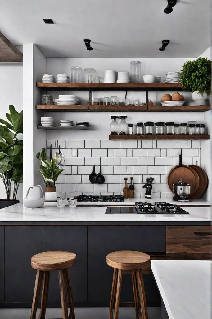
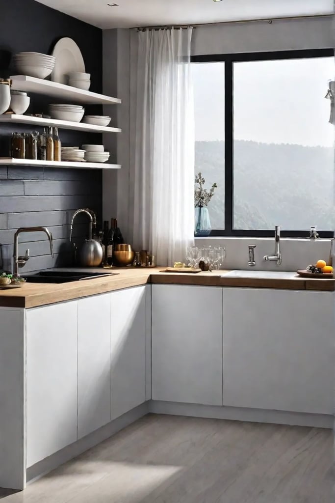
- Install open shelving that extends from countertop to ceiling. It’s like giving your kitchen a vertical highway for all your stuff!
- Use a tall, narrow bookcase to store cookbooks, pretty dishes, or those quirky salt and pepper shakers you couldn’t resist at the flea market.
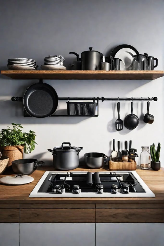
- Hang a pegboard and customize it with hooks, shelves, and baskets. It’s like a game of Tetris but for your kitchen tools!
And for those of you with a green thumb (or aspirations thereof), consider a vertical herb garden. It’s not just a trendy way to add some life to your kitchen walls – it’s also incredibly practical. Fresh basil at arm’s reach while you’re cooking? Yes, please!
Speaking of trends, vertical wall decor is having a moment. From macramé hangings to cascading air plant displays, there are endless ways to make your walls work harder (and look prettier) in your small kitchen.
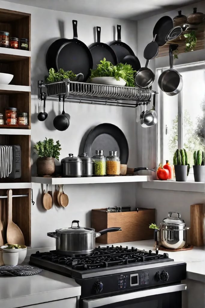
Remember, the key to mastering verticality in your kitchen is to think outside the box – or in this case, above it. Look for unexpected places to add height, like the side of your fridge or that awkward space between the counter and the upper cabinets. With a little creativity, you can turn even the tiniest kitchen into a vertical masterpiece that would make Jack and his beanstalk jealous!
Now that we’ve reached new heights with our vertical adventures, let’s move on to another small kitchen game-changer. Get ready to fall in love with the airy and accessible world of open shelving!
Open Shelving: Airy and Accessible
You want it to feel spacious, but you also need a place to stash your prized collection of mismatched mugs. Well, my fellow decor enthusiasts, let me introduce you to the magic of open shelving – the small kitchen’s secret weapon.
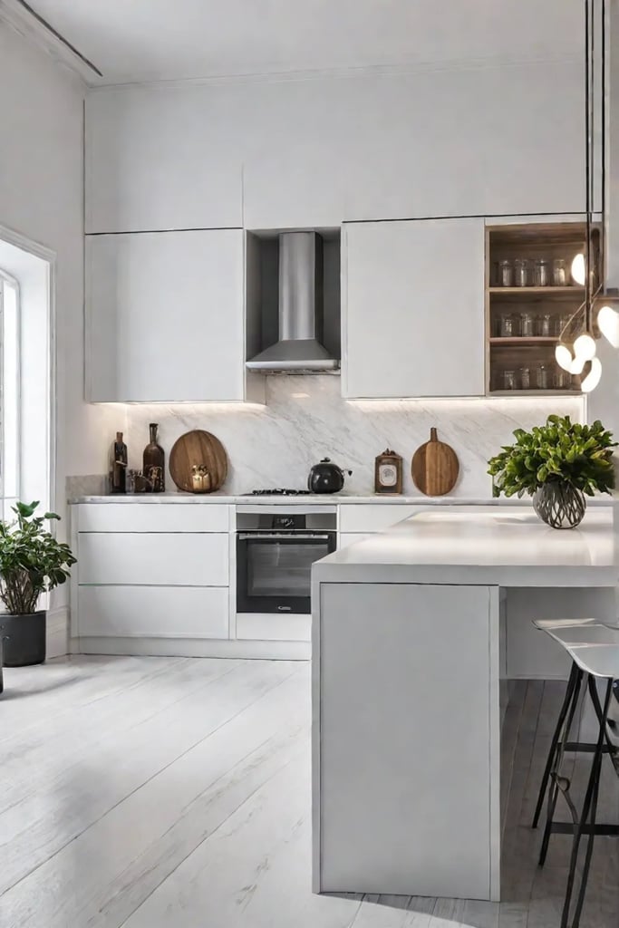
Breaking Down Walls
Remember that time I accidentally knocked down a cabinet while attempting to hang a vintage macramé plant holder? (Don’t ask.) Well, it turns out I was onto something! Removing upper cabinets and replacing them with open shelves can instantly make your kitchen feel more expansive. It’s like giving your walls a breath of fresh air.
Here’s a quick tip: Start small by replacing just one section of cabinets with open shelves. It’s less commitment than a full kitchen reno, and you can always add more later if you fall in love with the look (which, trust me, you will).
Style on Display
Now, here’s where the fun begins. Open shelving isn’t just about storage – it’s about creating a living, breathing gallery of your kitchen treasures. It’s time to let your personality shine!
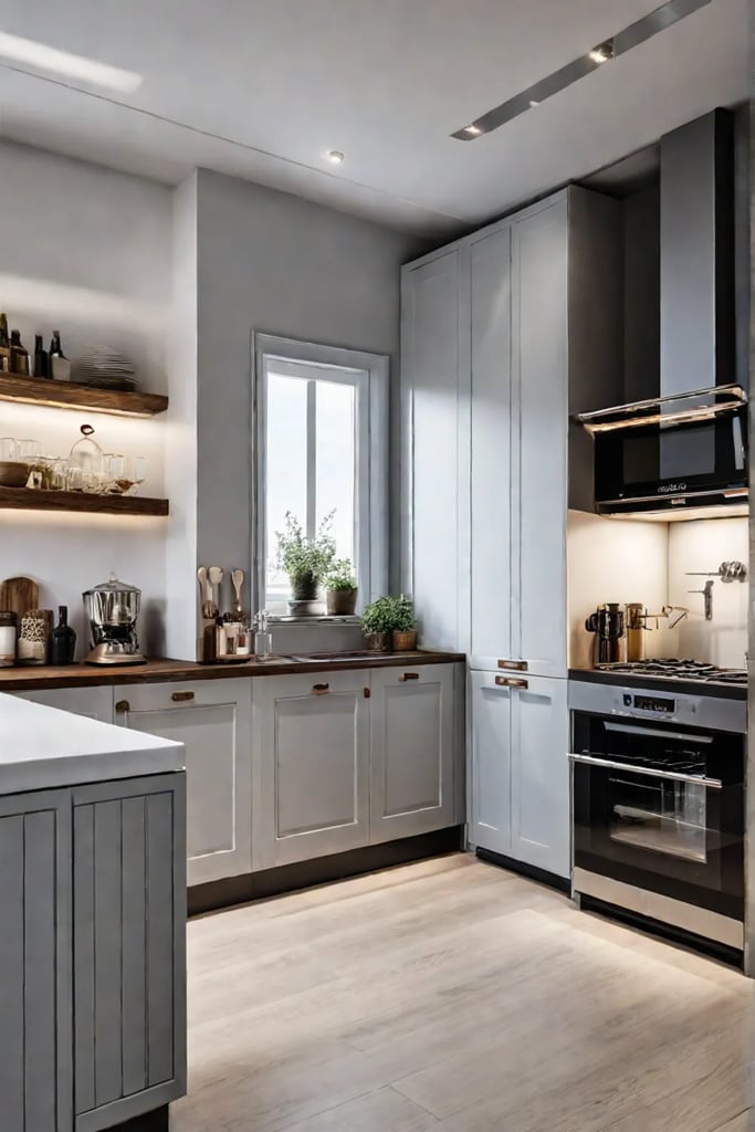
- Group like items together: Create little vignettes of your favorite pieces. Stack your colorful Fiestaware, line up those quirky salt and pepper shakers, or showcase your collection of vintage cookbooks.
- Play with height and texture: Mix tall items with shorter ones, and pair smooth surfaces with more textured pieces. It’s all about creating visual interest.
- Add a pop of green: Tuck a few small plants or herbs among your dishes. They’ll add life to your shelves and might even inspire you to use that basil plant instead of just admiring it.
- Embrace the odd number rule: Groupings of three or five items tend to be more visually appealing than even numbers. It’s one of those weird design secrets that just works.
But wait, I can hear you asking, “Jesse, won’t open shelves just become dust magnets?” Fear not, my friends! Here are a few tricks to keep your shelves looking fresh:
- Use items regularly: The more you rotate your dishes, the less dust they’ll collect.
- Keep a small duster handy: A quick once-over while your coffee brews in the morning, and you’re good to go.
- Choose wisely: Display items that are easy to clean or don’t show dust easily.
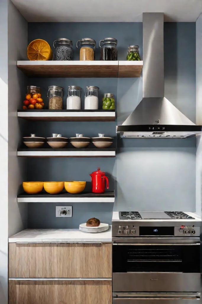
Remember, the key to successful open shelving is finding that sweet spot between practical storage and stylish display. It’s like creating a miniature art installation that also happens to hold your cereal bowls. And the best part? You can change it up whenever the mood strikes!
As we wrap up our open-shelf adventure, let’s take a moment to appreciate how this simple change can transform your kitchen from cramped to captivating. It’s amazing how removing a few cabinet doors can open up a whole new world of design possibilities.
Speaking of opening up possibilities, let’s shift gears and explore another game-changing approach to small kitchen decor. Get ready to embrace your inner minimalist as we dive into “The Minimalist Approach: Less is More.” Trust me, you’ll never look at your kitchen gadget drawer the same way again!
The Minimalist Approach: Less is More
Let’s face it, folks: when it comes to small kitchens, less really can be more. As someone who’s turned more than a few cramped cooking spaces into serene culinary sanctuaries, I’m here to tell you that embracing minimalism isn’t just about aesthetics – it’s about creating a space that’s as functional as it is fabulous.
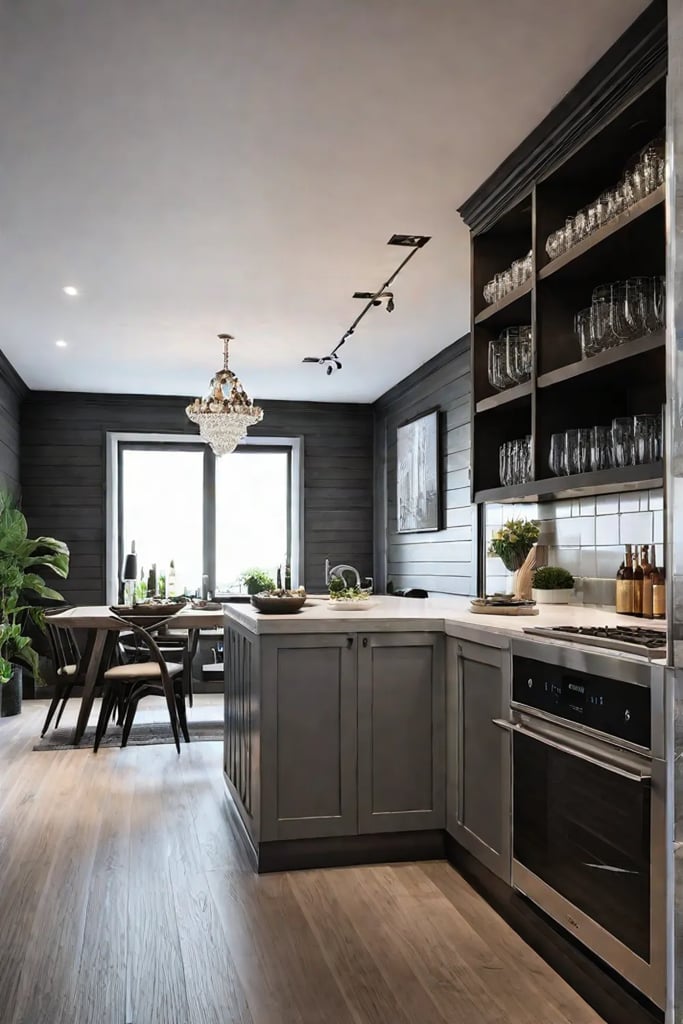
Declutter and Conquer
First things first: it’s time to channel your inner Marie Kondo and bid farewell to kitchen clutter. Trust me, your countertops will thank you! Start by asking yourself:
- Does this [insert kitchen gadget] spark joy… or just collect dust?
- When was the last time I used this [obscure utensil]?
- Do I need five different types of whisks?
Remember, a clear counter is a happy counter. And a happy counter makes for a happy cook!
Functionality Meets Style
Now that we’ve decluttered, let’s talk style. The key to a minimalist kitchen that doesn’t feel like a sterile lab is to focus on pieces that are both functional and beautiful. Here’s how:
- Stick to a limited color palette. Think soothing neutrals with perhaps a pop of color here and there.
- Invest in wall-mounted storage solutions. Magnetic knife racks and pegboards are your new best friends.
- Choose multi-purpose items. That gorgeous wooden cutting board? It’s also your serving platter!
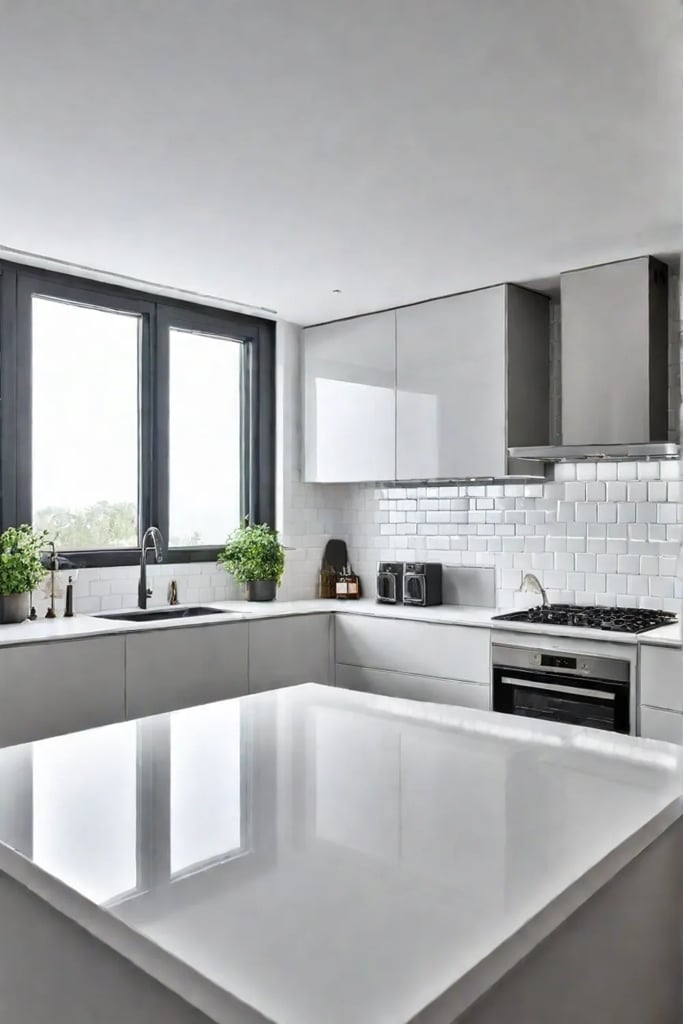
But what about personality, you ask? Fear not! You can add character without cluttering up your space. Try these ideas:
- Display a single, stunning piece of art that speaks to your culinary passions.
- Use a beautiful, vintage-inspired canister to store your most-used utensils.
- Hang a small herb garden for both function and flair.
As for those essential items that simply must stay on the counter? Keep it simple:
- A sleek coffee maker (because, of priorities)
- A stylish fruit bowl (form meets function!)
- A cutting board that doubles as decor
Remember, in a minimalist kitchen, every item should earn its place. If it’s not beautiful, useful, or ideally both, it’s time to say goodbye!
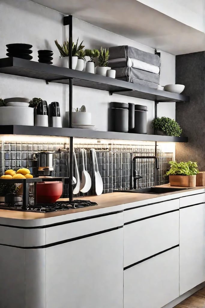
By embracing this less-is-more approach, you’ll be amazed at how much more spacious and serene your small kitchen feels. It’s like giving your culinary space a deep breath of fresh air!
Now that we’ve decluttered and simplified, let’s add a dash of personality to our minimalist masterpiece. In our next section, “Artful Additions: Personality and Flair,” we’ll explore how to infuse your kitchen with character without compromising on that clean, uncluttered look we’ve worked so hard to achieve. Get ready to let your culinary creativity shine!
Artful Additions: Personality and Flair
A kitchen without personality is like a cupcake without frosting. Sure, it’ll do the job, but where’s the fun in that? It’s time to jazz up those bare walls and infuse your culinary space with a hefty dose of you-ness. Trust me, your taste buds (and your guests) will thank you!
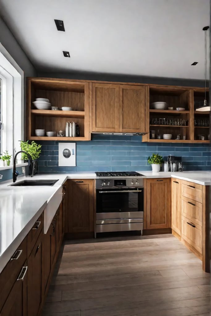
Reflect Your Style
Who says art is just for living rooms? Your kitchen deserves some love too! Here are a few ways to make those walls sing:
- Create a gallery wall of your favorite food-related prints or vintage cookbook covers. It’s like Instagram for your kitchen, minus the scrolling!
- Install a chalkboard or magnetic wall for grocery lists, meal planning, or impromptu haiku sessions while waiting for water to boil.
- Hang a collection of colorful plates or cutting boards. It’s storage and decor in one – talk about a win-win!
Remember, your kitchen should reflect your unique flavor. Are you a globe-trotting foodie? Showcase maps of your favorite culinary destinations. Aspiring mixologist? Display those cocktail recipes like the works of art they are!
Creative Expressions
Now, let’s think outside the box (or should I say, outside the cabinet?). Here are some unexpected ways to add personality to your kitchen walls:
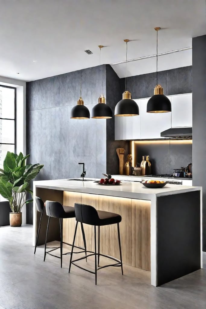
- Turn that blank space into a living wall with herbs or succulents. It’s like having your own vertical garden – and it smells amazing!
- Install a pegboard to hang utensils, pots, and pans. It’s practical, customizable, and oh-so-satisfying to organize.
- Create a statement wall with bold wallpaper or a hand-painted mural. Who says you can’t have a Sistine Chapel moment while making spaghetti?
For those of you with a penchant for vintage charm (like yours truly), why not incorporate some antique pieces into your modern kitchen? An old-school kitchen scale or a retro clock can add a delightful touch of nostalgia. Just last week, I scored a set of vintage fruit crate labels at a flea market – they now proudly adorn my kitchen wall, adding a pop of color and a dash of history to my morning coffee routine.
Remember, dear readers, the key is to have fun with it! Your kitchen should be a reflection of you – quirks, passions, and all. So go ahead, let those walls tell your story. Who knows? You might just inspire your next culinary masterpiece while admiring your handiwork.
As we wrap up our journey through the world of small kitchen wall decor, let’s take a moment to reflect on all the possibilities we’ve explored. From functional to fabulous, there’s no shortage of ways to make your kitchen walls work harder and look better. But before we say goodbye, let’s recap the key takeaways that will help you transform your space from bland to grand.
Conclusion
Well, my fellow small-space warriors, we’ve reached the end of our kitchen wall decor adventure! From embracing the power of light and reflection to scaling new heights with vertical design, we’ve explored a world of possibilities that prove size doesn’t matter when it comes to style.
Remember, your kitchen isn’t just a place to whip up midnight snacks or perfect your sourdough game. It’s a canvas for your creativity, a stage for your culinary performances, and a reflection of your unique personality. So don’t be afraid to mix it up, try new things, and let your walls tell your story. After all, the best kitchens are the ones that make you smile every time you walk in – whether you’re tackling a gourmet feast or just reheating last night’s pizza.
Now, go forth and conquer those kitchen walls! And who knows? With these tips and tricks up your sleeve, you might just find yourself hosting the next neighborhood potluck in your newly fabulous space. Just don’t forget to invite me – I’ll bring the wine and the witty kitchen banter!
