There is a particular feeling that comes from waking up in the right room. Not just a clean room, or a tidy room, but one where the wall behind your head was chosen with the same care you’d give to anything else that matters. Bedroom wallpaper designs do something that paint alone can’t — they layer colour, pattern, and texture into a single surface that changes with the light and holds its depth regardless of the hour. The difference between a well-wallpapered bedroom and a freshly painted one is the difference between a room that was finished and a room that was decided.
From a colour psychology perspective, the bedroom wallpaper designs you choose are doing active psychological work — whether you realise it or not. Every pattern, every colour temperature, every texture registers on the brain’s sensory pathways and shapes the room’s emotional atmosphere. That’s not a soft claim. Cortisol levels, sleep onset timing, and morning mood are all measurably influenced by the visual environment of the space where you sleep. These 15 bedroom wallpaper designs run the full spectrum — from whisper-quiet tone-on-tone to full-wall forest murals — with a psychological read on each one, so you can choose not just what looks good but what will actually work for how you want to feel.
1. Large-Scale Botanical Prints That Bring the Garden In
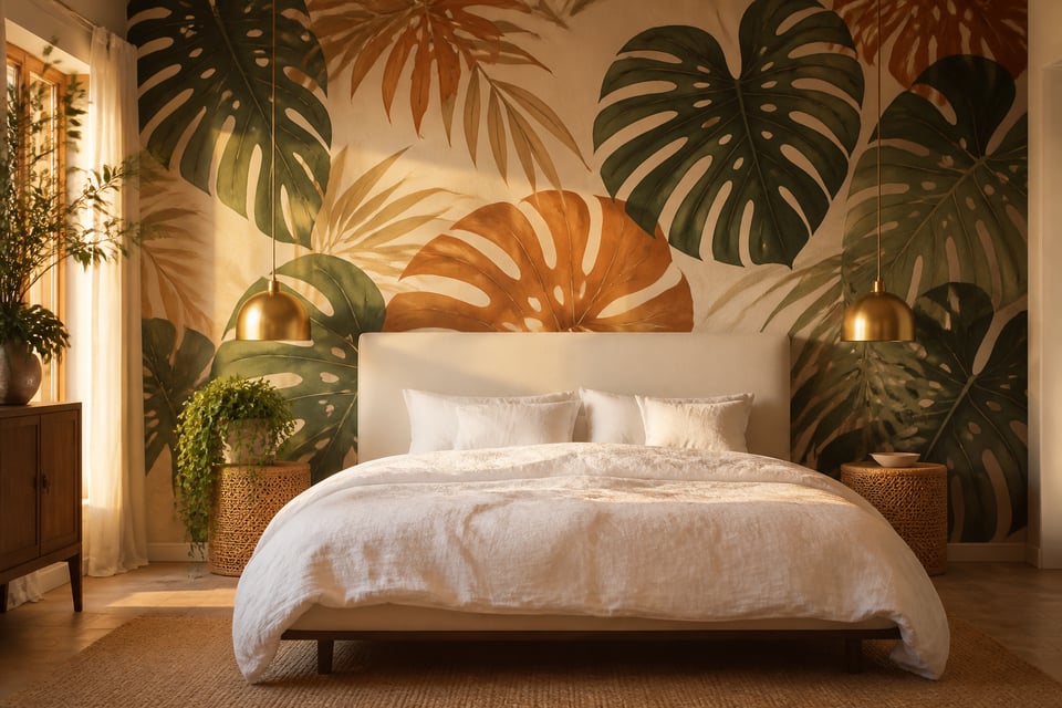
There’s a reason the botanical wallpaper category has dominated home design conversations through 2025 and into 2026: the brain is hardwired to respond to leaf shapes and green hues as signals of safety, life, and environmental abundance. This isn’t aesthetic preference — it’s biology. Studies from the Journal of Environmental Psychology show that exposure to natural imagery measurably reduces cortisol and elevates the three hormones most associated with restorative rest: dopamine, serotonin, and oxytocin. A well-chosen botanical bedroom wallpaper design is, by any honest assessment, functional design.
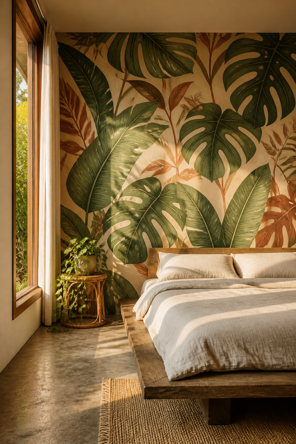
The scale matters more than the species. Oversized prints — monstera, banana leaf, tropical palm — hold the eye differently than small repeating florals. Large-scale imagery creates a sense of immersion rather than decoration, which is the key to achieving the biophilic effect. For rooms under 150 square feet, contain the print to a single feature wall; in a compact space, four botanical walls compress rather than expand. Pull one secondary colour from the wallpaper into your throw pillows — if the print has rust-red stems against a deep green ground, the rust goes in the textiles, not elsewhere. Keep the opposite three walls in flat matte paint matched to the lightest tone in the design.
William Morris & Co and Mitchell Black both offer premium botanical collections in multiple colourways, with Morris designs starting around £85 per roll. The most common mistake here is over-matching: pulling three colours from the wallpaper into the soft furnishings instead of one, until the room looks like a branded store rather than a bedroom.
2. Geometric Bedroom Wallpaper Designs for a Modern Edge
Shape is a primary language of the nervous system, and geometric patterns carry specific psychological weight depending on what you choose. Squares and rectangles convey stability and order. Triangles introduce movement and direction — upward-pointing shapes are particularly activating, which makes them useful in creative workspaces but worth approaching with care in a bedroom. Hexagons and soft organic geometric forms sit in the middle: visually interesting without the directional energy that can impair sleep onset.
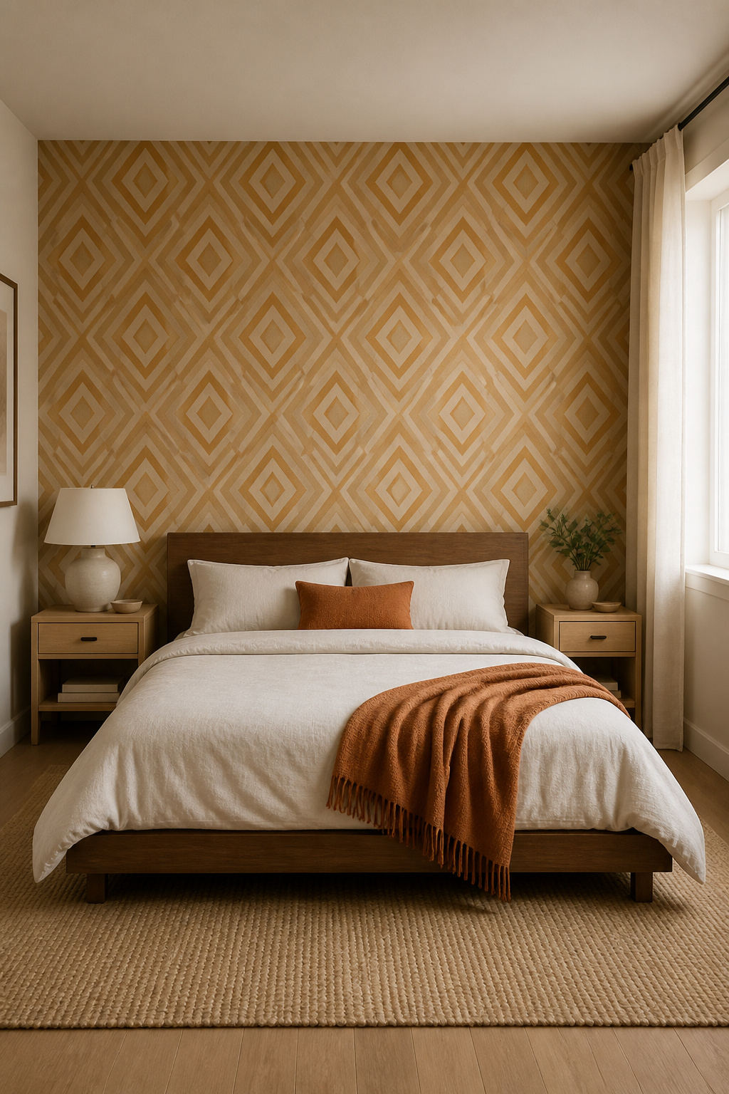
For bedroom wallpaper designs, the key variable is not just shape but contrast. High-contrast black-and-white geometrics belong in home offices or hallways where alertness is the goal. In a bedroom, the same shapes work beautifully when rendered in near-tonal pairs: warm cream and soft putty, dusty sage and ivory, pale terracotta and warm sand. Mid-century diamond and chevron patterns in ochre or clay are among the most widely searched geometric bedroom wallpaper combinations right now, and the reason is largely psychological — warm earth-tone geometrics feel grounded and settled rather than sharp.
Wall Blush and Walls Republic both stock peel-and-stick geometric options from around £6-12 per square foot, making this one of the more renter-friendly bedroom wallpaper choices. Graham & Brown’s bedroom range offers several neutral geometrics designed to work across multiple furniture styles. The practical note: a geometric print is easier to get wrong than a tonal botanical, so order at least two large samples and check them in both daylight and evening lamplight before committing.
3. Textured Grasscloth Wallpaper for a Natural Calm
Grasscloth does something that neither paint nor printed wallpaper can replicate: it adds a tactile quality that the brain registers even when you’re not touching it. Visual texture engages sensory pathways that flat surfaces simply don’t reach. The effect is acoustic as well as visual — natural fibre wallcoverings like jute, sisal, and river grass create a subtle sound-softening quality, making a grasscloth bedroom feel quieter and more intimate. Nate Berkus has described it as one of the few wall treatments that transforms a room from across the room and at arm’s length. The natural fibre variation means no two rolls look identical, and that handmade irregularity registers as warmth rather than inconsistency.
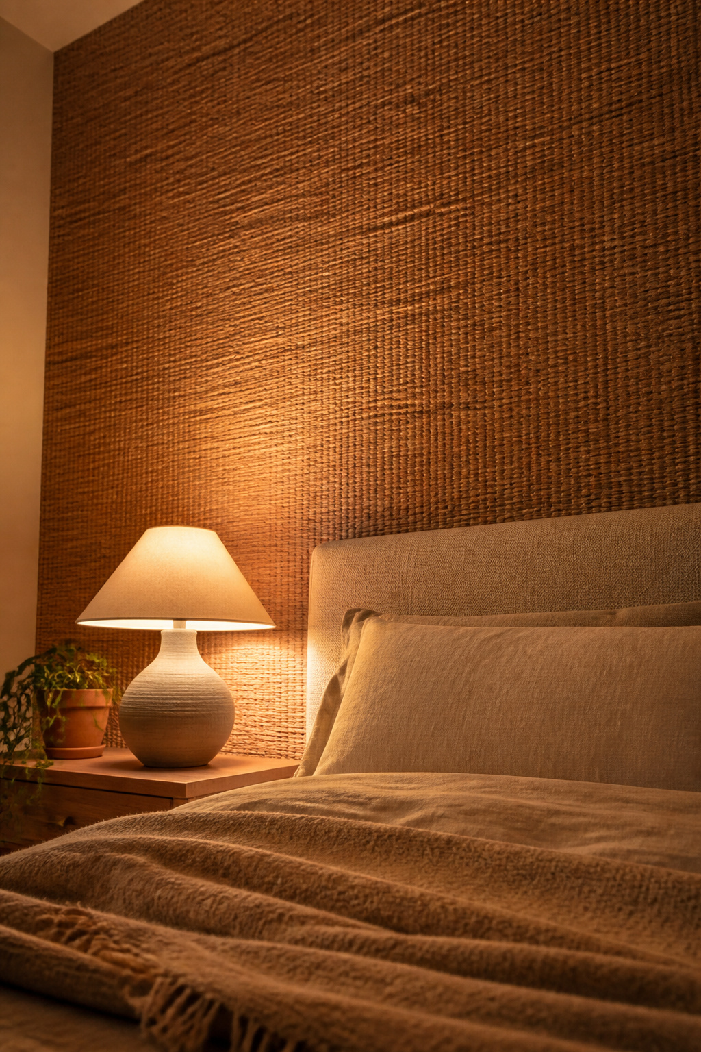
Before you buy, understand the difference between natural and faux grasscloth. Natural varieties — made from jute, arrowroot, sisal, or seagrass — run £5-14 per square foot and cannot be cleaned with water; surface stains are largely permanent. Faux grasscloth (vinyl-backed paper with a woven texture print) costs £2-6 per square foot, is moisture-resistant, and wipes clean. For a bedroom used mostly by adults, natural grasscloth on the headboard wall is a considered luxury. For a family bedroom or one prone to humidity, faux is the practical choice. Both deliver the same visual warmth.
Natural grasscloth will show seams at the panel joins — this is a characteristic of the material, not an installation error. Experienced wallpaper hangers minimise seam visibility through careful panel alignment, but a zero-seam result is not realistic. If visible seams feel unacceptable, faux grasscloth is a cleaner option. Direct sunlight fades natural grasscloth within 18 months, so reserve it for north or east-facing walls. For more bedroom wall ideas that layer texture and material depth, there are plenty of directions this aesthetic opens up.
4. Deep Jewel-Tone Bedroom Wallpaper for a Dramatic Effect
Sapphire blue reduces cortisol and supports serotonin production — the neurotransmitter most directly linked to sleep regulation. Emerald green triggers environmental safety cues in the brain, slowing heart rate and reducing vigilance. Amethyst and deep plum encourage what designers and psychologists both describe as restful interiority: a turning-inward that supports both sleep and the transition from the demands of the day. This is not intuitive design talk. The evidence for dark, saturated hues in sleep spaces has been building since the early 2000s, and the practical applications are straightforward.
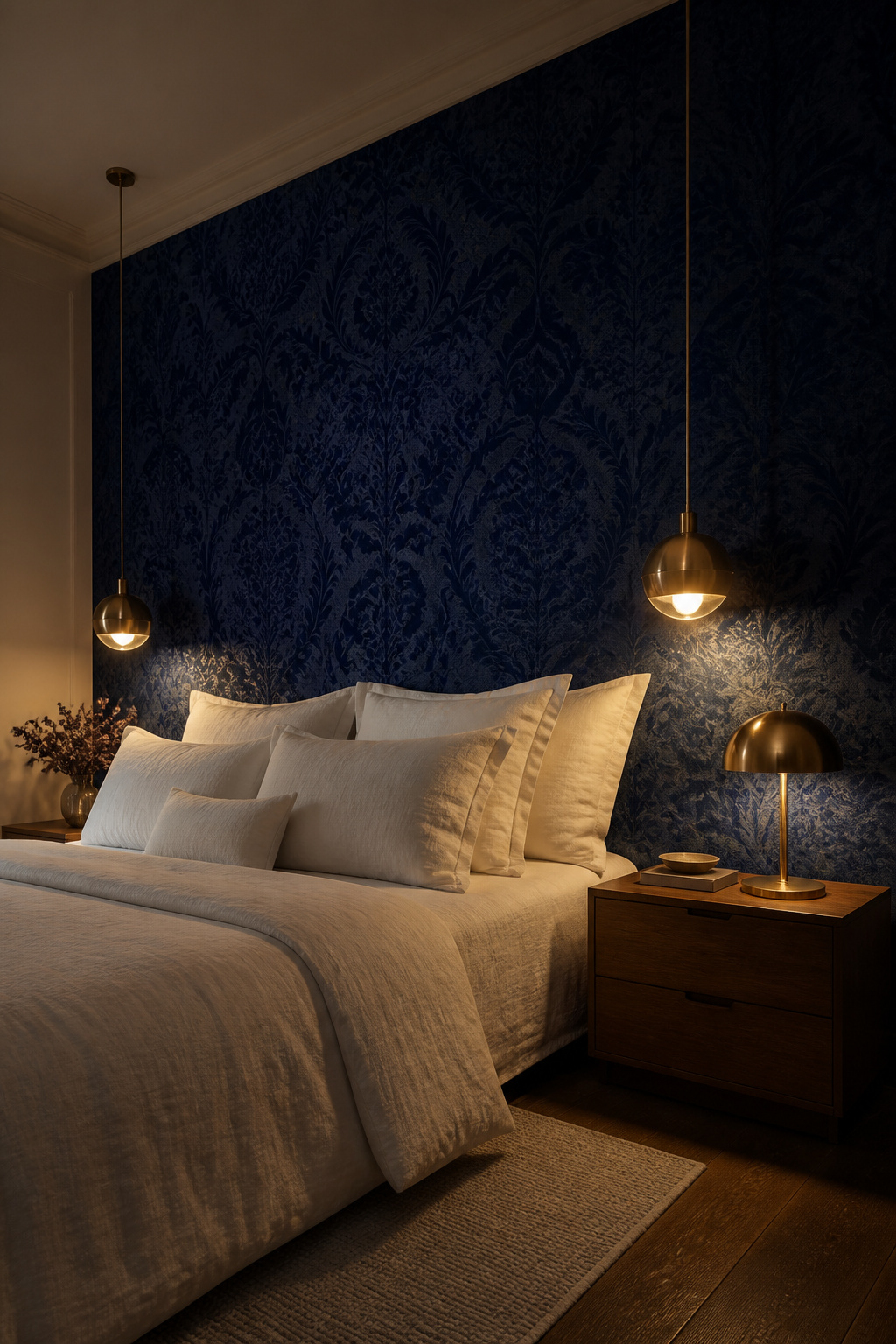
The cocooning effect of a jewel-tone wall works because visual compression — the sense of the walls being closer — mimics the neurological response to being in a sheltered, protected space. It’s the same mechanism that makes a low-ceilinged cottage bedroom feel more restful than a high-ceilinged hotel room. Sapphire pairs best with brass hardware, warm white bedding, and natural linen. Emerald needs warmth — walnut furniture, cream textiles, and terracotta accents keep it deep rather than cold. Avoid cool grey pairings with any jewel tone; the coolness fights the saturation and flattens the depth. For deeper styling ideas around blue bedroom decor ideas, the colour psychology principles extend well beyond the wallpaper itself.
Three non-negotiables for making dark bedroom wallpaper feel considered rather than oppressive: white or cream ceiling paint (mandatory — it lifts the room), light-coloured bedding as a counterweight, and multiple layered light sources. A single overhead light will flatten a jewel-tone wall. Dimmer-controlled bedside lamps, wall sconces, and a table lamp at different heights let the deep colour breathe. Pearl and Maude specialise in jewel-tone artisan wallpaper that is worth investigating at this end of the market.
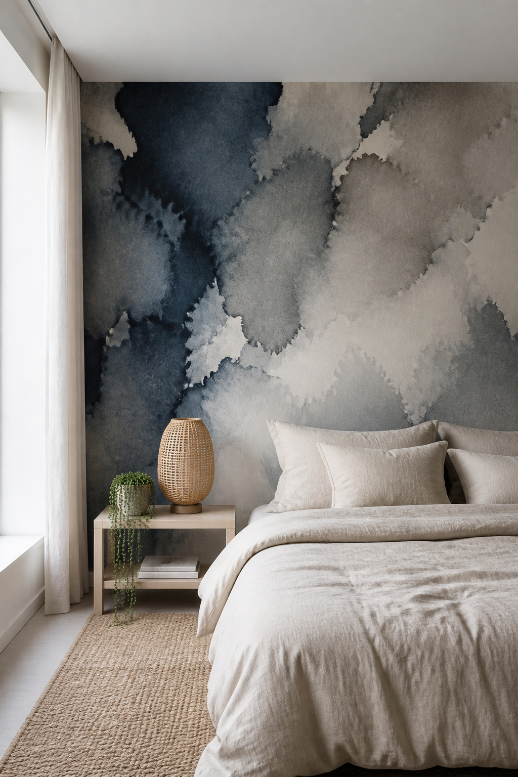
5. Soft Watercolour Wash Wallpaper for an Ethereal Feel
There is something about a watercolour wall that changes the quality of the air in a bedroom. The bleeding edges and soft washes register as ‘in-process’ rather than finished — a visual quality that reduces the sense of hard boundaries and softens the space. In colour psychology terms, the hand-painted imperfection signals authenticity and craft, which the brain processes as warmth. Add a pastel palette — blush, dusty rose, sage, pale indigo — and the result is a bedroom that the nervous system reads as genuinely restful.
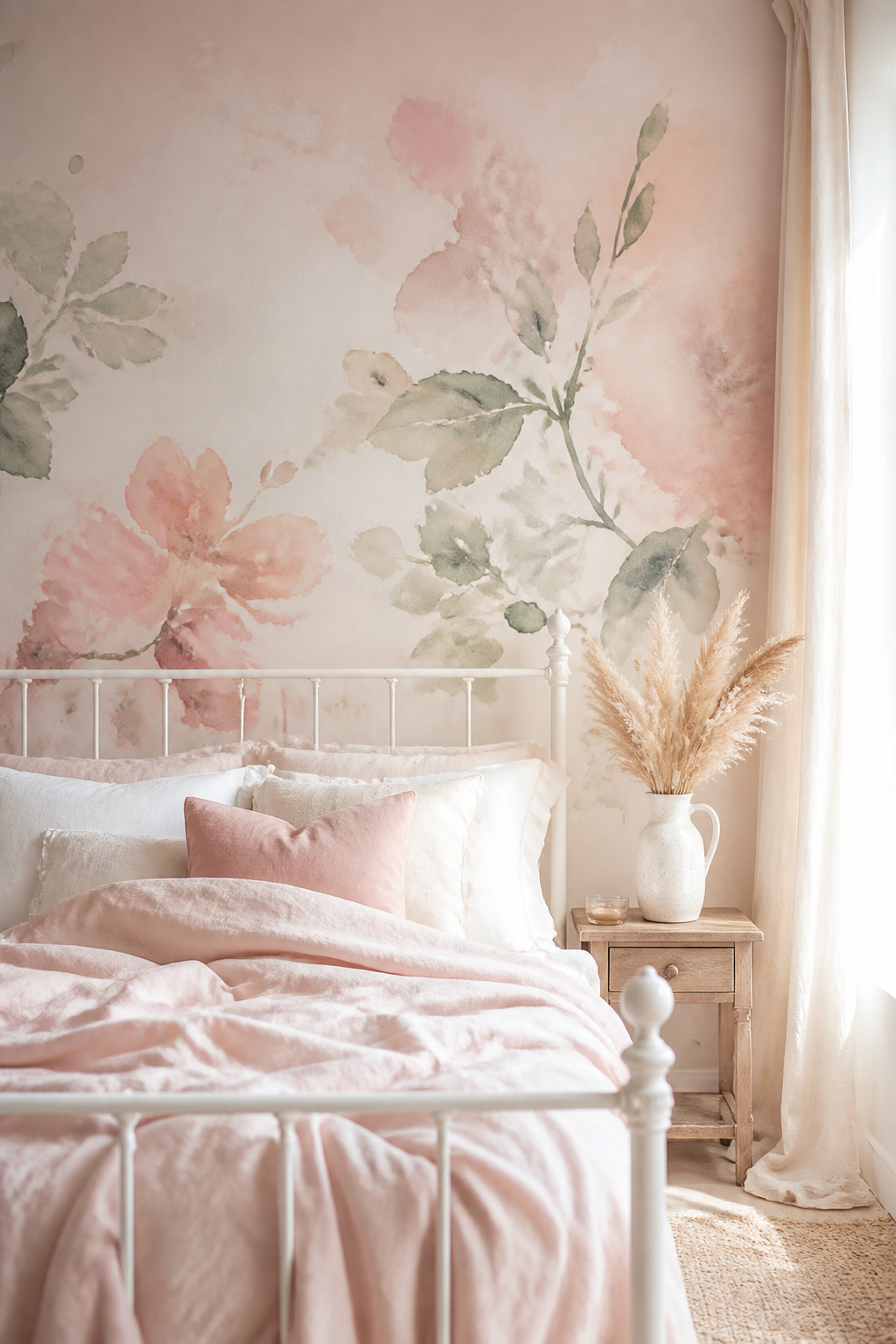
The quality of the print matters enormously. The best watercolour bedroom wallpaper designs are digitally reproduced from original hand-painted artwork, and the difference between a high-resolution print and a low-resolution one is immediately visible at close range. Pixelation destroys the ethereal quality entirely. Milton & King and Hovia are the reliable reference points at the premium end; Wall Blush offers peel-and-stick options from around £6 per square foot that are a useful starting point for renters. The palette for a bedroom runs blush, dusty rose, terracotta, sage, and pale indigo — all of these pair naturally with washed oak furniture, warm brass fixtures, and cane chairs.
Watercolour wallpaper demands an uncluttered room to work properly. White or cream linen bedding — nothing patterned — lets the wall be the visual event. Sheer curtains rather than blackout drapes allow light to animate the watercolour effect as it moves through the day; the shift from morning light to afternoon gold to evening lamp glow is one of the most genuinely pleasurable qualities of a well-chosen watercolour bedroom wallpaper design. Keep accessories minimal. A single oversized ceramic lamp, a wooden bowl, and a trailing plant are enough.
6. Scenic Mural Wallpaper That Turns One Wall Into a View
The brain partially processes perspective cues in a well-executed mural as real spatial information — a forest path disappearing into the distance creates a measurable sense of expanded depth, not just a decorative one. This is why scenic mural wallpaper is one of the most effective tools for small bedrooms: a scene with strong recession makes a 100-square-foot room feel larger in a way that mirrors and clever furniture placement cannot fully replicate. Choose lighter, muted scenes — misty woodlands, soft sky gradients, pale beach horizons — for maximum spatial effect. Dense, dark forest imagery or high-contrast urban murals are more atmospheric than expansive.
What to Look for in a Bedroom Mural Scene
The best mural choices for bedroom wallpaper designs are nature scenes with strong perspective recession, abstract sky gradients, and soft architectural views. Forest and woodland murals with mist or dappled light have the strongest backing from biophilic research for sleep improvement. Abstract cloud and sky murals are design-neutral — easier to restyle the room around without replacing the wallpaper. City and architectural scenes suit urban aesthetics but can carry a low-level alertness that belongs in a living room rather than a bedroom. Photowall, Murals Your Way, and Rebel Walls all offer custom sizing; a single bedroom feature wall runs £80-180 depending on material and complexity.
Installation is the main challenge, and two-person teams are not optional for panels over six feet tall. Non-woven mural wallpaper uses a paste-the-wall method (faster and cleaner than paste-the-paper), but the wall preparation is non-negotiable: fill every hole, sand every bump smooth, and prime bare plaster. Any surface irregularity shows through a mural. Numbered panels should be laid out on the floor before any paste is applied — alignment errors between panels 2 and 3 are the most common mural installation mistake, and they’re invisible until the paste has dried.
7. Classic Stripe Bedroom Wallpaper Designs That Add Height
Vertical stripes are the oldest optical illusion in interior design, and they still work. The eye follows vertical lines upward, extending the perceived wall height — a well-executed stripe wallpaper on a standard 8-foot-ceiling room reads convincingly as 9 or 10 feet. Farrow & Ball’s Closet Stripe is the reference here: a clean, narrow stripe created by the traditional method of dragging paper under open-bottomed troughs, which produces a subtle variation in density that makes the line feel handcrafted rather than printed. Cole & Son’s stripe designs add rhythmic order to a room — the vertical progression creates not just height but a quiet visual discipline.
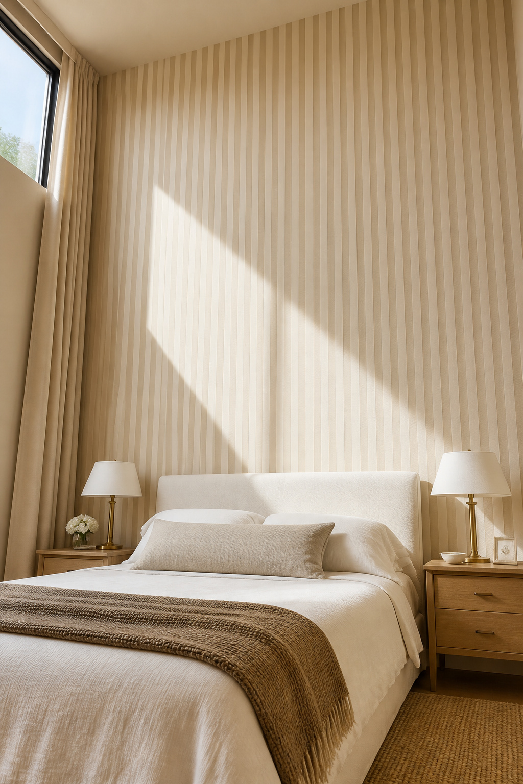
Stripe width is the primary variable. Pinstripes (under a quarter-inch) create a tailored texture with minimal decorative impact — the subtlest option, close to a textured neutral. Narrow stripes in the Closet Stripe range deliver the strongest height illusion with a classic aesthetic. Farrow & Ball’s Broad Stripe is more overtly decorative and works best as a statement feature wall rather than all-round. The colour combination is where most people go wrong with classic stripe bedroom wallpaper designs — avoid high-contrast regency combinations (navy and white, red and cream) in a bedroom. The pairing to reach for is two values of the same hue: warm cream with soft putty, sage with ivory, blush with warm white. For small bedroom ideas to maximize space, stripe wallpaper on the two longest walls is one of the few treatments that addresses height and length simultaneously.
One practical rule: run the stripe wallpaper all the way to the ceiling. Stopping it at picture-rail height defeats the optical illusion entirely and makes the ceiling feel lower rather than higher.
8. Vintage Toile and Heritage Prints for Timeless Charm
Toile de Jouy has endured since its origins in Jouy-en-Josas, France in the 1760s, and the reason is psychological as much as aesthetic. The pastoral scenes — farmers, bridges, shepherdesses, animals — offer the brain gentle visual engagement: complex enough to hold interest, orderly enough not to stimulate arousal. Heritage prints in general activate what psychologists describe as continuity associations — the sense of connection to something that has lasted, which is fundamentally calming rather than stimulating. In a bedroom wallpaper design, this is not a small thing.
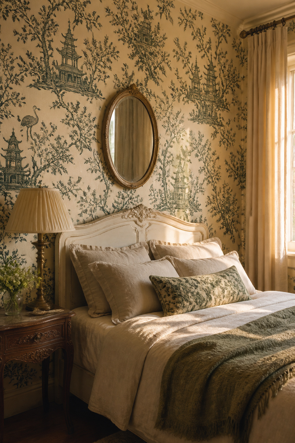
French Country vs Chinoiserie Toile
The two main categories to understand: French country toile and Chinoiserie toile. French country prints feature European pastoral scenes, typically in deep red, navy, or black on a cream or white ground — grounded, traditional, and directly associated with the Provençal farmhouse aesthetic. Chinoiserie toile draws from Asian visual traditions — pagodas, cranes, cherry blossom, temple motifs — with the same single-colour discipline but a more theatrical quality. Colefax and Fowler’s Toile Chinoise in charcoal is the designer reference: an off-white ground with detailed motifs that sit comfortably in a modern interior. Chinoiserie has the edge in more contemporary rooms, French toile in traditional or country-house settings.
The key to modernising toile wallpaper — so it reads as a deliberate aesthetic choice rather than a period recreation — is to pair it with furniture that is clearly contemporary. A low-profile platform bed against a traditional toile wall creates productive contrast; a matching four-poster and heritage furnishings tips it over into museum territory. Updated colour choices help considerably: toile in forest green, teal, or slate blue has a freshness that the traditional red and black cannot match. Natural linen and raw cotton textiles rather than formal silks keep the overall atmosphere relaxed and lived-in.
9. Metallic Bedroom Wallpaper Designs That Catch the Light
Metallic wallpaper is one of the few bedroom wallpaper designs where the room genuinely changes through the day. Gold and copper surfaces catch morning sidelight differently than afternoon sun and differently again in evening lamplight — by soft warm lamplight, the wall glows in a way that is distinctly conducive to winding down. In direct daylight, the same wall can read as sharp and cold. This dynamic quality is both the appeal and the challenge of metallic bedroom wallpaper, and it makes bedroom lighting ideas the most important supporting decision you make alongside your wallpaper choice.
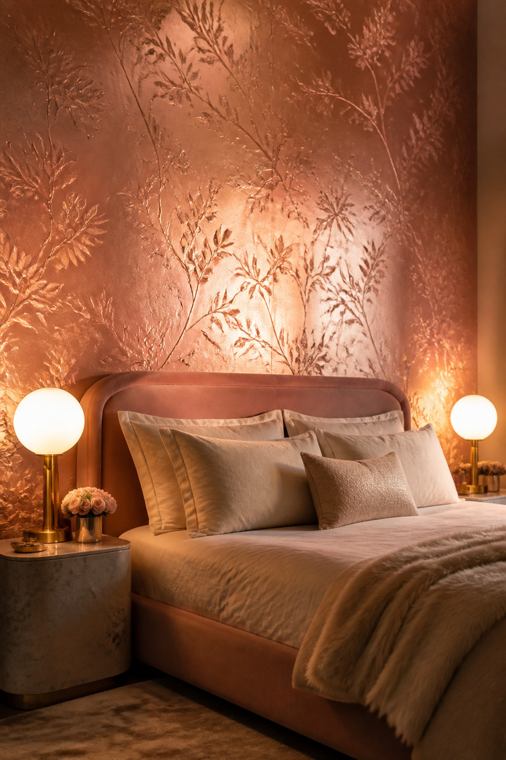
Choosing Your Metallic Finish
The metallic family covers real ground. Gold pairs with jewel tones, warm woods, and deep velvet textiles — maximalist and hotel-luxe in atmosphere. Silver is cooler and more contemporary: better suited to minimalist bedrooms, where it pairs with crisp white bedding and grey stone surfaces. Copper is the warmest option — it works with terracotta, brick, and warm neutrals, and sits naturally in an industrial or bohemian bedroom. Rose gold lands between copper and silver, pairing with blush, ivory, and soft grey. Of the four, rose gold is currently the most widely sold metallic finish in bedroom wallpaper designs, largely because it works across more furniture styles than pure gold or silver.
Graham & Brown’s Lustre Gold and Eclipse Pearl & Gold are the benchmark references for bedroom-appropriate metallic wallpaper — both use delicate metallic lines or a pearl base that reduces the reflective intensity. One wall maximum, always. Balance every metallic surface with matte textiles — velvet, linen, and wool absorb light and prevent the room feeling hard and reflective. Place the metallic wall away from the main window: direct sunlight on a fully metallic surface creates glare, not glamour.
10. Maximalist Floral Bedroom Wallpaper for Bold Personalities
Maximalism is no longer a fringe position in interior design. Through 2024 and into 2026, it has consolidated from counterculture to genuine authority, and the psychological case behind it is coherent: after years of spare, minimalist interiors, the brain craves abundance. Visually complex spaces that are well-curated are energising and mood-elevating. The variable is curation. A maximalist floral that feels overwhelming typically has the problem of colour inconsistency — too many hues competing at equal volume. The maximalist bedroom wallpaper designs that work have tightly controlled palettes: four to six colours, usually including one or two neutrals as anchors, with every shade relating to every other.
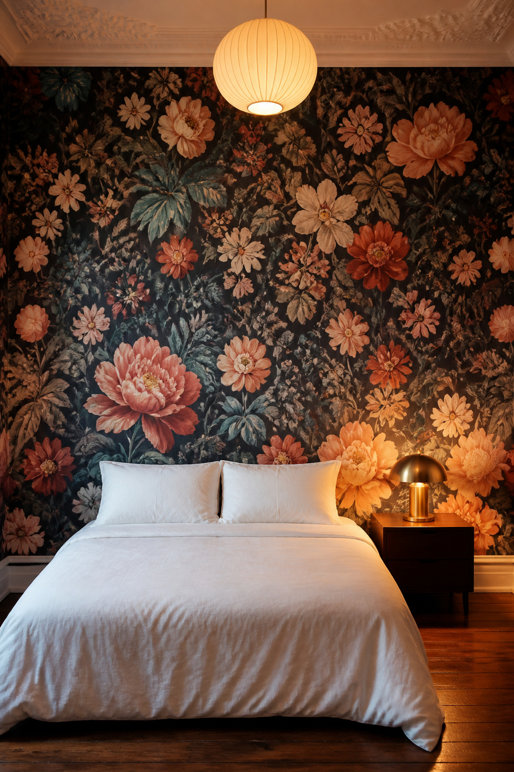
House of Hackney’s William Morris-derived collections are the reference here. Their prints use a structured colour palette built around a handful of saturated tones — deep teal, terracotta, coral, blush — on a ground colour that relates to the lightest tone in the palette. The result reads as layered rather than chaotic, because there is an underlying geometric grid to the repeat. Schumacher’s Chiang Mai Dragon and Pyne Hollyhock do the same for the American market. The pattern is dense, but it is internally consistent. Choose a bedroom wallpaper design where the ground colour appears elsewhere in the room — in the bed frame finish, the curtains, or a significant piece of furniture — and the maximalist wall becomes part of a conversation rather than a monologue.
Keeping the Room Quiet Around a Loud Wall
Maximalist wallpaper demands a quiet room around it. A simple bed, a plain nightstand, and one statement lamp — that is the furniture budget for a maximalist bedroom. White ceilings, plain wood floors, and a single colour from the wallpaper’s palette in the soft furnishings. House of Hackney specifically recommends pairing their prints with plain linen in the wallpaper’s lightest ground colour. The common mistake is adding pattern on pattern: a maximalist floral against patterned bedding and a decorative area rug dissolves everything into visual noise.
11. Abstract and Painterly Wallpaper for Artistic Bedrooms
Abstract wallpaper interest grew by 18% between 2024 and 2025, which places it well past trend territory and into something more durable. The appeal is a gallery atmosphere without the curation overhead of original art — a brushstroke or ink-wash print brings the expressive energy of painting to an entire wall. In colour psychology terms, abstract patterns stimulate the brain’s interpretive functions: the eye moves across the surface finding shapes and connections, a form of passive creative engagement that is mentally absorbing without being arousing.
The design families are meaningfully different in character. Brushstroke prints — wide, gestural sweeps of paint — are the most dramatic and art-forward option; they work best in single tonal palettes, all warm neutrals or all cool blues, otherwise the brushwork reads as chaotic. Ink-wash designs have soft gradients and pooled pigment edges, creating the quietest and most bedroom-appropriate abstract bedroom wallpaper design. Gestural mark-making prints fall between the two: multi-directional and expressive, but without the strong directionality of a brushstroke, which makes them the most versatile family for bedroom use. Tonal palettes — rust, clay, sage, warm charcoal — are consistently the better bedroom choice over high-contrast abstracts in black and white.
Abstract wallpaper and gallery walls are a natural combination in concept, but require careful execution. The wallpaper should be tonal and the artwork bold — a busy abstract print behind a busy gallery creates conflict. The better approach is one large-format framed piece that mirrors the wallpaper’s colour palette but offers a contrasting subject: a portrait or a botanical drawing against an abstract wall. Keep frames simple — thin natural wood or plain black. Mirrored frames multiply the pattern in ways that quickly become overwhelming.
12. Tone-on-Tone Bedroom Wallpaper Designs for Subtle Depth
Tone-on-tone wallpaper resolves a genuine design problem: a plain painted wall reads as flat and unfinished, while most patterned wallpaper reads as a visual commitment. The tonal solution sits exactly between them — pattern registered by the brain as background information rather than foreground stimulation. The eye receives depth and movement without arousal. In a bedroom, this is the ideal cognitive state: visually engaged without being visually active. And unlike paint, tone-on-tone wallpaper shifts as light moves through the day. An embossed surface creates shadows that change from morning sidelight to afternoon diffusion, making the room feel subtly alive.
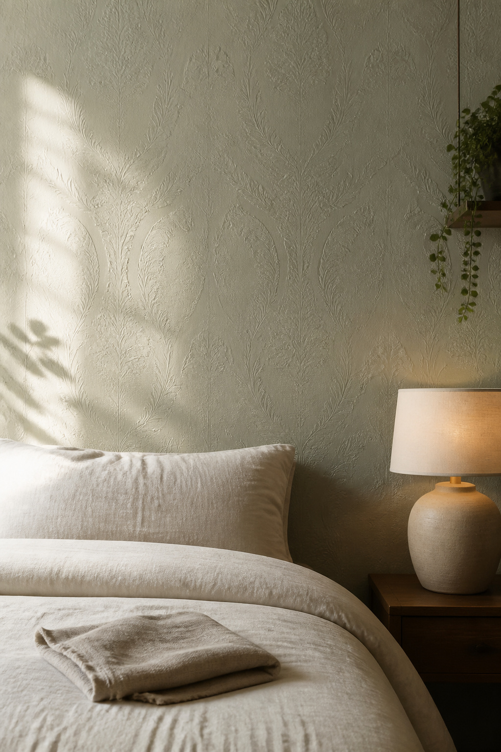
Colour Choices for the Bedroom
Blush is the warmest option — it pairs with brass hardware, warm white bedding, and washed oak, and creates a bedroom that feels intimately enveloping. Sage is psychologically the most effective choice for sleep: soft greens measurably reduce blood pressure and slow the respiratory rate. Ivory and warm off-white are the most versatile options in tone-on-tone bedroom wallpaper designs, working across furniture styles and accent colours. The one colour to avoid in a tone-on-tone bedroom with limited natural light: cool grey. In a north-facing room, a grey tonal wallpaper flattens into a uniformly cold atmosphere rather than the layered depth it creates in a well-lit space.
Embossed tone-on-tone wallpaper works best in rooms with good sidelight — the texture is most visible in natural light that rakes across the surface at an angle. For poorly lit bedrooms, a printed tone-on-tone (flat surface, more consistent appearance) delivers a cleaner result. Damask-pattern tone-on-tone is the classic application for heritage or Edwardian properties, and there it feels entirely appropriate. Pricing runs £3-10 per square foot depending on technique and brand.
13. Bohemian Bedroom Wallpaper That Tells a Story
Globally-inspired patterns do something decoratively unusual: they carry cultural narrative. A Moroccan geometric, an ikat design, a batik-influenced print — each of these has a traceable origin in a specific place, time, and craft tradition. In a bedroom, that semantic depth creates what psychologists call a sense of place and identity: the feeling that the room reflects something true about who lives in it. This is not a quality that can be engineered through generic floral or stripe wallpaper. It is specific to designs that have earned their patterns through actual cultural history.
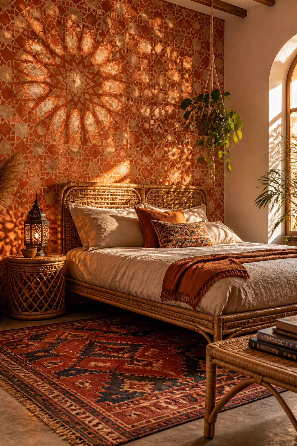
Mandala and pampas grass prints are currently the most-searched boho bedroom wallpaper patterns globally, followed by Moroccan tile and ikat designs, with terracotta backgrounds leading the colour trend. Moroccan geometric wallpaper — zellige-inspired star patterns in repeat — creates structured visual depth. Ikat’s blurred, feathered edges soften the geometric precision, preventing it from reading as sharp. Batik-influenced designs carry Indonesian wax-resist patterns with organic flow and palettes built around indigo, rust, and ochre. Kilim-inspired prints are the most statement-making of the category: bold tribal geometric in terracotta, cobalt, and cream.
Layering Bohemian Bedroom Wallpaper Well
Pairing a bohemian bedroom wallpaper design comes down to restraint in layering. One large-scale pattern (the wallpaper), one small-scale textile pattern in the throw blankets or cushions, and no more. Living plants — trailing pothos, hanging macramé planters, sculptural cacti — are the most effective accessories, reinforcing the natural and global narrative without competing with it. The cohesive palette is terracotta, mustard, rust, sage, and warm cream; choose two or three of these and use them across wall, textiles, and ceramics. When completing this kind of bedroom, the boho bedroom furniture ideas that work best lean into natural materials — rattan, raw linen, worn leather — rather than polished or lacquered finishes.
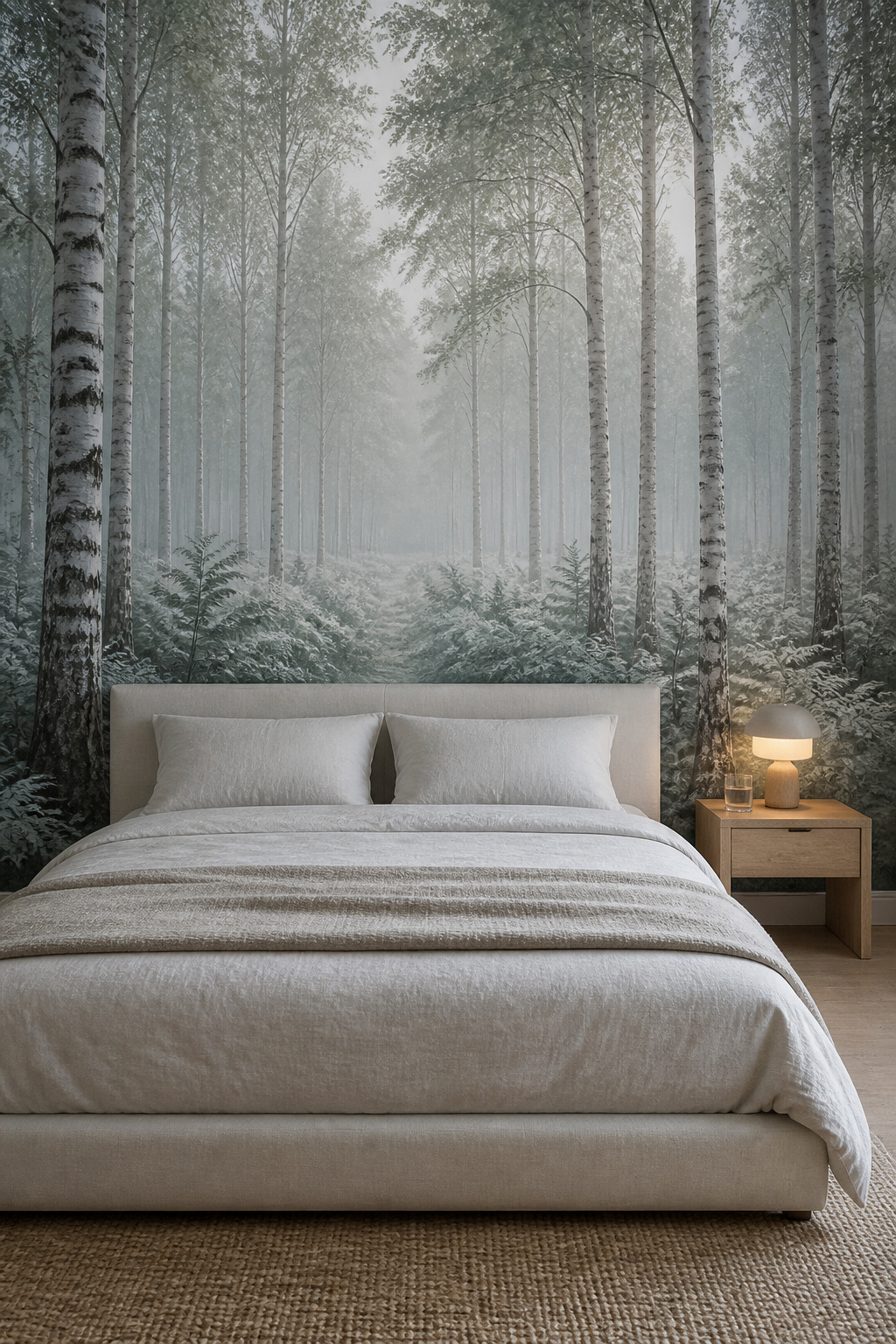
14. Forest and Nature Mural Bedroom Wallpaper for Restorative Sleep
The evidence for nature imagery in sleep spaces is stronger than for any other bedroom wallpaper design category. Hospital environments with nature murals have been formally studied: patients report reduced pain perception, lower anxiety, and shorter recovery times compared to control rooms with plain walls. The mechanism is the same one at work in residential bedrooms — the brain cannot fully distinguish between real nature and high-quality nature imagery in terms of its physiological response. A well-chosen forest mural activates the same hormonal calm as an actual woodland view. Dopamine, serotonin, and oxytocin — the sleep-supportive trio — are measurably elevated by nature scenes, and the bedroom is the highest-value context for this effect.
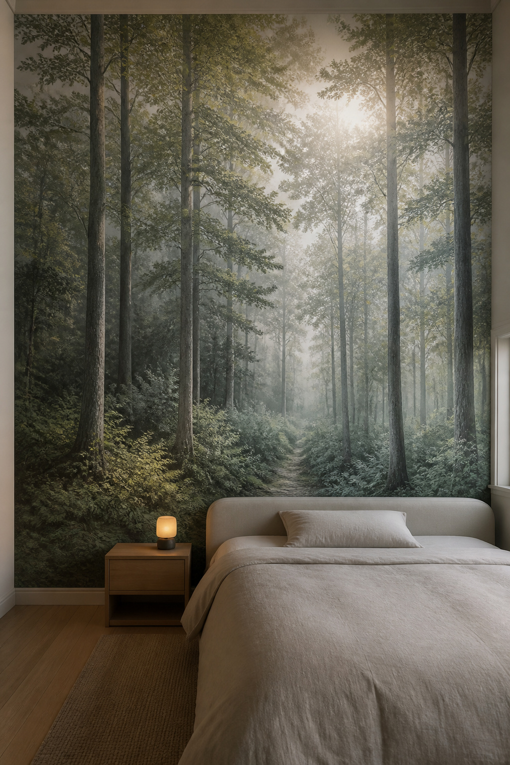
Scene Choice and Sleep Quality
Dense woodland with dappled light is the most psychologically effective scene for sleep. Pale cherry blossom murals — Japanese-influenced, pink and white on a neutral ground — are lighter and more airy, better for smaller bedrooms where a dark forest scene might feel enclosed. Tropical scenes are more energising than calming due to saturated colour and high visual contrast — they work for a resort atmosphere but are not the primary choice for a sleep-focused bedroom. Rebel Walls specialise in high-resolution forest and nature murals with accurate botanical detail; their non-woven material uses a paste-the-wall technique manageable for confident DIY installers. For supplementary cozy bedroom decor ideas for better rest that support the biophilic approach, the layering principles translate directly.
Placement matters as much as scene selection. The headboard wall is optimal — it’s the wall the eye returns to when lying down, maximising the calming effect through the hours before and after sleep. For bedrooms under 150 square feet, choose a mural with strong perspective recession to maximise spatial expansion. Misty or soft-focus scenes work better in small rooms than sharp, high-contrast imagery. Rebel Walls murals are supplied to custom dimensions and start at £100-250 for a standard bedroom feature wall.
15. Minimalist Line Art Wallpaper for a Pared-Back Bedroom
Line art wallpaper is the most psychologically efficient of all bedroom wallpaper designs: it provides the minimum visual stimulus necessary for a wall to feel considered rather than bare. A single continuous line drawing — a peony sketch, a trailing botanical, a gestural figure study — offers focal interest at close range while registering as near-neutral in peripheral vision. The brain receives texture and intention without arousal. For a bedroom where the primary goal is the fastest possible descent into rest, this is the design logic that serves best.
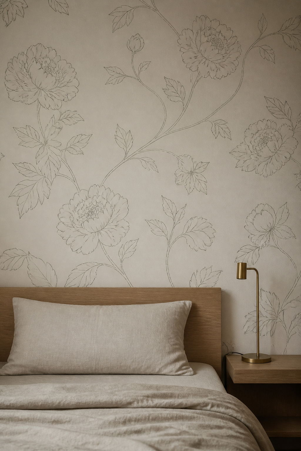
Types of Line Art for Bedrooms
Sketched botanical line art is the most widely available and most bedroom-appropriate subcategory: delicate leaf outlines, peony sketches, and botanical studies on warm cream or ivory grounds. Architectural line drawings — buildings, arches, windows — suit a more intellectual bedroom aesthetic, closer to a library atmosphere. Figure studies are the most personal and art-forward choice, best as a single feature wall in a contemporary bedroom with deliberate, minimal styling. Livette’s Wallpaper and Mayflower both carry dedicated line art collections. Peel-and-stick options from Etsy and ONDECOR start at £4-10 per square foot.
The ground colour is where most people under-invest their thinking in minimalist bedroom wallpaper designs. White ground reads as the crispest option and works well in naturally bright rooms, but in a bedroom with softer light it can read as clinical rather than calm. A warm cream or off-white ground softens the contrast between line and background, and a tan line on warm cream is the most instinctively bedroom-appropriate combination available. Colour grounds — sage, blush, dusty blue — give line art wallpaper warmth and presence; the line recedes slightly but the wall reads as a colour with a quiet pattern rather than a statement.
How to Choose the Right Bedroom Wallpaper Design for Your Space
The first question is not what you like — it’s how you use the bedroom. A primary sleep space calls for designs that actively support rest: calming botanical prints, grasscloth, watercolour washes, forest murals, or tone-on-tone patterns. High-contrast geometrics and metallic bedroom wallpaper designs are genuinely useful in the right room but require careful light management to avoid working against sleep quality. A bedroom-office hybrid can sustain a tonal abstract or a structured geometric on one wall — intellectual energy when you’re working, visual quiet when the lights are low. For a guest bedroom, toile, stripe, or a classic botanical print offer the broadest aesthetic appeal. For a child’s room, simple geometric in muted tones, botanical line art, or a soft nature mural support rest without visual overstimulation.
Practical decisions come second. Small rooms (under 120 square feet) benefit from vertical stripes, watercolour washes, or a perspective mural — any bedroom wallpaper design that adds visual depth without adding pattern weight. North-facing bedrooms with cooler light need warm-toned wallpaper to compensate: blush, botanical green, burnished gold metallic, or earthy terracotta. Avoid cool greys and silvers in these rooms; they compound the coolness rather than balancing it. Before committing to any bedroom wallpaper design, order at least two large samples and look at them across three light conditions — morning sidelight, afternoon diffusion, and evening lamplight. The wall you choose at noon may look like a different decision by nine at night.
Wallpaper also outlasts paint by a significant margin — 10-15 years against paint’s 3-5 — which makes the per-year cost more comparable than the upfront price suggests. Choose the bedroom wallpaper designs that match the room you want to wake up in, not just the room that photographs well.