The Myth That Holds Blue Back—And Why 2026 Proves It Wrong
For decades, design advice whispered the same caution: blue kitchens feel cold. Too risky. Too trendy. Stick with whites and grays.
That narrative is crumbling, and for good reason. Blue is the world’s most universally liked colour across cultures—a finding backed by decades of research in environmental psychology. When we surround ourselves with blue, our bodies respond measurably: studies show blue environments reduce perceived stress by up to 26%, lowering cortisol and creating genuine physiological calm. That’s not decoration. That’s medicine.
In 2026, blue has officially overtaken sage green as the defining kitchen colour. But this isn’t a fleeting trend driven by Instagram feeds. Designers are reaching for these blue kitchen ideas because they work—psychologically, aesthetically, and practically. The colour conveys reliability and sophistication while simultaneously feeling inviting. Navy grounds a space with timeless authority. Powder blues create airiness without sterility. Deep teals and denims offer warmth without sacrificing visual depth.
The “coldness” criticism stems from a fundamental misunderstanding: how we pair blue matters infinitely more than the colour itself. Warm brass hardware, natural wood accents, and intentional lighting transform blue from austere to luxurious. And the psychological payoff? Kitchens in blue encourage slower, more intentional cooking and eating—a radical antidote to rushed breakfasts and stressed dinner prep.
What follows are fifteen blue kitchen ideas, each offering a different emotional temperature and design commitment. Some ask for bravery; others whisper rather than shout. All of them prove that blue belongs exactly where colour-fearful design told us to fear it most.
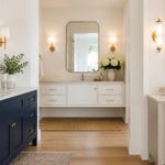
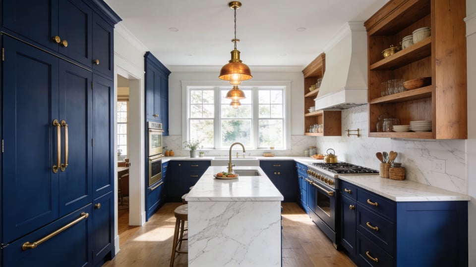
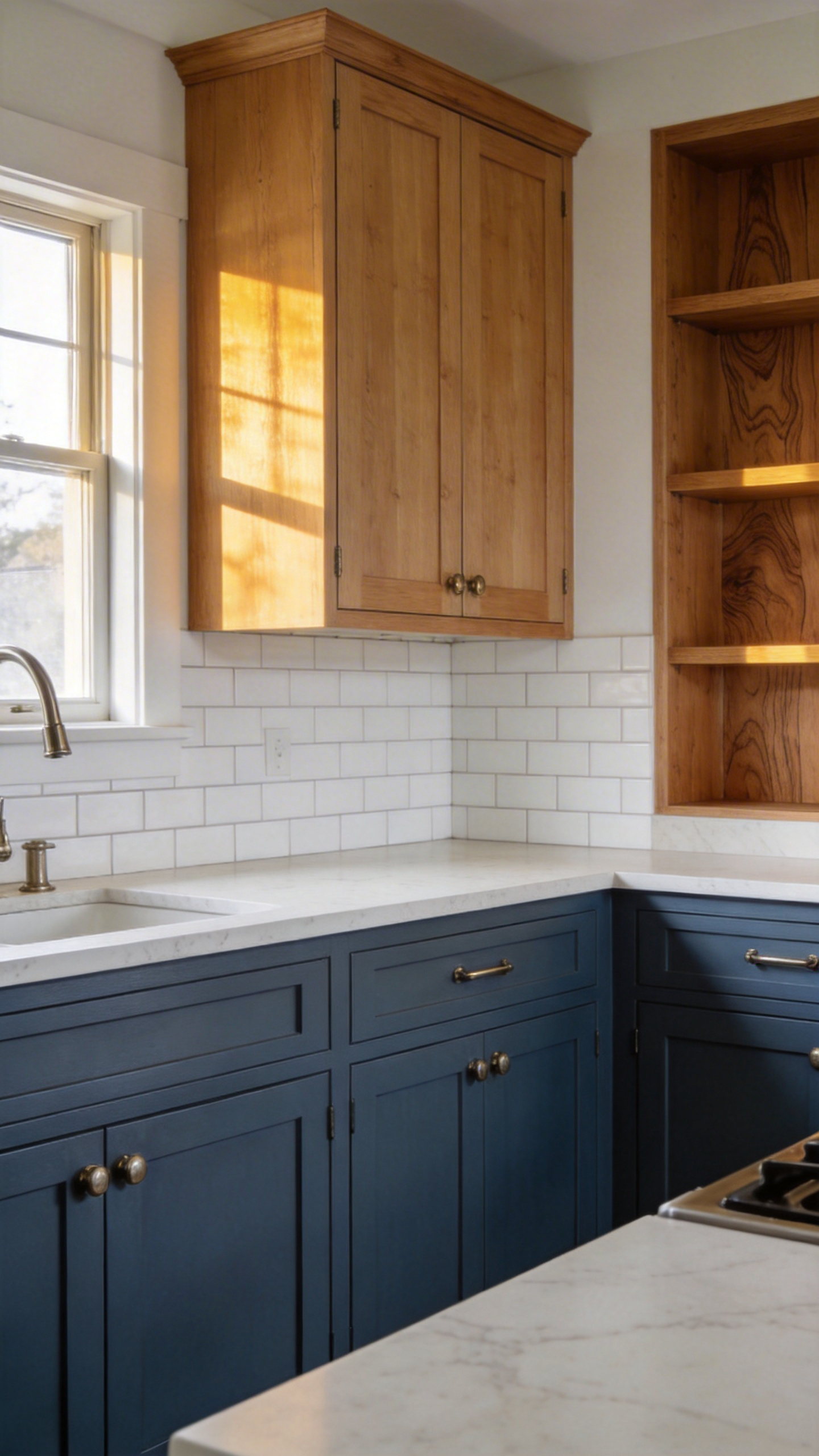
1. Navy Shaker Cabinets That Ground the Room with Timeless Depth
Choosing Your Navy Shade
Navy isn’t monolithic. The difference between Sherwin-Williams Naval (LRV 4) and Benjamin Moore Hale Navy (LRV 8.36) determines whether your kitchen feels formal-luxe or approachably sophisticated. Farrow & Ball’s Hague Blue No. 30 introduces subtle green undertones that shift the mood toward nature and calm rather than pure authority. Navy Shaker cabinets are one of the most enduring blue kitchen ideas—timeless enough to outlast multiple trends.
Hardware That Makes Navy Shine
Navy absorbs 90-95% of light—a fact that sounds ominous but actually anchors the space with visual weight. In smaller kitchens (under 150 square feet), reach for Hale Navy’s higher LRV to prevent visual heaviness. Larger spaces can carry Naval’s drama without claustrophobia. The tuxedo kitchen—navy lower cabinets paired with lighter uppers—has become the defining 2026 trend precisely because it offers this grounding while maintaining openness above the eye line.
Warm brass hardware is the classic pairing, bringing elegance and timelessness. Polished brass reads more formal; unlacquered brass develops patina and feels lived-in. For contemporary kitchens, satin nickel bridges navy’s formality with modern restraint.
Psychologically, navy encourages intentional, leisurely meals—the colour communicates reliability and invites you to slow down, not rush. Pair navy cabinets with warm white countertops (Benjamin Moore White Dove rather than stark white) and natural wood accents to prevent the space reading as austere. If you’re exploring a kitchen cabinets makeover, navy Shaker profiles are among the most transformative changes you can make.
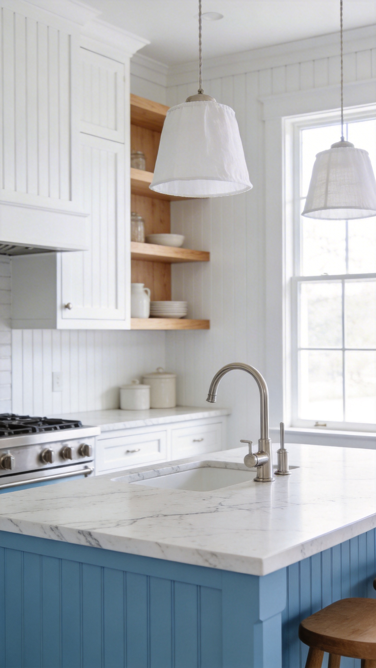
2. Powder Blue Walls with White Cabinetry for Airy, Effortless Drama
The Right Shade of Pale
Powder blue walls with white cabinetry is one of the freshest blue kitchen ideas for smaller spaces. It works only when it reads as genuinely pale—that means LRV 60 or higher. Benjamin Moore Iceberg 2122-50 (LRV 72.59) and Farrow & Ball Borrowed Light No. 235 achieve that weightless quality. Sherwin-Williams Powder Blue SW 2863 sits at the accessible end of the spectrum, offering the aesthetic without a premium price tag. Below LRV 60, you’ve drifted toward dusty blue or periwinkle territory—both valid, but a different conversation.
Warm Accents That Stop Pale Blue Feeling Cold
Direction matters more than you’d expect. East-facing kitchens benefit most from powder blue, where morning light amplifies the colour’s airiness. North-facing kitchens can appear flat and washed unless you compensate with warm fixtures and natural wood. The colour’s psychology—openness, calm, optimism—triggers associations with sky and water, creating genuine physiological relaxation and improved concentration.
This is where most powder blue kitchens fail. Pairing pale walls with bright white cabinetry and stainless steel feels hospital-sterile. Instead, warm the space intentionally: use warm white cabinetry (Benjamin Moore White Dove), introduce raw oak or warm maple open shelving, and choose brass or warm copper fixtures. A kitchen like this—pale blue walls, soft white cabinetry, brass hardware, warm wood accents—holds you rather than exposes you. The warmth prevents coldness; the blue delivers calm.
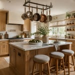
3. Cobalt Blue Kitchen Island That Commands the Room Without Overwhelming It
Proportion Is Everything
Among the bolder blue kitchen ideas, a cobalt island stands apart—it works only when it represents 20-30% of your total kitchen colour palette. Anything above that threshold and the colour dominates rather than punctuates. If your cabinetry is white and walls neutral, the island alone can anchor the entire scheme. If you already have navy lower cabinets, cobalt becomes too much blue—competing focal points flatten each other’s impact.
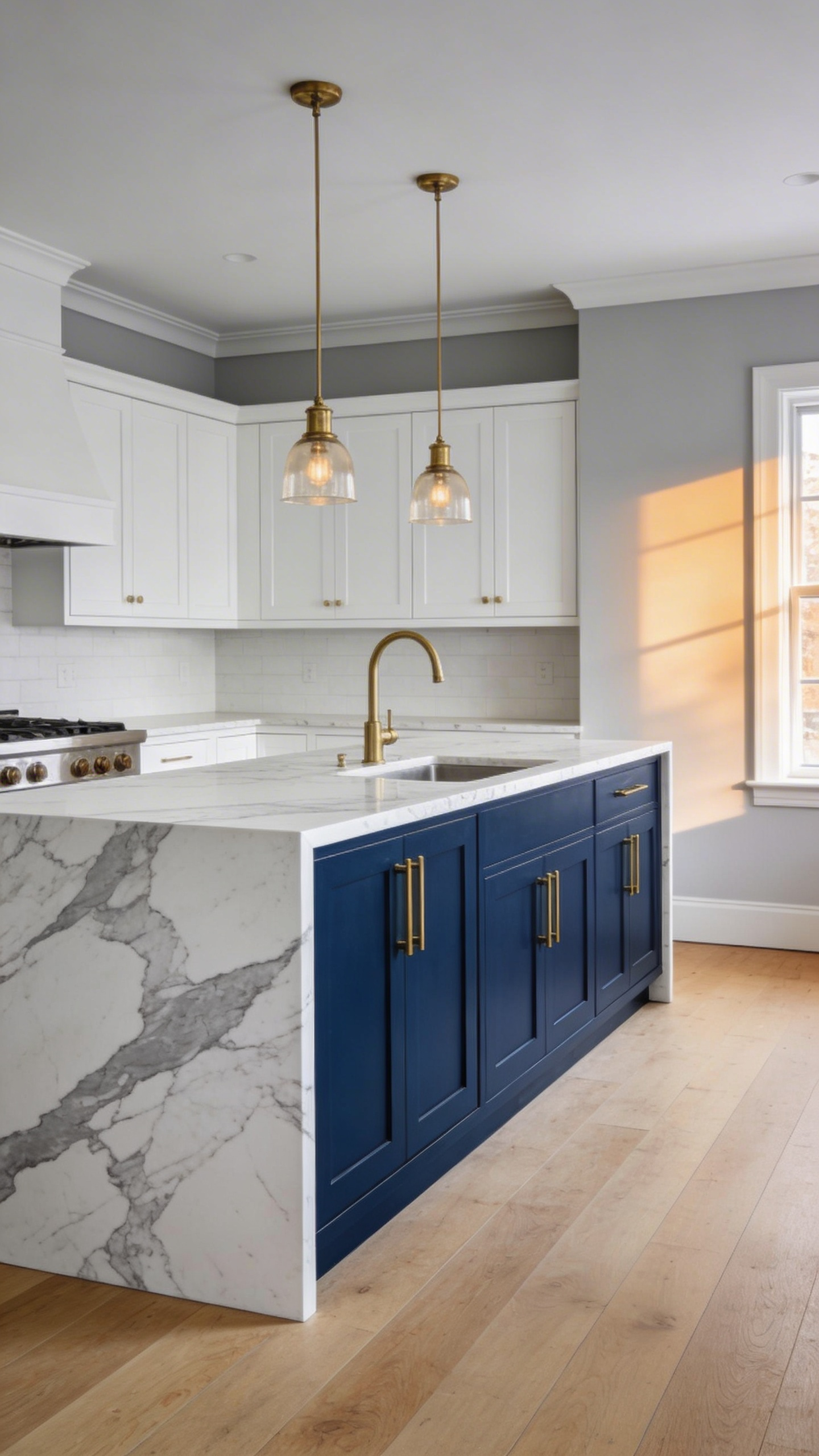
Countertop Pairings That Maximise the Drama
The island itself requires discipline. Maintain a minimum 36-inch walkway clearance on all sides (the ADA standard) to prevent the room feeling cramped around a bold-coloured centrepiece. The colour should feel like a deliberate choice. Farrow & Ball De Nimes and Little Greene Bluebell both deliver that jewel-tone cobalt that reads as intentional luxury rather than impulse.
Calacatta marble is the luxury countertop pairing—white with subtle gray veining that echoes the cobalt without competing. White quartz offers the practical alternative, cleaner and more durable. Avoid dark countertops that merge visually with cobalt and flatten the drama entirely. You want contrast, not camouflage. Unlacquered brass hardware balances the cool saturation, warming the palette without dimming the colour’s confident presence. Psychologically, cobalt signals luxury and confidence—it encourages social gathering and turns the island into the kitchen’s conversation centrepiece.
4. Denim Blue Painted Walls for Lived-In Warmth You Can Change Any Time
Why Denim Blue Reads Warmer Than Navy
Denim-blue painted walls are one of the most approachable blue kitchen ideas for first-time colour adopters, because they offer commitment without permanence. Denim blue sits in the LRV 10-18 range—darker than powder blue but warmer than navy, thanks to gray undertones that soften pure saturation. Benjamin Moore Van Deusen Blue HC-156 delivers that classic dark denim quality. Farrow & Ball Stiffkey Blue No. 281 is the showstopper: it changes mood between daylight and evening, appearing more vibrant in bright sun and almost navy-green at night.
The Accents That Make It Sing
Walls can be repainted. Cabinet colour feels existential. For first-time colour adventurers, denim-blue walls with off-white or warm white cabinetry (not pure white, which clashes) create groundedness and familiarity. The psychology is contemplative and spa-like—not austere navy authority, but approachable calm.
Pair denim walls with unlacquered brass, raw oak open shelving, and off-white cabinetry. White tile backsplash, warm wood countertops, or light marble all work here. Avoid chrome or stainless steel, which clashes with denim’s warmth. The colour communicates groundedness and trust—a kitchen painted in denim blue feels like a space where real life happens, not a showroom.
5. Blue Zellige Backsplash Tiles That Bring Texture and Soul to Any Kitchen
Authentic vs. Machine-Made: What’s Worth the Premium
The blue zellige backsplash may be the most commitment-free blue kitchen idea on this list—you’re changing one wall, not your entire kitchen. Zellige tiles are handcrafted Moroccan clay, an 800-year tradition where each piece varies slightly in colour, glaze, and texture. That inconsistency is the point—it signals authenticity and artisan craft. Handmade zellige costs £60-120 per square metre ($17-28/sq ft); machine-made alternatives cost $7-10/sq ft. The premium reflects labour, kiln time, and the knowledge that no two tiles are identical.
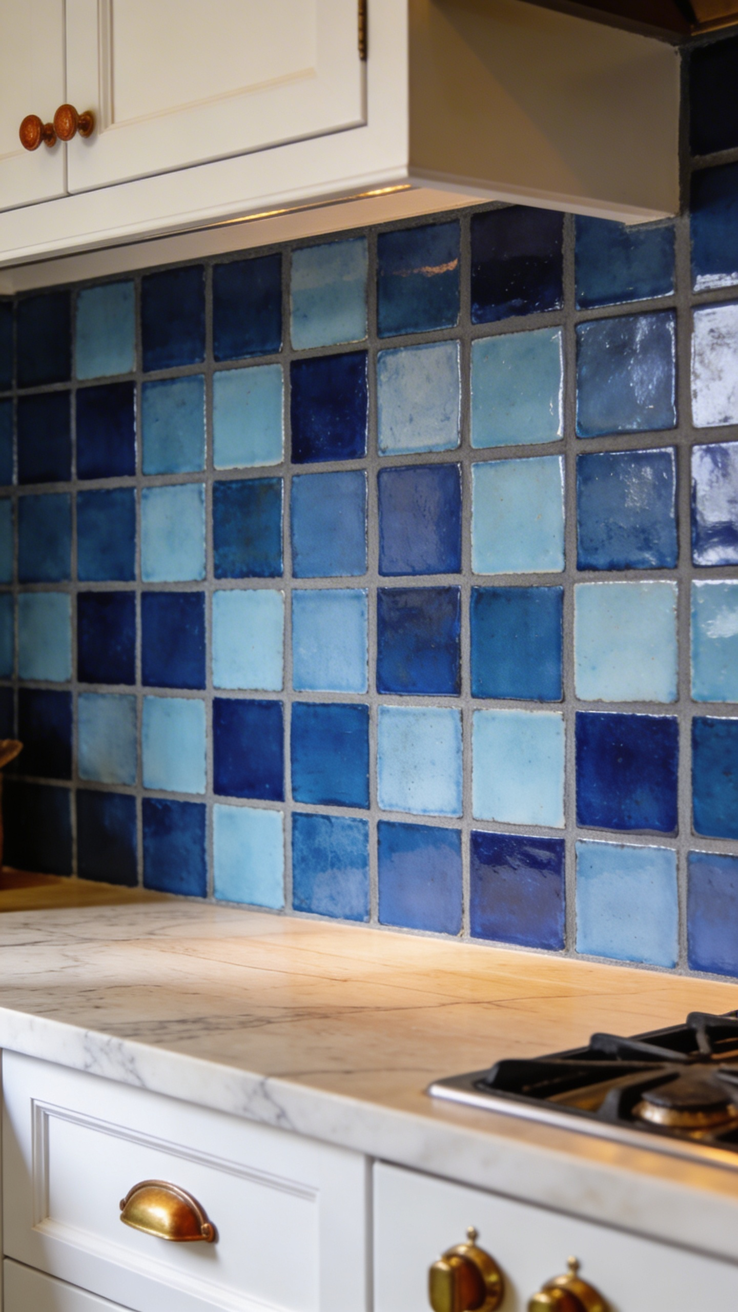
Grout Choices That Make or Break the Look
Suppliers like Clé Tile, Bert & May, Zia Tile, and My Moroccan Tile carry authentic pieces. A 75mm square creates intimate rhythm; 100mm squares read bolder and more contemporary. For those also researching modern kitchen backsplash ideas beyond zellige, this artisan format represents the high end of the backsplash spectrum.
Medium gray grout is the technical choice. Bright white grout creates visual harshness that undermines zellige’s handcrafted warmth. Dark grout feels heavy and dates quickly. Medium gray lets each tile’s glaze and colour variation sing without forcing the eye to follow grid lines. Zellige installation requires flexible adhesive and skilled labour—installation costs often match material costs. Budget accordingly.
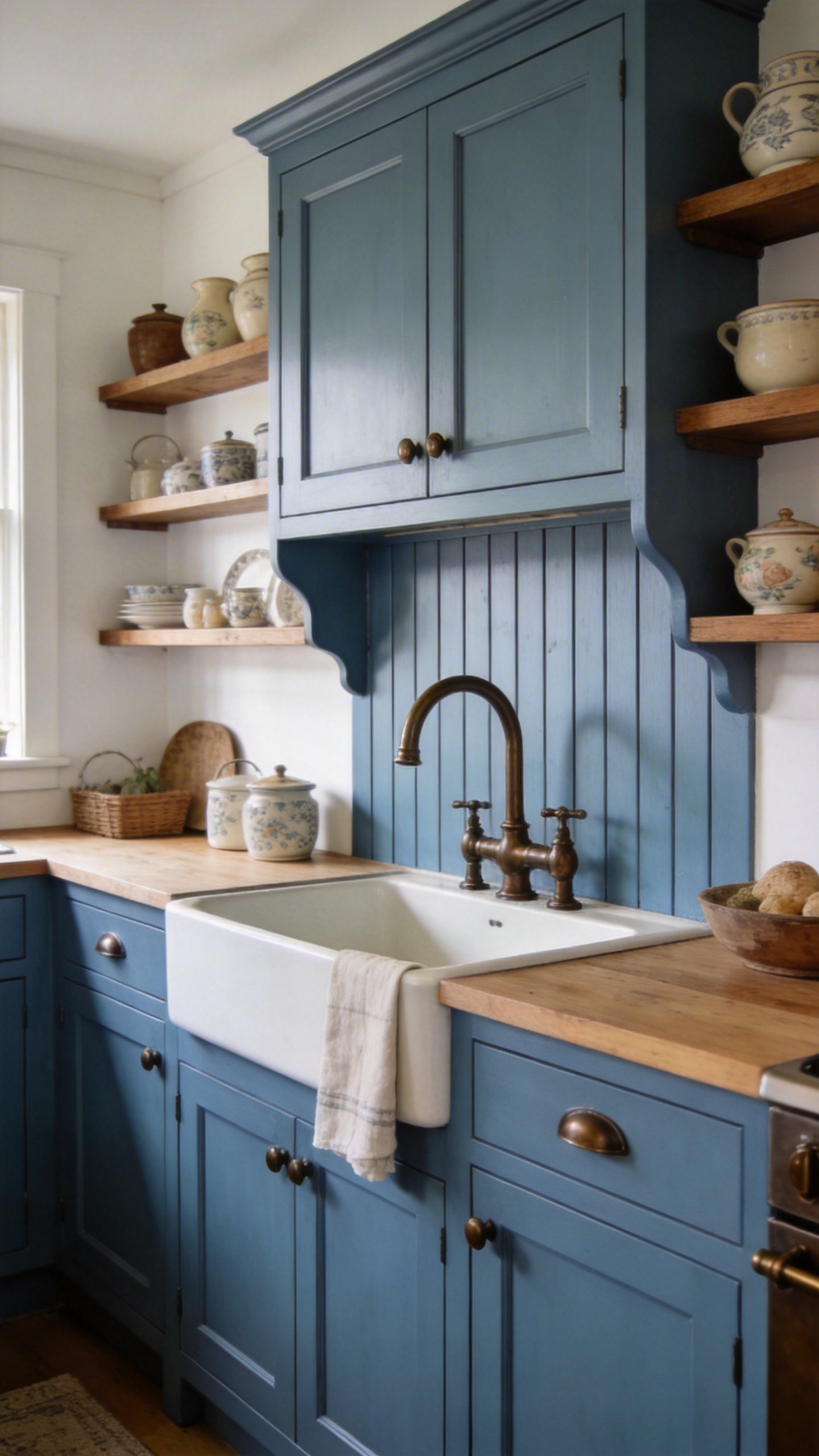
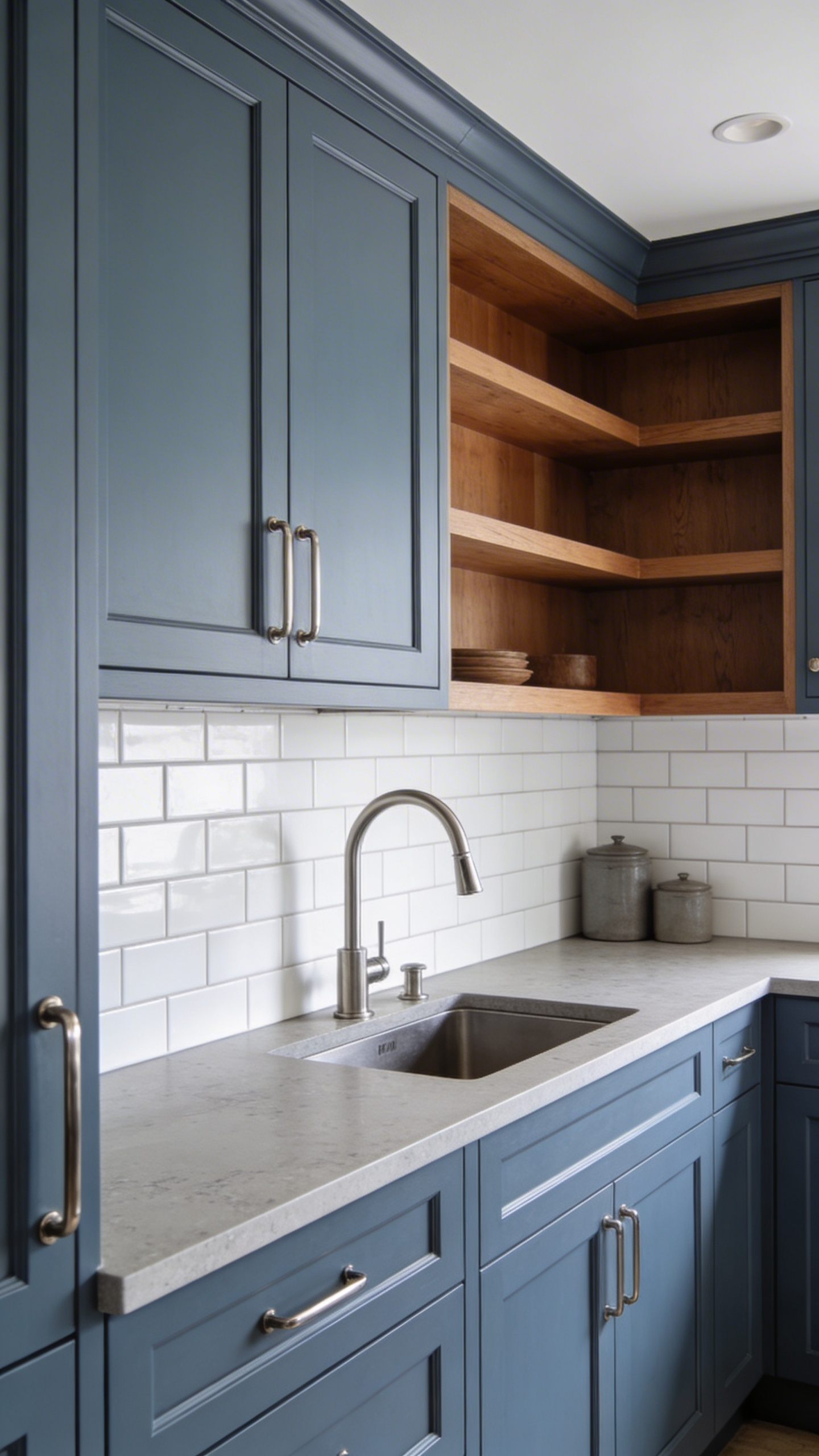
6. Slate Blue Lower Cabinets with Natural Wood Uppers — A Two-Tone Formula That Works
Getting the Proportion Right
The two-tone slate-blue-and-wood kitchen is one of the most balanced blue kitchen ideas available because it grounds colour with nature simultaneously. Two-tone cabinetry follows a strict proportion rule: darks on lower cabinets (approximately 33% of total cabinet area), lighter on uppers. This reverses the visual weight that could otherwise make the kitchen feel top-heavy. Slate blue—colours like Farrow & Ball Pigeon 25, Benjamin Moore Smoke Gray 2122-40, or Sherwin-Williams Debonair SW 9139—delivers depth without the austere formality of navy.
Which Wood Species Work Best
Slate blue is blue with gray DNA. It whispers rather than declares. When paired with natural wood uppers (oak, maple, ash, walnut), the contrast becomes the story: emotional grounding and trust (slate blue’s psychology) combined with warmth and approachability (wood’s inherent human quality). This combination is psychologically balanced in a way that pure navy-and-white two-tone sometimes isn’t.
Light to medium oak creates the strongest visual contrast and feels most contemporary. Maple reads cleaner and more refined. Ash offers gray tones that echo slate blue’s undertones. Walnut creates richness but requires careful proportion—too much dark wood above dark cabinets and the kitchen loses airiness. The rule: if your lower cabinets are slate blue, choose wood uppers noticeably lighter. Brushed nickel hardware bridges both tones neutrally; polished brass warms the palette.
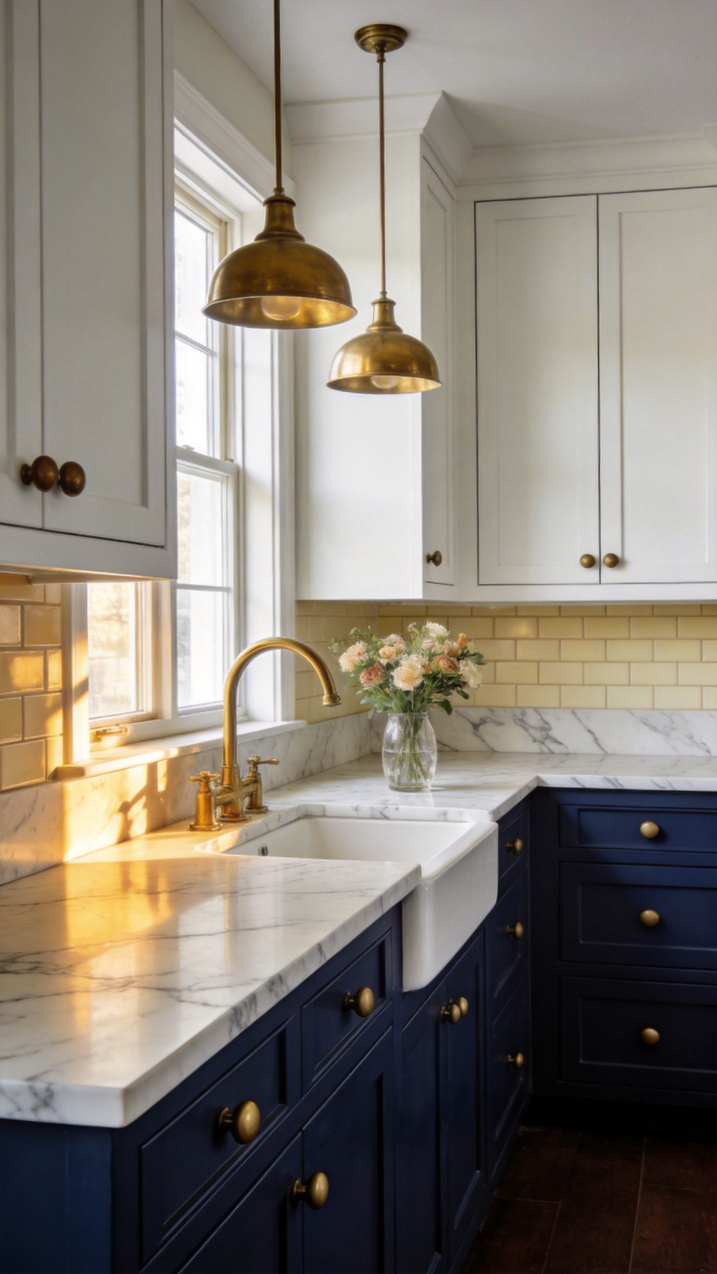
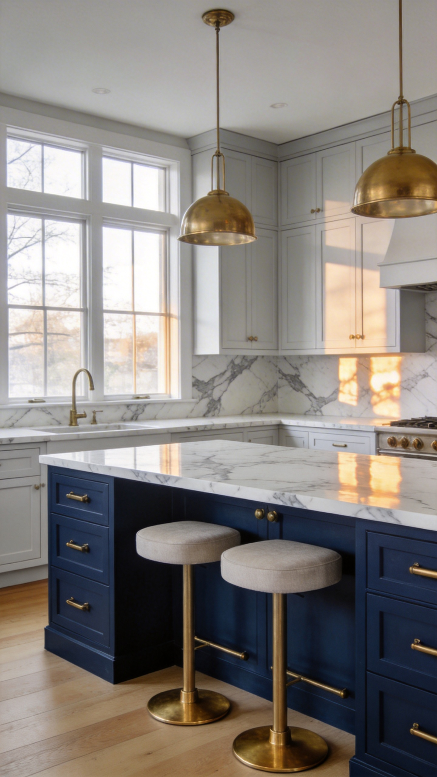
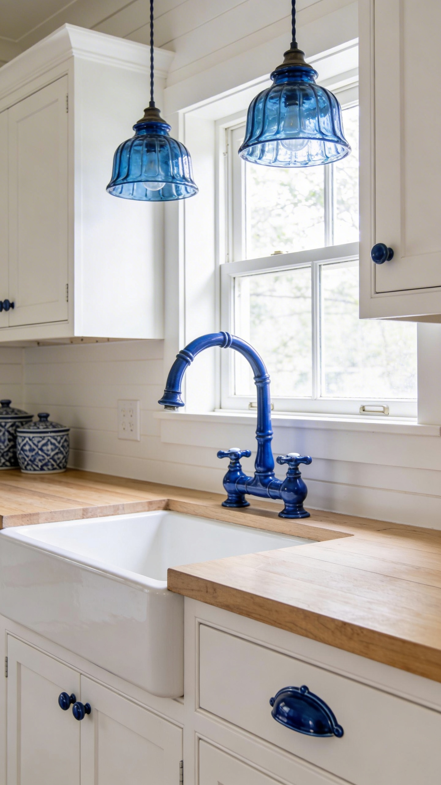
7. Navy Blue Island with Brass Hardware for Effortless Timeless Drama
Brass Hardware: Polished vs. Brushed
The navy-and-brass island is a perennial blue kitchen idea—formal enough for the best kitchens, warm enough to feel livable. Navy and brass together signal sophistication: navy conveys authority and trustworthiness; brass communicates opulence and warmth. Armac Martin (UK-made since 1929) and Rocky Mountain Hardware offer solid cast brass that develops character over time. Polished brass gleams and feels jewellery-like; unlacquered brass ages to a matte patina that deepens with touch.
Sizing and Seating Your Island
For a navy island, polished brass reads more formal. Unlacquered brass feels more collected and lived-in. The psychology of navy-and-brass kitchens is authoritative yet welcoming—you’re signalling that this kitchen is a place of intention and care. Maintain minimum 42 inches of clearance around the island to ensure comfortable traffic flow.
A minimum island of 3 by 4 feet (900mm by 1200mm) accommodates a sink, cooking surface, or seating without feeling cramped. Stool height matters: 24-26 inch stools for 36-inch counter height; 30-inch stools for 42-inch bar height. Space pendants 24-30 inches apart and hang them 30-36 inches above the countertop. The island’s countertop must contrast the navy—Calacatta marble (luxury), white quartz (practical), or light granite. Dark countertops merge with navy and flatten visual impact.
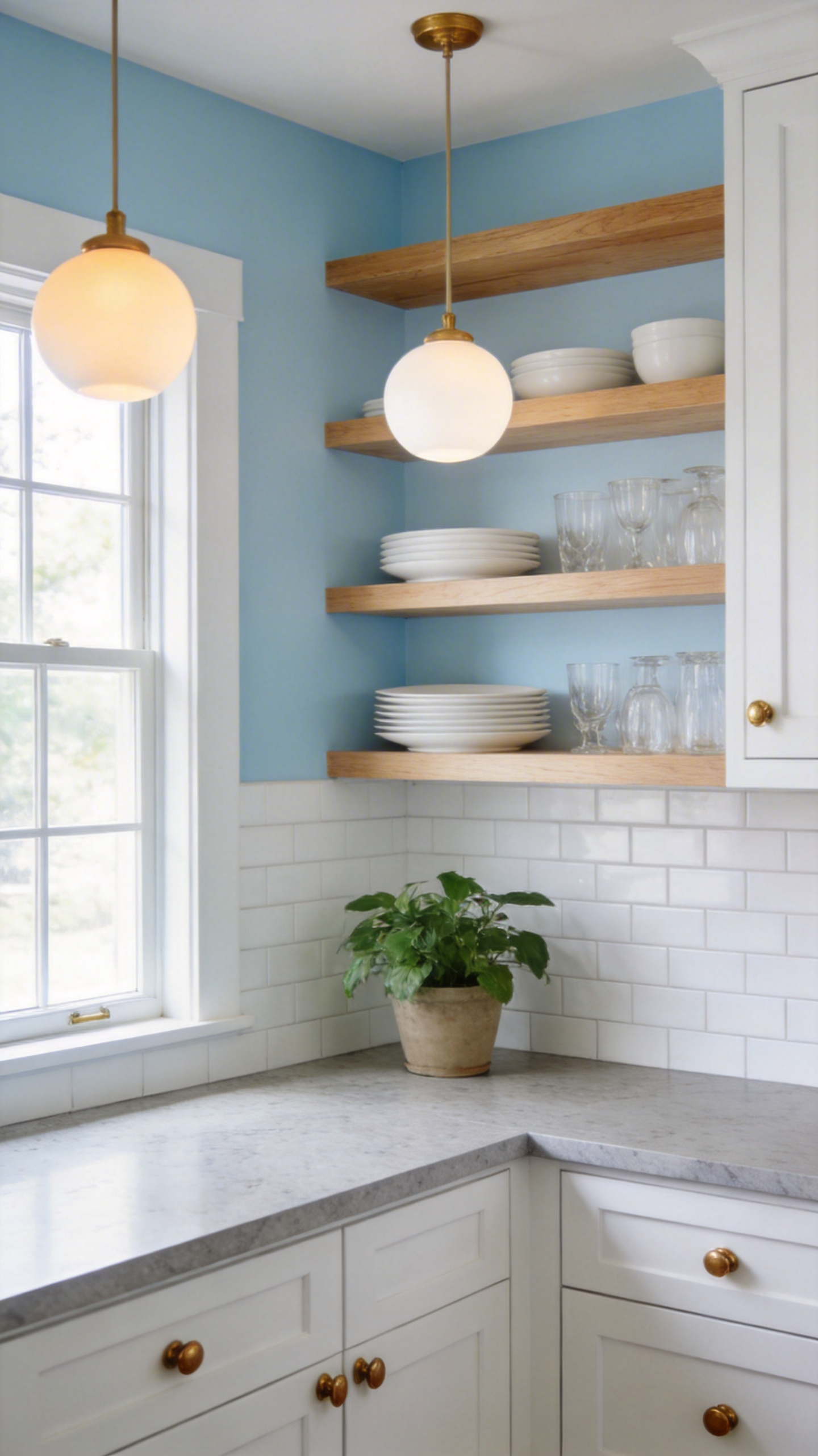
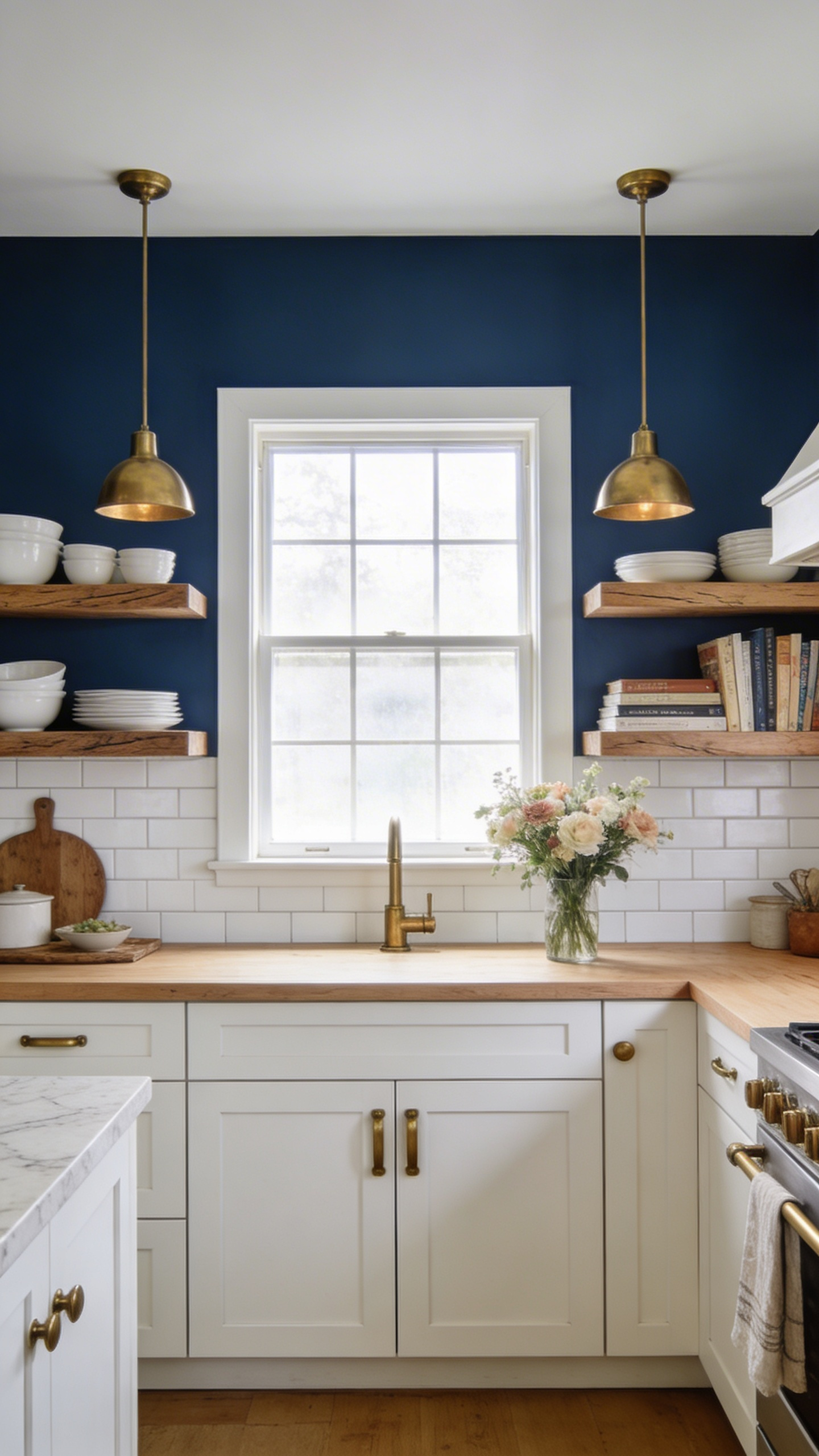
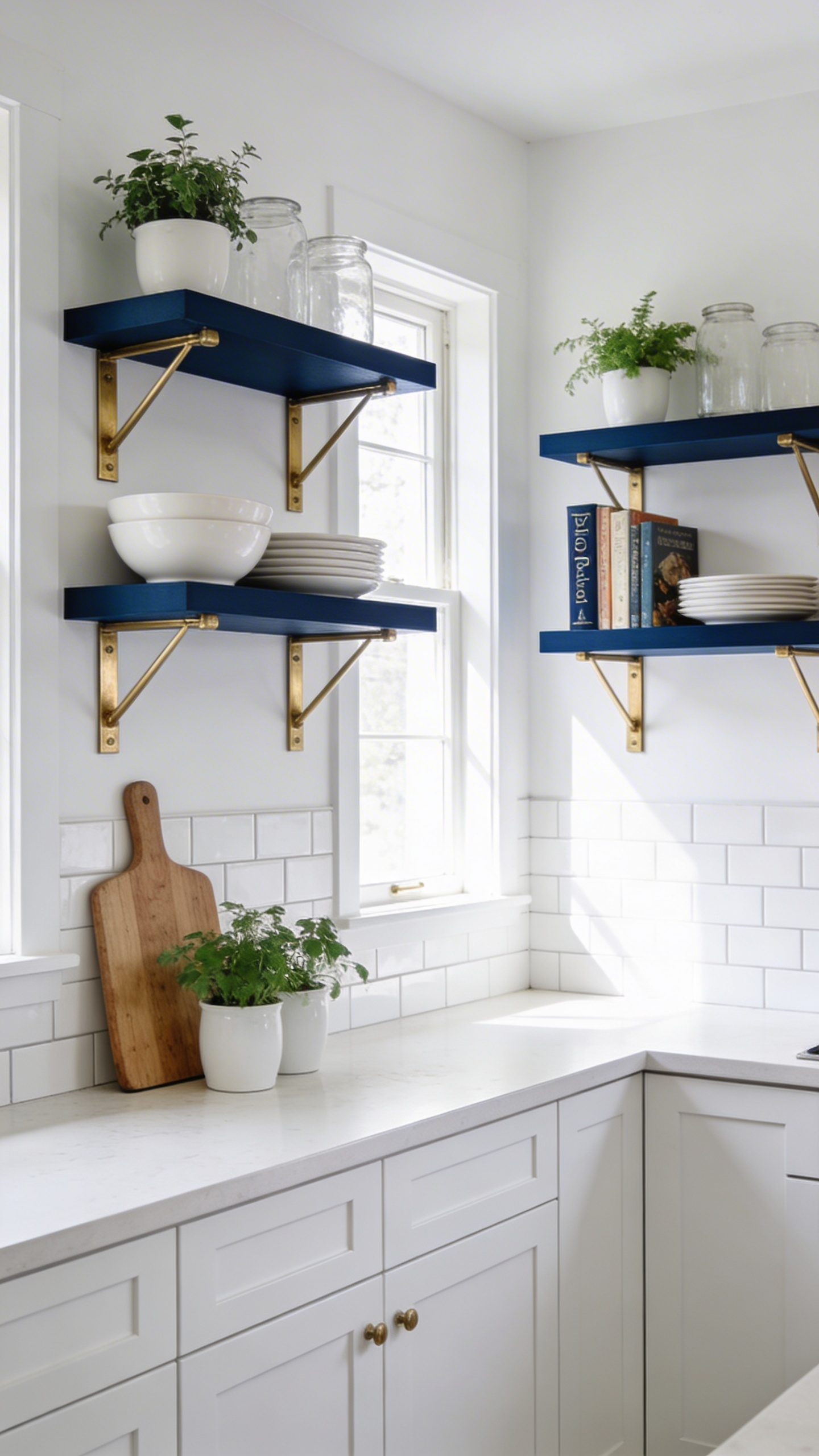
8. Blue Open Shelving That Layers Colour into an All-White Kitchen
Choosing the Right Blue for Shelving
Open shelving is one of the most accessible blue kitchen ideas because it adds colour without touching a single cabinet door. Blue shelving only works when it’s deep enough to read as intentional. Pale blues wash out against white backgrounds and create visual confusion rather than design drama. Reach for Farrow & Ball Pitch Blue 220 (strong cobalt with black pigment) or Little Greene Hicks’ Blue (LRV 10%, deep inky blue). These colours sing against white walls and white dishware without disappearing.
How to Style Blue Shelves Without the Clutter
Shelf depth should be 10-12 inches (254-305mm); spacing 12-18 inches between shelves allows for varied item heights and prevents a cramped, cluttered feeling. The rule of three applies: group items in threes, vary heights (tall back, mid middle, small front), and mix textures—white ceramic, natural wood, glass. Blue shelves signal that you’ve curated what’s visible, not just stashed what’s hidden.
Open shelving fails when it looks chaotic. Blue shelves make this worse—colour draws the eye, so everything on those shelves becomes part of the design narrative. Style using negative space: white dishes with breathing room, a potted plant, a few cookbooks spine-out. Bracket styles matter too: hairpin brackets read modern and minimal, floating shelves feel seamless, corbels feel traditional. Choose brackets that echo your kitchen’s hardware style.
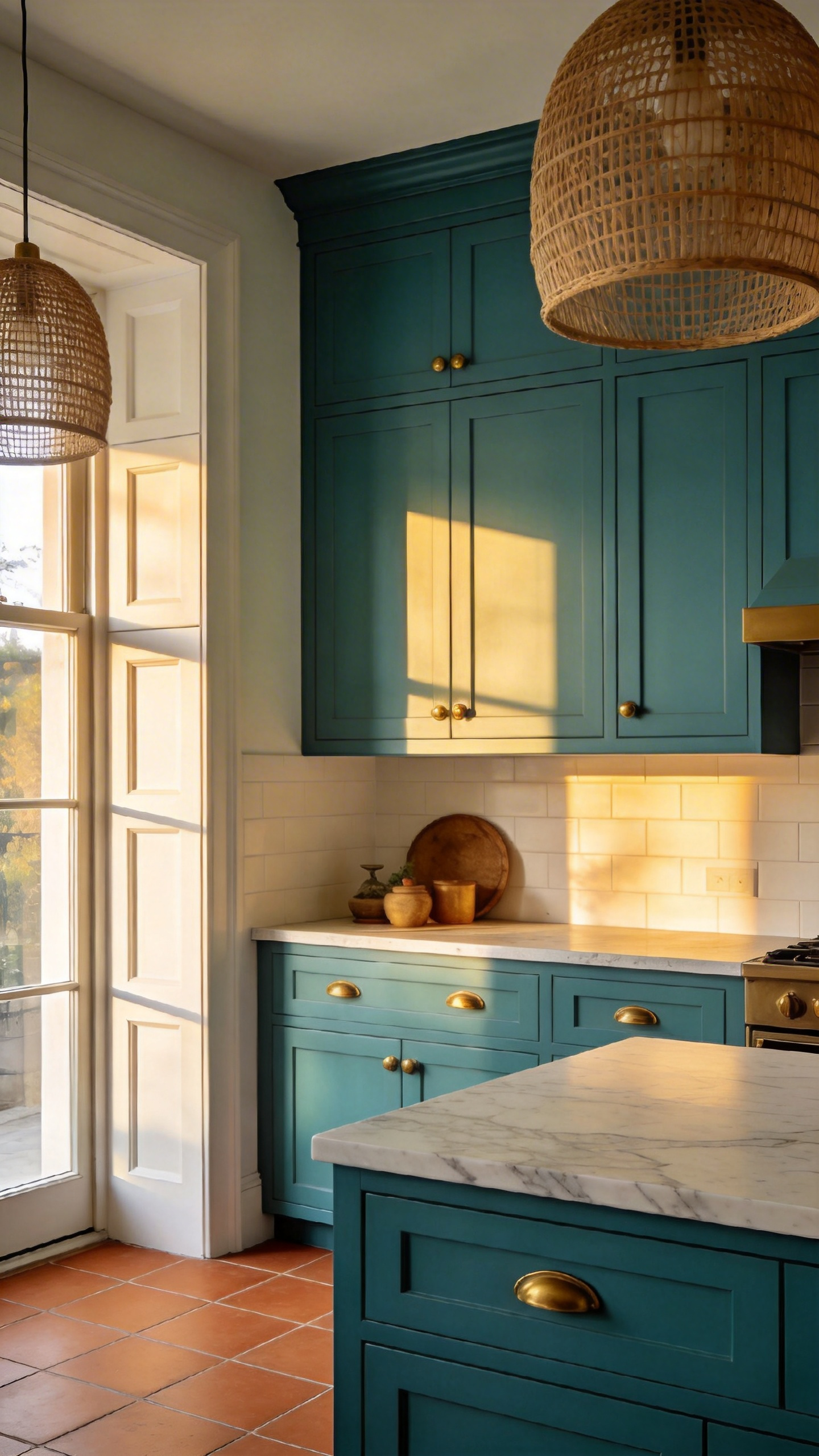
9. Teal Kitchen Cabinets That Sit Beautifully Between Blue and Green
Reading the Blue-Green Spectrum
Teal is the blue kitchen idea for 2026—and not just because WGSN and Coloro named Transformative Teal as the year’s defining colour. Teal occupies a fascinating psychological space: it’s where blue’s calm authority meets green’s vital renewal energy. Unlike pure navy, which can feel clinical in certain light, teal breathes with life because of its green component. It’s why teal kitchens feel simultaneously sophisticated and energising, grounding and aspirational.
Materials That Ground Teal’s Energy
The right teal shade depends on your supporting palette. Farrow & Ball Vardo 288 is a bold yet refined true teal; Benjamin Moore Peacock Blue 745 leans more sumptuous and emerald, pairing beautifully with warm metals; Sherwin-Williams Blue Peacock takes the greenest approach. Each reads differently depending on adjacent materials.
Pair teal cabinetry with warm white (not crisp white—the difference matters). Warm white allows teal’s green component to expand visually and feel less heavy. Add rattan detailing, terracotta floor tiles, and warm brass or oil-rubbed bronze hardware. These elements amplify teal’s transformative psychology. Teal with cold chrome feels corporate. Teal with warm brass feels refined and alive.
10. Coastal Blue and White Kitchen That Stays Fresh Without Feeling Clichéd
Beadboard Details That Feel Architectural, Not Themed
Coastal blue-and-white kitchens are among the most frequently requested blue kitchen ideas—and among the most frequently executed badly. The secret separating authentic coastal kitchens from kitschy ones is restraint in accessories and quality in materials. No sailboat prints. No anchor motifs. Instead, focus on light, proportion, and texture.
The 2026 Coastal Palette
Beadboard cabinetry with subtle vertical grooves is having a 2026 moment, replacing basic flat-panel Shaker doors. These aren’t decorative flourishes—they’re architectural details that catch and reflect light, creating visual interest without novelty. Slim Shaker door rails of 1.25-1.5 inches (32-38mm) read more refined than chunky 2-inch proportions. Pair with marble or quartz countertops and linen textiles for the full effect.
Benjamin Moore Sea Salt OC-80, Farrow & Ball Skylight 205 (LRV 80.6%), and Farrow & Ball Green Blue No. 84 define the updated coastal kitchen ideas colour story. These aren’t the bright beach-house blues of the 2010s—they’re sophisticated, with enough grey undertone to feel contemporary. The defining principle is always the same: let materials and light do the heavy lifting, not accessories.
11. Dusty Blue Farmhouse Kitchen That Feels Chalky, Warm, and Genuinely Inviting
Matte Finishes That Define the Farmhouse Look
Among the warmest blue kitchen ideas, the dusty blue farmhouse look stands apart because its appeal is entirely finish-dependent. Dead flat or eggshell reads as heritage and handmade quality. High-gloss dusty blue is a contradiction—the two ideas work against each other.
Hardware and Sink Details That Complete the Picture
The LRV range that defines chalky dusty blue is 40-55. Farrow & Ball Lulworth Blue 89 (LRV ~45-53) is the iconic choice; Benjamin Moore Dusty Cornflower CSP-605 (LRV 36.19) and Sherwin-Williams Dustblu SW 9161 (LRV 33.12) offer slightly deeper alternatives. Each creates that soft, powdered appearance that feels collected over time rather than freshly purchased.
Behind the sink, tongue-and-groove V-groove paneling is the classic farmhouse focal point—timeless, not trendy. Cup pulls and bin pulls in oil-rubbed bronze or antique brass (warm, aged finishes that echo the matte cabinet aesthetic) are the hardware of choice. Your apron sink should measure 33-36 inches wide with an 8-10 inch basin depth—proportional comfort that defines the farmhouse centrepiece. The psychology of farmhouse kitchens is rooted in authenticity and belonging. Every detail reinforces that you’re cooking in a space with genuine history and care, not a freshly staged showroom.
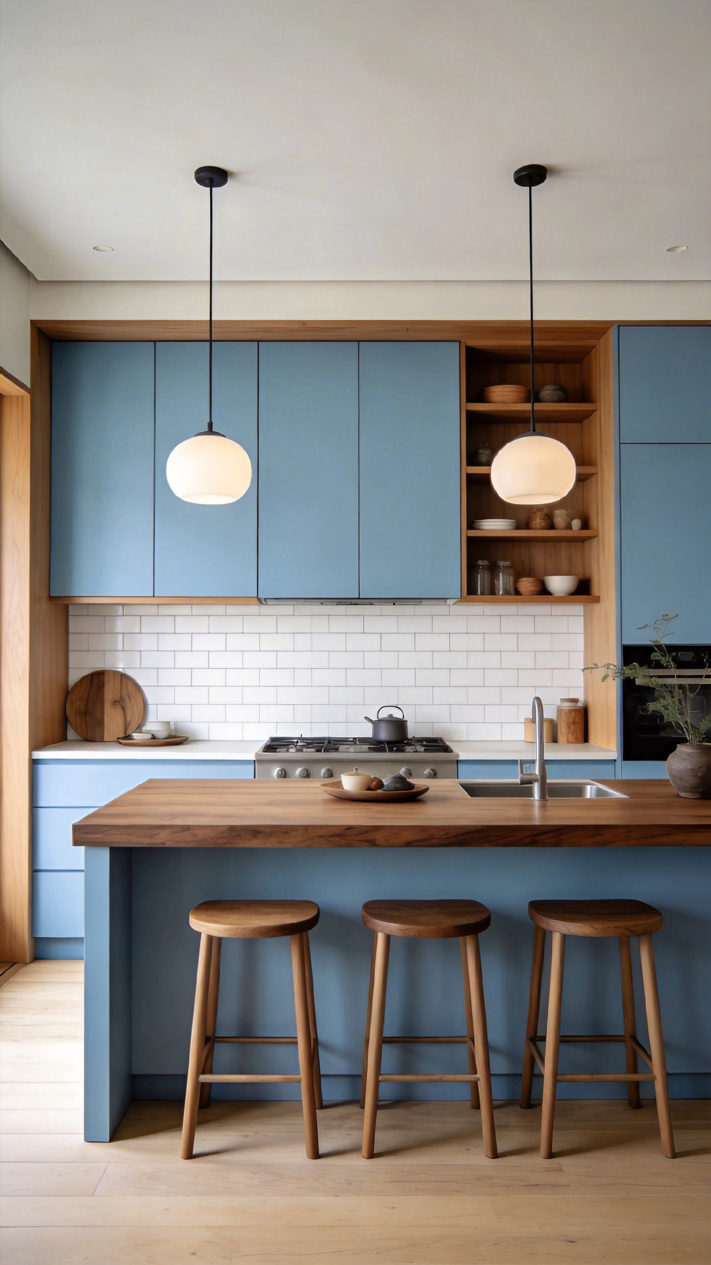
12. Blue and Wood Kitchen That Grounds Bold Colour with Natural Warmth
Matching Wood Undertones to Your Blue
Blue and wood is one of the most psychologically grounded blue kitchen ideas because it recreates the landscape we find most restorative: sky meets earth. Biophilic design research shows wood materials reduce stress hormones and increase perceived safety—while simultaneously grounding blue’s cool undertones with natural warmth.
The Japandi Formula
Light oak (warm golden) creates perceived thermal warmth and visual contrast alongside blue. Walnut (dark chocolatey) grounds blue and creates sophisticated depth, ideal for contemporary approaches. Ash (cool pale) complements grey-blue without competing, offering a Scandinavian sensibility. Wood elements should comprise 30-40% of visible kitchen surfaces for sufficient warmth. Less than that and blue dominates psychologically; more and you lose the blue’s design impact.
Soft blue cabinets plus thick walnut countertops plus white ceramic backsplash—that’s the Japandi formula dominating contemporary high-end kitchens. Paint codes worth testing: Farrow & Ball Oval Room Blue 85, Benjamin Moore Grayish Blue 1620, and Little Greene Juniper Ash 306. Each pairs differently with wood species. Compared with green kitchen cabinet ideas paired with wood, blue tends to read cooler and more serene—where green-and-wood feels botanical, blue-and-wood feels restorative.
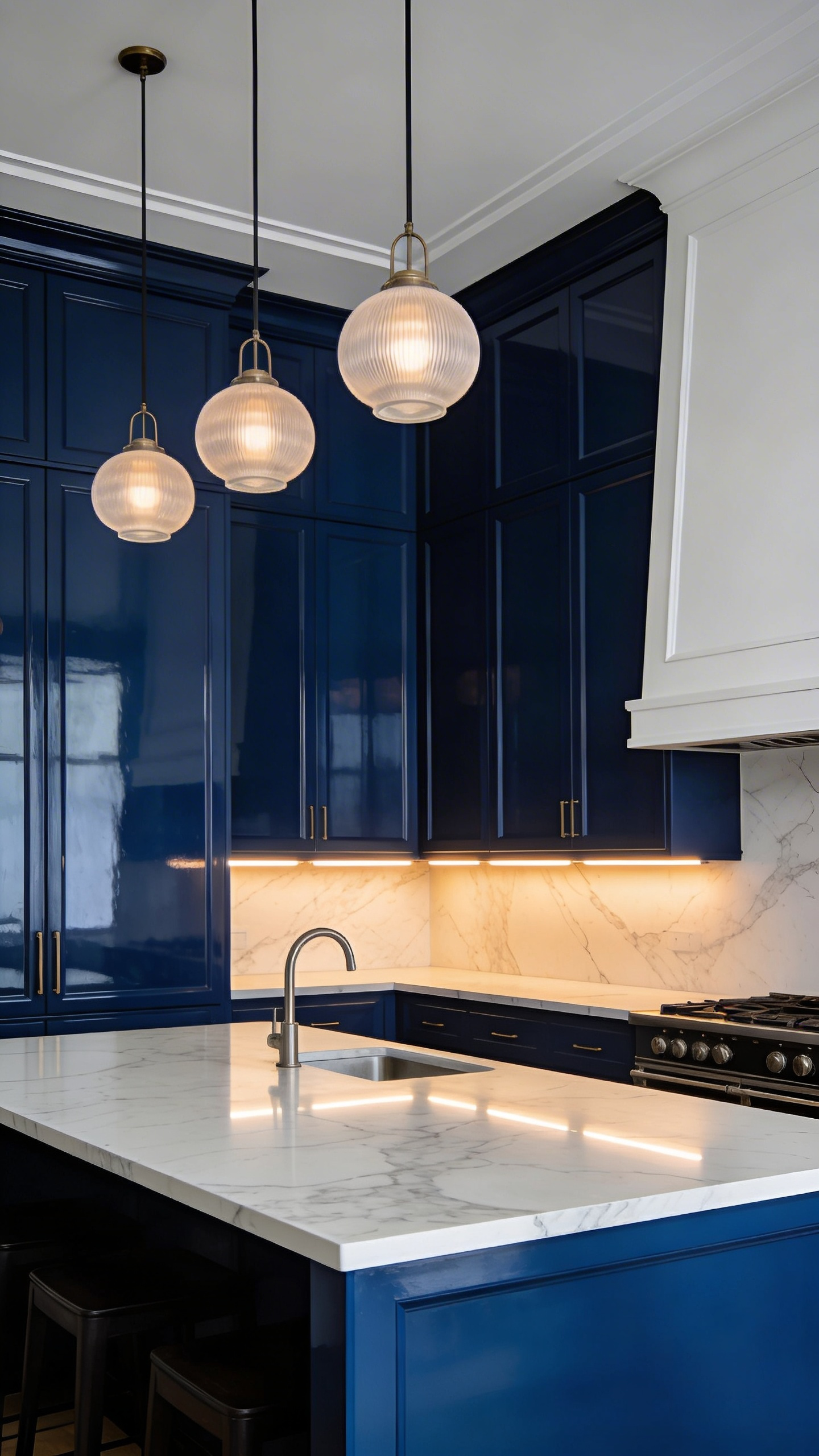
13. Midnight Blue Glossy Cabinets for a Dramatic, Contemporary Kitchen Statement
Getting the Lighting Right for Dark Cabinets
Midnight glossy is the most dramatic of all blue kitchen ideas—and the most technically demanding. Midnight blue differs from navy: it carries more grey and black undertones (LRV 8-12 versus navy’s LRV 12-18). In low light, midnight reads as a beautiful dark void. In proper light, it transforms into something jewel-like and luminous. High-gloss finish intensifies this effect—it reflects 90%+ of light, creating depth without heaviness.
Countertop Contrast Is Non-Negotiable
This requires serious commitment to lighting. Plan for 5,000-10,000 total kitchen lumens; under-cabinet LED should deliver 300-400 lumens per linear foot. Pendant lights suspended 30-36 inches above an island need three or more fixtures for an 8-foot span. Without this infrastructure, midnight cabinets create a cave effect. Farrow & Ball Railings 31 and Little Greene Dark Lead 228 are quintessential midnight options; Benjamin Moore Newburyport Blue HC-155 (LRV 10.31) offers subtle grey warmth.
Your countertop must provide visual relief. White marble or pale quartzite (LRV 60+) is non-negotiable—dark plus dark equals visual collapse. Consider a two-tone strategy: midnight lower cabinets with pale upper cabinets visually lifts ceiling height while maintaining drama at eye level. With strategic lighting and pale countertops, midnight becomes a statement of refined confidence rather than an oppressive space.
14. Blue Kitchen Hardware, Fixtures, and Accents for Low-Commitment Colour
The Jewellery Approach: Less Is More
Hardware and accents are the most accessible starting point for blue kitchen ideas—you’re adding colour without touching a single cabinet or wall. Blue hardware and fixtures offer sophisticated colour with minimal commitment. Think of them as kitchen jewellery: concentrated areas of saturated colour that read as intentional rather than chaotic.
Maximum Impact on a Budget
Options range widely: hand-painted ceramic cabinet pulls (artisan versions £15-40 / $18-50; budget versions £2-8 / $3-10), enamel knobs, blue-tinted brass or bronze, blue glass pendants. A statement SMEG Azure Blue faucet (£300-600 / $360-720) becomes a focal point that justifies its cost through daily visibility. Artisan blown glass pendants (£250+) create drama over islands without overwhelming the space. Limit blue to 2-3 statement pieces—choose a single statement faucet OR pendant lights, not both competing for attention.
Pair blue ceramic hardware with warm metals (satin brass, rose gold), never cool chrome. Blue textiles—a runner, curtains, towels—should comprise 15-25% of visible soft furnishings for cohesion without dominance. This restrained approach to kitchens colour ideas lets you refresh your kitchen without full renovation. Swapping hardware takes an afternoon. Both deliver psychological impact disproportionate to cost and commitment.
15. Steel Blue or Slate Blue Kitchen Cabinets That Balance Cool Sophistication with Warmth
Why Designers Call It the Most Wearable Blue
Across all blue kitchen ideas, slate blue may be the most wearable—and the one designers most often recommend to clients who want colour without the anxiety of full commitment. Steel blue and slate blue occupy a chromatic middle ground: neither warm nor cool, they bridge contemporary and traditional sensibilities. Grey undertones create psychological equilibrium. LRV range of 30-45 makes them forgiving across changing light conditions.
Testing Slate Blue in Your Own Light
Post-renovation studies show grey-blue kitchens score 87% satisfaction versus pure blue at 78% and navy at 81%. Over 5-7 years, grey-blue kitchens retain 85-90% of their renovation value. Benjamin Moore reports the grey-blue family as their fastest-growing professional designer segment—up 42% year-over-year. Farrow & Ball Oval Room Blue 85 (the most blackened of their blues) and Benjamin Moore Grayish Blue 1620 are the designer favourites. Little Greene Juniper Ash 306 adds warmth-grey undertones for Japandi-influenced interiors.
Never buy slate blue paint without testing it across your kitchen’s changing light. These colours shift more than pure blue as the day progresses. Test at 9am, noon, 3pm, and 6pm. Grey-blues reveal their undertones differently at each hour—morning light exposes cooler grey notes; afternoon light warms them toward blue. Pair with satin nickel for soft modern sensibility, or pewter and brushed chrome for contemporary edge. Slate blue is the choice for those who want colour that feels like wisdom rather than trend.
Finding Your Blue Kitchen Confidence
The journey through these blue kitchen ideas—from pale powder blue to denim, navy, midnight, slate, and teal—reveals something essential: there is no single best blue. There is only the blue that matches your lifestyle, your light, and your psychological needs. A north-facing kitchen craving warmth might choose dusty blue or teal. South-facing rooms flooded with light can carry midnight or true navy without heaviness. For spaces where focus and calm matter most, slate blue consistently delivers the answer.
Colour psychology teaches us that blue is never arbitrary. It’s a tool for shaping mood, energy, and the daily experience of the space where you feed your family. Trust your intuition about light. Test your paint at multiple times of day. Choose materials with intention. And remember: the most powerful blue kitchen ideas are the ones that feel like home the moment you walk in.