There’s a particular kind of discomfort that comes from standing in your own living room and feeling like something is off — even when you can’t say what. The sofa is fine. The rug is fine. The lamp you loved in the store still looks okay. Yet the room doesn’t feel the way you imagined it would when you bought everything. It feels assembled rather than designed.
That experience is almost always about the relationships between pieces, not the pieces themselves. Living room furniture decor isn’t about owning the right objects — it’s about understanding how color, scale, placement, and psychological cues interact to create a room that genuinely feels like home. After years of studying how color and space affect the way we feel, I can tell you that most furniture decisions people agonize over for months become much simpler once you understand what a room is actually trying to do to your nervous system.
These 15 living room furniture decor ideas cover the full range — from the anchor decisions (your sofa, your rug, your lighting) to the finishing moves that most people leave to chance. Start where you are, not where you wish you were.
1. The Sofa as Your Living Room’s Emotional Anchor
Before you think about anything else in your living room, think about what your sofa is communicating. Not stylistically — psychologically. The sofa is the most visually dominant piece in the room, and its color and placement establish the emotional tone before any other piece gets a word in.
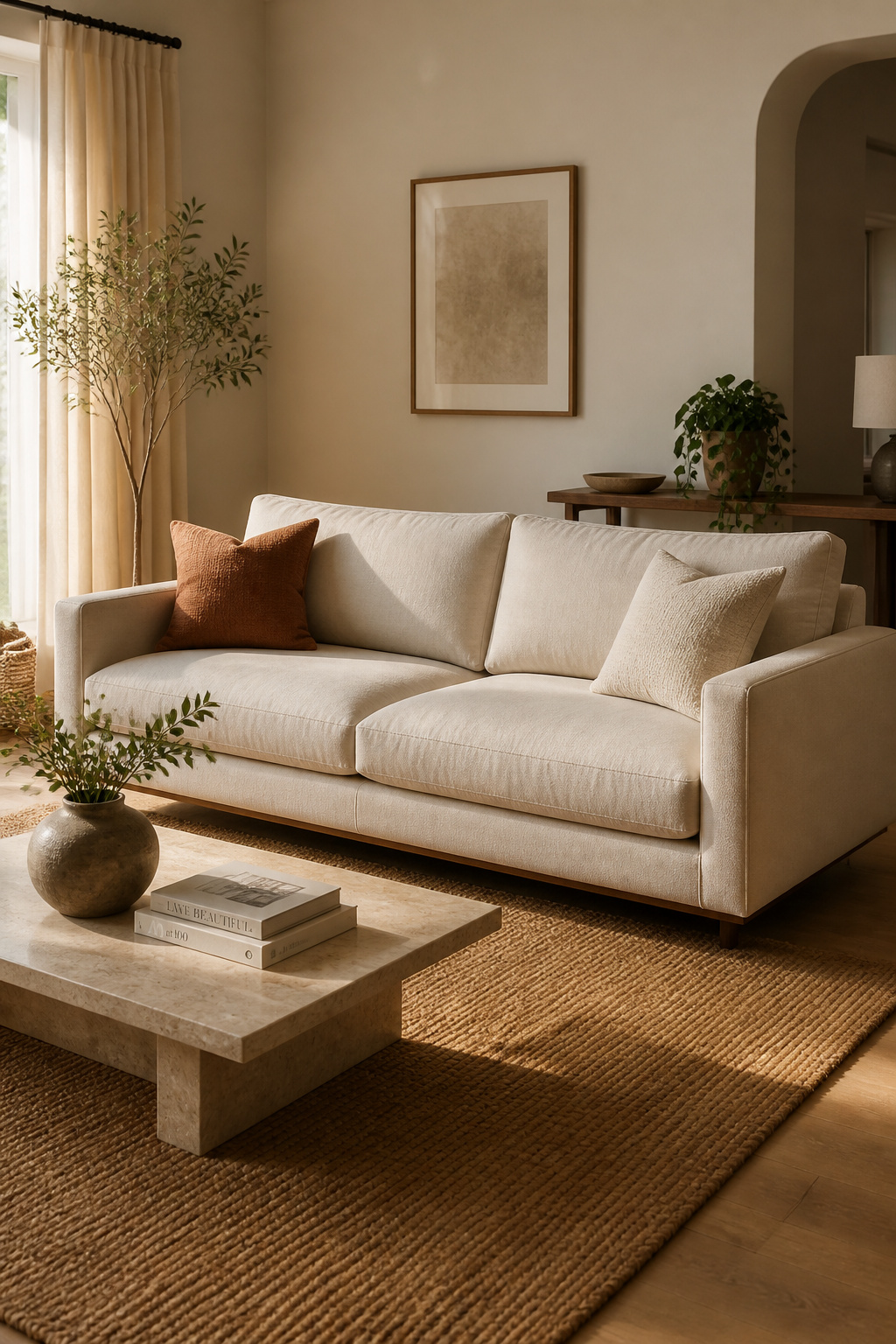
Cool-toned sofas — blues, soft greys, sage greens — activate the parasympathetic nervous system. They encourage calm, ease, and a relaxed kind of conversation. Warm-toned sofas — terracotta, amber velvet, warm cream linen — do the opposite: they raise energy levels, signal welcome, and make a room feel sociable and alive. Neither is better, but choose deliberately based on how you actually use the space.
Placement matters as much as color. Pushing the sofa against the wall is the single most common living room mistake — it creates what designers call the “waiting room effect,” where furniture is arranged around the perimeter with an empty center. Pulling your sofa just 12–18 inches from the wall and floating it in the space changes everything. It creates depth, signals intention, and makes conversation actually possible.
The scale rule: your sofa should not exceed two-thirds of the wall behind it. A 12-foot wall calls for a sofa no longer than 96 inches. Go shorter and it looks like an afterthought. Go longer and the room loses all its breathing room. For more on the psychological side of a genuinely cozy living room, there’s a lot worth exploring on that front.
2. Choosing Living Room Furniture Colors That Set the Mood
The 60-30-10 rule is the most useful color framework most people have never applied to their furniture. In practice: 60% of your room’s visual real estate — your sofa, your rug, your walls — carries a dominant color. The next 30% — accent chairs, curtains, primary throw pillows — holds a secondary, complementary color. The remaining 10% lives in decorative objects, lamps, and smaller accessories.

The key is the relationship between those percentages, not the colors themselves. A warm-ivory sofa (60%) pairs beautifully with sage green accent chairs (30%) and terracotta accessories (10%). The same sofa works equally well with dusty blue chairs and brass accents. What matters is that the undertones — warm or cool — stay consistent across all three tiers. Mixing warm and cool undertones across furniture is the most common reason a room feels inexplicably unsettled.
The science here is worth trusting. Warm tones in furniture activate the sympathetic nervous system — they raise energy, invite social interaction, make you want to entertain. Cool tones do the opposite: calm, focus, rest. Your living room’s dominant furniture color should align with its primary function. A family movie room has different needs than a quiet reading room.
And always — evaluate furniture colors in your own light before committing. Store lighting is designed to make everything look attractive. Your 6pm autumn light at home is a different thing entirely. Bring a swatch.
3. Coffee Tables That Spark Conversation and Balance Flow
The coffee table is the compositional center of gravity in any living room seating arrangement. It’s the first thing the eye finds when scanning the space, and it’s also the piece that most clearly defines your living room furniture decor approach — functional or sculptural, formal or relaxed. A room built around a well-chosen coffee table has a center; a room with an ill-fitting one feels unresolved regardless of everything else.
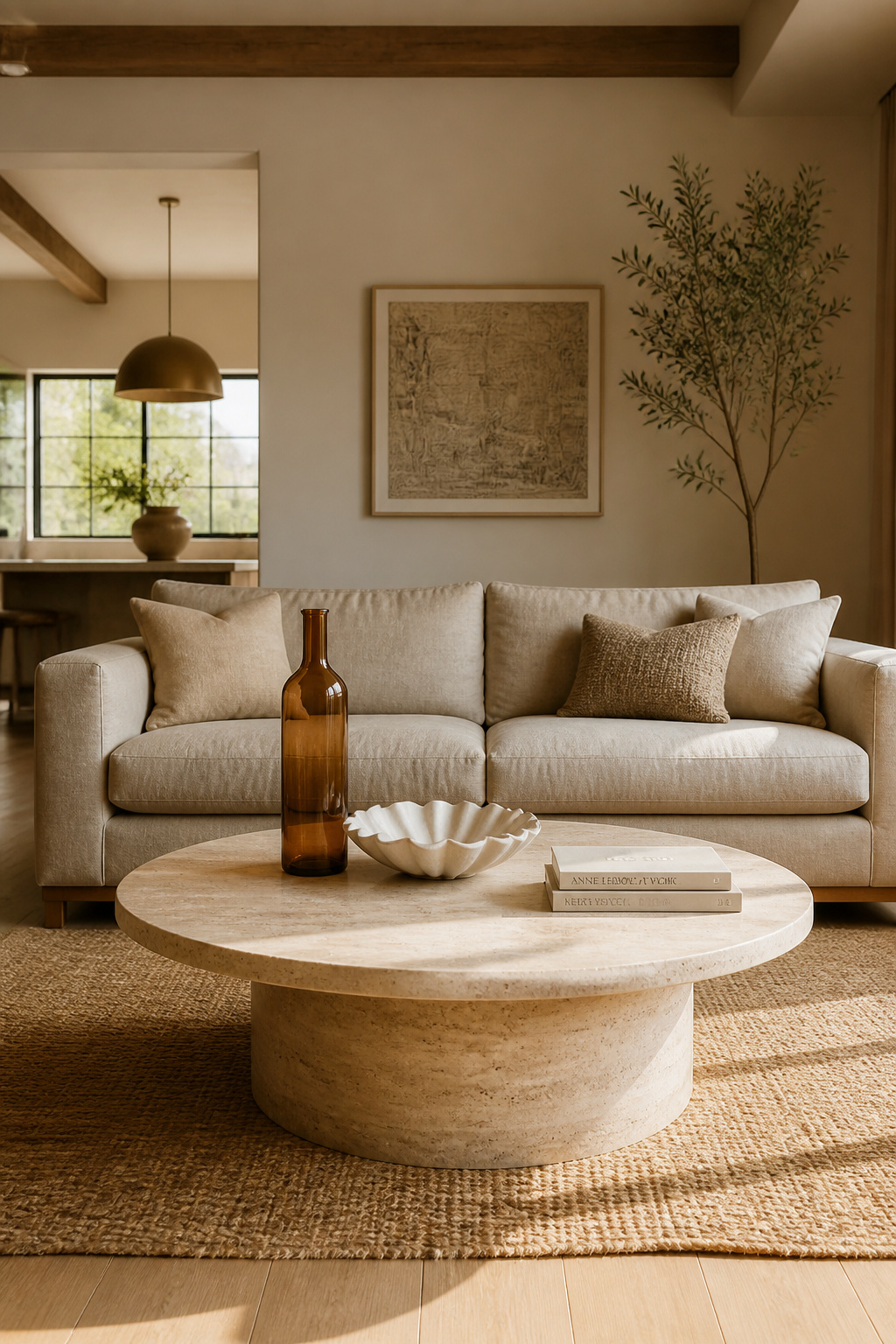
Height comes first: a coffee table should sit 1–2 inches below the sofa seat height — typically 15–17 inches tall for a standard sofa. Too low and it’s difficult to use comfortably; too tall and it dominates the sightlines of the seating arrangement. Length follows: the table should be roughly two-thirds the length of your sofa. A 90-inch sofa pairs with a 60-inch table. Smaller and the table looks lost; larger and it crowds the room.
Shape affects traffic flow more than most people realize. Round and oval coffee tables have no sharp corners — they allow better circulation in smaller living rooms and create a softer, more conversational atmosphere. Rectangular tables suit longer sofas and more formal arrangements. They read as structured and grounding.
Surface Styling the Right Way
Surface styling follows the rule of odd numbers and height variation: group three objects rather than two or four, and vary their heights deliberately. One tall element (a substantial vase, a taper candle), one mid-height element (a sculptural bowl, a small plant), one low element (a stack of two or three oversized art books). Leave 30% of the surface completely clear. That negative space is what makes the styled 70% look intentional rather than cluttered.
4. Accent Chairs in Contrasting Hues for Personality and Depth
A single accent chair in a color that contrasts with your sofa is one of the highest-impact moves in living room furniture decor, and one of the most underused. Where the sofa says “comfort,” the accent chair says “taste.” It’s the piece that signals the room was designed with intention rather than assembled by default.
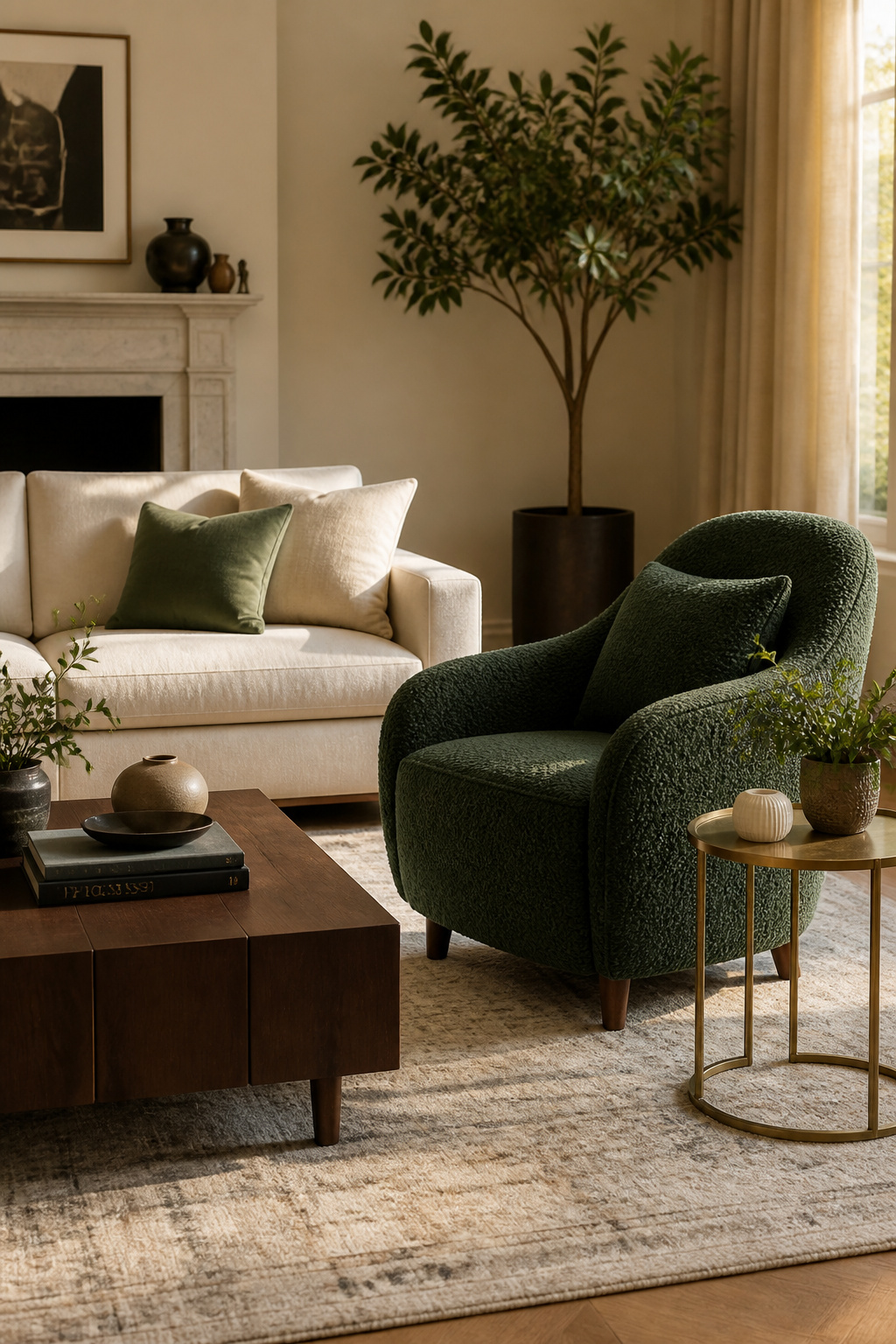
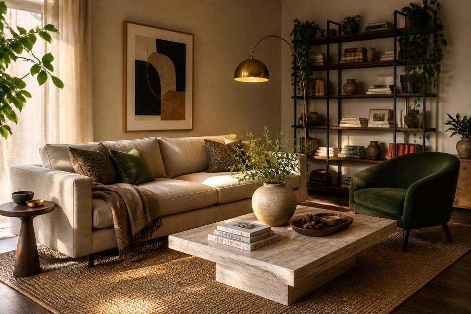
The contrast doesn’t need to be dramatic. A warm ivory sofa with a deep forest green chair is contrast. So is a mid-grey sofa with a warm rust velvet chair. What matters is that the chair’s color wasn’t chosen to match the sofa — it was chosen to complement and enliven it. Velvet and bouclé hold color exceptionally well and add textural contrast to smoother upholstery. They’re worth the extra cost for an accent chair because they stay saturated and interesting in ways that flat weaves often don’t.
Placement for Conversation
Angling the accent chair slightly toward the sofa — just 15–20 degrees off straight — signals that the room is designed for conversation rather than screen-watching. The H-form arrangement (two chairs directly across from the sofa, coffee table between) works well in square rooms. The U-form (chairs flanking the coffee table on either side) suits rectangular rooms and creates a gathered, social feeling.
The binding rule: repeat the accent chair’s color at least once elsewhere in the room. A pillow on the sofa, a small object on a shelf — something that makes the chair’s color read as deliberate palette rather than accidental purchase. For more depth on how much work living room chair styles that define a space can do, that’s a rabbit hole worth going down.
5. Living Room Furniture Decor Ideas for Small Spaces
The most common small living room mistake is furniture that’s too large — and it’s also the most fixable. A standard three-seat sofa in a 10×12 foot room doesn’t just look big; it psychologically compresses the space in a way that makes every other piece feel wrong regardless of its actual size.
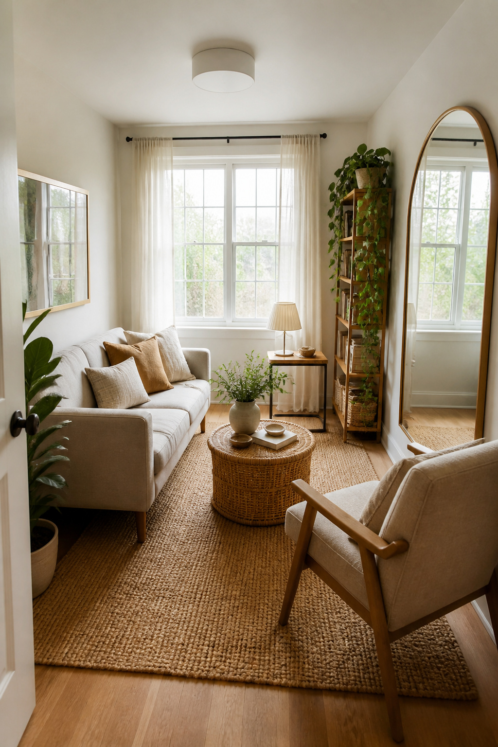
The two-thirds rule applies strictly in small spaces: in a 10-foot room, no piece of furniture should exceed 80 inches along any wall. But scale is only half the battle. Visual weight matters as much. Furniture with exposed legs reads as lighter than fully upholstered, floor-grazing pieces because the eye can see the floor continuing underneath. That visual continuity of floor space — even when the furniture is large — makes rooms read as more open.
Multi-functional pieces are the practical answer: a storage ottoman that serves as coffee table, footrest, and hidden storage simultaneously; nesting tables that stack when not in use and separate for guests; a C-table whose base slides under the sofa, providing a lamp and drink surface without occupying any floor space beside it.
Visual Tricks That Genuinely Work
One large mirror placed opposite a window can increase perceived brightness by 20–40%, making a small living room feel genuinely lighter and larger. And a rug sized correctly — at minimum an 8×10 foot rug with front furniture legs on it — anchors the seating arrangement and creates coherence. A 5×8 foot rug in a full living room setup looks like a bath mat and makes the room feel more chaotic, not less.
6. Layered Textiles That Add Warmth Without Visual Noise
The difference between a layered room and a cluttered room is mostly a question of scale variation and restraint. The textile layer is where living room furniture decor goes from furnished to finished — and where most people either overdo it or give up entirely. Layering works when each textile contributes something distinct: a low-pile wool rug brings flatness and durability; a chunky-knit throw brings coarse texture and weight; linen cushions bring fine weave and a slightly formal finish. Cluttering happens when everything competes at the same intensity.
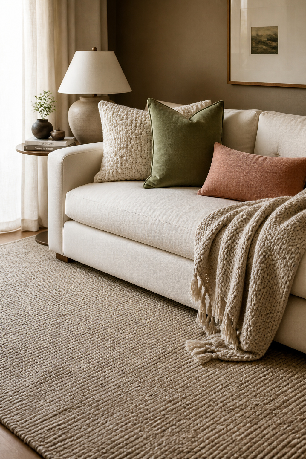
Rug sizing is the foundational decision. In most living rooms, an 8×10 or 9×12 foot rug suits the space best — large enough for the front legs of the sofa and chairs to rest on it (the standard designer approach), or large enough for all four legs if you prefer a more enclosed feel. Leave 6–18 inches of bare floor between the rug’s edge and the wall. That framing of the flooring creates visual balance and distinguishes the rug as a deliberate element rather than a floor covering.
Throw pillows follow the rule of odd numbers: three or five on a sofa, not two or four. Vary the sizes — a 22×22 inch square, a 20×20 inch, and a 12×20 lumbar — and limit yourself to one bold pattern, one subtle texture, and one solid. These should relate to the room’s 60-30-10 color palette.
A throw blanket draped loosely over one arm of the sofa tells visitors the room is actually lived in. (A loose, casually draped throw beats a perfectly folded one every single time — that’s exactly the feeling you’re after.)
7. The Psychology Behind Symmetrical Seating Arrangements
Harvard researchers have confirmed what most people feel intuitively: symmetrical environments reduce stress. The brain processes mirror-image furniture layouts with measurably less cognitive effort than asymmetric ones, which is why well-balanced rooms tend to feel calm and resolved even to people who couldn’t articulate why.
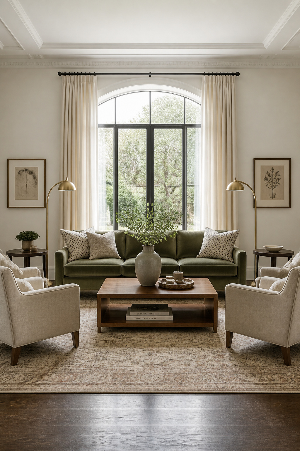
In practice, symmetry means the classic sofa-flanked-by-matching-chairs arrangement, matched lamps on either side of a credenza, a centered coffee table on a centered rug. It works especially well in formal living rooms designed primarily for entertaining, in rooms with a clear single focal point (a fireplace, a large window), and in rooms where the architecture is itself symmetrical.
But symmetry isn’t always the right answer — and in 2026, designers are increasingly moving away from rigid symmetrical layouts for everyday living spaces. Homes & Gardens notes that strict symmetry “can feel too formal and difficult to maintain with real family life.” Asymmetric balance — where different pieces carry equivalent visual weight — reads as more relaxed and personal. A large dark sofa on one side balanced by an accent chair, a floor lamp, and a floor plant on the other achieves equilibrium without mirror-image precision.
The simplest move toward intentional asymmetry: use one accent chair rather than a matching pair. The diagonal line it creates when angled toward the sofa adds visual dynamism that perfectly matched flanking chairs cannot achieve.
8. Statement Lighting as Living Room Furniture Decor
Lighting is the invisible decorator — it changes how every piece of furniture reads before anyone notices the furniture itself. A beautiful sofa under flat overhead fluorescent lighting looks institutional. That same sofa under warm 2700K lamp light looks like something worth spending an evening on.
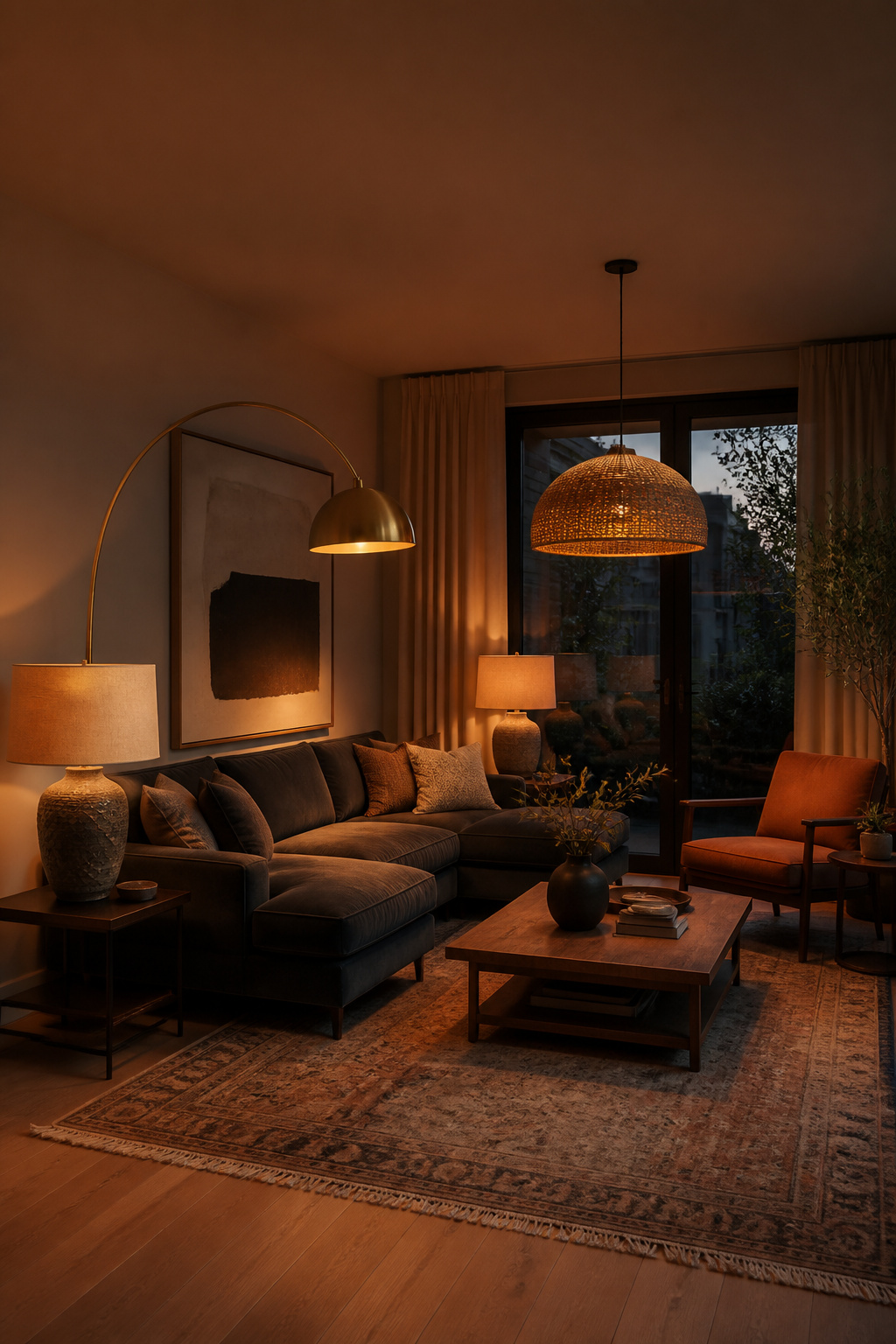
The color temperature of your bulbs is the most overlooked living room furniture decor decision. Bulbs rated at 2700K produce warm amber light that enriches wood tones, deepens fabric colors, and makes rooms feel genuinely inviting. They’re ideal for evening living — the warm light cues the nervous system toward rest and connection. Bulbs at 3000K are slightly cooler neutral-warm, better at revealing accurate colors, and more appropriate for spaces used for daytime work and evening relaxation alike. The practical approach: ambient ceiling light at 3000K, floor and table lamps at 2700K — one layer for function, one for atmosphere.
Floor lamp scale matters more than most people expect. An arc lamp that extends over a seating grouping at 72–80 inches creates a sense of intimate enclosure around the conversation area — it defines the space without walls. Table lamps on side tables should be approximately 1.5 times the height of the surface they sit on, with a shade width that roughly equals the base height.
A pendant or chandelier hung over the conversation area (not necessarily the center of the room) creates a sense of designed enclosure that ceiling lighting alone cannot. The question of how to layer light sources for maximum effect is one where masterful living room lighting strategies make a meaningful difference. The right hanging height for a pendant over a coffee table or conversation zone is 60–72 inches from the floor in standard 8–9 foot rooms.
9. Side Tables That Anchor a Seating Zone Without Overpowering It
Side tables are the functional punctuation of living room furniture decor — they complete the composition by giving every chair and sofa end somewhere useful to land. The height rule is simple: within 2 inches of the arm height of the furniture they accompany. Standard sofa arms sit between 22–25 inches high, which means most side tables should fall between 22–27 inches.
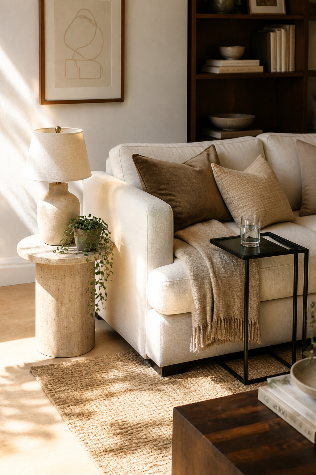
A table that’s too short becomes frustrating within days — you can’t comfortably reach a drink without leaning. One that’s too tall blocks sightlines across the room and makes the seating area feel closed off. The standard 24-inch side table height works for most sofas, which is probably why it’s the most common.
The more interesting decision is whether to match or mix. Two identical side tables flanking a sofa create a formal, symmetrical arrangement — clean and composed, but rarely surprising. Two mismatched tables that share one common detail (the same finish, the same approximate height, a similar metal tone) create a curated, personal quality that matched sets cannot replicate. A round travertine table on one end, a square brass-legged table on the other — both warm-toned, both at the right height — reads as collected over time rather than purchased as a set. This is genuinely underappreciated as a design move.
For small living rooms where a traditional side table won’t fit, C-tables are useful: the base slides under the sofa, the surface cantilevers at arm height, and the floor footprint is essentially zero. Nesting tables do similar work — stacking flat when not needed, pulling apart when guests arrive.
10. Bookshelves and Display Cabinets as Personality Statements
Well-styled bookshelves are among the most distinctive living room furniture decor decisions you’ll make. They communicate personality, interests, and aesthetic confidence in a way that no mass-produced furniture arrangement can. The mistake most people make is treating shelves as storage that happens to be visible rather than as one of the room’s most prominent design surfaces.
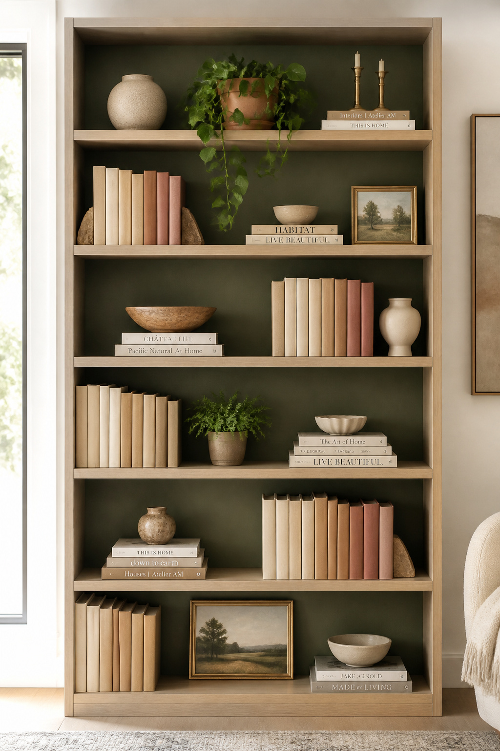
The 70/30 ratio is where to start: 70% of shelf space filled with books, 30% left as breathing room for objects and open space. A shelf packed 100% full reads as storage; a shelf at 70–80% reads as curation. Each shelf needs one clear focal point — a trailing pothos, a sculptural piece, a forward-facing art book cover — and that focal point should be the first thing you style before anything else goes up.
Height variation across a shelf creates rhythm: upright rows of books alongside horizontal stacks (2–4 books high) that serve as pedestals for small objects. Vary the stack heights across different shelves so no two shelves look identical.
The backdoor approach to instant shelf sophistication: remove dust jackets from hardcover books. The cloth-bound spines underneath — often linen, cream, or dark cloth — are almost universally more elegant than the illustrated covers. Grouping them by spine color creates a tidy color story that looks intentionally designed. It costs nothing and takes ten minutes.
11. Mixing Old and New Furniture for Curated Living Room Decor
Rooms decorated entirely from one store or one collection rarely feel interesting. There’s a sameness to them — everything designed to coordinate, everything purchased at the same moment, everything reflecting the taste of whoever wrote the catalogue. The rooms that people actually remember tend to mix periods, sources, and styles through one unifying thread.
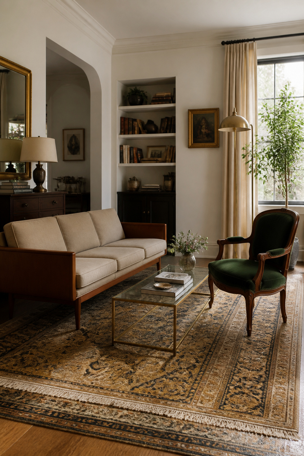
The design principle: combine no more than three distinct furniture styles, with one dominant (approximately 60% of pieces) and two complementary (30% and 10%). The dominant style sets the room’s direction; the others add depth and surprise. Mid-century modern frames (tapered legs, clean geometry) pair particularly well with contemporary upholstery and antique accent pieces — the contrast between organic vintage curves and modern clean lines creates visual interest that neither achieves alone.
The binding element is what makes it work. Repeating warm wood tones across a mid-century credenza, an antique oak side table, and a rattan accent chair creates a shared warmth that unites them regardless of their different origins. Repeating a metal finish — brushed brass across lamps, hardware, and picture frames — achieves the same thing even when the furniture styles vary significantly.
For sourcing: Facebook Marketplace has the highest volume and best variety for affordable vintage pieces. Estate sales offer items priced low to clear, often in excellent condition. Consignment shops provide pre-curated quality. The best vintage finds either have the right proportions already or can be reupholstered — a tired vintage frame in great contemporary fabric reads as current immediately. Creating an eclectic living room with intention requires exactly this kind of thinking about what connects disparate pieces.
12. The Transformative Power of Mirrors in Furniture Arrangements
A well-placed mirror is one of the most cost-effective interventions available in living room furniture decor. It amplifies natural light, creates the visual impression of additional space, and introduces a second “view” into a room that might otherwise feel closed. Done well, it works hard enough to substitute for a structural change.
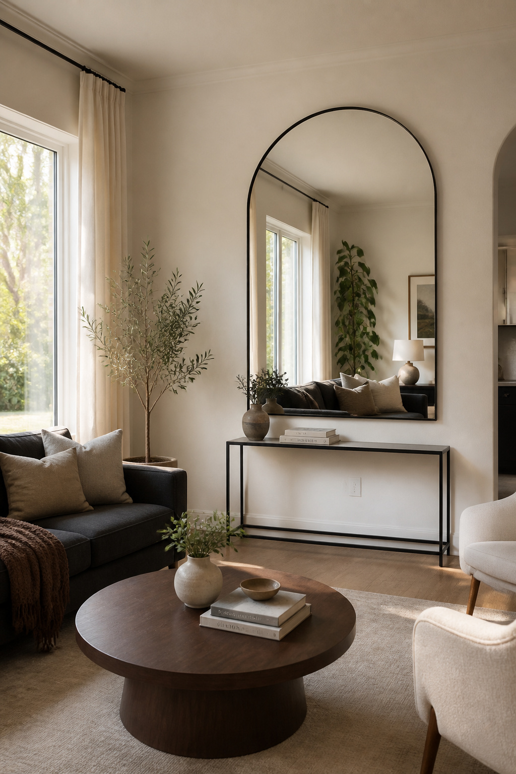
The most powerful placement is directly opposite a window. Sunlight enters, hits the mirror, and bounces back across the room — research suggests this can increase perceived brightness by 20–40% in a dim living room. The center of the mirror should hang at approximately 57 inches from the floor, slightly above standard eye level, so reflected light spreads across walls and furniture rather than shooting at the ceiling.
Mirror shape contributes significantly to the room’s overall aesthetic. Arched mirrors add organic softness to rooms dominated by right angles — they’re particularly effective in contemporary and transitional spaces where every other element is geometric. Sunburst mirrors function simultaneously as mirror and sculptural wall object; they don’t need anything around them to hold visual weight. Leaner mirrors — propped against a wall rather than hung — are especially useful in small living rooms, elongating the room visually without permanent installation.
The mistake worth avoiding: placing a mirror that reflects a cluttered area. Mirrors double whatever they show. Position them to reflect a window, a plant, a piece of art, or an attractive corner — not the pile of mail on the console table. For additional ideas about wall surfaces around your furniture, living room wall decor ideas that boost well-being covers the adjacent territory well.
13. Scale, Proportion, and the Space Between Your Furniture
The space between your furniture pieces is as much a design decision as the pieces themselves. Most people treat clearance as whatever’s left over after placing everything — designers treat it as a non-negotiable that gets planned first.
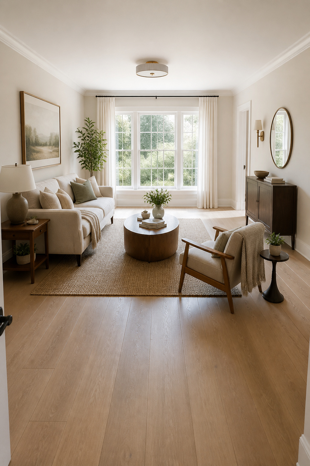
Main traffic paths through the room need 36 inches minimum. That’s the width that allows two people to pass each other without turning sideways — derived from human ergonomics, not aesthetic preference. Secondary paths around furniture need 18–24 inches. Between the sofa and coffee table: 14–18 inches, close enough to reach a drink comfortably but wide enough to stand without performing an obstacle course.
The 60/40 rule gives you the overall target: furniture should occupy roughly 60% of the room’s floor area, leaving 40% as negative space for traffic flow and visual breathing room. Below 50% and the room feels sparse and hotel-lobby cold. Above 70% and it starts to feel genuinely cramped regardless of how good the individual pieces are.
Visual Weight: Balancing Heavy and Light
Visual weight balancing is the more intuitive art. A dark, solid, fully upholstered sofa carries significant visual weight — it advances toward the viewer and makes the room feel smaller than its dimensions. Balancing it means placing lighter-reading pieces around it: an accent chair in a lighter color, glass or rattan side tables, light-colored throw pillows. Transparent and airy materials — glass, lucite, rattan, open-frame metal — contribute their function without adding visual mass. Using them in at least one or two pieces gives any room visual breathing room, even when the furniture count is high.
14. Decorative Accents That Complete Your Living Room Furniture Decor
The final 10% of living room furniture decor is what separates a furnished room from a designed one. Most people underinvest in this layer — either leaving surfaces bare because they can’t decide, or filling them randomly because they feel like they should. Neither approach gives you a room that feels finished.
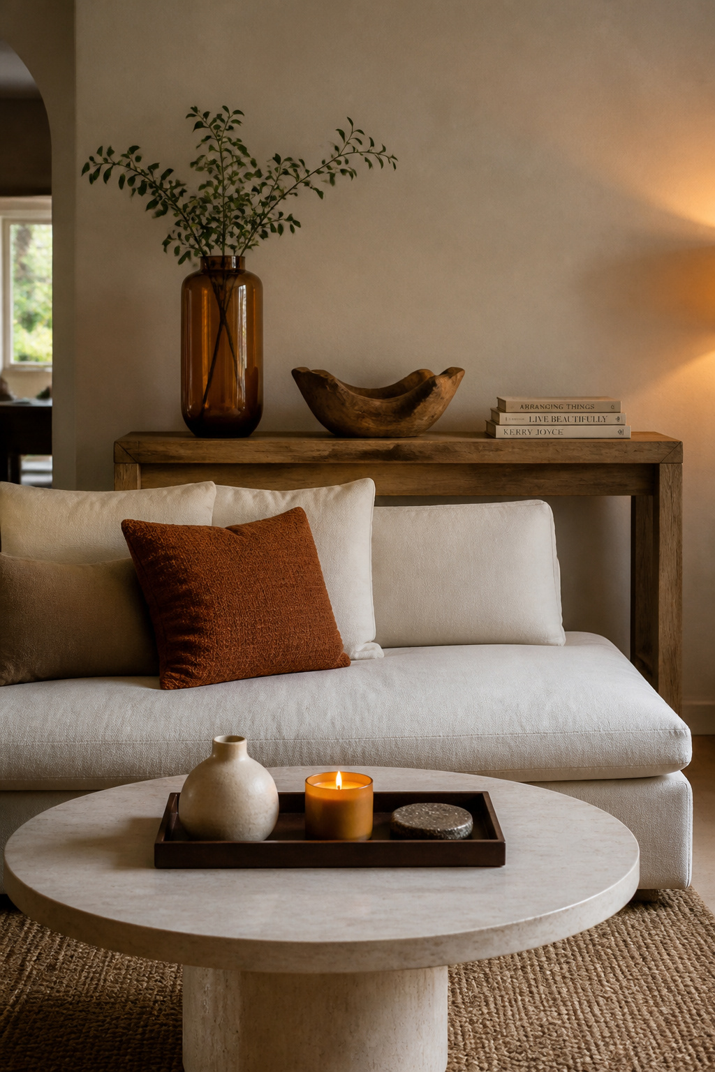
The rule of odd numbers is where to start: group accessories in threes rather than pairs. An odd grouping creates natural visual flow — the eye enters at one element, travels to the second, and exits through the third. Even pairs feel formal and static; odd groups feel casual and collected. For surface compositions, vary the heights deliberately: one tall element (a substantial vase, a tall candle), one mid-height element (a small sculpture, a framed object), one low element (a tray, a stack of books). That triangulated height creates depth and gives the eye a clear path to follow.
Trays are one of the most underrated tools in this layer. A tray on a coffee table, ottoman, or console groups smaller objects into one composed element — instead of five scattered things, you have one organized composition. It looks intentional rather than accumulated.
The editing principle is more useful than the adding principle: put everything you own on the surfaces, then remove 30%. What you remove should be anything generic, anything that doesn’t connect to the room’s aesthetic story, and anything competing with something more interesting nearby. Simple living room decor that supports your life often comes down to exactly this kind of deliberate subtraction rather than addition. Accessories sourced from different places — a market find, a travel piece, a thrift store discovery — create the layered personal quality that same-store purchasing cannot replicate.
15. Bringing Natural Textures Into Your Furniture Palette
Biophilic design — the practice of bringing natural materials and living elements into interior spaces — is grounded in decades of research showing measurable reductions in stress, anxiety, and cognitive fatigue when nature-inspired environments surround us. In the context of living room furniture decor, this translates to a simple principle: rooms that include wood, natural fiber, stone, and living plants feel warmer, calmer, and more genuinely inviting than rooms composed entirely of synthetic materials.
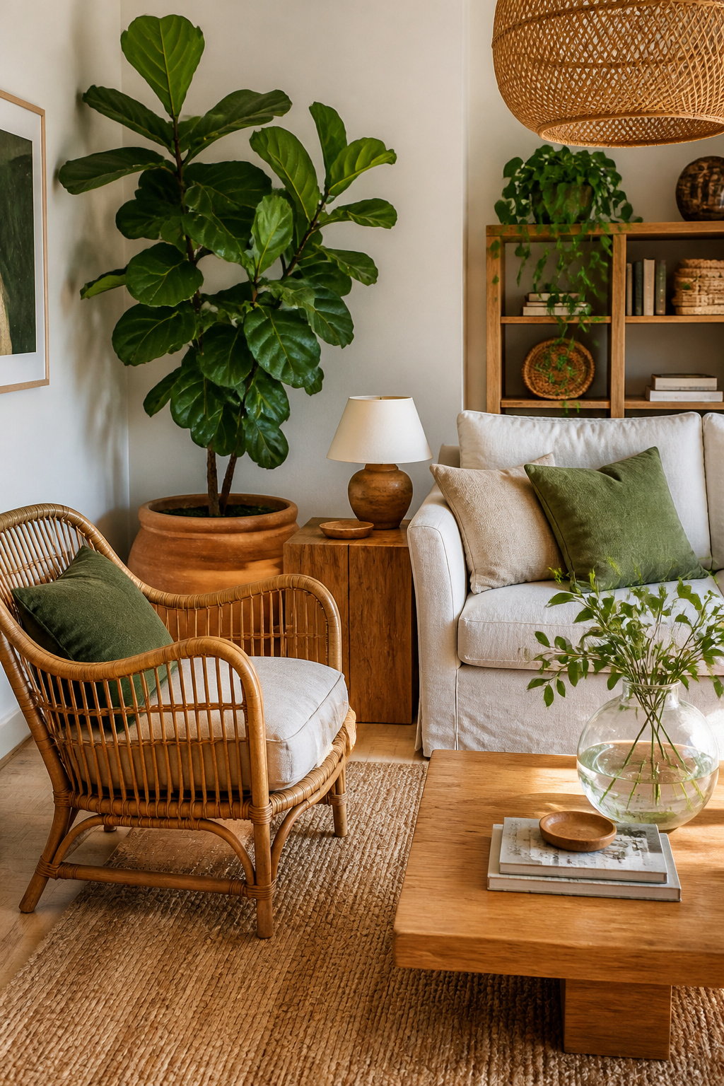
Natural materials introduce the slight irregularities that synthetics cannot replicate — the grain variation in solid oak, the imperfect weave of a jute rug, the subtle color variation in handmade ceramic. These irregularities are psychologically significant. They signal authenticity, which is what most people are actually reaching for when they say they want their living room to feel “cozy” or “real.”
In practical terms: rattan chairs and side tables add lightweight textural contrast to upholstered furniture without adding visual weight. Jute rugs bring warmth underfoot and introduce an organic texture that grounds more polished surfaces. Warm wood tones — honey oak, golden walnut, amber teak — pair particularly well with 2700K lighting because the warm light deepens and enriches their natural color. As for plants: pothos is genuinely impossible to kill and trails beautifully from shelves; snake plants are architectural, sculptural, and happy in low light; fiddle-leaf figs make a dramatic statement if you can give them bright indirect light.
One Rule: Don’t Go All the Way Natural
The mistake to avoid is going so fully natural that nothing contrasts. All rattan, all linen, all wood, all plants, all warm neutrals — and you’ve created a Pinterest mood board rather than a lived-in room. One polished, reflective, or synthetic element grounds the natural palette: a glass vase, a lacquered side table, a brass lamp base. The contrast is what makes the natural elements read as warm and intentional rather than relentlessly rustic.
Finding a Living Room Furniture Decor Style That’s Actually Yours
Before you buy another piece of furniture or spend another hour on a mood board, define the mood you want the room to create. Not the style — the mood. One word: calm, vibrant, cozy, sophisticated, playful. Then audit every potential purchase against that word. A piece that contradicts your intended mood is always a mistake, regardless of how good it looks in isolation.
Function comes before aesthetics. How is the room actually used? Primary TV space, primary entertaining space, daily family gathering room, occasional guest room? The function determines the furniture arrangement — and the arrangement determines what pieces you need — before any stylistic decisions are relevant.
If you’re starting from scratch, begin with the sofa. Its color sets your 60% dominant palette, its scale sets your proportion template, its style sets the direction for every adjacent decision. Get this one right and the rest of the room has a foundation to build from. If the sofa is already in place and staying, start with the rug instead — it bridges the sofa to the floor and establishes your secondary and accent colors in a way that opens up all the choices that follow.
The one-piece rule is worth remembering throughout: a great sofa with nothing else reads better than a room full of mediocre furniture. Quality and scale in the anchor piece elevate everything around it. Living room furniture decor works best when you resist the urge to furnish everything at once and give each good decision room to breathe.