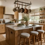
There’s a particular kind of relief you feel stepping into a kitchen where everything has a place and the counters breathe. No rogue spice jars crowding the splashback, no mismatched small appliances jostling for territory, no visual noise competing for your attention while you’re trying to cook. That’s what minimalistic kitchen design actually delivers when it’s done well — a calmer, less demanding experience of your home’s most used room.
After 12 years designing kitchen and dining spaces, I’ve seen homeowners fall in love with the idea of a minimal kitchen and then stall at the decisions. Handleless or handled? Matte or gloss? What to do about the range hood? This list works through the fifteen most impactful choices you can make, from the structural decisions that define the entire space down to the small specifications that quietly complete it. Whether you’re planning a full renovation or looking for the one move that transforms your current kitchen, these ideas give you something specific to work with.
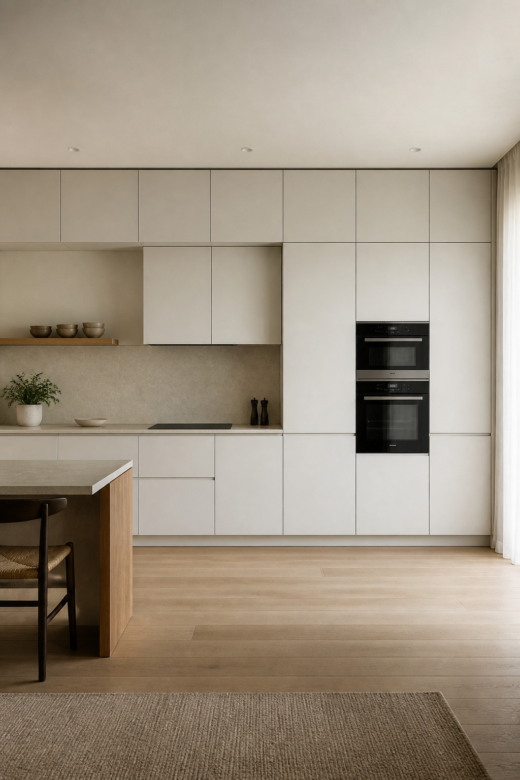
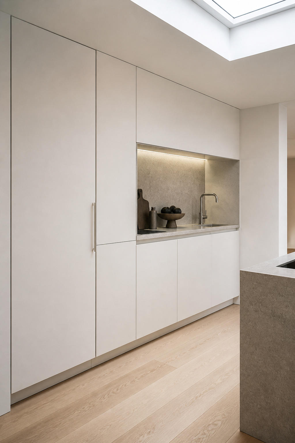
1. Flat-Front Cabinetry Without Hardware for a Seamless Wall
The handle is the most visually fragmented element in a traditional kitchen. Remove it, and the cabinet run becomes one continuous plane — the eye travels across the wall without interruption rather than stopping at each pull of chrome or brushed nickel. It sounds like a small change. In practice it’s transformative.
There are three ways to achieve handle-free cabinets, and the mechanism you choose matters more than most people realise. Blum TIP-ON uses a mechanical spring device fitted inside the cabinet frame — a firm push opens the door smoothly, and it’s the most reliable system for heavy-use base cabinets where cheaper push-to-open mechanisms would wear out within a few years. Budget $40–$55 per unit, so for a twenty-cabinet kitchen you’re adding $800–$1,100 in hardware. Gola profile rails — a recessed aluminium channel built into the door or carcass edge — are the cleanest-looking option and require no separate mechanism; they add around $10–$15 per door in construction cost but last essentially forever. Push-to-open magnetic systems sit at around $20 per door and are fine for lighter wall cabinets but less suited to heavy base drawers.
The door profile is equally important. For true minimalism, slab (flat-front) is the only correct choice — any profiling, whether a shaker bead or a V-groove, creates shadow lines that contradict the clean-wall effect. If you’ve been looking at contemporary kitchen cabinet ideas that feel genuinely modern rather than just updated traditional, this is the specification decision that separates them.
2. Minimalist Kitchen Design With an All-White or Tonal Palette
Colour contrast between cabinets, walls, and countertops creates boundaries that make a kitchen feel compartmentalised. A tonal palette — where all those surfaces sit within a close range of the same colour family — dissolves those boundaries and makes the room feel larger and quieter than it actually is.
This isn’t about choosing pure white and painting everything the same shade. It’s more nuanced than that. The key is keeping your cabinet colour, wall paint, and countertop tone within a 5–10 LRV (light reflectance value) range — the result reads as cohesive without being clinical. Warm whites (with yellow, cream, or pink undertones — Farrow & Ball All White, Benjamin Moore Chantilly Lace, Dulux Natural White) work best with timber accents or warm-toned stone. Cool whites leaning grey or blue suit steel appliances and stainless fixtures without going cold.
Where most tonal kitchens go wrong is in the finishes. A flat-matte cabinet next to a polished stone countertop next to a satin-painted wall gives you three surfaces at the same colour value but three different light responses — and that contrast is exactly what creates depth in a monochromatic scheme. The formula is one matte surface anchoring, one semi-reflective surface adding dimension, one textured surface providing interest. Different sheens are doing the work that different colours would otherwise do.
3. Panel-Front Appliances That Disappear Into the Cabinetry
An integrated appliance doesn’t announce itself. A panel-ready dishwasher takes a cabinet-front panel that your kitchen maker supplies to match the rest of the run — when it’s closed, it reads as another cabinet door. The result is a kitchen that appears to have no appliances at all, which is the ultimate expression of the less-is-more principle.
Dishwashers are the easiest starting point. Nearly all premium brands offer panel-ready models — Bosch 800 Series, Miele G7000, and Fisher & Paykel DishDrawer — and the panel sits on the front of the door. Prices range from $1,200 for Bosch entry-level to $8,000 for the higher Miele configurations. Refrigerators require column-format panel-ready units (Fisher & Paykel RS90, Miele MasterCool) that accept a custom door panel 19–22mm thick to match your cabinetry; budget $6,000–$15,000 depending on brand.
A few practical details that get missed during the excitement of specification: column fridges require a 25mm clearance gap at the top for heat dissipation, which a slim fixed false-top panel can hide. Dishwasher panels must be 3–5mm shorter than a standard cabinet door so the panel clears the floor when the door opens fully. And always check the manufacturer’s maximum panel weight — Miele allows 3.5kg per door panel; exceed that and the hinges misalign over time. The integrated aesthetic adds around 8–15% to total project cost, but it’s the specification that distinguishes a true minimalistic kitchen design from a kitchen that is simply tidy.
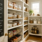
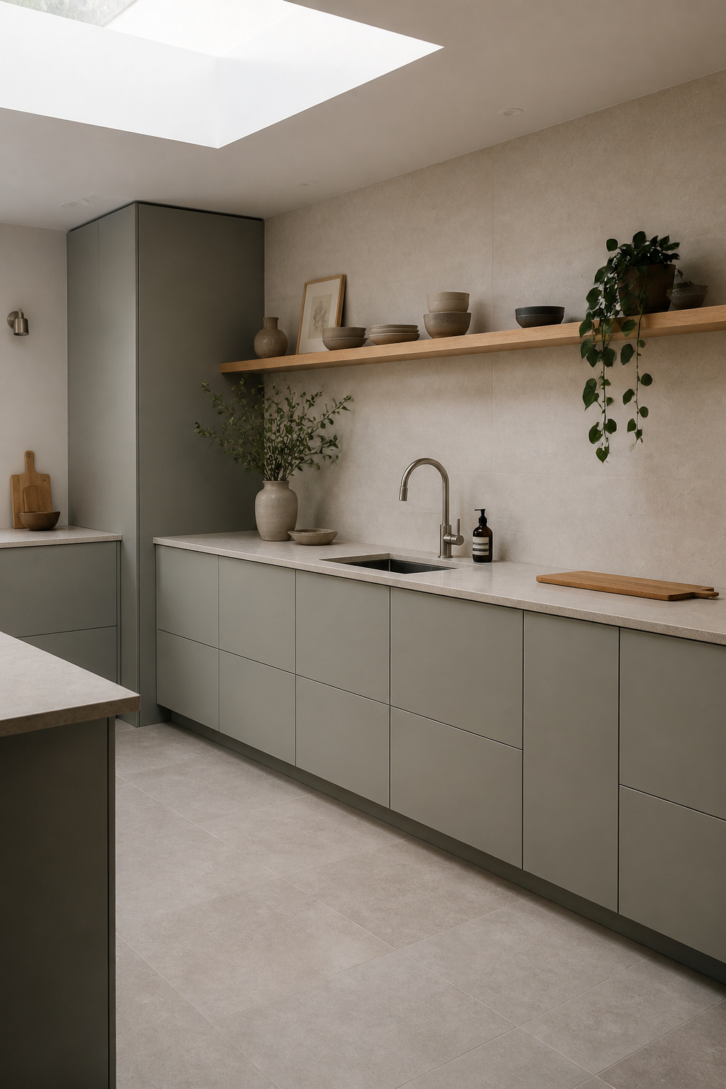
4. Open Shelving With Strictly Curated, Functional Displays
Open shelving only works in a minimalist kitchen if the curation is genuinely disciplined — and that’s a higher standard than most people anticipate. The shelf that holds the beautiful ceramic bowls, three matching glass storage jars, and nothing else? That’s a successful open shelf. The one that also has the multivitamins, a rogue bread bag, and three different spice containers in different packaging? That’s a counter problem moved to wall height.
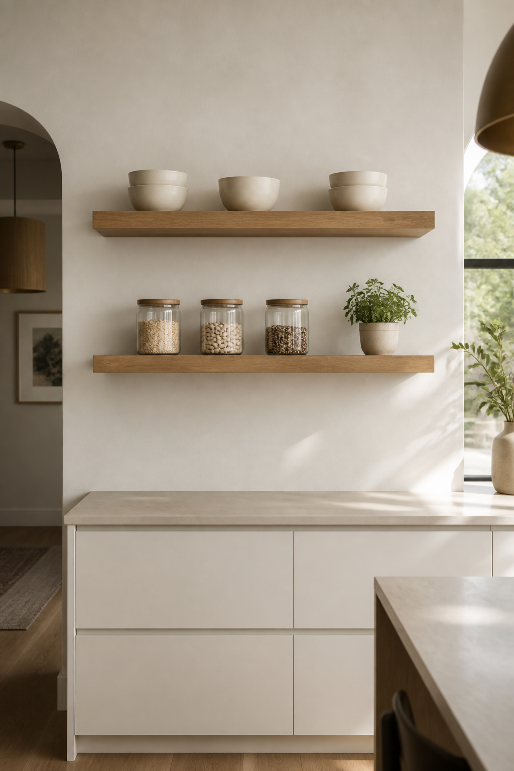
The three-category rule makes the curation decision straightforward: each shelf should hold only items that are (1) used daily, (2) visually uniform in height and colour, or (3) intentionally decorative as a single statement piece. Anything outside those categories belongs in a drawer or closed pantry. What kills the minimalist effect fastest is mismatched plasticware, appliances with visible cables, or random spice jars in different packaging — these should never live on an open shelf.
For the shelves themselves, thick floating oak is the practical and aesthetic sweet spot. White oak’s mild grain reads as texture without pattern, its Janka hardness of 1360 resists dings from stacked plates, and it ages to a warm honey tone with oiling. Shelf thickness matters more than it should: 40–50mm shelves look intentional and solid; 18mm MDF shelves sag under more than 5kg and look cheap. Bracket-free systems that use a hidden steel rod anchored into studs (rated to 150lbs per stud fixing) are the clean-installation choice. Leave 20–30% of each shelf empty — the negative space is working as hard as the objects.
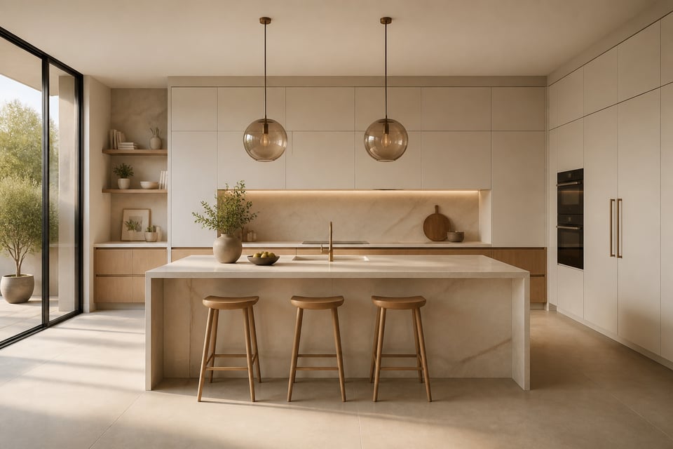
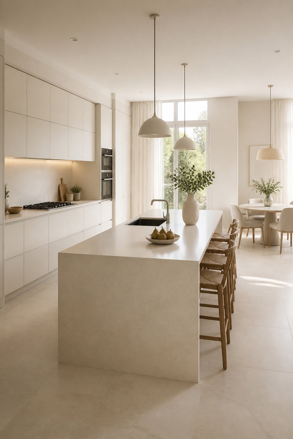
5. Minimalistic Kitchen Design: The Waterfall Island or Counter Edge
A waterfall countertop extends the counter slab vertically down one or both sides of the island to the floor, continuous and unjointed. It’s one of the strongest single moves in minimalistic kitchen design — it makes the island feel sculptural rather than furniture-like, which is the difference between a kitchen that reads as ‘nice’ and one that reads as ‘designed’.
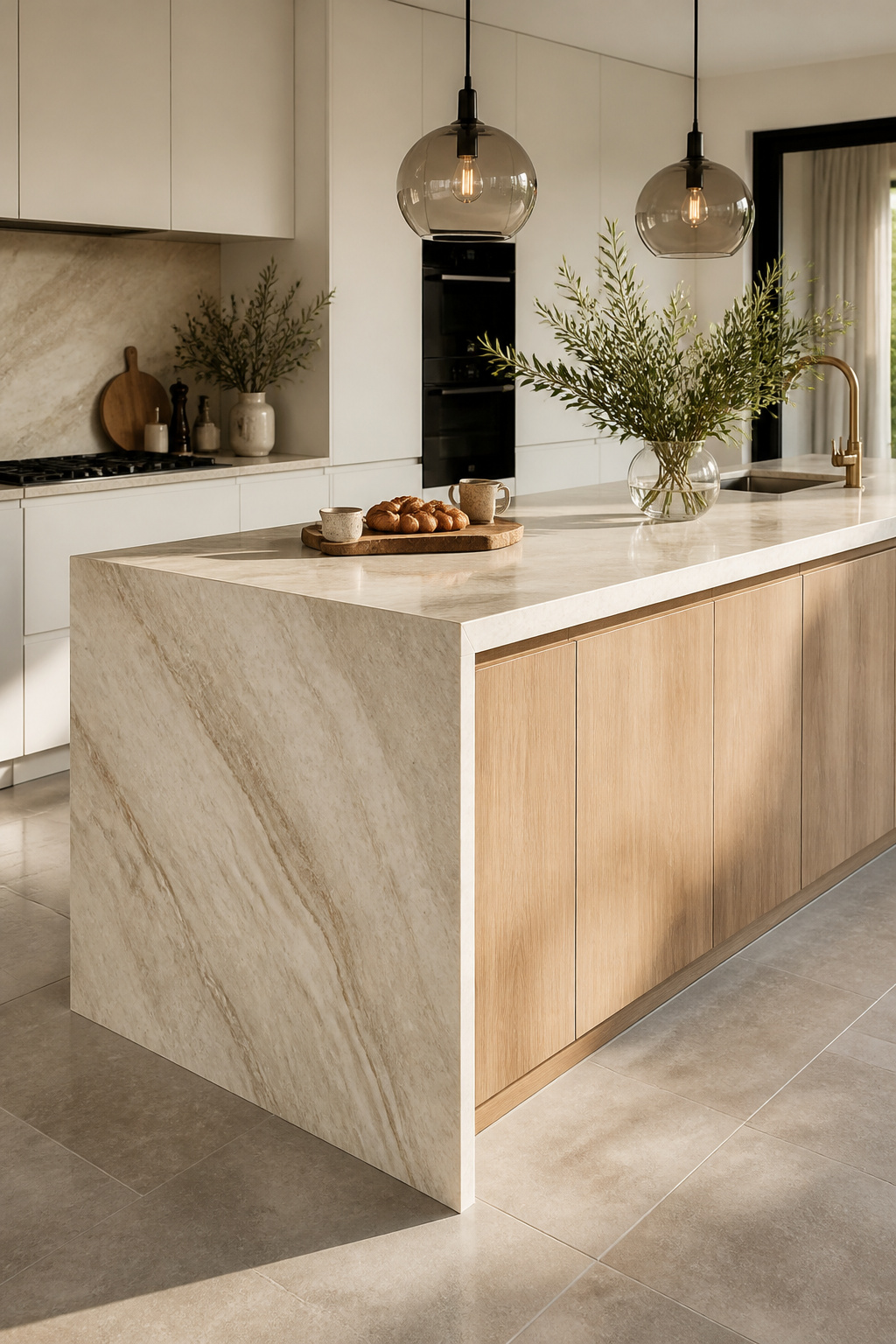
The material choice is where the decision gets interesting. Natural quartzite (Taj Mahal, Sea Pearl) is beautiful but requires book-matching of slabs — aligning the stone’s vein pattern at the mitre corner so it flows continuously — which adds 30–40% to material cost and demands an experienced stone fabricator. Porcelain slab (Dekton, Neolith) achieves a similar effect at roughly half the price: UV-stable, scratch-resistant, heat-resistant, and available in stone-look patterns that are genuinely convincing. For a full explanation of what these kitchen island countertop options cost and how they perform over time, the range is wider than most renovation guides let on. Total installed waterfall island cost runs $3,000–$10,000+ depending on material and whether one or both sides carry the treatment.
Proportion is the detail that separates a successful waterfall from an awkward one. Islands need to be at least 900mm deep for the vertical panel to look intentional rather than stuck-on. In smaller kitchens — under 10 square metres — limit the waterfall to one side; two-sided treatments can overpower the space and make the island feel heavier than the room can carry.
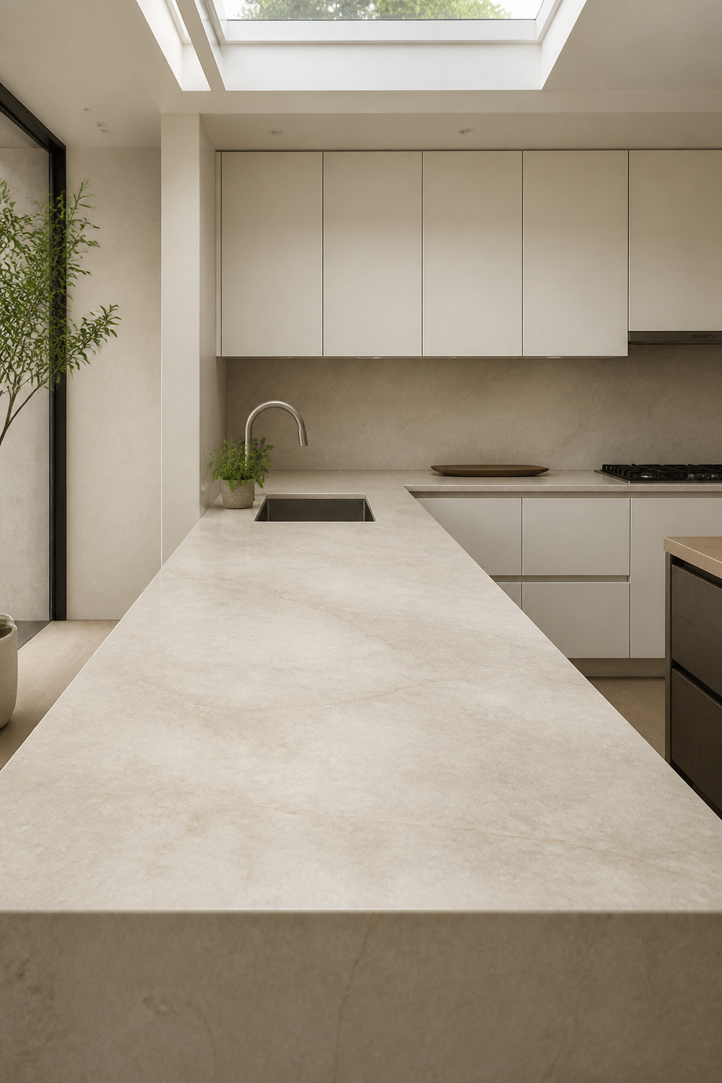
6. A Single-Material Backsplash That Runs Floor to Ceiling
The standard kitchen has four to six material transitions behind the cooktop: the counter edge, the tile start, the tile finish, the wall junction, sometimes a window reveal. Each transition is a visual interruption. Running one material from counter to ceiling — or in an open-shelf kitchen, from floor to ceiling — eliminates all of them and replaces that visual complexity with one continuous material plane.
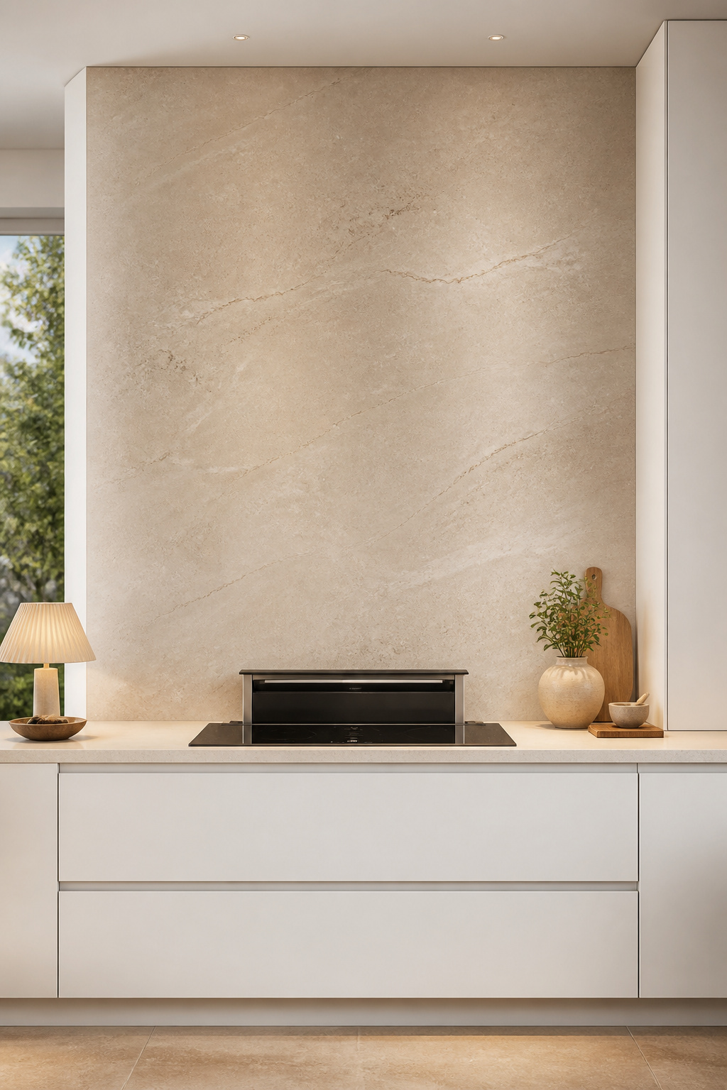
Large-format rectified porcelain is the workhorse material here. The 600x1200mm format is the practical standard — fewer grout lines than smaller tiles, impressive material presence, and a price range of $40–$90 per square foot installed. The 600x2400mm slab format is the visual upgrade for full-height treatments, often in stone-effect finishes (Calacatta-look, Statuario-look, or cement grey) that are genuinely difficult to distinguish from natural stone at a distance. For natural stone slab — book-matched marble or quartzite running floor to ceiling behind the hob — budget $150–$300 per square foot; it’s dramatic but it’s a significant portion of total kitchen spend.
The grout decision is where this idea usually falls apart. Matching grout — the colour within 2–3 shades of the tile body — is non-negotiable for the seamless effect. A white tile with mid-grey grout creates a visible grid that defeats the whole point. Rectified tiles allow 1–2mm joint widths (vs the 3–5mm needed for standard tiles), so even with grout it’s nearly invisible. For inspiration on how modern kitchen backsplash ideas handle the material and format decisions, the range of execution styles is broader than floor-to-ceiling alone.
7. Deep Drawer Systems That Pull Everything Off the Counters
The deep drawer is the minimalist kitchen’s most practical tool. A single 600mm-wide, 600mm-deep drawer can store a 12-piece pot and pan set with lids standing upright in dividers — the equivalent of a full-height broom cupboard in storage capacity. Convert your base cabinets to three-drawer stacks (shallow top for cutlery, mid-depth for small appliances, full-depth for pots) and you can eliminate every item from your countertop and still access everything easily.
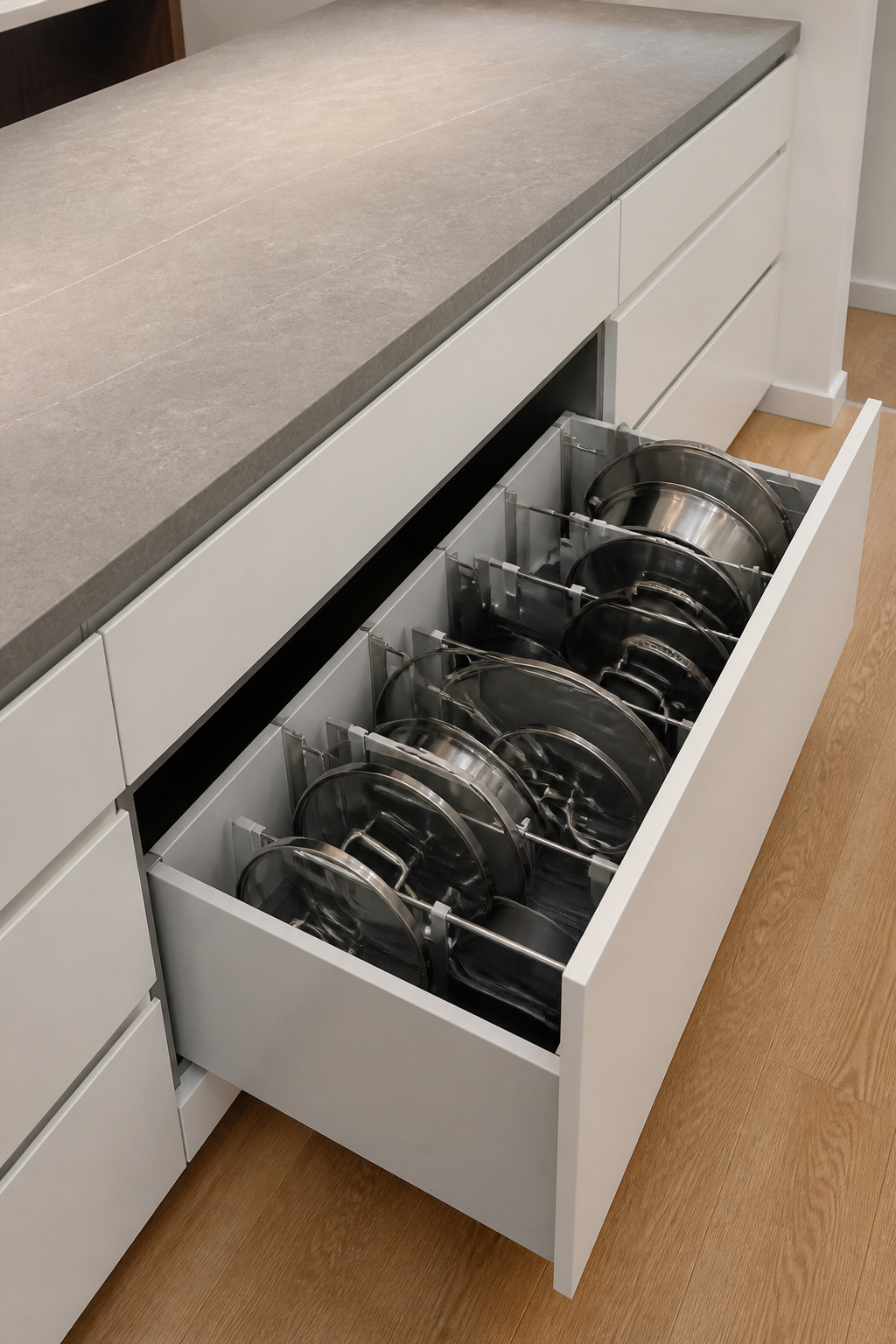
Blum TANDEMBOX Antaro is the industry benchmark: rectangular minimalist profile in white or orion grey steel, integrated BLUMOTION soft-close, TIP-ON compatible for handle-free operation, rated 70kg per runner, with a ten-year warranty. Hettich InnoTech AtiraSpace is the serious alternative — slightly more affordable, equally smooth, good for high-drawer-count kitchens where budget matters across thirty or forty runners. Both systems use modular internal organiser accessories (ORGA-LINE for Blum, HACK for Hettich) that hold cutlery, spice jars, and pot lids in place rather than letting them slide.
Budget $200–$400 per drawer for premium hardware and installation. For a kitchen with twenty drawers, that’s $4,000–$8,000 in drawer hardware alone — but these kitchen storage organisation strategies pay back over the life of the kitchen in both daily usability and the clean counter surface that defines the minimalist result. Drawer depth is the single most important specification decision: 500–600mm internal depth is the minimum for pot-and-pan drawers to work properly; 400mm base cabinets produce drawers that are wide but shallow, which is less useful and wastes the storage opportunity.
8. Minimalist Kitchen Ideas: Warm Wood Accents in a Sea of Neutral
The all-neutral minimalist kitchen can tip from calm to cold if there’s no organic warmth in the material palette. Timber is the answer — but it works only when it’s introduced as a single, contained accent rather than scattered across multiple zones.
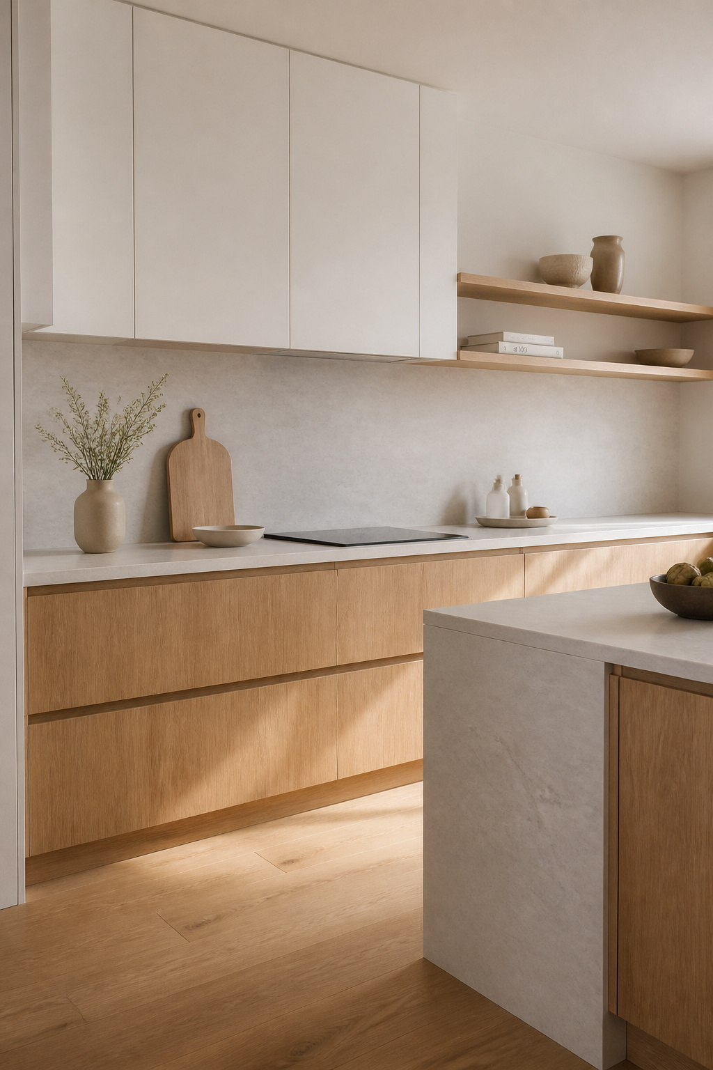
The one-zone rule is the most useful constraint here: choose one surface for timber and keep everything else in the neutral. The island base panels are the highest-impact placement — the island is the kitchen’s focal piece, so a natural oak island base against white lacquer upper cabinets reads as a deliberate design decision rather than a clash. Alternatively: floating open shelves in oak against a white wall, or a timber breakfast bar return. The most-specified minimalist kitchen combination of 2025–2026 per AMK industry data is matte white lacquer upper cabinets with natural oak lower cabinets — the Japandi approach executed in practical kitchen terms.
White oak is the species of choice for most applications. Mild, relatively straight grain with a silvery-beige tone, Janka hardness of 1360 (durable enough for daily kitchen use), and a pairing range that extends from warm whites to cool greys. Rift-sawn or quarter-sawn cuts give a straighter, more minimal grain pattern with less figure — this is what European premium kitchen brands specify when they want timber that reads as material rather than pattern. For the finish: oiled oak looks richer and more natural, needs re-oiling every 12–18 months, and allows spot repair of surface scratches. Lacquered oak is more resilient and easier to clean, with a 4–6 year maintenance interval. In a cooking household with children, lacquer is the practical choice. For everyone else, oiled oak is the beautiful one.
9. Under-Cabinet LED Lighting for Task Work and Architectural Depth
Under-cabinet lighting does two things simultaneously: it provides practical task illumination at the counter surface, and it creates an architectural separation between the counter and the cabinet underside that gives the kitchen visible depth. In an all-white or tonal kitchen — where you can’t use colour contrast to create dimension — this separation is one of the most effective tools available.
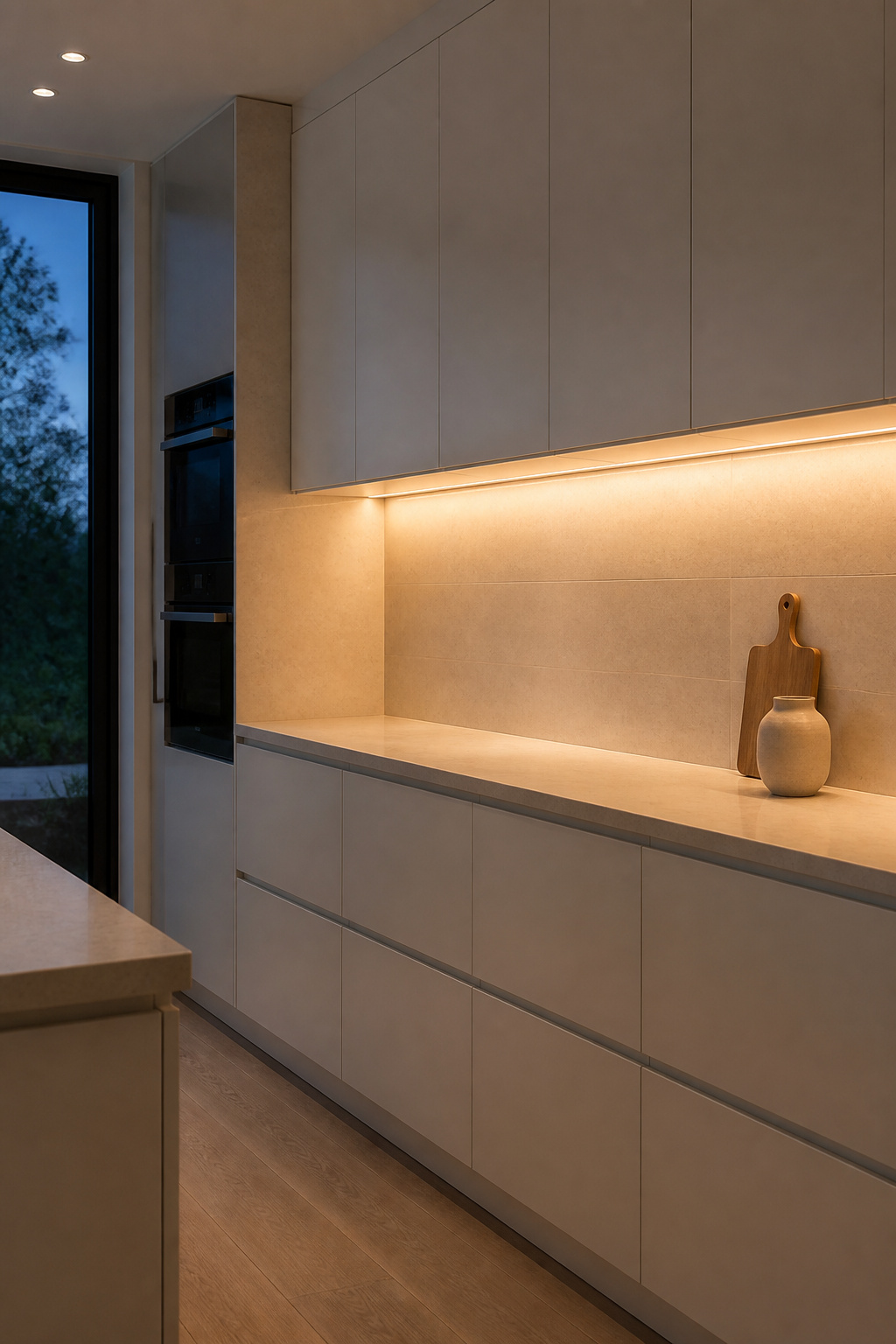
The light creates a bright band at the counter surface and casts the cabinet underside into relative shadow. That gradient makes the countertop appear to float slightly rather than being pressed hard against the cabinet above. It’s a subtle effect in daylight but becomes one of the defining visual qualities of the kitchen in evening light.
For the clean minimalist result, specify LED strip in a recessed aluminium extrusion profile — a U-channel that sits flush with the cabinet underside and diffuses the light through a frosted polycarbonate cover. The light appears to come from the cabinet itself rather than from a visible fitting. Mount the strip 50–75mm back from the cabinet front edge; front-mounting creates harsh downward glare and reflects off glossy splashbacks. On colour temperature: 2700K (extra warm white) suits kitchens with warm timber accents and cream tones; 3000K (warm white) is the kitchen industry standard and pairs equally well with white, grey, or timber-dominant palettes. For the full kitchen lighting design that works in real use — balancing ambient, task, and accent layers — the under-cabinet layer is always the first one to specify because it determines what everything else needs to do.
10. Matte Finishes on Cabinets and Countertops for a Soft Look
Gloss surfaces reflect the room back at you. In a small kitchen, this doubles the visual complexity — the gloss cabinet shows you the ceiling, the opposite wall, the lighting fixtures, all overlaid on the colour of the cabinet itself. Matte surfaces absorb light and reduce that reflection, making the room quieter. The practical translation: a matte kitchen looks considered; a gloss kitchen looks bright. For minimalism, considered wins.
The quality that makes high-quality matte lacquer worth paying for is its tactile dimension. A flat-matte lacquered door has a soft, slightly chalky feel that gloss cannot replicate, and in a minimalistic kitchen design context it reads as more intentional even when the underlying cabinet construction is identical. Colour also appears richer in matte: the same grey-green in matte and gloss reads as two different colours — the matte version looks more saturated and intentional because the light isn’t washing it out.
The practical trade-off is fingerprint management, and it’s worth being honest about. Under spotlighting, oil from fingers is visible on a matte surface — not dramatically, but it’s there. Anti-fingerprint coatings (available from most major cabinet suppliers since 2023) largely address this in practice. Gloss wipes clean faster — one pass with a damp cloth — while matte requires a microfibre cloth and diluted detergent to avoid streaking. For countertops, honed stone paired with matte cabinets creates a unified palette where every surface has the same absorbed-light quality. Honed quartzite or honed limestone are the more practical choices over honed marble in a working kitchen, since marble etches from acidic spills. Matte porcelain countertop in 20mm thickness achieves the same visual effect with no sealing requirements.
11. Minimalistic Kitchen Design: A Pared-Back Sink and Tap Pairing
The sink zone is where minimalist intention most often meets practical friction. A drying rack on one side, a soap dispenser through the counter, a sponge in the basin — by the time you’ve settled into daily life in a new kitchen, the counter is occupied again. Getting the fixture specification right from the start is the only reliable solution.
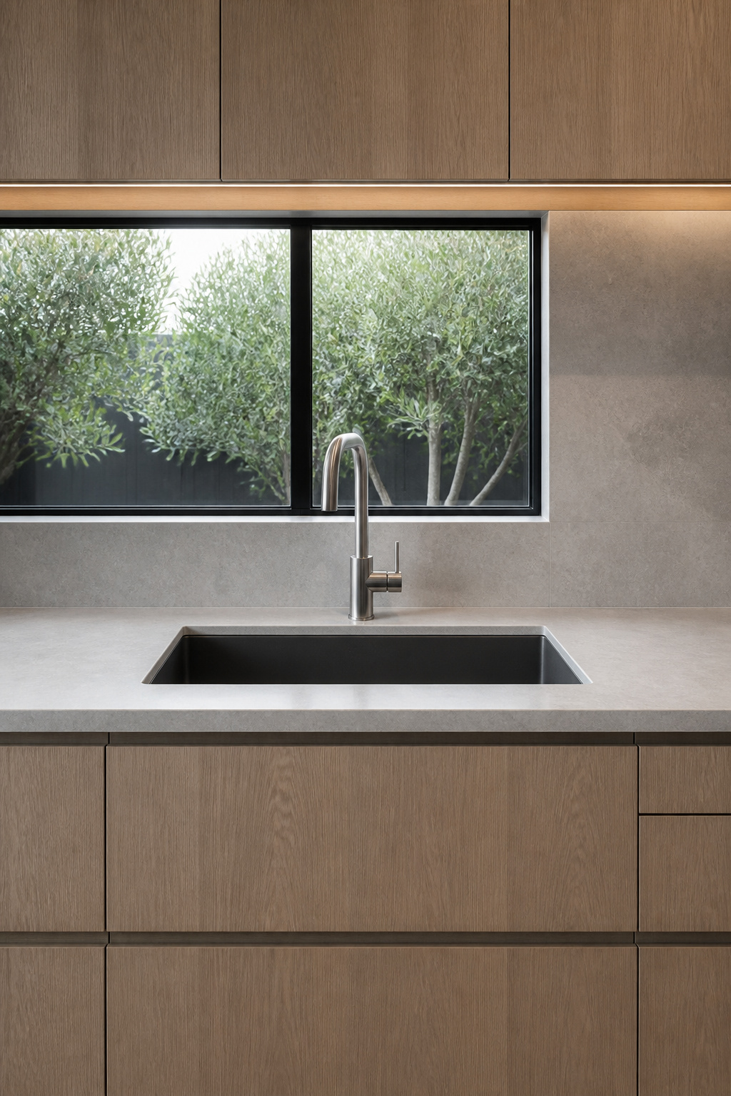
Start with undermount. An undermount sink mounts from below the counter so the counter surface extends to the sink rim — crumbs and water wipe directly into the bowl without a raised edge to catch them. The counter reads as an unbroken plane from wall to hob. A flush-mount (zero-radius) sink goes one step further: the sink sits in an exact cutout, rim flush with the counter surface. Both require a stone or solid-surface counter that can be machined to precise tolerances. Drop-in sinks with a visible rim above the counter are incompatible with minimalist design — full stop.
The Right Tap Specification
For the tap, the premium minimalist choices have been consistent for decades because the design principles don’t date. Dornbracht Meta is the German benchmark: 170mm tall, 200mm spout projection, available in matte platinum and brushed durabrass — body proportions that are so restrained they read as geometry rather than fixtures, priced $800–$1,200. Vola KV1 is the Danish classic, the tap Arne Jacobsen specified for the SAS Hotel in 1960 and still in production — cylindrical handle, projecting spout, available in 20 colours including powder-coated matte finishes, $600–$900. Wall-mounted taps eliminate the deck plate from the counter entirely — the surface is completely clear — but require supply plumbing in the wall rather than through the counter, so they need planning during construction. One final note on the soap dispenser: a second countertop hole for a built-in dispenser defeats the clean counter strategy; a glass bottle decanted from the kitchen soap to match the counter tone is both cheaper and less disruptive to the visual.
12. Monochromatic Flooring That Continues the Counter Palette
Most kitchen floors introduce a contrast — a darker tile against lighter cabinets, a warmer wood against cooler grey countertops. That contrast grounds the space but it also creates a horizontal line at the base of the cabinets that defines the room’s boundary. In a minimalist kitchen, dissolving that line is the better strategy.
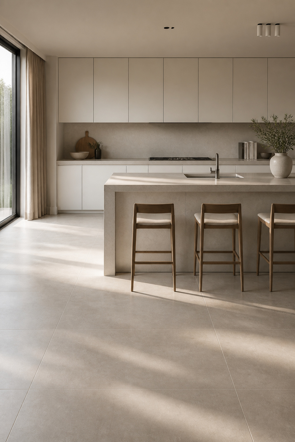
Choosing a floor tile that matches the counter and cabinet tone — not identically, but within the same LRV range — extends the visual field from floor to ceiling without interruption. The eye reads the whole space as a single vertical volume rather than as a floor zone plus a cabinet zone. For a kitchen with a 2.4m ceiling, this visual continuity can increase the perceived height by 15–20cm — a meaningful change in a compact apartment kitchen.
Large-format rectified tiles make this strategy work. The 600x600mm format is the practical standard: matte or semi-matte finish for non-slip safety, 4 tiles per square metre, efficient to install. The 600x1200mm format is the visual upgrade — fewer grout lines, more expansive material presence. Both require a highly level subfloor (no more than 3mm deviation per 2m) and a matching grout colour to keep the seams from reading as a grid. If budget allows, underfloor heating under porcelain or natural stone tile is the single most-requested kitchen upgrade in premium renovations — bare stone floors feel cold underfoot in a kitchen, and UFH solves this without adding any visible heating element to the wall plane.
13. Concealed Range Hood or Downdraft Extraction System
The standard chimney range hood is the element that most reliably breaks a minimalist kitchen’s visual coherence. It projects 250–400mm from the wall, hangs 600–700mm below the ceiling, and dominates the back wall regardless of how the rest of the kitchen is designed. You can have flat-front cabinets, integrated appliances, and a beautiful waterfall island — and the hood undoes half of it.
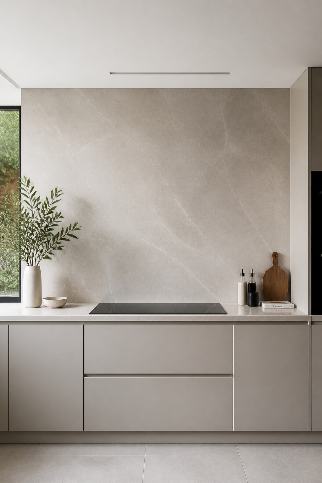
There are two practical alternatives. Ceiling cassette hoods (Elica Hidden, Faber ceiling series) install the extraction unit entirely within the ceiling void, with only a grille flush with the ceiling surface visible. They work brilliantly and require no compromise in the kitchen wall plane — the extraction geometry (above the cooktop) is actually more efficient than downdraft. The requirement is a ceiling void depth of at least 250mm, which means they’re easiest in new builds or major renovations where the ceiling structure is being reconfigured.
Downdraft extractors (Elica RISE, Bora Basic, Bora Pure) integrate into or behind the cooktop and extract at surface level. The Elica RISE rises 300mm from behind the hob when active and retracts flush when off — 700m³/hr extraction rate, compatible with most cooktop brands, suited to islands where ceiling ductwork isn’t possible. Bora Pure takes integration further still: it’s an induction hob with extraction built directly into the cooktop, requiring no separate extractor at all. One performance trade-off is worth knowing: downdraft extracts less efficiently than overhead capture because it must draw steam downward against its natural upward convection; 700m³/hr downdraft performs closer to 450m³/hr overhead in practice. For a kitchen used mainly for pasta, eggs, and light cooking, downdraft performance is entirely adequate. For regular high-heat frying and wok cooking, the ceiling cassette is the better choice.
14. Minimalist Kitchen Lighting: A Single Architectural Pendant Row
Pendant lighting over the island is the kitchen’s one opportunity for a design statement, and in a minimalist kitchen that statement should be made once, quietly. Not two styles mixed. Not three different metals. One pendant type, one row, properly sized and spaced — the confidence of that restraint is what makes it work.
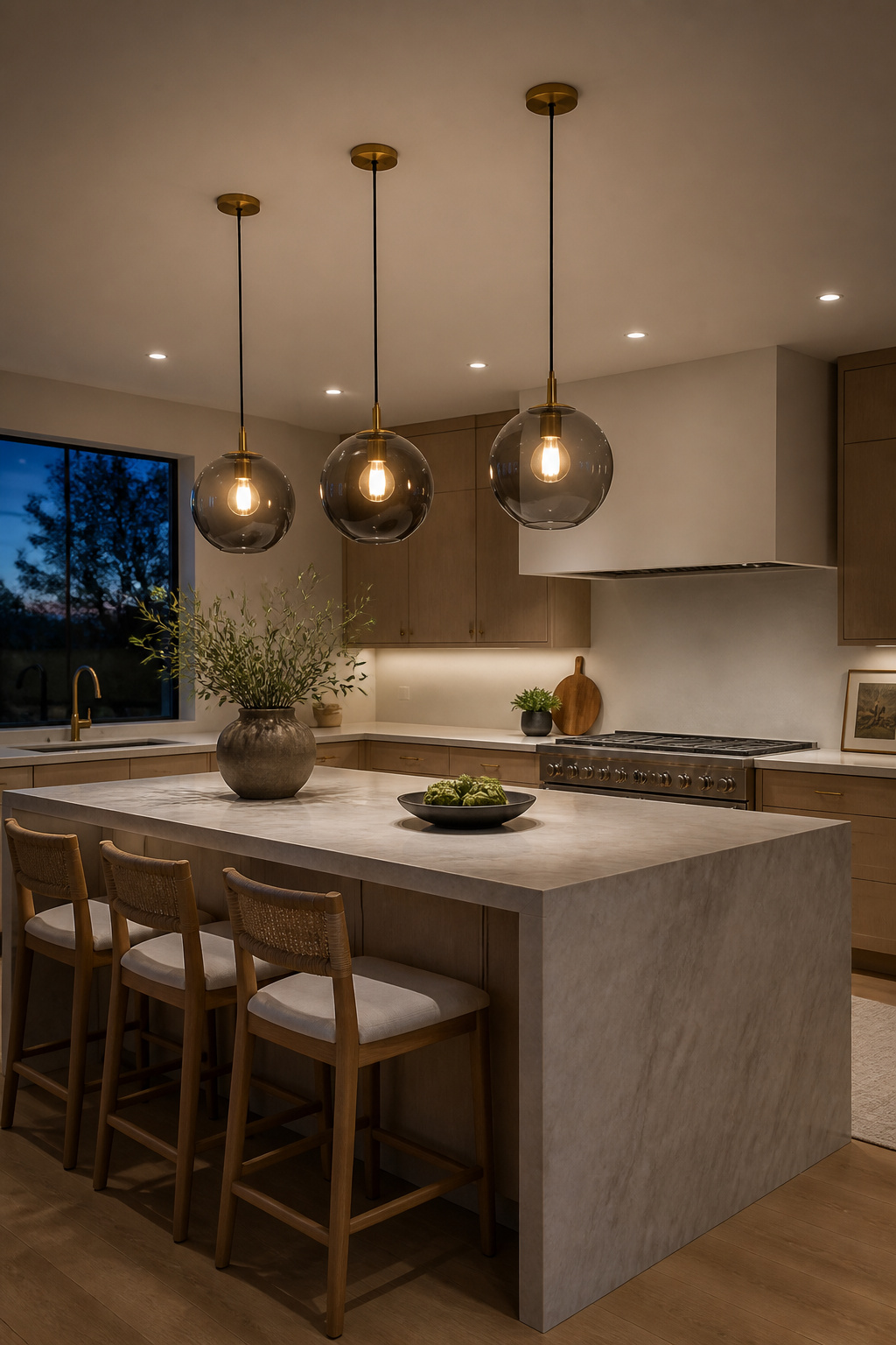
A mixed pendant arrangement creates visual complexity that works against the minimalist brief. One row of two or three identical pendants over the island, with recessed ceiling lights elsewhere, makes the pendants the only decorative lighting element in the space. That single choice carries the whole room’s character. The 2025–2026 minimalist pendant options that work consistently are: matte black cylinder, mouth-blown smoke glass globe, brushed brass cone, and wire-cage sphere — all defined by simplicity rather than decoration.
The sizing formula: pendant diameter should be roughly one-third of the island width if using one pendant; slightly smaller for two or three. For a standard 1500mm island, two pendants 750mm apart centre-to-centre is the most common solution. Hang them 700–800mm above the island surface — this is the clearance between the bottom of the pendant and the counter, not the total drop from ceiling. Pendants hung higher than 900mm above the counter look disconnected and provide poor task light; lower than 650mm creates a visual obstacle across the island. For the full specification detail on kitchen light fixtures worth the investment, the sizing relationships matter more than the fixture choice itself.
15. Neutral Stone Countertops as the Kitchen’s Quiet Anchor
The countertop is the surface with the most visual presence in any kitchen — it runs the full length of the space and everything else is built around it. In a minimalist kitchen, the countertop’s job is to be beautiful without being loud. The stone you choose should recede, not perform.
White quartzite is the 2025–2026 standout for exactly this reason. Taj Mahal quartzite has a beige-cream background with gentle silver veining — present enough to read as natural stone, quiet enough not to dominate the room. It sits at 7 on the Mohs hardness scale, close to granite, with low absorption and easy sealing — the durability of engineered stone with the organic quality of natural. Seal every 12–18 months with a penetrating impregnator; the water-bead test tells you when it’s due — if a water drop absorbs within 60 seconds, reseal. Grey limestone (Blue de Savoie, Gris Organic) is the genuinely minimalist choice — naturally uniform grey, fine grain texture, no pronounced veining at all; suited to kitchens where even a gentle stone pattern is too much. Seal every 6–12 months and use pH-neutral cleaners only.
The veining intensity decision is worth making deliberately. Low-movement stones — Mont Blanc quartzite, Calacatta Michelangelo (white with soft grey veins, no dramatic black) — work for kitchens where the stone is meant to recede. High-movement stones like Calacatta Gold or Arabescato Orobico are spectacular but they create a focal point, which is the opposite of minimalist intention. The arm’s length test is reliable: look at a stone sample from 2 metres. If the veining is still visually dominant at that distance, it’s too busy for a minimalist kitchen. If it has softened to a texture, it will work.
Choosing Your Minimalistic Kitchen Design Direction
Not every kitchen needs all fifteen of these ideas at once, and budget rarely allows it. The useful question is where to start.
The ‘big three’ deliver roughly 80% of the minimalist visual effect: cabinetry (flat-front, handleless), extraction (concealed or downdraft), and countertop (quiet stone or porcelain slab). These decisions define whether the kitchen reads as minimalist before any other elements are considered. If you’re working within a renovation budget rather than a full build, replacing cabinet fronts and hardware on existing carcasses can run $3,000–$6,000 vs a full kitchen replacement at $30,000–$80,000, yet delivers most of the visual transformation.
For a new build, the decision sequence matters: start with extraction because downdraft or ceiling cassette affects structural planning; then cabinetry style and colour, which sets the tone for everything else; then countertop, chosen to coordinate with the cabinetry; then flooring to continue the counter palette; lighting last, because it responds to the material palette rather than driving it. And the easiest, cheapest win of all: declutter the countertops. Move every appliance off the surface except the ones used daily. That single act — which costs nothing — delivers the minimalistic kitchen design effect immediately, and gives you an accurate sense of what you’re working toward before any renovation begins.