The difference between an apartment that looks rented and one that feels genuinely lived-in comes down to intention. Not budget — the research on this is consistent. Renters who deliberately layer their apartment decorating ideas, treating each choice as a psychological decision rather than a shopping list item, consistently create spaces that outperform their square footage. The same principles that make a well-designed hotel room feel like a personal retreat work equally well in a studio, once you understand what those principles are actually doing.
Color, light, texture, and spatial arrangement each interact with mood and behaviour in specific, documented ways. The 15 apartment decorating ideas here represent the highest-return interventions — some take an afternoon, some require a weekend, and a few call for a little advance planning. Every one is renter-friendly, and every one comes with an explanation for why it works, not just what it looks like.
1. Peel-and-Stick Wallpaper for Renter-Friendly Apartment Decorating
As apartment decorating ideas go, removable wallpaper has matured considerably in the past few years. The early vinyl versions — plasticky, bubble-prone, and stubbornly adherent to painted surfaces — have given way to poly-woven materials with genuinely repositionable adhesive. Brands like Chasing Paper and Tempaper allow you to peel back and realign during installation without losing tack. Wall Blush and James & Colors are the design-forward options, with PVC-free panels and seamless seam alignment. For first-timers on a tighter budget, NuWallpaper from Target or Amazon does the job on a single accent wall without requiring a design degree.
A single accent wall is the practical sweet spot for renters — the installation takes an afternoon, and removal averages twenty minutes with no steamer, no scraper, and no patching. Fresh paint needs a full thirty days to cure before you apply any removable wallpaper; install sooner and you risk pulling the paint layer off on removal. That’s the most expensive mistake in this category, and the most avoidable.
For pattern selection, keep it anchored to colours already present in your furniture or rugs. One shared colour creates cohesion without a full redecoration. Large-scale botanicals and geometric prints read well from across the room in small apartments; tiny repeating patterns can make a cramped space feel even busier. Earthy tones — rust, terracotta, and muted sage — are the 2026 palette story, and they translate well to peel-and-stick media. You can find more bedroom wall decor ideas beyond paint to extend this thinking to other rooms.
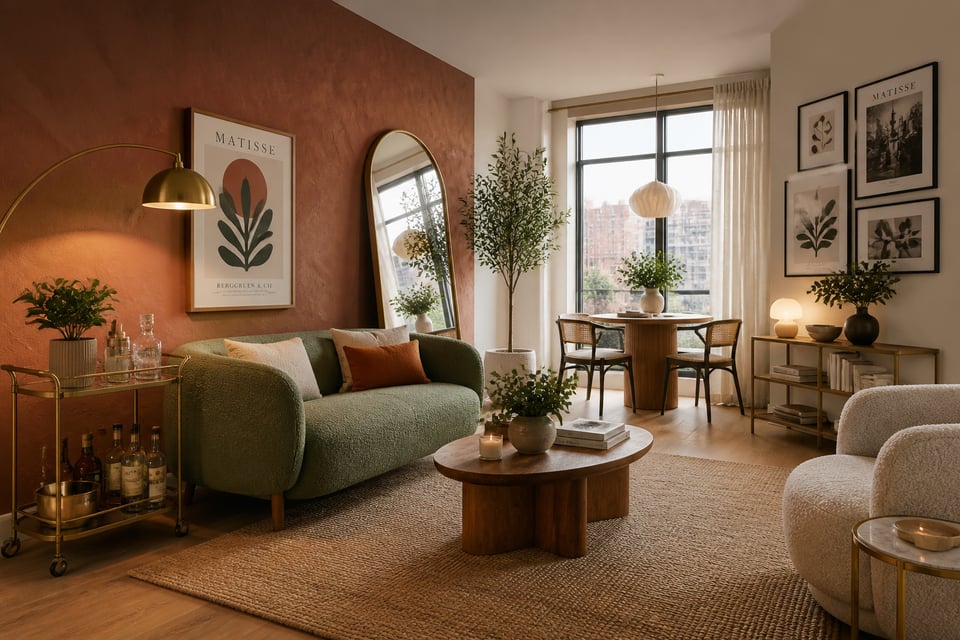
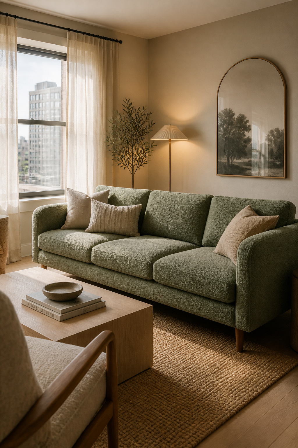
2. A Statement Sofa as Your Apartment’s Psychological Color Anchor
The sofa is the psychological anchor of any apartment living room. Its colour, texture, and scale set the emotional tone for the entire space before anything else registers. Blue sofas — navy, slate, or teal — promote relaxation and tranquility, the most popular choice in urban apartments where the home functions as a decompression chamber from city stimulation. Green sofas (soft sage and moss tones in particular) signal nature, renewal, and freshness, and test well specifically in apartments where outdoor access is limited. Warm neutrals — beige, taupe, greige — create calm and openness, and give maximum flexibility as the rest of the room evolves over time.
Scale and Proportion for Tight Spaces
The practical dimension matters as much as the psychological one. For apartments under 800 square feet, watch the sofa depth: standard pieces run 36-38 inches deep, which eats floor space aggressively. A 34-inch maximum preserves meaningful walking clearance. Exposed legs at six inches or taller are worth seeking out — the gap beneath the sofa lets light and floor show through, making the room read as larger than a skirted piece of the same dimensions.
Fabric choice defines how the sofa performs over years of use. Boucle has cemented its position as the texture story for 2026: the looped surface conceals wear patterns better than flat weaves, feels genuinely comfortable, and photographs well without special staging. Velvet is the alternative for anyone wanting a more saturated colour statement — forest green and dusty rose in velvet both carry enough visual weight to anchor a room. Whatever you choose, test the fabric swatch against your wall colour in actual room light before committing. Showroom lighting flatters nearly everything. Your apartment’s overhead fluorescent does not.
3. Gallery Wall Layout That Makes Low Ceilings Feel Taller
This apartment decorating idea doesn’t just fill empty wall space — it manipulates perceived ceiling height through compositional direction. The principle is vertical line: when frames are arranged so the eye follows the composition upward, the ceiling appears higher. A vertical column of three or four portrait-oriented frames rising from seated eye level toward the ceiling adds a perceived 12-18 inches of height in standard eight-foot rooms. The effect is demonstrably different from a wide horizontal arrangement, which emphasises the room’s breadth — exactly the opposite of what most apartments need.
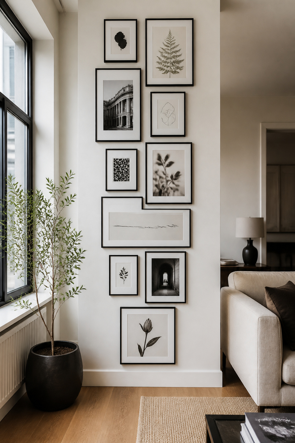
Museum curators hang artwork so the optical centre of the arrangement sits at 57-60 inches from the floor. For a gallery wall, this applies to the collective centre of the grouping, not each individual piece. The frames at the lower end of a vertical arrangement may sit at 45 inches; the pieces at the top edge might reach 72-78 inches. The grouping reads as one composed unit rather than individual pieces scattered at random heights. Spacing between frames should stay consistent: 2-3 inches in smaller rooms, 3-4 inches in taller spaces.
Renter-Friendly Hanging Methods
Matching frame finishes across the arrangement — all black, all natural wood, all gold — creates cohesion even when the content is varied. For renter-friendly hanging, 3M Command Picture Strips handle 7.5 lbs per pair (20 lbs extra-large) — sufficient for most standard frames. For heavier anchor pieces, Monkey Hooks hold 50 lbs each, leave only a one-millimetre hole, and require nothing but a push to install. Template the arrangement on kraft paper before driving anything: trace each frame, tape the outlines to the wall, and rearrange until satisfied. Creating a bedroom focal point with gallery walls covers the bedroom-specific application of the same vertical principle.
4. Mood-Setting Layered Lighting for Small Apartment Living
Single overhead lighting is the most common apartment ambience mistake, and one of the apartment decorating ideas that corrects it most effectively is the three-layer formula. Top-down light from a single source creates flat illumination associated neurologically with offices and waiting rooms — not rest or warmth. The formula distributes light across three functions.
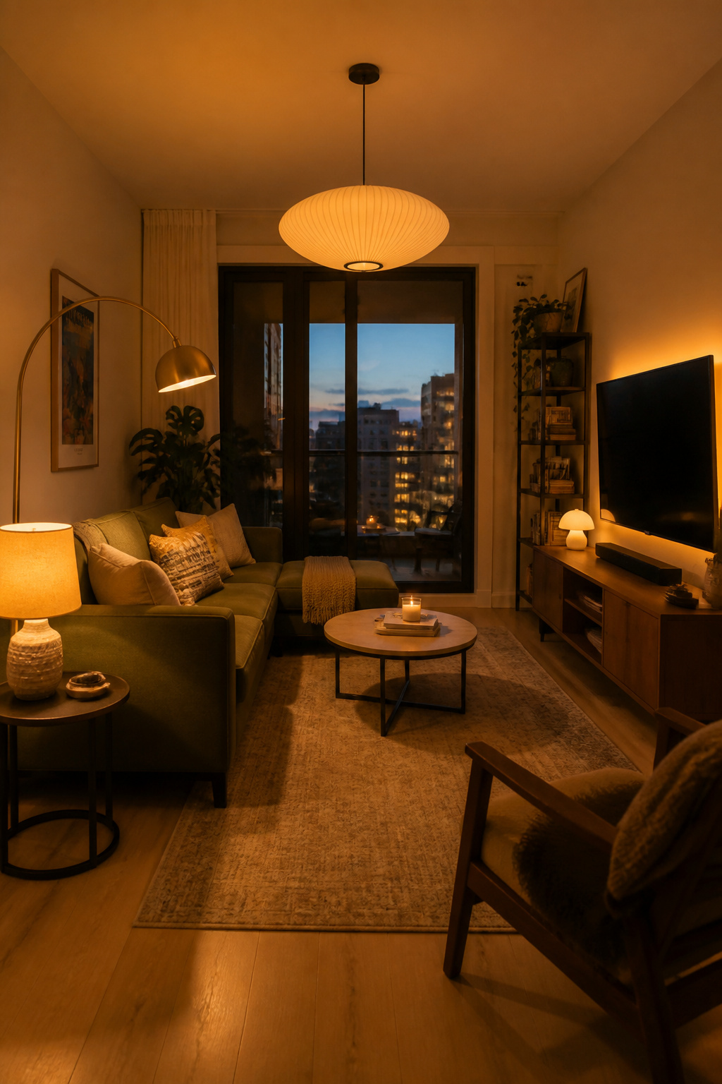
Ambient lighting is your base — your existing overhead fixture, managed. Task lighting is focused: a desk lamp, an arc floor lamp positioned behind the sofa for reading, or an under-cabinet strip in the kitchen. Accent lighting is the mood layer: table lamps at 60-70 centimetres height, an LED strip behind the television, a spotlight trained on a piece of art. Accent light should be approximately three times brighter than the ambient level it’s highlighting to register properly. A well-layered apartment typically runs three to five light sources simultaneously in the evening — one overhead and four positioned lamps is the practical target.
The quickest single-step upgrade: swap the overhead bulb from 4000K (cool white) to 2700K (warm white). The visual difference is dramatic, the cost is negligible, and it takes five minutes. Philips Hue White Ambiance bulbs allow temperature adjustment from 2200K to 6500K via a phone app — a candlelight setting for evenings, a clear-headed setting for mornings. Smart plugs from TP-Link Kasa ($12-15) make any existing lamp dimmable without replacing the bulb — the budget entry point into proper lighting control. For more approaches, living room lighting ideas that actually work covers the layering principle applied room by room.
5. Floating Shelves as Functional Apartment Decor
Floating shelves occupy a specific and valuable position among apartment decorating ideas — they store things, display things, and add architectural interest to blank walls simultaneously. The styling approach, however, is what separates a purposeful shelf from an overcrowded ledge. Two principles apply regardless of shelf size.
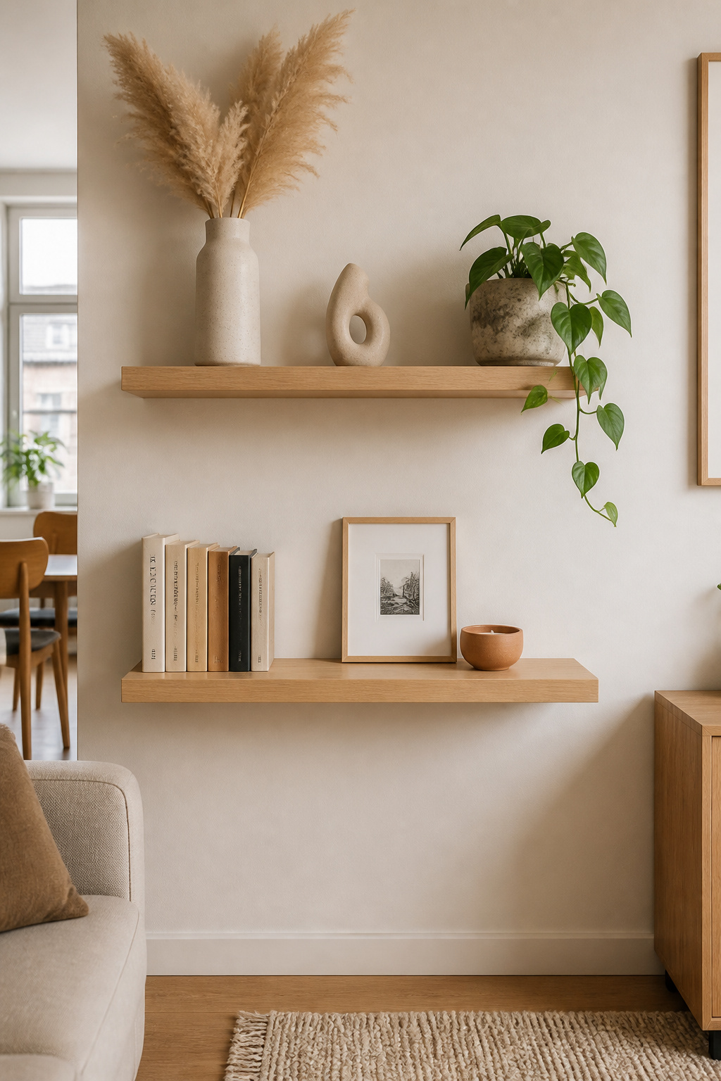
The 60/40 ratio is the first: roughly 60% functional items (books, plants, useful objects) and 40% purely decorative pieces. Going above 40% decorative tips the shelf toward a cluttered look; going below 20% makes it read like a warehouse. Negative space is an active part of the composition — a shelf at 70-75% full looks more curated than one packed to 95%.
For the arrangement, the rule of three and the visual triangle are the two reliable techniques. Group objects in threes with the tops forming a subtle triangle: one tall piece at the back, one medium in the middle, one low piece toward the front. Vary textures within each group — a smooth ceramic, a rough terracotta pot, a glossy art book produce more visual interest than three similarly surfaced objects. Shelves anchored to studs hold 45-50 lbs per connection, comfortably handling most combinations of books, plants, and ceramics. Space each shelf 10-14 inches apart vertically to accommodate standard book heights while leaving breathing room.
6. Oversized Area Rug to Define Zones in an Open-Plan Apartment
Almost everyone who decorates an apartment buys a rug that is too small. It’s the single most common error in apartment styling, and it happens for an understandable reason: smaller rugs cost less. But an undersized rug makes furniture float disconnected from the floor, creates a chopped-up look that makes the room feel smaller, and signals careless decorating immediately.
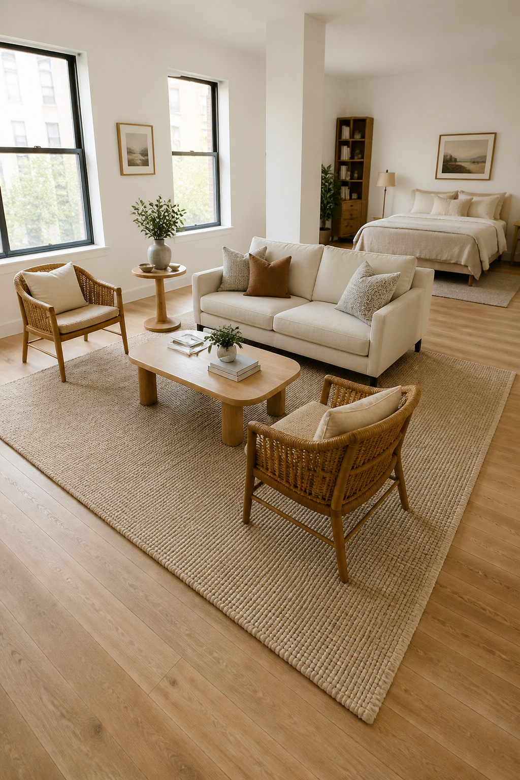
The rule is simple: go bigger than you think. For a standard living room, an 8×10 is the minimum; in open-plan studios, a 9×12 or even 10×14 is usually correct. The sofa’s front legs at minimum should sit on the rug; ideally all furniture legs in the seating arrangement make contact. Leave 6-8 inches of bare floor between the rug edge and the wall — this frames the rug and prevents the room from looking wall-to-wall carpeted.
In open-plan studios, the rug does something structural: it defines the living zone as distinct from the sleeping or dining zone without any physical partition. A 9×12 under the seating area creates psychological separation that the studio otherwise lacks entirely. Painter’s tape on the floor to mock the rug footprint before ordering consistently changes people’s size decisions — visual confirmation works where measuring tape often doesn’t. A quality rug pad extends rug life by years and adds 3-4mm of underfoot cushion. It’s a $40-60 addition that pays for itself quickly.
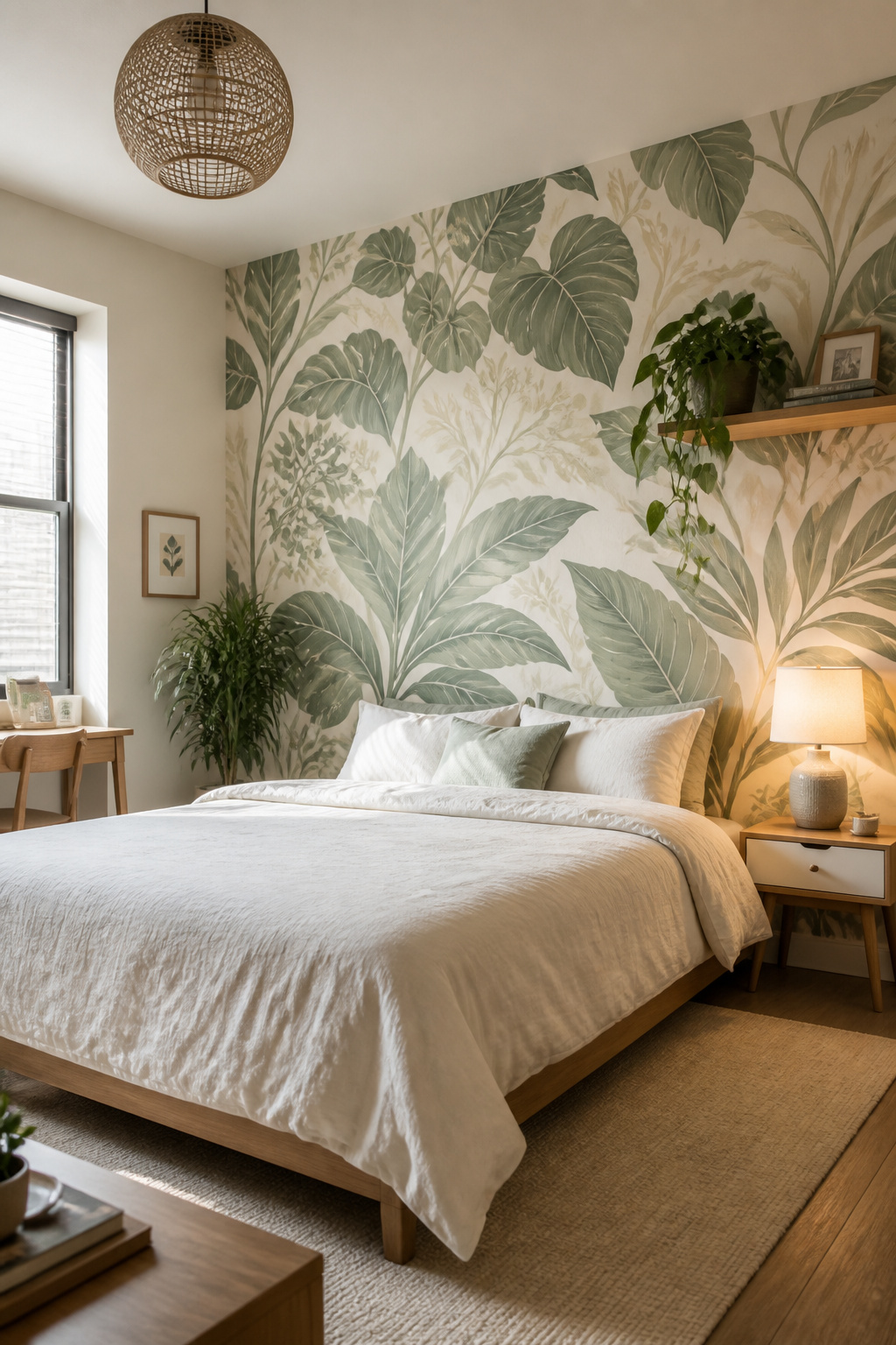
7. Botanical Apartment Decor: Indoor Plants for Every Light Level
Among apartment decorating ideas rooted in psychology, biophilic design has the most documented evidence behind it. Even small amounts of plant life — a single potted plant at eye level in a home office, a trailing pothos on a high shelf — produce measurable cortisol reduction and improved reported wellbeing. The psychological mechanism isn’t mysterious: visual access to organic form, to something alive and growing, provides a neurological counterweight to the hard-edged, screen-heavy environments most urban renters occupy for most of their waking hours.
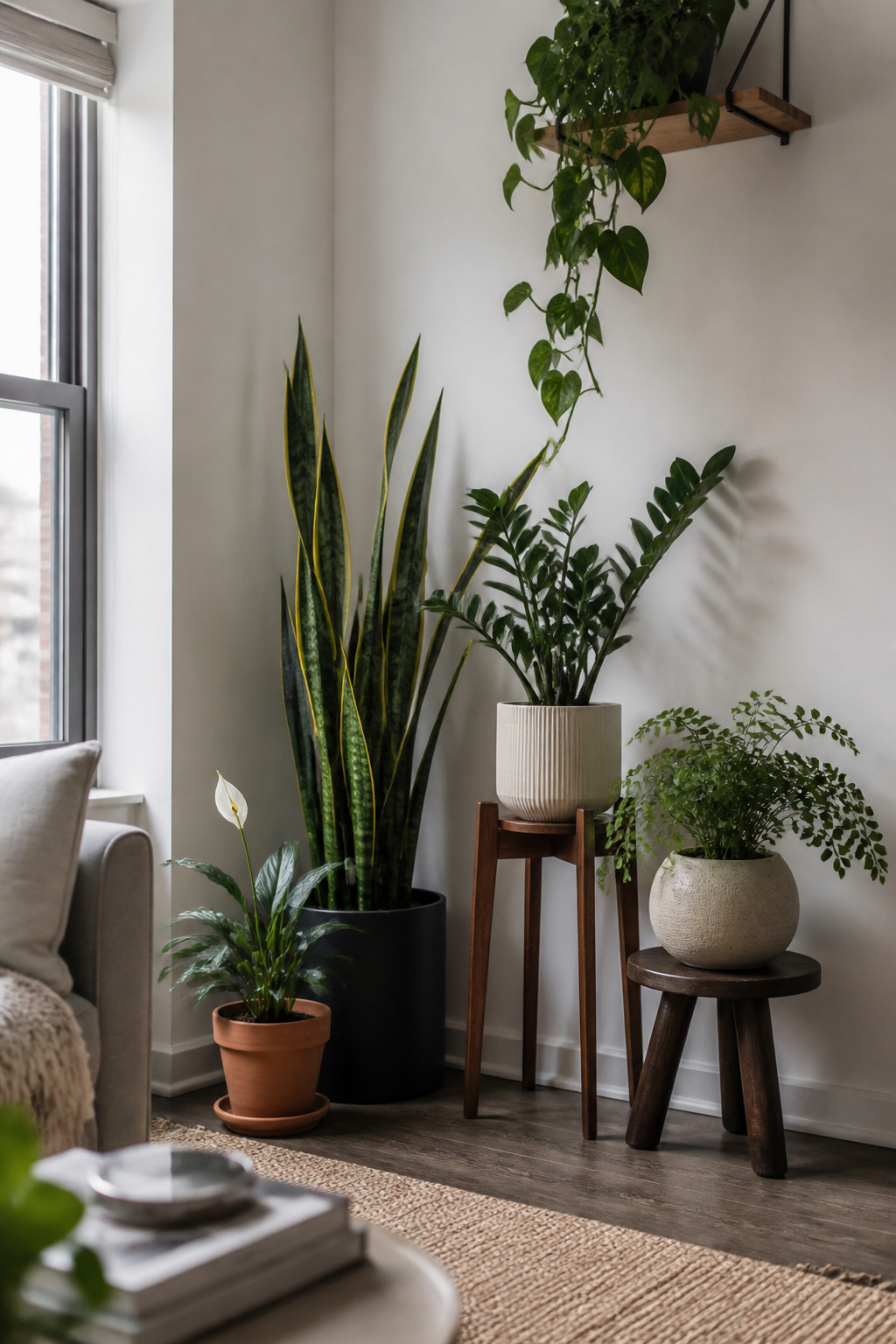
For apartments with limited natural light, plant selection matters more than quantity. Pothos tolerates near-total shade, grows readily as a trailing or climbing plant, and is essentially impossible to kill by underwatering. The ZZ plant stores water in its roots and survives weeks of neglect in north-facing rooms — the right choice for anyone whose plant track record is candid. Snake plants add architectural interest with their upright form and tolerate almost anything. Peace lilies are the rare flowering option that performs in low light; the white spathes add visual variety, though they’re mildly toxic to cats and dogs.
For styling, the same principles that govern shelf vignettes apply to plant groupings: odd numbers, varying heights, consistent pot finishes for cohesion across different species. Plant stands at 60-90 centimetres bring plants to seated eye level, creating a more immersive green presence than floor-level pots alone. Trailing species on high shelves add vertical green lines that reinforce the ceiling-height visual tricks from the gallery wall section. The bedroom paint colors inspired by nature article is a useful companion if you want to extend the biophilic approach into your colour choices.
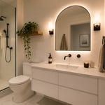
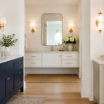
8. Strategic Mirrors That Double Visual Space Without Drilling
A well-placed oversized mirror effectively doubles the visual footprint of a room by reflecting both light and depth. Opposite a window is the highest-value placement — the mirror acts as a second window, bouncing natural light into the room and creating depth that reads, at a peripheral glance, as outdoor space beyond the wall.
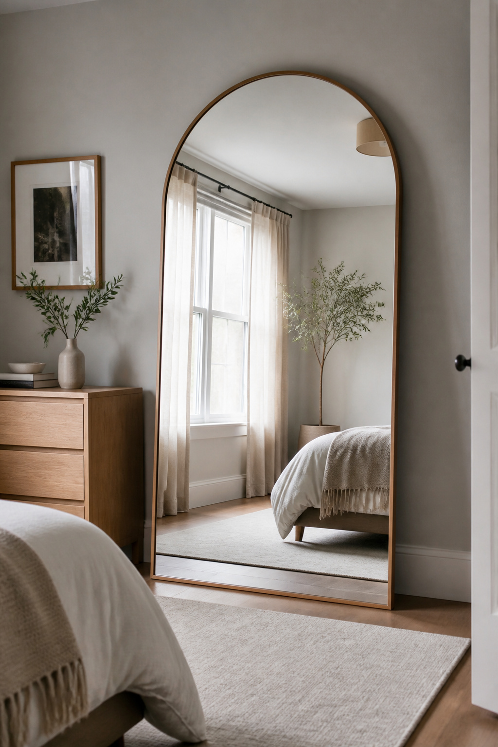
The guiding principle is straightforward: reflect the best part of the room. Position the mirror to capture a window, a well-styled shelf, or a piece of art — not a blank wall, a cluttered corner, or the inside of a tight passage. What the mirror reflects is the image the room presents to everyone standing in it. Place mirrors facing each other and you get an infinite tunnel that reads as disorienting rather than spacious.
Leaning mirrors are the practical choice for renters. A 72-inch floor-leaning mirror in a minimal frame requires no mounting, no wall anchors, and can be moved between rooms as the layout evolves. The standard leaning angle — base a few inches from the wall — has the mirror tilting slightly forward, which is both structurally stable and visually correct, as it reflects the room rather than the ceiling. Two rubber door stops behind the base on hard floors prevent slipping. Arch-top mirrors (the asymmetric arch form that has defined 2024-2026 aesthetics) add architectural character that plain rectangular versions lack — a genuinely useful feature in the characterless white-box apartments that still dominate the rental market.
9. Modular Storage Furniture That Earns Its Apartment Floor Space
Every piece of furniture in an apartment under 800 square feet should pass a simple test: does it do at least two jobs? If it can’t, it’s an inefficient use of floor space. This isn’t minimalism — it’s making every square foot count. These apartment decorating ideas in the storage category work because they hide their capacity inside forms that look like pure design objects.
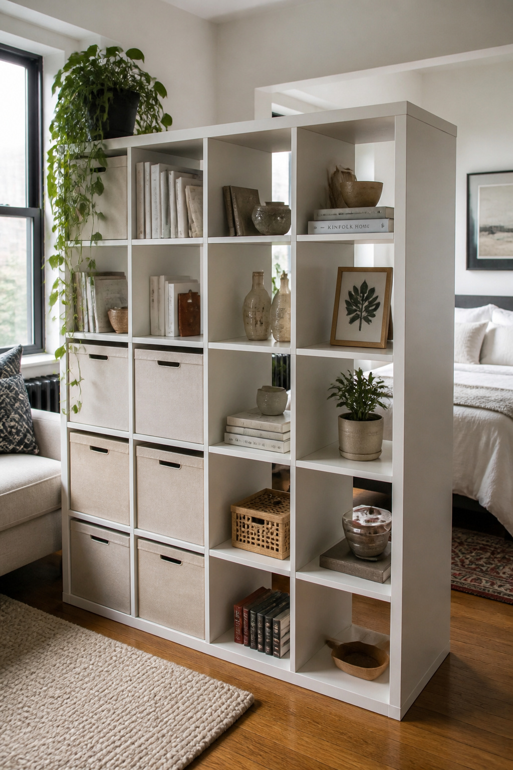
The double-function pieces that earn their keep most reliably: the storage ottoman (seat plus hidden storage), the platform bed with built-in drawers (sleep surface plus the equivalent of a full dresser), and the lift-top coffee table (surface, storage, and adjustable-height work desk rolled into one). IKEA’s KALLAX system ($69.99 for the 4×4 unit) remains the most versatile modular choice. Used as a room divider placed perpendicular to a wall, it creates a bedroom-living room boundary in studios without losing natural light. Storage ottomans run 9-12 inches of internal depth — fine for blankets, seasonal cushions, and board games. The IKEA LIFTARYD ($150) and West Elm versions ($400+) raise the coffee table surface to desk height and conceal 4-6 inches of interior storage.
Build vertically wherever possible. A 77-inch tall shelving unit uses the same floor footprint as a 32-inch unit but delivers triple the storage. The vertical dimension is the most consistently under-utilised axis in small apartment planning — once you start looking at it, it’s difficult to look at an empty stretch of wall without seeing the storage potential.
10. Textural Layering With Throws and Cushions for Sensory Warmth
Texture is the underrated variable in apartment decorating. Colour gets most of the attention, but texture works at a more fundamental level — it triggers comfort associations through sensory suggestion before anyone touches anything. A neutral room with three well-chosen textures reads as warmer and more inviting than a colourful room dressed entirely in flat fabrics. This is why certain hotel rooms feel luxurious even when the furniture is standard: it’s the textile quality, not the room size.
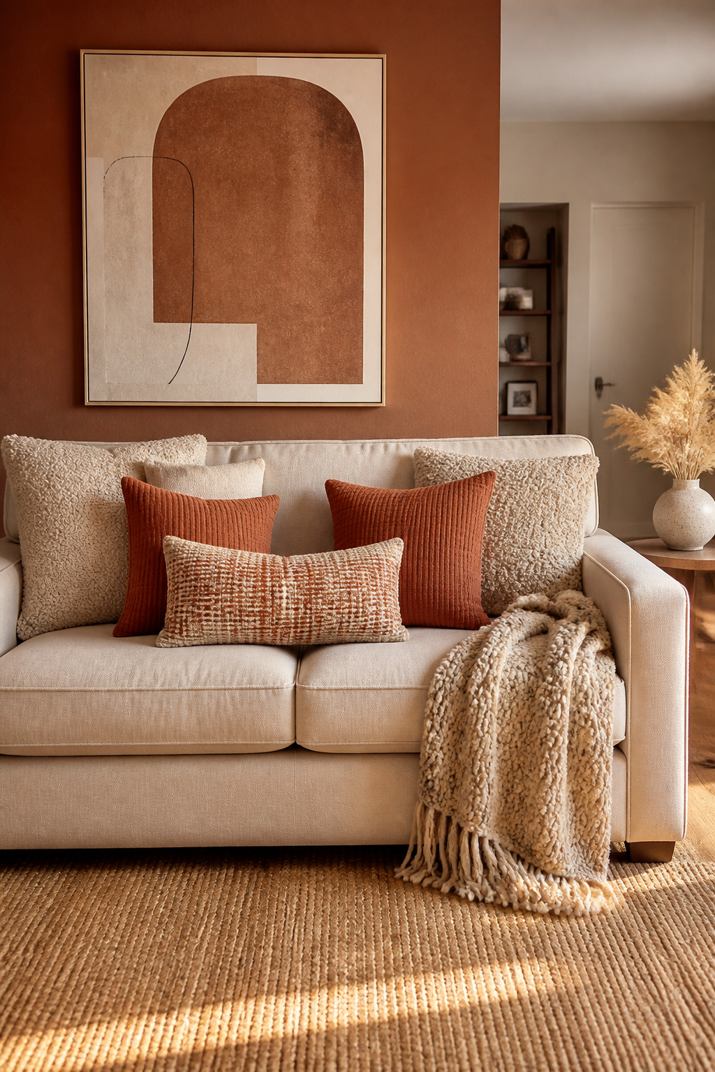
The practical principle is limiting texture categories to two or three per vignette. For a sofa arrangement, that might mean a boucle cushion (the anchor texture), a waffle-weave throw (the contrast), and a single woven pattern as accent. Introducing more than three distinct textures in one composition tips from rich to chaotic. The height layering for cushions works from large to small, back to front: 22×22 solid anchors at the back, 18×18 textured or patterned pieces in the middle, small 14×14 or lumbar at the front. One patterned piece with two solid-textured companions is the ratio that works most reliably.
Boucle has cemented its position as the dominant texture of 2026 — the looped poly-weave in cream and oatmeal tones appears widely because it photographs well, conceals wear, and genuinely feels as good as it looks. It pairs most effectively with smooth linen (textural contrast) and a single velvet or wool piece (depth). For seasonal rotation, swap cushion covers rather than entire cushions: summer covers in slubby linen and washed cotton, winter covers in chunky knit and velvet. The same inner pad works year-round, and the $30-50 cover swap is the most cost-efficient seasonal refresh in apartment decorating.
11. A Curated Bar Cart as Apartment Decorating’s Secret Focal Point
The bar cart is one of the most underused objects in apartment decorating. It’s simultaneously a surface, a storage unit, a room divider in miniature, and a styled focal point — on wheels, which means it moves without tools and reconfigures without commitment. Among the living room decorating ideas that transform your home, mobile, renter-friendly focal points rank among the highest-return choices.
In a studio, a bar cart positioned between the kitchen and sitting area acts as a soft visual divider that adds interest from both sides. It doesn’t require a bar function to justify its floor space; the most effective versions I’ve seen function as coffee stations, plant carts, and book displays. The standard two-tier cart (32-36 inches tall, 28-32 inches wide, 16-18 inches deep) fits comfortably in gaps that traditional furniture ignores: between a sofa and a wall, beside a bookshelf, or in an entryway where it serves as both landing surface and visual anchor.
For the styling, the three-level formula works on most two-tier carts: upper tier with tall vessels at the back, glassware in the centre, one small botanical at the front; lower tier with a flat surface (a marble board, a stack of hardcovers) at the back and smaller objects forward. Vary heights dramatically — the tallest piece should be roughly twice the height of the shortest to create a dynamic arrangement. The metallic finish of the cart defines its character: brass reads as warm and eclectic; matte black is graphic and contemporary. Choose one and keep accessories consistent.
12. Pendant and Floor Lamp Swaps for Dramatic Lighting Without an Electrician
Plug-in pendant lights are the most impactful single lighting upgrade available to renters among all apartment decorating ideas in this list — they install in fifteen minutes using a ceiling hook and a wall outlet, require no electrician, and completely change the visual personality of a space. The shade design drives the effect: a sculptural glass pendant creates something entirely different from a woven rattan sphere, even when both serve identical functional roles.
Installation is straightforward. A small ceiling hook (adhesive or small-nail-based) suspends the shade from above; the cord routes to the nearest outlet. A plastic cable raceway ($8-15 per metre, paintable white) conceals the cord along the ceiling and wall. The ideal hanging height for general use is 6-7 feet from the floor; for dining and desk applications, 30-36 inches above the surface creates the focused pool of light the fixture is designed to deliver.
Arc floor lamps address the other common apartment gap: the sofa with no side table space for a lamp. An arc lamp extends 5-6 feet from its base and positions the shade directly over the seating area, leaving the floor around the sofa clear. Weighted bases (15-25 lbs, typically marble or concrete) are the stability-conscious choice in apartments where foot traffic is normal. Brass and matte black are the dominant arc lamp finishes for 2026 — both work with neutral palettes, but brass adds warmth and matte black adds graphic contrast. Pull the finish from whatever hardware already exists in the kitchen or bathroom and you get the kind of through-line that reads as deliberately designed.
13. Apartment Decorating Ideas With Scent: The Forgotten Design Layer
Scent is the most neurologically direct design element and, by a significant margin, the most overlooked in apartment decorating ideas lists. Unlike visual stimuli, scent bypasses cognitive processing entirely — it travels directly to the amygdala (emotional processing) and hippocampus (memory storage), which is why a particular fragrance can produce an emotional response before the rational brain has registered anything. The practical application is scent-scaping: treating fragrance as a deliberate layer with its own spatial logic, the same way you’d think about lighting zones or colour assignments.
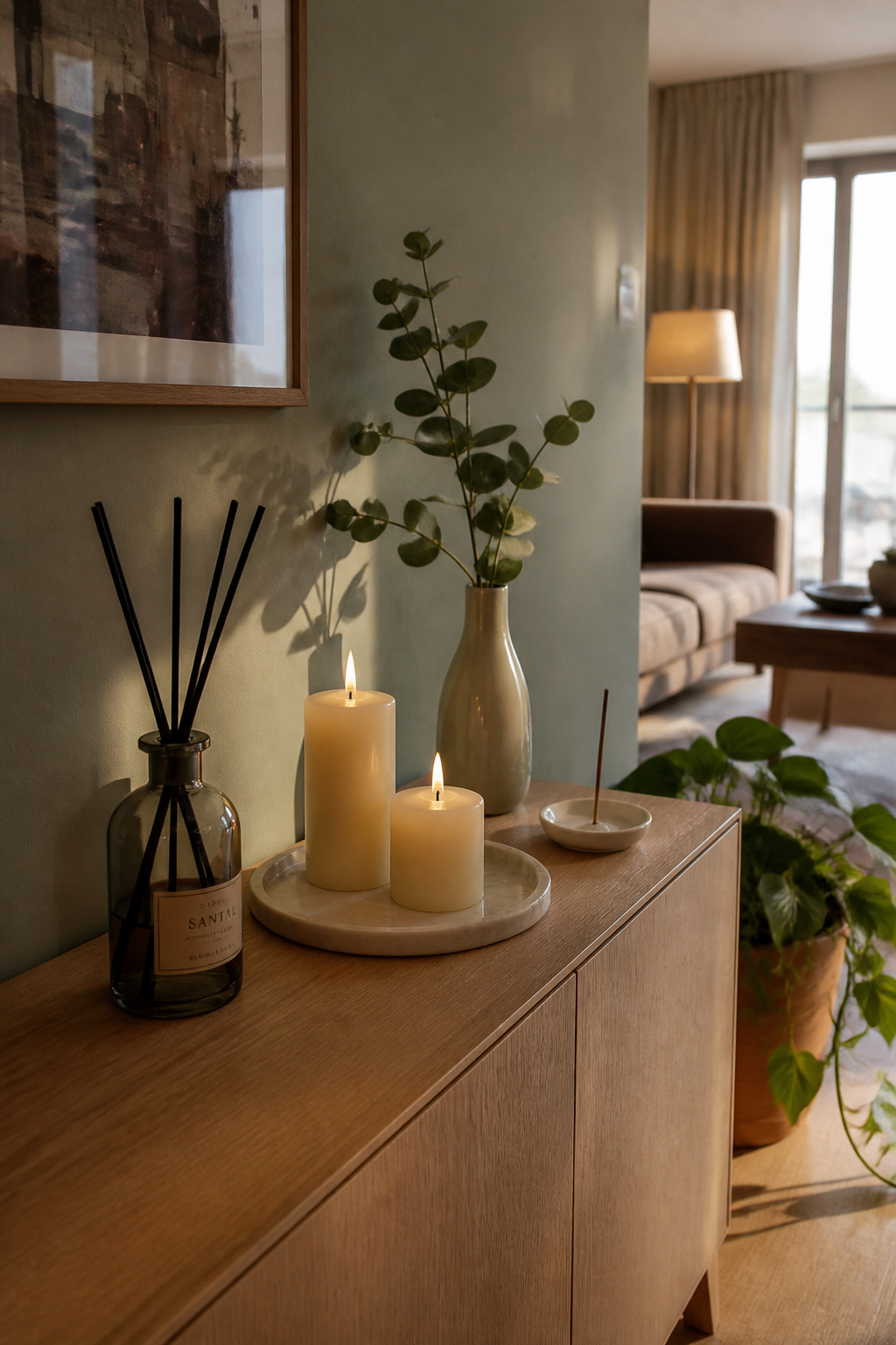
The framework is simple. The living room gets a social scent — welcoming and warm without being cloying. Fig, sandalwood, neroli, and light amber all work in this register. The bedroom gets a sleep-supporting scent: lavender’s link to cortisol reduction is well-documented in sleep research, and cedarwood and vetiver sit in the same calming category. The bathroom belongs to clean, fresh notes — eucalyptus, white tea, light citrus. If you work from home, rosemary has shown up in cognitive-performance studies as genuinely focus-supporting (not just pleasant), and lemon and green tea sit nearby in the focus-without-stimulation register.
Choosing Between Candles, Diffusers, and Room Sprays
Reed diffusers are the continuous background layer — low-intensity fragrance for hallways, bathrooms, and entryways where you want a consistent note without active management. A bottle lasts 2-3 months per fill. Candles are tools for intentional moments: lighting one to mark the start of an evening or a dinner creates a sensory signal that the transition has happened. Warmer notes (woods, amber, vanilla) perform better through candle heat — the warmth brings rich base notes forward in a way cold diffusion can’t replicate. Room sprays are the reset tool, not the primary layer: two or three sprays before guests arrive, or after cooking, to bridge back to the intended room scent.
14. Curtains Hung High and Wide to Amplify Natural Light
This is one of the simplest apartment decorating ideas on the entire list, and one of the most visually impactful. Hanging curtain rods at ceiling height — rather than the standard few inches above the window frame — creates an unbroken vertical line from ceiling to floor. In a standard eight-foot room, a rod mounted 2-4 inches below the ceiling with floor-length curtains adds a perceived 18-24 inches of ceiling height. A 28-inch window reads as significantly taller and wider when the curtains extend from ceiling to floor and stack 8-12 inches off the glass on each side when open.
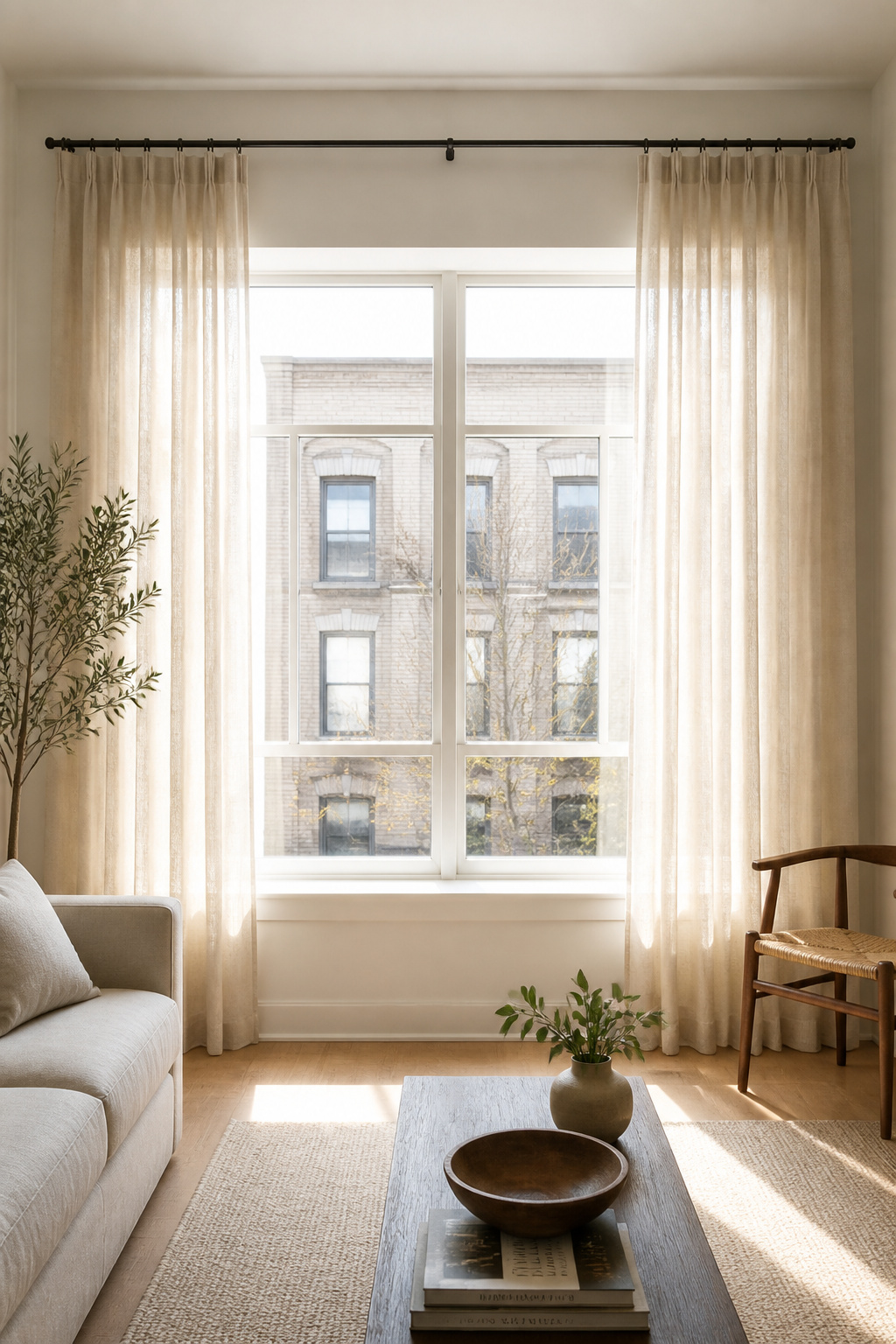
Floor-length curtains should hover ½ inch above the floor for a clean, tailored look, or puddle 3-6 inches for an intentionally relaxed effect. Curtains that stop mid-wall, at the sill, or at some arbitrary point between feel unfinished regardless of the fabric quality. Rod width should extend 8-12 inches beyond the window frame on each side so the curtains stack off the glass entirely when open, keeping the window fully clear for light.
For renters, spring tension rods (up to 30 lbs capacity) work well for lightweight sheers in narrower spans. Adhesive curtain rod brackets hold lightweight rods with no holes; for heavier panels, small brackets screwed into the wooden window trim leave a 3mm hole that fills cleanly with white toothpaste on move-out — the most consistently landlord-accepted approach. Blackout-lined panels in a heavier fabric give you the privacy of blackout without the institutional appearance of pure blackout fabric; the lining is hidden inside a piece that reads as linen or velvet from the front.
15. Color Psychology Paint Choices for Every Apartment Decorating Goal
Paint remains the most cost-effective room transformation available — a £40 or $50 tin, a weekend, and a room’s entire psychological character changes. These are the apartment decorating ideas where Taylor’s expertise in colour psychology is most directly applied: specific hues have measurable effects on cortisol, heart rate, and cognitive performance, and the difference between a room that supports what you do in it and one that works against you is often a single colour choice.
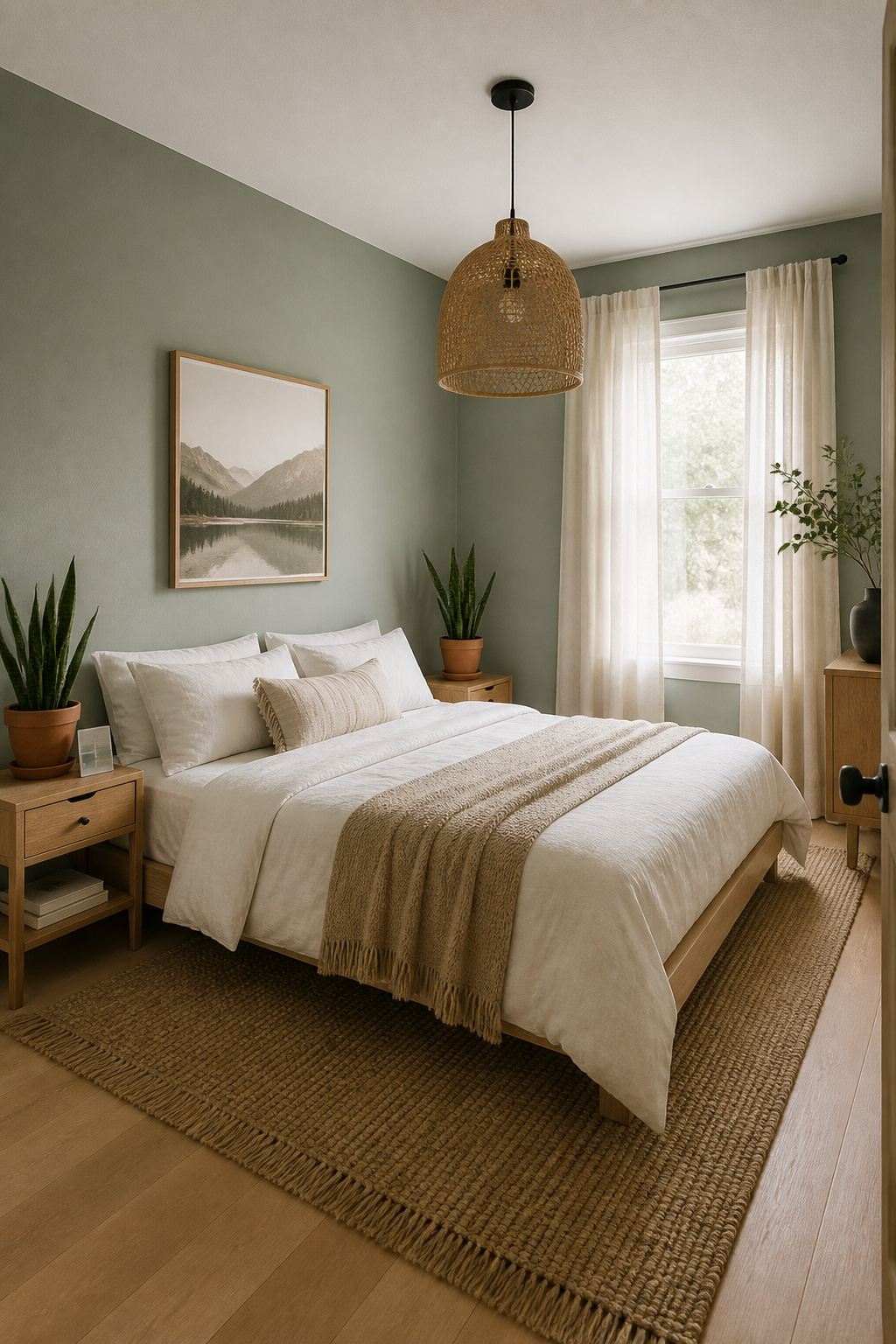
For bedrooms, the goal is cortisol reduction and melatonin support. Benjamin Moore Gray Owl (OC-52) and Pale Oak (OC-20) score consistently in sleep-environment research. Farrow & Ball Inchyra Blue (No. 289) is the deeper alternative for renters who want something more envelope-like. For living rooms, Benjamin Moore October Mist (1495) and Sherwin-Williams Evergreen Fog (SW 9130) have dominated 2025-2026 precisely because they lower heart rate measurably compared to white walls while reading as sophisticated rather than colourful. Dark, saturated walls — deep navy, forest green — in home offices improve focus and reduce eye strain by narrowing the contrast between screen and surroundings.
Testing Before Committing
Sample testing is the step most people skip and most often regret. Paint a 12×12 inch sample directly on the wall — not on white card — in every corner of the room. A colour that looks right in a south-facing corner can read entirely differently in a north-facing one. View the sample at three points: morning natural light, midday sun, and evening artificial light. A colour that fails any one of those conditions is the wrong choice for that specific room. Before painting at all, check the lease clause: most residential leases either prohibit painting or require returning to the original colour, which in practice usually means any standard builder’s white. For the full decision-making framework, how to actually choose a bedroom paint color covers the process in the depth it deserves.
Your Apartment Decorating Plan: Where to Start and What to Prioritise
These fifteen apartment decorating ideas sit at different points on the effort-to-impact spectrum, and the practical order of operations matters.
Start with the foundations: lighting, rugs, and curtains. These three elements define the room’s spatial architecture and make every subsequent styling choice easier. Hang the curtains high. Upgrade the light sources. Lay the rug that actually fills the floor. These changes happen in a weekend and last for years. Most apartments that feel under-decorated are actually looking at a lighting and proportion problem, not a styling deficit.
Phase two is personality: the gallery wall, the plants, the bar cart, the textural cushion layers. These add character and identity on top of the foundation you’ve established. They’re also the most reversible decisions — if a gallery wall arrangement doesn’t work, you try another. If the bar cart is better in the bedroom, you roll it there.
Phase three is commitment: paint, a statement sofa, modular storage sized for the apartment. These are worth taking seriously, and the best time to make them is after you’ve lived with phases one and two for a few months. The apartment will teach you where the light falls, how you actually use the space, and which rooms you need most from — information that changes paint colour decisions more than any colour chart or online guide ever will.
The apartment decorating ideas that last are always the ones grounded in how you actually live, not just in what looks good in photographs. Start with the right foundations, layer with intention, and the space will become a place that genuinely works for you.