I almost talked myself out of it twice. The kitchen felt too risky — too much grease, too much humidity, too many people telling me that wallpaper and kitchens don’t mix. Then I rolled out a sample of a simple linen-textured paper on the wall behind the open shelves, stepped back, and understood immediately why kitchen wallpaper ideas on a budget deserve more attention than they get. The room stopped looking like a kitchen and started looking like *my* kitchen.
What I’ve learned from years of helping families rethink their cooking spaces is that the kitchen wall is the most underused canvas in the home. Paint does a lot, but it can’t bring warmth, texture, or genuine personality the way wallpaper can. And with today’s options — peel-and-stick removable papers, ultra-durable vinyl, half-wall dado techniques, and print-on-demand services — you genuinely don’t have to spend much to make a lasting difference. Most of these kitchen wallpaper ideas on a budget will cost you less than a new faucet.
Here are 17 ideas that work across kitchens of every size, style, and budget level. Whether you rent, own, or are somewhere in between, at least a few of these will make you look at your kitchen walls differently.
1. Peel-and-Stick Removable Wallpaper for Budget Kitchen Makeovers
If you’ve been avoiding wallpaper because you rent, or because you’re simply not ready to commit to something permanent, peel-and-stick has changed everything. The format exists in a completely different category from the traditional paste-and-pray installation experience — it goes up without special tools, comes down cleanly when you’re ready for a change, and has become genuinely sophisticated in its range of patterns and finishes.
The key is material. Look for PVC or vinyl in at least 6 mil thickness — thinner options are harder to align, more prone to edge lifting near a stove, and less durable against kitchen humidity. Surface prep matters enormously: clean the wall with a degreaser before you start, not just a damp cloth. Grease residue is invisible but stops the adhesive bonding properly — you’ll discover this the hard way if you skip that step.
Brands worth knowing: Tempaper (300+ prints, consistently strong adhesive), Rifle Paper Co. (hand-painted florals on non-woven material), and Love vs. Design (kitchen-specific options from around $20 per roll). For most accent walls — 8 by 10 feet — you’ll need two to three rolls. For a full small kitchen, budget for eight to twelve. Always make it a two-person job: one holds the roll, one smooths from the centre outward. Air bubbles happen when the paper meets the wall at an angle; a second pair of hands almost entirely prevents them.
2. Vintage Floral Patterns That Make Small Kitchens Feel Inviting
There’s a reason vintage florals keep coming back to kitchens. They have a relaxed, slightly faded quality that suits the lived-in character of a room where you cook, spill, and gather. Modern florals with sharp lines and saturated colour can feel too precise — too finished for a space where someone is always slicing garlic or rolling pastry. Vintage florals feel at home because they already look a little lived-in themselves.
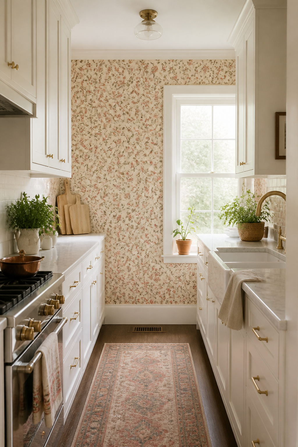
Pattern scale is the decision most people get wrong. In a galley kitchen or any space with limited uninterrupted wall between upper and lower cabinets, a large-scale repeat gets chopped by cabinetry and looks unfinished. Stick to small ditsy prints (pattern repeat under 4 inches) in tight spaces; they read as texture from a distance and reveal their detail up close. You can use medium or large patterns only when you have a continuous wall of at least 4 feet uninterrupted.
For cabinet pairing, white or cream shaker fronts are the natural match — they let the pattern breathe. Brass hardware is consistently the better choice over brushed nickel for vintage florals. If there’s a dominant colour in the wallpaper — sage green, dusty rose, ochre — consider carrying that colour through the cabinet paint for a genuinely curated result. For anyone working with limited wall space, affordable kitchen wallpaper in a small-scale vintage floral is one of the best investments you can make; look at small kitchen decor ideas to see how pattern decisions play out in compact kitchens.
3. Subway Tile-Print Wallpaper as a Backsplash Alternative
Real subway tile backsplash installation runs $1,000 to $3,000 once you include materials, grout, and labour. A vinyl tile-print wallpaper covering the same area costs $60 to $150 and can go up on a Saturday morning. The trade-off is obvious, but the quality of today’s tile-look wallpapers has narrowed the visual gap considerably.
For kitchen use, look specifically for acrylic-coated vinyl or fabric-backed vinyl rated for kitchen environments. This material can be wiped down with mild soap and typically lasts 5 to 7 years with routine care. Smart Tiles (Canadian-made since 1999) and Target’s Threshold subway tile peel-and-stick option (27.5 sq ft coverage, stain-resistant, washable) are reliable starting points. One hard rule: don’t place non-rated wallpaper directly behind the stove. Heat and grease splatter will ruin it within months.
Grout colour changes the character completely. White grout is the classic choice — it photographs brightest and reads as cleanest. Grey grout looks more realistic and hides minor wall imperfections better. Dark grout gives an industrial quality that pairs well with matte black fixtures. If you’re still deciding between wallpaper and actual tile, comparing all your kitchen backsplash ideas side by side will help you commit based on your renovation timeline and total budget.
4. Affordable Kitchen Wallpaper in Warm Neutral Tones
Not every kitchen wall needs a statement. Sometimes the most powerful move is to add depth and texture in a tone that works with everything — and warm neutrals do that better than any other category in the kitchen.
Pure white walls under warm kitchen lighting often read as slightly yellow or flat. Cream, linen, and warm greige avoid this problem entirely by shifting warmly rather than yellowing. In practice, warm greige is the most versatile of the group — it bridges cool stainless steel appliances and warm wood elements without requiring either to change. There’s also a quiet benefit easy to overlook: warm neutral kitchen wallpaper ideas on a budget make food colours and produce look more vibrant. Stand back in a kitchen with creamy warm walls and compare it to the same room in clinical white.
Textured neutral wallpapers — linen weave, grasscloth look, or a subtle tone-on-tone geometric emboss — add visual depth without any colour commitment. The texture catches light differently throughout the day, giving the room a quality that flat paint simply can’t replicate. For kitchen use, always check for ‘scrubbable’ or ‘washable’ on the label; non-coated textured papers absorb steam and grease. LVSHI’s peel-and-stick grasscloth-look in ivory white or greige (Amazon, 24 inches by 394 inches per roll for under $30) is one of the most accessible options. If you’re thinking about how warm neutral wallpaper fits into a broader plan, understanding your kitchen’s overall kitchen colour schemes is the right starting point.
5. Bold Geometric Patterns for a Modern Kitchen Feel
A bold geometric accent wall delivers what most kitchen renovations promise but few achieve at budget prices: a design moment that makes people stop and look. The key word is *accent* — one wall, not four.
Hexagon, chevron, and diamond geometrics have particular strength in kitchens because they echo the geometric logic of tile, cabinetry lines, and hardware already present. Black-and-white geometrics are the most-photographed choice: the contrast is legible in all lighting conditions, from morning sun to evening overhead light. And the impact is renovation-level for the price of a few rolls of wallpaper.
Scale selection is where geometric kitchen wallpaper ideas on a budget succeed or fail. Large-scale geometrics (8+ inch repeat) need an uninterrupted wall of at least 4 feet. Small-scale geometrics (under 3 inches) can cover multiple visible walls in a small kitchen without becoming overwhelming. The medium range, 4 to 6 inches, suits the typical 36 to 48-inch gap between counter and upper cabinet and is the safest starting point. Pair the wallpaper with solid, matte cabinet fronts — shaker or slab doors in white or warm grey. The pattern needs a quiet companion, not competition. For anyone working in a genuinely compact kitchen, small kitchen design ideas will show how other designers have handled the single-wall strategy in tight spaces.
6. Shiplap-Look Wallpaper for Farmhouse Kitchen Style
Shiplap became the defining surface of farmhouse kitchen design over the past decade — crisp horizontal boards, whitewashed, running the length of the kitchen. Real shiplap runs $2 to $7 per square foot including labour and requires a weekend of serious work. Shiplap-look wallpaper achieves the same visual in an afternoon.
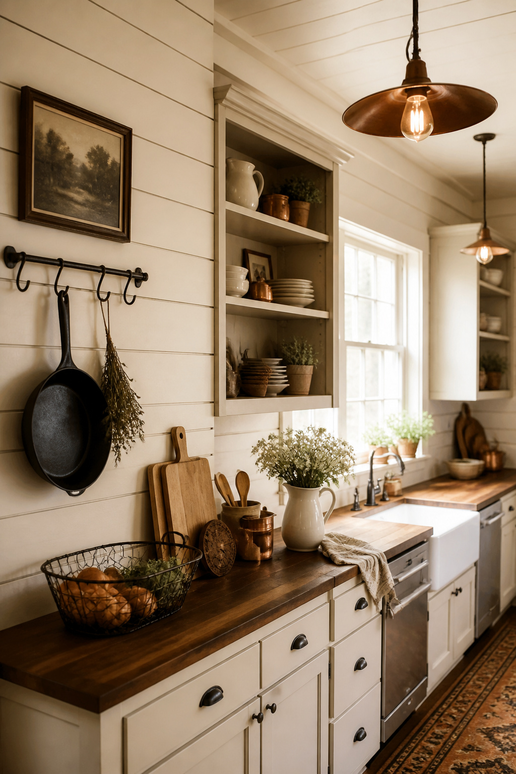
Seabrook Designs’ PW20000 is the most-discussed option in the renovation blogging community: a paintable, unpasted faux shiplap available at Home Depot for approximately 57.5 square feet per roll. What makes it genuinely useful is the paintability — it uses a high-puff ink that absorbs any standard interior latex paint, applied immediately after installation or years later when you want a colour change. Walls By Me and James and Colors offer peel-and-stick horizontal shiplap alternatives for renters who need clean removal.
Horizontal shiplap is the traditional farmhouse orientation — it makes narrow kitchens feel more expansive. Vertical shiplap gives a taller, more colonial character and provides low-ceiling kitchens some visual lift. For painted shiplap wallpaper, popular kitchen colours are White Dove (Benjamin Moore), Alabaster (Sherwin-Williams), and Simply White — each reads differently under different kitchen lighting, so test a sample first. Use water-based latex paint only; oil-based paints prevent the paper from breathing and can cause edge lifting. For anyone building out the full farmhouse look around this affordable kitchen wallpaper choice, farmhouse kitchen ideas covers the complementary decisions well.
7. Budget-Friendly Kitchen Wallpaper With Dramatic Color Pops
When the cabinets represent a significant investment, painting them is a commitment most people aren’t ready to make. Wallpaper is the workaround — it introduces a bold colour to the kitchen without touching a single cabinet door, and you can change it if the relationship doesn’t work out.
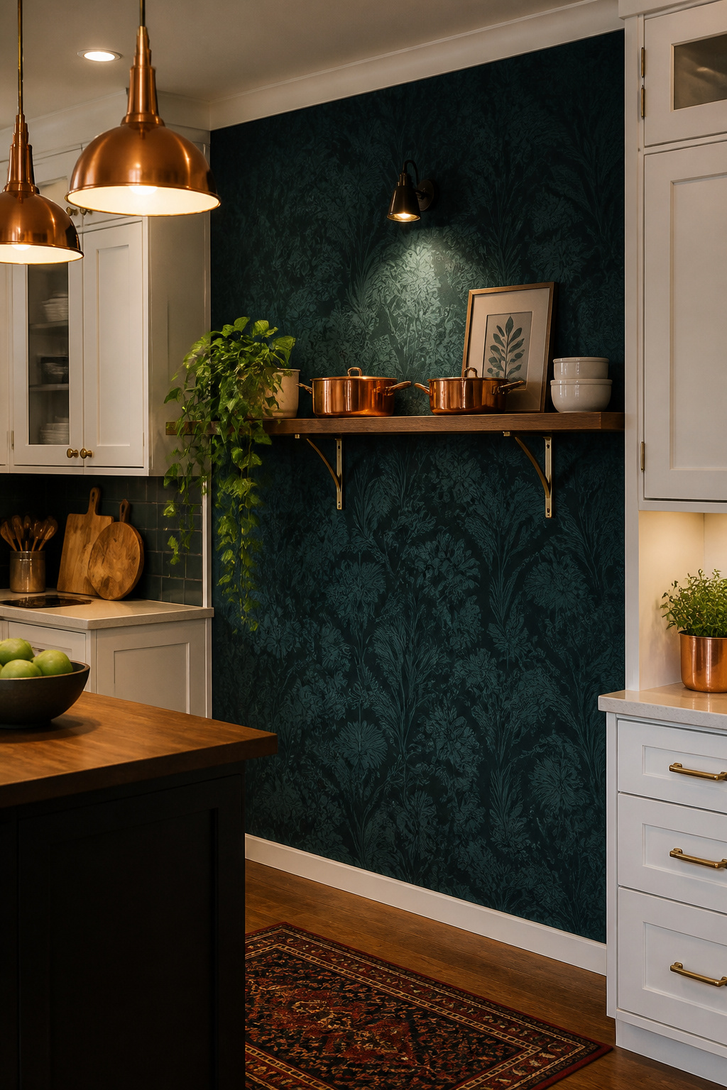
Deep teal, terracotta, and forest green are the three colours that have consistently proven their worth in kitchen wallpaper applications. Teal pairs naturally with copper pendant lighting, warm brass hardware, and cream countertops — a combination that’s dominated kitchen editorial photography for years. Terracotta connects to the warmth of clay cookware and timber shelving; forest green makes the kitchen feel grounded and alive. Dark navy and charcoal can be dramatic in kitchens with strong natural light, but in darker kitchens they risk reading as oppressive.
The 60-30-10 rule is useful here: neutral cabinetry takes 60%, the budget-friendly kitchen wallpaper reads as the 30% secondary element, and metallic hardware accounts for the 10% accent. White or warm cream shaker cabinets are the universal counterbalance. Keep countertops in light, relatively quiet stone or quartz when the wallpaper is working hard — adding a busy countertop pattern creates visual competition that neither wins. For anyone considering whether the wallpaper colour should inform the cabinet direction, this guide to green kitchen cabinet ideas shows how designers build bold kitchen colour stories from the ground up.
8. Botanical and Herb Print Designs for Cottage Kitchens
The kitchen is the one room in the house where a nature-themed print makes genuine sense. Botanical wallpaper in a bedroom feels decorative; in a kitchen, the connection between garden, harvest, and cooking gives the pattern a logic it earns rather than borrows.
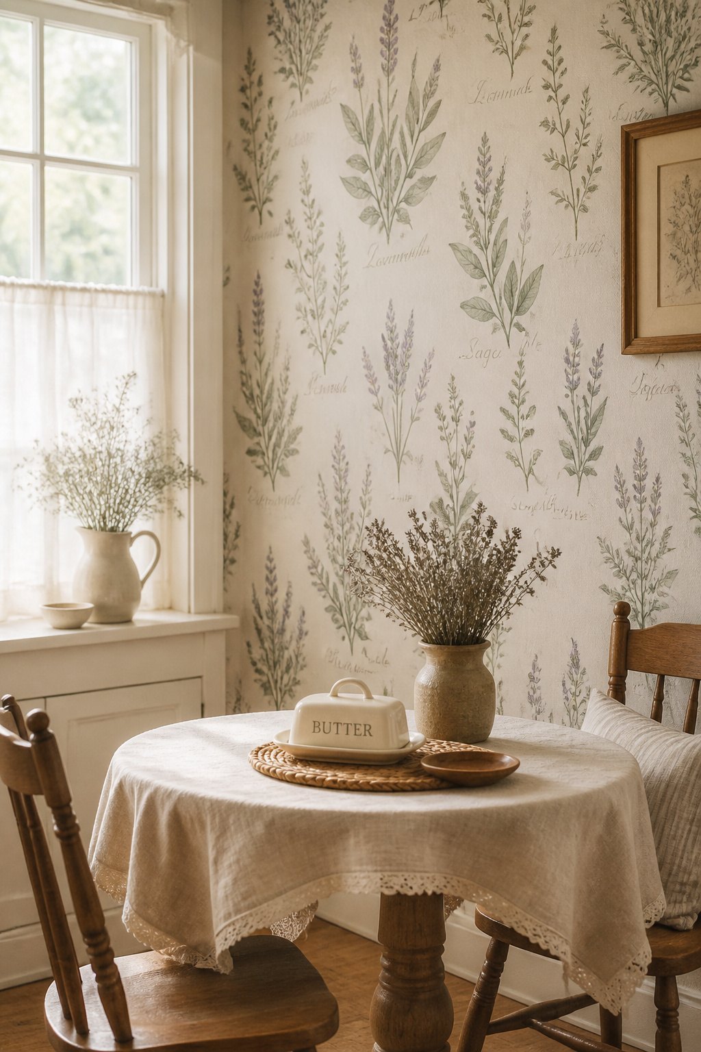
Illustrated herb prints — sage, thyme, rosemary, lavender — are the strongest choice for cottage kitchens. The key is illustration style: vintage botanical engravings in the Royal Horticultural Society tradition read as sophisticated; bright clip-art vegetables on white backgrounds read as novelty decor. There’s a large gap between those two categories, and it’s worth taking time to find something with visual depth. Soft green stems on cream or off-white grounds photograph well under any kitchen lighting and pair with almost any cabinet colour. Milton & King and York Wallcoverings both carry kitchen-appropriate botanical ranges that sit firmly in the first category.
Placement restraint is what separates botanical wallpaper that looks considered from botanical wallpaper that looks accidental. The wall behind a breakfast nook or kitchen table is the highest-impact position — you look directly at it while eating. Pantry interiors are the most surprising choice: a botanical-papered pantry discovered when you open the door is a genuine moment. Inside glass-front cabinet backs is another option — the pattern glimpsed through glass adds depth without committing to a full wall. What you want to avoid is botanical wallpaper on all four kitchen walls, where it reads as theme rather than decision.
9. Checkerboard Wallpaper That References Classic Floor Tile
The black-and-white diner floor is one of the most enduring images in American kitchen design — and checkerboard wallpaper brings that graphic energy to a vertical surface where it can be used more selectively and more affordably than floor tile.
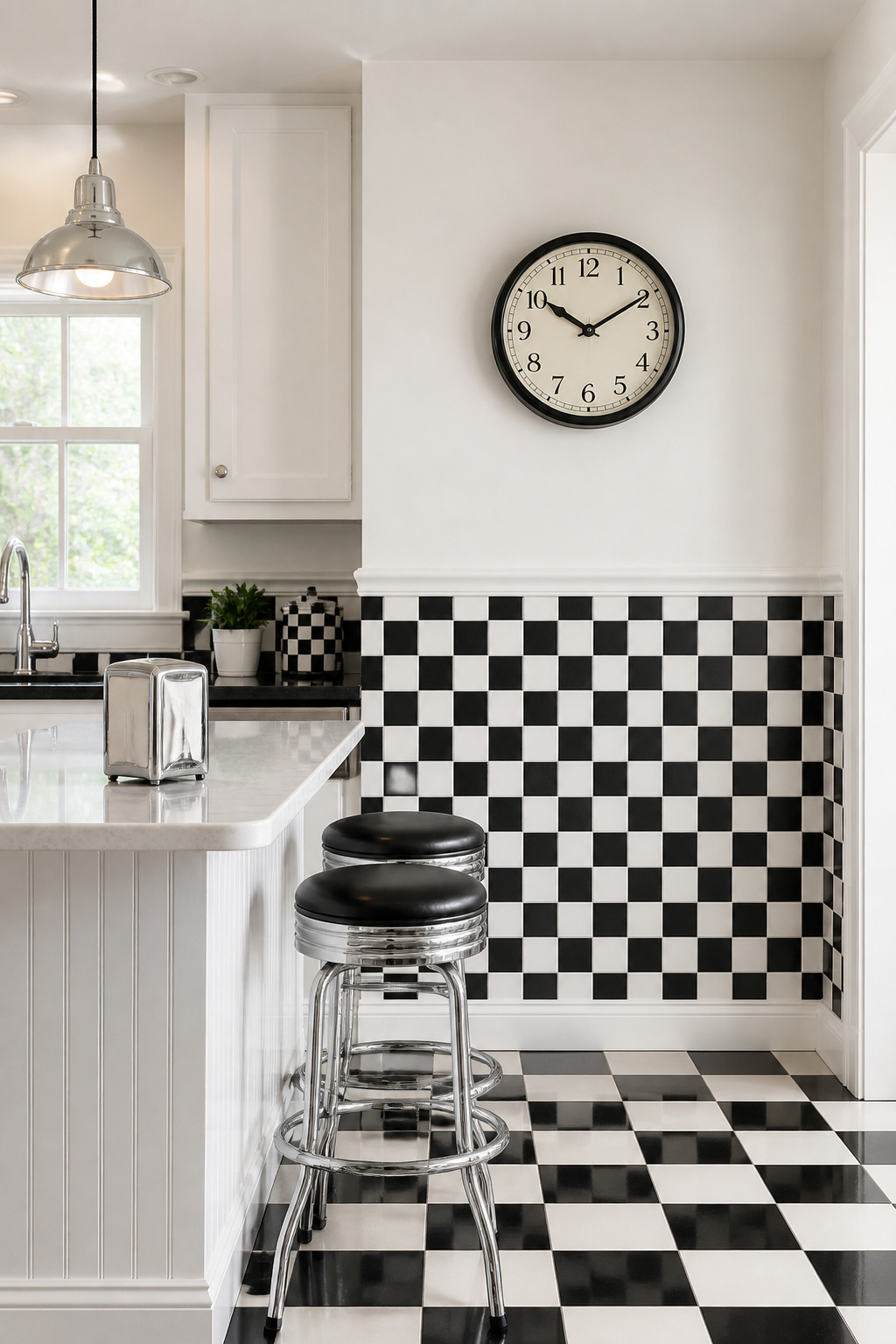
The retro revival of checkerboard in 2025 kitchens is driven by its dual identity: simultaneously nostalgic (the 1940s and 1950s diner) and freshly graphic (the current shift away from all-white minimalism). Black-and-white checkerboard is the boldest version — it commands the room and requires everything else to stay solid. Turquoise-and-white or orange-and-white delivers the diner feel with more warmth and playfulness. Mint green and cream is the softest variant — beautiful with natural wood and rattan accessories without the graphic intensity of the monochrome version.
The half-wall dado application is where checkerboard wallpaper is most effective and most cost-efficient. Running it from the baseboard to a chair rail at approximately 36 inches creates an authentic diner reference — visually contained and half the material cost of a full-height treatment. A chrome or brushed nickel chair rail reinforces the diner aesthetic far better than a painted wooden rail. One firm rule: one pattern per kitchen. If you have checkerboard walls, the backsplash tile should be solid or very quiet. Layering two strong patterns in the same room always reads as if the kitchen renovation design was trying too hard.
10. Grasscloth-Look Wallpaper for Texture Without the High Price
Real grasscloth wallpaper — woven from seagrass, jute, or sisal — costs $8 to $20 per square foot and is deeply unhappy in kitchens. It absorbs moisture, stains readily, and doesn’t survive cooking humidity. Vinyl faux grasscloth solves every one of those problems while maintaining the tactile warmth of the original.
The quality gap between natural and faux has closed significantly. Premium faux grasscloth options from Mayflower Wallpaper and Walls Republic deliver a woven texture that’s visually indistinguishable from the real thing in a finished kitchen photograph. What you gain over natural grasscloth: it’s washable, humidity-resistant, and scrubbable — a grease splash wipes clean rather than leaving a permanent mark. LVSHI’s peel-and-stick grasscloth-look in ivory white or greige (Amazon, under $30 per 24-inch by 394-inch roll) is one of the most reviewed accessible options. It’s genuinely one of the most satisfying affordable kitchen wallpaper choices available right now.
Adding Warmth to White Cabinetry
Against all-white shaker fronts — the most common kitchen cabinet situation — a warm beige or natural grasscloth texture breaks the monotony without introducing competing colour. The woven pattern catches light differently throughout the day, giving the room a living quality that flat paint and smooth vinyl simply can’t replicate. Rattan pendant lights, woven bar stools, and wicker baskets all complement grasscloth texture naturally.
Two practical notes: always check for the ‘scrubbable’ label before purchasing — faux grasscloth without a protective coating absorbs kitchen grease. Keep it away from the wall directly behind the stove — even vinyl degrades under consistent oil and heat exposure. Use it on opposite or side walls where it can be appreciated rather than abused. If you’re also reconsidering your kitchen cabinet ideas alongside the wallpaper, the grasscloth look is particularly compatible with white, cream, or pale wood fronts.
11. Vertical Stripe Patterns That Add Height to Low-Ceiling Kitchens
A kitchen with 7.5-foot ceilings — or lower — needs all the visual help it can get. Vertical stripe wallpaper is the most reliable intervention available and requires no renovation, no structural work, and no professional installation.
The mechanism is well-documented: the eye follows vertical lines upward, and the perceived ceiling height is the point where those lines terminate at the ceiling — not the actual height. Vertical stripe wallpaper consistently makes rooms feel significantly taller. The effect is strongest with high-contrast or gloss-finish stripes. This is the single most effective wallpaper choice for kitchens with low ceilings — far more effective than paint alone, and among the most practical kitchen wallpaper ideas on a budget for tight spaces.
For the strongest height illusion, choose thin stripes (half an inch to one inch wide) in light colours. Wide-band stripes (3+ inches) have a bolder graphic quality but a less pronounced height effect. Colour combinations that work best: white-and-cream (most versatile, doesn’t compete with kitchen surfaces), navy-and-white (coastal reference, pairs beautifully with brass hardware), and sage green-and-white (farmhouse and Mediterranean kitchens). One installation note: the stripe must run all the way to the ceiling without a border or stopping point. Terminating below the ceiling line breaks the upward movement and undermines the entire effect. Small kitchen owners should also look at small kitchen renovation tips for additional strategies that compound well with stripe wallpaper for maximum perceived space.
12. Vintage Recipe and Food-Themed Wallpaper for Playful Kitchens
Every kitchen deserves at least one moment of genuine personality, and food-themed wallpaper is the most direct expression of what a kitchen is actually for. It would be eccentric in a bedroom; in a kitchen, it makes complete sense.
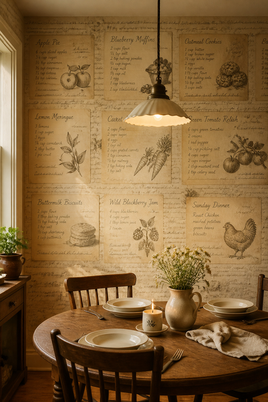
The difference between charming and kitschy lives entirely in the illustration style. Vintage botanical engravings of strawberries, citrus cross-sections, and asparagus — rendered in the manner of 18th-century horticultural plates — read as art and sit comfortably in kitchens with white or cream cabinetry. French bistro menu typography (hand-lettered wine lists, chalkboard-style dish descriptions in a weathered serif) works beautifully in open kitchen-dining spaces. Recipe card wallpaper in a sepia or aged-parchment palette carries strong nostalgia appeal, particularly for farmhouse and cottage styles.
Restraint is the discipline that makes food-themed wallpaper work. The safest placement is a single wall — behind the kitchen table, at the end of a galley, or inside a pantry. Pair the wallpaper with solid, unbranded accessories: plain white ceramics, natural wood cutting boards, simple cotton textiles. Let the wallpaper make the statement once, clearly, and everything else stays calm. Where it goes wrong is when the theme multiplies across surfaces — themed wallpaper plus themed dishware plus themed tea towels creates a gift-shop effect that no one intends.
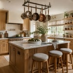
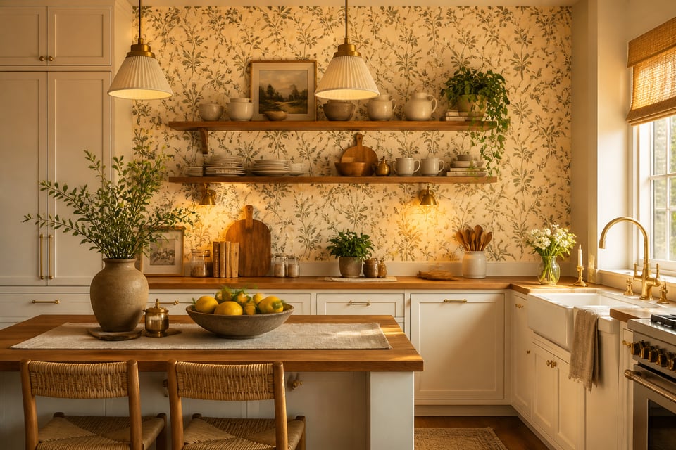
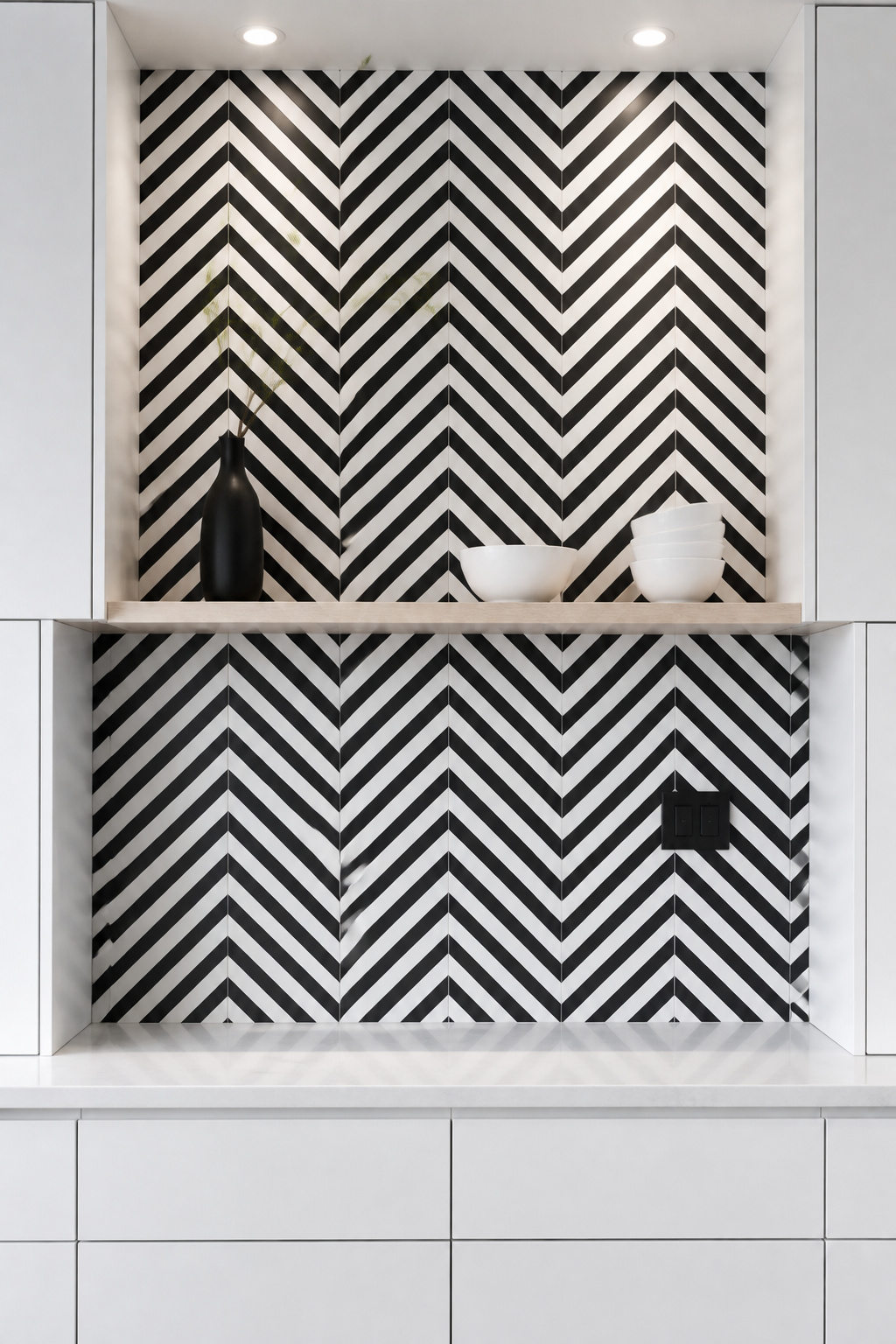
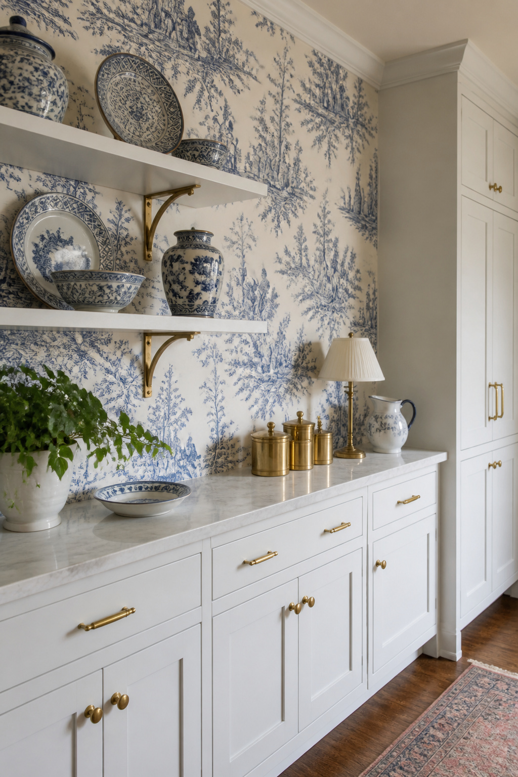
13. Affordable Kitchen Wallpaper for Accent Walls Behind Open Shelving
Of all the places wallpaper can go in a kitchen, the wall behind open shelves is the single highest-impact position. The shelves frame it like a gallery installation — you see the pattern in the spaces between objects, partially obscured and then revealed, creating a layered composition more interesting than either element alone.
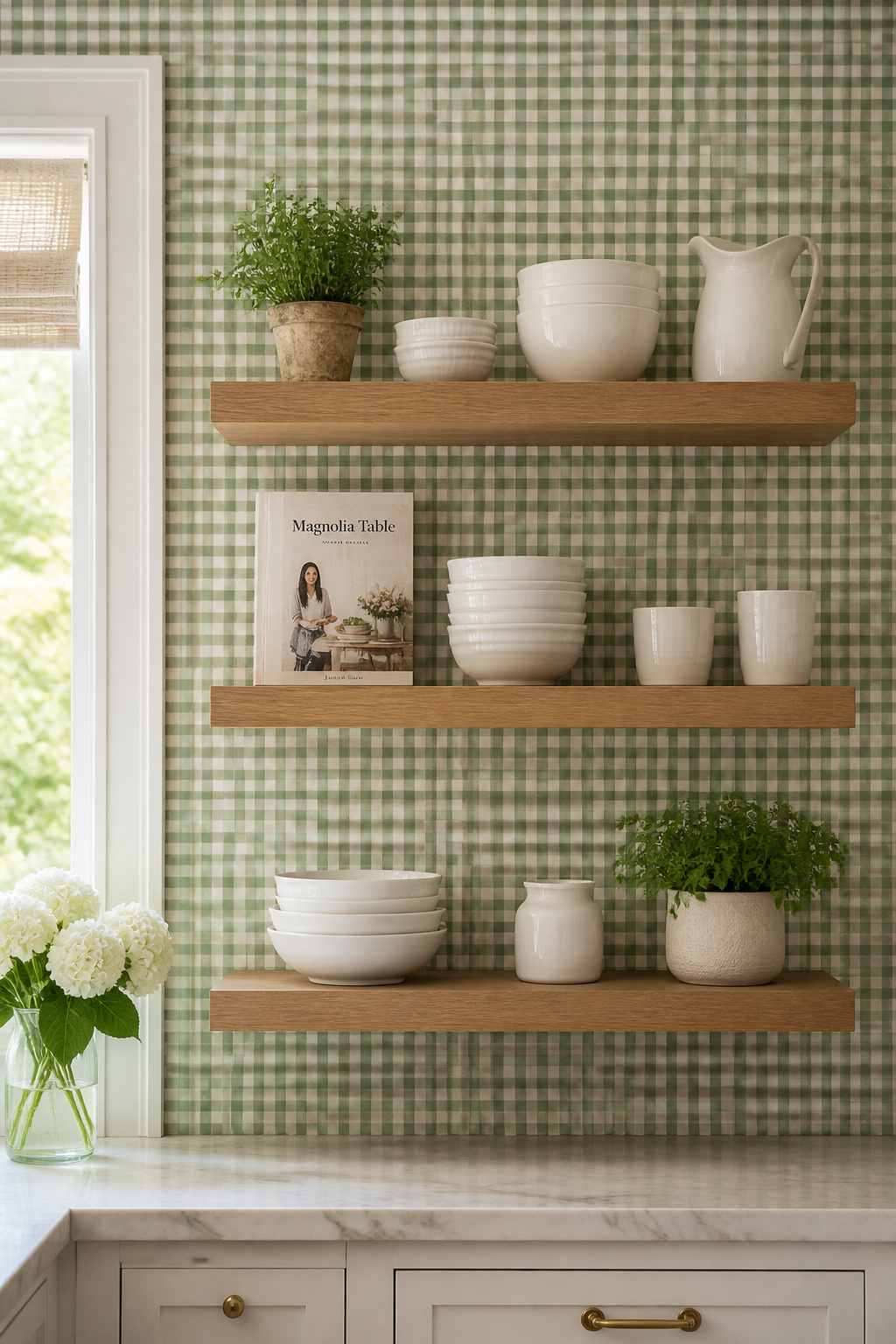
The other reason to start here: cost. A typical open-shelving accent wall measures approximately 4 feet wide by 6 feet tall — 24 square feet. One double roll of most wallpapers covers this entirely. Even at $40 per roll, the total material cost is $40 to $80. That’s the most transformative $80 available in kitchen decorating, and peel-and-stick options make it risk-free.
The pattern choice depends on what lives on the shelves. If you display colourful ceramics or patterned dishware, the wallpaper should be quiet — a solid colour, a subtle texture, or a very small-scale print. If the shelves hold white ceramics or simple glass, the wallpaper can do the visual work: a bold botanical, a tight geometric, a vintage floral. Gingham and check patterns in small scale are the most consistently successful choice for kitchen shelf backing — structured enough to hold their own but not so busy they fight the objects in front. The full spectrum of kitchen wallpaper ideas on a budget for accent positions is worth exploring in this collection of kitchen wallpaper ideas from across the site.
14. Blue-and-White Patterns for Timeless Kitchen Character
Blue and white in the kitchen isn’t a trend. It’s a tradition that traces to 17th-century Delft tile — the Dutch convention of hand-painted blue ceramic kitchen walls that established a design logic still operating four centuries later. French toile de Jouy (pastoral scenes in blue on cream ground) brought the combination to wallpaper; British gingham and ticking brought it to textiles. The colour relationship has been tested longer than most design philosophies and has never genuinely dated.
Contemporary blue-and-white kitchen wallpaper has moved well beyond figurative toile scenes. Abstract interpretations — painterly blue strokes on white, indigo shibori-look patterns, watercolour washes — bring the same colour authority in a language that’s current. Indigo-dye effect wallpapers referencing Japanese shibori or batik traditions photograph beautifully and feel genuinely global and textured. Navy-and-white ticking stripe remains the most enduring budget option — clean, timeless, and compatible with almost any kitchen style.
Blue tone matters more than most people realise. Navy and cobalt hold their saturation under both warm incandescent bulbs and natural daylight. Powder blue and sky blue can wash out badly under warm kitchen lighting, reading closer to lavender than blue. French blue — a mid-tone, slightly greyed blue — is perhaps the most universally flattering: sophisticated in photos, warmer in person, and subtly different in morning versus evening light. If you’re also considering actual tile to pair with blue-and-white wallpaper, farmhouse kitchen backsplash ideas will show you which tile patterns work best alongside a strong wallpaper.
15. Art Deco Patterns That Make Kitchen Walls Feel Curated
Art Deco geometry has an interesting relationship with kitchens. Its vocabulary — chevrons, sunbursts, fans, diamonds — references the geometric logic of tile work, cabinetry, and architectural hardware already present in the room. Where Art Deco can feel theatrical in a living room, in a kitchen it reads as a natural extension of the existing geometric language.
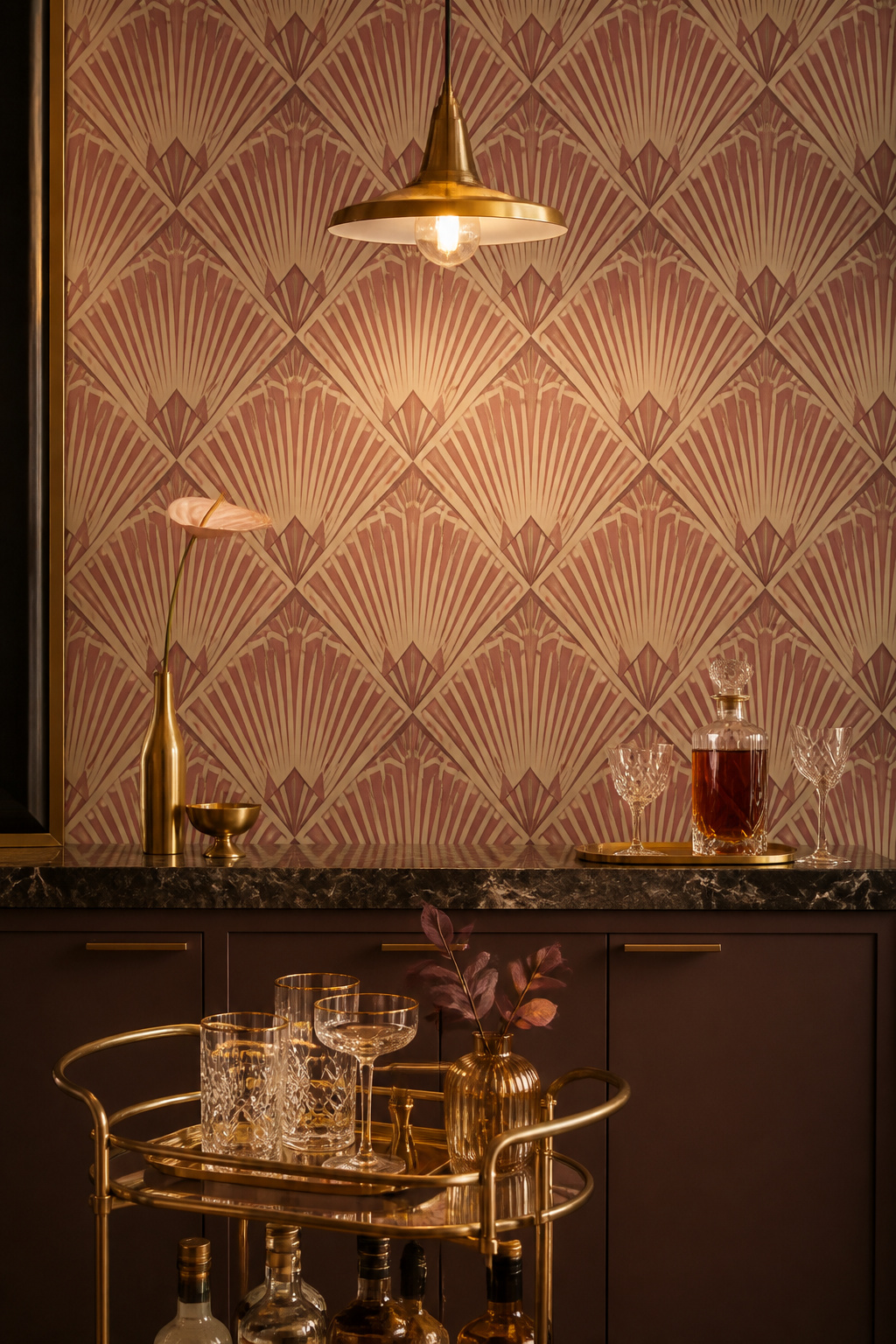
The scale you choose changes the character completely. Gold-and-black Art Deco at full intensity is maximalist and glamorous — it works best in kitchens with dark cabinetry or as a bar cart backdrop, not as an all-kitchen treatment. Muted Art Deco palettes in dusty rose, sage green, or warm cream have a sophisticated quality that’s far more liveable daily. Graham & Brown’s Art Deco collection and Rebel Walls (180+ designs) sit in accessible territory; ONDECOR offers removable peel-and-stick versions in gold-black geometric patterns for those who want the drama with the option to retreat.
For affordable kitchen wallpaper in an Art Deco direction, Spoonflower is the standout resource: hundreds of independent designs available in custom sizes, printed on non-woven or peel-and-stick material, starting at around $15 to $22 per foot of yardage. You order exactly the square footage needed — no waste, no leftover rolls. Anyone exploring Art Deco kitchen wall treatments will find excellent visual reference in this guide to modern kitchen wallpaper ideas. One sizing caution: Art Deco motifs with large pattern repeats (8+ inches) get clipped by upper cabinets. Aim for a 4 to 6-inch repeat for typical kitchen wall spaces.
16. Kitchen Wallpaper on a Budget: The Half-Wall Dado Technique
The dado — the lower portion of the wall running from baseboard to a chair rail at approximately 36 inches from the floor — is the most cost-effective wallpaper technique available and one of the most underused in kitchen design.
The arithmetic is straightforward: papering below the dado rail uses roughly 40 percent of the wallpaper of a full-height treatment. A project that would cost $150 in materials at full height becomes $60. The painted chair rail between the wallpaper and the upper painted wall creates an architectural detail that makes the room look more considered. Basic MDF chair rail moulding runs $1 to $3 per linear foot; fitting it takes about two hours in most kitchens. Paint it in a colour pulled from the wallpaper pattern. Alternatively — and this costs essentially nothing — a wide painter’s tape border and a painted faux rail delivers the same visual effect at zero material cost.
Choosing the Right Pattern for Dado Height
Pattern choice matters for dado-height wallpaper. Non-directional allover patterns work best because they don’t look accidentally cropped at the chair rail line. Strong horizontal elements — wide stripes, shiplap planks, wainscot-look panelling — read as deliberately chosen for half-wall application. Bold or large-scale patterns that would overwhelm a full wall become much more manageable at dado height; the chair rail contains the visual energy and turns a potentially excessive pattern into a confident choice.
Directional patterns — anything featuring objects or figures that would appear sideways or upside-down if cropped — should be avoided entirely for dado application. Kitchen wallpaper ideas on a budget don’t get more practical than this: the dado technique cuts material use almost in half while still delivering everything wallpaper does for a room’s character. If this approach sounds like the right entry point, this collection of ideas for kitchen remodelling on a budget covers a wider range of low-cost, high-impact transformations that pair well with a wallpaper project.
17. Faux Stone or Brick Wallpaper for Industrial Kitchen Style
The exposed-brick loft kitchen is one of the most aspirational spaces in residential design. Raw brick, open iron shelves, black pendant lights, concrete counters — it communicates seriousness and character simultaneously. Real brick veneer installation runs $8 to $12 per square foot. Faux brick wallpaper covers the same area for $1 to $4 per square foot with a weekend DIY installation, and the quality ceiling has risen considerably.
The distinction between convincing and unconvincing faux brick comes down to three things: 3D embossing (raised surface rather than flat printed pattern), colour variation within individual bricks (real brick varies in tone from brick to brick — single-colour printing immediately reads as fake), and matte finish rather than glossy (real brick absorbs light; gloss vinyl reflects it and breaks the illusion immediately). Milton & King’s Vintage Bricks Wallpaper and WallsRepublic’s faux brick range are most frequently cited as the most realistic options. For kitchen use, ensure the product is rated scrubbable — vinyl with a protective coating handles grease splatter; uncoated products absorb it.
Pairing Faux Brick With the Right Materials
Matte black pendant lights and faucets are the natural companions — they reinforce the industrial reference without competing with the texture. Concrete countertops (or convincing concrete-look quartz) maintain the hard-industrial palette; butcher block or warm oak provides warming contrast that keeps the kitchen from feeling like a film set. Warm wood open shelving on black iron brackets is the most balanced combination: the organic timber breaks the hardness of brick and concrete while the iron hardware maintains the industrial register.
This is one of the most transformative kitchen wallpaper ideas on a budget precisely because the material cost is so low relative to the design impact — and because no one looking at the finished kitchen is thinking about what it cost. Anyone who wants to take the industrial kitchen wallpaper direction further should look at creative kitchen wallpaper applications for less conventional uses of both tile-print and stone-look papers beyond the standard accent wall.
Choosing the Right Kitchen Wallpaper for Your Budget and Style
Seventeen options is a lot to sit with. But most kitchens will eliminate at least a dozen of them immediately once you apply a few honest filters.
Start with wall size. If your kitchen has limited uninterrupted wall space between upper and lower cabinets — under 3 feet wide — remove large-scale patterns, oversized florals, and big Art Deco repeats from consideration. They won’t work. That leaves textures, stripes, small-scale prints, and the dado technique as your strongest candidates.
Natural light is the second filter. Bold dark wallpapers — deep teal, forest green, faux brick in dark grey tones — need genuine natural light to read as dramatic rather than oppressive. If your kitchen is on the north side of the house or has limited windows, stay in the lighter half of the colour palette.
Finally, the cabinet situation. Bold wallpaper needs calm, solid cabinetry as its counterbalance. If your cabinets are already decorative — raised panel fronts, wood grain, mixed colours — choose a quiet wallpaper: a warm neutral texture, a subtle stripe, a small gingham. Let one surface make the statement.
For most kitchens, the best of all 17 kitchen wallpaper ideas on a budget comes down to two entry points: the dado half-wall technique with a peel-and-stick material, or a single accent wall behind the open shelves. Both are reversible, both cost under $100 in materials, and both can genuinely change how you feel about the room every time you walk into it. That’s a strong return on a Saturday afternoon.